Featured
Is the Dow Jones going to hit a new all-time high?
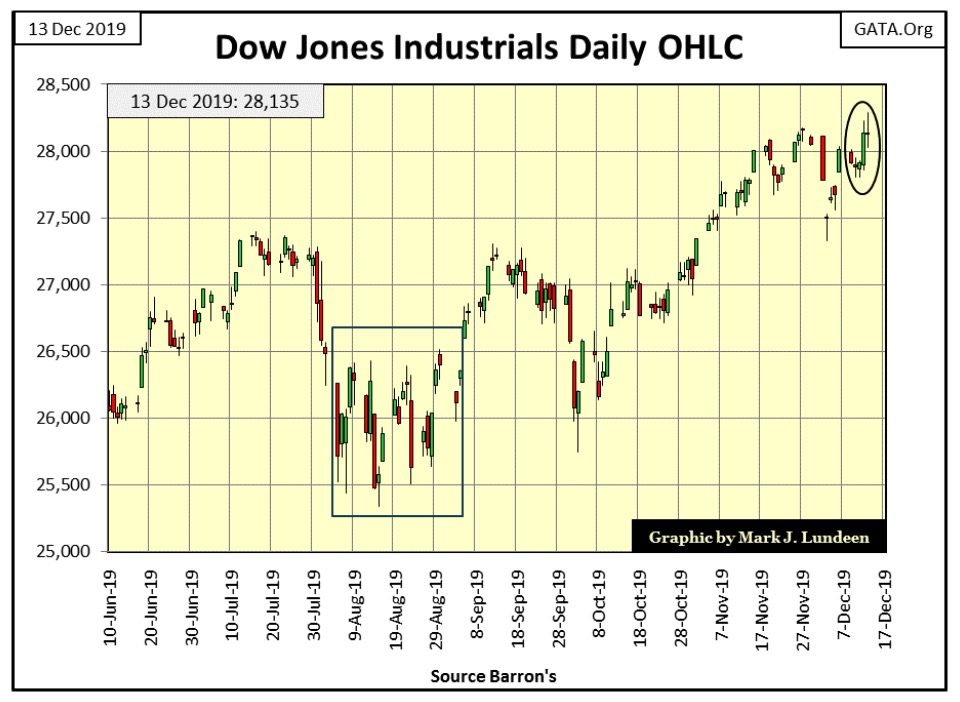
The Dow Jones closed last week only 0.10% from making a new all-time high. It’s likely that we will see a few more new all-time highs before this advance is over. Since January 1982 the Dow Jones has closed at or within 5% of a new all-time high for 4,832 of its daily closings. That means that 50.4% of all daily closings over the past four decades were within 5% of a new all-time high.
Looking at the Dow Jones BEV chart below, going back to January 1982, the Dow Jones has knocked at the door of a new all-time high many times before.
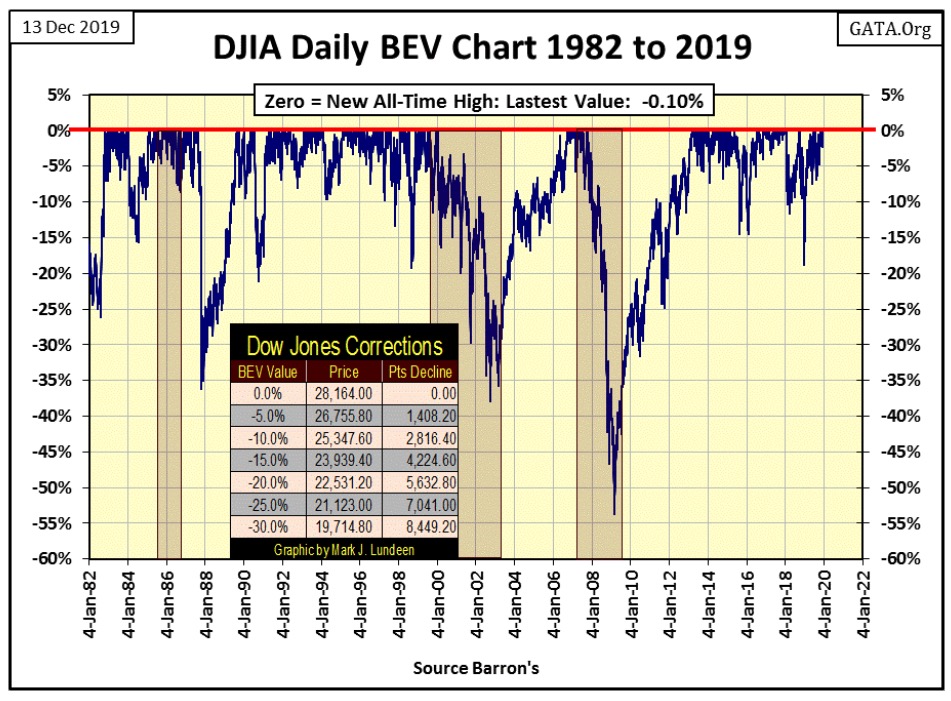
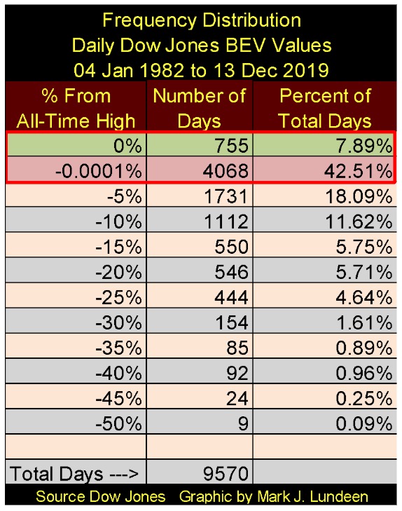
Want a number on that? 755 new all-time highs since January 1982, as seen in the Dow Jones Frequency Distribution table below, or 7.89% of all daily closes for the past thirty-eight years saw the Dow Jones close at a new all-time high. When we add the days in the 0% and the -0.0001% rows, those daily closings just short of a new all-time high down to -4.99% from one, we discover that since January 1982 the Dow Jones has closed at or within 5% of a new all-time high for 4,832 of its daily closings. That’s 50.4% of the daily closings for the past four decades were within 5% or at a new all-time high.
Since 1885, no other four decade period of market history can match what we see above. There is a good reason for this; the Federal Reserve has been actively managing market valuations since August 1987, when Alan Greenspan became Fed Chairman.
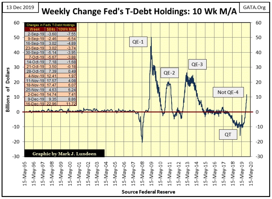
The FOMC still has its meat hooks fixed deep in the market; as seen below (table insert) we are in week #10 of Fed Chairman Powell’s Not QE-4, and this week the FOMC monetized a big $22.96 billion dollars of Uncle Sam’s IOUs in the Treasury market. This pushed the 10Wk M/A to $11.72 billion, taking it above the 10 billion dollar line in the chart below.
Why are our “monetary-policy makers” doing this? Because if they didn’t something really bad would happen. What would that be? In time we’ll all find out, but I’m thinking something big-bad and ugly is raising its head in the banking system. Something having to do with derivatives and increasing risks of massive counter-party failure for a major financial house on Wall Street. When news of this, whatever and whenever this breaks, I doubt the Dow Jones will see a new all-time high for a while.
Maybe we’re on the cusp of a global banking-system collapse. But the stock market at the close of this week doesn’t care, not when all this “liquidity” is flowing into the financial system. This week the major indexes I follow are once again making new BEV Zeros (new all-time highs), even if the Dow Jones didn’t.
Here’s the Dow Jones in daily bars. I expect the Dow Jones will soon join the party and make additional new all-time highs in the weeks to come.
I haven’t looked at the Dow Jones and its trading volume for a while, but once again it’s become weird. But first let’s look at how the Dow Jones and trading volume worked from 1900 to 2000 with a quick look at the Dow Jones and NYSE trading volume (daily basis) from 1918 to 1938.
Trading volume and the market valuations aren’t bolted together; still, historically bull markets have seen trading volume expand, while bear markets see trading volume contract, exactly as the law of supply & demand would have it.
Looking at the Dow Jones (Blue Plot) and NYSE Trading volume’s 40Day M/A below (Red Plot) for the twenty years from 1918 to 1938, this relationship between market valuation and trading volume held fast. The Roaring 1920s bull market saw both rising valuations and trading volume, as the depressing 1929 to 1932 market crash was a crash of both trading volume and market valuations.
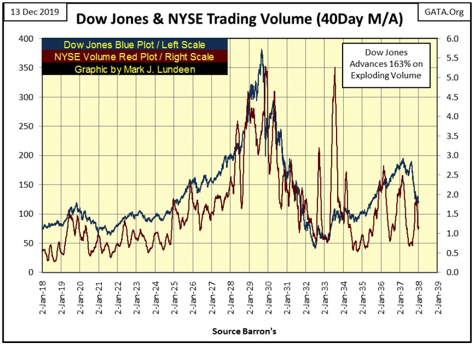
The best year in Dow Jones history (July 1932 to July 1933) saw the Dow Jones appreciate 163% on exploding trading volume, as one would expect. And so it went; until 2000, when the NASDAQ High-Tech bubble began deflating and the stock market turned the Law of Supply & Demand on its head, or so it seemed.
Below I’ve plotted Dow Jones Trading volume’s 10-Day M/A from 1979 to the close of today. In this chart’s insert we see rising trading volume from 1982 to the 2000 market top, an increase in daily trading volume of about 30 times.
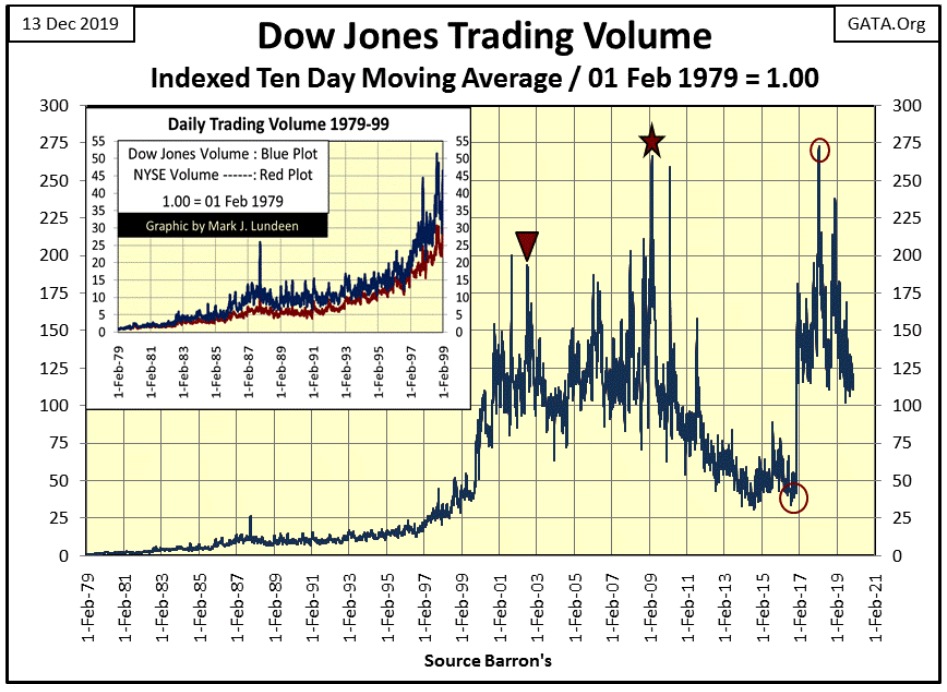
That was how it was from 1900 to 2000. However, when the Dow Jones (my proxy for the general stock market) began deflating market valuation from 2000 to 2002, trading volume exploded. The Red Triangle above marks the October 2002 Dow Jones 38% market bottom, which occurred on about seven times the trading volume it had at its January 2000 market top. Weird!
The same thing happened at the Dow Jones -54% market bottom of March 2009, identified by the Red Star in the chart above. And when the Dow Jones began an advance that inflated its valuation by some 21,000 points by the close of this week, it began this advance as trading volume contracted for six years (first Red Circle / November 2016).
Then, for the first time since 2000, the Dow Jones saw its Post 2016 Election advance on exploding volume, until January 2018 (second Red Circle). But in the past two years the Dow Jones is once again advancing to new all-time highs, on declining trading volume. I expect that on the next correction in the stock market, it will do so on rising trading volume as the FOMC enters the market to “stabilize” market valuations.
So, it’s no mystery why this inversion of the Law of Supply & Demand happened time and a time again – the FOMC’s new “policy” is to support market valuations. So, using monetary inflation, the Federal Reserve buys stocks in the open market when no one else will, and at prices everyone else refuses to pay.
If this is right, and I’m sure it is, should the day come when the FOMC withdraws from the financial markets, it would trigger a historic-market crash such as we’ve never seen. Now I doubt that would happen, that the Federal Reserve and its central-banking brethren would stop managing the financial markets. However a day is coming when a crisis so massive arrives, that it will overwhelm the best efforts of central banks to “stabilize market valuations.”
Any sign of that happening yet? I’d say seeing Chairman Powell’s Not QE-4 beginning in October is a warning to all that an ill wind is approaching.
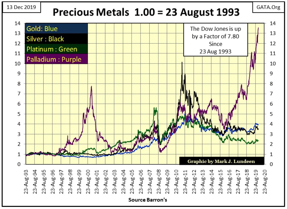
Looking at the precious metals below, palladium (Purple Plot) remains the clear winner, even outperforming the Dow Jones since 1993.
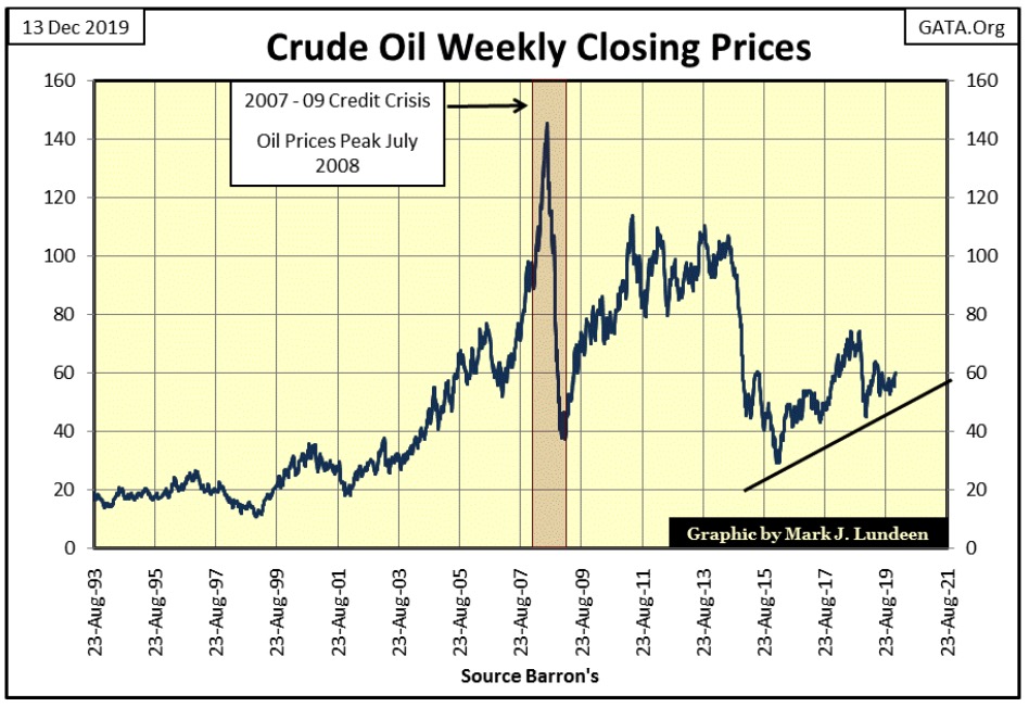
So, when is gold and silver going to do something for their advocates? Well, if the “policy makers” are managing the financial market valuations up, they’re also managing precious metals and other commodities valuations down. Here’s the price of crude oil since August 1993, in the past three decades its price has increased by only a factor of three.
When we consider the potential for inflating consumer prices from the Federal Reserve’s past acts of monetary mania, such as now four quantitative easings, one has to wonder why crude oil closed the week at around $60 a barrel. Don’t get me wrong, I like my gasoline cheap. But I have to wonder what is going to happen to energy prices should the FOMC loses its grip on the financial markets.
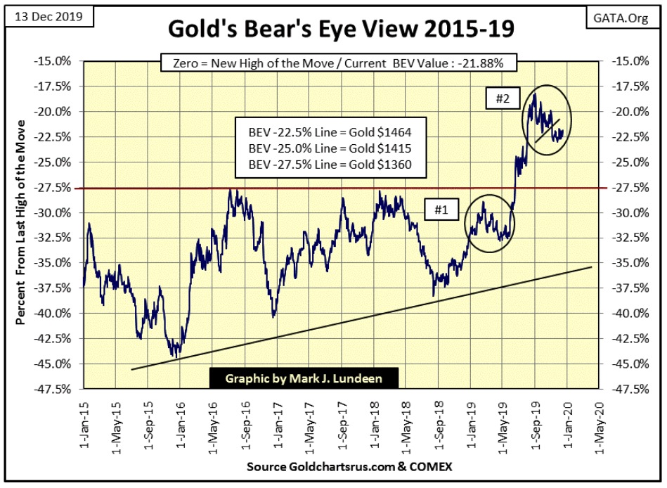
This week gold refused to break below $1450 (-23.23% BEV Value). Actually, since November 8th gold’s -22.50% line ($1,464) has been where the battle between the bulls and bears have been. Its encouraging seeing gold refuse to break below a level it’s defended for over a month now.
This week on Greg Hunter’s USA Watchdog Greg interviewed Bill Holter, who claims that the COMEX gold market is already in deep default. Bill is talking about over 1000 tons of gold that can’t be delivered. The interview is only sixteen minutes long and well worth listening too.
One of these days all this crap Wall Street and Washington have been doing to maintain the fiction of a bull market in financial assets is going to grind to a halt. And when it happens retail investors aren’t going to be able to purchase gold and silver at a retail outlet for gold and silver eagles at prices anywhere near to where they are now, or maybe they will be unavailable to the public at any price.
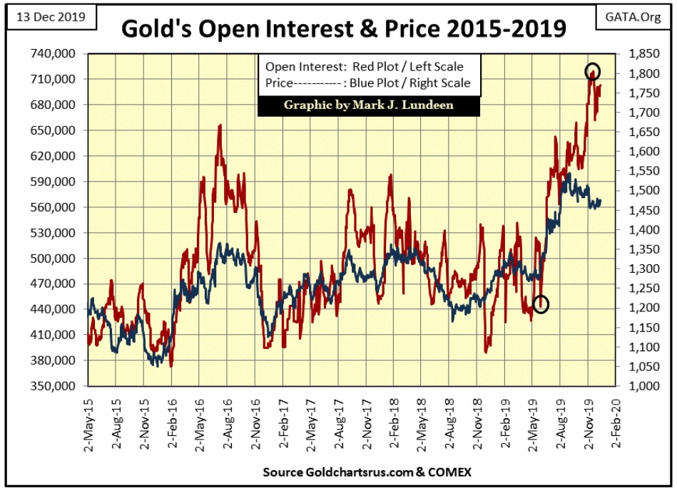
COMEX gold open interest (OI) remains high, but the longs in the gold market (those who profit from rising prices) haven’t begun to run away yet; if they were we’d see the OI declining along with the price of gold in this chart.
But the big banks are the big shorts in this market, and so far they haven’t done much since early November to push the longs off their positions. I’m thinking about Powell’s Not QE-4 and Bill Holter’s interview at USA Watchdog as possible factors that are limiting what the big shorts can do to the longs now in December 2019.
Although it would be good for the bulls in gold and silver, seeing OI below begin to COLLAPSE ON RISING PRICES would be a horrible omen for Wall Street and the financial markets in general; possibly the resumption of the crisis of 2007-09.
But it must be said that until the “policy makers” allow Mr Bear to do what must be done; remove dead assets and deflate over valued assets from balance sheets everywhere, the financial system will not be healthy.
Sounds good, but keep in mind that in the process widespread bankruptcy and ruin will be a byproduct of Mr Bear’s inevitable program of financial hygiene. Pension funds will be closed down, insurance companies will fail and the banking system will be in a crisis not seen since the early 1930s.
It’s no fun being a bear! But what must be will be, and it’s best to get it over with than to do what the “policy makers” have been doing since the early 1990s – patch up the problems with monetary inflation to continue the fiction of a bull market on Wall Street going.
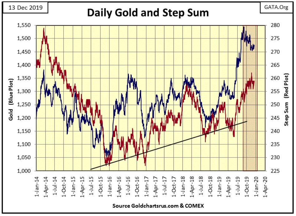
Moving on to gold’s step sum chart the bear box remains valid, but since November 8th the $1,450 level has remained a solid floor to the gold market. That’s twenty-six COMEX trading sessions that the bulls successfully defended $1,450. Twenty-six COMEX trading sessions the bears failed to break gold down below an important floor in the market.
There’s great drama to be seen in the chart below, and above, with much more at stake here than just whether the price of gold is going to go up or down.
—
(Featured image by Sabrina B via Pixabay)
DISCLAIMER: This article was written by a third party contributor and does not reflect the opinion of Born2Invest, its management, staff or its associates. Please review our disclaimer for more information.
This article may include forward-looking statements. These forward-looking statements generally are identified by the words “believe,” “project,” “estimate,” “become,” “plan,” “will,” and similar expressions. These forward-looking statements involve known and unknown risks as well as uncertainties, including those discussed in the following cautionary statements and elsewhere in this article and on this site. Although the Company may believe that its expectations are based on reasonable assumptions, the actual results that the Company may achieve may differ materially from any forward-looking statements, which reflect the opinions of the management of the Company only as of the date hereof. Additionally, please make sure to read these important disclosures.


Graph Therapeutics Secures $5M to Advance AI-Driven Precision Therapies
Biotechnology company Graph Therapeutics raised 5 million dollars in a funding round led by Daphni, with support from existing investors....


DEA Hearing Signals Historic Turning Point for U.S. Cannabis Policy
The DEA has begun a key hearing on reclassifying cannabis from Schedule I to Schedule III, following a recommendation from...


Italy Leads Europe in Digital Sustainability Reporting for SMEs, EFRAG Finds
Italy leads Europe in digital sustainability reporting tools for SMEs, according to EFRAG’s second mapping of VSME platforms. The ecosystem...


RLUSD Launch in Japan Amid XRP Price Decline and Uncertain Outlook
Ripple and SBI launched the RLUSD stablecoin in Japan after JFSA approval, signaling strong progress in tokenization. However, XRP fell...


Youth Cannabis Use in Colorado Is Falling — But the Full Story Is More Complex
The 2026 Colorado survey shows teen cannabis use fell to 10 percent in 2025, down from 21 percent in 2015....
 |
|
 |  |
 |
|
-

 Impact Investing2 weeks ago
AI Adoption in Italian Retail Stalls Despite Strong Experimentation
-

 Cannabis2 days ago
Cannabis Dominates Global Drug Use: Trends, Risks, and Shifting Markets
-

 Impact Investing1 week ago
EU Weighs More Free Emission Permits in ETS Review to Boost Industry Competitiveness
-

 Crypto6 days ago
Bitcoin and Ethereum Slide as Market Pressure Builds Amid Strategy Concerns and Layer 2 Disruptions