Featured
Gold and the Dow Jones for the Week
The Dow has remained above its BEV -7.5% line since last February, though in May and August it came down to test this level. Now in late October, we are waiting to see what comes next; a new BEV Zero or a break below the Dow Jones’ BEV -7.5% line of support. As the Dow Jones closed the week only 2.15% away from its BEV Zero of last July, it certainly could make market history from this level.

Another week, but for the Dow Jones the song remains the same: so close yet so far from making a new all-time high. The Dow has remained above its BEV -7.5% line since last February, though in May and August it came down to test this level. Now in late October, we are waiting to see what comes next; a new BEV Zero or a break below the Dow Jones’ BEV -7.5% line of support.
Since March 2009 its BEV -7.5% (Red) line has been an important line of support the Dow Jones has bounced off many times. When the Dow Jones has broken below it, typically it sees a double-digit correction, the last one being an 18% decline just last December.
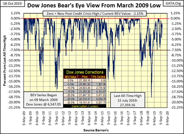
So what comes next; a new all-time high or a double-digit correction? As the Dow Jones closed the week only 2.15% away from its BEV Zero of last July, it certainly could make market history from this level. But as I’ve noted many times since late August with the Dow Jones just a hair’s breadth from making market history, the bulls haven’t been able to make that happen.
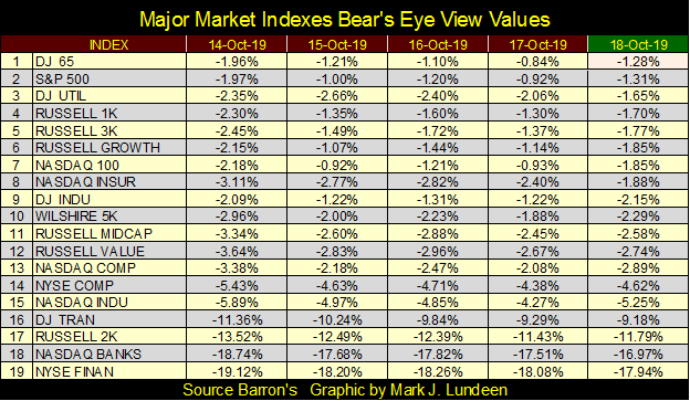
Look at the daily BEV values for the Dow Jones (#9) for the week in the table below. From Tuesday or Thursday’s -1.22% the bulls couldn’t close the gap and make a new all-time high. It’s been like this for the past month and a half; where time and time again the bulls have failed to make a new all-time high when they had the opportunity too.
I’m not telling anyone, like the bulls what they should or should not be doing. I’m only commentating on what they are, and are not doing. And what the bulls are doing is wasting everyone’s time, because they are refusing to do something bullish at the BEV 0.00% line in my BEV charts.
So, my thoughts turn to the Dow Jones’ BEV -7.5% line, the key line of support since March 2009. What happens when the Dow Jones once again breaks below this support line? The last time it did we saw the biggest correction of the Post Credit Crisis market advance; an 18% correction, the deepest since March 2009. The question to ask now is whether the next correction will be greater than 18%? But that’s a question that can’t be answered by just looking at the Dow Jones BEV chart.
Maybe this Jim Willie interview by SGT Report will shine some sunlight on the situation the stock market now finds itself in, and I believe it does; the Federal Reserve has already begun another round of QE via the overnight repo market. Why would this be important? Because it indicates the banking system is once again in trouble, as it was during the 2007-09 sub-prime mortgage bear market.

However, as Jim Willie tells us, the banking system’s current problems are far larger than they were a decade ago. So let’s take a quick look at the Dow Jones (Blue Plot) and its step sum (Red Plot) during the 2007-09 sub-prime mortgage debacle below.
From its terminal bull market high on 09 October 2007, the Dow Jones began a market decline that a year later saw the Dow Jones deflate by 40% for the first time since December 1974. This was a major market event! Yet it wasn’t until the Dow Jones saw this 40% market decline on 10 October 2008 that its step sum turned down. And the step sum declined by only twenty-three net down days at this bear market’s bottom, the second deepest bear market bottom since 1885 on 09 March 2009.
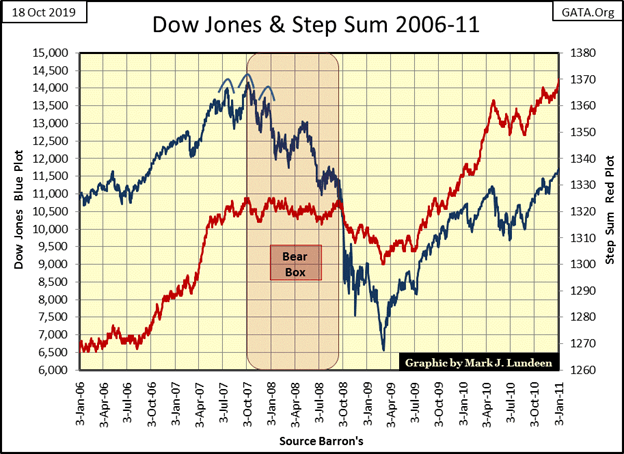
This was all wrong. Here is the problem as I see it; a bear box exists when a market index declines for more than eight weeks occurs without its step sum trending down with it. In the bear box above, trends for the Dow Jones and its step sum decoupled for an entire year.
The step sum is a market sentiment indicator, and the bear box exists for only as long as each down day in a bear market (or market correction) is followed by an advancing day. The existence of a bear box indicates the bulls believe they’re buying cheap stocks in a market that will soon recover, or “buying on market weakness” as the bulls wisely do during a normal bull market correction.
When the bulls finally come to understand they are wrong, that the decline isn’t a bull-market correction but a bear market, the market decline then begins its liquidation phase as the bulls begin exiting their bullish positions which drive the step sum down with its index to their ultimate bear market bottoms.
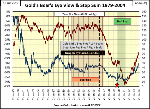
Gold in its 1980 to 2001 bear market saw a six-year bear box (next chart), followed by a massive collapse in market sentiment as seen in its collapsing step sum from 1996 to 2001.
Look at the bull box from 1999 to 2001. Market sentiment (the step sum) was so bearish it continued its liquidation phase two years following the actual bear-market low in the price of gold in July 1999 (Red Star). Now that’s what a hard bottom looks like; overwhelming down days in a market with no corresponding impact on the price.
Back to the Dow Jones credit-crisis bear market, the 2007-09 credit-crisis bear market began its liquidation phase on 10 October 2008 as the Dow Jones broke down to its BEV -40% line; so far so good. But from that point, the step sum declined by only a net of twenty-three down days by the 09 March 2009 bear market bottom. That’s a pathetic liquidation phase in market sentiment for the second deepest Dow Jones bear-market bottom since 1885.
In October 2019 we now know why this happened; the FOMC began their first quantitative easing, or as I called it at the time “Operation Bear-Market Interruptus.” If no one else was going to use their own money to buy stocks as the stock market became quicksand beneath their feet, then by golly Doctor Bernanke was going to with a few trillion dollars of monetary inflation!
Operation Bear-Market Interruptus impacted market sentiment; following a bad day in the market, the FOMC made sure there was a nice market advance, as seen in the Dow Jones step sum’s pathetic liquidation phase.
By March 2009, floating on an ocean of “liquidity” flowing from the Federal Reserve, the Dow Jones (my proxy for the broad stock market) began an advance that continues, with some difficulty to this day.
But what would have happened had the Federal Reserve in 2008-09 allowed Mr. Bear to do what he was supposed to have done; purge illiquid, non-performing assets and deflate overpriced valuations from everyone’s balance sheets. From the truncated Dow Jones’ step sum of this bear market, I believe the Dow Jones would have seen a bear market decline of over 70% sometime in 2009-10.
After listening to Jim Willie’s comments on the overnight repo market, I believe it’s safe assuming this time the Federal Reserve decided not to wait until the Dow Jones has declined 40% before it begins its next operation bear-market interruptus.
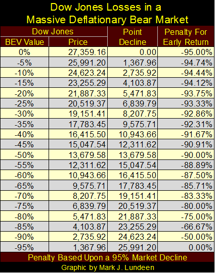
The “best and brightest” sitting around the big table in the FOMC fear after decades of their market malfeasants, the financial markets and economy are on the verge of another Great Depression market event. What would that look like? The table below displays one possibility; that of a 95% market crash in the Dow Jones.
“Good Grief Mark! Why are you so bearish?” It’s a lot more than just step sums and chart patterns. It’s my realization of how important moral standards are in maintaining social integrity. Ten Commandment stuff like:
- Thou shall not steal;
- Thou shall not lie;
- Thou shall not encumber any publically-traded corporation you control as a fiduciary with more debt than its earnings can service during a recession.
Since the creation of the Federal Reserve in 1913(done in secret), standards have been lowered to the point where today anything is allowed if that’s what it takes to keep market values inflated. In such a world, why should we exclude the worst as a possibility?
Most of my adult life, before 1995, I didn’t qualify for a credit card. Multiple banks refused me as I didn’t have a history-of-credit; I only paid in cash or with a check. If I had to use a bank loan to buy something – I went without. Being in the navy I used pay-phones on the pier, so I got an AT&T phone card to pay for my calls back home, much better than shoving quarters into the phone as one did back then.
Then one day I got a letter from AT&T sending me a Master Card with a multi-thousand dollar line-of-credit. I didn’t ask for it, but it was an offer I couldn’t refuse – No Fees for Life! I’ve never carried over a balance from one billing period to another, so AT&T has never made a cent for sending me that card; a source of satisfaction to this day.
Okay, so other than to illustrate I’m one of the strange ones and a cheapskate, what’s the point of all that? Only that a society whose money supply is infected with inflation is a society whose standards are under constant assault.
Isn’t that how I got my first credit card? The banking system (via AT&T) lowered their standards, and that was in 1995. Today people who declare bankruptcy discover a few months later they are flooded with credit card offers.
Then there are these advertisements on how to “improve” one’s credit score, as seen below.
I don’t know exactly what is going on here, but it pretty clear the financial system intends on lowering credit standards (raise credit scores) on marginal debtors as a means to allow them to become even deeper into debt.
Housing has been greatly impacted by monetary inflation, as seen in this 1954 quote from Barron’s:
“The Housing Act of 1954 will turn out to be one of the worst pieces of inflationary legislation ever placed on the statute-books. For the first time, non- veterans will be able to buy a $10,000 house with a down payment of $500, the Federal Housing Administration insuring a 30-year mortgage of $9,500 on such a house. This is a triumph of the Nation’s Home Builder’s Association and a defeat of commonsense. Unfortunately, there is no reason to hope that mortgage money lenders will resist the practical consequences of this legislative monstrosity. Throughout the’ first half of’ 1954, most of them have been eager to make VA mortgage loans to home-buyers at no down payment at all.”
– Barron’s The World at Work, 05 July 1954, Page 7
Imagine buying a new home today for $10,000, and new homes’ exteriors in 1954 were of brick and stucco. Today an equivalent home would cost over $150,000 and have vinyl siding as brick and stucco exteriors are too expensive. On the surface that is true, but really what happened in housing is that six decades of inflation has made home buyers pay more for less.
Education also has been impacted by monetary inflation. For decades the cost of a college education increased annually by double-digit percentages as just about everything else, including wages and income, increased by low single digits. Before the 1970s students could and did pay for their college education by working at night and on the weekends. But today that’s not possible as inflation has driven the cost of a college education up to that of a house in a bad part of town.
However, it’s worse than that as most degrees now offered by “higher education” are worthless from the standpoint of increasing a student’s means of improving their earning potential.
For an engineering graduate who excelled in their studies, assuming they can find employment in their field, after servicing their school loan to term are they really better off than someone else who joined a union and attended their apprentice program? Before 1970 that would certainly be the case, but I’m not so sure that is true anymore.
We should ask ourselves if there is a connection between housing and education? And there is; both have a direct connection to the inflationary flow from the Federal Reserve via a Federal Government guaranteed loan program. As in a Greek tragedy: “whom the Fed’s would destroy they first provide government-guaranteed loans to.”
Is there any sector of the economy that isn’t impacted by “monetary policy” dictated by the FOMC? If there is it isn’t in corporate earnings, or so it appears below.
Dow Jones’s earnings reached $20 in early 1930, then crashed in the early 1930s, along with everything else (except for gold mining shares). Earnings for the Dow Jones didn’t recover until 1949 – twenty years. Compare that to the 2007-08 crash in Dow Jones earnings, a crash of over $900 for the Dow Jones.
But unlike the Great Depression earnings crash, it took only two years for earnings for the Dow Jones to recover and go on to record highs. I’m not an accountant or a market expert by anyone’s definition, but the 2008-2011 recovery in Dow Jones’s earnings doesn’t pass my smell test.
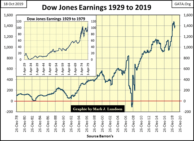
It’s not just me who’s a bit suspicious of 21st-century corporate earnings. Below Yahoo republished a Bloomberg opinion piece on exactly this topic
“However frothy valuations currently seem to be, optimists can always argue they’re justified by strong earnings. In the past four years, S&P 500 operating earnings per share have grown by nearly 40%. Those numbers, however, may be as airy as the asset prices they support.”
– Bloomberg, Satyajit Das, October 13, 2019
So, the next time the Dow Jones falls below its BEV -7.5% line, will it see a decline that is deeper than the 18% decline it saw last December?
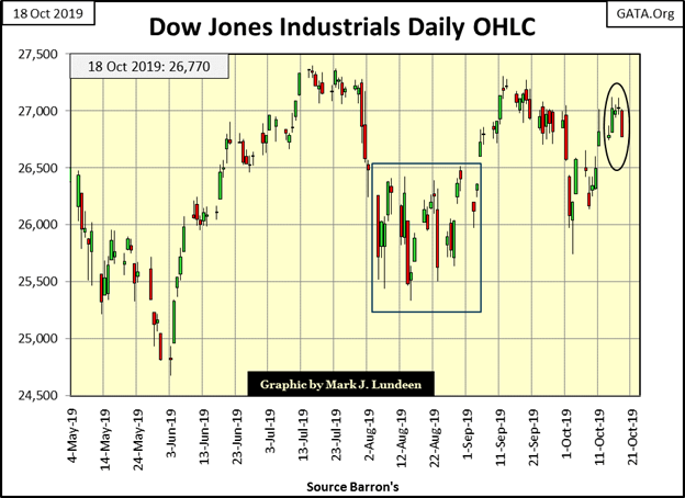
If that is to be our fate, a break down to the Dow Jones’ BEV -20% line, it hasn’t begun as of this week’s close as seen in the Dow Jones daily bar chart below. But a longer-term view of the Dow Jones shows how since January 2018 it has been ranged bound between 22,000 and 27,500 for almost two years now. This is something that will one day change.
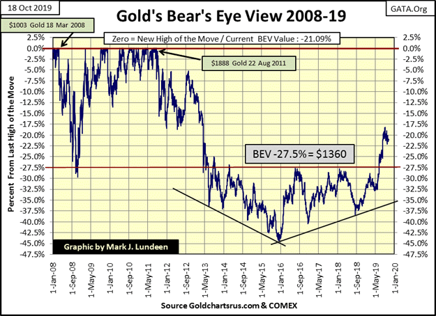
Gold in its BEV chart below continues looking attractive. And gold does look attractive coming off a 45% market correction in December 2015 and finally breaking above, and staying above its BEV -27.5% since early last summer.
Compare that to the Dow Jones near the top of a ten-year advance that hasn’t done much for the bulls since January 2018.
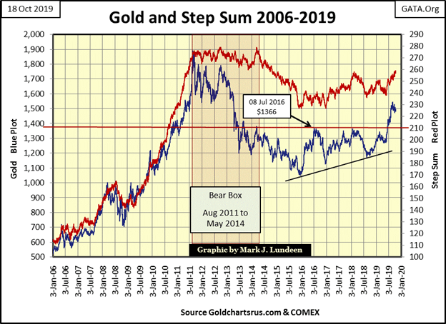
Here’s gold’s step sum chart. Since gold peaked at $1542 on August 28th it has decoupled with its step sum. Are we seeing a bear box in the making? Yes but I’m not going to worry about it as the price of gold itself hasn’t really fallen much from its highs of August.
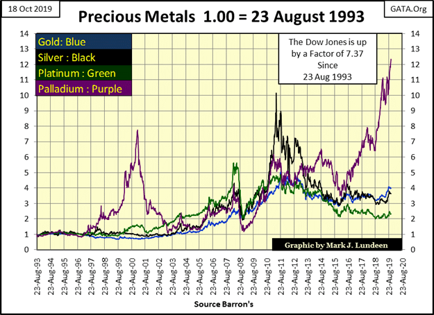
Palladium (Purple Plot below) is advancing again and doing a whole lot better than the Dow Jones since 1993. The sore spot for this chart is that both palladium and the Dow Jones are outperforming gold and silver. Give the old monetary metals some time and I expect they’ll surprise us all.
How much time am I thinking about? How much time before the Dow Jones breaks below its 18% market correction of last December? That’s the key as what drives the price of gold and silver up is deflation in the financial markets.
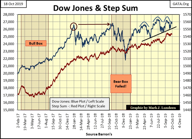
Next is the step sum chart for the Dow Jones. If this was 2013 instead of 2019, I’d see this chart as very bullish. I’d interpret the market action since January 2018 as a two-year base from which the Dow Jones could (would) go to much higher levels.
The 18% correction of last December flushed out the excessive bullish sentiment, something a good correction in a bull market is supposed to do. And since then we see a pattern of rising bottoms (see rising trend line) that’s compressing the Dow Jones against its last all-time high. If you take a look at gold in its step sum chart above, there are a lot of similarities between the two.
So why do I like gold but not the Dow Jones? For one gold is coming off a 45% market bottom in December 2015. I call it a market correction within a continuing bull market, but most of the world would call a 45% market decline a bear market bottom for darn good reasons.
So let’s just say, gold is only in the fourth year of a bull market, a bull market that so far has so far failed to exceed its last all-time high of August 2011. So I see gold (and silver) in the early years of a major bull market.
The Dow Jones is a completely different story, coming off it credit-crisis -54% bear market bottom, it’s been advancing for over ten years, gaining over 21,000 points in the process!
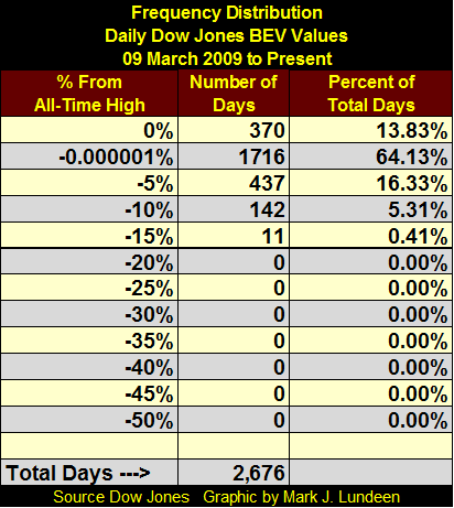
And look at the Dow’s frequency table of its daily BEV values since 09 March 2009. The BEV data set used in this freq table can be seen in the Dow Jones BEV chart above, the first chart of this article.
Note: this freq table uses a BEV series that begins on 09 March 2009, so the -54% market bottom of that day is read as a BEV Zero. The first true new all-time high of this advance didn’t happen until 05 March 2013, when the Dow Jones finally broke above its last all-time high of October 2007.
But analyzing the post-March 2009 advance as a thing unto itself, the Dow Jones has seen 370 daily BEV Zeros, and 1,716 daily closings just short a BEV Zero down to -4.99% (in the -0.000001% row). In other words, 78% of the daily closings of the Dow Jones since March 2009 have been within 5% of a BEV Zero – Wow!
No wonder the stock-market bulls are exhausted.
Should the FOMC decide to “inject” additional “liquidity” into the financial system, the Dow Jones could see additional BEV Zeros.
However, if the banking system begins seeing a series of failures in the big banks due to the toxic nature of their reserves, as happened with Bear Stearns and Lehman Brothers in 2008, the current ten-year advance would be terminated.
Let’s move on to gold and the Dow Jones’ step sum tables. Since September 16th, the price of gold has seen a slight decline as its step sum has increased by four net advancing days. This is how a bear box is formed if this continues long enough.
Gold’s 15 counts has remained positive for most of the past twenty-five trading sessions, but the 15 count remaining between -3 to +3 that’s just normal market action, in which the price of gold could be advancing or declining.
Actually the item I’m looking at in gold’s step sum table is its volatility’s 200D M/A. It’s up 0.02% since last month, which is why gold and silver are such boring markets. We’ll know when the precious metals begin their next advance by seeing their volatility advance briskly above their 1.00% levels.
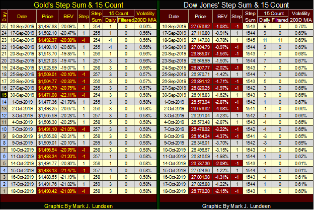
Dow Jones’ valuation is also deflating, but not by much. The big item for the Dow Jones is seeing how its daily volatility has decreased by 0.10% these past twenty-five trading sessions. Low volatility for the stock market is a good thing, so maybe the stock market is anticipating a good week coming our way.
I won’t be writing an article next week. I have some personal matters that must be attended to. But if next week becomes interesting, I may write a short article.
—
(Featured picture by Austin Distel via Unsplash).
DISCLAIMER: This article expresses my own ideas and opinions. Any information I have shared are from sources that I believe to be reliable and accurate. I did not receive any financial compensation for writing this post, nor do I own any shares in any company I’ve mentioned. I encourage any reader to do their own diligent research first before making any investment decisions.


RLUSD Launch in Japan Amid XRP Price Decline and Uncertain Outlook
Ripple and SBI launched the RLUSD stablecoin in Japan after JFSA approval, signaling strong progress in tokenization. However, XRP fell...


Youth Cannabis Use in Colorado Is Falling — But the Full Story Is More Complex
The 2026 Colorado survey shows teen cannabis use fell to 10 percent in 2025, down from 21 percent in 2015....


Morocco’s Growth Holds at 4.6% as Agriculture Offsets Economic Pressures
Morocco’s economy grew 4.6% in Q1 2026, driven by a strong agricultural rebound offsetting declines in industry. Services expanded moderately...


Abivax Shares Surge as New Trial Data Eases Safety Concerns Over Ulcerative Colitis Drug
Abivax shares surged nearly 36% after positive updated trial results for its ulcerative colitis drug obefazimod reassured investors following earlier...


El Dorado Raises $9M to Expand Cross-Border Fintech Platform
El Dorado, a Latin American fintech improving cross-border financial services, raised a $9 million Series A led by Paradigm with...
 |
|
 |  |
 |
|
-

 Impact Investing6 days ago
ESG Gap Persists as Firms Struggle to Link Sustainability to Financial Value
-

 Crowdfunding2 weeks ago
Temotiva Launches Crowdfunding Campaign to Advance Preventive Mental Health
-
 Fintech1 day ago
El Dorado Raises $9M to Expand Cross-Border Fintech Platform
-

 Crypto1 week ago
Bitcoin Holds Steady as Microtransactions Surge and ETF Inflows Continue