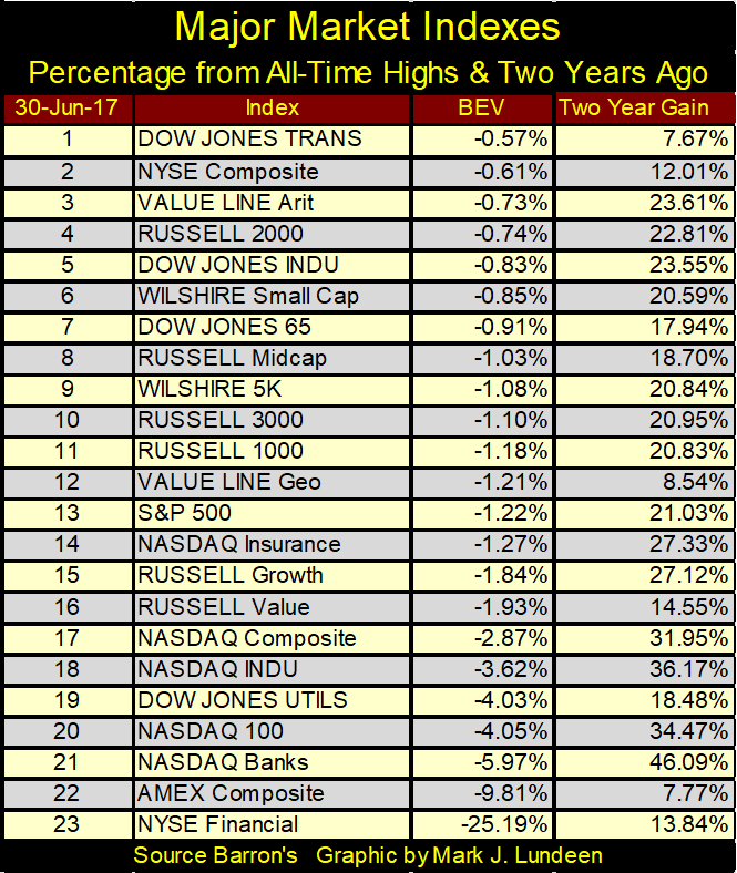
Markets
Dow Jones ended last month with seven all-time highs
The question then will be what’s next? A return to a market where new all-time highs in the Dow Jones are common occurrences? Or a market where the Dow Jones experiences ever deeper declines, down below the Dow Jones BEV -20% line?
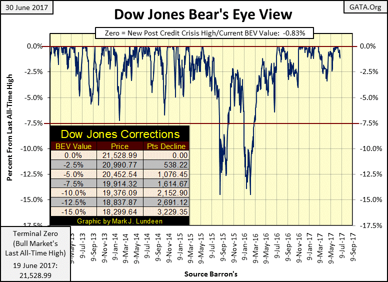
Another month in 2017 has come and gone. And, I have to say that June was for the most part pretty quiet compared to what the stock market saw earlier in the year. In June we saw seven new BEV Zeros (new all-time highs) in the Bear’s Eye View chart below. But for all that the Dow Jones ended June only 341 points higher from where it found itself at the end of May. When looking at a market over 21,000, 341 points isn’t really much of a gain after seven new all-time highs.
Looking at the area of the BEV chart for the November election, now seven months ago, it’s very obvious that something changed. The BEV plot moved from -4.01% on November 4th and then slammed into the BEV Zero line only three trading sessions later. That’s one heck of a move; nothing unprecedented, but an advance not seen very often. Since November 4th, the Dow Jones’ BEV plot did descend down to -2.67 on March 27th, but for the most part has remained above its -2.50% line.
© Mark Lundeen
This is a situation that isn’t going to last for the rest of the year. If it does, I’ll be surprised! It takes buying to make a market go up, but gravity alone can bring it back down. The last time the Dow Jones found itself below its -5.0% line was on June 27th of last year (-6.40%).
Look at the Dow’s BEV Chart above. In the normal ebb and flow of the market, twelve months is a long time for the Dow Jones not to have seen a correction of greater than 5% from an all-time high. That makes the past year in the market an anomaly, and by definition, anomalies don’t last forever. But I suspect this anomaly will last for as long as the “policy makers” have the will and means to continue it.
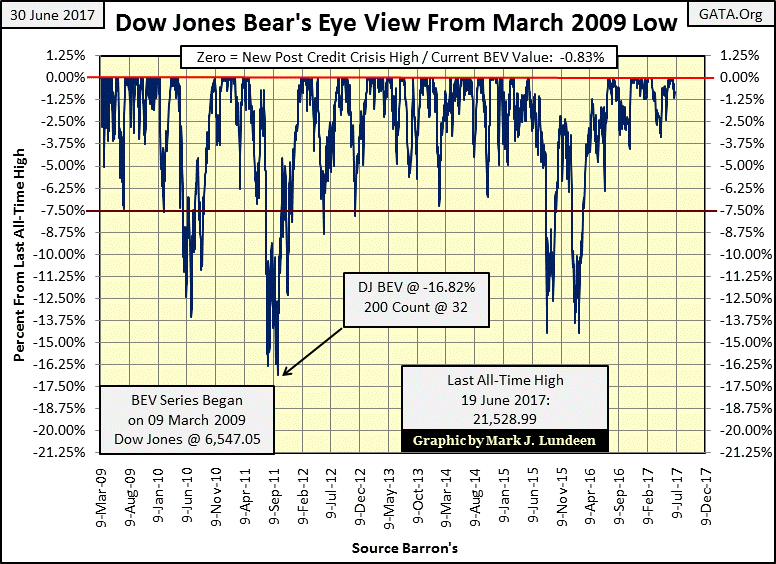
Let’s take a look at the BEV Plot series going back to day one of the current bull market, back to 09 March 2009 in the chart below. Since March 2009, there have been four double-digit corrections that took the Dow Jones down below its BEV -10% line in 2010, 2011, and again in 2015 and early 2016. It can be argued though that the 2015-16 corrections were a single correction, as there were no BEV Zeros separating them.
But what is undeniable is that since last summer, the Dow Jones has found its path of least resistance in going up, not down.
© Mark Lundeen
Like I said before, this is something that isn’t going to last forever. The day will come when Mr. Bear will veto the “policy makers”, and the Dow Jones will once again break below its BEV -10% line (19,376). The question then will be what’s next? A return to a market where new all-time highs in the Dow Jones are common occurrences? Or a market where the Dow Jones experiences ever deeper declines, down below the Dow Jones BEV -20% line?
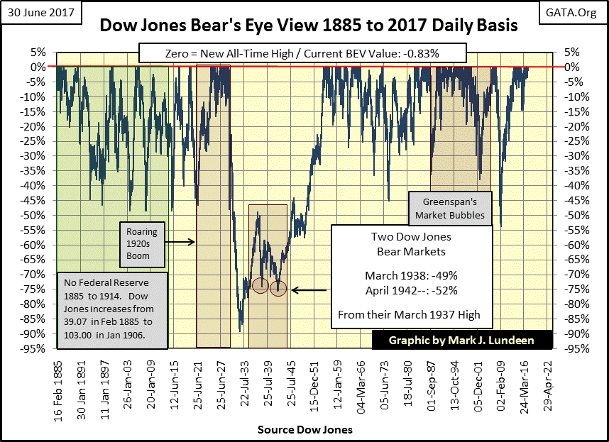
Short term I’m a bull. For as long as the “policy makers” can maintain the valuation in the Dow Jones where it doesn’t breach below its BEV -5% line above, or maybe even its BEV -7.5% line, I expect we’ll continue seeing this aging advance in the Dow Jones capable of making new all-time highs. But for every bull market, there is its Terminal Zero (TZ) in a BEV chart – its last all-time high. That’s been true since 1885 in this BEV chart for the Dow Jones below.
© Mark Lundeen
Longer term I’m a grizzly bear on this market because of the horror I see in the following chart. Is it only me, or do you also see the historic market bubble in the chart below? Look at the past year – straight up!
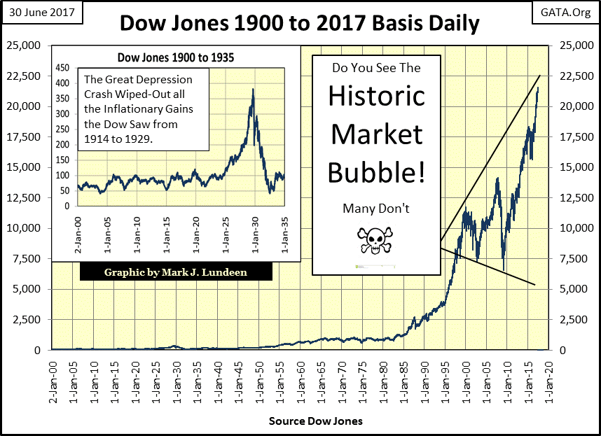
© Mark Lundeen
I don’t want to look at this monetary monstrosity the FOMC has inflated into the stock market. In the chart’s insert, I have the Roaring 1920s and the depressing 1930s plotted. Do you really believe Mr. Bear isn’t going to deflate our bubble too? If we see only a 70% bear market we’ll be lucky, but I’m expecting a repeat of the Great Depression Crash when Mr. Bear pops this bubble. When he does, he won’t ask Janet Yellen for permission to do it.
If you don’t understand why I’m always recommending my readers purchase, and take home some gold and silver bullion, and have some exposure to the mining issues, it’s because when this bubble begins to deflate in earnest, chaos will be the order of the day. That’s when you’ll be glad you took my advice.
Back to the Dow’s BEV charts.
As I read the BEV charts above, the day the Dow Jones breaks below its BEV -10% line, if you’re still in this market, you had better get the hell out of Dodge City. Wild Bill Hickok and his partner Mr. Bear are coming to gun down all the cowboys whooping it up on Wall Street.
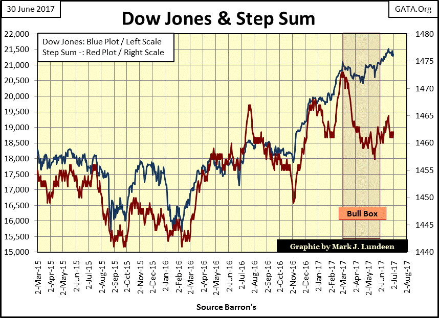
Fortunately, Wild Bill and Mr. Bear are peacefully playing poker and drinking whiskey at the Silver Dollar saloon, so they aren’t looking for any trouble right now, as we can see in the Dow Jones step sum chart below.
The step sum is a market sentiment indicator. The Dow Jones’ step sum below (Red Plot) has backed off some, indicating the bulls could use some liquid courage to bolster their confidence. But the all-important blue price plot is less than 1% away from its June 19th all-time high.
No one really knows what the future holds for themselves, or the Dow Jones. So we sometimes have to make assumptions to make our way from day to day. And right now the assumption I’m making is that until the Dow Jones makes it clear it wants to go down, it will continue going up.
© Mark Lundeen
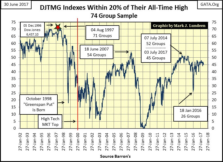
Okay, assuming I’m right, and the market continues going up, how much higher could it go? Well, the Dow Jones’ step sum or BEV charts aren’t much help in telling us that. However, the Dow Jones Total Market Groups’ (DJTMG) top 20 is a reliable barometer of the market’s future potential. And what the top 20 is telling us right now is that the best of what the current advance had to offer the bulls is best seen in their rear-view mirror.
I track 74 groups in the DJTMG, and the top 20 consists of the number of those 74 groups within 20% of their last all-time highs. No market indicator is perfect, but the top 20 reliably rises during bull markets, tops, and then reverses for the bear markets.
What the top 20 is saying now is that the broad stock market (if not for the Dow Jones and other major market indexes) peaked in Barron’s 07 July 2014 issue with 52 of 74 groups within 20% of their last all-time highs.
Predictably, the top 20 then declined to only 26 groups within 20% of their last all-time high in Barron’s 18 January 2016 issue. It was at this point when the “policy makers” once again began practicing bear-market interruptus. Since then the top 20 had remained around 45 groups within 20% of their last all-time highs.
© Mark Lundeen
The Dow Jones may continue going up. However, the DJTMG’s top 20 (unlike from March 2009 to July 2014 where it advanced with the Dow Jones), is now refusing to follow the Dow’s lead tells us something important. That the market has become selective.
For the five years following March 2009, pretty much everything in the stock market was going up with the Dow Jones. This is how bull markets act in their early stages. But as bull markets approach their termination points, groups in the DJTMG stop making new all-time highs before the Dow Jones does, and that is exactly what we are seeing above. I can’t estimate how many points the Dow Jones could still rise, but with the top 20 stagnating as it has for the past year, the Dow’s potential is greatly limited.
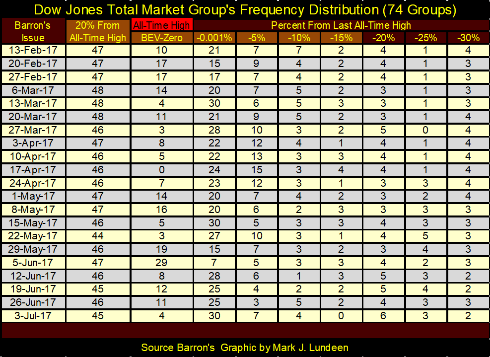
Here’s the frequency table for the DJTMG data where I derive the top 20 data. It’s simply the sum of the columns from BEV-Zero to -15% (BEV 0.00% to -19.99%).
© Mark Lundeen
Looking at the table, along with the top 20 chart above, it appears the 52 made in July 2014 isn’t going to be exceeded any time soon. The inability for the top 20 to break over into the 50s is a great weakness in the current advance for the Dow Jones, and the other major market indexes below.
These major market indexes may be very close to their last all-time highs, but only because of the phenomenal gains in today’s glamor stocks. This places the stock market into a situation where it can hit an air pocket, where over the course of a week, or even a big one day decline, a hand full of favored issues could completely alter the landscape for the bulls.
© Mark Lundeen
But so far that hasn’t happened. And as Wild Bill and Mr. Bear are currently keeping themselves occupied at the Silver Dollar saloon, I’ll remain short-term bullish on the stock market. But the big gains enjoyed by the bulls earlier in the advance are for the most part gone.
Uggh! It appears the “policy maker” intends on making gold (Blue Plot below) break below $1225 sometime in the near future. Typically, market sentiment (Red Plot / Step Sum) doesn’t yet see it coming. I could be wrong with this, but I don’t think so.
And Geez Louise, if you ever take anything I say to play the market with leverage, like going short in the futures market, don’t blame me if you lose money in this rigged casino. That said, the next few weeks could see gold go lower.
I’m so sick of this. Well it’s what happens when you have the best Congress money can buy, and truth be told, the “market regulators” at the CFTC are doing very well too.
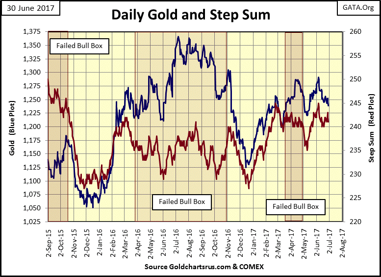
© Mark Lundeen
But one of these days this will change, when gold and silver will break free of the grip “policy” currently holds them in. And when will that be? When Wild Bill and Mr. Bear come gunning for those cowboys now running wild on the streets of Dodge City. Maybe this autumn when the US Treasury sees its next debt crisis.
Until then, be smart enough to continue increasing your position in gold and silver bullion. Heck, the government is subsidizing its current low price – take advantage of that. Just don’t use the rent money in doing so.
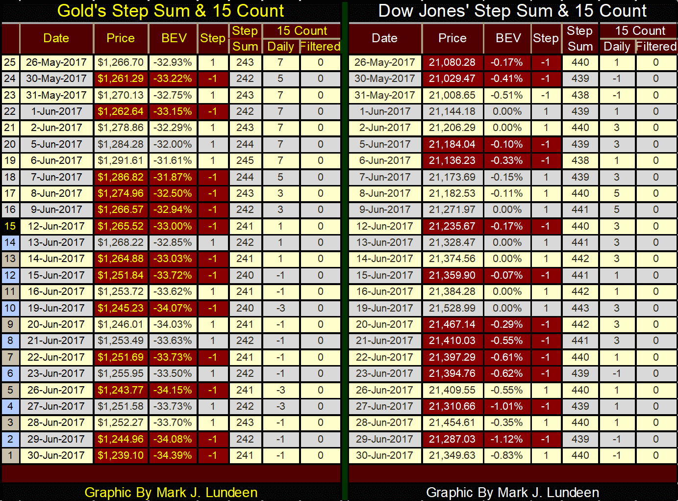
Here is gold and the Dow Jones step sum and 15 count table.
For gold, the bears are getting more from their down days that the bulls are seeing on the advancing days. That’s why it’s going down.
But the Dow Jones wants to go up. Since May 26th its step sum hasn’t changed, and its 15 count is at a -1. Yet against this headwind, the Dow Jones has still advanced 269 points. I can’t argue with success.
© Mark Lundeen
I’ll admit it; American’s are the most parochial people in the world. As a group, we know little of the wider world beyond our national boundaries, defined by the New York, Washington DC corridor to the east, Hollywood on our west, with America’s great “fly-over country” sandwiched in between. God help the Mid-West.
But in our defense, I have to say that there is also a lot happening within the United States we don’t pay proper attention to either. It all comes down to the unavoidable fact that whatever continent someone comes from, the hours of the day anyone can spend on matters that lay outside our personal concerns of making a living and taking care of the family is limited.
What isn’t limited is the number of hours Washington’s “policy makers” spends thinking about us, including those who have made a killing on bitcoin in the past year. In my past few articles, I’ve talked about bitcoin, wondering how the Federal Government was going to respond to this digital wealth held outside their banking system, beyond the reach of their grasping little hands.
Well, I now know how the “policy makers” are planning to get bitcoin owners back on the reservation, but I had to go to an alternative news source to find out about Senate Bill 1241.
Maybe SB 1241 is something some of my readers would support. It certainly isn’t the first time members of Congress have sponsored a bill curtailing the free-market options of the American people. I’m just noting that the MSM, being trusted members of the establishment, will have no interest in reporting on this topic to the public until this bill is signed into law, and no longer subject to public debate.
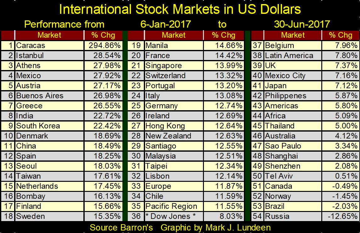
Another area I don’t spend much time on is the international stock markets. I have weekly data going back to 1991; data I carefully maintain every week. But being the parochial American that I am, I seldom look at it. But this week I had some spare time to do something with the data, so I constructed the table below.
The data in the table is from two sources Barron’s publishes. One is the Key Foreign Stock Market Indexes linked below. These are national stock indexes maintained by a local newspaper or bank.
I don’t use them all; just the ones that have been continuously published by Barron’s since April 1995. These indexes can easily be identified as they are named after cities, like #1,2,3&5 in the table below.
The other source Barron’s publishes is the Dow Jones Global Indexes, linked below. These are indexes maintained by Dow Jones Inc. and are named after countries, like #4,6,7&8 in the table below.
So, note that Mexico (#4) is from Dow Jones, while Mexico City (#40) is a local stock index. That’s quite a difference between Mexico and Mexico City. I haven’t a clue why there would be. The performance between Athens (#3) and Greece (#7), or South Korea (#9) and Seoul (#13) isn’t as wide. But then it is when we look at China (#11), then Shanghai (#48) and Shenzhen (#49).
I placed the Dow Jones Industrial Average in the mix (#38). Why not the S&P500? The Dow Jones has tradition behind it that the S&P500 lacks. Also, Dow Jones (the company) has for over a hundred years published most, if not all of its data for the price of an issue of Barron’s or the Wall Street Journal. That makes Dow Jones the great benefactor of the investing public since 1885. Standard and Poors, on the other hand, maintains superb in-depth market data for institutions and academia, and they charge the big bucks for it too.
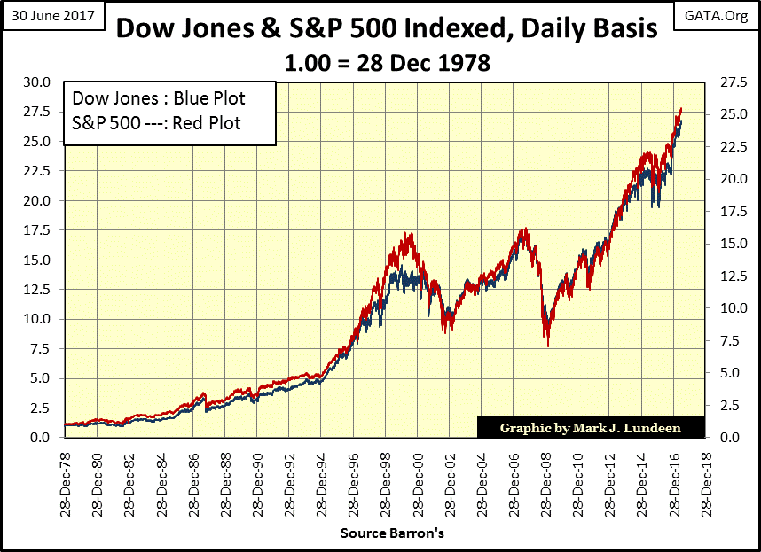
All and all, I like Dow Jones, the company, and the stock average, so I use the Dow Jones, not the S&P500. It really makes no difference. Here’s a chart indexing the Dow Jones and the S&P500 going back to the late 1970s. Over the years, in bull or bear markets, the differences between the Dow Jones (Average) and the S&P500 (Index) aren’t worth mentioning.
© Mark Lundeen
That said, it’s always interesting seeing how one market has performed when compared to another. For instance, with all the excitement coming from Wall Street, the Dow Jones at the end of this week is up by only 8.03% for 2017, a lowly #36 of 54 in the table.
The best performing index so far in 2017 is Caracas in Venezuela. In the past decade, Venezuela has descended into a communist hell-hole. People of this formerly rich country are now rioting in the streets for food, yet Caracas is the top performing index in the table below? There’s truth to the old market saw – buy when there’s blood in the streets. But after a 295% advance, I expect there’s more risk than reward chasing those gains.
© Mark Lundeen
Like kernels of popcorn in a microwave, the debt bomb the central banking cartel has planted in the global economy is beginning to go pop, pop, pop. What started in Greece and Cyprus a few years back (counterparty failure in the debt market by governments and their banks), has spread to Puerto Rico, with California, Illinois, and Chicago not far behind.
This week I saw a new name: Connecticut.
I’m not a big fan of the Republican Party, but on the local level, the Republicans have proven to be superior managers of municipal and state government. Take for example the loathsome Democrats from Illinois, who can’t even properly manage their state lottery.
How does anyone screw up a lottery? Let the politicians run it, that’s how. The mafia once ran a lottery; it was called the “numbers racket” in the old Hollywood gangster movies. They continued to successfully run their numbers racket until the politicians shut them down.
Their formula for this amazing money making scheme was simple; one collected the funds, and made the payout to the winners – that’s it! This racket was (and still is) mathematically set up for a big part of the proceeds to always go to the lottery’s managers. Unsurprisingly, the State of Illinois appears to have spent the money owed to its lottery’s winners. The mafia never did something this dishonest. What an embarrassment for the Democratic Party of Illinois, home of Barack Obama and Hilary Clinton.
Politicians and bureaucrats really need to go to prison over this, and so much more for the corruption we see at all levels of government today.
The reason the mainstream media is having such a difficult time today is because people are becoming painfully aware that the MSM have chosen to protect a very corrupt establishment, instead of doing their job as journalists exposing the criminal activities of these corrupt officials before events become a crisis.
It’s no surprise that internet-based alternative news sources, such as The Drudge Report and Infowars have become major players in the news media. Polished they are not. But because of them (and many others), the media giants such as CNN have discovered that once again there is competition in the media business.
Internet-based Project Veritas, in the grand tradition of CBS’s 60 Minutes from years ago, has recently played the little David to CNN the Goliath in the video clips below.
Why CNN is Fake News is made clear below.
I don’t see how CNN survives this. They’ve sowed the wind, and now they reap the whirlwind.
Back to civic counter-party failure; it’s not just me saying there are big problems pending in the financial obligations of local government. The bond market doesn’t like what it’s seeing either. Since November 2010 (348 continuous weeks), yields for tax-free muni-bond published by Barron’s has been higher than the yield of Barron’s Best Grade Bonds.
Barron’s has published this data going back to 1938. Except at the end of the depressing 1930s, or the three months spanning from November 1981 to February 1982, muni-bond yields were always lower than Barron’s Best Grade Bonds. This was for the good reason that muni-bonds were safer than corporate bonds.
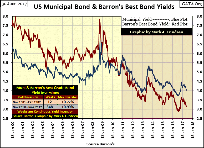
© Mark Lundeen
But beginning in November 2010, all that changed as seen in the chart above.
We live in a dangerous world; safety is an illusion. Even believing the US Treasury won’t ultimately default on its T-debt is foolish. The fact is that the US Treasury defaulted on its oblations to its creditors twice during the 20th century. First when it devalued gold from $20.67 to $35.00 in 1934, and again in 1971 when it abandoned the Bretton Wood’s $35 gold peg. The US Government is doing everything necessary to make their third default unavoidable.
So what are we to do? First get right with God, and don’t let this world’s transitory problems overwhelm you.
Chuck Missler is an interesting guy. He has a master’s in electrical engineering and was the CEO of the company that was awarded the contract for the avionics package for the B2 bomber. He knows science and technology. He also has a Ph.D. in theology and has many YouTube videos on the Bible. Missler pulls out some amazing details from the scriptures I’ve never thought possible. You may like the one below.
But we aren’t in heaven yet, so I really believe holding gold and silver bullion, and some exposure to their miners as a core holding is the most logical position one can take in today’s markets.
—
DISCLAIMER: This article expresses my own ideas and opinions. Any information I have shared are from sources that I believe to be reliable and accurate. I did not receive any financial compensation in writing this post. I encourage any reader to do their own diligent research first before making any investment decisions.
Featured Image by Alexander Baxevanis via Flickr / CC BY 2.0


Temenos to Acquire Additiv to Boost AI Wealth Management
Temenos is acquiring Zurich fintech Additiv to strengthen its digital wealth management and expand AI-driven financial orchestration. Additiv’s platform connects...


EFPIA Warns Limited SPC Reform Could Weaken EU Pharma Competitiveness
EFPIA supports the EU Biotechnology Law and a 12-month SPC extension but warns the current proposal is too limited. A...


EU Approves €23B Italian Renewable Energy Plan to Boost Climate Goals
The European Commission approved Italy’s €23 billion aid scheme to boost renewable energy and meet 2030 climate goals. Supporting wind,...


Institutional Bitcoin Buying and LiquidChain Presale Signal Market Optimism
Institutional Bitcoin buying, like Strategy’s 1,550 BTC purchase, signals confidence, stabilizes prices, and may trigger bullish momentum. Meanwhile, infrastructure projects...


The German Biotech Industry Faces Funding Crunch Despite Market Stability
German biotech held steady in 2025 but faces ongoing financing pressures, according to EY-Parthenon and BIO Deutschland. Total capital fell...
 |
|
 |  |
 |
|
-

 Crypto1 week ago
Altcoins Show Mixed Performance as Bitcoin Weakens
-
 Fintech21 hours ago
Temenos to Acquire Additiv to Boost AI Wealth Management
-

 Cannabis1 week ago
Amsterdam Keeps Coffeeshops Open to Tourists While Raising Europe’s Highest Tourist Tax
-

 Biotech2 weeks ago
Alternative Protein Sector Calls for Clear EU Biotech Law II Frameworks
You must be logged in to post a comment Login