Markets
Dow Jones ended yet another week with a new all-time high
Whatever our feelings on this subject may be, how much higher the Dow Jones can climb is still a mystery to mortals like us. One thing I can say with certainty, the current advance’s days are numbered.
Last week ended with a new all-time high for the Dow Jones. Keep in mind I’m still a big bear on the stock market, but there’s no need to begin the depression any sooner than is necessary. Still, I have to be honest and point out the current advance has been engineered by the “policy makers” at the FOMC, so it’s not real.
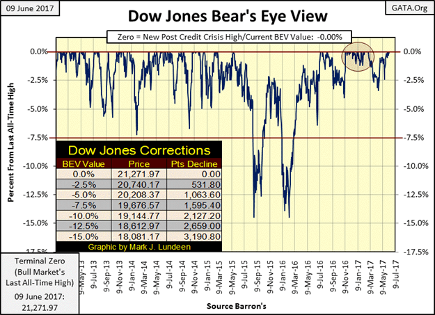
The Dow Jones closed on Friday at 21,271.97. How high is that? Look at the table in the chart. For the Dow to correct by 15% from today’s new all-time high (nothing spectacular historically), it would have to shed 3,190.80 points. Historically, however, that’s a lot of points for the Dow Jones to lose.
© Mark Lundeen
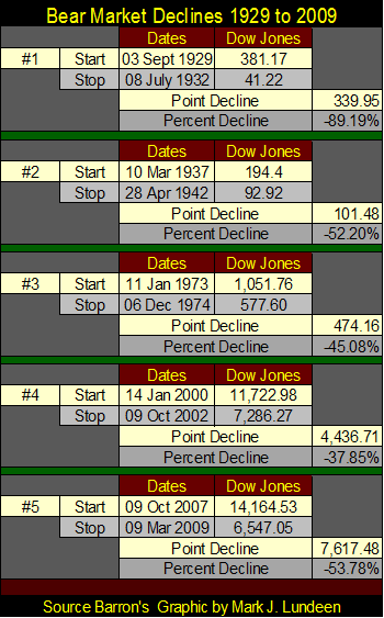
In the following table, I’ve listed the five big bear markets since 1929 in terms of points and percentage declines. The Great Depression crash was a whopping -89.19% decline. But the Dow Jones itself declined by only 340 points during the crash.
© Mark Lundeen
The total point decline for the Dow Jones during the 2007-09 credit crisis was 7,617 points, which resulted in a 54% decline in the Dow Jones; the second deepest percentage decline in the history of the Dow Jones going back to 1885.
And since March 2009, the Federal Reserve has “injected” the Dow Jones with so much “liquidity” that now a big 3,190 point decline results in only a 15% correction. Does that bother you? It does me!
However, whatever our feelings on this subject may be, how much higher the Dow Jones can climb is still a mystery to mortals like us. One thing I can say with certainty, the current advance’s days are numbered. There will come a last all-time high in the current advance (the Terminal Zero in BEV terminology), and then it will be all downhill from there in a bear market that I expect will prove to be long remembered by future generations of market watchers.
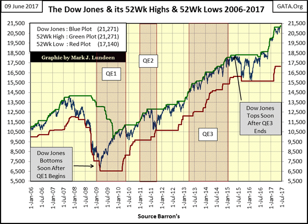
Here’s the Dow Jones with its 52Wk High and Low lines. I note how Doctor Bernanke’s three QEs dominated the Dow Jones since early 2009.
Shortly after the start of QE1 the Dow Jones bottomed and began its current advance. Keep in mind that in October 2008, the entire global banking system was at risk of total collapse. That would have resulted in a situation very similar to what happened during the Great Depression crash of 1929-32. Had QE1 not been successful, the Dow Jones would have declined much more than the 54% it ultimately did in March 2009.
After the termination of QE3 in December 2014, the Dow Jones saw its last all-time high on 19 May 2015. After studying the chart below, the question that comes to my mind is what was the source of “liquidity” that fueled the post-November election advance without a QE4?
© Mark Lundeen
The last 3,000 points in the Dow Jones didn’t happen because the election of Donald Trump inspired confidence in the market!
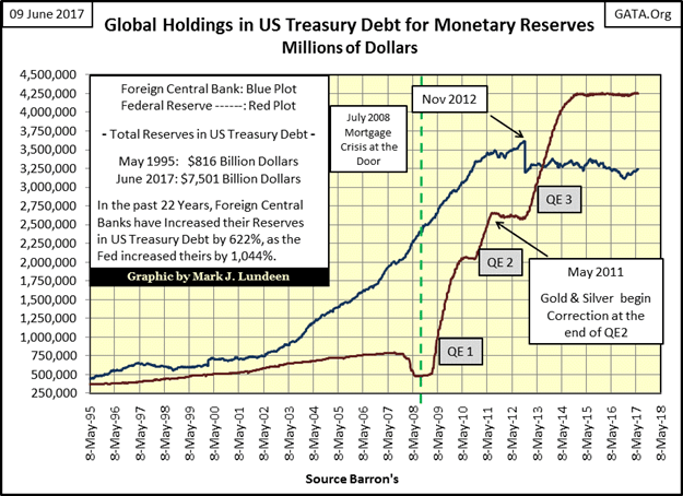
Looking at the data the Fed publishes in the public domain, they haven’t expanded their balance sheet (Red Plot chart below) since the end of QE3 in December 2014. I find it very hard believing the stock market could have done this well since November without the Federal Reserve’s active involvement. Is Fed Chairwoman Janet Yellen keeping a secret second set of books to implement a QE by stealth?
I wouldn’t doubt it. I remember when Alan Blinder was selected to be Vice Chairman of the Fed in 1994. I saw him on several financial news programs gleefully telling the world what the last duty of a central banker was:
“The last duty of a central banker is to tell the public the truth.”
– Alan Blinder, Vice Chairman of the Federal Reserve, June 1994
© Mark Lundeen
Here’s gold (Blue Plot) with its step sum (Red Plot) below. On Tuesday gold broke above last April’s high and then was battered down for the remainder of the week. I was hoping it would have broken above $1,300 and stayed there. The thing to watch for now is to see how successful the bears (the big banks) are in driving down gold towards the $1220 seen in early May.
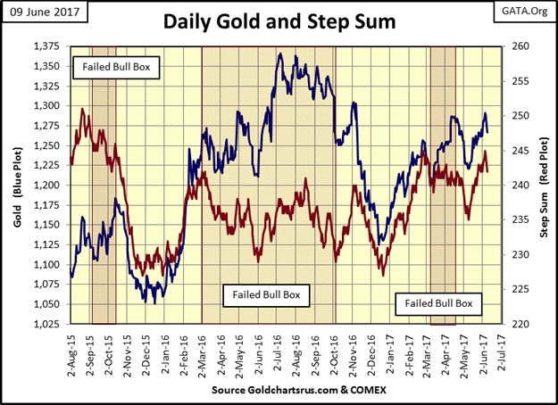
(Source)
But no matter what happens next week, which could also prove to be very positive, I’m still a long-term bull on gold and silver.
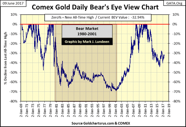
Let’s step back and look at the past five decades in the gold market with gold’s BEV chart below. Since 2011, gold did decline below its -40% line in the chart below. The gold cartel had to work damn hard to accomplish that. However, if you look at what gold did in 1976, it saw a correction of almost 50% just before it took off into history. For this reason, I still believe the gold bull market that began in 2001 is still ongoing, with the 44% decline that bottomed in December 2015 just a correction within it.
And look at what gold did during its 1980 to 2001 bear market; it declined 70% from its January 1980 terminal zero. But what this chart doesn’t show is how undervalued the stock and bond markets were during the 1980s and 1990s; undervalued markets that dominated overvalued gold and silver for the next two decades.
When gold broke above $840 in January 1980, AAA rated bond yields were in double digits after a three-decade long bear market. Today, you have to purchase junk bonds to receive a return of something over 5% in fixed income. In April 1980, the Dow Jones was yielding over 7%; today it has a dividend yield of only 2.33%. The financial markets (stocks, bonds and real estate) have been advancing for the better part of the past four decades. Valuations in these markets have been bloated with monetary inflation far past the point of grotesqueness, while precious metals assets are now the undervalued asset class.
Look at gold’s BEV plot below. After a four year, 44% correction from its highs of 2011 (a smaller correction than gold saw in 1976) gold is now working its way back up in the face of massive market manipulation by the global banking system, and their government sponsors.
© Mark Lundeen
I’ll tell you a little secret about gold and silver that no one knows. Gold and silver don’t go up because of “inflation” as “market experts” inform their viewers on TV. What goes up because of inflation are the stock, bond and real estate markets. The “policy makers” wouldn’t have it any other way. What drives gold and silver higher is DEFLATION in the stock, bond and real estate markets as wealth flees for its life from crashing market values in paper assets.
I don’t care to predict when, as I don’t know. But when bond yields and interest rates begin to climb again, exactly as they did from the early 1950s to early 1980, gold and silver are going to become the investment of a lifetime. And it won’t take three decades for the bull market in the old monetary metals to fully develop.
It may develop that a year into the pending advance in gold and silver, the old monetary metals could become unattainable in transactions using currencies managed by central banks.
That sounds pretty far out today until one considers what the debt service of the US Treasury would be on $20 trillion at over 5%. The assumption of this much debt by the US Treasury would have been impossible had the US Government not recklessly cast aside the Bretton Wood’s $35 gold peg in 1971. That they did pretty much tells us that this expansion of debt by government, corporations and private citizens was the plan all along.
Due to rising bond yields and interest rates in the years to come, the US Treasury and much of corporate America may be considering how best to declare bankruptcy because of what the Federal Reserve has done in the credit markets since Alan Greenspan became Fed Chairman in 1987.
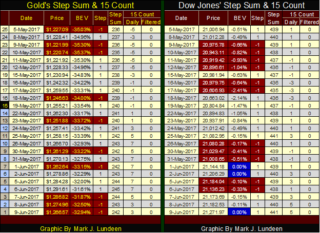
Putting aside that thought for the moment, and looking at gold’s and the Dow’s step sums and 15 counts below, both of these markets could do well in the coming week. Still, how the gold market has been functioning since 2011 remains frustrating nonetheless.
© Mark Lundeen
Gold and silver began the week strongly, and then on Wednesday began showing weakness; as is typical of their trading pattern of the past six years. In a world where central banks are running amuck, “injecting” their “liquidity” into just about every paper asset class trading anywhere in the world, this is absurd.
The exploding valuations in the cryptocurrencies (such as bitcoin) are symptomatic of an inflationary monetary system whose “liquidity” has begun to leak outside of the confines of “policy.” It’s only a matter of time before the “policy makers” take some action against the cryptocurrencies, as they have gold and silver. It will be interesting to see what they do to correct this problem. No doubt something that will inflict as much pain as possible to the owners of these cryptocurrencies.
Just keep in mind that historically, managing market valuations has always been a mug’s game played by idiot savants incapable of learning from the past. The days where they can maintain market valuations within the parameters of their “policy” are numbered.
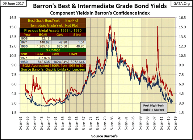
It will be easy to identify when the precious metals bulls will once again take control of their market; when interest rates and bond yields once again begin to rise, in spite of the dictates of “policy” (the chart following the table below).
1958 is notable for several reasons. It was in 1958 when a run on the US gold reserves began that didn’t terminate until President Nixon closed the gold window in 1971. The problem was the US monetary authorities were issuing paper money in excess to the gold reserves held by the US Treasury (table below) since 1945. This action was in violation of the Bretton Woods $35 gold peg.
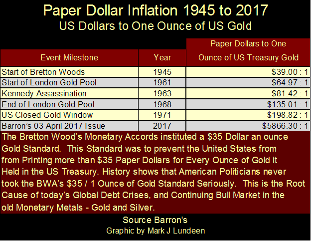
© Mark Lundeen
In the chart below, one can identify when the US dollar was no longer seen by the financial markets as “good as gold”; when bond yields began rising in 1958. The increase in bond yields (deflation in bond prices) continued until 1981.
This was a twenty-three-year fixed-income bear market that devastated private individuals, trust funds, and educational endowments. This bear market didn’t just happen. The federal government and its banking system (or should I say the banking system and its federal government?) decided to predate private wealth via the monetary inflation seen in the table above; a predation that continues to this day.
I highlighted the timeline from 1958 to 1980, to illustrate when the Barron’s Gold Mining Index (BGMI) enjoyed a bull market, where for twenty-two years performed well above the rate of inflation. It’s interesting noting for the first thirteen years of this bull market in the gold mining shares, gold itself was pegged at $35 an ounce by the US government.
Much is made by “market experts” who warn that rising interest rates are a negative factor in a precious metal bull market. However, that wasn’t true for the BGMI from 1958 to 1980, or for gold and silver from 1971 to 1980. The table on the chart gives the specifics.
© Mark Lundeen
The most remarkable feature of this chart is how from 2001 to 2011 (ten years) gold, silver and the PM mining shares enjoyed a remarkable bull market as bond yields continued declining (bond valuations rising). Obviously, there was a little leakage of “liquidity” from the financial markets into gold, silver and their miners that the “policy makers” patched up in 2011, a patch that will not prove to be a long-term fix.
If history is any guide, and it usually is, the precious metals bull market will recommence when bond yields (currently at levels not seen since 1958 – chart above), rebound upward, exactly as they did six decades ago.
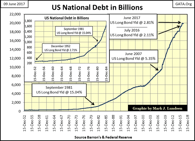
How can they not? The US national debt has exploded since 1952 (chart below), yet yields for the US Long Bond are about the same as they were in 1952 because central banks currently are managing market valuations up and yields down in the Treasury and corporate bond markets.
© Mark Lundeen
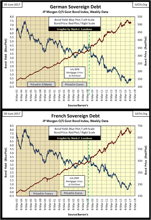
And it’s not just the Federal Reserve that’s managing government debt markets; the ECB is manipulating the sovereign bond markets of the entire EU. Below is the past quarter century for the German and French government debt markets. Who else but the ECB would purchase these bonds at top prices (Red Plot) for a next to nothing return (Blue Plot) on invested funds?
© Mark Lundeen
Exactly how these central banks manipulate these sovereign bond markets, including the US Treasury market, is actually repugnant to anyone who actually has to work for earn their dollars, euros or yen. The Federal Reserve (or any other central banks) writes a check from a banking account with no assets in it to purchase these bonds. It’s called writing a check with insufficient funds should you or I attempted the same thing.
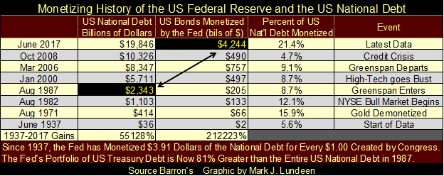
The table below gives a history of the Federal Reserve monetizing the US national debt. In June 1937, the national debt was a then-shocking $36 billion dollars, of which the Federal Reserve had monetized $2 billion or 5.6% of the national debt. When a central bank is allowed to write checks from an account with insufficient funds, monetizing $2 billion in 1937 was no harder than monetizing $4,244 billion in 2017.
Apparently, no mainstream market commentator is aware that the Federal Reserve’s portfolio of Treasury debt is now about double the total US national debt at the time Alan Greenspan became Fed Chairman in August 1987. I find this fact more than a little disturbing. As it is, the Federal Reserve has now monetized 21.4% of the national debt.
© Mark Lundeen
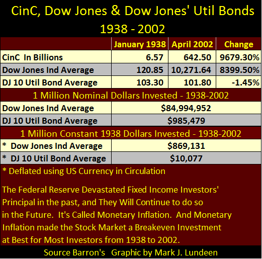
These “open market operations” by the FOMC have had a huge impact on private wealth, as Washington and Wall Street confiscate private wealth via monetary inflation (table below).
Notes on table: From Barron’s 03 January 1938 issue to their 08 April 2002 issue, they weekly published the Dow Jones 10 Utility Bond Average. Using the values for the:
· Dow Jones 10 Utility Bond Average
· Dow Jones Industrial Average
· Currency (paper money) in Circulation (CinC)
From these two issues (sixty-four-year timespan), I constructed the table below.
The top portion of the table lists the published data from Barron’s and the percentage change. Note the DJ 10 Util BD Average; an AAA rated fixed income investment, actually lost 1.45% over these sixty-four years.
© Mark Lundeen
The central portion of the table lists what a million dollar investment in the Dow Jones Industrials and the DJ 10Util Bd Average would have realized from 1938 to 2002. A million dollars invested in the Dow Jones would have become $85 million, and a million dollars invested in the DJ 10Util Bd Average would have decreased by $15,000 over these sixty-four years.
The bottom portion of the table shows a million dollar investment in terms of constant 1938 dollars, deflated with CinC. Keep in mind the income from a million dollars in 1938 provided its owner with the best of what life had to offer, and then some.
After sixty-four years of “monetary policy” a million dollars invested in the Dow Jones had been reduced to only $869,131 in 1938 dollar terms. Still a significant amount of wealth, but a $130,869 loss in 1938 terms nonetheless due to monetary inflation flowing from the Federal Reserve.
The losses in the DJ 10Util Bd Average were horrific! A million dollars invested in these fixed income assets were reduced to only $10,077, 1938 dollars during these sixty-four years.
Why were blue-chip stocks a superior inflation hedge than fixed income bonds? Dividend payments from blue-chip stocks aren’t fixed. In January 1938 the Dow Jones was paying out $8.34 dollars in dividends. By April 2002 its payout had increased to $183.11, and currently, the Dow’s dividends have increased to $496.
Bonds being contracts for debt have their payouts fixed, and in an inflationary financial system, that’s fixed income’s fatal flaw. Currently, the stock market’s fatal flaw is that purchasing shares is taking on fractional ownership in giant corporations that in 2017 are dangerously over-leveraged in the bond market, and have unknown exposure in the multi-hundred trillion dollar OTC derivative market.
The Dow Jones’ dividend payout may currently be $496, but Mr. Bear could swiftly slash that down to zero should the economy and banking system begin to upchuck again on counterparty failure as it did in 2008. The risk of seeing a repeat of the Great Depression crash in the Dow Jones cannot be ignored.
That’s why I like gold and silver; they have no counterparty risk. It’s no more complicated than that.
—
DISCLAIMER: This article expresses my own ideas and opinions. Any information I have shared are from sources that I believe to be reliable and accurate. I did not receive any financial compensation in writing this post. I encourage any reader to do their own diligent research first before making any investment decisions.


SBTi Net-Zero Standard 2.0 Enhances Corporate Climate Action
The Science Based Targets initiative (SBTi) has released Corporate Net-Zero Standard Version 2.0, a major update to its global framework...


Europe’s Cannabis Shift: Rising Use, and New Risks
EUDA report shows cannabis remains Europe’s most used illegal drug, with 22 million adults trying it. Use is highest among...


Remote Work Reshapes Sales Management: Key Lessons for Moroccan Leaders
Remote work is rapidly expanding among Moroccan managers, yet practices lag behind. Insights from France show higher productivity but weakening...


Corn Prices Slip Amid Strong Crop Conditions and Favorable Weather
Corn was lower again last week on Midwest rains despite a neutral WASDE report. The report showed slightly higher beginning...


Advances in Biomarkers and Targeted Therapies Transform Kidney Care in Autoimmune Disease
New biomarkers and targeted therapies are reshaping the management of kidney damage in autoimmune diseases like lupus and vasculitis. Experts...
 |
|
 |  |
 |
|
-

 Fintech2 weeks ago
Barcelona Strengthens Its Position as a Southern European Fintech Hub
-

 Impact Investing6 days ago
EU Approves €23B Italian Renewable Energy Plan to Boost Climate Goals
-

 Biotech2 weeks ago
Early Use of Tirzepatide Shows Strong Results in Type 2 Diabetes Study
-
 Biotech2 days ago
Advances in Biomarkers and Targeted Therapies Transform Kidney Care in Autoimmune Disease
You must be logged in to post a comment Login