Markets
Latest stock waves of the Obamacare repeal bill
The failure to repeal Obamacare now throws the rest of the agenda into question. The drop so far in the stock market is merely a slight waver. But could it turn into more?
Hard-line Republican conservatives, moderate Republicans and Democrats were all opposed to the Obamacare repeal bill. The result of all of this sudden creation of uncertainty has seen the US stock market fall—not much yet, but there is a drop.
As well, the US$ has fallen and gold has gone up. The stock market rode a wave of optimism to record highs on the belief that the Trump agenda would pay huge dividends given its emphasis on tax cuts, deregulation, boosted spending on defense, Homeland Security, and infrastructure, and finally on the repeal of Obamacare. The failure to repeal Obamacare now throws the rest of the agenda into question. The drop so far in the stock market is merely a slight waver. But could it turn into more?
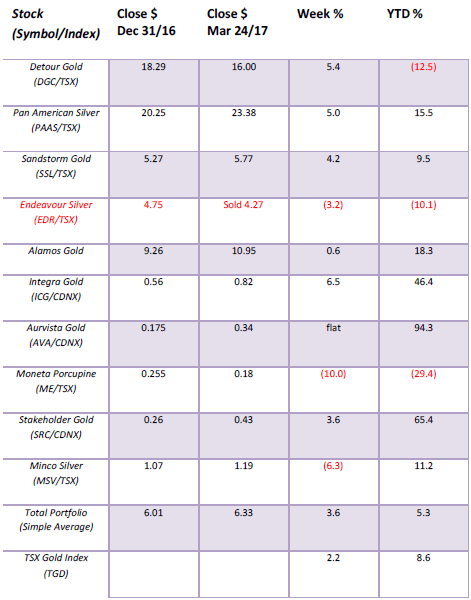
Model Portfolio
© David Chapman
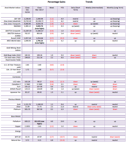
MARKETS AND TRENDS
© David Chapman
Note: for an explanation of the trends, see the glossary at the end of this article.
New highs refer to new 52-week highs.
Key Economic Numbers Week March 13 – March 17, 2017
(Source)
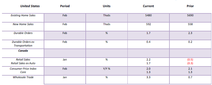
(Source: www.shadowstats.com, www.data.bls.gov, www.statcan.gc.ca, www.tdeconomics.com)
Note: % M/M unless otherwise noted
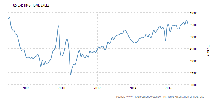
Existing Home Sales in the US plunged 3.7% in February. Not a particularly good sign. Nonetheless, it has been rising steadily if not spectacularly over the past year. However, sales remain well down from the peak seen in September 2005 when sales hit 7,250 thousand units. New home sales, on the other hand, rose 6% this past month. But, like existing home sales it is less than half of what was seen in July 2005 when it hit 1,389 thousand. Today it is 592 thousand.
(Source)
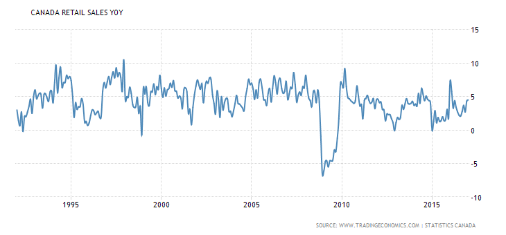
Canadian retail sales put in an average year from January 2016 to January 2017 gaining 4.5%. This is well short of the highs of 1997 when it gained 10.5% but a far cry from the depths of the 2008 financial crash when retail sales plunged 6.5%. So one could say that retail sales were neither hot nor cold over the past year but it seems just about right.
(Source)
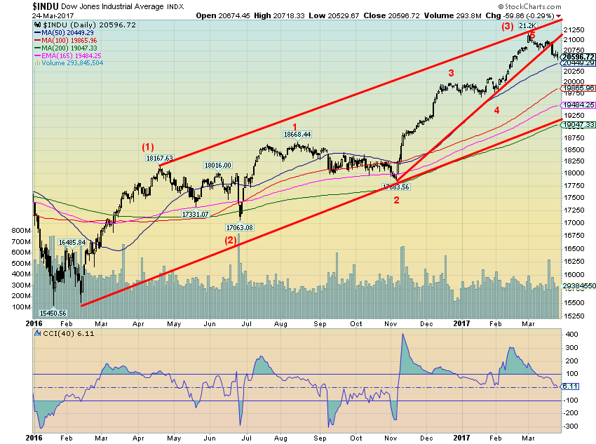
Is it possible now that the Dow Jones Industrials (DJI) has completed a five-wave up advance from the June 2016 (Brexit) low? If so this might signal the top of what we believe is intermediate wave (3) up from the February 2016 low. The break came on Tuesday March 21, 2017 following a rather conservative rate guidance from the Fed. On Wednesday, the FOMC hiked the Fed rate another 25 bp as was expected. The Fed range is now 0.75% – 1.00% and is the third Fed hike since December 2015. The hardest hit was the banks which have been up until now one of the prime beneficiaries of the Trump agenda. The 1%+ drop of the DJI and other indices was the steepest decline since October 2016.
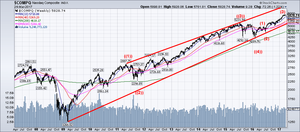
It is interesting to note that of all the major US indices only the NASDAQ made new all-time highs this past week. The NASDAQ then reversed and closed down 1.2% on the week. The day was a key reversal day for the NASDAQ given it made its new all-time highs then reversed and closed sharply lower taking out the lows of the previous day. See comment on the NASDAQ below.
If, as we suspect, the DJI has completed a five-wave advance, look for a corrective wave that could carry us into May or June followed by another run to new highs to complete waves (4) and (5). We’ll determine potential targets for wave (5) once we see how wave (4) unfolds. A corrective wave (4) would find support at 20,400 to 20,450, 19,500 to 19,900 and 19,000 to 19,300. Only a breakdown under 19,000 and especially under 18,650 would signal that the entire bull market is over. The most likely target could be 19,500 to 19,900.
(Source)
The NASDAQ not only put in an outside key reversal on March 21, 2017 with a new all-time high followed by a downside reversal below the low of the previous day, but the NASDAQ also put in an outside key reversal week. What this means is the NASDAQ made new all-time highs, reversed, and closed below the low of the previous week. The key was the new all-time high followed by a lower close below the low of the previous week the classic definition of a key reversal. The indicator suggests a correction of some magnitude coming but not necessarily a final top for the market. Our weekly chart of the NASDAQ from the depths of the 2008-2009 financial crash shows what appears to be four primary waves to the upside ((1)), ((2)), ((3)), ((4)) and thus far three intermediate waves up thus far for wave ((5)). As with the DJI, it suggests that following a correction the NASDAQ could move to new highs. But this is also the kind of pattern that creates double tops and other types of major tops. Irrespective of this, we could still be going into the summer of 2017 before we see our final top.
(Source)
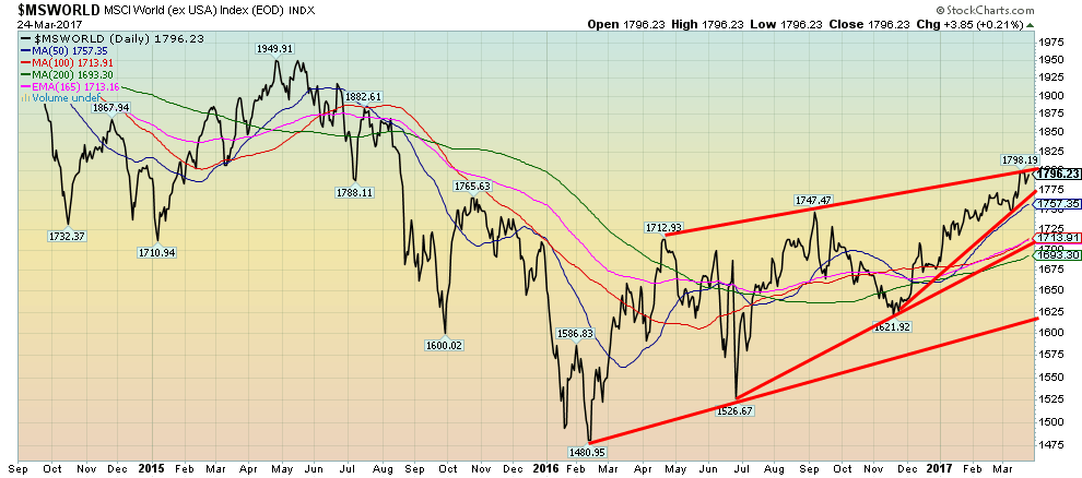
The MSCI World (ex USA) Index made new 52-week highs this past week. But unlike the US markets the MSCI did not make new all-time highs. That occurred back in October 2007 at 2,390. The MSCI remains down about 25% from those lofty heights. Nonetheless, the fact that the MSCI appears to be continuing to climb is it would appear positive for the global economy. The warning, however, is that the MSCI appears to be forming a large ascending wedge triangle. These patterns are ultimately bearish. A breakdown under 1,750 would suggest at least an initial decline towards 1,700. These wedge triangles are not uncommon at major tops (and bottoms as well where the pattern is known as a descending wedge).
Stock markets are like bellwethers for the economy. The stock market will rise in anticipation of an improving economy. However, a stock market typically tops out and starts to fall before the economy peaks. At that point, it’s expecting a weakening economy and even a recession. This is something to keep in mind if the stock markets start a decline.
(Source)
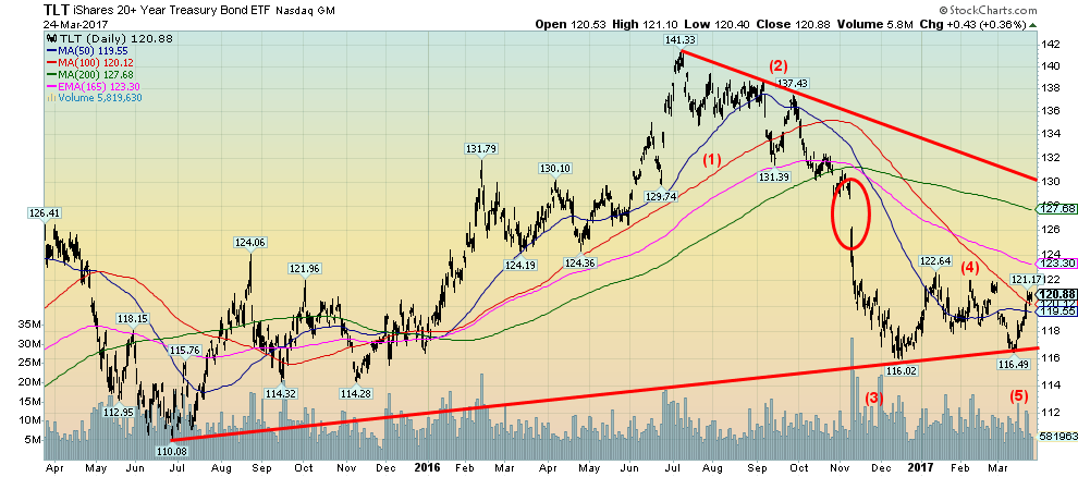
We believe that the iShares 20+ year Treasury Bond (TLT) has made a five-wave decline from the top in July 2016. A corrective wave to the upside should now be underway. A magnet for the corrective will be that huge gap seen back in November 2016–roughly between 126.25 and 128.50. Our thoughts are that the bonds may have put in a major top in July 2016. After all, it has been long ride upward lasting 35 years. The expectation is that the market will fail the July 2016 top. Indeed, it may not get beyond 128. The falling 200-day MA is currently at 127.68. The TLT needs to take out the 122.64 high to suggest that a further move to the upside is underway.
(Source)
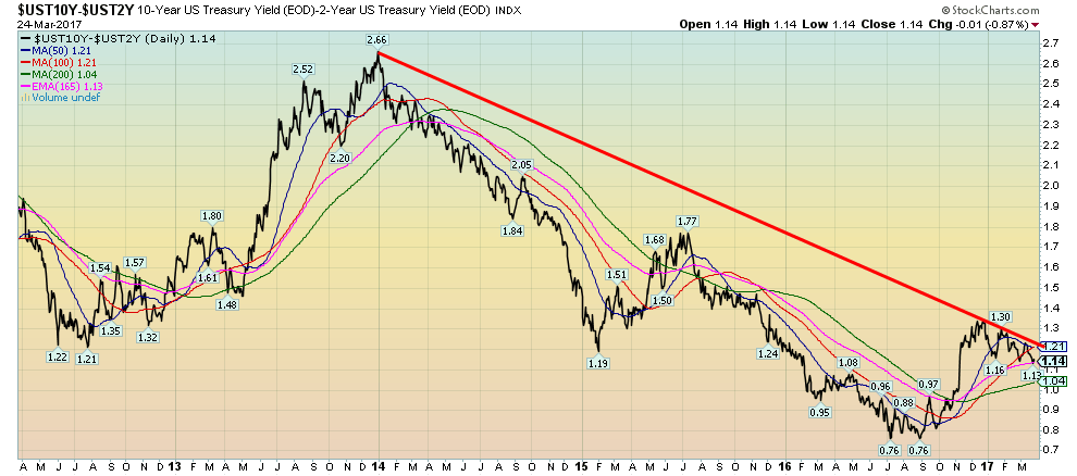
We don’t normally talk a lot about spreads between bonds but they are worth keeping an eye on. This is the spread between the 10-year US Treasury note and the 2-year US Treasury note. It has fallen recently from around 1.30% to 1.14%. Widening spreads are usually seen when the economy is improving and the pressure for higher interest rates out the yield curve is highest. When spreads are narrowing it usually indicates a tightening Fed and anticipation in the longer end of the curve that it could cause a recession. Negative spreads often presage a recession. It is interesting to note that the 2–10-year spread has been negative on a couple of occasions only over the past 20 years. It turned negative in 2000 just before the 2000–2002 high tech/internet collapse and recession and it was negative again in 2006–2007 presaging the 2007–2009 financial collapse and subsequent steep recession. Peaks were seen in 2003 and 2010 and to a lesser extent with a lower high in 2013. The 2–10 spread is not in danger territory and it is above the levels seen in 2016 from June to July. But it is worth keeping an eye on and a negative spread would most likely presage a recession.
(Source)
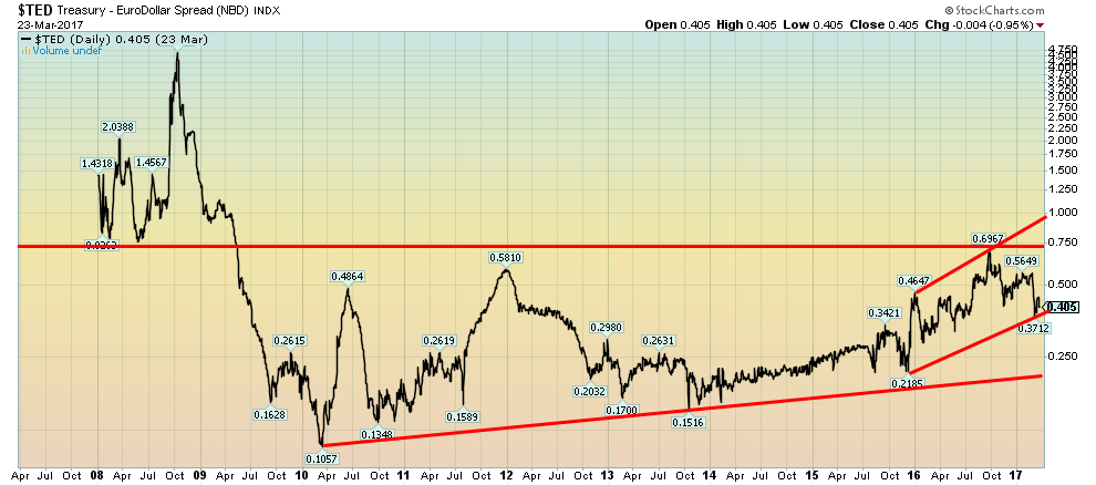
The TED spread is also worth keeping an eye on. The TED spread is the spread between 3-month US Treasury Bills and 3-month Eurodollars. A widening TED spread indicates deteriorating credit conditions while a narrowing credit spread indicates little or no credit worries. The TED spread bottomed in 2010 at 0.1057%. Since then it has been making an irregular rise, peaking in late 2011 during the EU financial crisis and more recently in September 2016 at 0.697% before the US elections. Since then it has fallen to the current level of 0.405%. However, the general trend of late has been to the upside. The TED spread probably doesn’t really break out until it gets over 0.75%. If that happened, it could signal a coming credit crisis. It topped at 4.64% in September 2008 at the height of the financial crisis.
(Source)
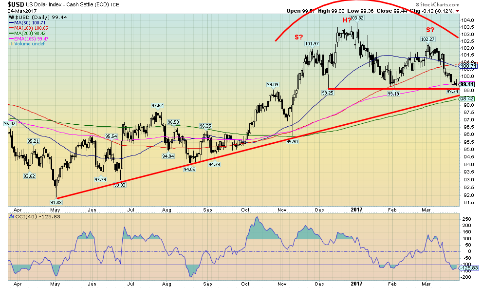
The US$ Index continues to make what appears to be an awkward looking head and shoulders top. While we have labeled it as a head & shoulders top, the reality is that a confirmation doesn’t come unless we break down under 99 and preferably under 98.40. Irrespective of this, the bullish case for the US$ Index seems to be on life support. The bullish case cannot be eliminated just yet, but the recent pullback has been steeper and that throws the bullish case into doubt. Certainly, the collapse this past week in the failure to pass the repeal of Obamacare throws the administration’s plans into doubt and with it there most likely will be some loss of confidence in the US$. The head & shoulders case is awkward as it is not clean looking with a rather skewed right shoulder, a right shoulder that rose slightly above the left shoulder high and a down sloping neckline. But a break of 99, and especially under 98.40, could target down to 94/95. A falling US$ Index would be positive for gold.
(Source)
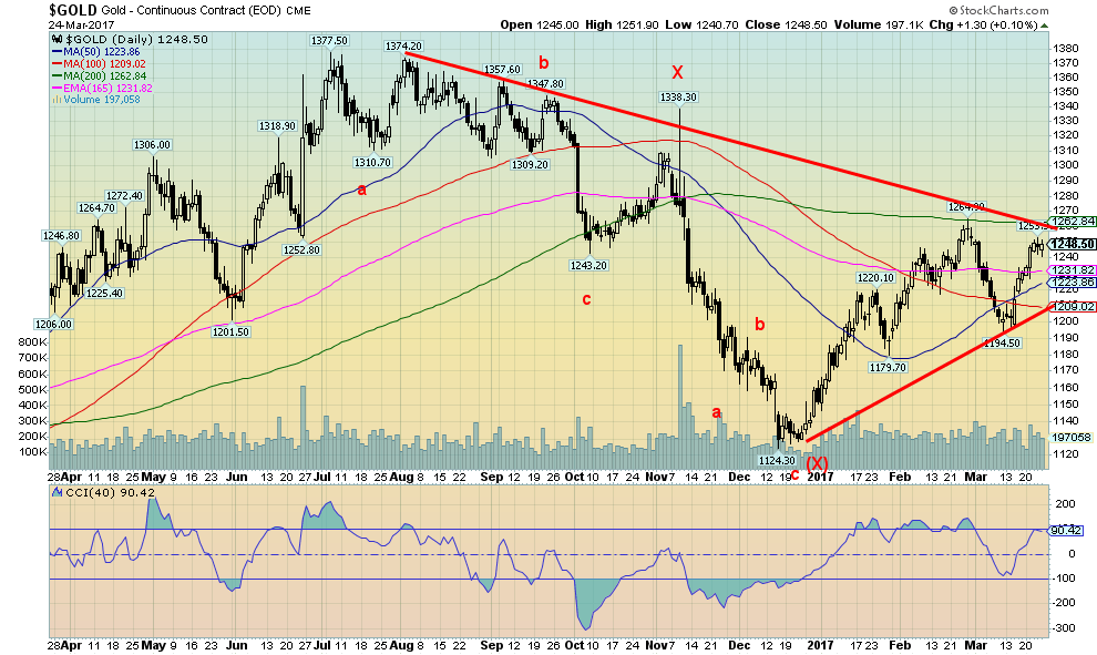
We confess the recent upswing for gold has not been overly impressive. Lethargic is a good way to describe it. No big pick-up in volume. So we wonder if there is some more corrective action to come before we restart the advance. Gold topped out at $1,253 this past week short of the $1,264 high seen in late February. Resistance, as we noted the previous week, was to be seen from roughly $1,250 to $1,260 so this week’s action should have been no surprise. But a solid break above $1,260 and especially above $1,270 should signal a rise to $1,300 and possibly higher. There is considerable support down to $1,230 and then down to $1,210. We figure that might the worst case on a pullback. A breakdown under $1,200 would change the scenario and suggest that the corrective action that got under way with the top in late February had more to go.
We re-labeled the wave down from the July 2016 top of $1,377 as a double zigzag abcxabc. It remains a corrective wave to the rise from the December 2015 low to the top in July 2016.
The falling US$ Index has helped gold recently. As we noted in our comments under the US$ it is at a critical juncture and it will either soon break down or rebound from the current levels. Any further signs of disagreement in Washington amongst Republicans would be negative for the US$. Add in the ongoing probe into possible Russian connections and there is a possibility that the US$ won’t hold up for much longer.
(Source)
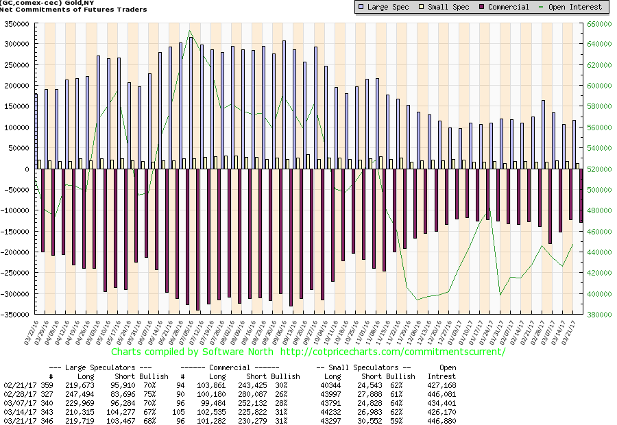
There was no change to the commercial COT this past as it stayed at 31%. There were only some small changes in the makeup as short open interest rose under 5,000 contracts while long open interest fell just over 1,000 contracts. The large speculators COT (hedge funds, managed futures, etc.) rose slightly to 68% from 67% as long open interest jumped around 9,000 contracts and short open interest fell about 1,000 contracts. Not a lot to read into it this past week. The commercials may be trying to cap the recent rebound. But, as noted, if we do break through $1,250/$1,260 then odds would favor the commercials cover more shorts.
(Source)
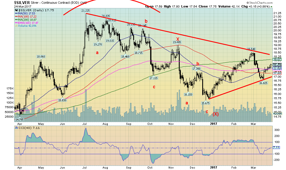
Silver has followed the same pattern as gold including what appears to be a double zigzag. We are wondering whether another one is unfolding with the wave completed to $18.54 and the b wave the recent low at $16.83. We should, in that case, break out to the upside above $18.25 and possibly reach to as high as $20.25. Silver appears to have lagged behind gold somewhat on this rebound and that could be a sign that as well that there is more backing and filling correction to do. After all, this period and especially into April tend to be seasonally weak for silver. Silver has good support, down to $17.50 then to $17.25 and $17. Only below $17 does the current rebound come into question and the potential for new lows below $16.83 looms.
(Source)
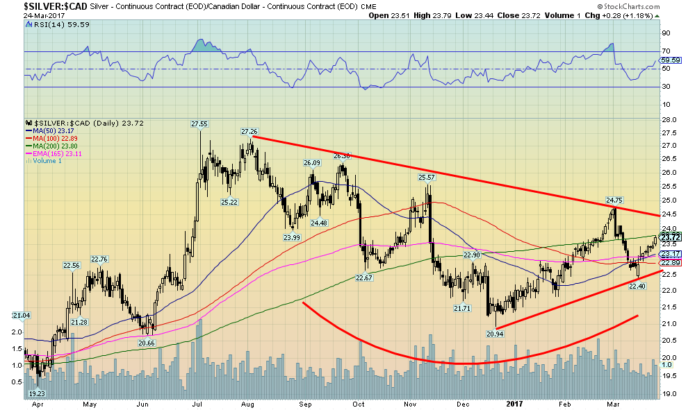
When we look at silver in Canadian $ we see the same zigzag pattern that was noted for silver in US$. But we also see a better-looking bottom forming and that suggests to us that once this pattern is complete silver should break out to the upside. There is of course, always a caveat, and that is if silver were to fall back under $22.50. Otherwise, this is a nice-looking bottom pattern and our expectations are that silver (and gold) should rise again soon.
(Source)
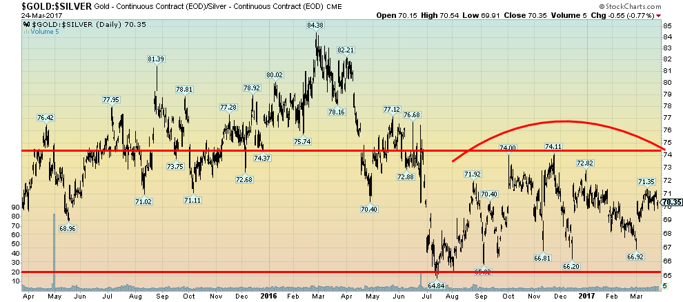
For the past several months, the gold/silver ratio has been trading in a sideways pattern, roughly between 65 and 74. Initially, the pattern seemed to rise, peaking out at 74.11. Now the pattern appears to be falling suggesting there is a top being formed here that should see the ratio fall further. A falling gold/silver ratio tells us that prices are rising for both gold and silver and silver prices are rising faster relative to gold. At a current ratio of 70:1 the gold: silver ratio is well above where it was roughly five years ago at 35 and way above a historical average of 15. But the ratio has ranged over the years being as high as almost 100 back in 1941 and 1991. In January 1980, the ratio was down to 19. And more recently it fell to about 31 in 2011. A breakdown under 65 would signal lower levels ahead. Only a break above 75 would signal that the ratio should rise further. Silver tends to underperform in a bear market and outperform in a bull market.
(Source)
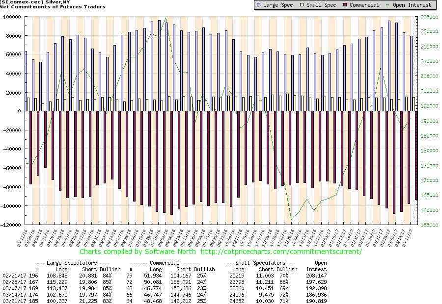
The silver commercial COT improved marginally this past week to 25% from 24%. Like gold, it was a rather dull week. Short bullish interest came off just over 2,000 contracts while long open interest rose about the same. The large speculators remain especially bullish about silver at 83%, down slightly from the previous week’s 84%. We wish the large speculators had pulled their bullish consensus back further. A reading down around 70% would be a lot better. But right now they appear to be too bullish and that is a caution sign.
GLOSSARY
Trends
Daily – Short-term trend (For swing traders)
Weekly – Intermediate-term trend (For long-term trend followers)
Monthly – Long-term secular trend (For long-term trend followers)
Up – The trend is up.
Down – The trend is down
Neutral – Indicators are mostly neutral. A trend change might be in the offing.
Weak – The trend is still up or down but it is weakening. It is also a sign that the trend might change.
Topping – Indicators are suggesting that while the trend remains up there are considerable signs that suggest that the market is topping.
Bottoming – Indicators are suggesting that while the trend is down there are considerable signs that suggest that the market is bottoming.
—
DISCLAIMER: This article expresses my own ideas and opinions. Any information I have shared are from sources that I believe to be reliable and accurate. I did not receive any financial compensation in writing this post, nor do I own any shares in any company I’ve mentioned. I encourage any reader to do their own diligent research first before making any investment decisions.


Morocco’s Growth Holds at 4.6% as Agriculture Offsets Economic Pressures
Morocco’s economy grew 4.6% in Q1 2026, driven by a strong agricultural rebound offsetting declines in industry. Services expanded moderately...


Abivax Shares Surge as New Trial Data Eases Safety Concerns Over Ulcerative Colitis Drug
Abivax shares surged nearly 36% after positive updated trial results for its ulcerative colitis drug obefazimod reassured investors following earlier...


El Dorado Raises $9M to Expand Cross-Border Fintech Platform
El Dorado, a Latin American fintech improving cross-border financial services, raised a $9 million Series A led by Paradigm with...


Bitcoin Stalls Near $60K as Strategy Moves, ETFs Outflow, and EU MiCA Rules Take Effect
Bitcoin hovers near $60,000 with ETF outflows, while Strategy boosts reserves, sells BTC, and raises dividends to reassure investors. Ethereum...


Cannabis Dominates Global Drug Use: Trends, Risks, and Shifting Markets
Cannabis remains the world’s most widely used illicit drug, with 256 million users in 2024, surpassing all others combined. Growth...
 |
|
 |  |
 |
|
-

 Africa6 days ago
Bank of Africa Expands Sino-African Trade Partnerships in Beijing
-

 Biotech2 weeks ago
Bavarian Biotech Sector Expands with Record Funding and Startup Growth in 2025
-

 Africa2 days ago
BOAD Approves Major Funding Boost to Drive West African Development
-

 Business1 week ago
Markets Diverge as Oil Falls, Rates Hold, and Inflation Persists
You must be logged in to post a comment Login