Featured
The law-of-diminishing returns is taking fold of the FOMC’s “Monetary Policy”
The violence of the decline in the Dow Jones from February 12th to March 23rd was historic, just short of a 40% bear market decline in little more than a month as its 8 count increased to 8, or eight continuous Dow Jones 2% days. The Dow Jones hasn’t seen an 8 count of 8 since the depressing 1930s. Unlike the stock market, bull markets in the precious metals are volatile markets.
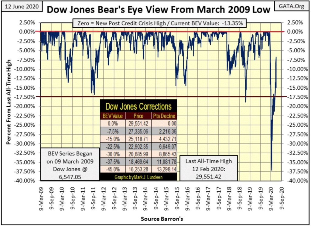
I had excellent timing for my vacation, with not much happening until this week; and what happened this week? On Monday’s close the Dow Jones came within 7% of its last all-time high (BEV Zero). What could go wrong and prevent the Dow Jones from making a historic new all-time high sometime in the coming weeks? Only Mr Bear, who in the next three days began clawing back market valuation with relish.
On Thursday the venerable Dow Jones began upchucking dollars, coughing up 1,862 of them in a single NYSE trading session, taking the Dow Jones all the way back down to its BEV -15% line in the chart below. Last Monday, it appeared the BEV -17.5% line was no longer a technically important level. The question in my mind now is will the Dow Jones once again advance into single digits in the BEV chart below, or find itself closing below its BEV -17.5% line?
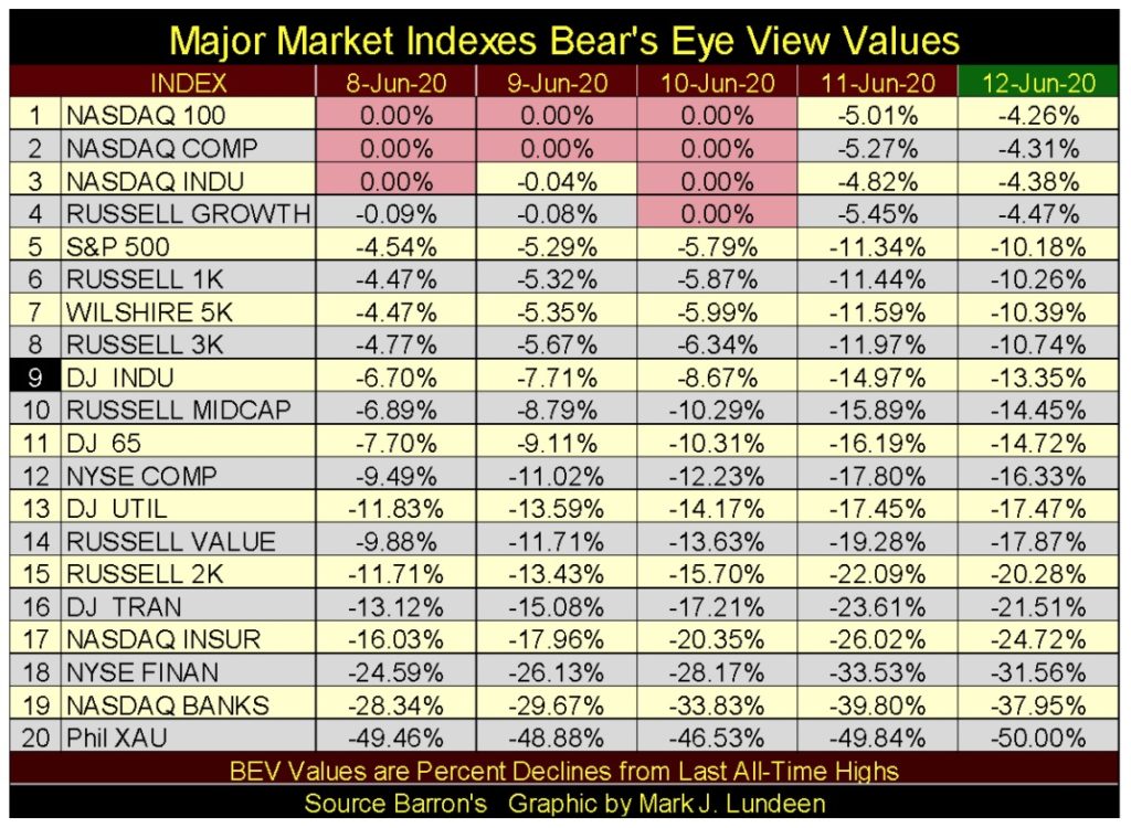
Next is my table for the Bear’s Eye View (BEV) for the major market indexes I follow, with the Dow Jones #9. We were beginning to see some new all-time highs in several indexes (0.00% aka BEV Zero); then came Thursday and every one of these indexes dropped over 4.5% in a single NYSE trading session.
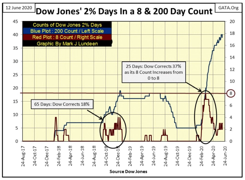
As expected, with the rising of the Dow Jones 200 count below (Red Plot / Left Scale), came a big market decline for the Dow Jones. The Dow Jones broke below the rising trend line it had been above since November 2016, then popped back up above it.
Can the Dow Jones remain above this rising trend line? I’d say no if the Dow Jones continues seeing days of extreme volatility; the dreaded Dow Jones 2% days, or days the Dow Jones moves 2% or more from a previous day’s closing price.
The Dow Jones last all-time high was on February 12th. Just six trading days later the Dow Jones began suffering its current bout of extreme volatility that lifted up its 200 count from 6 to now 40 at the close of this week.
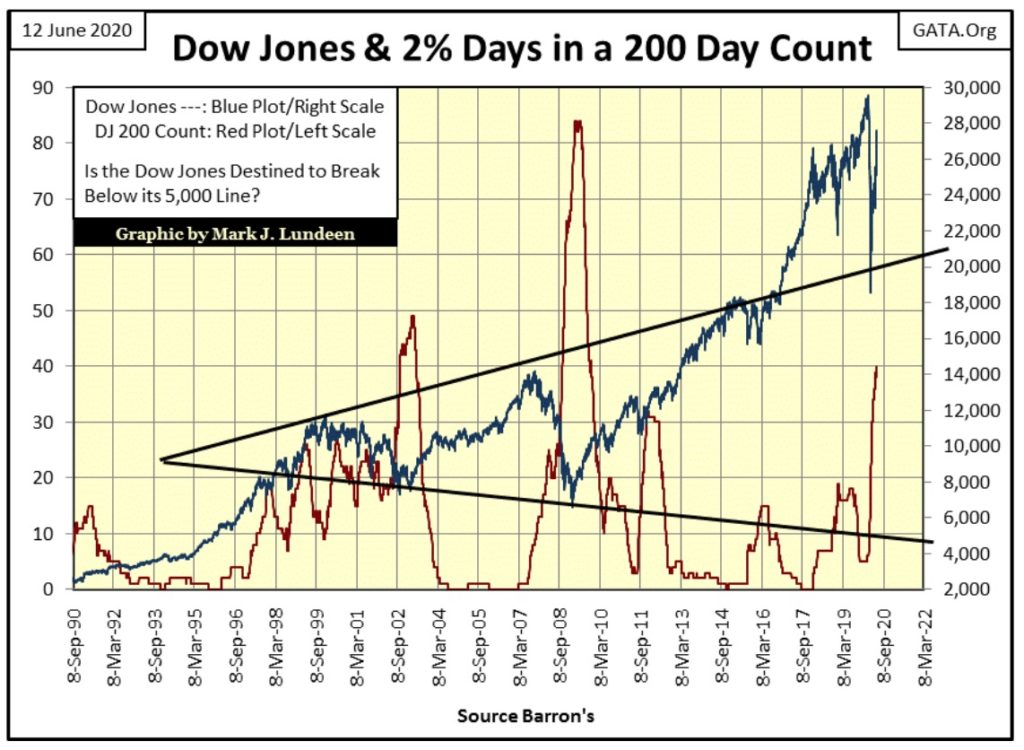
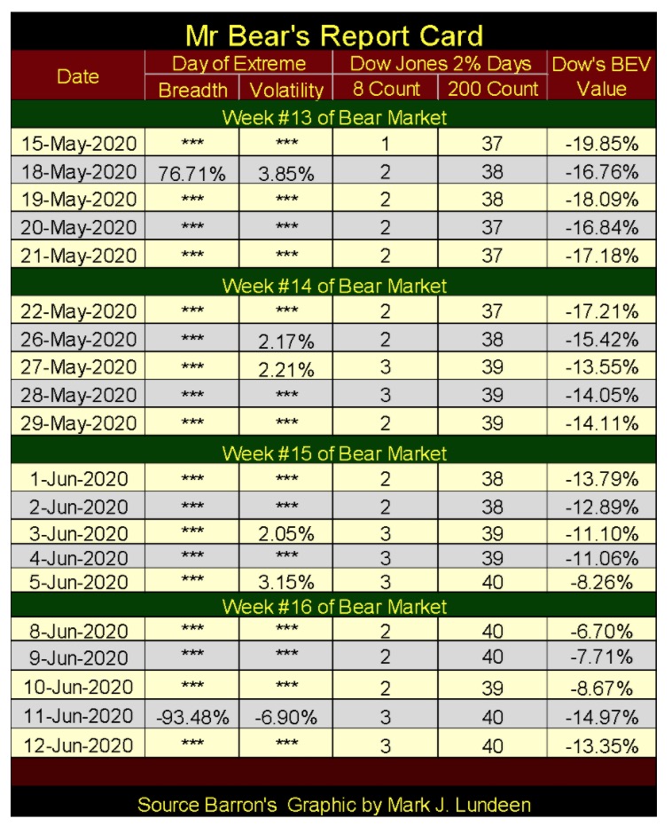
Here’s Mr Bear’s Report Card below. This bear market is now in its sixteenth week and since late February the Dow Jones has seen at least one 2% day in each week.
Also this week we saw a bearish extreme day of market breadth, or NYSE 70% A-D day. This ratio hit a -93.48% two days ago as only 92 of the 3038 issues trading on the NYSE advanced on Thursday.
During bull market advances these extreme days are rare market events. The stock market can go for years between them. That for the past sixteen weeks they have both become frequent events tells me we are in no bull market. Until this changes, I’ll not change my opinion of what kind of market this is – a bear market.
I don’t care if the Dow Jones goes to a new all-time high, which it could only do should the FOMC “inject” sufficient “liquidity” into the financial system, which it just might. As I read this market, there’s more risk than reward for being bullish in today’s stock market.
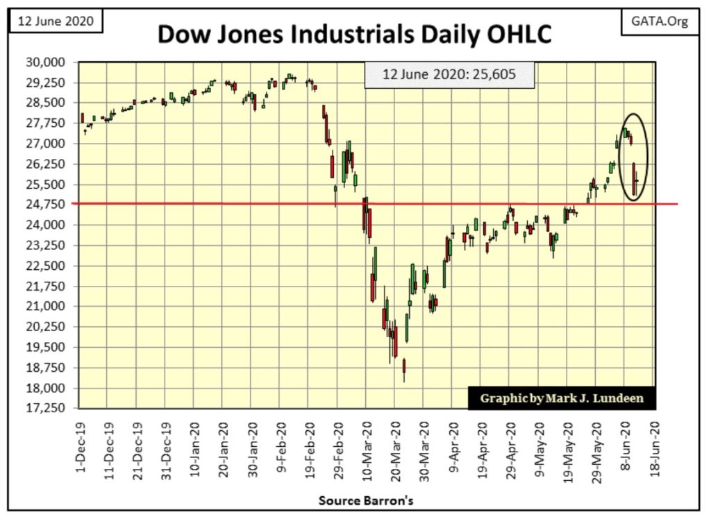
Here’s the Dow Jones in daily bars, with this week’s action circled. For the bulls this is not a pretty picture.
Here’s a chart plotting the Dow Jones’ 8 & 200 counts; or the quantity of Dow Jones 2% days in a running 8 day (Red Plot) and 200 day sample (Blue Plot). Whether the 2% day is positive or negative makes no difference, as in bear markets a 2% day is a 2% day.
The violence of the decline in the Dow Jones from February 12th to March 23rd (25 NYSE trading sessions) was historic, just short of a 40% bear market decline in little more than a month as its 8 count increased to 8, or eight continuous Dow Jones 2% days. The Dow Jones hasn’t see an 8 count of 8 since the depressing 1930s.
The market has calmed down since late March, but the Dow Jones’ 8 count has yet to return to Zero, closing the week at 3. I wasn’t surprised when this week the stock market once again felt the hot breath of Mr Bear on the back of its neck.
Until the Dow Jones can shed itself of this extreme volatility, where its 8 count goes down to a Zero, and stays there for a few months as happened following the December 2018’s 18% correction, I think we’ll see more excitement to the down than the upside in this market.
Next is my comparison between the Great Depression and our bear markets. Is this a fair comparison? With the current market advance being largely a “monetary event”, where the FOMC is “injecting” enormous amounts of “liquidity” into the financial system – it sure is!
The question that can only be answered in the weeks to come is whether the dead-cat-bounce off the March 23rd’s Dow Jones 37% decline came to its end last Monday when it increased to its BEV -6.70%.
From past experience I’ve learned not to make predictions in a market manipulated by inflation flowing from the Federal Reserve. So the best way to look at this data is to view it as whether or not the FOMC’s “monetary policy” is having its intended effects.
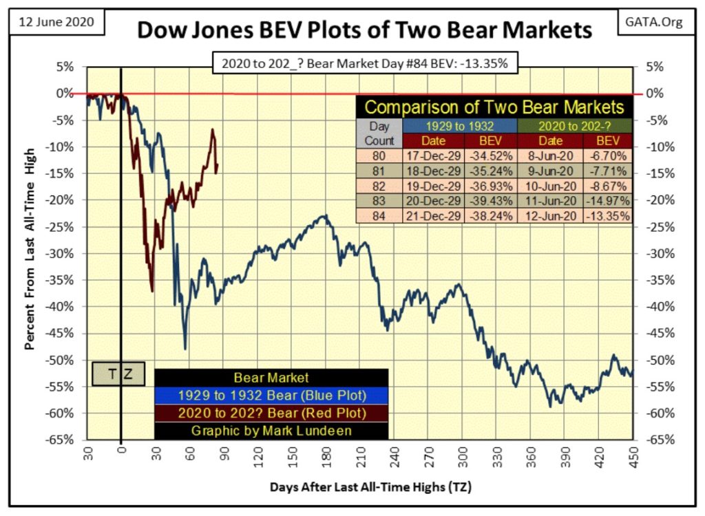
Obviously, the FOMC doesn’t desire the Dow Jones to break below its BEV -40% line; rather it desires a new all-time high in the coming months. So that is what I’m looking at; can the FOMC still control the market? If so we’ll see a new BEV Zero in the coming months; if not the Dow Jones will break below its BEV -40% line sometime before September. Should that happen; it could get very ugly very fast.
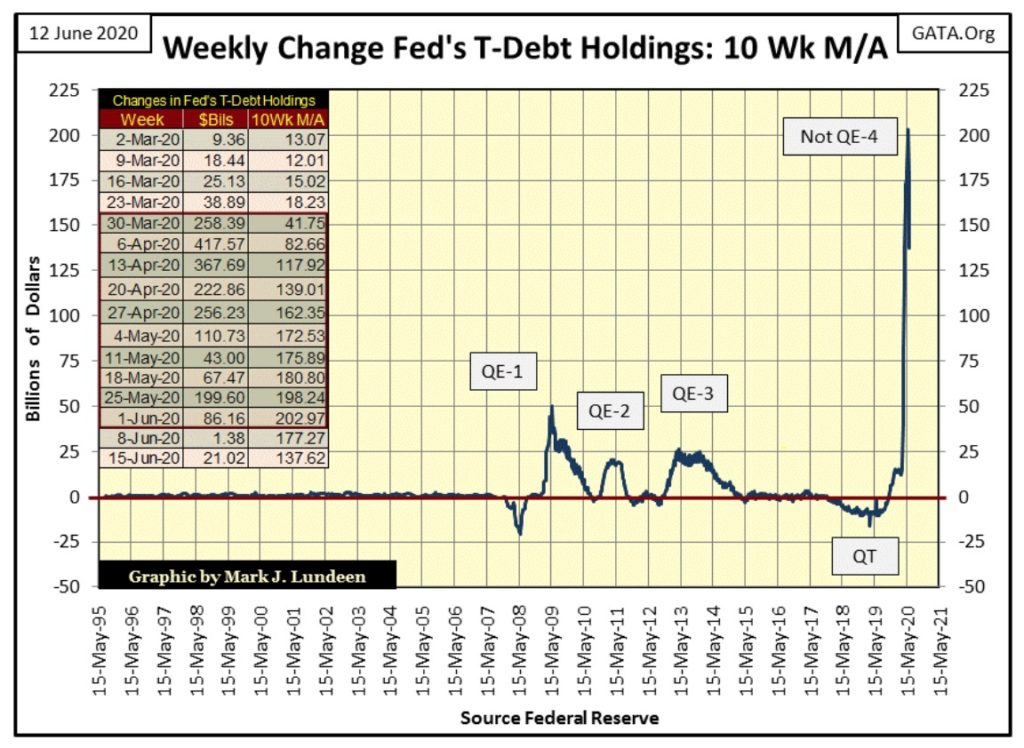
Looking at the weekly changes in the Federal Reserve portfolio of US Treasury debt below, it’s perfectly clear how much effort the FOMC has put into “stabilizing market valuation” in the stock market since the Dow Jones began its -37% market decline in March.
Look at what the FOMC had to do to inflate the NASDAQ High Tech and Real Estate market bubbles before 2007; almost nothing in terms of “monetizing” the Treasury market!
But when the sub-prime mortgage bubble popped in 2008, the Federal Reserve was forced to place a bottom to the market with its QE 1-3. Then beginning last October, they terminated their Quantitative Easing (QT). Now March’s humongous “Not QE-4” was required re-inflate the stock market off its March 23rd low, and the Dow Jones still hasn’t seen a new all-time high after all this!
Obviously the law-of-diminishing returns is making itself felt. I’d say it’s safe assuming it’s not as much fun being a central banker today as it was when Alan Greenspan was inflating bubbles in the financial markets from 1987 to 2006.
In fact I’m sure our current Chairman of the Fed: Jerome Powell is very aware he’s now playing a mug’s game attempting to revive a bull market that should have been allowed to die with dignity over a decade ago in the collapse of the mortgage market in 2008. A bear market decline free from the QE 1-3 seen below, where ever that would have allowed the Dow Jones to decline to, quite possibly a 70% or more market decline.
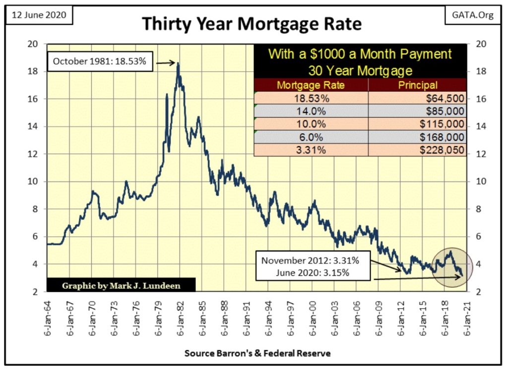
Two weeks ago the 30yr mortgage rate hit a fifty-four year low: 3.15% (chart below). Understandably, this may not be the rate you or I would qualify for should we seek to finance a home purchase. But it is the rate published by the St. Louis Federal Reserve, from where I gather this data every Friday night.
https://fred.stlouisfed.org/series/MORTGAGE30US
Long ago when woolly mammoths and saber-tooth tigers roamed North America, let’s call it the Pre-Federal Reserve Era before 1913; low interest rates flagged a slowdown in the economy. Low rates equaled cheap money for lack of demand for credit by business, so the banking system would discount its credit to stimulate demand from potential borrowers.
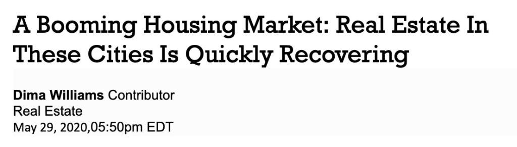
But that was long ago. Today with record low mortgage rates, real-estate prices in many markets are at record highs and climbing, as this Forbes article informs us.
I write about luxury real estate and trends in the wider industry.
“As mortgage applications, price appreciation and slowly growing new listings indicate that the national real estate industry is finally mending from the coronavirus, some housing markets are charting faster and stronger recoveries than others.”
So, by the old, and now long forgotten rules of supply and demand, demand for housing has collapsed to the point where the streets of our large cities are filled with the homeless as mortgage rates are at historic lows. Yet home prices have risen to all-time highs? The old geezer in me suspects there is something very odd going on here.
It’s not just the real estate market that is out of whack with past historical standards; for almost ten years tax-free municipal bonds (Blue Plot below) have offered yields higher than Barron’s Best Grade Bond (Red Plot).
I don’t know which municipalities’ bonds are used in this index. Since 1937 we can be sure there have been many changes in the construction of this data series. But the good people at Barron’s are competent, so I’m not going to question whether this data for the past 501 weeks hasn’t been a true representation of market reality in the debt market.
Since 1937, with few exceptions, tax free muni-bonds had lower yields than taxable corporate bonds as they were seen in the debt market as a having a lower risk profile than did best grade corporate bonds.
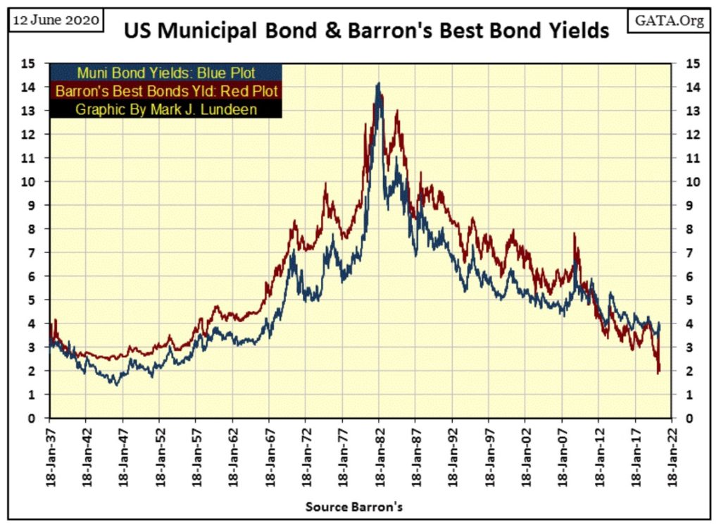
But in November 2010 all that changed, and now for the past 501 weeks yields for tax free muni-bond have been higher than best grade corporate bonds, as seen in the plot of their spread below.
Why would this be so? I’m going to have to go back to what I was taught in my Economic 101 class, which I took onboard the USS Schenectady (LST 1185) while transiting the Northern Pacific from San Diego to Japan.
The armed services always try their best to offer their members educational opportunities. The college professors teaching these courses also loved these cruises as there is nothing like sailing the seven seas on a man-of-war. A trip on the Carnival Cruise Line can’t compare.
Anyway, what my professor told me was higher risk assets always demanded higher yields to compensate investors for the risks they assumed. However he may have lied to me; after all his masters’ degree was in Marxist Economics, but I don’t think so.
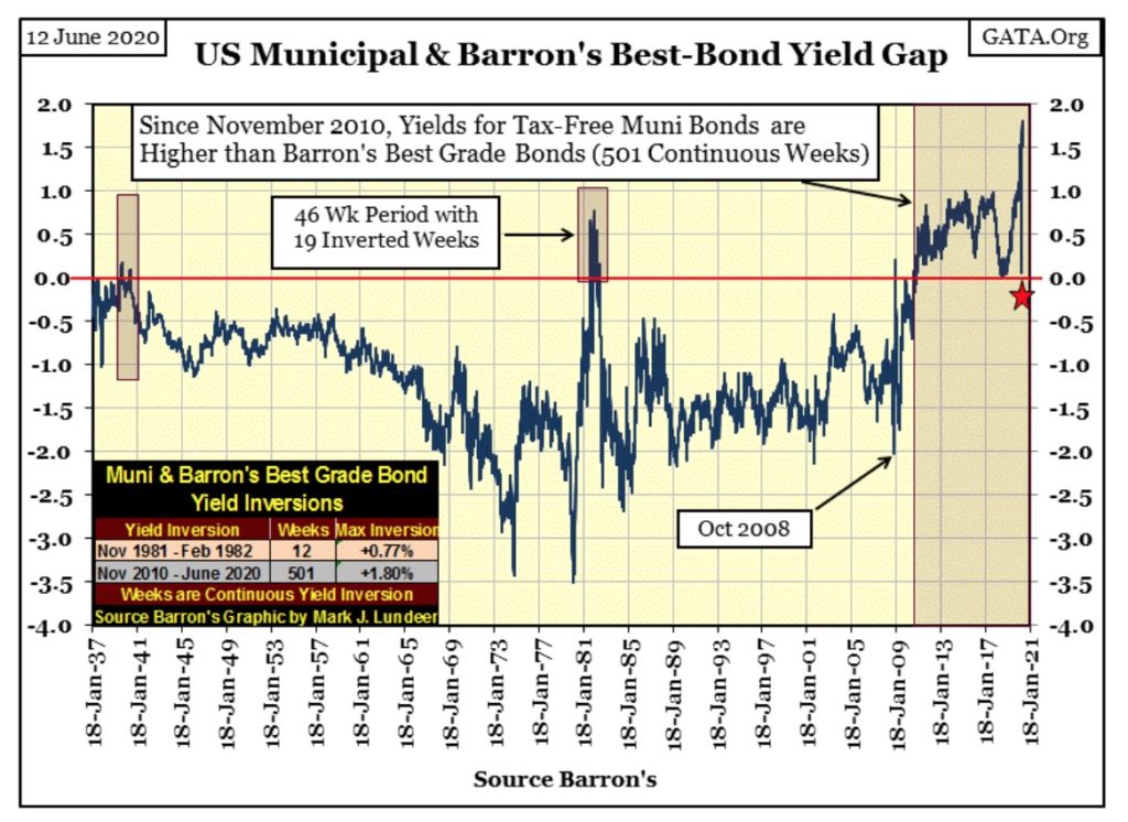
So, since November 2010, what risks have increased in the municipal bond market? Long before November 2010 it has been widely known American states and cities have increased their staffing past the point of prudence, offering all a generous retirement plan that ultimately will overwhelm their tax base.
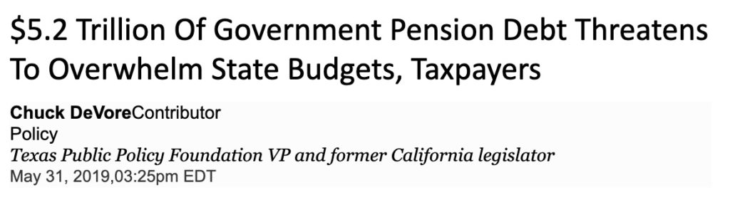
Pension Tracker, a project of the Stanford Institute for Economic Policy Research led by former California State Assemblyman Joe Nation, Ph.D., is out with its updated assessment of the nation’s unfunded state and local government pension fund liabilities. It’s not a pretty picture—especially if you live in Alaska, California, Connecticut or Illinois where your per household pension debt ranges from $102,084 to $76,398.
Looking at the charts above, I’d say it was in November 2010 the bond market was finally coming to terms with this economic reality.
One factor the markets and the general population has YET to come to terms with is how many state and local governments, and the institutions under their control are now dominated by radical Marxists who have NO good intention for those who pay their taxes to them.
Here’s an extremely well done report by InfoWar’s Millie Weaver on the pre-planning of the riots in Minneapolis, Minnesota.

We have sources imbedded within these groups to get to the bottom of where all this leftist radicalization is coming from. We got their plans, manuals, intercepted internal communications, and have recordings of their zoom chats.
What you are about to see is part of a two year undercover investigation into the leftist radicalization imbedded within the climate justice movement that contributed to the riots in Minneapolis, Minnesota. In this first video, we are going to show how the Sunrise Movement played a preemptive role in carrying out the mayhem, taking advantage of George Floyd's death and using it as a trigger point, to further push their Green New Deal agenda and promoting the abolition of the police.
https://www.millennialmillie.com/post/undercover-investigation-minneapolis-riot-was-preplanned
Is it possible criminality on this scale is possible without legal recourse to the citizens of Minneapolis and elsewhere? People died as a result of what these people did. Minneapolis’ City Council only response to these riots was to propose the disbanding of their police force; as if the looting, broken glass and fires were the fault of the cops.
The members of the City Council aren’t stupid. What they are, is a bunch of Communists committed to over throwing the established order of America! Not good for the owners of Minneapolis’ muni-bonds.
The Democratic Party and the mainstream media that promotes them are despicable. I hear there is a new movement developing in many of America’s large cities, especially those who suffered from this rioting – The RED Movement (Remove Every Democrat from office). But that won’t balance these local government’s books after decades of their malfeasants.
Back to the charts; there’s a down spike in the spread in the chart above I’ve marked with a red star that happened in Barron’s 23 March 2020 issue. To better illustrate what happened in Barron’s 23 March 2020 issue I’ve plotted Barron’s Best and Intermediate Grade bond yields going back to 2014 below with the table for the FOMC’s changes in its holding of US T-bonds below.
Keep in mind it was in late March of this year when the Dow Jones saw its swiftest 37% decline from an all-time high in its 135 year history. This event was mirrored in the bond market by a huge jump in corporate bond yields (huge decline in corporate bond prices), as seen below. The next week (Barron’s 30 March 2020 issue) the FOMC “monetized” a record $258.39 billion in Treasury bonds, followed by an even larger $417.57 billion in the week that followed.
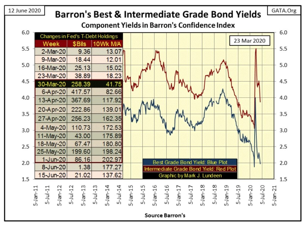
It wasn’t just the stock market the FOMC was “stabilizing market valuations”; you can see their meat hooks in the corporate bond market too. But they’ve admitted as much, as reported by Forbes on 23 March 2020, the day the Dow Jones hit bottom.

There is a total of $10 trillion of corporate debt in America from bonds to loans, and some of it will be bought by the U.S. central bank.
In an unprecedented U.S. action, the Federal Reserve moved on Monday to buy corporate debt, one of several actions the U.S. central bank took in a massive start-of-the-week intervention to support credit markets amid the dramatic economic impact of dealing with the coronavirus.
Current “monetary policy” has gone full-banana republic. I fear it will only get worse as the burden-of-debt on the productive economy increases to the breaking point. Before all this comes to a conclusion “counter-party risk” will become another dirty four-letter word our “market regulators” will dare not speak in polite society.
So what are we to do? Well I’m no one’s “investment advisor.” But if you agree with the conclusions I’ve made after commentating on the charts above, you’d likely place your wealth with as much distance from financial assets such as stocks, bonds and real estate as you can.
The best way I know of to accomplish this is to simply trade your Federal Reserve Notes for as much gold and silver bullion, assets with zero counter-party risk as you can, while you still can, because the day is coming when you’ll wish you had.
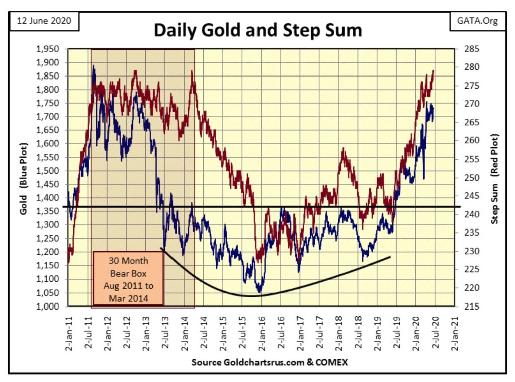
So let’s move on to gold’s BEV chart below, and I note not much has changed since I began my vacation on May 24th. Actually not much has changed since April 13th when gold saw a BEV of -7.01% ($1756.30), a high for the move that so far has lasted two months (#4). After two months one would think the price of gold would have seen a bit of a correction, but no, gold doesn’t like trading below its -10% BEV level either ($1700).
This tight trading range won’t last forever, so I’m anticipating whatever way gold breaks outside of circle #4, either up or down, will dictate the next big move in the price of gold. I doubt it will take us another two months before we find this out, and I’m expecting the next big move up in the price of gold (and silver) will be to the upside.
Actually, if gold traded in a free market it would have made its “next big move to the upside” last week when the Dow Jones deflated over 1800 points (6.9%) on Thursday. And what did gold do? On Thursday it closed down 0.31% and silver was down 1.36% as riots and civil unrest was the rule of the day in too many of America’s cities, including New York where gold and silver were trading!
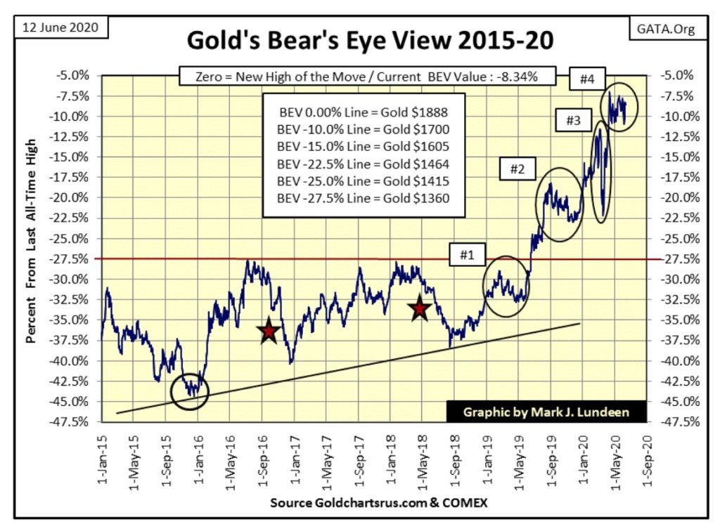
Looking at the chart above, one could be excused believing the plot was the Bear’s Eye View of the price of gold, but really it’s not. What we are actually seeing above is a contained explosion in the price of gold.
When the “market regulators” for the precious metals market lose control, when their immense efforts to contain the rising price of gold fail, we’ll see market history that will be remembered and talked about by the public and academia for many decades to come.
Gold’s step sum chart below is interesting as there are the makings of another step sum box in it. The problem is that since April 13th, when gold saw its last high of the move, I can’t say whether the price of gold has trended bullishly or bearishly as its step sum continues rising. So, even though the potential for a bear box has existed for the minimum of eight weeks, I can’t call it a bear box; not yet anyways. Should gold break below $1660 I just may do that, but I think this is unlikely.
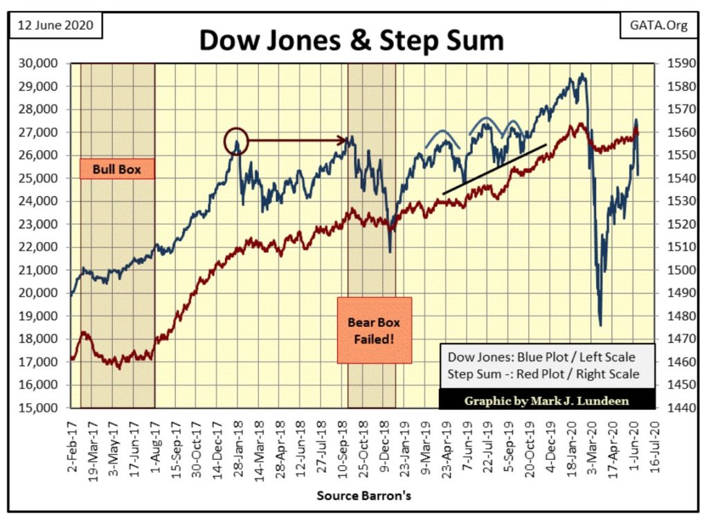
In the Dow Jones step-sum chart below, the damage done to the bull’s advance is on full display. But should its step sum plot continue rising as it has since late March (indicating the Dow Jones is seeing more daily advances than declines), the advance off the market’s March 23rd low could continue, taking the Dow Jones to something over 30,000.
But will this happen? Like me, my readers will just have to wait until next week to see what is to come.
Looking at gold’s step-sum table below, its step sum has advanced six steps since May 8th which has advanced the price of gold over $20. Much like kissing your sister; this feels good but doesn’t provide the excitement we’ve all been looking for.
The big problem as I see it is daily volatility at only 0.79% for its 200 day M/A in the gold market, which is low. Unlike the stock market, bull markets in the precious metals are volatile markets. When gold really begins to take off we’ll see gold’s daily volatility’s 200 day M/A break far above 1.00% in a dramatic fashion.
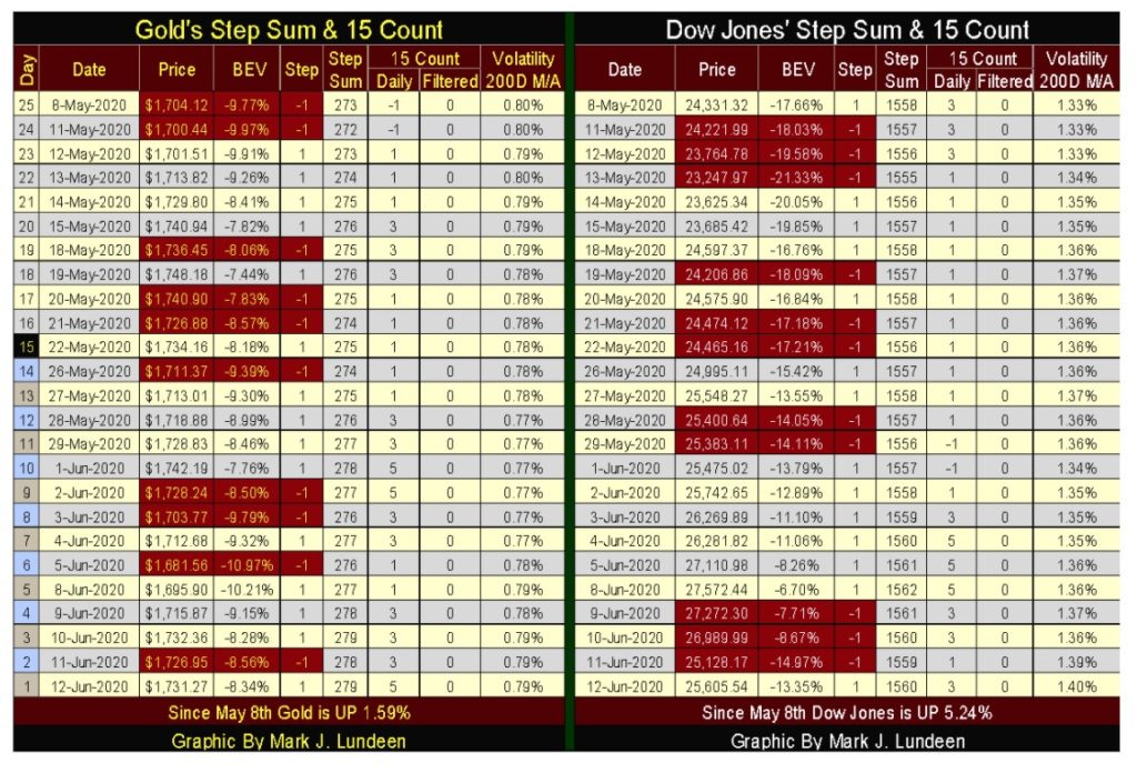
Gold’s 15 count at +5 remains neutral (see table below) but could be overbought should it reach a +7 next week, and an overbought market is a market due for a rest.
For the Dow Jones step-sum table above, the most important thing to note is it closed this week with a daily volatility’s 200 day M/A of 1.40% – and climbing, which indicates the stock market has a fever. Meaning big events are likely be to the downside, as we saw last Thursday when the Dow Jones deflated by 6.9%, (1862 points) in a single day.
A note for those who have purchased shares of Eskay Mining, a company I have a significant holding in, but one I don’t receive any compensation for promoting.
The company has several news releases in recent weeks informing shareholders of their successful financing plans and exploration projects to take place this summer.
https://eskaymining.com/news/news-releases/
The big news in this is that Eskay Mining is still alive and well and using any incoming funds to advance its exciting exploration program. Their portfolio of potential ore bodies is impressive. In a prolonged market advance for gold and silver that sees their prices far above where they are now, Eskay Mining will do very well.
Still, precious metals exploration is a speculation, so no more than 1% to 5% of one’s allocation of mining shares should be placed in it.
—
(Featured image by Markus Spiske via Pexels)
DISCLAIMER: This article was written by a third party contributor and does not reflect the opinion of Born2Invest, its management, staff or its associates. Please review our disclaimer for more information.
This article may include forward-looking statements. These forward-looking statements generally are identified by the words “believe,” “project,” “estimate,” “become,” “plan,” “will,” and similar expressions. These forward-looking statements involve known and unknown risks as well as uncertainties, including those discussed in the following cautionary statements and elsewhere in this article and on this site. Although the Company may believe that its expectations are based on reasonable assumptions, the actual results that the Company may achieve may differ materially from any forward-looking statements, which reflect the opinions of the management of the Company only as of the date hereof. Additionally, please make sure to read these important disclosures.


Dolci Palmisano Issues Its First Minibond of the F&P “Rolling Short term” Program
Dolci Palmisano Srl issued its first €300K Short Term Minibond at 5.5%, fully subscribed on launch. Structured by Frigiolini &...

Bitcoin Traders on DEXs Brace for Downturn Despite Price Rally
Despite Bitcoin’s recent rally, over 70% of BTC options volume on DEXs like Derive.xyz are puts, signaling trader caution. Many...


Dow Jones Nears New High as Historic Signals Flash Caution
The Dow Jones is nearing a new all-time high despite past resistance, with a current BEV of -2.65%. A potential...


Stock Markets Surge Amid Global Uncertainty, But Storm Clouds Loom
The stock market hit new highs despite global tensions, with the S&P 500, NASDAQ, and TSX leading. Oil collapsed amid...


The TopRanked.io Weekly Digest: What’s Hot in Affiliate Marketing [NordVPN Affiliate Program Review]
There's a bit of a vibe in the EU right now that's slowly taking hold of everyone, from everyday consumers...
 |
|
 |  |
 |
|
-
 Markets2 weeks ago
Navigating the Fourth Turning: Cycles of Crisis and Opportunity
-

 Cannabis4 days ago
Is Aurora Cannabis Stock a Risk Worth Taking?
-

 Impact Investing2 weeks ago
EU Eases CO2 Tax Burden on SMEs with Revised CBAM Rules
-

 Business6 days ago
America’s Debt Spiral: A $67 Trillion Reckoning Looms by 2035