Business
March 8th: the bottom of gold’s current correction is in
Last week we were wondering whether or not gold would break below its BEV -20% line. This week we know the answer to that question: no. Actually on Wednesday gold almost broke * ABOVE * its BEV -15% line, closing the week just short a half of a percent from it.The question I have at the close of this week is whether or not we’ve seen the bottom in gold’s correction from its August 2020 highs?

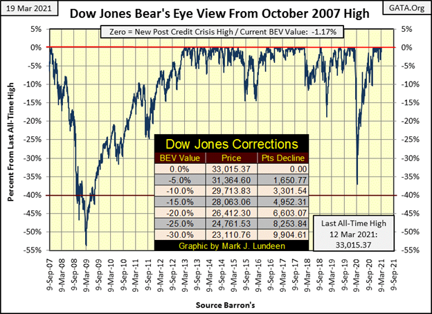
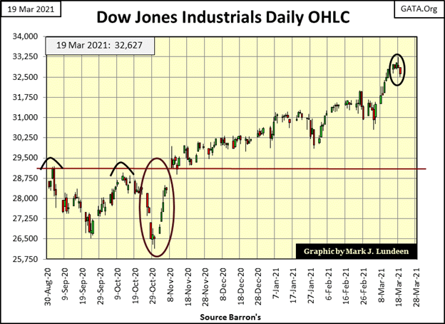
The Dow Jones made a BEV Zero on Wednesday this week, then closed the week down 1.17% from Wednesday’s all-time high. The Dow Jones has been in scoring position (within 5% of its last all-time high) since November 4th, scoring 22 new all-time highs, advancing the Dow Jones by 5,167 points during the past three and a half months.
I’m thinking this is something to be aware of as we go deeper in to 2021; when the day comes where the Dow Jones does close outside scoring position (a daily close with a BEV of -5.00% or more), it could indicate the start of market exhaustion for the bulls. Until then, I’m remaining positive on the Dow Jones and the stock market as a whole.
Another factor remaining positive for the stock market is NYSE 52Wk H-L Nets continue seeing nets of +300 or more on a regular basis. In the table below, the Dow Jones since February 4th has seen eleven new all-time highs. The thirty stocks in the Dow Jones aren’t the only listings trading on the NYSE that are seeing new 52Wk Highs. Seeing so many H-L Nets below deep into the +300s and some daily closings in March even into the +400s is a sign of a strong market. However, when the NYSE 52Wk H-L Nets begin seeing daily nets of +500, and especially +600 is an indication, if not the promise a market advance is approaching its end.
Historically that has been the case. In the weeks to come let’s keep an eye on the NYSE 52Wk H-L Nets, how long before we see some daily nets of +500 and +600 in the table below.
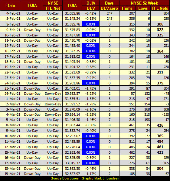
The major market indexes’ BEV values are listed in the table below. Monday saw lots of new BEV Zeros. But on Wednesday when the Dow Jones (#3) saw its last BEV Zero, it didn’t have much company. Seeing at week’s close fourteen of these indexes in scoring position, within 5% of their last all-time highs is a good reason to cheer for my bullish brethren out there.
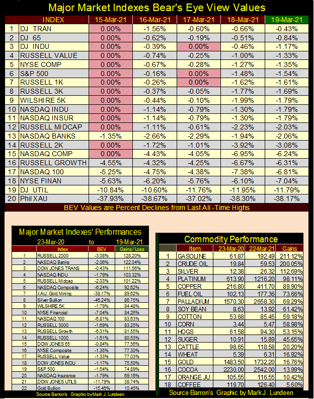
Looking at the market performance for the past year in the table on the lower left-hand side remains concerning. Is it reasonable to expect a repeat performance in the year to come? I don’t think so. And then there are the gains in commodity prices seen in the table to the right. I do my own shopping, and increases in actual consumer prices seen at local stores in the past year are significant. At some point rising CPI inflation will force bond buyers to demand an inflation premium; lower bond prices, higher bond yields.
In fact, since last August it already has, as seen in this 30yr US Treasury Bond I’ve tracked on a weekly closing basis since it was issued in February 2011. Since last August, this bond’s current yield (Red Plot below) increased from 0.95% to 2.24% as its market price (Blue Plot) deflated by 17.76%.
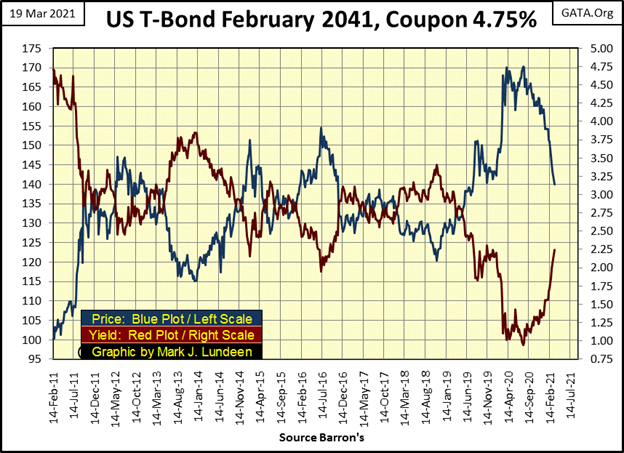
It’s not just this particular bond; the entire bond market is also deflating by double-digit percentage, as the stock market’s major market indexes seen above are all deeply into double and triple digit percentage gains.
If these trends in commodity prices and bond yields continue, and I suspect they will due to the FOMC’s massive “injections of liquidity” into the financial system, at some currently unknown point in time the Dow Jones will once again begin a series of big 2% days, something very similar to what we saw last October in the red oval below. We’ll see if the FOMC can once again nip in the bud a major market decline as it did last October.
But unlike last October’s series of Dow Jones days of extreme volatility, the FOMC may find it impossible reflate the market, signaling the arrival of Mr Bear to Wall Street’s party.
But we’re not there just yet.
I first discovered bank debt as a teenager when my friends were buying cars using other people’s money. It was an exciting idea that not just promised, but actually delivered immediate self-gratification. A bank gives one a check, one then cashes the check, one then spend the money to purchase a car were wonderful revelations in the life of any eighteen year old.
This is also true in 2021, no matter which of seventy-four genders America’s youth can now wake up to be today or tomorrow. This is a big change from when I was young, when gender fluidity was restricted by an oppressive patrimony and credit creation by the Bretton Woods’ $35 gold peg.
The problem I had then, a problem I still have with bank debt, is the part where I have to repay the debt with interest. This little detail of obligating a share of my future wages and earnings with a bank for years to come ruined everything. I can honestly say I’ve spend most of my adult life managing my personal affairs so I never woke up in the morning after dreaming I just had something special happen with me with a bank under the covers the night before.
This doesn’t mean I believe all debt is bad. Debt taken on for capital formation; debt taking on to be repaid with profits made possible with debt built America and the Industrial West. I’m all for that. It’s just consumptive debt I’m opposed to; debt casually taken on to purchase consumer goods that are frequently disposed of before the debt used to buy them is paid back in full. And then there is the consumptive debt that is never paid back in full, such as credit-card debt used at McDonald’s to pay for breakfast.
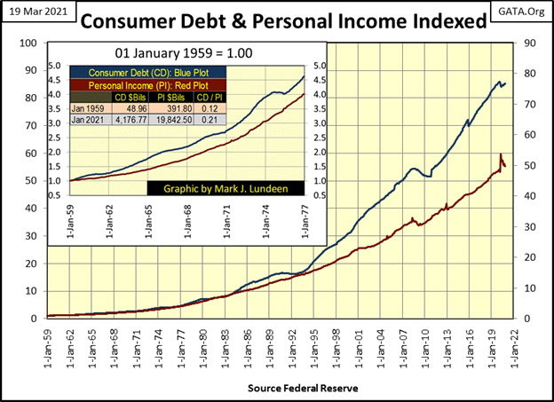
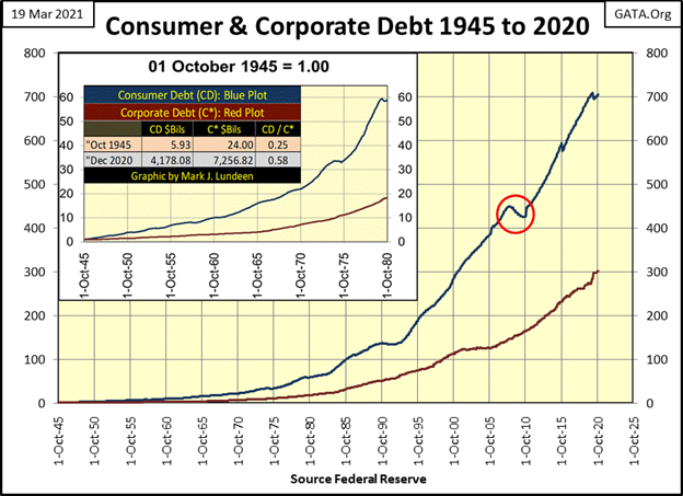
The St. Louis Fed has data on consumer debt going back to October 1945 and personal income back to January 1959. Using the start date for personal income I constructed the chart below with the indexed values for the two data series. To display the data in terms of billions of dollars I’ve included a table listing the values in $bils for the first and last data points in these series.
So what are we looking at? We are looking at how Americans have lived beyond their means for the past seven decades, with credit made possible by the Federal Reserve. “Living beyond one’s means”; what does that mean? I could reply to that with a curt answer, such as look at the chart. But it’s a serious question that deserves a much better answer than two plots on a chart will ever supply.
So, here goes; it’s a sad fact that all too many people wake every morning knowing no matter how hard they work, they can’t get ahead in life – stuck in a rut – for what’s on display below;
- debt being used to finance consumption (Blue Plot),
- personal income used to service their consumptive debt (Red Plot).
What’s displayed below is nefarious and pernicious. Since the creation of the Federal Reserve System in 1913, this plus the elimination of the gold-backed monetary system was the intent of the banking system. To alter money from a personal asset society used to promote prosperity into an asset controlled by the banking system that ultimately will prove to be as destructive to society, as heroin is to an individual.
Isn’t that a stretch? I don’t believe it is, and what is more those at the top of this system know exactly what they are doing and why they are doing this.
Here’s a four minute video by Professor Jordan Peterson of the University of Toronto: How Hitler was Even More Evil than You Think.

For those who choose not to view this video, I’ll provide a summary. Hitler was a liar. So, we should stop listening to what he said, and instead focus on what he actually did.
His promises for a Thousand-Year Reich and perpetual prosperity for the “Germanic super race” were worthless because in fact he was an agent of chaos who destroyed everything he placed his hands on. And this destruction of everything he could touch took precedence over all, even victory in war and his own personal survival.
Okay, now take the four minutes and watch the video; you’ll learn something.
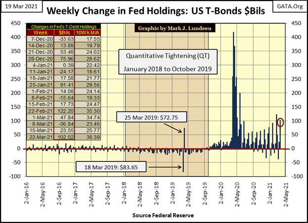
Was Hitler a historical anomaly? Professor Peterson doesn’t think so, a position I fully support with my weekly publishing of charts for the FOMC’s activities. Just this week the FOMC “injected” another $102 billion into the financial system (Red Circle below) in their unceasing efforts to “stabilize” the markets and financial system.
But for those at the top, they must realize that they aren’t “stabilizing” anything. Rather they’re managing the global financial and economic systems to a point of maximum instability, the point where they then step aside and watch it all come tumbling down.
The banking system at all levels are staffed by brilliant people. The danger a banking system’s reckless credit and currency creation presents to an economy, and the society that provides for its citizens with it, have been known and studied in fine detail since the early 18th century in the aftermath of John Law’s Mississippi Scheme, and England’s South Seas Bubble.
So why has the Federal Reserve, and the global central banking cartel dedicated themselves to the destruction of the global monetary system? Because it’s what they do; destroy what they touch, and there is no need to make it any more complicated than that. Does that sound extreme? Wait ten years and then ask me that.
The charts above also says much about the state-of-education in the United States, and elsewhere; the current universal state-of-ignorance where matters of thrift and credit are concerned.
When one realizes the Federal Reserve is fully integrated into the economics department of all universities and colleges, and is an important component of the peer review process of all economic post-graduate publications, one shouldn’t be surprised when college freshmen enrolling into a college are met with offers for credit cards besides required paper work for their school loans.
Or when college students graduate with a masters in gender studies, made possible with tens or even hundreds of thousands of dollars provided by the Federal Reserve System, and can’t pay back the loan, many join radical leftist groups to riot in the streets as they did all last summer.
This too is another method used by the Federal Reserve, in close cooperation with “higher education” to increase levels of chaos and rage in the social group called the United States of America.
So much for that. Let’s move on to the Consumer Debt to Personal Income Ratio in the chart below. The series used in this ratio are seen in the chart of Consumer Debt and Personal Income; two charts up.
I circled the point in time when this ratio increased above 17%, and has stayed there since 1995 as obviously something changed that motivated consumers to leverage their consumption with even higher levels of consumer debt. I see two things happening in 1995.
- Before the mid-1990s credit cards were not as available to the public as they were after. I remember news stories at the time where banks had sent individuals, and incredibly their dogs hundreds of credit cards ready to be activated with a phone call.
- The NASDAQ high-tech bull market was well underway by the mid-1990s, and since then Wall Street has become a perpetual bull market in one form or another. As the public became bullish, and as bulls are optimistic, I’m not surprised seeing consumers willing to increase their leverage consumption.
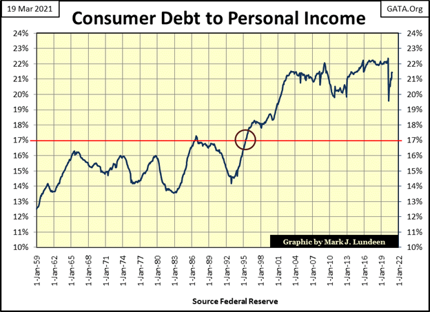
Leveraged consumption was a big thing during the Roaring 1920s bull market too. It was the Singer Sewing Machine company that coined the marketing logan: “buy now, pay later” in the 1920s as they promoted credit from the newly created Federal Reserve System to sell their sewing machines. All that changed in the depressing 1930s, as Mr Bear taught my parents and grandparents’ generations a lesson on leverage consumption they never forgot, a lesson most people today have yet to learn.
Here’s a chart on consumer and corporate debt going back to 1945. Since 1945 consumer debt is up by a factor of 700. That can’t be good. Look at the levels of debt consumers and corporations had in October 1945; consumer debt was $5.93 billion dollars and corporate debt coming out of WWII was an immense $24 billion dollars. Today in 2021, $24 billion dollars just isn’t the same
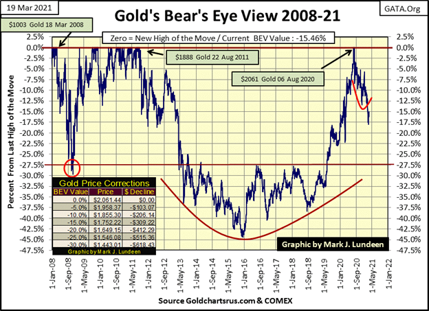
Time to look at gold’s BEV chart below. Last week we were wondering whether or not gold would break below its BEV -20% line. This week we know the answer to that question: no. Actually on Wednesday gold almost broke * ABOVE * its BEV -15% line, closing the week just short a half of a percent from it.
The question I have at the close of this week is whether or not we’ve seen the bottom in gold’s correction from its August 2020 highs?
Market prognosticators can never be sure of what is to come, but something deep inside drives them to speak as if they do, things that might come back and embarrass them one day. And right now this something deep inside of me is driving me to say that gold’s BEV -18.03% seen on March 8th is the bottom of this correction.
There I said it; the bottom in the gold market is in. Let’s see what happens from here.
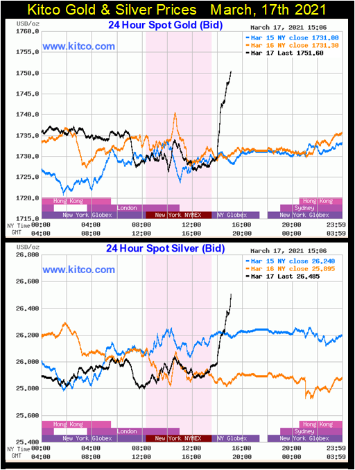
Last Wednesday gold and silver had a big day, as seen in their Kitco.com charts below. The Mainstream Financial Media on Wednesday said Fed Chairman Powell said something to someone about this; that and the other thing and so gold and silver took off.
I admit it; I have a bad attitude when it comes to FOMC personnel, especially the Fed Chairman. I have a test to see when they are lying to me – when their lips are moving they are lying to me. But putting that aside, the following day most of the gains see here were taken back, as is usually the case with big daily gains; no follow through is allowed in the following days. This is especially so in any week the FOMC “injects” $102 billion into the financial system, as they did this week.
So, do I still want to call the bottom of the correction in the price of gold? I do; the BEV -18.03% seen on March 8th.
I’m going to skip gold’s and the Dow Jones’ step sum charts this week and go directly to their step sum tables.
Selling pressure in the gold market was immense, driving gold’s 15 count down to a -9 on March 3rd. Then a few days later we see March 8th’s BEV -18.03% that I’m now calling the bottom in gold’s correction.
Let’s take a look at the gold market before and after March 8th. Before, down days highlighted in red dominated the market. After March 8th daily advances in the price of gold became as common as daily declines. As I see it, something changed in the gold market, and that something might very well be the passing of the March 8th’s BEV -18.03% bottom.
What would be nice now to confirm the bottom of the gold market is actually in would be some big daily advances in the gold and silver markets. For gold, a day of extreme volatility is a 3% move from a previous day’s close. For silver make that a 5% daily move, and it doesn’t matter whether or not these days of extreme volatility are positive or negative. But rest assured that as gold approaches its last all-time highs of last August, most if not all, will be of the positive variety.
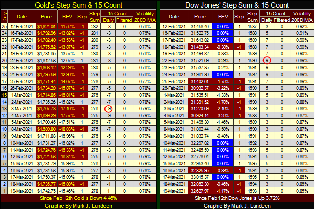
As far as the Dow Jones’ side of the table goes; nothing has changed. Daily advances still dominate the market (its 15 count remains positive) as the Dow Jones continues making new BEV Zeros, or new all-time highs. All this plus seeing the NYSE 52Wk H-L Nets regularly spike into +300s, if you’re a bull running wild and free on Wall Street, life is good.
Someday rising bond yields and commodity prices are going to prick this bubble in the stock market, but that day isn’t at hand just yet. That makes this a good time to lock in some of your capital gains by selling into this market strength, and using the proceeds to get a position in precious metal assets.
_
(Featured image by Michael Steinberg via Pexels)
DISCLAIMER: This article was written by a third party contributor and does not reflect the opinion of Born2Invest, its management, staff or its associates. Please review our disclaimer for more information.
This article may include forward-looking statements. These forward-looking statements generally are identified by the words “believe,” “project,” “estimate,” “become,” “plan,” “will,” and similar expressions. These forward-looking statements involve known and unknown risks as well as uncertainties, including those discussed in the following cautionary statements and elsewhere in this article and on this site. Although the Company may believe that its expectations are based on reasonable assumptions, the actual results that the Company may achieve may differ materially from any forward-looking statements, which reflect the opinions of the management of the Company only as of the date hereof. Additionally, please make sure to read these important disclosures.


Eli Lilly Hits $1 Trillion Valuation Amid Strong Bullish Momentum
Eli Lilly stock hit a record high, surpassing $1 trillion market value after strong product demand. Shares surged over 7%,...


BOAD Approves Major Funding Boost to Drive West African Development
At its 151st session in Lomé, BOAD approved eleven operations worth 344.577 billion FCFA, raising total financing since 1973 to...


Oil Surges on U.S.–Iran Tensions as Global Markets Show Diverging Trends and Rising Risk Fears
Rising U.S.-Iran tensions expose a fragile agreement, likely pushing oil prices higher while pressuring stocks and gold. Markets show mixed...


Dow Jones Near Highs Signals Strength Until Volatility Returns
The Dow Jones stayed below all-time highs all week, signaling continued strength while it remains in “scoring position.” Since November...


PayPal’s Slowdown: From Fintech Leader to Low-Growth Dividend Stock
PayPal has shifted from fintech leader to low-growth, value-style stock, losing over 25% in market value and trading at a...
 |
|
 |  |
 |
|
-
 Impact Investing1 week ago
AI Adoption in Italian Retail Stalls Despite Strong Experimentation
-

 Impact Investing5 days ago
EU Weighs More Free Emission Permits in ETS Review to Boost Industry Competitiveness
-

 Impact Investing2 weeks ago
SBTi Net-Zero Standard 2.0 Enhances Corporate Climate Action
-

 Crypto3 days ago
Bitcoin and Ethereum Slide as Market Pressure Builds Amid Strategy Concerns and Layer 2 Disruptions