Featured
Market update: A primer on the Bear’s Eye View
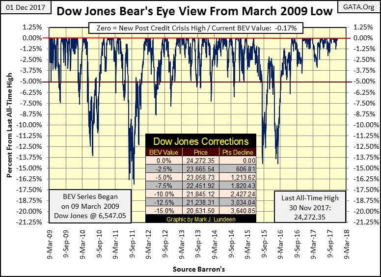
If the Dow Jones reaches the -5% BEV line, there’s a big chance that it will continue to drop further.

The Dow Jones broke above 24,000 last week on Thursday. It was trading in the 23,000 range only since October 18th, a month and a half back. What’s next, the Dow Jones with a 25K handle by February? Well, when a market refuses to go down, the only thing it can do is go up until something happens to knock the wind out of the bulls’ sails.
It needs to be said and then said again, that the big bulls in this market are the central banks, institutions that never fear they may lose money. These are the guys their governments gave the monopoly of counterfeiting their national currencies too. Central banks can and do print as many dollars, yen, euros, and etcetera as they need, whenever they need it. And since the NASDAQ High Tech bubble began deflating in 2000, central banks have been printing money like never before.
The only thing central bankers fear losing is their “credibility,” the general perception of competence all con men, especially central bankers need to bilk the public.
Look at the Dow Jones BEV chart below; it hasn’t closed 5% below a BEV Zero since June 2016, eighteen months ago, or 2.5% from a BEV Zero since last April. This is a real market anomaly, not that the bulls (big or small) are complaining, and really why should they? I just have this feeling that the next time the Dow Jones finds itself below the red -5% BEV line, it will continue going down into its deepest decline since the sub-prime mortgage bear market – and then some.
© Mark Lundeen
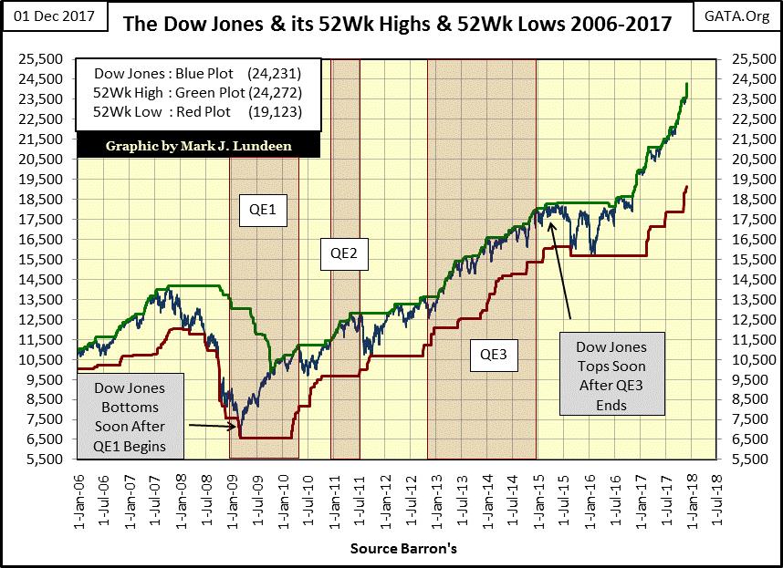
Why would that be? Look at the Dow’s last two double-digit percentage corrections in the BEV chart above (summer 2015 & early 2016), and find them in the chart below plotting the Dow Jones along with its 52Wk High & Low lines. Without a pause (correction in price) the Dow Jones has been advancing since February 2016, almost two years now.
And then there’s the growing gap between the Dow Jones 52Wk High and Low lines; this is a trend that can’t continue forever. One of these days we’ll see the Dow Jones stop pushing its green 52Wk High line ever higher, as it reverses and begins bearing down on its red 52Wk Low line, as it did from 2008-09.
© Mark Lundeen
But when is that going to happen? Sorry to say I haven’t a clue on the when of this coming sad day in the market, only the what. Right now I’m just admitting the bulls are having their way in the market – because they are. So I’m looking for Dow Jones 25,000 by March or April of next year, and I’m stating this with the understanding that I’ve been wrong before, but sometimes I get it right too.
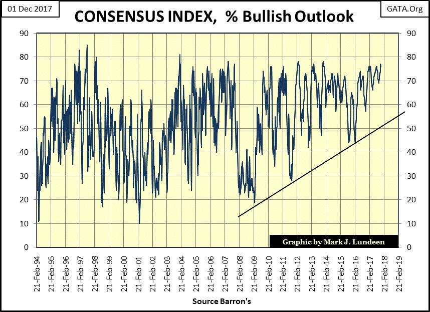
Here’s the chart for the Consensus Index. The good people at Consensus Inc. conducted a poll of futures traders asking who is bullish or bearish on the market. In the chart below we see the percentage of bullish future traders since 1994. This link from Barron’s shows where I get my weekly data.
Take a moment to study this chart. Do you see how the plot changes after the March 2009 bottom in the stock market? The rough edges begin to disappear, and the plot takes on the appearance of a moving average smoothing out the data. It’s not a moving average. But compared to the plot’s appearance before March 2009, it looks as if it is. And this is significant observation too; after March 2009 the plot never declines below the rising-trend line I inserted on the chart. Is it just me, or do you also see how something changed after March 2009?
© Mark Lundeen
What’s with this? I’d say it’s verification from the professional futures traders that they agree with me; that after the “policy makers” in the Federal Reserve and other central banks in the global banking cartel began their quantitative easings in late 2008 / early 2009, the financial markets had only one way to go: up, with little-perceived risk to the downside by a growing number of market participants.
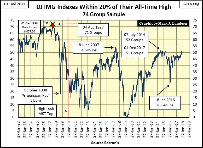
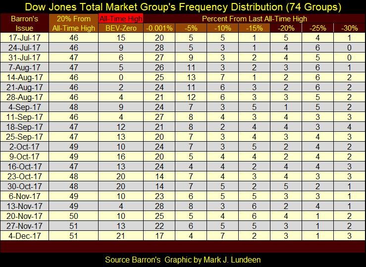
This ingrained bullishness in the markets won’t last forever, but darn if I know when it’s going to stop. Look at the Dow Jones Total Market Groups (DJTMG)’s top 20. In the past, I said the 52 seen in Barron’s 27 July 2014 issue would prove to be the high for the post-March 2009 advance. And for the past three and a half years it sure looked as if this 52 would hold.
© Mark Lundeen
Then three weeks ago the top 20 climbed to 50, and in the past two weeks, it increased to 51 of 74 groups within 20% of their last all-time highs. Here’s the frequency table where this data is constructed.
© Mark Lundeen
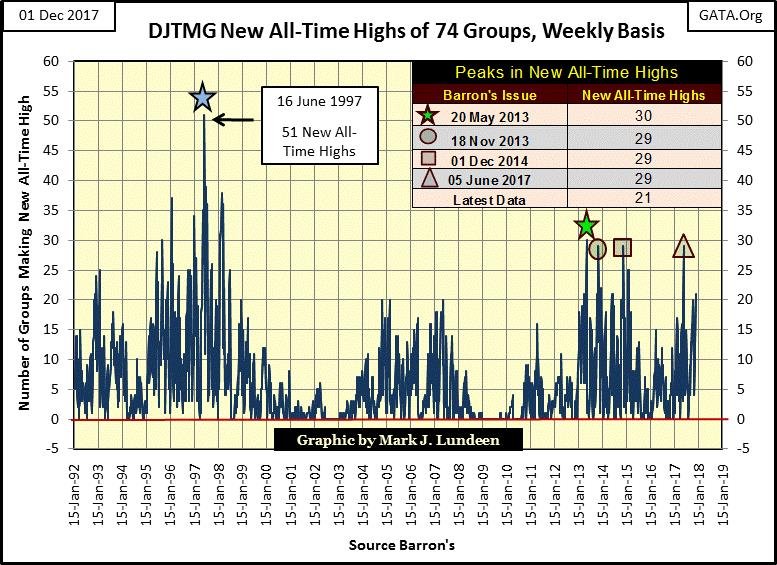
This week there were 21 new all-time highs (BEV Zeros) in the 74 groups of the DJTMG I follow, the most since mid-July. In the chart below we see how new all-time highs peaked at 30 in Barron’s 20 May 2013 issue, and this series saw 29 three times since then. But seeing the DJTMG making a large number of new all-time highs is something it typically does in the first 2/3rds of an advance, and then tapers down as the bull market matures and then ends.
Looking at the BEV Zeros in the table above and in the chart below, that’s something that isn’t happening in the second half of 2017; almost nine years after the beginning of the current advance. Small wonder the Consensus Index seen above has been so bullish for the past few years.
Right now I’m watching to see how much higher the DJTMG’s top 20 and new all-time highs will go before this monster-of-a-bubble in the market begins to deflate, which one day it most certainly will.
© Mark Lundeen
At this late stage of our monster move, I’m not recommending anyone to enter the stock market, but I understand why someone would. For me, the financial markets are strictly a spectator sport. I’m cheering for the bulls, but I know the bears will ultimately win this game.
Markets are basically perverse and sadistic. March 2009 was the time to enter the stock market, but few (including me) did for fear of further market declines. Nine years into the current advance, people are once again excited about an advance in the stock market that began in 2009.
The big money has already been made in this advance. Still, a growing number of people believe the stock market is currently a strong buy, now that the Dow Jones broke above 24,000 this week. But using history as a guide, the average investor has about as much chance of making and taking profits out of the market as they do from Las Vegas because they don’t know when it’s time to leave the party.
Most people don’t know when to come to the party either, which as 2017 nears its end, gold, silver and their miners look very attractive compared to the broad market as seen above with the Dow Jones.
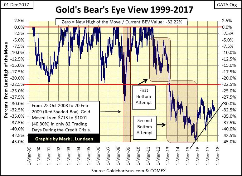
Gold made a hard bottom in December 2015 and has been rising since, with strong support at its rising trend line I placed on the chart. No one really knows what the future will bring. I sure don’t! But if you’re going to be successful in making money in the markets, you must anticipate what might be, and enter early in a big advance that you ride out to its end.
I interpret the post-December 2015 chart action below as the early stages of a big powerful move in the price of gold and silver that will last many years. The only thing needed for the old monetary metals to take off is for the financial markets to begin having problems, begin seeing extreme days of volatility and market breadth. But until then, just seeing gold hold on to its current gains is a very good sign of the profitable things to come in owning gold and silver bullion.
© Mark Lundeen
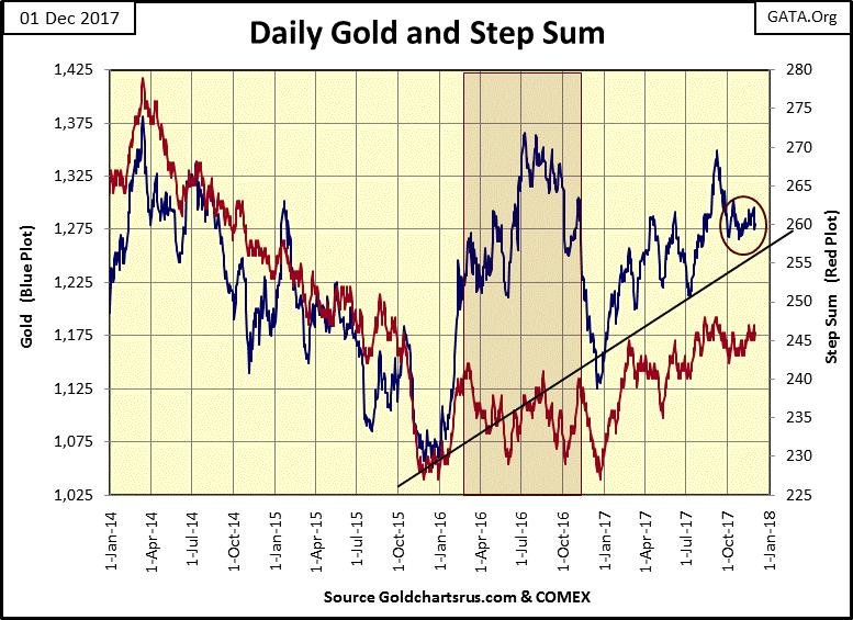
Here’s gold and its step sum, both made important bottoms in December 2015 & 2016. So far in 2017, it appears gold and its step sum are not planning to repeat that pattern. Also, since early October the price of gold hasn’t done much. It can’t get much above its $1275 line, but then so far it also refuses to go much below it.
Being a big bull on gold and silver, of course, I want to see gold take out the $1375 peak from March 2014. But I wouldn’t be surprised if the bears made an attempt to take out the lows of last December ($1125). I don’t think they would succeed should they attempt it, but technically a failed bear attack on the price of gold could do the bulls some good.
One thing for sure, we’ll see a break out of the tight price range found in the circle. An up or down break out I can’t say, but in either case, the long-term outlook for gold and silver is bullish.
© Mark Lundeen
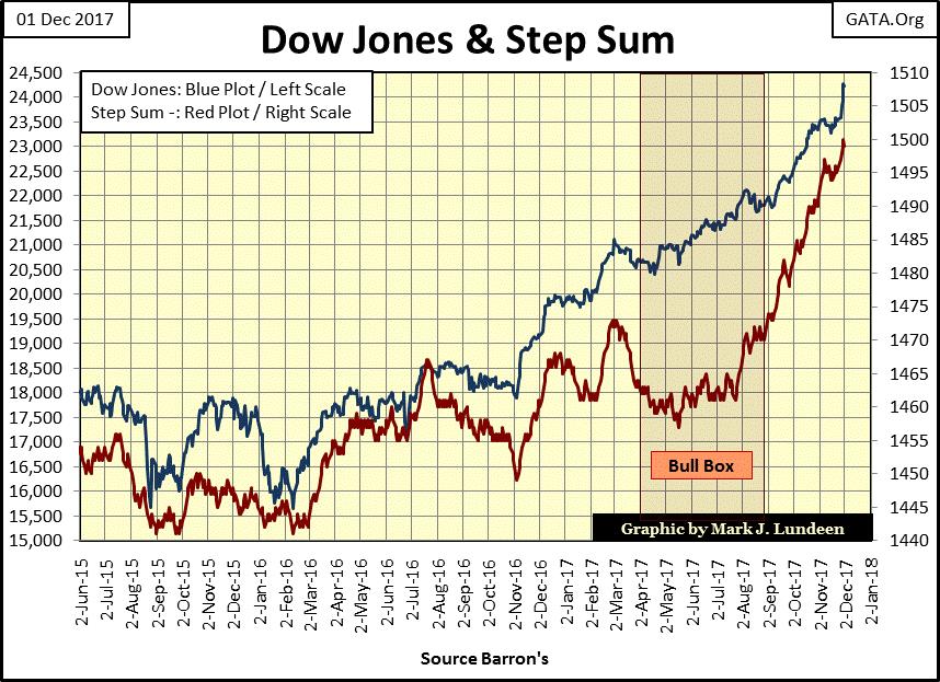
Here’s the Dow Jones with its step sum. What’s there to say? After the Dow Jones’ bull box was closed in late August, the Dow Jones has seen an overwhelming number of daily advances (rising step sum) and the Dow Jones has benefitted greatly from them.
© Mark Lundeen
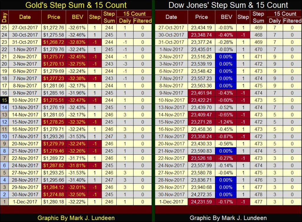
On gold’s side of the step sum table below we see the daily churning in the gold market. About as many down days as advances in the price of gold range bound between $1268 and $1295.
© Mark Lundeen
On the Dow Jones side of the table, the power of the current advance is on display. In late October and early November, the daily 15 counts were either a 7 or a 9, counts (only 4 or 3 down days during a 15 trading day sample). Since then the Dow Jones broke above 24,000 with its 15 counts declining to the 3s & 5s. This is a freight train coming down the track.
As 2017 draws to its close, and the beginning of 2018 is at hand, a review of some of the technical charting tools I used is in order. So, first let’s review my Bear’s Eye View (BEV) charts. The following explanation is a bit technical, but it’s only one paragraph, so bear with it as understanding it will prove worth any time taken.
The BEV chart displays a market series as Mr. Bear sees it: each new all-time high is equal to a big fat zero to Mr. Bear, a 0% in a BEV plot, or as I call them BEV Zeros. All Mr. Bear cares about is how many percentage points he can claw back from each all-time highs the bulls achieve. So, in a BEV plot, any data point not an all-time high is expressed as a percentage decline from its last all-time high.
In effect, a BEV plot compresses price data within a range of 100 percentage points:
- 0% = New All-Time High
- -100% = Total Wipeout in Valuation.
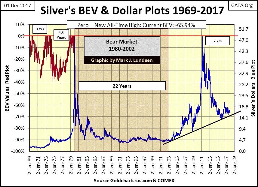
An excellent data series to examine a BEV plot is silver’s daily price going back to 1969. In the chart below I’ve plotted silver in both dollars (Blue Plot / Right Scale) and in a BEV format (Red Plot / Left Scale). Notice how the red BEV plot disappears after January 1980. That’s because the dollar scale was calibrated so silver’s last all-time high ($48.70 / 17 January 1980) touches the BEV scale’s 0% line, and uses $0 to match the BEV -100% line.
Aligning the two scales in the silver chart below as I have, it becomes obvious how the chart action as seen in dollars, or in BEV format (% decline from a last all-time high) is identical between all-time highs. As silver’s last all-time high (BEV Zero) is still its $48.70 from 16 January 1980, the two plots have over lapped for the past four decades.
© Mark Lundeen
Why hadn’t the two plots overlapped from 1969 to 1980? Because silver saw many new all-time highs during these eleven years, pushing the blue dollar plot up from $1.85 in January 1969 to $48.70 in January 1980. For the red BEV plot, each new all-time high in the BEV plot registered only a 0%, and never more. With a BEV plot, data points not a new all-time high are expressed as a percentage decline from its last all-time high. From 1969 to January 1980, besides the new all-time highs, the price of silver never saw a decline of 40%, and that’s what we see with silver’s red BEV plot.
So, the blue plot shows the gains silver had made in dollars from 1969 to 1980, while the red plot shows new all-time highs and the percentage declines from those all-time highs. It just happens with silver’s last all-time high from decades ago; it’s possible to overlay its BEV plot with its dollar plot going back to January 1980.
That’s interesting, but what’s the big deal using a BEV plot? For silver, it’s not a big deal, as decades of inflation flowing from the Federal Reserve has somehow avoided the price of silver for a long time. The closest silver came to taking out its last all-time high was on 29 April 2011, when it closed at $48.58, 13 cents short of making a BEV Zero (new all-time high).
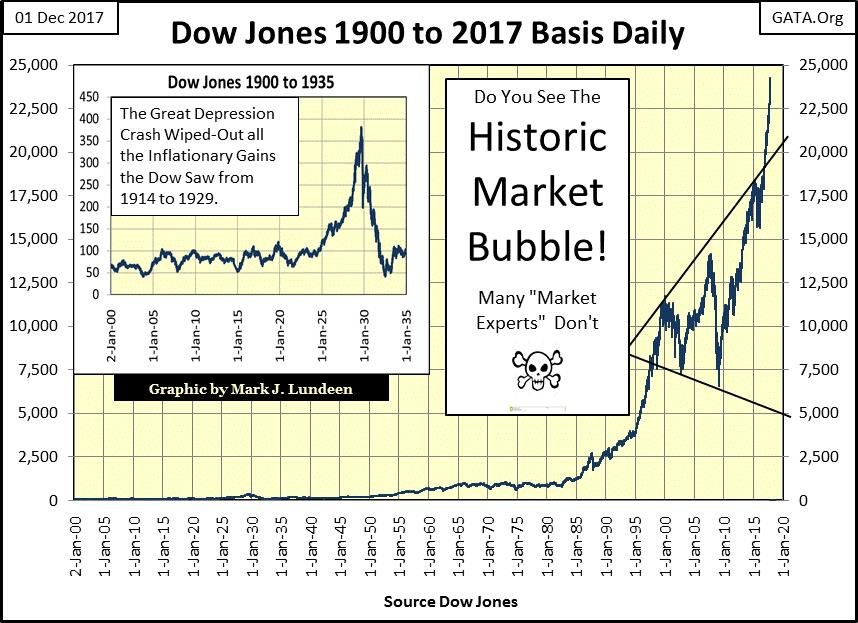
But one market series that hasn’t had any problems making a new all-time high is the Dow Jones, and price data for the Dow Jones goes back to February 1885. Here’s a daily chart for the published values of the Dow Jones going back to January 1900. Monetary inflation flowing from the Federal Reserve has made price data previous to 1985 meaningless in this chart.
I could have included the data going back to 1885, but what would be the point in that? The greatest bear market in history, the Great Depression Bear Market would go unnoticed if I hadn’t inserted it in a separate graphic in the chart.
The obvious thing in this chart is how the Federal Reserve has inflated a bubble in the stock market (the bond and real estate markets too). When this bubble begins deflating in earnest, it will devastate private and institutional wealth on a scale not seen since the 1930s, and possibly worse. Don’t think so? The Great Depression happened only after the Federal Reserve inflated the markets from 1925-29. The Federal Reserve has been inflating the current bubble since August 1982.
© Mark Lundeen
Understand that monetary inflation has rendered most of the historical price data displayed on the chart above, previous to 1985 incomprehensible. What relationship does the 1973-74 bear market, the first 40% decline in the Dow Jones since April 1942 has with the monetary bubbles blown into the stock market by Alan Greenspan since he became Fed Chairman in August 1987?
This is true for many other market series valued in dollars, if not (yet) silver. Market data corrupted by decades of “monetary policy” is tailored made for analyzing with a BEV plot, as seen with the BEV plot of the Dow Jones going back to February 1885 below.
By compressing the decades of Dow Jones daily data plotted above within the 100% range allowed in a BEV plot; with 0% being new all-time highs, and -100%, being a total wipeout in market valuation, interesting details in the stock market can be made.
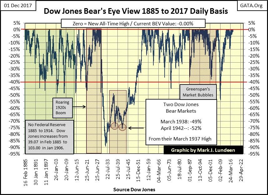
© Mark Lundeen
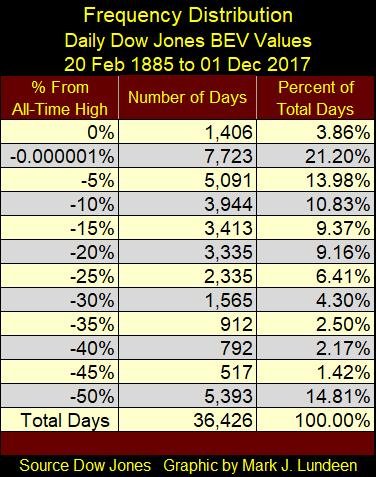
By using the Frequency Distribution function available in MS Excel, I’ve constructed the table below listing the number of days the Dow Jones has closed within a defined range of percentage declines allowed by the BEV plot. Of the 36,426 trading sessions the NYSE has seen since February 1885, the Dow Jones has closed at a BEV Zero (new all-time high) in only 1406 of them, or 3.86% of the total trading sessions.
That’s of interest to us as since 08 November 2016’s presidential election (267 NYSE trading sessions ago), the Dow Jones made new all-time highs in 80 of them or 30% of the NYSE trading sessions of the past year. For those who believe the market action of the past year is historically normal and can be sustained; well it’s not and so won’t be.
The -0.000001% row in the table below is there to catch any Dow Jones close that’s only a penny away from making a new all-time high. This row contains the daily closes from just a whisker away from becoming a BEV Zero, down to -4.99% from being one.
© Mark Lundeen
When taking the 0% and the -0.000001% rows together, from 20 February 1885 to 01 December 2017, 25.06% (1 of 4) Dow Jones daily closings occurred at a new all-time high, or within 5% of one. That’s pretty bullish but then look again at the massive bubble (1982-2017) in the Dow Jones chart above priced in dollars. Just keep in mind that there were also plenty of days where the Dow Jones closed well below 50% from a BEV Zero.
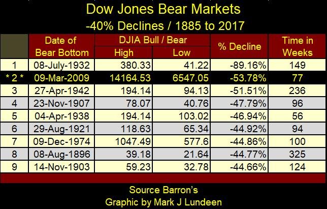
Returning to the Dow Jones BEV chart above; since 1885, whenever the Dow Jones had declined by 40% (a 40% Bear Market), the stock market was approaching a bear market bottom, and a very profitable reentry point was soon to be had.
The table below lists the Dow Jones 40% Bear Markets, based on the BEV plot seen above. I also included the Dow Jones valuations for the last BEV Zero, or Terminal Zero (TZ) for the previous bull market and the market lows of the following bear market. In the table we see the sub-prime mortgage bear market, with its 53.78% decline, was the second deepest decline in the Dow Jones since 1885.
Here’s something to consider; in the 1890s the Dow Jones saw a 40% bear market with a decline of only 17.54 dollars. But that was years before Congress created their central bank in 1913, aka the Federal Reserve. Today, after decades of the Federal Reserve’s “monetary policy” eroding the dollar’s purchasing power, for the Dow Jones to see a similar 44.77% decline, it would have to lose 10,867 points and close at 13,405.
© Mark Lundeen
Of course, any rule that simple has to have exceptions to it, and in the table above it’s the Great Depression Bear Market’s 89.16% market decline. But amazingly, since 1885 it’s the only exception to this 40% rule – so far anyway.
So, what are the implications for this exception of the Great Depression Bear Market? It illustrates the perils to wealth from a massive-deflationary bear market, the consequences of unrestrained “injections of liquidity” the stock market sustained in the 1920s by the Federal Reserve.
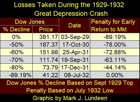
The following table shows the bear-market mathematics of the Great Depression Crash. In October 1930, a year into the crash, the Dow Jones finally broke below 50% from its bull market high of a year earlier, from 381.17 to 187.37. But the ultimate low for the Dow Jones came in July 1932 at 41.22.
Here’s an example of the dangers of returning to early in a market during a catastrophic-deflationary collapse, e.g. the Great Depression’s 89% market decline. For someone entering the market in October 1930 using a buy and hold strategy and believing a 50% decline in the stock market offered them a profitable reentry into the market, two years later they discovered that they had lost 78% of their invested capital (table below).
Even reentering the market in December 1931 with the Dow Jones down to 73.79, and six months before the ultimate bottom of the Great Depression Crash, reentry into the stock market with the Dow Jones down 80% still resulted in a 44% loss by the following July.
© Mark Lundeen
What a nightmare the early 1930s were to investors! And the glamor stocks of the Roaring 1920s, the automobile manufacturers, radio, and broadcast network companies fared no better than I suspect Google or Apple will in the coming deflation.
Based on this week’s last all-time high for the Dow Jones, the following table lists the specifics for a 95% market decline in the Dow Jones. Why a 95% market decline? I’m that bearish on the coming bear market, though with the Dow Jones doing so well for years now, I admit this is an extreme case.
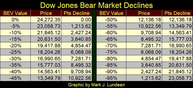
© Mark Lundeen
The mathematics in this table are grizzly, and I hope it doesn’t happen. But for decades now the financial markets have been manipulated by politicians, bankers, and academics for their own purposes, which had nothing to do with the efficient flow of capital into the productive economy seeking an honest return. The table above could very well be a consequence of this official-sector meddling in the market, as well as gold and silver prices (precious metals mining shares too) rising far above where anyone today believes possible.
But in any case, I hope my little primer on the Bear’s Eye View (BEV) on the price of silver and of the Dow Jones was helpful. New week we’ll look at the step sum.
—
DISCLAIMER: This article expresses my own ideas and opinions. Any information I have shared are from sources that I believe to be reliable and accurate. I did not receive any financial compensation in writing this post. I encourage any reader to do their own diligent research first before making any investment decisions.

-

 Fintech2 weeks ago
Lutech Acquires Talentomobile to Boost European Fintech Expansion
-

 Cannabis2 days ago
Germany’s Cannabis Legalization Struggles to Curb Black Market
-

 Africa1 week ago
Why Small Businesses in the MENA Region Struggle to Scale Despite Access to Finance
-

 Business4 days ago
The Everything Bubble and the Fed’s Fragile Endgame


You must be logged in to post a comment Login