Featured
Markets May Have a Top Into August/September but It Can Drag Into October
Our theme this week is bear markets. We cite BlackBerry as a prime example of a long bear market that is not yet finished. The rise and even more spectacular fall of BlackBerry has been the subject of books and movies. We then look at the bear markets of 1929-1942, 1966-1974 and 2000-2009 to try and figure where we are now. We are still early working on the first major wave to the downside.

We recently saw the film BlackBerry (2023), the story of the stunning rise and disastrous fall of the world’s first smartphone. A classic tale of how hubris and arrogance brought down a company.
On June 29, 2007, Apple (AAPL) introduced the iPhone. BlackBerry (BB) stock initially dropped but then sharply recovered when the market appeared to believe that BB would survive the iPhone. On June 19, 2008, BB topped for the last time at the lofty price of $150, after coming from $2.20 in 2002. By December 2013, BB had fallen 96%. The iPhone, followed by Android, swiftly overtook and then surpassed the BlackBerry. At its peak, Blackberry held 45% of the cell phone market. Today, it holds nothing. Cybersecurity is their current focus. Some people still cherish their old BlackBerry.
Our focus here is not so much on BlackBerry itself but on clear waves that developed over time. BlackBerry’s wave structure is not dissimilar to the waves seen in major bear markets. There were differences, of course, but the overall picture is similar. The purpose here is to use the information from these bear markets and apply it to today’s bear market that, overall, we believe is still in its early stages.
What was seen with BlackBerry is quite similar to what we witnessed in bear markets in 1929–1942, 1966–1975, 2000–2009 and what we may be seeing with today’s still-unfolding bear market. The chart of BlackBerry topped in June 2008 at $150.30. Its first wave down was a sharp 70% decline into December 2008 (1). Then came the rebound 2 wave. The wave impressed, gaining 108% into June 2009, but not only did it fail to reach the June 2008 top, it was well short. Still, it gained 108%. Then came the big decline that ultimately didn’t bottom until December 2013. The decline was 94% from the June 2009 top and 96% from the June 2008 top.
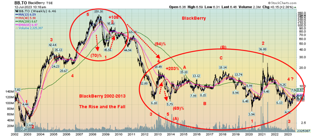
What’s key here is that following a big top there is an initial decline followed by a rebound. We sometimes refer to that as the hook that gets everyone back in, thinking that the recovery is on. Once the rebound wave is complete, the really big decline gets underway. That decline normally completes what we refer to as the primary wave to the downside (A). Then what normally follows is the (B) wave up. Those (B) waves can last months and even years. BlackBerry’s may not be finished. Once complete, the final (C) wave gets underway. Or it may already be underway, depending on how one interprets the wave structure. Currently, BB appears to be trying to rise again. However, if that’s correct, it should fail that previous high and then move to new lows.
Our table below summarizes these waves for the bear markets of 1929–1942, 1966–1975, and 2000–2009. All followed similar patterns, even if the absolutes may not be the same.
BlackBerry and the Great Bear Markets
| Bear market | Primary (A) wave decline | Primary (A) wave time period | Primary (B) wave rebound | Primary (B) wave time period | Primary (C) wave decline | Primary (C) wave time period |
| BlackBerry 2008–? | (96)% | June 2008– December 2013 (66 mos.) | 213% | December 2013–January 2018 (49 mos.) | ? | January 2018–? |
| 1929–1942 (1) | (89)% | September 1929–July 1932 (34 mos.) | 372% | July 1932–March 1937 (56 mos.) | (52)% | March 1937–April 1942 (61 mos.) |
| 1966–1974 (2) | (36)% | February 1966–May 1970 (51 mos.) | 70% | May 1970–January 1973 (32 mos.) | (53)% | January 1973–December 1974 (23 mos.) |
| 2000–2009 (3) | (39)% | January 2000–October 2002 (33 mos.) | 97% | October 2002–October 2007 (60 mos.) | (54)% | October 2007-March 2009 (17 mos.) |
| 2022–? | (22)% to date | January 2022–? | ? | ? | ? | ? |
| Average 3 Bear Markets ((1) to (3) | (55)% | 39 mos. | 180% | 49 mos. | (53)% | 34 mos. |
For consistency, we use the Dow Jones Industrials (DJI). Other indices such as the S&P 500 (SPX) and the NASDAQ (Q) follow similar patterns, but the percentage gains and losses can differ.
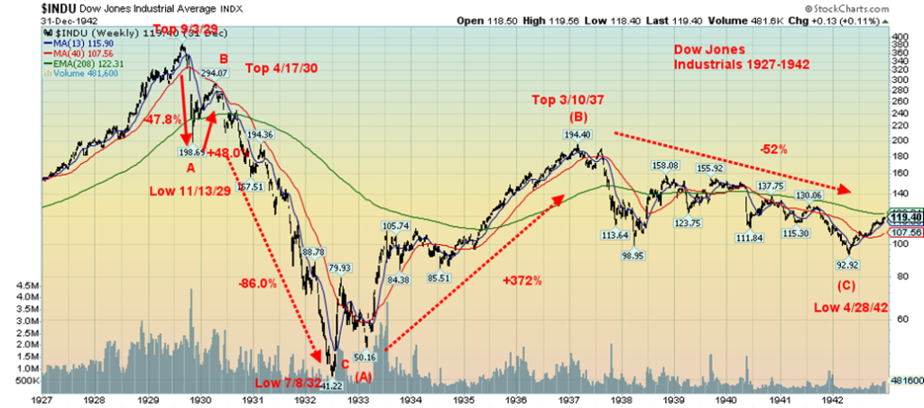
Our first chart below shows the DJI of 1927–1942. This followed the classic pattern seen with BB. The DJI first topped in September 1929, followed by a crash that first bottomed in November 1929, a decline of 47.8%.
Then came the hook. The rise from November 1929 to April 1930 was an impressive 48% but it failed miserably.
It was followed by perhaps one of the most devastating declines seen in the history of stock markets. From April 1930 to the final low in July 1932 the DJI fell 86%. In total, the DJI fell some 89% from September 1929 to that low in July 1932. That completed primary wave (A) to the downside. Next came the (B) wave. As spectacular as the decline was, the (B) wave was equally spectacular but to the upside. The DJI gained 372% from July 1932 to a top in March 1937. For many, it constituted a new bull market. That the rise, spectacular as it was, did not see new highs suggested that when it was complete another decline would get underway. The secondary depression of 1937–1938, followed by World War II, saw the DJI fall 52% from March 1937 to April 1942 in a series of choppy ups and downs with the trend consistently down. The first wave down during 1937–1938 saw the DJI lose over 50%.
That bear market was actually followed by another rise into May 1946 that saw the DJI gain 129%. However, once again it was followed by a post-war decline into June 1949. The decline was relatively shallow as the DJI only lost in total some 24%. It took until 1954, a period of 25 years, before the DJI finally took out the 1929 high on a nominal basis. On an inflation-adjusted basis, it took until 1959 to finally beat 1929. For Elliott Wavers, it was the completion of a long ABCDE-type of a bear market correction.
Dow Jones Industrials 1927–1942
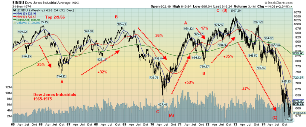
The next bear market was the long bear market from 1966 to 1974. As with the 1929-1942 bear, it was not finished. Two more waves took it until 1982 to complete the ABCDE bear. We present the key period of 1966–1974 next. The bull market of 1949–1966 topped out in February 1966. Note we are not focusing on what drove the bull or bear markets, merely the key tops and bottoms and the wave structure. The initial A wave down was only 25%, lasting from February 1966 to July 1966. The B wave or the hook, as we like to refer to it, was an ABC structure that lasted until November 1968. The gain was unimpressive: 32%. But it lasted over two years as many thought we were embarking on a new bull market. The high of the wave largely equaled the high of February 1966 at 985 vs. 995. The C wave down was no match for the 1930–1932 C wave as it lost only 36%. Overall, the primary (A) wave down from February 1966 to May 1970 saw the DJI lose only 37%.
The intermediate (B) wave featured the rise of the “Nifty Fifty” as the DJI gained an overall 70% from May 1970 to January 1973. It was, however, a long bull, and no surprise that many believed we were embarking on a new era and a long-term bull market. That the rally printed new all-time highs at 1,067 convincing many that the new era and new bull market were underway. It was derailed by the Watergate crisis and the Arab oil embargo. Down we went for the primary (C) wave. That wave lasted from January 1973 to the final bottom in December 1974 as the DJI fell in five waves, losing 47%. Others, including SPX, lost even more.
As with the 1929–1949 bear market, this bear wasn’t finished yet and unfolded in an ABCDE-type pattern. The D wave lasted from December 1974 to September 1976 and saw the DJI gain 80%. The final wave down was an awkward up-and-down affair that actually saw the DJI make its final nominal low in March 1980. But for many, the final low didn’t come until August 1982 as the DJI made higher lows but other indices made lower lows. Overall, it was only a 29% decline in nominal terms, but in inflation-adjusted terms it was 73%. This was a period of high inflation and 20% interest rates. On an inflation-adjusted basis, the August 1982 low took the DJI back to 1949. It took until the latter part of 1982 to take out the high point of the bear market seen in January 1973. On an inflation-adjusted basis, it was even worse, taking until 1995 before we finally beat the high.
Dow Jones Industrials 1965–1975
The bear market of 2000–2009 is probably the freshest on investors’ minds. This bear market included the high-tech/dot.com crash of 2000–2002 and the financial crisis of 2007–2009. In between was once again what many would call a new bull market. After all, the DJI did see new highs and it lasted five years, from 2002–2007. But the SPX only roughly equaled its 2000 high and the NASDAQ wasn’t even close to its former high seen in 2000.
This bear differed from the others in a few ways. The top for the DJI came in January 2000. The SPX and the NASDAQ followed with their tops in March 2000, at the time a divergence. The DJI A wave lasted from January 2000 to October 2001. The 9/11 attack helped trigger that C wave down to complete intermediate wave A. All told, the A wave was a very choppy affair until the final plunge from May 2001 to the low in October 2001. Overall, the A wave lost 31%. The NASDAQ lost 77%. The B wave hook that again had everyone thinking it was over lasted until March 2002 as the DJI gained 32%. However, it was nowhere near previous highs. The final plunge saw the DJI lose about 33% to its low in October 2002. Pity the NASDAQ as altogether it lost 78%, resembling more the DJI of 1929–1932.
Dow Jones Industrials 1999–2009
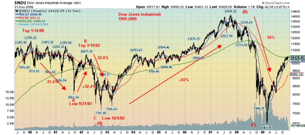
Slashing interest rates and providing oodles of liquidity helped set up the primary (B) wave that saw the DJI gain 97% from October 2002 to the top in October 2007. This wave most closely resembled the 1932–1937 (B) wave except in terms of the percentage gain. The SPX gained 102% but, as noted, the October 2007 high was only slightly above the high of March 2000. The NASDAQ wasn’t even close to its old high, even though it gained 157%. Nonetheless, the financial crisis of 2008 saw the DJI plunge 54%, the SPX lose 57%, and the NASDAQ 56%. The bottom came in March 2009.
The bear market of 2000–2009 did not see clear new highs for the DJI until early 2013 on a nominal basis. On an inflation-adjusted basis, it took until August 2013 to reach those new highs.
Our final chart shows the current unfolding bear market. It took nine months, which is fairly normal for an intermediate wave. The unfolding B wave, or the hook as we call it, has broken the downtrend of the A wave down. This suggests we are embarking on a new wave to the upside. Could it last as long as the others did? In the 1929–1932 bear, the B wave hook only lasted from November 1929 to April 1930—five months. During the 1966-1975 bear the intermediate B wave up lasted over two years July 1966 to November 1968. Intermediate waves can last months or even more than a year. So far, we are nine months in. We continue to look for a potential high into August/October. However, we freely admit it could last into 2024.
That first wave down was a very choppy affair, lasting from January 2022 to June 2022. The second wave up topped out in August 2022. The final wave down bottomed in October 2022. Altogether, the DJI lost only 22%. Expectations on this B wave up are that we could equal the January 2022 high or slightly higher. However, so
far, the markets are diverging as the SPX and NASDAQ are clearly outperforming the DJI and its sister the Dow Jones Transportations (DJT).
Dow Jones Industrials 2022–Present
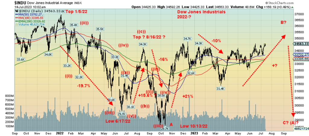
We believe the current unfolding of the first big wave to the downside is similar to the big drop in September 1929 to July 1932, February 1966 to April 1970, and January 2000 to October 2002. All this suggests that what we have to watch for is the top of the current up wave or B wave unfolding, followed by the C wave to downside that may not find a bottom until sometime in 2024 or even later. The narrowness of the rally, the divergences amongst the indices, and a falling put/call ratio in favor of calls all point to a market that’s now on borrowed time, even as it does appear to be broadening out somewhat.
As the table shows, the average length of the primary A wave of previous bears was 39 months but the range was 33 months to 51 months. Two-year-plus bear markets are not unusual. Given those ranges, this bear could last anywhere from January 2022 to October 2024 to April 2026. This would fit well with our 90-year cycle (due 2022) and the current 18-year cycle that dates from March 2009 and due to bottom 2027 +/- 3 years according to cycles analyst Ray Merriman (www.mmacycles.com). While the 90-year cycle is due in 2022 (dating from the last one that bottomed in 1932), it has a very wide range and even overlaps with the 72-year cycle that bottomed in 2009.
In the bigger picture, with previous long bear markets lasting anywhere from nine years (2000–2009) to 20 years (1929–1949) or in between 16 years (1966–1982), this one has some time to play out. The 2000–2009 bear played out as three primary waves (ABC), but both the 1929–1949 bear and the 1966–1982 bear played out as five primary waves (ABCDE). All fit the Elliott Wave description of bear markets. So far, we appear to have only completed one intermediate wave to the downside and we are working on the second intermediate wave to the upside. The third, and potentially more devastating intermediate wave to the downside is yet to come. How low do we go? Some say as much as an 80% drop overall, which would be comparable to the 1929–1932 bear and definitely more than 1966–1970 and 2000–2002.
Old boy scout motto—Be Prepared. C waves are dangerous.
Chart of the Week
The Job Numbers – U.S. and Canada
Yes, the job numbers came out a week ago while we were away on holiday. But they are still worth talking about. Continued strong job numbers are playing a key role in keeping the Fed and the Bank of Canada (BofC) with their foot on the interest rate hike pedal. The BofC confirmed that with another interest rate hike of 25 bp on July 12, 2023, to 5%. The odds remain high that the Fed too will hike another 25 bp at the July 25–26 FOMC. Irrespective of this, many believe it will be the last one.
Last Friday’s nonfarm payroll (NFP) showed a gain of 209,000 jobs, below the expected 225,000. There were downward revisions to the two prior months’ NFP by 110,000. Previously, the May NFP was reported as 306,000. But in Canada, the shocker was a big jump of 59,900 jobs in June, well above the expected 20,000 and the previous one of a loss of 17,300 jobs. Private sector jobs took a hit in June in the U.S. as it produced only 149,000 jobs vs. an expectation of 200,000 and the previous month’s 259,000. Government jobs made up the rest. Full-time employment rose by 382,000 while part-time employment fell by 262,000. Again, in Canada it was a barn buster as full-time employment rose by 109,600 while part-time employment fell by 49,800. Are leisure and hospitality jobs moving to full-time, or are there just not as many?
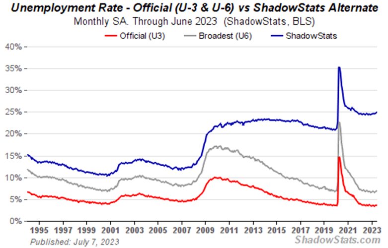
The U.S. unemployment rate (U3) fell to 3.6% from 3.7%, but the U6 unemployment rate (short-term discouraged and other marginally-attached workers as well as those forced to work part-time because they cannot find full-time employment) rose to 6.9% from 6.7%, the highest since August 2022. The Shadow Stats (www.shadowstats.com) unemployment rate (U6 plus “discouraged workers”, defined away in 1994 during the Clinton administration and unemployed longer than one year) rose to 24.9% from 24.7%. That was the highest since October 2021.
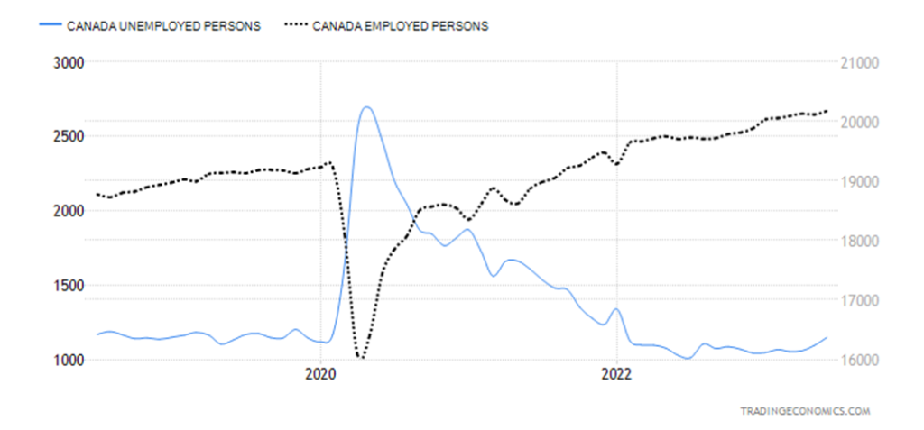
Canada – Employed and Unemployed Persons 2018–2023
The U.S. labor force participation rate remained unchanged at 62.6% but rose for the important 25–54 age group to 83.5% from 83.0%. The employment-population ratio was also unchanged at 60.3%. Also to note was that the civilian labor force rose by only 133,000 while the population level (all those eligible to work) rose by 183,000. Significantly, the number of those not in the labor force fell by 1,025,000 to 98,891 thousand. Not sure where they all went, but obviously some went to work. Retirees number some 58.9 million and those who are disabled number some 8.7 million, according to the U.S. Debt Clock (www.usdebtclock.org).
In Canada, the labor force participation rate rose to 65.7% from 65.5%. Canada’s unemployment rate was 5.4% (it’s no surprise it rose with more participating) while the R8 unemployment rate (plus discouraged searchers, waiting group, and portion of involuntary part-timers), the highest reported by Statistics Canada (www.statcan.gc.ca) was 7.1%, a decrease from the previous month’s 7.2%. Interestingly, the number of employed persons in Canada rose by 59,900 in June while the number of unemployed persons rose by 54,100. The rise in unemployed persons reflects the rise in the labor force participation rate.
One source of confusion was the U.S. ADP employment report that came out the day before the NFP report. The ADP report showed a gain of 497,000 in June, well above the expected 228,000. That surprise sparked a sell-off in gold and a jump in interest rates. One of the biggest differences between the two reports was that the ADP showed a huge jump for the leisure and hospitality group of 200,000 vs. the Bureau of Labour Statistics (BLS) report which showed only 21,000. The ADP report is produced by Moody’s Analytics from payroll files. The BLS produces theirs from a population survey (surveys from households) and from employer’s data (current employment statistics of business). The ADP report leaves out data on strikes or other changes, whereas the BLS report picks those up. About a quarter of the time the two reports are fairly matched and over time they tend to merge. We view this month’s ADP report as an anomaly that will eventually balance out.
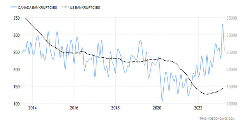
In both instances, the reports suggest a slowing economy but not a recessionary one. Consumers appear to have shrugged off high interest rates and we are seeing increased travel (hardly recessionary) and steady retail sales. Employment is slowing but is nowhere near recessionary. Business bankruptcies are rising in both countries (Canada is the highest in a decade and actually approaching levels seen during the 2007–2009 recession). But in the U.S., it is just starting to rise and remains well below levels seen for most of the past decade. Consumers are having trouble with mortgages and there has also been a rise in consumer bankruptcies, but, again, it’s not yet a panic.
Canada and U.S. Business Bankruptcies 2013–2023
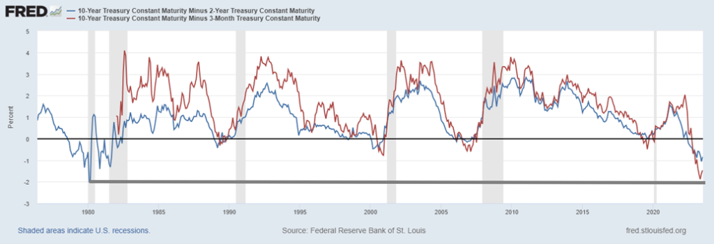
But the inverted yield curves are still predicting a recession. A reminder, however, that a recession doesn’t usually start until at least 6–12 months after the spreads bottom. Have they bottomed? That’s not conclusive yet, but by this chart, we could be looking for the end of 2023, the beginning of 2024, or even out to a year from now before we will see a recession. Many expect only a mild recession, although some are in the hard landing camp. So, we are slowing. But recession? What recession? Not yet, anyway.
U.S. 10-year treasury note minus 2-year U.S. treasury note (Blue) and 3-month U.S. treasury bill (Red) 1976-2023
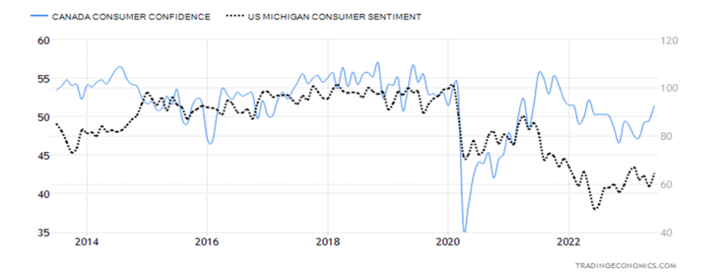
Even consumer confidence has improved (more travel?), even as it remains at decade-level lows.
U.S. and Canada Consumer Confidence 2013–2023
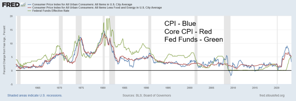
Finally, inflation is slowing as well as witnessed by the June CPI. The June CPI year-over-year (y-o-y) came in at 3%, below the consensus of 3.1% and below May’s 4%. Core CPI (less food and energy) was y-o-y 4.8% vs. the expectation of 5% and May’s 5.3%. With core inflation remaining high and higher than the fast-falling CPI, this suggests that inflation is going to remain an ongoing problem. Inflation is coming down, but we remind ourselves that, initially, after a spike in inflation in 1970s, followed by a subsequent drop, inflation surged again to even higher levels. Doesn’t necessarily mean it will happen this time, but it’s something to keep in mind. Given ongoing supply problems, wage demands, rising oil prices, and more, inflation may well be approaching a bottom and getting back to 2% could prove to be sticky. Will this change the Fed’s thoughts of another interest rate hike? Not likely. Eventually, the job market will teeter more than it has so far.
CPI, Core CPI, Fed Funds 1960–2023
Markets & Trends
| % Gains (Losses) Trends | ||||||||
| Close Dec 31/22 | Close Jul 14, 2023 | Week | YTD | Daily (Short Term) | Weekly (Intermediate) | Monthly (Long Term) | ||
| Stock Market Indices | ||||||||
| S&P 500 | 3,839.50 | 4,505.42 (new highs) | 2.4% | 17.3% | up | up | up | |
| Dow Jones Industrials | 33,147.25 | 34,509.03 | 2.3% | 4.1% | up | up | up | |
| Dow Jones Transport | 13,391.91 | 15,826.95 (new highs) | 1.5% | 18.2% | up | up | up | |
| NASDAQ | 10,466.48 | 14,113.76 (new highs) | 3.3% | 34.9% | up | up | up | |
| S&P/TSX Composite | 19,384.92 | 20,262.07 | 2.2% | 4.5% | up | neutral | up (weak) | |
| S&P/TSX Venture (CDNX) | 570.27 | 628.44 | 2.2% | 10.2% | up | up | down | |
| S&P 600 (small) | 1,157.53 | 1,236.66 | 3.1% | 6.8% | up | up | neutral | |
| MSCI World | 1,977.74 | 2,201.73 (new highs) | 5.1% | 11.3% | up | up | up (weak) | |
| Bitcoin | 16,531.31 | 30,140.21 | (0.7)% | 82.3% | up | up | neutral | |
| Gold Mining Stock Indices | ||||||||
| Gold Bugs Index (HUI) | 229.75 | 246.63 | 8.0% | 7.4% | up | neutral | down (weak) | |
| TSX Gold Index (TGD) | 277.68 | 292.04 | 7.3% | 5.2% | up (weak) | neutral | down (weak) | |
| % | ||||||||
| U.S. 10-Year Treasury Bond yield | 3.88% | 3.83% | (6.1)% | (1.3)% | ||||
| Cdn. 10-Year Bond CGB yield | 3.29% | 3.37% | (5.6)% | 2.4% | ||||
| Recession Watch Spreads | ||||||||
| U.S. 2-year 10-year Treasury spread | (0.55)% | (0.94)% | (8.1)% | (70.9)% | ||||
| Cdn 2-year 10-year CGB spread | (0.76)% | (1.29)% | (4.0)% | (69.7)% | ||||
| Currencies | ||||||||
| US$ Index | 103.27 | 99.61 (new lows) | (2.3)% | (3.5)% | down | down | up | |
| Canadian $ | 73.92 | 75.76 | 0.4% | 2.5% | up | up | down (weak) | |
| Euro | 107.04 | 112.26 (new highs) | 2.4% | 4.8% | up | up | neutral | |
| Swiss Franc | 108.15 | 115.97 (new highs) | 3.1% | 7.2% | up | up | up | |
| British Pound | 120.96 | 130.91 (new highs) | 2.0% | 8.2% | up | up | neutral | |
| Japanese Yen | 76.27 | 72.02 | 2.3% | (5.6)% | up | down (weak) | down | |
| Precious Metals | ||||||||
| Gold | 1,826.20 | 1,964.40 | 1.7% | 7.6% | up (weak) | up (weak) | up | |
| Silver | 24.04 | 25.19 | 8.2% | 4.8% | up | up | up (weak) | |
| Platinum | 1,082.90 | 984.30 | 7.2% | (9.1)% | neutral | down | down (weak) | |
| Base Metals | ||||||||
| Palladium | 1,798.00 | 1,266.40 | 1.7% | (29.6)% | down | down | down | |
| Copper | 3.81 | 3.93 | 4.0% | 3.2% | up | neutral | neutral | |
| Energy | ||||||||
| WTI Oil | 80.26 | 75.42 | 2.1% | (6.0)% | up | down (weak) | neutral | |
| Nat Gas | 4.48 | 2.54 | (1.6)% | (43.3)% | neutral | down (weak) | down | |
New highs/lows refer to new 52-week highs/lows and, in some cases, all-time highs.
Happy days are here again. Maybe that should be the motto as the markets power higher. The last pullback was typical of a pullback in a bull. It was shallow. But a reminder that this market is still being mostly powered higher by a select few stocks in high-tech/AI. While some broadening is being seen, the other indices, notably the Dow Jones Industrials (DJI), Dow Jones Transportations (DJT), the S&P 400, S&P 600, and the Russel 2000 are lagging. The S&P 500 is making fresh 52-week highs as is the NASDAQ, the NASDAQ 100, and the NY FANG Index, but not the DJI, DJT, or the Dow Jones Composite (DJC), and the Dow Jones Utilities (DJU) is not even close. Nor is the Wilshire 5000. The Russell 1000 and 3000 have powered to new highs, but not the small-cap Russell 2000.
On the week, the S&P 500 gained 2.4%, the DJI was up 2.3%, the DJT up 1.5%, and the NASDAQ gained 3.3%. The S&P 400 was up 2.7% and the S&P 600 gained 3.1%. In Canada, the TSX gained 2.2% as did the TSX Venture Exchange (CDNX). In the EU, the London FTSE gained 2.5%, the EuroNext was up 3.6%, the Paris CAC 40 up 3.7%, and the German DAX gained 3.2%. None made fresh 52-week highs, but some are getting close. In Asia, China’s Shanghai Index (SSEC) was up 1.3%, the Tokyo Nikkei Dow (TKN) finally faltered as it was flat, and Hong Kong’s Hang Seng (HSI) was up 5.7%. The MSCI World Index did make new 52-week highs up 5.1%, but Bitcoin faltered, falling 0.7%.
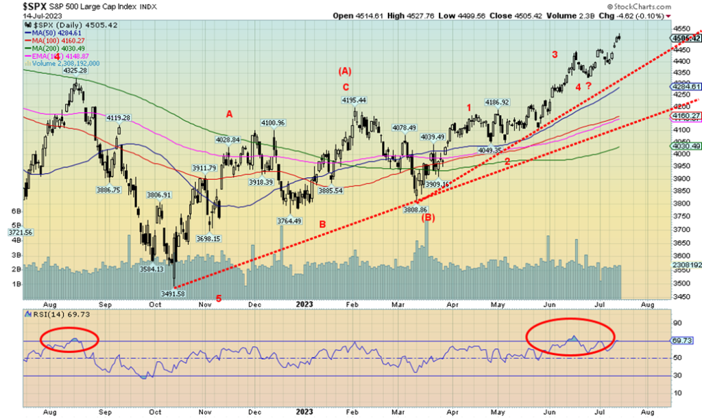
The markets were powered higher by lower inflation numbers and thoughts that, following the next Fed meeting on July 25–26 that they will see the last of the rate hikes. But as we attempt to explain in our opening, we do not believe that this is the start of a new bull market but rather a B wave correction to the A wave down that bottomed in October 2022. That was effectively a five-wave decline and that tells us this is only a correction to that decline. However, a possible head and shoulders bottom pattern does suggest the S&P 500 could reach the old highs near 4,800. Sounds like the inflationary 70s when stock markets kept equalling that 1966 high (or slightly exceeding it).
Nonetheless, markets look higher. Markets have had a tendency to top out in August through October so we’ll see where this one goes. The RSI is twigging overbought levels at 70, but it can stay that way for some time. That last low was at 4,385, so if we break that we may be putting in at least a temporary top. Under 4,300 a top may be in. A breakdown under 4,000 could trigger the next bear move to the downside. In the interim, targets remain up to at least 4,800 and a top equal to the January 2022 high.
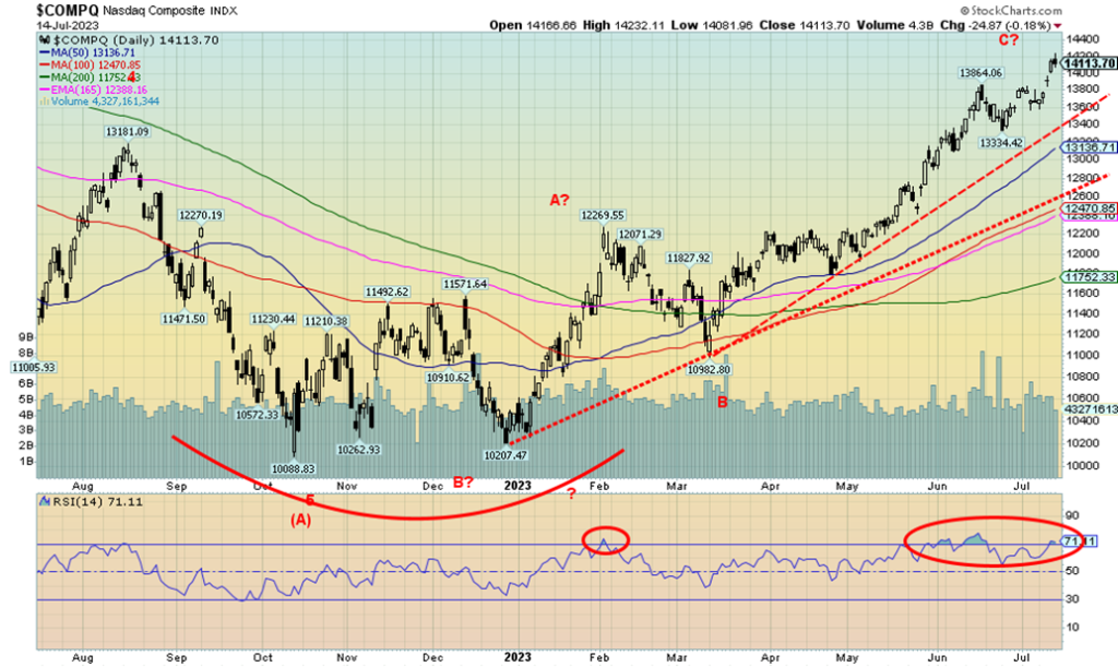
The NASDAQ continues its stellar performance in 2023 with another 3.3% to again fresh 52-week highs. On the year, the NASDAQ is up 34.9%. But remember, the breadth remains narrow as it is those high-tech/AI stocks that are leading the way. Some of them made new highs again. Making new highs was Meta, up 6.3%, while Amazon was up 3.8%, Netflix gained 0.9%, Tesla (again, and Elon Musk gets richer) was up 2.5%, and Nvidia up 7.0%. Nvidia is the star of the year, up 211%, while Tesla is up 129% and Meta up 157% in 2023 so far. Despite the gain, the NASDAQ has a way to go to regain its all-time high. That was seen at 16,212 back in November 2021. The NASDAQ needs another 15% to reach those levels. The NASDAQ did make what appears to be a double bottom in October 2022 and again in late December 2022. That double bottom projects up to 13,050, a level already surpassed. The next target could be up to 15,100, then 15,275 and 15,450. Yes, we are overbought with the RSI once again over 70, but in a strong bull market an RSI continually over 70 is not unusual. The NASDAQ led the market down in 2022, falling roughly 38%. A break under 13,400 could signal the end of this rally.
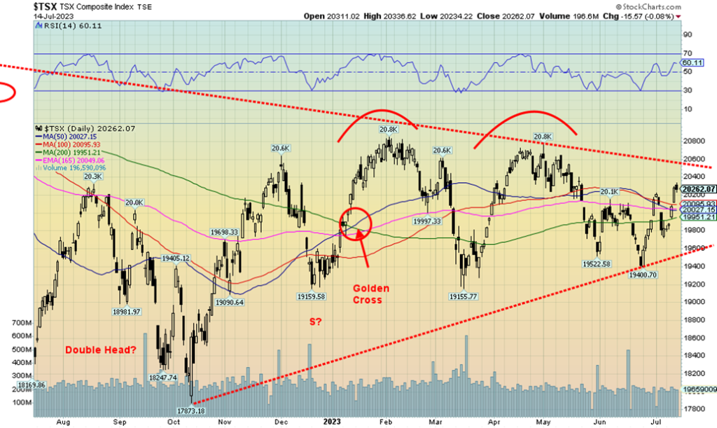
The TSX Composite rose this past week, but it was muted compared to the rise in the U.S. indices. The TSX remains below the two recent highs seen in January and May 2023. On the week, the TSX gained 2.2% as did the TSX Venture Exchange (CDNX). It’s encouraging but doesn’t guarantee higher prices. Considerable resistance is seen for the TSX up to 20,600. The sub-indices enjoyed a good up week with the only loser (the biggest loser?) being Telecommunications (TTS), down 3.1%. It helped keep the TSX lower than what might have occurred had TTS been up instead. Leading the way to the upside was Golds (TGD), gaining 7.3%, followed by Metals & Mining (TGM), up 6.4%. We have consistently touted both these sectors to be bought. Other decent gains were seen for Materials (TMT), up 4.8%, Information Technology (TTK), up 4.7%, and Health Care (THC), up 3.1%, with the only other one at 3% or higher being Real Estate (TRE). The weakest of the gainers was Energy (TEN), up only 0.2%. Being the second largest component, that also helped keep a lid on the TSX. The largest component is Financials (TFS), which gained 2.3%, roughly the same as the TSX. Since we expect the U.S. indices to move higher, our expectation is that the TSX could also move higher in concert, led by Materials, Metals, and Golds, if we are correct. Support is down to 20,000 and stronger support is at 19,500.
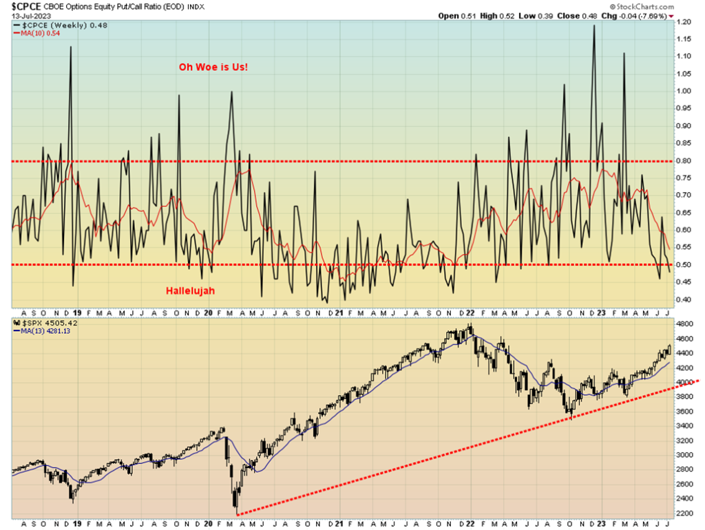
We couldn’t help but notice that the put/call ratio has fallen once again under 50. This is the most consistent notice of the put/call ratio under 50 since that long stretch in 2020–2021. It is only a couple of observations, but as the stock market moves higher it is no surprise that the put/call ratio keeps falling or remains under 50 in favor of call options over put options. We did get a spike over 80, but that was earlier in 2023, with a few in 2022. The stock market bottomed in October 2022 and it is no surprise that the put/call ratio in favor of puts was at its highest after the market had actually bottomed. It was a sign that the next move for the stock markets should be up, not down. Currently, the put/call ratio is not yet at a level that would signal a top. And it can remain that way for quite some time as we saw in 2020 through 2021, even as the market kept crawling higher.
U.S. 10-year Treasury Bond/Canadian 10-year Government Bond (CGB)
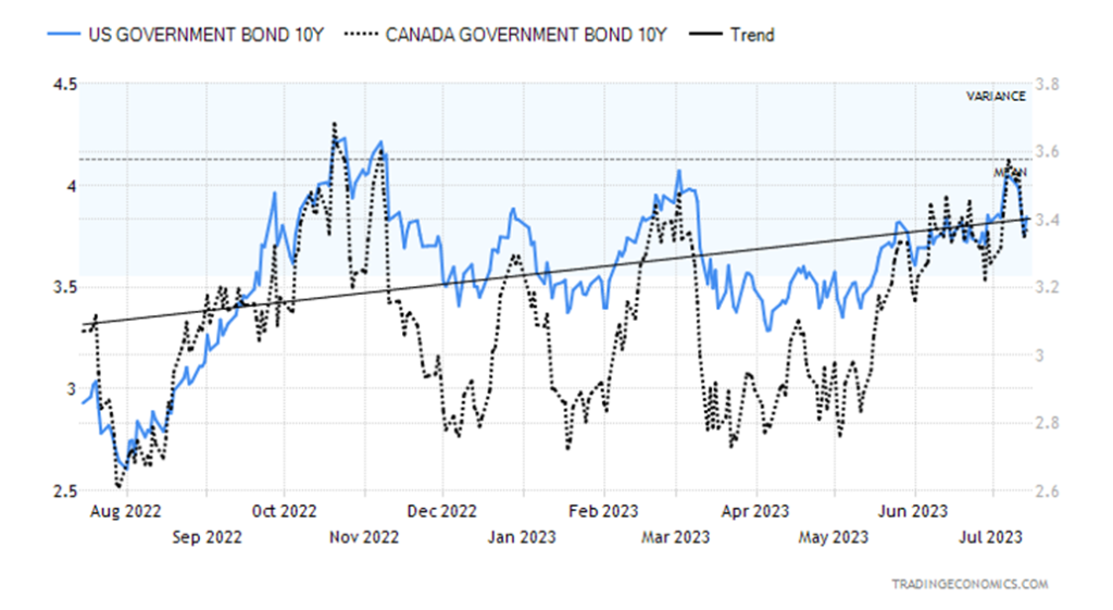
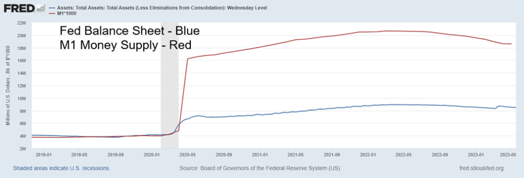
Just as it appeared that the U.S. 10-year treasury note might break out, the weak inflation numbers this past week pushed yields back down. The 10-year briefly went over 4% before falling, after the CPI and PPI reported inflation numbers (covered earlier) below forecast. All this has led to speculation that the Fed is at or near the end of its tightening schedule. A couple of things to keep an eye on, however, are the Fed balance sheet and the money supply. Both have been falling. As well, the monetary base is also falling. Instead of hiking interest rates further, the Fed may continue to allow assets to run off its balance sheet, which in turn constricts the money supply and it contracts as well. The FOMC meeting is July 25–26 and the expectation is that the Fed will hike a further 25 bp to 5.50%, but that it could also be the last hike. The odds of hikes in September and November have dropped considerably. The two-year treasury note also fell and the 2–10 spread narrowed somewhat. A recession does not normally get underway until the yield curve begins to normalize. A recession usually takes at least 6–12 months after the 2–10 and even the 3-month–10 spread bottoms. A bottom is not yet clearly in place. The Bank of Canada (BofC) hiked 25 bp at its last meeting and the ECB is also following.
This coming week’s numbers include the NY Empire Manufacturing Index and the Philly Fed, retail sales, and Industrial production for June, along with existing home sales and housing starts for June. Lower numbers could help push bond yields even lower. Nonetheless, the potential topping pattern (yield) remains intact. A breakdown under 3.35% could target lower prices as low as 2.40%–2.50%. At that point a recession is probable. Only a return back above 4.00% could change this scenario.
U.S. Fed Balance Sheet and M1 2019–2023
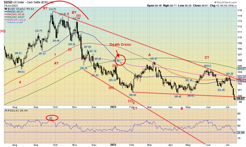
Is the US$ Index (USDX) breaking down? We have long cited 100 as a key support zone for USDX. This past week USDX broke and closed under that level, hitting a low of 99.26 before closing at 99.61. On the week, USDX lost 2.3%. The currencies that make up USDX surged. The euro gained 2.4%, the Swiss franc was up 3.1%, the pound sterling was up 2.0%, and the Japanese yen gained 2.3%. The euro, Swiss franc, and pound all made fresh 52-week highs while USDX made fresh 52-week lows. Not to be left out, the Canadian dollar gained 0.4%, thanks partly to higher oil prices. The fall in USDX rewarded gold and silver as both rose along with platinum and the gold stocks. USDX has hit oversold levels with the RSI closing at 28. That doesn’t mean it can’t stay at oversold levels, but it also suggests that there could be a rebound at any time. Follow-through to the downside this coming week would be a further negative for USDX. Thus far, the break under 100 is not yet conclusive. Lower inflation, lower interest rates, particularly at the long end, and hopes that the Fed is nearing the end of its tightening schedule helped push USDX lower this past week. For USDX it is a 15-month low. There is some support at 99 but the next good support is at 98. This appears to us as the start of third wave to the downside. The first wave down fell in five waves as should this one. The first wave down fell 14 points, so this wave could fall anywhere from 17 points to even 28 points. The third wave should be at least as long as the first wave. A reminder it is never a straight down affair. If, for whatever reason, this failed above 102.30, we should see new highs above that last high at 103.28.
Gold followed the market higher this past week as it gained 1.7%. Silver went gangbusters, up 8.2%, while platinum jumped 7.2%. Near precious metals such palladium also rose, but a more mundane 1.7%. Copper jumped 4.0%. Drivers were a lower U.S. dollar, lower inflation, and falling U.S. treasury yields. Potentially a driver were the ongoing stories of the BRICS meeting in August where they will introduce a BRICS currency backed by gold. The belief is that this could lead to de-dollarization. As noted, the US$ Index was down sharply this past week. Is it over-hype? The gold bugs tend to over-hype everything related to gold. Other analysts are, of course, dismissing the attempt by BRICS to not only introduce a BRICS currency (most likely yuan-based) but also back it with gold. The world has been off the gold standard since August 1971.
One of the drivers of a BRICS currency and the creation of an alternative to the global payment system was the banning of a number of Russian banks from SWIFT. They joined some Iranian banks that are also banned. The feeling was that if they can ban Russia, then all of them are vulnerable to the whims of the U.S. that controls SWIFT (along with the IMF and the World Bank). The question is global U.S. hegemony and many countries, led by the BRICS, desire to break out from under that regime.
Despite calls that there might be de-dollarization, we are reminded that U.S. capital markets are the largest and deepest in the world. Commodities are still priced in dollars, irrespective of countries now doing deals that cut out the dollar. China and Saudi Arabia, for example, are dealing in yuan for oil and others are as well.
However, it is not yet sufficiently widespread to totally threaten the U.S. dollar as the world’s reserve currency.
Remember they once claimed that Bitcoin was going to dethrone the U.S. dollar. We can see where that went. Nonetheless, the BRICS meeting in August should be closely watched. It also might be a case of buy the rumour (BRICS will back a currency with gold) and sell the news (BRICS announces a gold-backed currency).
There have been numerous calls for a new Bretton Woods and that gold once again be at the center as it was at Bretton Woods 1 in 1944; however, the world (more specifically the U.S.) is not there yet. The U.S. dollar still dominates and we suspect they will do what they have to do to protect their position. That’s not to say it won’t happen, but we are likely at least a decade away from that discussion.
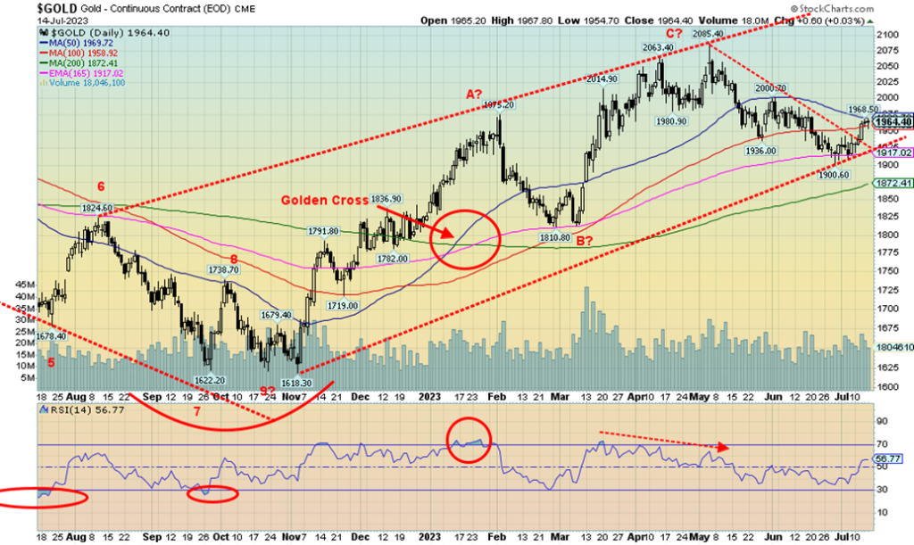
Gold ran into resistance this past week at $1,960. Resistance can be seen at $1,980–$2,000. Above $2,000, gold looks higher. Above $2,040/$2,050, new highs above $2,085 and even $2,089 (both previous highs) become probable. There is some support at $1,950, but strong support doesn’t show up until $1,915/$1,925. Below $1,915 new lows are probable.
There was no COT this past week. Not sure why as the holiday was the previous week. Nonetheless, there should be one out on Monday. As usually is the case, as gold moves higher the commercial COT (bullion companies and banks) falls as they sell into it. The large speculators COT (hedge funds, managed futures, etc.) rises.
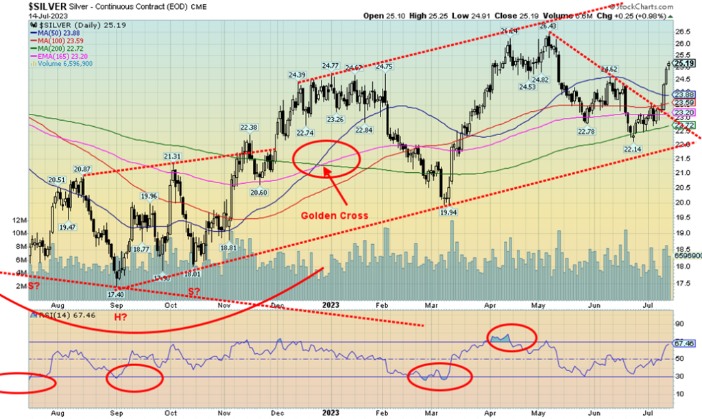
Silver surged this past week by 8.2% to the highest level in two months as concerns grew concerning supply, increased industrial demand, and a weaker U.S. dollar. Growing demand for silver used in EV and carbon emissions is a significant contributor. Silver demand for solar panels is expected to make up some 14% of global silver consumption, compared with only 5% back in 2014. Another increase in demand is expected in 2023. As well, regulatory concerns in Mexico are also fueling shortages. Softening inflation also helped silver. Silver’s RSI hit 67.5 this past week and could soon become overbought, but if the growing shortage concerns persist, a persistent RSI over 70 would not be an impediment. We like to see silver lead (it normally does in both bull and bear markets) and this past week silver did it in spades. A move and close above $25.40 would signal to us that new highs above the May high of $26.43 are probable. The recent pullback traced out a nice ABC correction, suggesting that this could be the start of a strong wave to the upside. Potential targets, once we make new highs, are up to $30.75. If that happened, silver would be hitting the highest price level since 2020. The all-time high is up near $50 seen in both 1980 and 2011. Support is now down to $24, then down to $23.
As with gold, there was no silver COT this past week. It will be out on Monday. As prices rise, the normal course is that the commercial COT falls.
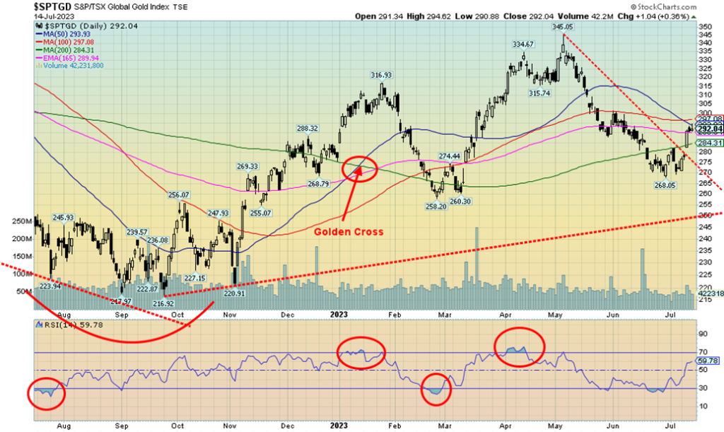
Finally, a decent week from the gold stocks. They should be leaders and this past week they did that. The Gold Bugs Index (HUI) rose 8% while the TSX Gold Index (TGD) was up 7.3%. They even rose on Friday when gold paused/pulled back. The rally has stalled at the 50/100-day MA for the TGD. A clear jump over that level this coming week could signal further gains. Resistance is up to 300 for the TGD. Support now is seen down to 280/285. A clear break over 305 should send the TGD to its next resistance level near 320. A good move over 325 could signal new highs ahead over the May high of 345. The all-time high for the TGD was seen way back in 2011 at 455. The HUI is even further away as its 2011 high was 639 and it is currently at 246. That’s a long way. It is encouraging that the RSI is nowhere near overbought (currently at 60) and the Gold Miners Bullish Percent Index (BPGDM), a sentiment measurement, is at a relatively mediocre 39.3. That’s a long way from overbought levels at 80–100. The most recent rally saw the BPGDM reach a high of 76. In August 2020 and July 2016, the BPGDM hit 100. Profit-taking was definitely in order. Support now for the TGD is down to 275, then 265. Long-term support can be seen at 250. A clear move over 300/305 would signal we are poised to move higher. As one can see, the gold stocks tend to turn on a dime. Note the recent low saw a low, then a rebound, then a pullback that did not make a new low. That was essentially a buy signal. The same thing happened back in February/March and on a wider scale in September and November 2022. Our expectations now are that higher prices will prevail. Note how well silver stocks did this past week as silver enjoyed a strong up week.
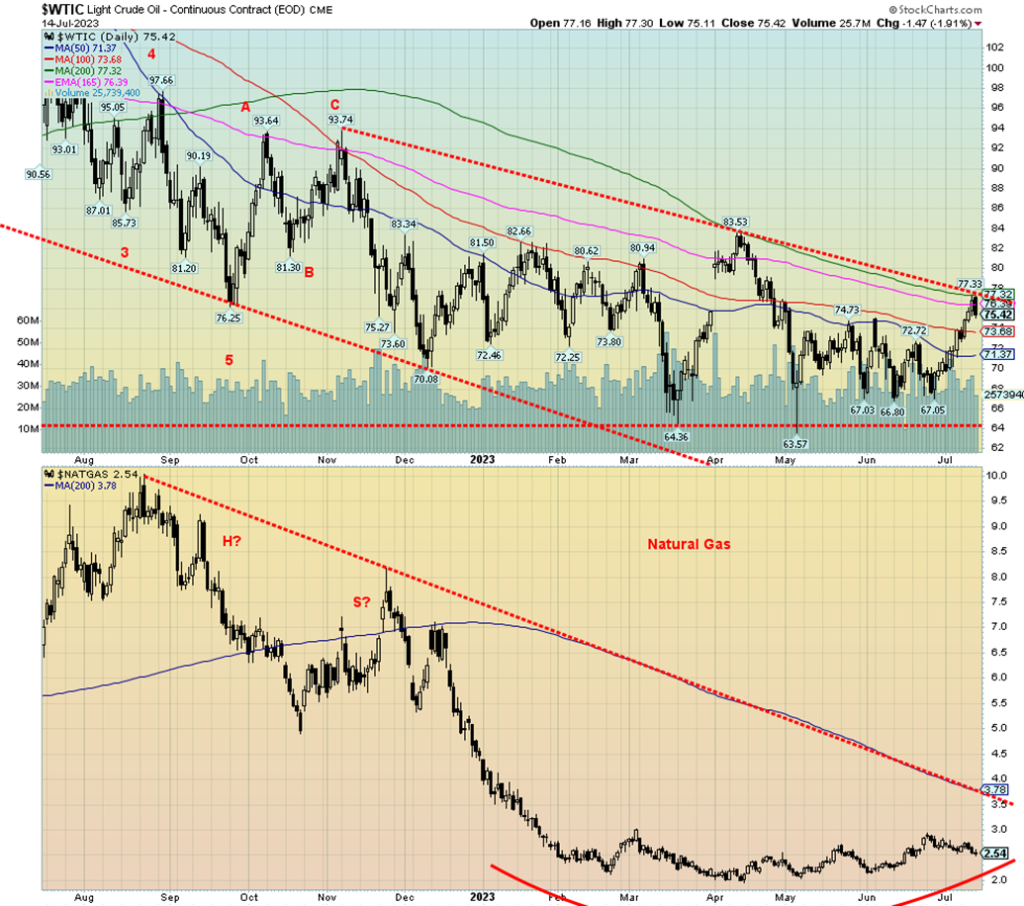
Is oil poised to break out? We have now rallied up to a breakout line but initially failed. That’s not surprising as often the first approach is repulsed. A clear break over $77.50 for WTI oil would signal that we are poised to break out and move higher. The 200-day MA is at $77.32, so it is no surprise that it also acts as resistance. As to natural gas (NG), well, its rounding bottom continues and breakout over that line is way up around $3.80. Definitely some distance to go.
This past week, WTI oil rose 2.1% while Brent crude jumped over $80, up 4.3% on the week. As with WTI, Brent needs to break out as its resistance is up to $82.50 (close $81.51). Natural gas (NG) did not fare as well as full tanks saw both the US Henry Hub and the EU Dutch Hub prices fall. Henry Hub fell 1.6% but the Dutch Hub was hit even harder, down 22.5%. The EU situation is a classic case of too much product. Norway increased supply, gas storage is 80% vs. a 10-year average of 60%, and demand has weakened. As well, maintenance projects are coming to an end. The same thing is happening at the Henry Hub, only less so as maintenance projects come to an end and storage tanks are relatively full. The hot weather, however, may help drive up demand in both the EU and the U.S.
The fall in inflation helped boost oil prices. Further cuts from Saudi Arabia and maybe Russia are also helping to push up prices. While U.S. inventories jumped this past week, that seemed to have little impact. As well, violence is escalating in Libya once again, which is expected to dampen production there. Demand is being impacted by the extremely hot weather in both the U.S. and the EU as the heat waves are crimping power generation.
The question, of course, is will the failure to bust through this past week look more like what happened back in April, or will we bust through this time? Bullish anticipation has been heating up. The energy indices rose this past week, despite a pullback on Friday. The ARCA Oil & Gas Index (XOI) rose 0.9% while the TSX Energy Index (TEN) was up 0.2%. Not great, all things considered. But then the stocks may be nervous as to whether we will break through this time.
Copyright David Chapman 2023
__
(Featured image by Kenji Takaaki via Pexels)
DISCLAIMER: This article was written by a third party contributor and does not reflect the opinion of Born2Invest, its management, staff or its associates. Please review our disclaimer for more information. This article may include forward-looking statements. These forward-looking statements generally are identified by the words “believe,” “project,” “estimate,” “become,” “plan,” “will,” and similar expressions. These forward-looking statements involve known and unknown risks as well as uncertainties, including those discussed in the following cautionary statements and elsewhere in this article and on this site. Although the Company may believe that its expectations are based on reasonable assumptions, the actual results that the Company may achieve may differ materially from any forward-looking statements, which reflect the opinions of the management of the Company only as of the date hereof. Additionally, please make sure to read these important disclosures.
David Chapman is not a registered advisory service and is not an exempt market dealer (EMD) nor a licensed financial advisor. He does not and cannot give individualised market advice. David Chapman has worked in the financial industry for over 40 years including large financial corporations, banks, and investment dealers. The information in this newsletter is intended only for informational and educational purposes. It should not be construed as an offer, a solicitation of an offer or sale of any security. Every effort is made to provide accurate and complete information. However, we cannot guarantee that there will be no errors. We make no claims, promises or guarantees about the accuracy, completeness, or adequacy of the contents of this commentary and expressly disclaim liability for errors and omissions in the contents of this commentary. David Chapman will always use his best efforts to ensure the accuracy and timeliness of all information. The reader assumes all risk when trading in securities and David Chapman advises consulting a licensed professional financial advisor or portfolio manager such as Enriched Investing Incorporated before proceeding with any trade or idea presented in this newsletter. David Chapman may own shares in companies mentioned in this newsletter. Before making an investment, prospective investors should review each security’s offering documents which summarize the objectives, fees, expenses and associated risks. David Chapman shares his ideas and opinions for informational and educational purposes only and expects the reader to perform due diligence before considering a position in any security. That includes consulting with your own licensed professional financial advisor such as Enriched Investing Incorporated. Performance is not guaranteed, values change frequently, and past performance may not be repeated.


Germany Tightens Cannabis Reimbursement Rules: Approved Medicines Must Come First
Germany’s Parliament passed the Statutory Health Insurance Contribution Rate Stabilization Act on July 10th, 2026, changing cannabis reimbursement rules. Around...

Withings Achieves Profitability in 2025 with 90% Growth Since 2018
Withings reached full-year profitability in 2025, growing revenue about 90% since 2018, driven by CE MDR-certified medical devices generating 66%...


Dow Jones Pauses Near Record Highs as Precious Metals Lead
The Dow Jones reached a record high before pausing, staying near peak levels as the bull market remains intact. Analysts...


Jobs Cooling Fast as a Cautious Fed Leaves Markets Without a Safety Net
June’s weak jobs report signals a cooling labor market, with low hiring, falling participation, and significant job losses. Growth is...


Quiet Markets Await a Catalyst as Jobs and Oil Support Sentiment
Markets remained calm as US-Iran tensions fluctuated between conflict and negotiations, keeping oil volatile but supported. CES Energy Solutions benefited...
 |
|
 |  |
 |
|
-

 Biotech2 weeks ago
Eli Lilly Hits $1 Trillion Valuation Amid Strong Bullish Momentum
-

 Crowdfunding5 days ago
East Crema Coffee Launches €3.5M Crowdfunding Campaign
-

 Cannabis2 weeks ago
Tilray Acquires HelloMD to Expand Medical Cannabis Digital Platform
-

 Markets7 days ago
Rice Prices Rise as Supply Outlook Tightens and Demand Stays Mixed