Featured
The markets’ pros & cons in late April 2020
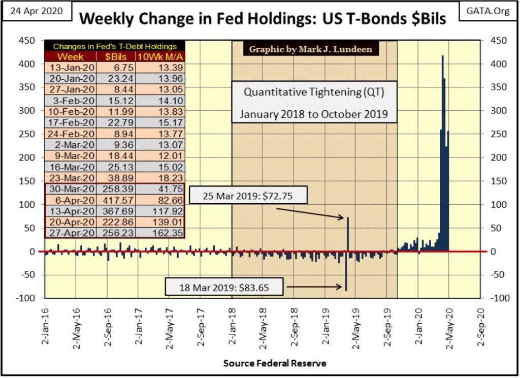
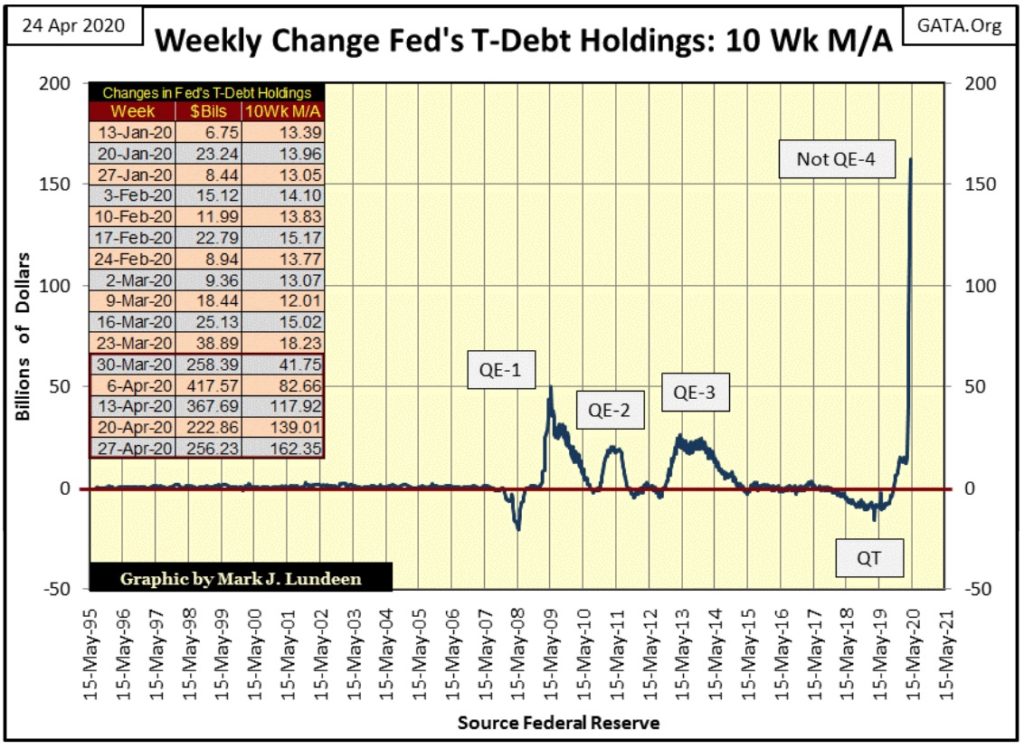
In this past week the FOMC “monetized” $256.23 billion of the US Treasury market. Back in August 1950 the entire US National Debt was $256 billion, and now the Federal Reserve “monetizes” that much in a single week. Thanks to the “policymakers” wildly successful program of destroying the US dollar as the global reserve currency, the gold miners can look forward to some real upside excitement.

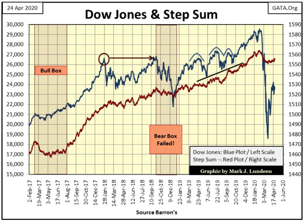
Since the Dow Jones’ March 2009 bottom, its BEV -17.5% line has been a critical level of support. In autumn 2011 the Dow Jones failed to break below it, and in December 2018 when the Dow Jones did break it, it closed below this critical level for only one day; Christmas Eve (-18.77%: 24 Dec 2018), where it bottomed and resumed its post March 2009 advance.
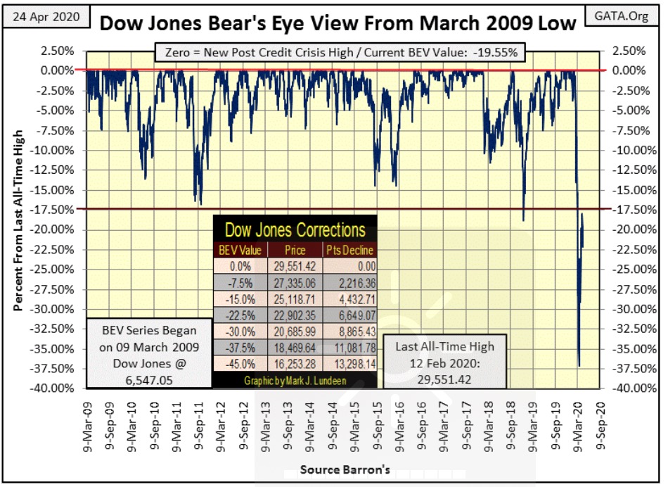
Little more than a year later the Dow Jones did break below its BEV -17.5% level, and kept going until it failed to break below its BEV -37.5% line, from which it then began its current recovery.
Interestingly, the BEV -17.5% line is now acting like a level of resistance, though it’s too soon to say how much resistance it will offer an inflating Dow Jones.
The closest the Dow Jones has come to breaking above this critical level was on April 14th (BEV -18.96%), before the Dow Jones corrected back down to a BEV -22.11% on Tuesday of this week. On Friday the Dow Jones closed at a BEV -19.55%.
Most technical analysis uses charts plotted in dollars, which displays the Dow Jones in a totally different aspect than using a BEV chart as seen above and below. Except for me, this BEV level of -17.5% would be totally irrelevant to anyone else. So, why since March 2009 has the -17.5% BEV line been such an important level for the Dow Jones? It’s the same as the BEV -40% line for the Dow Jones going back to 1880s when it traded for less than 100.

Why this is I haven’t a clue. But charting a market series using the Bear’s Eye View (BEV) often discloses important technical levels displayed as percent declines from previous all-time highs, which currently for the Dow Jones is now its BEV -17.5% line.
What we’re looking for now is if the Dow Jones can break above this important level, and failing that would it then break below its BEV -37.5% line. If the Dow Jones fails to clear this -17.5% line in the next few weeks, it won’t be good for the bulls. But I’m not in the market predicting business, so I’ll just wait to see what happens as April gives way to May.
But I can still handicap the Dow Jones; seeing what it has going for it and going against it, and right now the “policy makers” continue flooding the financial system with dollars, as seen below.
In this past week the FOMC “monetized” $256.23 billion of the US Treasury market. Back in August 1950 the entire US National Debt was $256 billion, and now the Federal Reserve “monetizes” that much in a single week. It’s not just about last week, as last week was the fifth week of this intensive phase of the Not QE-4, which began last October when they terminated their quantitative tightening (QT) program.
As of right now, this monetary lunacy is “supporting market valuations” in the financial markets. But if Alasdair Macleod in his latest posting at King World News has it right, and I’m afraid he has nailed it down hard; inflating the supply of dollars to the point of infinity will result in the dollar, and all financial assets denominated in those dollars ultimately becoming worthless:
https://kingworldnews.com/alasdair-macleod-the-terrifying-endgame-of-this-global-collapse/
“Anatomy Of A Global Collapse
April 23 (King World News) – Alasdair Macleod: This article asserts that infinite money-printing is set to destroy fiat currencies far quicker than might be generally thought. This final act of monetary destruction follows a 98% loss of purchasing power for dollars since the London gold pool failed. And now the Fed and other major central banks are committing to an accelerated, infinite monetary debasement to underwrite their entire private sectors and their governments’ spending, to prop up bond markets and therefore all financial asset prices.”
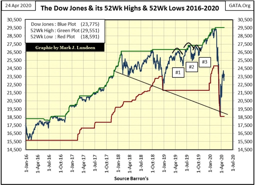
Here’s the Dow Jones plotted with its 52Wk High & Low lines. Mr Bear’s latest mauling did a lot of technical damage to the market’s advance. If the Dow Jones is going to make a new all-time high, it will take much more time to recover than it took shedding 10,960 points from February 12th to March 23rd: only twenty-seven NYSE Trading Sessions.
Since the Dow Jones’ March 23rd bottom, it has advanced 5183 points. That’s a nice advance, but one that may have to be digested by the market before the Dow Jones makes another attempt for a new all-time high.
At week’s close extreme-market events:
- Dow Jones 2% days (extreme volatility)
- NYSE 70% A-D days (extreme breadth)
are becoming rarer and less intensive, as seen in Mr Bear’s Report Card below.
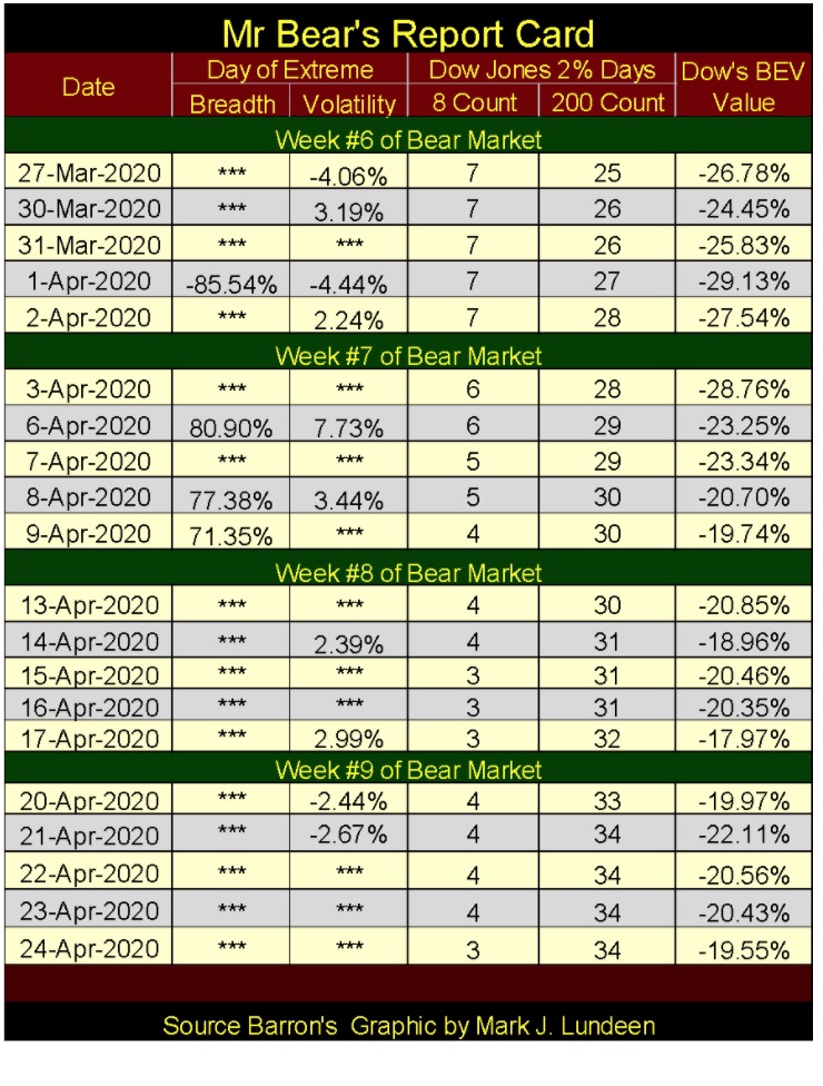
This is a very positive development for the bulls. So, whether the Dow Jones’ BEV -17.5% level of resistance can hold up or be broken, at this point it’s a coin toss; either way a 50/50 chance.
Here are the BEV values for major market indexes I follow. At the close of the week some are near breaking into single digit BEV values again. In fact the NASDAQ 100 closed the week within 10% of its last all-time high.
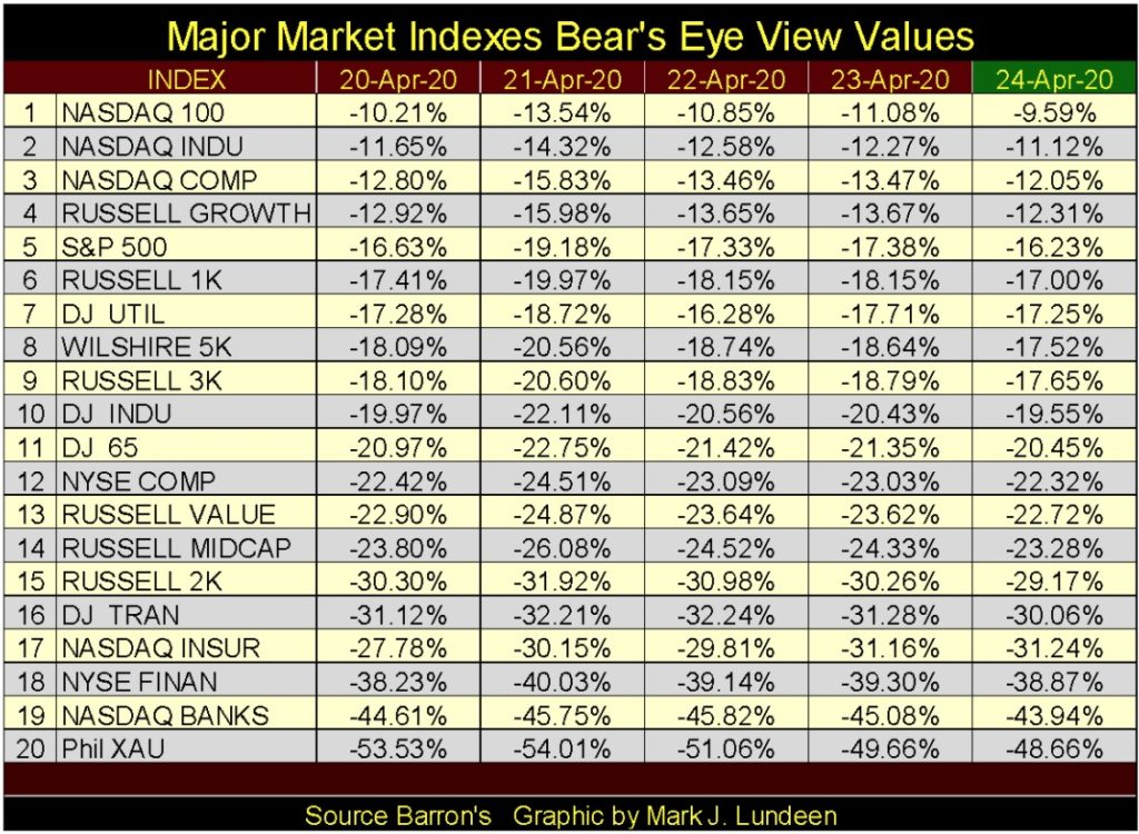
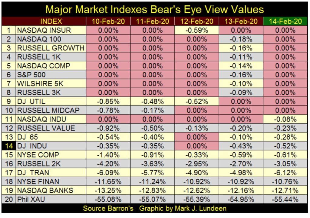
The above BEV values are quite different from those of mid-February (table below at market top). The thing I noted when comparing these two tables is how little volatility the XAU (gold mining) has seen since February. The precious metals miners have been advancing slowly, but surely all during the stock market’s late winter maelstrom.
For investors in these gold and silver mining shares (the XAU), not only did they miss most of the bear-market excitement since the February 12th last all-time high for the Dow Jones – they’re also up 15% in the past two months. Once again the gold-mining sector has provided a safe harbor in a storm for investors.
Take a look at the financials in these BEV tables; the NYSE Financial Index and NASDAQ Banks (#18 & 19 above and below). They are dramatically underperforming the other market indexes since their mid-February highs and that’s an indication of BIG TROUBLE ahead.
This won’t continue like this forever. Thanks to the “policy makers” wildly successful program of destroying the US dollar as the global-reserve currency, the gold miners, as well as gold and silver bullion can look forward to some real upside excitement, possibly before 2020 expires.
Next is my comparison between the Great Depression’s market crash with our so far common-bear market. Friday was day 50 of our bear market, a bear market I don’t believe we’ve seen its ultimate bottom to. For the 1929 market crash, by day 50 the Dow Jones had yet to see a 40% market decline, something that will happen next week on day 54 (11 Nov 1929: BEV -42.18%).
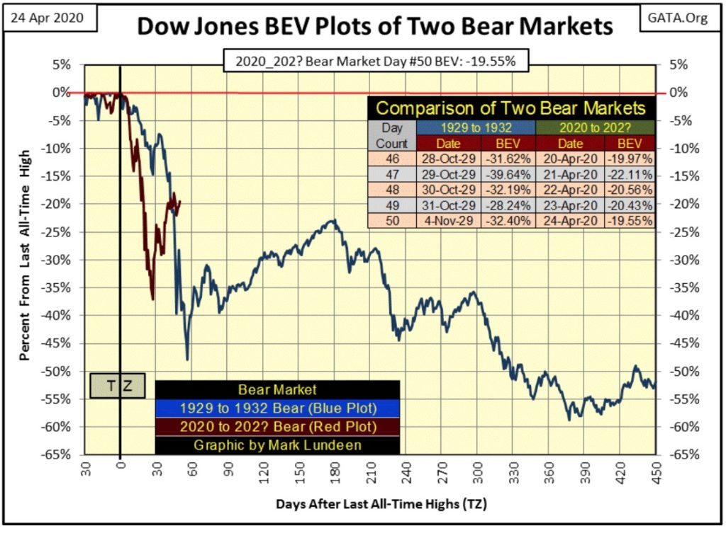
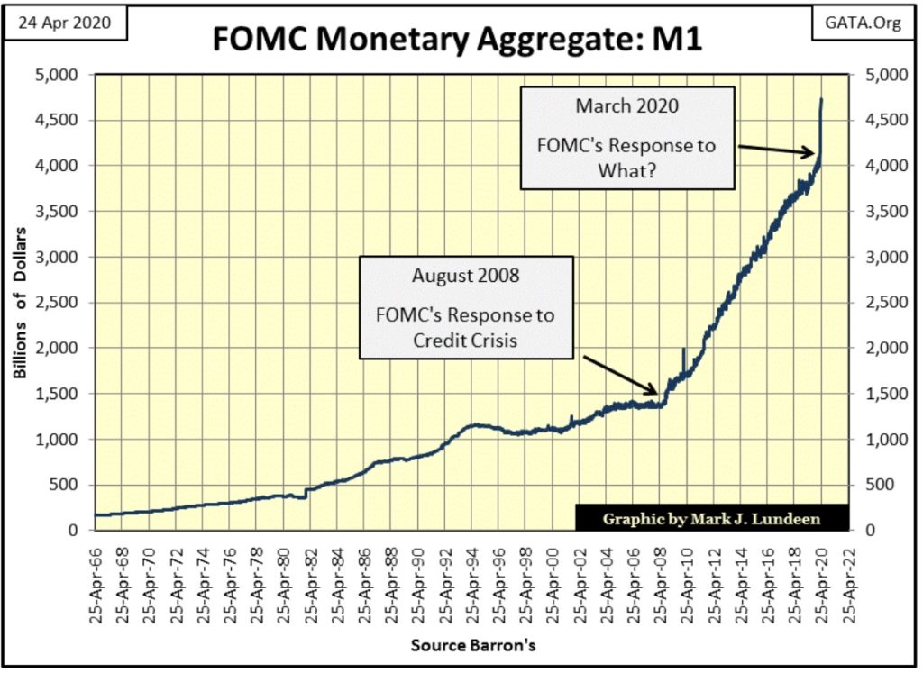
How much further does our market’s dead-cat bounce have to go is the question that comes to my mind when examining this chart. And I can’t count out the possibility of the Dow Jones making a new all-time high (BEV Zero) in the chart above, not when looking at what the FOMC has done to their balance sheet below with their Not QE-4.
This overwhelming expansion in the money supply began in the very same week the Dow Jones hit its bear market low of -37.09% in the BEV charts above. A simple coincidence you think?
Without this massive flood of “liquidity” flowing from the FOMC, the Dow Jones would NOT now be attempting to break above its BEV -17.5% line. Most likely we’d be asking ourselves how long before the Dow Jones breaks below its BEV -50% or -60% lines.
Looking at the chart above is an excellent jumping off point to talk about gold.
Gold closed the week with a BEV of -8.60%, just a hair from being within scoring position of its BEV -5% line in the BEV chart below.
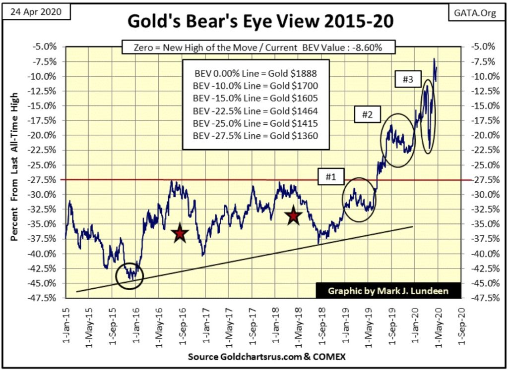
Since the Dow Jones’ February 12th BEV Zero, the stock market has seen daily volatility that would have been impossible to believe in early February. Who in early February would believe on March 24th the Dow Jones could advance by 11.37% from a previous day’s closing price; but it did.
Statically gold and silver are more volatile markets. A day of extreme market volatility for the Dow Jones is a 2% day, but a day of extreme volatility for gold is a 3% daily move, while it takes a 5% daily move for silver before it’s considered an extreme day.
If the Dow Jones can move up 11.37% from one daily closing to the next, gold could easily move just 10%, and from Friday’s close that would take gold up to $1898.99, for a new all-time high(BEV Zero) in the BEV chart above.
10% plus daily moves in gold and silver are going to happen, however most likely not next week. But with gold on the verge of breaking above its BEV -5% line; we can dream.
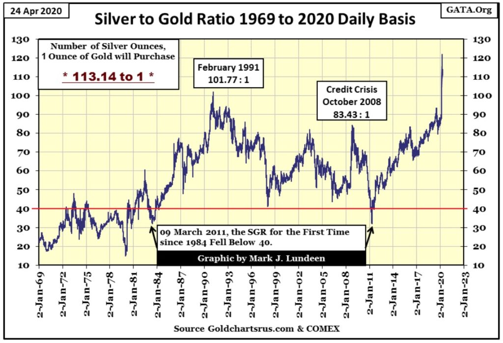
Unfortunately some dreams are nightmares, such as the current Silver-to-Gold Ratio (SGR) of 113.14 ounces of silver for one ounce of gold seen in the chart below. How this market series got labeled as the Gold-to-Silver Ratio I don’t know, as grammatically and mathematically it certainly is not a ratio of gold to silver, but of silver to gold. But I digress.
The SGR went ballistic on February 24th, where from 89 it rocketed up to 121 on March 18th. I don’t know why this happened; why in terms of gold, silver is now so cheap. But in a world where dollars are being reproduced like bacteria in a septic tank by the FOMC, I have to believe silver is now a historic bargain for anyone thinking of purchasing precious metals.
Next a table giving market performance for various commodities and market indexes since Barron’s 30 Dec 2019 issue; gold and the XAU come in at #2 & 3, with the BGMI and silver lagging behind at #8 & 12.
I understand why the Barron’s Gold Mining Index (BGMI) is lagging the XAU. The BGMI has been published weekly since early 1938 when it was a component of the now discontinued Barron’s Stock Averages (1938 to 1988). In 1938 a computer was an intern who could do math fast and accurately with a pencil on paper, so they used Thursday’s closing data for the Barron’s Stock Averages to give the kids time before the publishing deadline. Barron’s still uses Thursday’s closing prices for the BGMI, and I suspect that’s why the BGMI is lagging the XAU this week.
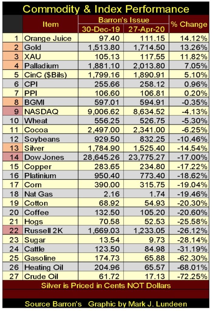
Energy markets (#25, 26 & 27) have crashed since the end of December for lack of global demand for energy. Are we looking at a precursor for an upcoming global depression? I fear we are.
How long can silver remain so cheap in terms of gold and dollars? Logic tells me not much longer. But I’ve been following gold and silver for decades, and experience tells me long enough to really tick me off.
Gold in its step sum chart below remains extremely positive, but the ball is on the bulls’ side of the court. They now need to drive the price of gold up above its last all-time highs of August 2011. It’s going to happen – but when?
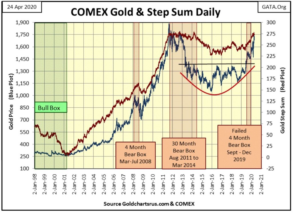
The nascent bear box forming in the Dow Jones continues, now in its fourth week. But I’m not going to make it official until at least week 8, and I may wait until week 12 or even 16 too. These boxes should be visually compelling technical formations, like gold’s 30 month bear box above, and so far this one isn’t.
Gold in its step sum table below has worked off its overbought condition (15 count of +7), and is now waiting for something to happen. Hopefully waiting for multiple days of extreme volatility, which for gold are +/- 3% daily moves and +/- 5% daily moves for silver.
We’ve seen six extreme days of volatility since January 1st for both gold and silver, with four of the six being -3% days for gold and -5% days for silver. But that’s okay, as it’s been three years since these markets have seen any extreme volatility. For gold and silver (but NEVER for the stock market) rising market volatility is an indication the bulls are coming alive and hopefully will soon be on the rampage.
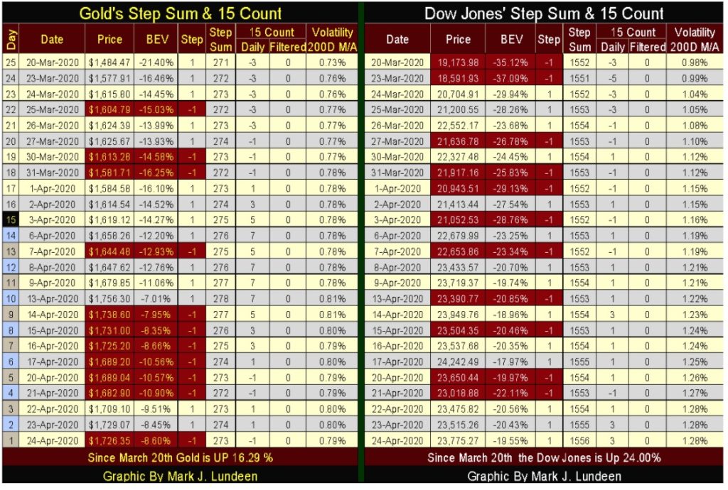
For the Dow Jones’ 15 count, it isn’t overbought or oversold; I’d say that’s good. Its step sum is finally rising with the Dow’s price, not looking good for the bear box, which is also a positive for the bulls. But the big item for the week is noting the Dow Jones daily volatility’s 200 Day M/A is over 1.00%. The stock market has a fever, and it’s not from the coronavirus!
With the FOMC weekly “injecting” hundreds-of-billions of dollars into the financial system since late March, we should expect more valuation gains coming as we progress into summer. Facing this fact, I’d rather not get to bearish for the weeks ahead of us. Still, with the Dow Jones volatility closing the week at a 1.28%, in an uptrend; it’s difficult being bullish on this market.
I’m stopping my market comments here as this week’s tea leaves are not as clear as I’d like them to be. Apparently, I’m going to have to wait until next week to see what’s to come. So I’m going to move on to something else.
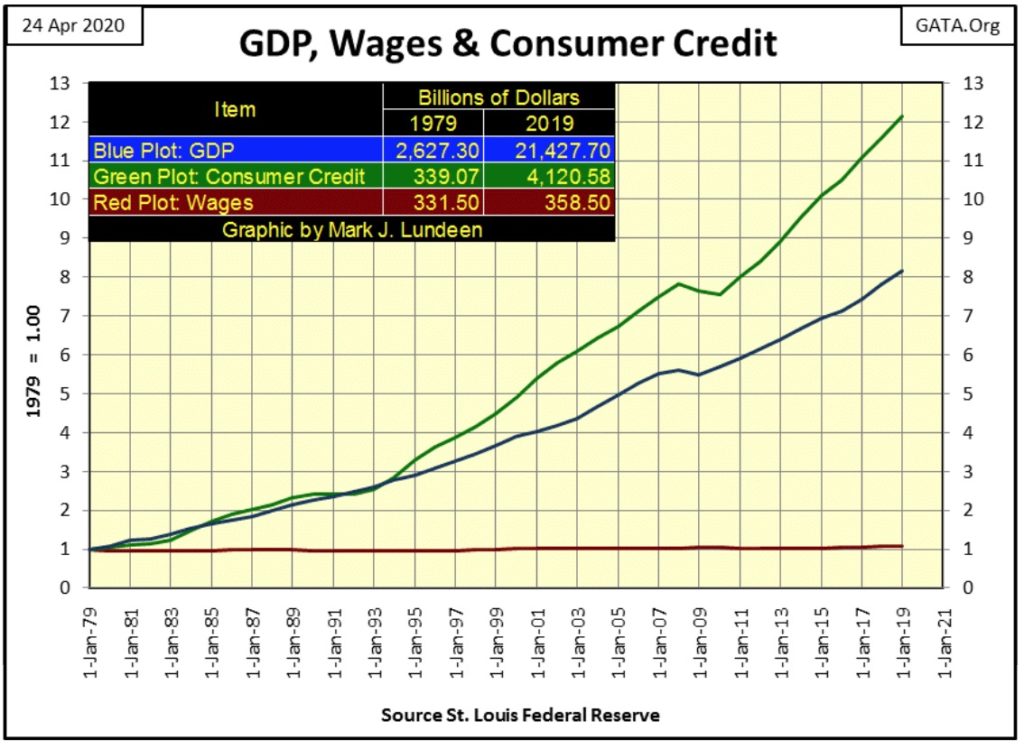
Below I’ve plotted the indexed values of
- GDP
- Consumer Credit
- Wages
with 1979 =1.00.
These series published values (in dollars) for their first and last data points (1979 & 2019) are given in the table placed at the upper left of the chart. The dollars used in these plots are not identical. GDP is measured in nominal dollars, consumer credit uses seasonally adjusted dollars, and wages for full time and salary workers over 16 are in 1982-84 CPI-adjusted dollars, which are then seasonally adjusted.
My preference would be for these series to be in nominal dollar terms adjusted for nothing. But I have to work with what I have, and what I have are dollars adjusted by economists and statisticians into what they feel are the most useful for historical research. So I’m using this data as given, that a 1979 dollar for GDP is equivalent to a 1979 dollar of wage, and so on and so forth for the next forty years.
Seeing wages (Red Plot) so little changed in the past forty years is a shocker. Had the US Department of Labor (the source the St. Louis Fed credits) not adjusted for CPI inflation this plot should have risen, but by how much? Maybe less than I expect as inflationary monetary systems are simply a tool used by the “policy makers” (our elite class of celestial beings), to extract wealth from everybody else.
In 2020 the financial media reports of massive “injections of liquidity” as information that sooths the rattled nerves of investors. The following quote from Barron’s 15 October 2007 issue makes this point.
“One reason that monster declines are less likely now is that investors recognized something that they didn’t in 1987: The Federal Reserve is on their side.”
– Andrew Bary, Barron’s 15 October 2007 issue
Today it’s long live the Plunge Protection Team, but it wasn’t always like this.
Before the Dow Jones began its historic bull market advance in August 1982, the Federal Reserve’s weekly report of M1 monetary aggregate could have been covered even by local-news outlets. Forty years ago, increases in M1 were understood by all as the root cause of this period’s annual double-digit rate increases for CPI & PPI.
Today the mainstream financial media doesn’t even report on M1, but they should.
Long before 1982 monetary inflation from the Federal Reserve was understood as the source of Consumer Price Inflation (CPI), and that CPI inflation was a “concealed type of tax” on the working class.
“November 15, 1951 reached a new low of 53 cents in terms of 1935-1939 dollar value. In extended comment on the shrinkage of the dollar, the National City Bank’s December Letter says: “From the standpoint of the creditor—the buyer of Savings bonds, the pensioner, the insurance beneficiary, the school teacher with lagging pay—the experience during and since World War II has been disheartening. Inflation is a concealed type of tax and these are the people who took the brunt of it.” In line with the repeated views of Professor Sumner H. Slichter, the City Bank adds: “People reconciled to a dollar of wasting value look around for real estate or other equity investments as a hedge against price inflation and dollar shrinkage.”
– Barron’s Editorial, 31 Dec 1951
In 1951 I note that City Bank didn’t include the stock market as a means of hedging against “dollar shrinkage.” Until the Baby-Boomer Generation came of age in the 1970s, for most people memories of the Depressing 1930s were just too painful to even consider risking their hard earned money in the stock market.
So maybe in dollar terms corrected for inflation, I should expect wages having gone nowhere since 1979. I’m not surprised how since 1979 consumer credit (Green Plot) has increased by a factor of 12.15, as forty years ago people paid in cash or wrote a check for payment of goods and services.
For people like me, using credit wasn’t an option. Long ago when I was in the US Navy I had a big five-figure sum deposited in a bank, but no history of debt service. Credit models used back then classified someone with all assets and no liabilities as to risky to extend credit too, so my bank routinely denied me a credit card.
In the early 1990s I got an AT&T phone card to pay for my long-distance phone calls to home. A few years later AT&T converted that to a Master Card with No Fees for Life. They didn’t even ask me if I wanted them to! For almost thirty years now they haven’t made even $0.01 off me since then as I always pay off my balance at the end of the month.
Who today, me included, takes cash or a check book to the grocery store when plastic is so convenient?
But unlike 1979, in 2020 too many people now carry a large balance on their credit-card accounts as they used credit provided by the Federal Reserve System to live beyond their means. And that is very bad; as in the chart above the Red Wages plot is supporting both the Green Consumer Credit and Blue GDP plots by leveraging wages with debt. Should wages decline in the coming years, the deflationary effects on the credit system and GDP will be significant, and maybe that’s what the “policy makers” wanted.
Bill Gates used to be a hero to many, including myself for finally freeing the world of digital computers from the grasping hands of IBM. But that was when Gates became Silicon Valley’s first billionaire in the 1980s. Thirty years and many billions-of-dollars later I have to wonder if he was ever my pal in the first place.
Gates is not now, or ever was a doctor, but in 2020 he is everyone’s go to “expert” on vaccines. His contribution in fighting this pandemic is pushing the idea of a quarantine (effectively a house arrest of all Americans) that should not be lifted until autumn 2021, when the vaccine he is pushing becomes approved and available.
From what I’ve read, Gates’ vaccine would not be voluntary. Included with it is a nanotechnology software package inserted into the victims’ flesh that allows the “authorities” to track, via 5G, the activities of their specimens, including GPS location and payment of taxes, goods, and services. This is real Mark-of-the-Beast stuff straight out of the Bible!
Be afraid. Be very afraid of Mr. Gates and his vaccine!
https://www.cnbc.com/2020/04/08/bill-gates-how-long-it-may-take-before-americans-are-safe-from-coronavirus.html
Gates’ operating systems (first DOS and then Windows) have been plagued by virus attacks since the 1980s. Failing to correct that problem, in the past decade he decided to dedicate his services to humanity by now focusing on biological viruses? What’s with that?
I’m getting pretty damn tired with this coronavirus stuff as all the dire consequences of this pandemic just haven’t played out as predicted by “experts” such as Bill Gates. In fact there are doctors who are saying the exact opposite, as seen in this link to the Next News Network below.
If you watch the first ten minutes of the above video, you’ll watch it to its end, and have a darn good reason to believe this coronavirus pandemic is only a tactic used by the Bill Gates’ of the world to manipulate mankind into a corner that we best not go into.
Its time mayors and state governors stop arresting people for enjoying human to human contact. It’s time to let Americans run wild and free again, exactly as seen in the video below.

—
(Featured image by Pexels via Pixabay)
DISCLAIMER: This article was written by a third party contributor and does not reflect the opinion of Born2Invest, its management, staff or its associates. Please review our disclaimer for more information.
This article may include forward-looking statements. These forward-looking statements generally are identified by the words “believe,” “project,” “estimate,” “become,” “plan,” “will,” and similar expressions. These forward-looking statements involve known and unknown risks as well as uncertainties, including those discussed in the following cautionary statements and elsewhere in this article and on this site. Although the Company may believe that its expectations are based on reasonable assumptions, the actual results that the Company may achieve may differ materially from any forward-looking statements, which reflect the opinions of the management of the Company only as of the date hereof. Additionally, please make sure to read these important disclosures.


The TopRanked.io Weekly Affiliate Marketing Digest [The Top VPN Affiliate Programs Roundup]
Want to be let in on a little secret about two massive affiliate opportunities you can take advantage of today?...


Sustainable Finance Faces Hurdles as Green Asset Ratio Reforms Fall Short of Full Transparency
The Green Asset Ratio (GAR) measures banks' alignment with the EU Taxonomy but remains low due to methodological flaws and...


XRP Hits New All-Time High Amid U.S. Crypto Policy Shift and Ripple’s Expansion
XRP surged past its 2018 all-time high, reaching $3.65 amid renewed political support for crypto in the U.S. under Trump....


Germany Moves to Curb Medical Cannabis Abuse, Sparking Access Concerns
Medical cannabis imports in Germany have surged, but health insurance-covered prescriptions remain low. Easy online access raises concerns about abuse...


JPMorgan’s Data Fees Shake Fintech: PayPal Takes a Hit
JPMorgan Chase will charge fintechs for customer data, threatening business models reliant on free access. PayPal’s stock plunged 5.7% after...
 |
|
 |  |
 |
|
-
 Business4 days ago
The Dow Jones Teeters Near All-Time High as Market Risks Mount
-

 Crowdfunding2 weeks ago
World4All, a Startup that Makes Tourism Accessible, Surpasses Minimum Goal in Its Crowdfunding Round
-

 Biotech1 day ago
Gut-Derived Molecule Identified as Early Marker and Driver of Atherosclerosis
-

 Crypto1 week ago
The Crypto Market Rally Signals Possible Breakout Amid Political Support and Cautious Retail Sentiment