Featured
Dow Jones reaches 2 new all-time highs, gold on the rebound to higher prices
The Dow has exceeded the highs it recorded in January while gold is slowly seeing higher prices.

My timing was pretty good. As it turned out, the Dow Jones saw two new all-time highs this week, the week I returned from a month-long break. These new all-time highs in the Dow Jones mark the termination of the fourth correction in the post-sub-prime / credit crisis bull market (see BEV chart below). Since its start on March 9, 2009, the absolute bottom of the credit crisis -54 percent bear market (Dow 6,547), the Dow Jones has advanced 20,196 points, or 308 percent, in the past 9.5 years.
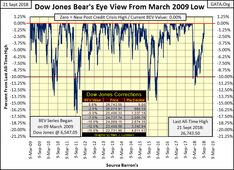
© Mark Lundeen
Let’s do a quick study of these corrections, declines in the Dow Jones of greater than 10 percent in the past decade:
- May to November 2010, a six-month correction that took the Dow Jones down by -13.55 percent in July 2010.
- May 2011 to January 2012, an eight-month correction that took the Dow Jones down by -16.82 percent in October 2011.
- May 2015 to July 2016, a 14-month correction that saw a double bottom: a -14.45 percent bottom in August 2015 and a fractionally deeper bottom of -14.48 percent bottom in February 2016.
- January 2018 to September 2018, an eight-month correction that took the Dow Jones down by -11.58 percent in March 2018.
Of the four corrections, our latest was the Dow Jones’ mildest, taking the Dow Jones below its -10 percent BEV line by only 1.58 percent during this eight-month period. We should ask ourselves what is the purpose of a correction during a bull market—to give a pause in the market’s advance before the next phase in the bull market begins. So, in late September 2018, should we now anticipate the next phase in the current advance in the stock market? Well maybe, and then maybe not.
In either case, one can’t deny how since March 2009 the Dow Jones has seen a wonderful advance. But historically speaking, just how wonderful has this advance been?
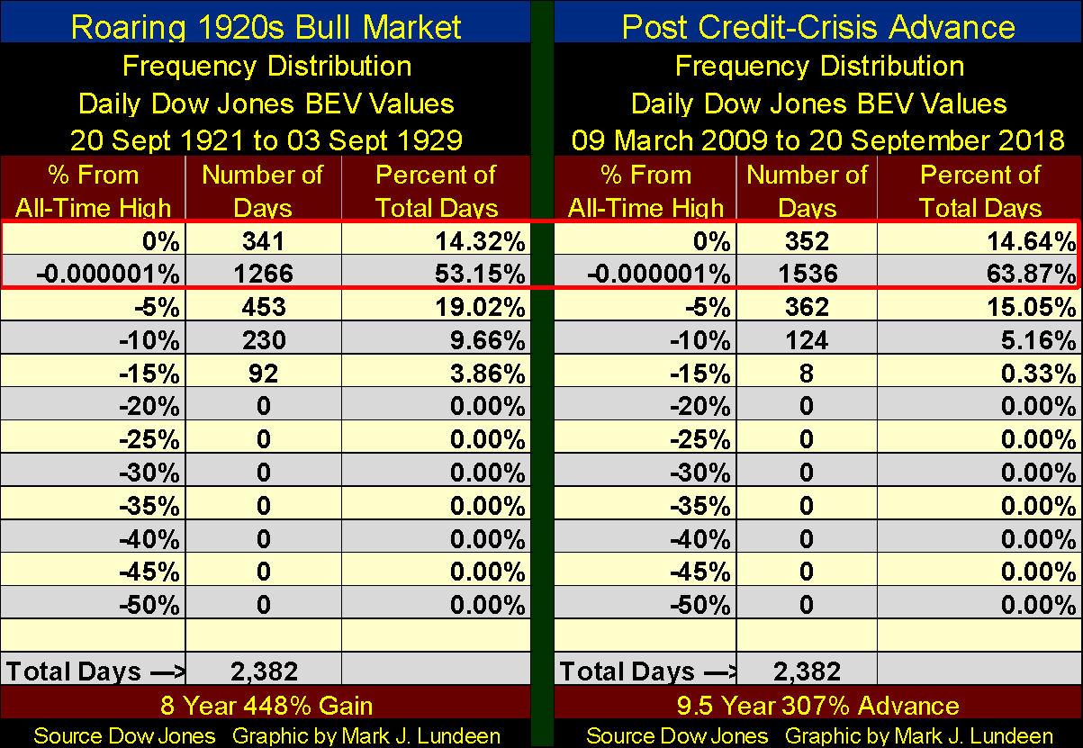
Thinking in historical terms, how has our current advance compared to what the stock market saw during the Roaring 1920s? That’s a fair question, so let’s compare the Dow Jones of the 1920s to how it’s performed since March 2009.
Below, I’ve done a frequency distribution of the daily values seen in the BEV chart’s plot above, all 2,382 of them with the 2,382 daily BEV values during the 1920s bull market leading up to the September 3, 1929, Roaring 1920s market top. Some explanation of the data and tables are required here. Typically, I call a zero percent (BEV Zero) a new all-time high, but in the tables below that isn’t always so.
I began the credit-crisis advance BEV series at the bottom of a -54 percent bear market. This meant the BEV data began producing BEV Zeros each time the Dow Jones advanced above that 54 percent bear market bottom—new highs for the advance to be sure, but definitely not new all-time highs in the Dow Jones itself.
Interestingly, the same is true for the data for the 1920s. The BEV series for the 1920s begins on September 20, 1921, with the Dow Jones down 41.82 percent from its last all-time high. In September 1921, the Dow found itself a month into a recovery from a 46.58 percent bear market bottom that bottomed on August 24, 1921, the month before.
Also, note of the 2,382 days in each sample, the advance from the 1920s took only eight years while the 2,382 days since March 9, 2009, took 9.5 years. This is because until the mid-1950s the NYSE, just as everyone else worked on Saturdays.
Looking at the table’s “ percent From All-Time High” column, which as I’ve mentioned previously isn’t always the case in these two samples, we start with the zero percent row, and these rows display the number of days closing at new highs of the advance in the BEV data.
The -0.000001 percent row catches those daily closings within a penny from making a new BEV Zero, down to -4.99 percent from a BEV Zero. If I didn’t include this row, the zero percent row would include all daily closings from new all-time highs down to -4.99 percent from one.
The -5 percent row catches daily closings within -5 percent down to -9.99 percent from a new all-time high, the -10 percent row catches daily closings within -10 percent down to 14.99 percent from a new all-time high, and so on and so forth.
Comparing these two market eras, the Roaring 1920s bull market produced eleven fewer BEV Zeros than we’ve seen in the past decade. Also, our current advance saw more daily closings within 5 percent of making a new BEV Zero (the -0.000001 percent row) than did the 1920s. Still, the 1920s Dow Jones advance took the Dow up by 448 percent, while in the past decade, the Dow Jones is up only 307 percent. It’s interesting that neither advance saw a daily close deeper than 20 percent below a BEV Zero.
© Mark Lundeen
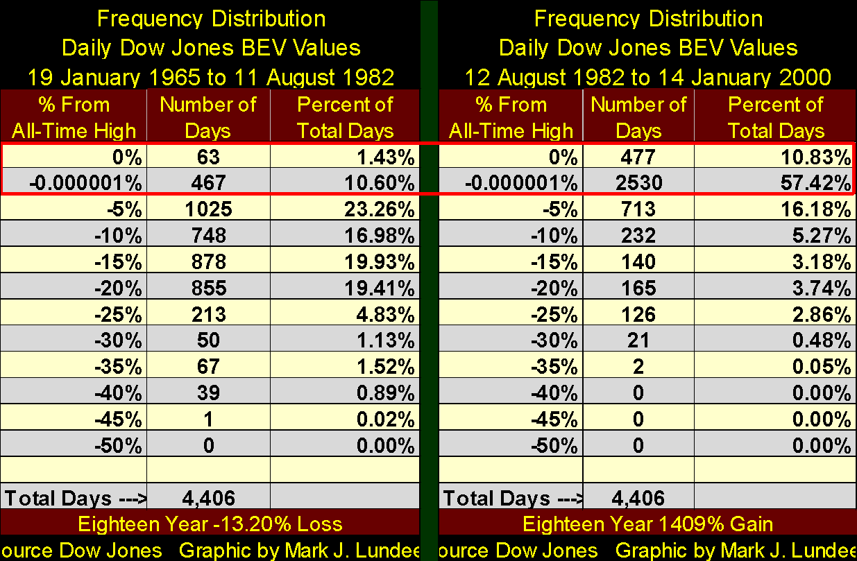
So how often does the Dow Jones go on making new BEV Zeros for years on end? In fact, since October 1981, when interest rates and bond yields peaked in double digits and began a decline that bottomed in July 2016 (35 years), seeing the Dow Jones advancing to new highs has been the rule rather than the exception.
But it wasn’t always that way. From January 1965 to August 1982 (left table below), as interest rates and bond yields increased to double digits, the Dow Jones saw only 63 BEV Zeros. Daily closings within 5 percent of a BEV Zero were only 467 during this 4,406 day period (17 years) that saw the Dow declined by 13.2 percent.
But this loss is in nominal dollar terms. In 1965, a first-class postage stamp cost $0.05; by August 1982, first-class postage had jumped to $0.20. It wasn’t only US postage that saw huge increases during these 17 years. So, inflation-adjusted losses in the stock market during this period of market history were actually much greater.
This was quite a contrast to the 4,406 days that followed. As interest rates and bond yields began to decline, monetary inflation from the Federal Reserve System stopped flowing into consumer goods and began flowing into the valuations of financial assets.
Compare the values found within my red rectangle for these two tables. From 1965 to 1982, only 12.03 percent of the Dow Jones’ daily closings found themselves within 5 percent of a new all-time high, while from 1982 to 2000, 68.25 percent of the daily closings occurred within 5 percent of a new all-time high.
© Mark Lundeen
In an environment of declining rates and yields (thanks to Paul Volcker and Alan Greenspan), the stock market found itself in a historic bull market (right table above). I believe it’s accurate saying the market advance that began in August 1982 continues today, thanks to the inflationary-monetary policy dictated by the FOMC.
We should note that bond yields and interest rates bottomed in the summer of 2016, and have been rising since. Somewhere above, there is a currently unknown threshold in rates and yields that when crossed will put an end to this amazing bull-market mechanism seen in the right side table above.
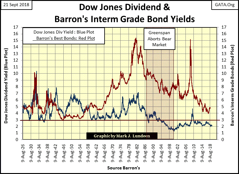
To better visualize the interest-rate environment for the two frequency distribution tables above, I’ve included the chart below. From 1965 to 1982, rising bond yields (Red Plot) proved a huge impediment in the ability of the Dow Jones to make new all-time highs (Left Table Above). This also proved to be the case during the credit-crisis bear market that saw these bond yields spike up to over 15 percent in 2008-2009.
© Mark Lundeen
However, it’s different when bond yields are declining. Within a year after yields and rates peaked in October 1981 (August 1982), the Dow Jones began an epoch that to this week has produced new all-time highs at a rate never seen since 1885 when the Dow Jones was first published.
Here’s the BEV chart for the entire history of the Dow Jones, daily BEV values, new all-time highs and the percentage declines from them going back to February 1885.
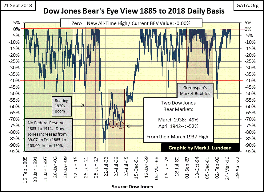
© Mark Lundeen
Below are three frequency distribution tables using the BEV data seen in the chart above, and I draw your attention to the zero percent and -0.000001 percent rows found within the red rectangle I placed on these tables. The far left table covers the entire history of the Dow Jones, where it has seen 1,427 days where it has closed at a new all-time high during the 36,629 NYSE trading sessions since February 1885.
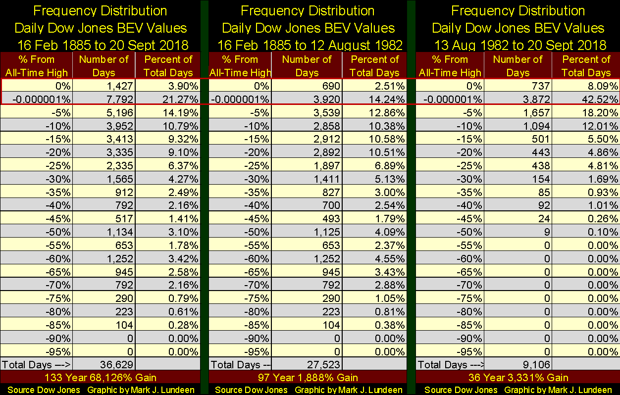
© Mark Lundeen
The tables located mid-ships and on the right split the history of the Dow Jones from before and after August 1982. Looking at the data within the red rectangle I placed on these tables, from 1885 to August 1982 (97 years) the Dow Jones closed at a BEV Zero, or within 5 percent of one in only 16.75 percent of the total days. However, after August 1982 to the close of trading this week, the Dow Jones closed at a BEV Zero, or within 5 percent of one for 50.61 percent of all daily closings for the past 36 years.
This isn’t incredible, it’s prima-facie evidence how for the past 36 years the stock market has been managed ever higher by the Washington / Wall Street establishment using an inflationary dollar issued by their central bank: The Federal Reserve. And I believe this same motley crew has been responsible for the suppression of the price of gold, silver and their miners as they’ve floated the broad stock market ever higher on a rising ocean of inflationary “liquidity.”
So what do I have against bull markets? “Bull market,” is that what this is?
Ron Chernow, in his book “The Warbergs,” noted how in 1913 (when the Dow Jones traded daily between 70 & 80) the Federal Government finally succeeded in implementing an income tax, and they were careful not to tax anyone earning less than $3,000 a year. As Mr. Chernow noted, this $3,000 threshold into the income tax system made sure only wealthy people’s income would be taxed.
But since 1913, the Federal Reserve has also inflated a bull market in personal income too, as noted by the Washington Post below.
“Middle-class income rose above $61,000 for the first time last year, U.S. Census Bureau says.” – Washington Post 12 Sept 2018
And, of course, rich people would find themselves dabbling in the real estate market, as noted by Bloomberg below.
“Cash-Strapped Americans Are Willing to Leverage Their Homes to Pay the Bills.” – Bloomberg 19 September 2018
To be fair to Bloomberg, they note this trend is more prevalent for those who earn $30,000 or less a year. Gee, $30,000 a year used to be a substantial income, not that Bloomberg noted that in their article. They also fail to note where the money is coming from to finance these home equality loans—the Federal Reserve System; the same central bank that has been financing the perpetual-bull market at the New York Stock Exchange since 1982.
I haven’t kept it a secret; while I’m a short-term bull, I’m very pessimistic about the stock market on a longer-term basis. And as people today can only remember a rising stock market, where even a 54 percent bear market is a buying opportunity, the general population’s exposure to a calamitous, and PROLONGED DEFLATION in market values is huge!
When Mr. Bear returns to stress test the balance sheets for the global banking system, governments at all levels and individuals like you and me, I’m expecting the result will be counterparty failure on an epic scale resulting in a market decline as deep or deeper than what the Dow Jones saw in the 1930s. And we should hold responsible the Federal Reserve System, and the US Federal Government who created it in 1913 for the debt-implosion debacle that’s pending on all of us.
But it hasn’t happened yet, and maybe I’m wrong. So let’s take a look at the market as it closed this week.
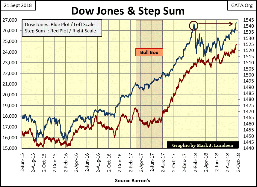
Here’s the Dow Jones (Blue Plot) with its step sum (Red Plot) below. I circled the Dow Jones high of last January and used an arrow to note the Dow has exceeded last January’s high this week. Nicely done.
© Mark Lundeen
The step sum above is looking very good, rising in synch with the Dow Jones price plot as we would expect in a market advance. But one thing that isn’t good is the market action in the NYSE 52Wk Highs and Lows data seen below.
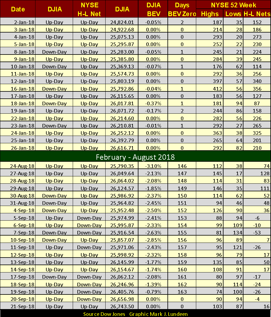
Take a moment to study the table; it’s not hard to understand. In the Dow Jones column to the far left, we see what is essentially the daily step-sum input for the Dow Jones, noting whether the Dow Jones was up or down for the day. Next to that is the NYSE H-L Net, which for the Month of January 2018 was a solid month of up-days. Looking at the DJIA BEV column, we see that from January 2nd to the 26th, the Dow Jones made eleven new all-time highs (BEV Zeros).
Moving to the table’s far right, to the specific NYSE 52Wk H&L daily data we see how strong the NYSE was last January; no triple digit 52Wk Lows for the month and the H-L Nets were, with one exception, in the triple digits. So last January, it wasn’t just the Dow Jones seeing regular new 52Wk Highs, but lots of other stocks trading on the NYSE too.
© Mark Lundeen
Now compare last January’s NYSE’s 52Wk High & Low data with the data for the past month. Though the Dow Jones saw two new all-time highs this week, in the past month NYSE 52Wk H&L data has been very week. Eight of the days listed in the table saw more 52Wk Lows than Highs, including last Thursday when the Dow made its first new all-time high since last January.
Usually, this type of market action, with the Dow Jones going to new highs as the NYSE 52Wk H-L data falls behind is found at the end of a market advance. But with the markets managed as they undoubtedly are; who knows what is to come if the market’s managers – the “policy makers” set their mind to accomplish something?
Below we see how in the early morning of Friday this week, once again from nowhere tons of digital gold were thrown at the gold futures market to knock gold down below $1,200 an ounce. I’m standing by my prediction that gold’s $1,165 close of August 15th will still prove to be the bottom of the 2018 correction in the price of gold.
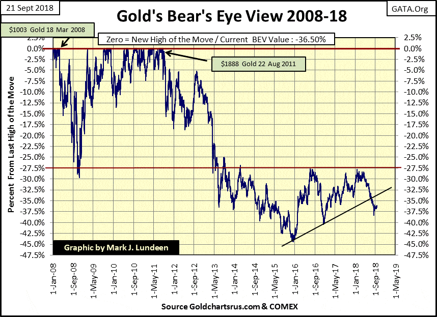
Here is gold’s BEV chart. Last summer (July) gold broke below the rising support line I placed on the chart. That’s disappointing, but not terminal to the current advance that began in December 2015. I expect the decline in gold (silver too) found a bottom last month (August); and though are rising at a snail’s pace, are now on a rebound to higher prices. Sometime in October I may regret saying this, but right now that’s how I see it.
© Mark Lundeen
The key level in gold’s BEV chart above is its -27.5 percent line. This line provided support in the autumn of 2008 during the credit crisis but became a line of resistance after May 2013. Take a look at the number of opportunities gold had to break above, and stay above this line in the past five years – but failed to do so. Four times as I see it. The burden of the bulls in the gold market now is to make their fifth attempt to break above this line and stay above it.
Can they do it? Keep in mind that all markets are connected in one way or another. When bond yields and interest rates rise above the currently unknown threshold, and the stock and bond markets begin to deflate in a very serious manner, a tsunami of flight capital will flee the deflating financial markets and rush into gold, silver and their miners. Then, if not before, gold will rise up through that red line like a hot knife through butter.
But when is that to be? Now that’s the question everyone including me wants to be answered. But over at the X22 Report, they are more daring than I am. They believe that Trump’s new Fed Chairman is working with Trump to increase interest rates with the intent of crashing the market in the not too distant future.
Studying gold’s step sum chart below, we note gold’s step sum in the past month has moved up sharply, unfortunately, gold’s price plot is stuck in a slump. Keep in mind that in step sum analysis, the price trend is a superior predictor of the future than is the step sum’s. At the close of this week, gold’s price trend is pointing towards a continuing tedious market.
However, tedium by itself is no reason to sell an investment asset. So consider this an opportunity to sell some of your stocks in the market’s current strength, and use the proceeds to purchase more gold and silver in their current weakness.
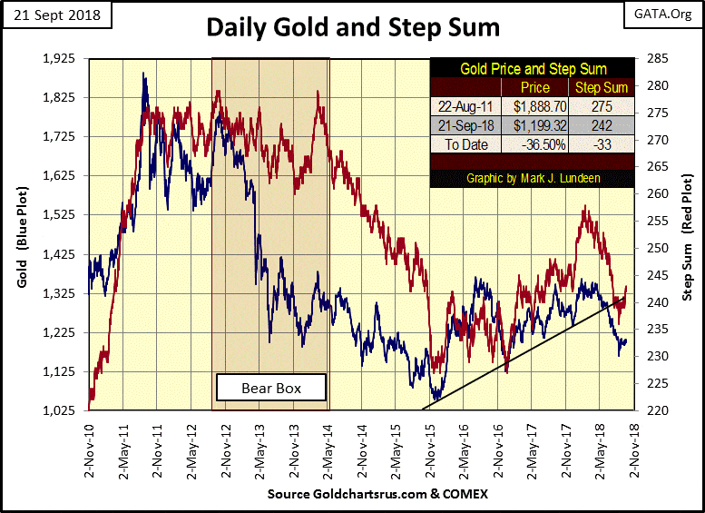
© Mark Lundeen
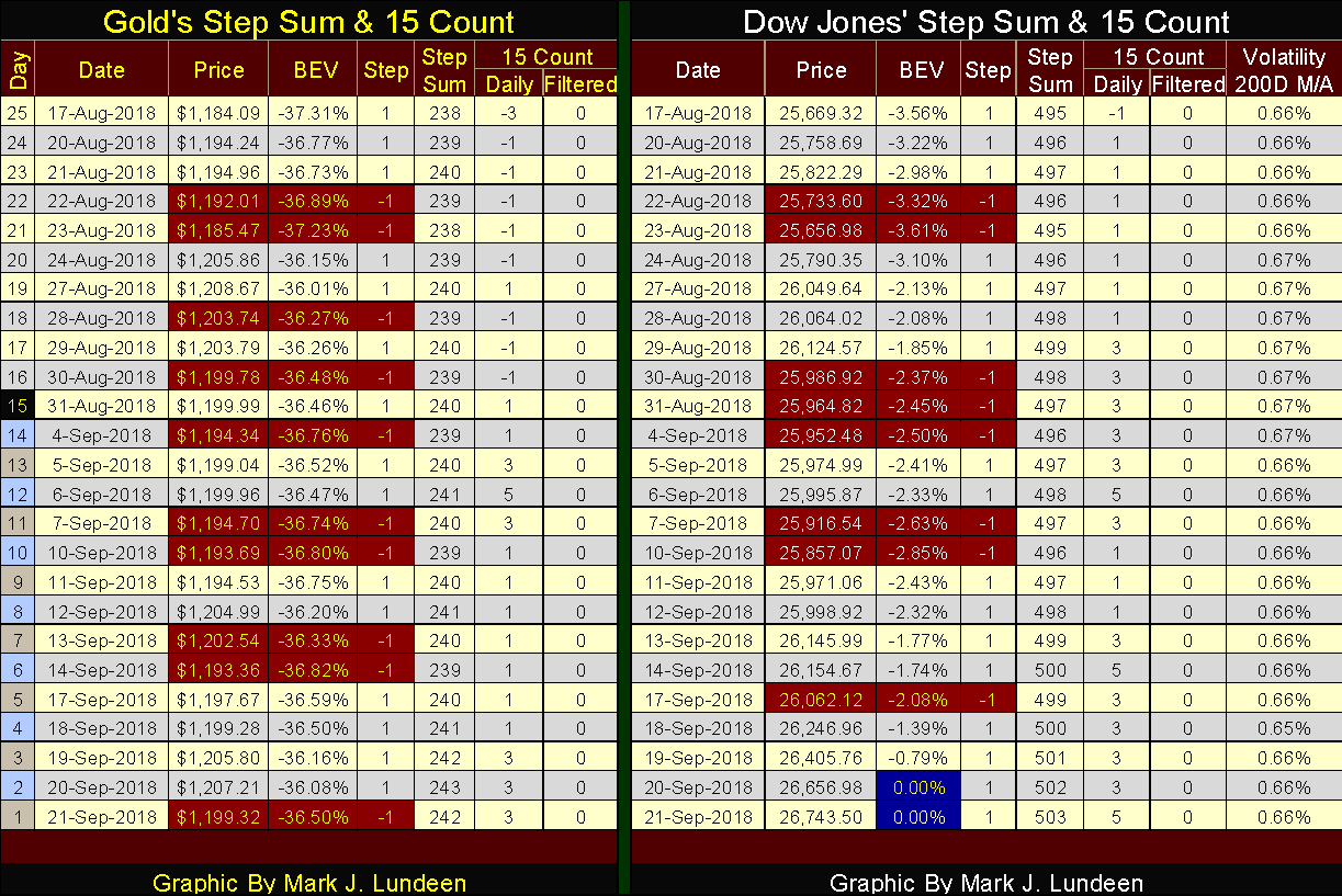
Moving on to gold’s and the Dow Jones step sum tables below, we can study in detail the difficulty the gold market has been seeing for the past five trading weeks. Its step sum has risen from 238 to 242, as its 15 count has turned positive. That’s darn good market action, except that after seeing how advancing days have overwhelmed the decliners, the price of gold itself has only risen by 1.28 percent in the past 25 trading days. So I’m not impressed, and I won’t be until we see the price of gold begin rising with some enthusiasm.
© Mark Lundeen
Market action for the Dow Jones has been excellent. Since August 17, its step sum has risen by eight net advancing days as the Dow Jones itself has increased by 4.18 percent. And look at those two new BEV Zeros I’ve highlighted in blue and white. We haven’t seen any of those since last January.
To refresh our memory of the last January’s market, here’s the step sum table from my January 26th article. Both gold and the Dow Jones saw their step sums increase by eight advancing days in these tables. But gold only advanced by 6.40 percent for all that while the Dow Jones increased by 7.64 percent.
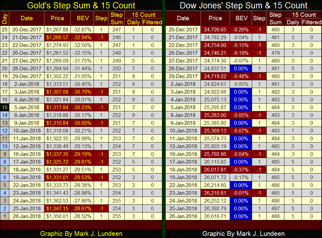
© Mark Lundeen
But the reason I’m including this step sum table from last January is to illustrate the strength the Dow Jones saw in its last month of the advance that began after Donald Trump was elected president in November 2016. Look at all those BEV Zeroes last January.
Beginning this week, the Dow Jones is once again making new all-time highs, but last January will be a hard act for the stock market’s bulls to follow. I recommend we take this market one day at a time and see what it has to offer us.
(Featured image by DepositPhotos)
—
DISCLAIMER: This article expresses my own ideas and opinions. Any information I have shared are from sources that I believe to be reliable and accurate. I did not receive any financial compensation in writing this post. I encourage any reader to do their own diligent research first before making any investment decisions.


Temotiva Launches Crowdfunding Campaign to Advance Preventive Mental Health
Temotiva Innovación Lab has launched a crowdfunding campaign through Santander X Explorer, marking a new phase for the University of...


Fed Policy Shift Raises Concerns Over Debt and Inflation Risks
The Federal Reserve is criticized for resuming balance sheet expansion through Treasury purchases despite expectations of tighter policy under new...


AI Adoption in Italian Retail Stalls Despite Strong Experimentation
A survey on AI in Italian large-scale retail trade shows companies are increasingly adopting artificial intelligence, but only 1.4% have...


Crypto Market Stays Stable as Bitcoin and Ethereum See Mild Declines
The crypto market remained stable despite slight declines in major coins like Bitcoin and Ethereum. Bitcoin held near $64,362, while...


WNBA Removes Cannabis From Banned Substances List in New CBA
WNBA removed cannabis from its banned substances list in a new CBA running 2026–2032, aligning with NBA policy and allowing...
 |
|
 |  |
 |
|
-

 Fintech4 days ago
Fintech and AI: Adoption Grows, but Profits Favor Agile Innovators
-

 Cannabis2 weeks ago
Argentina Legalizes Cannabis Seed Sales Under New Regulatory Framework
-

 Business6 days ago
SpaceX IPO Sparks Déjà Vu as Market Risks Loom and Gold Bulls Stay Hopeful
-

 Business2 weeks ago
Dow Jones Rally Faces Uncertainty Amid NASDAQ Reversal
You must be logged in to post a comment Login