Featured
Keep playing the game: Markets set to continue rising but beware of future corrections
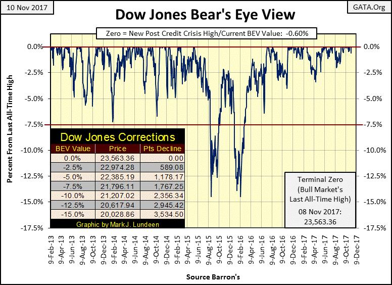
Those keeping an eye on the stock market will not like the outcome after the Dow Jones spots a 5% correction.

The week ended with the Dow Jones closing down on Thursday and Friday. Still, the week closed with the Dow Jones only 0.60% below its last all-time high made on Wednesday, far from its BEV -5% line seen in the BEV chart below. Seventeen months have passed since June 2016, when the Dow Jones last found itself correcting more than 5% from an all-time high. To my way of thinking, there is something odd about that, something fundamentally wrong about how this market refuses to make normal, periodic corrections.
My concern is when the day comes where the Dow Jones does see a 5% correction, it will continue going down to levels that will shock market watchers. A remarkable dead-cat bounce will follow to once again lure the bulls into Mr. Bear’s meat grinder before it goes down yet again in a really nasty market decline.
© Mark Lundeen
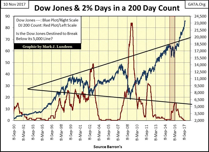
But when is all this going to happen? When we once again see extreme market events occurring regularly in the market. Days of extreme market volatility or Dow Jones 2% days have always been a harbinger of coming of bad times for the bulls in the stock market
Volatility, as I measure it with the number of 2% days the Dow Jones sees within a running 200-day count, has been at zero since August 23rd, which for the bulls has been a real blessing. Historically, low volatility has been a bull market phenomenon since forever. It’s the old “don’t short a boring market”, and this is one boring market! The chart below plotting the Dow Jones (Blue Plot) with its 200-count (Red Plot) going back to 1990 makes the point.
© Mark Lundeen
How much longer the stock market, as measured by the Dow Jones, can continue advancing is a mystery. But market history strongly suggests that until the Dow Jones’ 200 count begins rising above its current zero line, the stock market will continue going up. One thing is certain; a negative 2% day, a 471, or more point down day in the Dow Jones, will be clearly seen in its BEV chart above, and create a shock wave in the market’s commentary. It’s only a matter of time before it happens, and don’t you be shocked when it does.
Until it does, and if what you’re doing is making you money in the stock market, keep playing the game. Just understand that when the Dow Jones once again begins seeing +/- 2% daily moves, it’s because Mr. Bear is changing the rules the bulls are now playing by.
Nothing new or exciting is happening with NYSE’s market breadth or 52Wk Highs and Lows, or anything else on the market. I don’t want to become boring to my readers, so let’s just move on to gold.
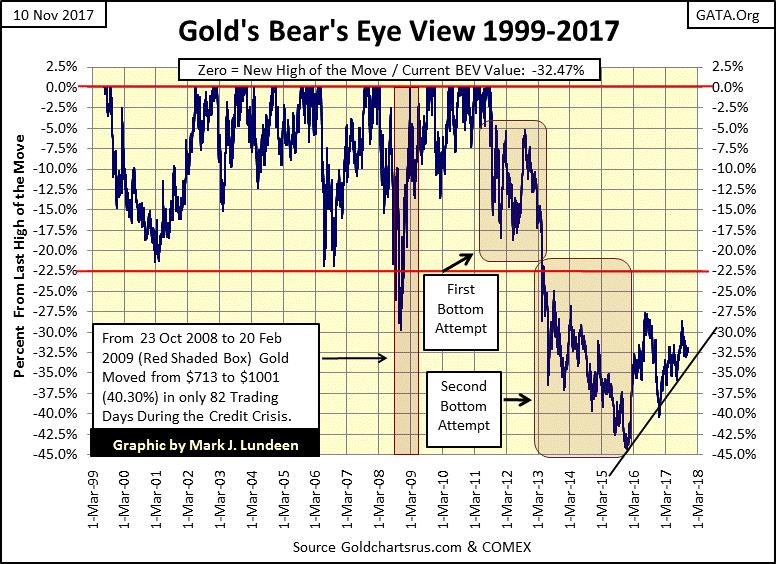
Gold’s BEV chart below is encouraging. Closing the week at 32.47% below its last all-time highs of August 2011, places the BEV plot at the bottom of its current downtrend, but comfortably above the black trend line I placed on the chart. Just looking at the chart, it seems the current correction in the price of gold is resting on its end point. Hopefully, the next thing we see below is gold advancing, and taking out its highs of the summer of 2016, above its -27.5% line.
© Mark Lundeen
Gold’s step sum chart below is also encouraging. After the huge collapse in market sentiment (as measured by gold’s step sum / Red Plot) from April 2014 to December 2015, gold is now behaving as if it’s in the early stages of its next big advance.
In other words, the bulls still haven’t completely recovered from the 2011 to 2015 collapse in the price of gold; in November 2017 they remain unsure of themselves. But the bears, having exhausted themselves in this decline no longer have what it takes to drive the price of gold down. Keep in mind the government’s market “regulators” allow the bears (the big banks) to cheat, so anything can happen. That said, I still expect the next big move in gold, silver, and their miners will be to the upside.

© Mark Lundeen
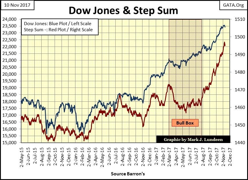
The Dow Jones and its step sum are looking good in the chart below.
© Mark Lundeen
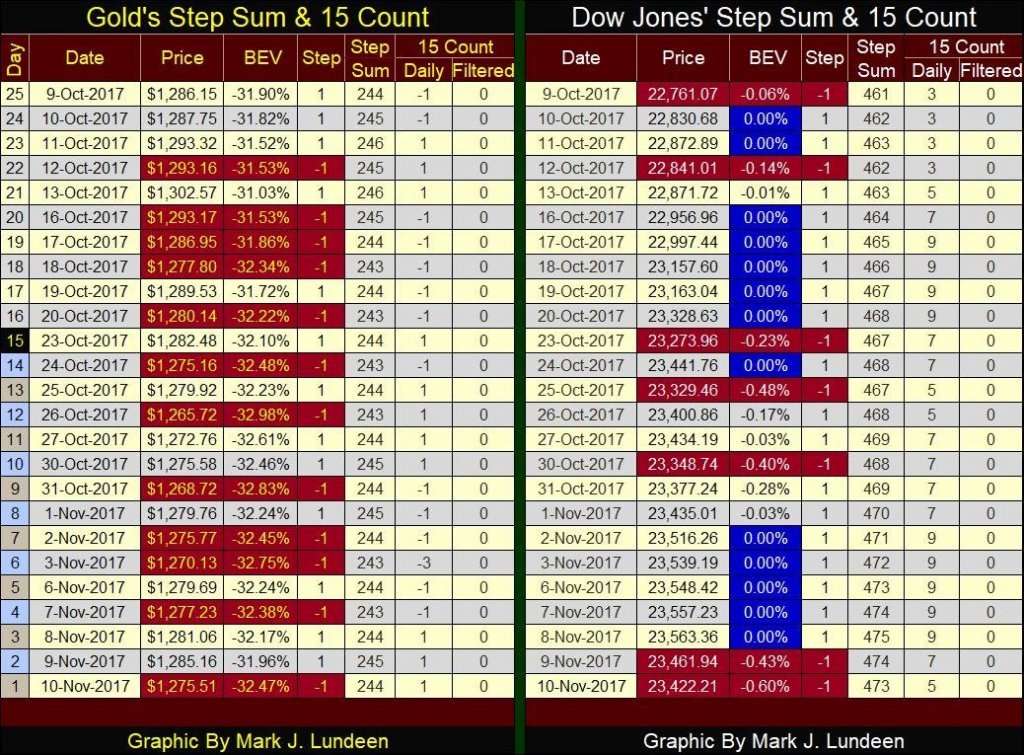
Looking at the Dow Jones’ step sum table below, we see how it made five new all-time highs from November 2nd to November 8th. But those five new all-time highs only pushed the Dow Jones up by 47 points, not much of an advance for a market metric currently above 23,500. And then the last two days of the week were down days, with each down day pushing the Dow Jones down more than any of the previous five advancing days pushed the Dow Jones up.
We may be approaching the point where the Dow Jones finds it easier to go down than up. Maybe the day where the Dow Jones declines by 471 points (a 2% day) isn’t that far away.
© Mark Lundeen
On gold’s side of the table above, the bulls and the bears are slugging it out. Its step sum is going nowhere fast. Though the bulls haven’t been able to drive the price of gold into a new advance; since October 8th the bears have been unable to drive the price of gold below $1260 either.
Once long ago, in a land far, far away, the Dow Jones Industrials & Railroads (now called the Transports) Averages were the high-tech wonders of the financial world. Before Charles Dow invented his stock averages in the 1880s, no one had ever considered watching the stock market as a whole, a thing unto itself. After he began publishing his stock averages, the stock market has never been the same.
As today, the Dow Jones in the 1880s was constructed using computers. However computers in the 1880s up to, the 1960s (I’m guessing), where people who could calculate the various averages The Wall Street Journal, and Barron’s published, rapidly and accurately using paper and pencils. Besides the Dow Jones Industrials, Transports and Utilities, there was also the DJ 40Bond and Barron’s 50Stock Averages, and a hand full of others averages too.
After the advent of digital computing, Standard & Poors began publishing its S&P500, an index (not an average) based on the market capitalization of the 500 largest companies traded on Wall Street. The Dow Jones Industrials, being an average of the share prices of only 30 large blue-chip companies, a relic of the 19th century, never looked the same afterward.
So, why is the Dow Jones Industrials Average still popular? Because it’s part of not just market history, but of history itself in a way no modern index could ever be. How many points did the S&P 500 climb in the Roaring 1920s, and then crash in the depressing 1930s? Standard and Poors has backdated their data so we could find this out, in an after-the-fact manner. But anyone using contemporary sources to study the 19th, 20th and now the 21st centuries will discover how over the decades, the stock market is best measured by the Dow Jones Averages.
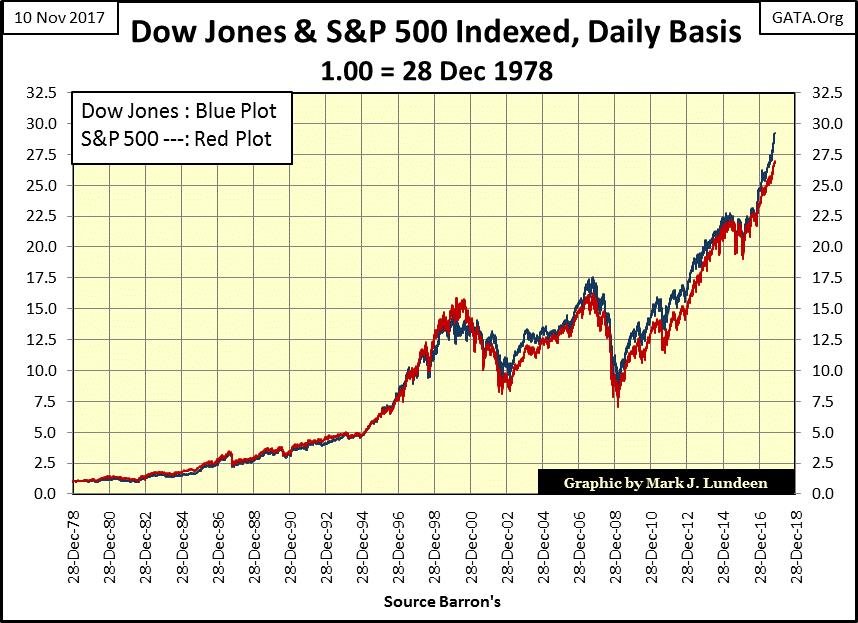
And what is lost when we view market history via the Dow Jones’ Industrial Average in lieu of the S&P 500 Index? Actually, not much. I’ve indexed the Dow Jones with the S&P 500 in the chart below (28 Dec 1978 = 1.00), and for the past 39 years, the differences between the two have been minimal.
Considering the radically different composition of these two famous market metrics, this is actually amazing. The Dow Jones being an average price of 30 blue-chip stocks, with a divisor to correct for stock splits, and the S&P an index of the market capitalization of the 500 largest companies trading on Wall Street.
© Mark Lundeen
And exactly what are we looking at in the chart above? Whether the stock market, as a whole, is advancing or declining. Or from my point of view – being inflated by the Federal Reserve in a bull market or being deflated by Mr. Bear in a bear market. Understand that during bull markets there are stocks and stock groups that out, or underperform the Dow Jones and S&P or may actually go down in value. Just as during bear markets there are stocks and stock groups that see much deeper declines than the Dow Jones or S&P or may actually advance.
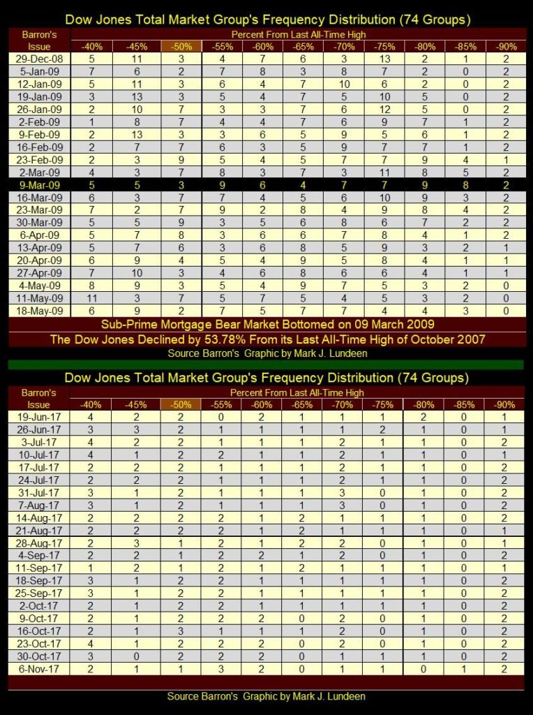
In the tables below I’m showing the frequency distribution for the DJTMG’s percentage declines from their last all-time highs (BEV Values) for the 09 March 2009 sub-prime bear market and the data as of last week’s Barron’s issue.
During the previous bear market, Dow Jones with its -53.78% decline would have been placed in the -50% column for March 9th, 2009. I highlighted the -50% column in light brown to show where the Dow Jones would have gone on March 9th, 2009.
In that issue of Barron’s, there were no DJTMG groups closer than -34.99% from their last all-time high. From -35% to -45% there were 17 groups who declined less than the Dow Jones in its -50% column, and 52 groups (-55% to -90%) which had declined more than the Dow Jones during the bear market. There were two more groups in the -95% column, which is not shown.
© Mark Lundeen
The point of all this is that while people think of bull and bear markets in terms of the Dow Jones or S&P500, keep in mind there are individual stocks and market groups that do better, or worse than the major indexes everyone follows daily.
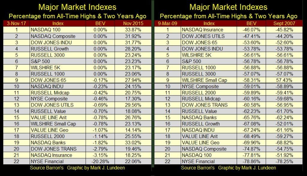
I thought it would be nice to see how the major indexes performed along with the DJTMG data above in the tables below. With all the “liquidity injected” into the stock market by Doctor Bernanke, we shouldn’t be surprised seeing how these big market indexes have recovered from their lows of 09 March 2009.
© Mark Lundeen
It’s good taking a step back to consider what has happened over a longer term than just a few weeks, months or even years. So, I constructed the following chart plotting the indexed values of the Dow Jones, a T-Bond I’m following, the growth in CinC as well as the price of gold and silver below.
It’s interesting how gold and silver (Brown & Black Plots), both currently near their bottoms of a particularly nasty correction, have still outperformed the stock and bond markets (Blue & Red Plots), markets currently near their bull market tops during these past eighteen years.
Considering the state of the world today, overloaded with massive levels of debt that will never be paid back, it’s reasonable assuming gold and silver will eventually take out their 2011 highs as the stock and bond market deflate back to, and then below their lows of January 2000.
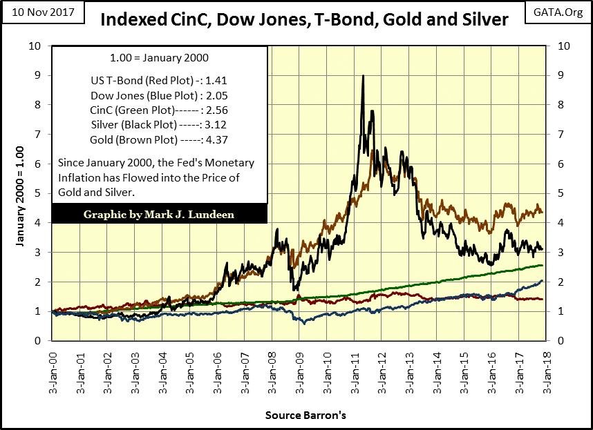
© Mark Lundeen
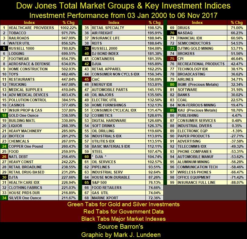
Taking this study a step further, let’s look at the performance of the Dow Jones Total Market Groups (DJTMG) along with some major market indexes and government statistics during this same period in the table below. Tab color key is given at the table’s bottom.
Note: The values above are indexed values (Jan 2000 / Nov 2017), while those below are percentage gains or losses (Jan 2000 / Nov 2017)-1. In other words seeing the Dow Jones above at 2.05 and below (#60) at 104.74% are the same, just processed differently.
© Mark Lundeen
It’s remarkable how well gold and silver (#18 & 34) have held up since January 2000. Much is now being made of the rebound in high-tech, but the best performing high-tech group is digital hardware (#53). All the hot groups of the 1990’s High-Tech and cell phone bubble are now at the bottom of the list, with Semiconductors at #72 and Software at #81.
There’s a lesson to be learned here; after a bubble deflates it can take decades before a market group recovers if it ever does to its former high. All the while other groups are benefitting from the interminable flow of inflation from the Federal Reserve. Look at who now find themselves near the top of this table; Healthcare, Tobacco, and Railroads, market groups “market experts” heaped scorn on in January 2000. The exact same thing happened to gold and silver from 1980 to 2001.
Of course, the high-tech now in fashion is the social-media companies, which were not big players in January 2000, a group that my data set of the DJTMG does not follow.
A big disappointment has been the poor performance of the gold miners (#73, 80 & 85), but this can change very quickly. It was just in the summer of 2016 when the gold miners were the best performing groups in this exact list, although the calculations were based on the performance from December 2015 to June 2016.
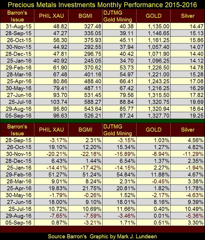
Here’s a table I used in early September 2016 listing the monthly changes in dollars (top) and in percentages (below) for the gold miners and the metals. As seen in November 2015 & February 2016 below, the performance for the miners is heavily leveraged to the metals.
© Mark Lundeen
One thing is for sure, it always nice thinking about making money in the markets.
—
DISCLAIMER: This article expresses my own ideas and opinions. Any information I have shared are from sources that I believe to be reliable and accurate. I did not receive any financial compensation in writing this post. I encourage any reader to do their own diligent research first before making any investment decisions.


XRP Under Pressure Amid Macro Forces, Fed Policy, and Regulatory Shifts
XRP remains under pressure despite easing geopolitical tensions, as macroeconomic factors and Fed policy dominate market sentiment. Liquidations and high...


Edison Accelerates Renewable Growth and ESG Impact in 2025
Edison reports strong 2025 sustainability progress, boosting renewable investments by 90% to reach 2.3 GW toward a 4 GW 2030...


New Gene Therapies Transform Rare Disease Care, but Gaps Remain
Gene therapies are transforming rare disease treatment, enabling normal lives for some patients. However, only about 6% of 7,000 rare...


Temotiva Launches Crowdfunding Campaign to Advance Preventive Mental Health
Temotiva Innovación Lab has launched a crowdfunding campaign through Santander X Explorer, marking a new phase for the University of...


Fed Policy Shift Raises Concerns Over Debt and Inflation Risks
The Federal Reserve is criticized for resuming balance sheet expansion through Treasury purchases despite expectations of tighter policy under new...
 |
|
 |  |
 |
|
-

 Business1 week ago
SpaceX IPO Sparks Déjà Vu as Market Risks Loom and Gold Bulls Stay Hopeful
-

 Business2 weeks ago
Dow Jones Rally Faces Uncertainty Amid NASDAQ Reversal
-

 Crowdfunding5 days ago
Wyrmgold Launches Crowdfunding Campaign for Believe in me! (please)
-

 Biotech2 weeks ago
The German Biotech Industry Faces Funding Crunch Despite Market Stability
You must be logged in to post a comment Login