Featured
The NASDAQ is still below what it gained during the 1990’s
Our ‘Chart of the Week’ looks at the massive increase in margin debt. Gold continues to try and find a bottom here. The clues are all positive. But gold has a lot of work to do to convince that another major up move is on its way. Oil may have hit a temporary top as the energy stocks were the worst performers this past week. WTI oil fell over 6%. Key now is that important support zones hold to maintain the bull market.

Oh yes, bubbles. Bubbles, according to the economist John Kenneth Galbraith (1908–2006) are twofold: “A distortion of economic values during the period of speculation, and, attention ceases to be on making of goods and becomes centered (only) on making money.” By that definition we are in a bubble.
Bitcoin, GameStop, SPACs (Special Purpose Acquisition Company). You have to love the SPACs—a company with no special commercial operation that is formed strictly to raise capital through an initial public offering (IPO) for the purpose of acquiring an existing company. Also known as “blank check companies.” According to Refinitiv (www.refinitiv.com), some 165 SPACs were created between January and October 2020, estimated at upwards of $40 billion. In terms of numbers, they were more than double 2019 and more than five times 2015.
The names of bubbles resonate: Tulip Bubble (1647) +5,900%; South Sea Bubble (1720) +750%; and the Mississippi Bubble (1720) +1,900% were three famous ones outlined in Charles MacKay’s book Extraordinary Delusions and the Madness of Crowds (1841). But more recently we had the Dow Jones Bubble (1929) +497%; Gold (1980) +2,276%; Silver (1980) +3,099%; Bre-X (1997) +13,305%; Fannie Mae (2008) +12,696%; Tokyo Nikkei Dow (1990) +1,873%; Nortel (2000) +1,017%; Crude Oil (2008) +1,255%; or Canopy Growth (marijuana stocks) up 6,560% (2015–2018). We could go on. So, what are we to make of Bitcoin +1,625% from 2018 to the present during the current second bubble or the 8,569% gain during the first Bitcoin bubble (2015–2017)? Or GameStop +18,693% or more conventional Amazon +8,973%; Apple +5,253%; Netflix +20,669%; Tesla +29,913%—all since 2009. The NASDAQ is up 1,020% and the S&P 500 is up 496% since 2009. The NASDAQ rose 1,489% from 1990–2000 and it was considered a bubble. Already, the percentage gain of the S&P 500 (2009–2021) equals that of the Dow Jones Industrials (1921–1929). Many consider the Canadian housing market to be in a bubble, yet the gains are not as spectacular as many noted here. But if, as is widely reported, people are buying without having physically seen the place, then we are in a bubble.
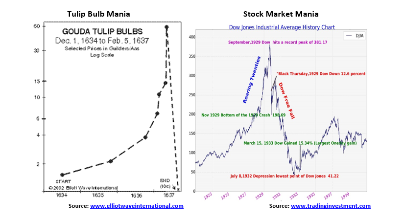
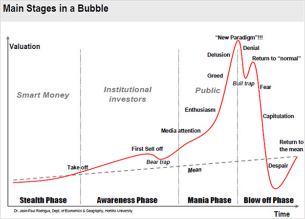
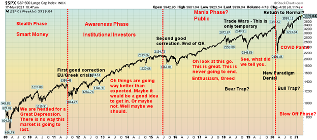
Yet, against this backdrop, all we hear is how it is going to be the “Roaring 2020s.” Really? After we have already had such spectacular gains? Manias can have a life longer than many short-sellers can remain solvent. Our chart below shows the stages of a mania. Our second chart shows the S&P 500 with our delineation of the stages of the bubble. But hold on, the stages of a bubble chart below show only one sell-off as the bear trap. So far, we’ve had at least three, maybe four, if one wants to break up the 2018 correction and the March 2020 correction. So, what gives? The DJI “Roaring Twenties” mania had only one serious correction along the way in 1923, although there were a series of smaller pullbacks through 1926. The gold mania of the 1970s also had only one serious pullback in its run from 1971 to 1980. That occurred in 1974–1976. But the NASDAQ mania of 1990–2000 had two pauses: first in 1994 and again in 1998. Of the two, the 1994 pullback was shallower.
But if this is a mania, a bubble, as many are suggesting, it is defying all norms and expectations. By many definitions we should be headed now into the collapse. If the business cycle is normal, we should have already hit the top. But we haven’t and we are not. What gives? In a word: massive intervention into the normal cyclical process of markets by the Federal Reserve (central banks) and the government. This has the bulls chortling. $1.9 trillion rescue packages, $14 trillion worldwide, $120 billion/month in bond purchases from the Fed and similar programs to varying extents in the EU, Japan, Canada, Australia, China, etc. In the past there were either no central banks to intervene or the concept of central bank intervention was still in its infancy (Great Depression). The central banks today appear ready to do “whatever it takes” and “smooth out the wild swings of past economic cycles…”
The fact that the market recovered quickly from the March 2020 COVID-19 collapse making new all-time highs has encouraged the bulls. The market, as some say, is powerfully bullish and has a long way to go. That certainly is a condition for a mania. Indicators are bullish as well with the NYSE advance-decline line printing new highs along with the market. Breadth is pointed up as the number of stocks trading over the 200-day MA is as high as it has ever been. That can also be a concern as high readings have tended to coincide with tops. Bullish sentiment is high but we have seen it higher. The put/call ratio is heavily in favour of calls and that is some reason for concern as well as we have never seen it remain this high for such a prolonged period of time. Another sign of a mania? Volatility indicators have broken to new lows and could even be headed back to the lows we saw back in late 2019 before the February 2020 top.
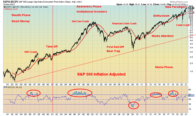
Here is yet another longer-term view of looking at the bubble. We saw this originally in an article at (www.advisoranalyst.com) titled #Technically Speaking: Another Way of Looking at Long-Term Bubble Cycles. Lengthy and technical but interesting. This is but a snippet with our own labeling. The premise is we are in a long-term bull market that has not yet ended. The market had its beginnings out of the 1982 stock market low which is considered the real bottom of the 1966–1982 bear market. We have adjusted the chart to take into consideration inflation. The idea is that the bull market that got underway in 1982 remains intact and we are only now entering the real mania phase. But is this time really different? Have we truly reached a new paradigm?
A new paradigm is not likely, but when you have a commitment to keep interest rates at zero for the foreseeable future—well, at least until 2023—coupled with monthly bond purchases (QE) of $120 billion ($80 billion U.S. treasuries, $40 billion mortgage-backed corporate bonds), and, that you are not too concerned about inflation, then that is more than enough to propel markets higher. We are only now moving into the heart of the mania phase. Where it tops or ends is anyone’s guess. We have noted that the 2008/2009 stock market low was the culmination of a 72-year cycle low, a 36-year half cycle low, and an 18-year quarter cycle low. The next 18-year cycle low is not due until 2027 +/- 3 years. We note that the 90-year cycle low, assuming one exits, is due between 2021–2037 so we are beginning to enter that window. The March 2020 low may have been a half-cycle low of the 18-year cycle, given it came within the range of 7–11 years from the key 2009 low.
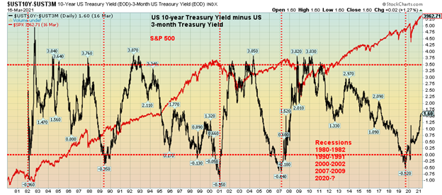
Another area that makes us bullish is the rising yield spread between the U.S. 10-year treasury note and the U.S. 3-month treasury bill. It is currently at 1.60 but still well below highs recorded in 1984/1985, 1992/1993, 2003/2004, and 2008/2009 over 3.50 that preceded major upside moves in the stock market. Recessions are predicted and follow when the spread turns negative as we saw in 1982, 1989/1990, 2000/2001, 2006/2007, and again 2019/2020. The positive yield spread suggests the market is poised to move even higher still.
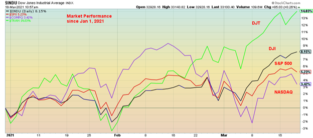
Since the beginning of the year the two top-performing markets in the U.S have been the Dow Jones Transportations (DJT) and the Dow Jones Industrials (DJI) (thanks, Mike). The NASDAQ that has led for the past decade is now lagging. What that tells us is that the market is shifting from “growth” to “value” that one often sees at the end of the cycle. As well, with better returns available in the U.S. bond market or the stock market, funds are flowing in from the EU and Asia. The majority is parked in bonds or the blue chip DJI.
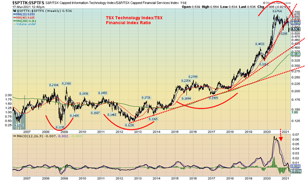
We see this further in our next chart of the TSX Technology Index (TTK) and the TSX Financials Index (TFS) ratio. Since 2012 the TTK has been leading the way up. However, the ratio has now broken the steep uptrend line, giving us a sell signal to sell the TTK and buy the TFS. Again, this is a play on the shift from growth to value.
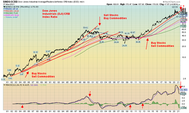
Besides the shift from “growth” to “value” there is also a shift occurring from “stocks” to “commodities”. We have mentioned this theme before. Our next chart of the Dow Jones Industrials (DJI) Commodity Research Bureau (CRB) ratio appears to be giving us a sell signal, suggesting the time is also to shift into commodity stocks. The CRB is a basket of 19 commodities with 39% allocated to energy, 41% to agriculture, 7% to precious metals, and 13% to industrial metals. The period 1982–2000 saw stocks outperform commodities. But the ensuing period 2000–2011 saw commodities generally outperform stocks.
The long stocks period 2011–2020 now appears to be coming to an end as the Dow:CRB ratio is giving us a sell signal to favour commodities over stocks. While gold and silver have lagged thus far in 2020, both oil and copper have outperformed. The energy and materials sectors have been strong performers so far in 2020. Since these trends tend to last many years, it suggests to us that commodities should outperform both stocks and bonds for quite some time.
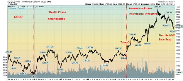
Our final chart is one of gold where, once again, we have applied bubble theory. Gold made its final low in December 2015. For the next three and half-years gold effectively traded in a range between $1,370 and $1,150. We have labeled that phase as our stealth phase, a period where the smart money was accumulating positions. In July 2019 gold broke out (Take-Off) breaking above $1,370 and going on a run into August 2020, topping at $2,089. Since the breakout, this is the first sell-off we have experienced. As a result, once this correction is finished, we believe that gold will take off in the mania phase of the cycle. This is a phase that may top out sometime in 2022 but could also stretch into 2023. As we have so often noted, gold’s 7.8-year cycle is not due to bottom until late 2022 but could range from early 2022 to the latter part of 2023. The 23.5-year cycle is also due during that period with the overlap ranging anywhere from late 2020 to early 2027. This first sell-off we have experienced is, we believe, the 31-month cycle low, but it is only the second one since December 2015. We await the start of the third and final phase.
Are we in a bubble? We are certainly seeing signs of one developing. Inexperienced retail traders have entered the market; there has been a surge of buying IPOs of companies whose purpose isn’t even known (SPACs); we appear to be entering a phase where everyone thinks stocks only go up, egged on by the Fed and the hopefulness of the end of the pandemic and everyone being vaccinated (new paradigm?); leverage is rising (see chart on margin debt under Chart of the Week); we are even seeing a surge of house buying where the buyer hasn’t even seen the house (except virtually). All of these are signs of rising frothiness.
The question is: how long does this last? What about rising interest rates and inflation? The Fed doesn’t seem too worried, more than willing to allow inflation to rise to 2.5% without intervention. There was not even a sign that they may bring in interest rate suppression with another Operation Twist (sell short bonds/notes, buy long bonds/notes). If Japan is the example, then 30+ years of debt financing with a government debt to GDP ratio of 271% far surpassing the U.S.’s current government debt to GDP ratio of 130% should have unleashed massive inflation (its current inflation rate as at December 2020 is negative 1.2%) and turned Japan into an economic basket case à la Zimbabwe or Venezuela. It hasn’t. However, its economy can best be described as a zombie economy. So again: how long does this last? The answer is simple: longer than the short-sellers can remain solvent.
The Pandemic Rages On!
Is the third wave upon us? Numbers have been rising. The 7-day moving average is up to almost 475,000 daily. In mid-February that number had fallen to roughly 366,000 daily. At the peak in mid-January, it was roughly 742,000 daily. Deaths so far remain steady around 8,700 daily. Leadership is changing as well. Where before the U.S. led the world in daily cases and deaths that mantle now belongs to Brazil. It is chaotic there with no leadership and overflowing hospitals. Cases have shot up in the third wave in Italy and France as well sparking another shutdown and anti-lockdown protests across the EU many of them violent. In the U.S. the daily cases remain steady around 56,000 and deaths as well averaging around 1,100 and falling. Canada is seeing an uptick in daily cases currently just under 3,500 but deaths are falling averaging lately around 29.
Sunday March 21, 2021 – 12:54 GMT
World
Number of cases: 123,545,682
Number of deaths: 2,723,693
U.S.A.
Number of cases: 30,482,127
Number of deaths: 554,871
Canada
Number of cases: 930,516
Number of deaths: 22,643
Source: www.worldometers.info/coronavirus
Chart of the Week
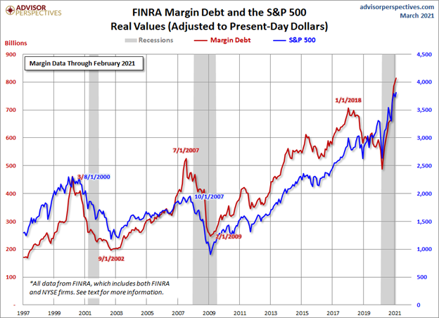
This is astounding. But it reflects the mania in the markets. Margin debt has soared to record levels, far surpassing those seen at the top of the dot.com bubble 1999/2000 and the housing bubble 2006/2007 that resulted in the financial crisis of 2008. The chart compares margin debt with the S&P 500, all adjusted for inflation. Margin outstanding bottomed at the lows of the March 2020 pandemic crash. But the Fed/Government put came into play and the buyers poured in. When you know that the Fed/Government is going to bail you out, you know no fear.
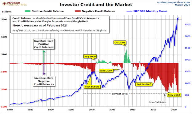
The second chart on the next page shows credit balances in accounts vs. the rise of the S&P 500 but on a nominal basis, not an inflation-adjusted basis. But the story is the same. Never has there been so much margin debt outstanding. Complacency reigns. Still, it is just an indicator and it does not tell us when a top could come in. Nor does it tell us that the market is going to crash, although the implication is that it is a very dangerous, highly-leveraged market.
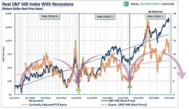
Our final chart also below reverts back to the charts we showed in our main article from Advisor Analyst. This one suggests that we are in the third long-term cyclical wave dating from 1871. Markets bottom with cyclical lows in the Shiller P/E ratio. We are not there yet. The first full cycle lasted 60–63 years, bottoming in 1931–1934 while the second cycle was shorter lasting just over 50 years, bottoming in 1982–1984. The chart implies we are still in the current cycle and that the markets did not go low enough for the P/E in 2008 to suggest the cycle was complete. The result is, this one implies we could bottom somewhere from 2032 to 2042. In other words, this mania market has further to go. And massive QE intervention and, it seems, massive margin debt are the catalysts.
MARKETS AND TRENDS
| % Gains (Losses) Trends | ||||||||
| Close Dec 31/20 | Close Mar 19/21 | Week | YTD | Daily (Short Term) | Weekly (Intermediate) | Monthly (Long Term) | ||
| Stock Market Indices | ||||||||
| S&P 500 | 3,756.07 | 3,913.10 (new highs) | (0.5)% | 4.2% | up | up | up | |
| Dow Jones Industrials | 30,606.48 | 32,627.97 (new highs) | (0.5)% | 6.6% | up | up | up | |
| Dow Jones Transports | 12,506.93 | 14,182.13 (new highs) | 0.2% | 13.4% | up | up | up | |
| NASDAQ | 12,888.28 | 13,215.24 | (0.8)% | 2.5% | down | up | up | |
| S&P/TSX Composite | 17,433.36 | 18,854.00 (new highs) | flat | 8.2% | up | up | up | |
| S&P/TSX Venture (CDNX) | 875.36 | 995.80 | 1.4% | 13.8% | neutral | up | up | |
| S&P 600 | 1,118.93 | 1,355.09 | (3.1)% | 21.1% | up | up | up | |
| MSCI World Index | 2,140.71 | 2,236.80 | 0.5% | 4.5% | up | up | up | |
| NYSE Bitcoin Index | 28,775.36 | 59,041.31 (new highs) | 3.9% | 105.2% | up | up | up | |
| Gold Mining Stock Indices | ||||||||
| Gold Bugs Index (HUI) | 299.64 | 279.29 | 3.0% | (6.8)% | neutral | down | up | |
| TSX Gold Index (TGD) | 315.29 | 294.63 | 3.1% | (6.6)% | neutral | down | up | |
| Fixed Income Yields/Spreads | ||||||||
| U.S. 10-Year Treasury Bond yield | 0.91 | 1.73% (new highs) | 6.1% | 90.1% | ||||
| Cdn. 10-Year Bond CGB yield | 0.68 | 1.59% (new highs) | 1.3% | 133.8% | ||||
| Recession Watch Spreads | ||||||||
| U.S. 2-year 10-year Treasury spread | 0.79 | 1.58% (new highs) | 6.8% | 100.0% | ||||
| Cdn 2-year 10-year CGB spread | 0.48 | 1.33% (new highs) | 6.4% | 177.1% | ||||
| Currencies | ||||||||
| US$ Index | 89.89 | 91.93 | 0.3% | 2.3% | up | down (weak) | down | |
| Canadian $ | 0.7830 | 0.8004 (new highs) | (0.2)% | 2.2% | up | up | up | |
| Euro | 122.39 | 119.04 | (0.4)% | (2.7)% | down | up (weak) | up | |
| Swiss Franc | 113.14 | 107.60 | flat | (4.9)% | down | down | up | |
| British Pound | 136.72 | 138.66 | (0.5)% | 1.4% | neutral | up | up | |
| Japanese Yen | 96.87 | 91.83 | 0.1% | (5.2)% | down | down | neutral | |
| Precious Metals | ||||||||
| Gold | 1,895.10 | 1,741.70 | 1.3% | (8.1)% | down | down | up | |
| Silver | 26.41 | 26.32 | 1.6% | (0.3)% | down (weak) | up (weak) | up | |
| Platinum | 1,079.20 | 1,200.10 | flat | 11.2% | neutral | up | up | |
| Base Metals | ||||||||
| Palladium | 2,453.80 | 2,628.10 (new highs) | 11.4% | 7.1% | up | up | up | |
| Copper | 3.52 | 4.11 | (0.7)% | 16.8% | up | up | up | |
| Energy | ||||||||
| WTI Oil | 48.52 | 61.44 | (6.4)% | 26.6% | neutral | up | up | |
| Natural Gas | 2.54 | 2.54 | (2.3)% | flat | down | neutral | neutral |
New highs/lows refer to new 52-week highs/lows and in some cases all-time highs.
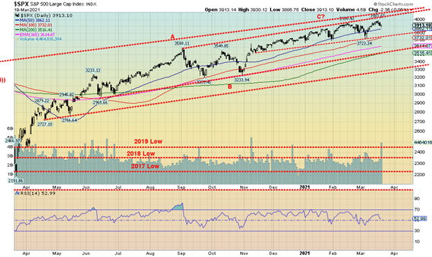
Have the stock markets topped? This past week most of the markets made new all-time highs once again but closed lower on the week. Many of them made the new highs barely above the high seen in February before once again turning down. The S&P 500 lost 0.5% after new highs and ditto the Dow Jones Industrials (DJI), down also about 0.5%, the Dow Jones Transportations (DJT) diverged, actually gaining 0.2%, but the NASDAQ fell 0.8%. The small-cap S&P 600 dropped 3.1% and the mid-cap S&P 400 was off 1.2%. In Canada, the TSX Composite was flat after new all-time highs but the TSX Venture Exchange (CDNX) was a star, once again gaining 1.4% and is now the best performer, up 13.8% in 2021. Still, nothing stopped Bitcoin as it gained 3.9%, rising again to near $60,000. Bitcoin is up 105.2% on the year. As the weekend progressed Bitcoin was again nearing $60,000.
In the EU, the London FTSE lost 1.2%, the Paris CAC 40 made new all-time highs but closed down 0.8%, while the German DAX held its gains, making new all-time highs up 0.8%. In Asia, China’s Shanghai Index (SSEC) lost 1.4% and the Tokyo Nikkei Dow (TKN) gained about 0.3% but appears to be rolling over. The MSCI World Index was up about 0.5%.
We would not be surprised at a corrective pullback for the major stock indices going into April that could even carry into May. The early March low was near 3,700 so a break of that level could send the S&P 500 down to the next level near 3,500. A breakdown under 3,500 would be more problematic and could trigger a decline to 3,300. Under 3,300 a panic could follow. We don’t believe we’ll get that low but do need to warn in the event it happens. Yes, the Fed was fairly bullish at its meeting this past week but that could also act as a catalyst to take some profits off the table. Rising interest rates at the long end and rising inflation expectations are weighing on the markets and seem to be in the way of rising expectations on economic performance as vaccinations get done and the economy opens up. However, there is concern in the EU where rising numbers due to the variants are triggering shutdowns once again in Italy and France.
Technically, there is a lot of overhead resistance for the S&P 500 up near 4,000 and up to 4,100. Similar patterns are seen for the DJI. The DJT on the other hand does not appear to have the overhead resistance some of the other indices have. Could that set up classic divergences with the DJT making new highs but the DJI not making new highs? Nonetheless, a pause now for the markets would not be the end of the world. As we have noted, we see higher prices still ahead.
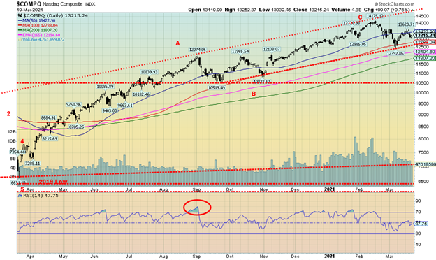
The NASDAQ continues to underperform, supporting the theory that there is a shift from the go-go growth high-tech stocks that make up the NASDAQ to value stocks that dominate the DJI. This past week the NASDAQ fell 0.8%. Except for Facebook with a gain of 8.1%, this past week the rest of the FAANGs were weak. Apple lost 0.9%, Amazon was off 0.5%, Netflix fell 1.1%, and Google dropped 0.9%. As well, Microsoft fell 2.3% while Tesla continues to lose some bloom, down 5.6%, and Twitter dropped 2.8%. But to make them feel good the ultimate value stock Berkshire Hathaway dropped 3.1%. The NASDAQ did bounce back on Friday but, overall, it is creeping closer to its breakdown point near 12,600. We have had a bearish reversal on the NASDAQ but it has not yet broken down. While 12,600 is a breakdown point a close this month under 13,000 would be negative. Potential targets below 12,600 are a drop to around 10,500 to 10,800. The 200-day MA is currently around 11,800. Only a move now back above 13,600 could suggest to us that the NASDAQ would make a move back towards the top of the channel currently near 14,600.
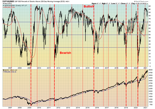
The percentage of stocks trading above the 200-day MA is currently at 87.17. However, it is down from highs seen in December 2020 when it hit 92. An elevated level like this has often been associated with tops in the stock market. Other indicators are also at elevated levels. The NYSE advance-decline line hit another all-time high this past week in line with the market. The McLellan Summation Index (RASI) is at 669, down from its highs at 1061 but remains elevated in bull territory. The CBOE put/call ratio rose to 0.51 this past week up from a low of 0.44 the previous week but it too remains highly elevated in favour of call options. The VIX Volatility Indicator appeared to break support this past week, hitting a low of 19.23, but ended the week at 20.95 after the market sold off. All of this continues to suggest to us that we could be near at least a temporary top and a possible pullback into April.
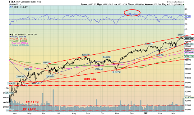
The TSX Composite once again made a new all-time high this past week at 19,037, then closed the week flat. It didn’t help that the TSX that one of its largest components, Energy (TEN), fell 6.1% the worst decline for any of the sub-indices. What helped keep the TSX from going into negative territory was that four of the sub-indices made new all-time highs. They were Consumer Discretionary (TCD) +1.3%, Financials (TFS) +0.8%, Industrials (TIN) +0.6%, and Telecommunications (TTS) +6.4% the biggest gainer on the week. Also posting good gains was Golds (TGD) +3.1%. Overall, 8 of the 14 sub-indices were actually negative on the week. Metals & Mining (TGM) was also a loser, down 2.6%. Over on the small cap TSX Venture Exchange (CDNX) the results were more positive as it gained 1.4% on the week. The TSX remains in what appears to be an ascending wedge pattern. The breakdown level is around 18,235 and a firm break under that level could carry the TSX down to major support near 16,500. Upside appears limited by the upper channel, currently at about 19,050. But it is rising about 50 points each day.
U.S. 10-year Treasury Bond/Canadian 10-year Government Bond (CGB)
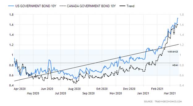
The rise in bond yields continues. This past week the 10-year U.S. treasury note rose to 1.73%, up 10 bp on the week. The 30-year rose to 2.44%, up from 2.05%. Going in the opposite direction was the U.S. 3-month treasury bill that fell to 0.01%. This was mainly due to massive cash injections from the Treasury General Account (TGA) totalling some $345 billion in March, including what seemed to be a $271 billion drop in one day this past week. This resulted in a huge gain of over $225 billion in deposits held by depository institutions. Because of the huge injection of cash, the overnight repo rate actually went negative. With so much in the way of funds flowing into the financial system, it could shift short rates to negative. Some shorter treasury bills also went negative. Assets held by the Fed have now reached $4.9 trillion. Could all of this action be designed to push institutions out along the curve to purchase long assets such 10–30-year notes and bonds?
Rates at the longer end continued to be pushed by rising inflation expectations along with the rate of vaccination that is rising rapidly and expectations that the U.S. economy could grow over 6% in 2021. All of this continues to suggest that the 10-year could rise to 2.00% or higher before this up-move is over. All of this is lowering the spread between the 10-year and the core CPI estimated at 1.6%. The economic optimism index today at 55.4 is the highest since February 2020 before the pandemic broke out and lockdowns began.
Economic numbers this past week seemed to confirm the improvement in the U.S. economy. The NY Empire Manufacturing Index came in at 17.4 vs. 12.1 in February and expectations of 14.5; retail sales year over year were 6.3% but ex-autos it was negative 2.7%; industrial production for February fell 2.2% when the market expected a 0.3% gain; housing starts for February fell 10.3% vs. an expectation of a rise of 2.3%; initial jobless claims for the past week were 770,000 vs. an expectation of 700,000 and 725,000 the previous week; but the Philly Fed Index came in at 51.8 vs. 23.1 and an expectation of 24. Overall, the week was mixed but the manufacturing numbers were strong.
The Fed meeting was held this past week and, as expected, rates were held at 0–0.25%. Also as expected, Fed Chair Jerome Powell calmed markets by stating rates will be held low for years until at least 2023. Some 90 million stimulus cheques have hit people’s bank accounts. Powell also did not see a big rise in inflation. They could tolerate a rise up to around 2.5%. Their estimates have inflation rising to 2.1% and unemployment continuing to fall into 2023. Despite it all, the rates on the 10-year rose further and the U.S. stock market wavered and closed the week marginally lower after hitting new all-time highs once again.
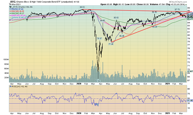
Could the high yield bond market be finally wavering? The iShares iBoxx High Yield Corporate Bond ETF (HGY) slipped this past week to 86.06 vs. 86.46 the previous week a decline of about 0.5%. We note the rise in the HGY failed to make new highs above the February 2020 high of 88.53. Could it be a double top in the making? The HGY appears to have broken its gentle uptrend. A breakdown under 83.40 could set up a sharp waterfall decline. Something to keep an eye on.
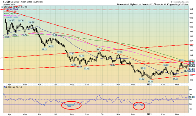
The US$ Index rose a small 0.3% this past week. The movements in the currencies were pretty muted. The euro fell 0.4%, the Swiss franc was flat, the pound sterling was off about 0.5%, while the Japanese yen rose a small 0.1%. The Canadian dollar made fresh 52-week highs, up to 80.88, and then reversed and closed down a small 0.2%. Overall, the U.S. dollar was pretty quiet this week. So far, it has failed to firmly break above 92.50 plus further resistance up to 93. Overall, our outlook on the U.S. dollar remains negative, but we cannot rule out further gains first, especially if it took out 92.50/93.00. Then a rise to 94 and even 95 could get underway. Our breakdown point is at 90.00 and below that new lows below the January low of 89.17 are possible. The first sign of trouble for the US$ Index would come on a break under 91.20 as that could set up the decline to 90 and a break of the same.
Gold prices defied a somewhat stronger US$ Index and rising bond yields this past week to gain 1.3% on the week. It was the second consecutive weekly rise. Silver led the way with a gain of 1.6%. Platinum was basically flat on the week. Palladium was a star, rising to fresh 52-week highs with a gain of 11.4%. Copper slipped 0.7%. Volatility reigns for the palladium market as at one time palladium was up 12% but slipped towards the end of the week. Palladium was rising because of flooding at the mines of MMC Norilsk Nickel PJSC, one of the world’s largest producers. The Russian company produces 40% of the world’s palladium. They may have to turn to central bank stockpiles to meet obligations.
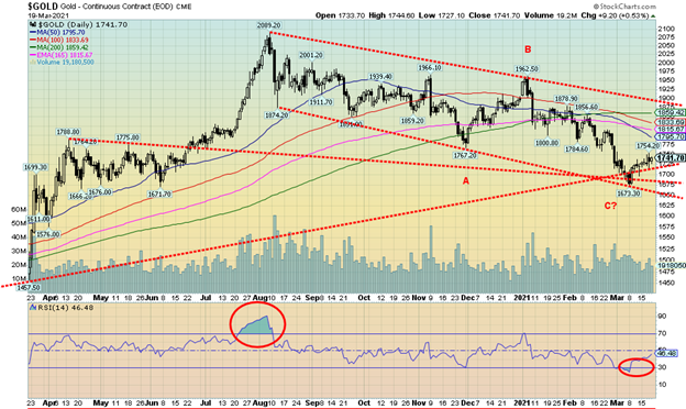
Any improvement in the US$ Index, coupled with falling bond yields, would help propel gold prices higher. Gold ran into resistance at the $1,750/$1,760 zone (high on the week was $1,754) as was expected. Once through $1,760, a rise to more significant resistance from $1,795 to $1,815 would get underway. However, gold’s major resistance is up at $1,830 to $1,860. Once over $1,880, gold should then rise above $1,900 to challenge the January high of $1,962. Only above $1,990 would gold be telling us that the August high of $2,089 could fall. However, breaking above $1,900 would end the downtrend that has been in place since August. Gold fell to its lowest levels since March 2020 when it hit down to $1,673. We view $1,670 as a major line in the sand as a breakdown under that level could take gold to $1,600 and lower. We don’t believe that is in play but we follow sites that believe gold will fail again, probably up in the $1,760/$1,770 range. Hence our own desire to see gold clear that level.
Still, the tussle now is between gold, the U.S. dollar, and rising bond yields. Expectations of higher inflation are pushing bond yields higher along with the huge sums the U.S. treasury needs to raise to cover the $1.9 trillion package, plus probably more stimulus packages to come. However, gold has been well known as a hedge against inflation. So it is a tussle here as to who will win. Given what we see, we believe gold will respond positively.
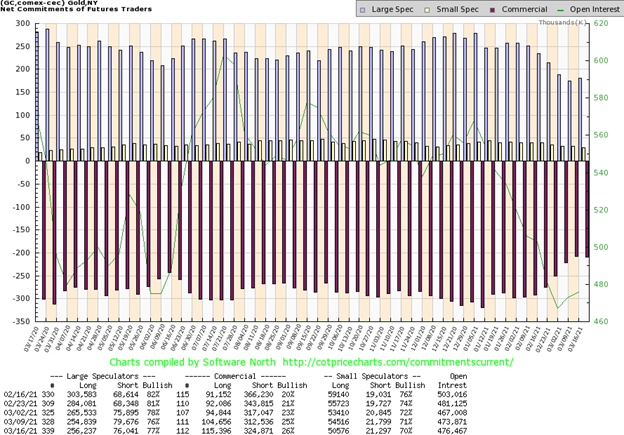
Once again, the commercial COT (bullion companies, bullion banks) improved this time to 26% from 25%. Long open interest rose by over 10,000 contracts, a very positive development. Short open interest, however, also rose, up over 12,000 contracts. Still, the rise in both longs and shorts favoured the improvement in the commercial COT. The large speculators COT (hedge funds, managed futures, etc.) also rose to 77% from 76%. Long open interest was up about 1,400 contracts while short open interest fell about 3,600 contracts. Overall, open interest rose over 2,500 contracts on a week that gold gained 1.2%. We view the improvement in the COT as positive although we would be far more comfortable if the commercial COT could regain over 30%.
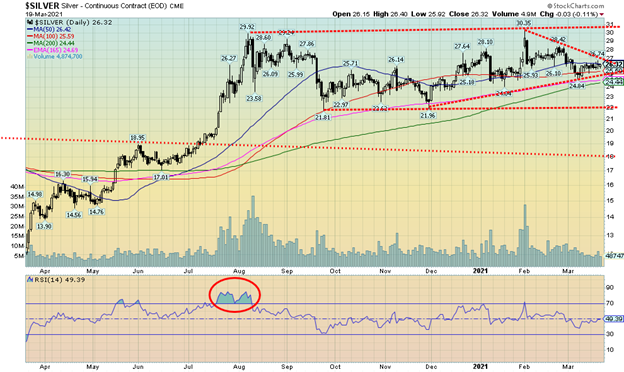
Silver prices rose 1.6%, leading the rise in gold that gained 1.3%. Silver leading the way is positive for the precious metals market. Silver also did not see new lows below its November 30 low of $21.96. That remains a positive divergence as gold prices did break below their November 30 low. Silver appears to be forming a symmetrical triangle where the breakout is at $27. One could also suggest that silver has been making a double bottom head and shoulders pattern, although we fully admit the left shoulder is not very well formed and the right shoulder saw a high above the highs of August 2020. While over $27 would be positive a breakout over $29 would be more telling and suggest that the high of $30.35 seen in January could be taken out. New highs above $31 would potentially suggest a move for silver up to $38/$40. What’s key on the downside is that we hold above $25. A breakdown under $24 could set up a test of the November low and even suggest new lows. We continue to view silver as positive and we are encouraged by the improving silver COT.
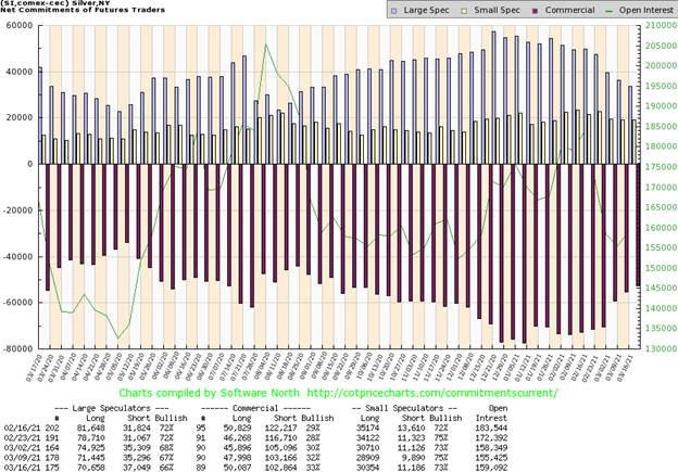
Once again, the silver commercial COT, like the gold commercial COT, improved this time to 33% from 32%. Short open interest slipped only about 300 contracts but long open interest rose over 2,000 contracts. Total open interest rose over 3,500 contracts on a week that silver gained 1.6%. The large speculators COT slipped again to 66% from 67% as they added almost 2,000 contracts to their short position while once again cutting their long open interest position. All this action is positive. We are encouraged by the report although it is still not at levels over 40 that would confirm a coming bull rise.
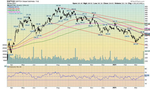
For the third consecutive week the gold stocks saw gains. This past week the Gold Bugs Index (HUI) was up 3.0% while the TSX Gold Index (TGD) gained 3.1%. The TGD is now up 10% in the past three weeks. Volume is also picking up. The gold stocks appear to be leading as there were days when gold prices were soft to down but the gold stocks saw gains. Despite the three-week run, the TGD has now run into an area of resistance from 290 to 300. A strong burst over 300 should set the TGD on its way to stronger resistance between 313 to 320. Finally, major resistance is seen up to 340. Over 340 and especially over 350 a new bull would be firmly underway. The high was seen last August near 417. New highs this time could imply a move to even higher levels up to 560/570, a 90% gain from current levels. Moves like that in the gold market are not unusual. The move from the March low to the August highs saw the TGD gain 140%. Since that March low this has been the first good correction. Gold stocks may now be poised to enter a new up-leg. The Gold Miners Bullish Percent Index (BPGDM) improved slightly this past week to 27.59 up from 24.14. The readings were low but were not well below 10 normally associated with bear market lows. The daily indicators all improved further this week and are turning up. It may take another up week to turn the weekly indicators up. While we are certainly encouraged by a 3-week rally, we’ll rest easier once we firmly break over 350. Major support is now down to 260, although now we’d prefer that the TGD remain above 280 on any pullback.
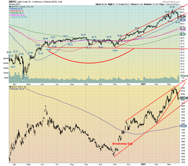
With a $7 drop in WTI oil prices this past week, the temptation is to say that the oil rally is officially over as some have declared. However, at best all we can say is that we have reached at minimum a temporary top. WTI oil fell 6.4% this past week, natural gas (NG) dropped 2.3%, and the energy stocks took a hit as the ARCA Oil & Gas Index (XOI) dropped 7.0% while the TSX Energy Index (TEN) was off 6.1%. Not a fun week for the oil bulls.
For sure, WTI oil has broken its steep uptrend line. This past week had oil testing the 50-day MA near $58.35. So far it has held. Below $58 a decline to stronger support could be seen at $50/$51. Major 200-day MA support is at $45.80. So, we have a way to go to officially declare the oil rally dead. A drop below $54 would officially put WTI oil in a bear market as it translates into a 20% decline from the top. The XOI broke a steep uptrend line, but its more important uptrend line is below near 950. It too has a way to go to officially declare the oil rally dead and over.
However, to put us back into a bull mode we’d have to regain back above $65. We knew going in that the $60/$65 zone would prove troublesome. Further resistance was seen in the $70/$75 zone. So, a failure here hitting a high near $68 was not surprising. RSIs had soared well above 70 and some above 80. The signals were there and were warned in this column.
So, what took oil down? A stronger U.S. dollar didn’t help. Trouble with vaccinations in Europe was also noted and the fact that France and Italy were shutting down again as a third wave took hold. It diminished hopes of driving vacations in Europe. In North America (Canada and the U.S.) they are opening up, but what if the third wave driven by variants takes hold and the numbers once again soar? Will they shut down a third time, irrespective of the hue and cry that would follow?
A couple of interesting stories we picked up. First, refining capacity has returned to only about 80% normal in the U.S. following the devastating storms that shut down the Texas grid in February. We learned as well that China continues to defy any sanctions with importing oil from both Iran and Venezuela. It is estimated that China is importing 918,000 bpd in March from the two blacklisted countries.
Oil prices have most likely topped for the time being. However, we wouldn’t declare the oil rally dead and over just yet. Instead, we suspect it is just a needed consolidation before it regroups and moves to new highs with targets remaining into the $70s and up to $80.
_
(Featured image by star5112 CC BY-SA 2.0 via Flickr)
DISCLAIMER: This article was written by a third party contributor and does not reflect the opinion of Born2Invest, its management, staff or its associates. Please review our disclaimer for more information.
This article may include forward-looking statements. These forward-looking statements generally are identified by the words “believe,” “project,” “estimate,” “become,” “plan,” “will,” and similar expressions. These forward-looking statements involve known and unknown risks as well as uncertainties, including those discussed in the following cautionary statements and elsewhere in this article and on this site. Although the Company may believe that its expectations are based on reasonable assumptions, the actual results that the Company may achieve may differ materially from any forward-looking statements, which reflect the opinions of the management of the Company only as of the date hereof. Additionally, please make sure to read these important disclosures.


El Dorado Raises $9M to Expand Cross-Border Fintech Platform
El Dorado, a Latin American fintech improving cross-border financial services, raised a $9 million Series A led by Paradigm with...


Bitcoin Stalls Near $60K as Strategy Moves, ETFs Outflow, and EU MiCA Rules Take Effect
Bitcoin hovers near $60,000 with ETF outflows, while Strategy boosts reserves, sells BTC, and raises dividends to reassure investors. Ethereum...


Cannabis Dominates Global Drug Use: Trends, Risks, and Shifting Markets
Cannabis remains the world’s most widely used illicit drug, with 256 million users in 2024, surpassing all others combined. Growth...


Italy Approves First Hydrogen-Powered Train for National Rail Network
ANSFISA has approved Italy’s first hydrogen-powered train, the Alstom HMU214, for use on the Brescia–Iseo–Edolo line. Capable of 140 km/h,...


Cotton Market Weakness Persists Despite Brief Rebound
Cotton prices fell to new lows last week before a modest rebound. USDA data shows crop conditions remain worse than...
 |
|
 |  |
 |
|
-

 Biotech1 week ago
New Gene Therapies Transform Rare Disease Care, but Gaps Remain
-

 Crowdfunding7 days ago
Ithaca: Climate Road Trip RPG on Climate Resistance
-

 Fintech2 weeks ago
Fintech and AI: Adoption Grows, but Profits Favor Agile Innovators
-

 Fintech5 days ago
PayPal’s Slowdown: From Fintech Leader to Low-Growth Dividend Stock