Featured
A Look at the NYSE Breadth Ratios
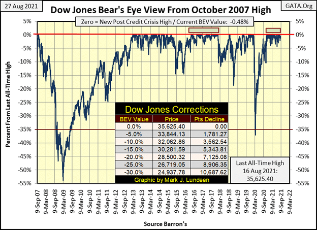
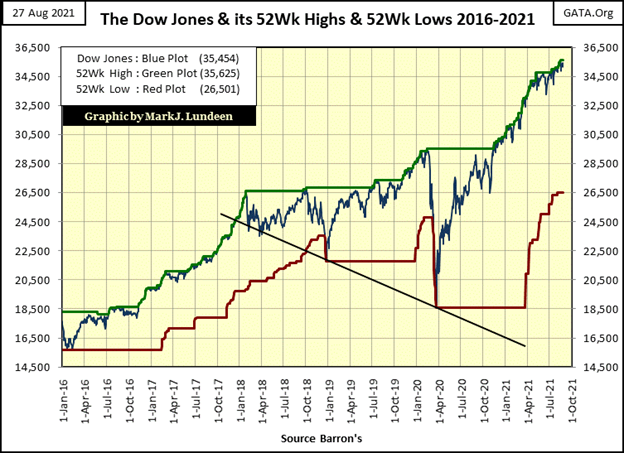
Since last November, the Dow Jones has made forty-two new all-time highs, with each also being a new 52Wk High. But for it to make a new 52Wk Low next week, it would have to deflate by 8,953 points, lose 25% of its valuation. So, seeing the Dow Jones (30 big dividend-paying, blue-chip stocks), or seeing 52Wk Lows at the NYSE overwhelming its 52Wk Highs is a significant market event.
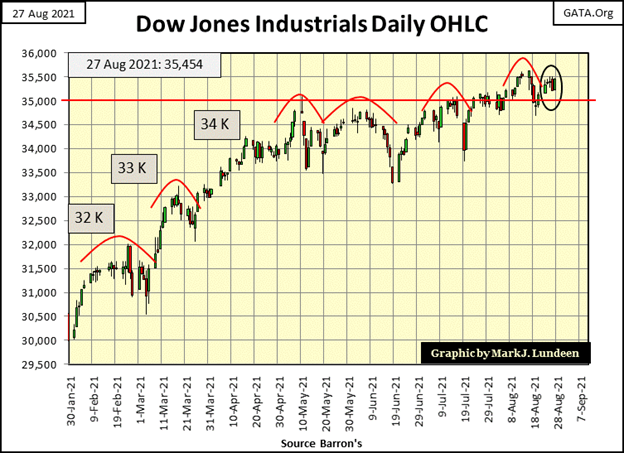
As it has been since last November, all this week the Dow Jones remained in scoring position; less than 5% from its last all-time high. We haven’t seen any new BEV Zeros in the BEV chart below since its last on August 16th. But I’d be surprised if the Dow Jones doesn’t make another leap into market history in the next two weeks.
It used to be, come an unforeseen international incident, such as we’ve seen in Afghanistan in the past few weeks, or the diplomatic buffoonery practiced daily by the Biden mis-administration’s response to their abandoning 15,000 American civilians and many allied civilians behind to the Taliban, the stock market would sell off some.
But that was then, and this is now. And now we can depend on the Dow Jones continuing to rise until – well until the FOMC stops “supporting market valuations.” To know when that happens, I’m keeping an eye out for an increase in daily volatility; a resumption of Dow Jones 2% days, and a possible dramatic breakdown in the Dow Jones, below its BEV -5% line.
Until then, it’s best to remain optimistic, and bullish on the stock market. That said, it doesn’t mean one should remain totally exposed to the growing risks in this stock market.
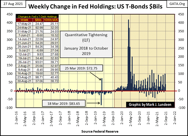
This week the FOMC “injected” an additional $37 billion of “liquidity” into the financial system.
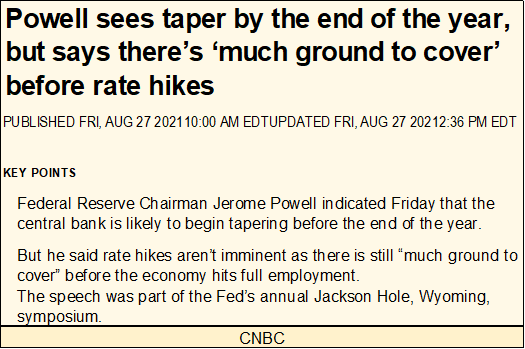
Also, this week Fed Chairman Powell said the FOMC may “taper” his economic stimulation sometime before the end of the year. If so, the bulls can say goodbye to those big “injections” of “liquidity” into the market they’ve enjoyed since March 2020, as seen in the chart below.
The last time the Federal Reserve attempted to return things back to normal was during their January 2018 to October 2019 quantitative tightening (QT). They wanted to withdraw some “liquidity” from their QE #1-3. This QT was terminated when overnight rates in the repo market shot up into double-digits in October 2019.
Four months later the Dow Jones saw its valuation deflate by 37% in only twenty-seven NYSE trading sessions, forcing Fed Chairman Powell to begin his Not QE #4 seen below. Why a “Not QE #4”? Because when he began it in October 2019, humbly at first, he made it clear he wasn’t beginning a new, 4th round of quantitative easing; hence Powell’s Not QE #4.
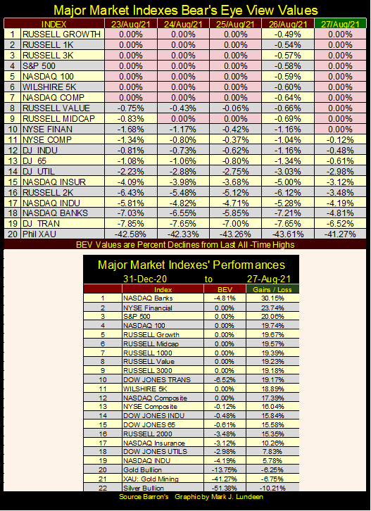
Last week there was a dearth of new BEV Zeros in my Major Market BEV Values table below. Not so for this week. And Friday’s close was exceptionally strong, with ten new BEV Zeros, and indexes from #11 down to #18 closing the week in scoring position; within 5% of making a new all-time high.
The setup for next week is excellent.
The Dow Jones, in its daily bar chart below also looks bullish, closing the week a tad short of its 35,500 line. If next week is a good week in the market, we can begin focusing on the Dow Jones’ 36,000 line.
Keep in mind, as the market advances, risks in the market only increase, as the potential to profit from the advance approaches zero. This is because all bull market advances stop advancing, once they’ve reached their final, last, endpoint all-time high.
I don’t know what this advance’s endpoint all-time high is. Is it above or below a Dow Jones’ 40,000? I can’t say, but I know it’s lurking somewhere out there in the dark. Also, keep in mind that no one on Wall Street will ever ring a bell to warn investors of an impending bear-market decline.
This seems like a good time to lock in some profits and keep the cash far away from the market.
The New York Stock Exchange (NYSE) publishes daily breadth data, which Dow Jones and Barron’s makes available to the public, a service these fine publications have provided for many decades. This data includes;
- Daily advancing issues
- Daily declining issues
- Unchanged issues
- 52Wk Highs
- 52Wk Lows
I particularly like 52Wk H-L data, as it provides truly insightful information on the market. One day a company trading on the NYSE may advance. The next day it could as easily decline and provide no strategic insight on the market. Not so with 52Wk Highs and Lows, as seen in the Dow Jones chart below plotted with its 52Wk High (Green plot) and 52Wk Low (Red plot) lines.
Since last November, the Dow Jones has made forty-two new all-time highs, with each also being a new 52Wk High. But for it to make a new 52Wk Low next week, it would have to deflate by 8,953 points, lose 25% of its valuation. So, seeing the Dow Jones (30 big dividend-paying, blue-chip stocks), or seeing 52Wk Lows at the NYSE overwhelming its 52Wk Highs is a significant market event.
Take a look at what happened in March 2020 below. In only eighteen NYSE trading sessions, the Dow Jones went from making a new 52Wk High to making a new 52Wk Low, deflating 19% from one 52Wk extreme to the other, and in only eighteen trading sessions!
The March 2020 flash crash was a historic market event, even if “market experts” today choose to ignore what happened a year and a half ago. Had the FOMC not “injected” a few trillion dollars into the financial system in the following weeks, how much further would the Dow Jones had deflated before it found a bottom?
Next is a chart plotting daily NYSE 52Wk Highs – Lows Ratios. It’s a ratio, as I take the daily H-L nets and divide them by the quantity of shares trading on the NYSE that day. As the number of issues trading at the NYSE has changed greatly over the decades, using a ratio normalizes the data over time; giving each day equal weight in the plot. I use a 9% cutoff threshold to eliminate the noise one would find if I had plotted each day’s data. Today, a 9% threshold is about a NYSE 52Wk H-L Net of (+/-) 300.
This data provides an excellent indication of the degree of euphoria in a market advance, with a +10% day a great day for the bulls at the NYSE. It also provides a measurement of the distress Mr Bear has inflicted on investors at the New York Stock Exchange, during market downturns of the last forty-one years. Any time this ratio has crossed its -20% line, it was a bad day in the market.
Keeping a daily record of NYSE 52Wk Highs and Lows is an extremely useful data series for investors to keep. This data allows them to know exactly when the market is cheap when there are bargains to be had – following days the NYSE saw a 52Wk H-L Ratio of -20% or more.
Those times when it may be wise to raise cash by selling profitable positions can also be identified when the NYSE 52Wk H-L Ratio begins seeing a series of +10% days over the course of a few weeks or months. A wise investor would keep the cash until the NYSE once again sees a 52Wk H-L Ratio of something below a -20% day, when true bargains once again presented themselves to investors. NYSE 52Wk H-L Ratios provides an excellent oscillator to mechanically sell at market tops (lock in profits) and buy at market bottoms (avoid big market declines).
The item I wanted to bring to your attention in the chart below is the red line at its -40% level. Before 2008, the only market downturn that forced the NYSE 52Wk H-L Ratio below this truly dismal level was the October 1987 flash crash. This downturn was artificial in nature, as it was actually a mistake in computer programing.
The banking system’s computers were all programmed to begin shorting the market when a certain threshold was crossed on a market decline, and on 20 October 1987, that is exactly what they did! But for this one market episode, the NYSE 52Wk H-L Ratio didn’t decline below its -40% level before 2008.
Then, beginning with the sub-prime mortgage bear market (October 2007- March 2009), the NYSE 52Wk H-L Ratio has routinely passed below this critical level. This begs the question of; why?
The answer that comes to my mind is; since the FOMC began “actively supporting market valuations” following the high-tech bear market (January 2000 to October 2002), they’ve inflated market valuations far above where natural market forces could support them.
Look at the 52Wk H-L Ratio for March 2020’s Dow Jones 38% flash crash (chart below); it went deep into the -70% area. The trauma this level of NYSE 52Wk Lows should have produced in the market was prevented when the FOMC used this horrific market event to justify an “injection” of a few trillion dollars of “liquidity” to “stabilize market valuations.”
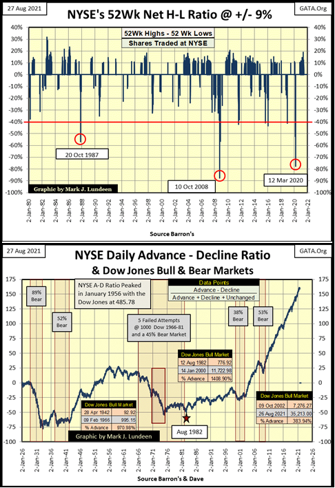
Market valuations have recovered nicely since the spring of 2020. The Dow Jones has almost doubled in value. But deflationary pressures now structured into market valuations are immense. There comes a bad day at the NYSE when a FOMC “injection” of a few trillion dollars may fail to reflate market valuations. The downside to the stock and debt markets from that point on will be historic.
How could an “injection” from the FOMC of several trillion dollars of “liquidity” fail to rally the markets? It worked in March / April 2020, as the Federal Reserve’s credibility remained high in the markets, both domestically and foreign. But the day is coming when credibility at the FOMC, and the full faith and credit of the US Federal Government will become a critical global concern. At that point, all of the old rules in the market will change.
It will be easy enough to identify when this shift in market psychology occurs; when the Treasury market is no longer seen as a safe haven during times of market distress. For example; during a big market downturn for the Dow Jones, T-bond yields would be seen spiking, along with big increases in gold and silver prices.
As we’re looking at NYSE Breadth Ratios, let’s look at the NYSE Daily Advancing – Declining Ratio since January 1926 (chart above). Again, we’re looking at a ratio as the number of issues trading at the NYSE has changed greatly over the decades. In January 1926, there were only about 600 issues, in total trading daily at the NYSE. That compared to over 3400 issues trading daily in August 2021.
I’ve identified bear markets with red boxes, and bull markets with bullseyes noting beginning and closing values for the bull market’s advance. It’s interesting observing how the NYSE Daily A-D Ratio has responded to bull and bear markets for the past century.
On a percentage basis, the 1982 to 2000 Dow Jones’ bull market saw the largest advance of the past century, yet advances in the NYSE A-D Ratio itself were greater during its 1942 to 1966 bull market advance. The real anomaly in the above chart is; following the Dow Jones’ October-2002 high-tech bear market bottom, the Dow Jones has advanced only 383% in the past two decades, as the NYSE A-D Ratio has advanced as it never has before.
Why is the A-D Ratio advancing like this? My best guess is we’re observing “open market operations” as practiced by the FOMC since the October 2002 market bottom. The idiot savants at the Federal Reserve want market valuations to advance. Looking at the NYSE A-D Ratio plot above, that’s exactly what has been happening at the NYSE for the past two decades.
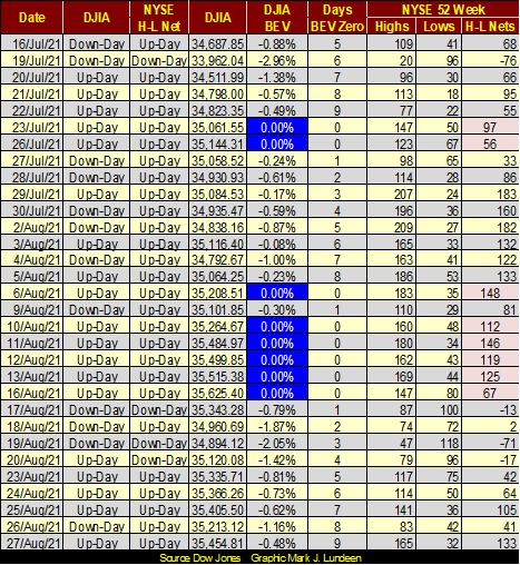
Every BEV Zero is more than just a new all-time high, it’s also a new 52Wk high. So, we can look at the Dow Jones’ BEV Zeros in the table below and compare them to the NYSE 52Wk H-L Nets for that day (highlighted in red).
In a strong market, a Dow Jones BEV Zero should be accompanied by a NYSE 52Wk H-L Net of +300 or more (NYSE 52Wk H-L Ratio of +9% or more), as frequently happened from January to early June of this year. However, the last time the market saw a H-L Net of +300 or more was on June 10th. Since then, NYSE 52Wk Highs have been diminishing, even as the Dow Jones itself continues seeing new BEV Zeros.
Normally, I’d say this is an indication of a coming market top. A good time to sell one’s profitable positions (losers too) to raise cash, and wait for the next big surge in NYSE 52Wk Lows. But, if the idiot savants at the FOMC don’t want to cooperate, then that may not happen.
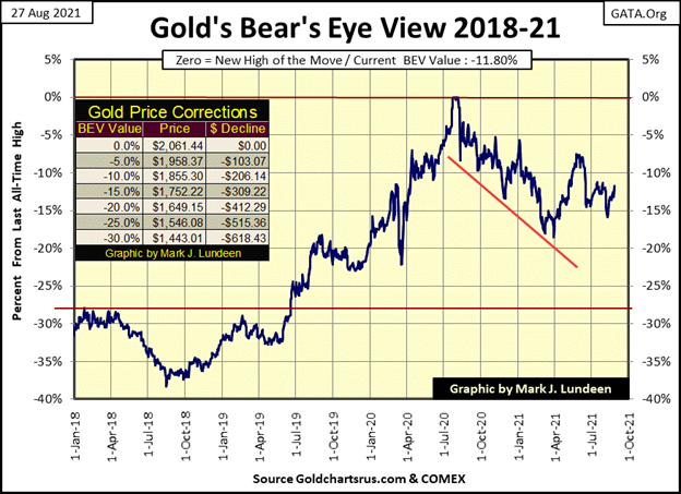
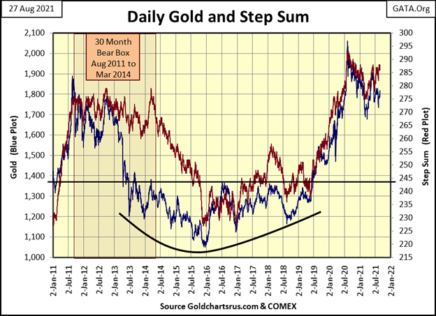
Gold and silver had a good week. Gold in its BEV chart below continues trending towards its BEV -10% line ($1855). As gold closed the week at $1818, a less than $40 advance from here would do the trick. That’s not much, so having gold close with a single-digit BEV value could happen in the next two weeks. But if the “policymakers” decide to put a stop to this, we could still see gold close below its BEV -15% line in the weeks to come. The “policymakers” have no interest seeing the price of gold running wild and free, far above its last all-time high of a year ago.
Today no one remembers, and few care to make the connection, but when the Federal Reserve System took over the management of the dollar in 1913, gold was money. In other words; the US dollar WAS GOLD at a rate of $20.67 paper dollars for each ounce of monetary gold issued (gold coins in circulation) or held in bar form (gold monetary reserves) by the US Treasury.
In the past century, following one self-inflicted monetary crisis after another, the Federal Reserve has run down the dollar to where a dollar now is whatever they say it is, with the dollar losing over 95% of its 1913 purchasing power. Small wonder the price of gold is now threatening to once again break above $2000 an ounce. This is going to happen; stunning increases in the price of gold and silver whether the “policymakers” like it or not. When this does happen, it will put a lot of pressure on what credibility the Federal Reserve System still has.
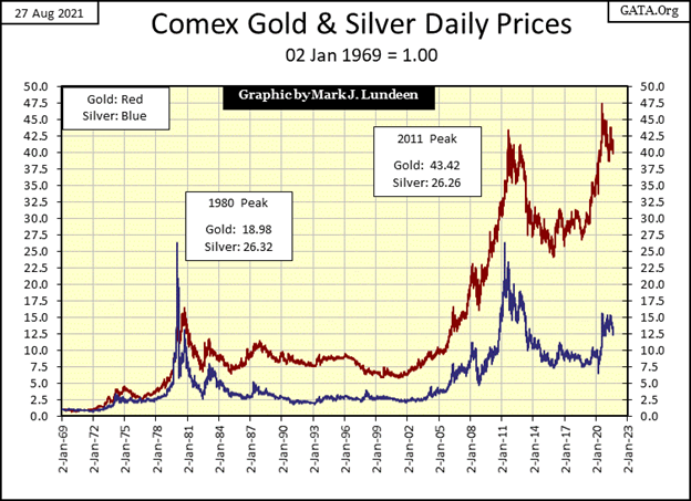
I was going through my old charts and I found this one, plotting the indexed values of gold and silver going back to the first week of 1969. The gains in the old monetary metals are good. I took data for CinC and the Dow Jones from these same issues of Barron’s; the first week of 1969. CinC has increased by a factor of 43, the Dow Jones by a factor of 37. So actually, gold if not silver, has kept up with CinC inflation for the past half-century, doing better than the Dow Jones.
So, if since January 1969 the Dow Jones has increased by a factor of 37, while gold has increased by a factor of 43; why is the Dow Jones overvalued today but gold isn’t?
It has to do with the debt burdens the economy carried in 1969 and today. In 1969, the world was at the door to a decade and a half of the double-digit interest rates and bond yields. The economy, as well as the US Treasury of the 1970s, could easily service those double-digit bearing debts, as their debt burdens were light.
From today’s perspective, the yield curve of July 1981 (Blue plot below) is amazing, as is the fact there was an amazing lack of bankruptcy during the 1970s.
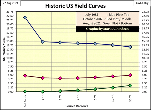
Today, should rates and bond yields increase to where they were before the sub-prime mortgage crisis (Red plot above), a bit more than 5% for most corporate bonds, I doubt all too many corporations, and governments could service their debts.
We live in a world pregnant with counter-party failure. The reason the yield curve for August 2021 has fallen to the floor (Green plot above), and can’t get up, is because if it did, waves of defaults would ripple through the debt markets.
Fed Chairman Powell said this week more work has to be done before he can consider raising rates. I take that to mean hell has to freeze over a bit more before he will be willing to allow rates to rise because he knows what higher rates will do to the economy. March 2020 all over again.
Rising rates and yields aren’t good for any financial market asset in today’s world. But with gold and silver, assets with Zero counter-party risks, I’d say the coming market chaos would be good for them.
Gold (Blue plot below) and its step sum below remain positive.
Moving on to the Dow Jones’ step sum chart below, things continue looking good, as good as an uncorrected 16,000 point advance off its lows of March 2020 can look.
So, what comes next? Sitting high in the market’s peanut gallery, I don’t know and I don’t care if the Dow Jones sees a correction from here. I think it should see, at a minimum a 10% to 15% correction from here, and let the bulls take a few months to rest and refresh themselves.
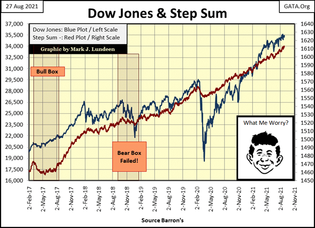
Whether or not the “policymakers” will allow that to happen, I haven’t a clue. I think the great fear the “policymakers” have is; if the Dow Jones corrects something like 15%, it might just keep going down 50% or more. So, I expect we’ll see the Dow Jones current advance continuing until “monetary exhaustion” forces it to stop. That’s when Mr Bear returns in a big way.
Here’s gold and the Dow Jones’ step sum tables. Not much new to see below, but both gold and the Dow Jones step sums have advanced by four steps in the past 25 trading days, and their valuations have benefitted. Gold’s daily volatility’s 200Day M/A remains too low for my comfort. Gold needs some 3% days to get things moving. The Dow Jones daily volatility has declined down to 0.58%, which is good for the stock market.
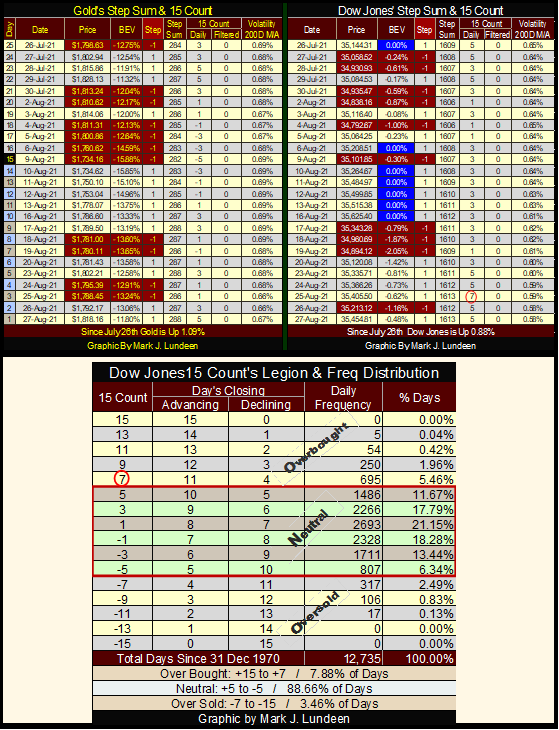
On Thursday this week, the Dow Jones’ 15 count increased to a +7, or became overbought as per the table above. Overbought markets are markets due for a pullback, but it didn’t remain overbought for long. I’m not holding my breath for the Dow Jones’ next pullback in valuation.
—
(Featured image by Cara Willenbrock via Unsplash)
DISCLAIMER: This article was written by a third-party contributor and does not reflect the opinion of Born2Invest, its management, staff or its associates. Please review our disclaimer for more information.
This article may include forward-looking statements. These forward-looking statements generally are identified by the words “believe,” “project,” “estimate,” “become,” “plan,” “will,” and similar expressions. These forward-looking statements involve known and unknown risks as well as uncertainties, including those discussed in the following cautionary statements and elsewhere in this article and on this site. Although the Company may believe that its expectations are based on reasonable assumptions, the actual results that the Company may achieve may differ materially from any forward-looking statements, which reflect the opinions of the management of the Company only as of the date hereof. Additionally, please make sure to read these important disclosures.


Advances in Biomarkers and Targeted Therapies Transform Kidney Care in Autoimmune Disease
New biomarkers and targeted therapies are reshaping the management of kidney damage in autoimmune diseases like lupus and vasculitis. Experts...


Bitcoin Rises on Iran Deal as Crypto Markets React to AI and SpaceX News
Bitcoin rose above $65,000, gaining about 5% as a tentative Iran war agreement boosted markets. ETFs still show weekly outflows....


Rising Inflation, Fed Uncertainty, and Market Excess Amid War and SpaceX Mania
Rising inflation, driven by war, debt, and money growth, puts the Fed in a difficult position ahead of its meeting....


SpaceX IPO Sparks Déjà Vu as Market Risks Loom and Gold Bulls Stay Hopeful
The author compares the 2000 AOL Time Warner merger to SpaceX’s planned IPO, warning it may signal a market top....


The TopRanked.io Guide to 2026’s Biggest and Best Affiliate Opportunities
Want to earn affiliate commissions on literal billions of dollars worth of revenue? Then this week, we've got something special...
 |
|
 |  |
 |
|
-

 Crowdfunding2 weeks ago
Spain’s Crowdfunding Sector Surges as Real Estate and SME Financing Expand
-

 Cannabis5 days ago
Argentina Legalizes Cannabis Seed Sales Under New Regulatory Framework
-

 Fintech2 weeks ago
Zulu Powers Instant Corporate Payments Launch in Colombia
-
 Business9 hours ago
SpaceX IPO Sparks Déjà Vu as Market Risks Loom and Gold Bulls Stay Hopeful