Markets
NYSE continues to record more 52-week lows than highs
Starting on Aug. 8, the NYSE made more 52-week lows than highs even when the Dow Jones ended its sessions on a high note.

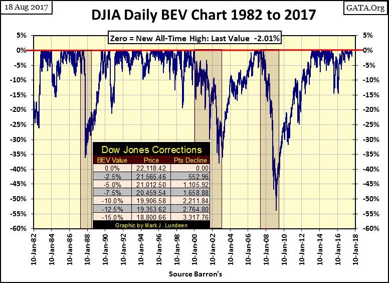
Here’s the Bear’s Eye View (BEV) for the Dow Jones going back to January 1982, a period of market history that covers the entire August 1982 to August 2017 market advance.
What’s a BEV plot? It displays the market exactly as Mr. Bear sees it. Each new all-time high in the Dow Jones is only a big fat Zero to Mr. Bear. He’s only interested in how many percentage points he can claw back from the Bulls from each all-time high, and that is exactly what is seen below. All new all-time highs register as 0%. Those daily data points’ not new all-time highs register as a percentage decline from their last all-time high.
Just eyeballing this BEV plot spanning the past thirty-five years of market history; we have to go back to the 1990s to see similar periods where for eighteen months the Dow Jones has seen so little in the way of market corrections greater than 5%.
The bulls must feel pretty good about that. However, looking at the Dow’s BEV plot, we know this isn’t going to last. One of these days the Dow Jones will see a double-digit percentage decline. That would be a 2,211 point decline, or more from the Dow Jones’ current all-time high. What happens then? Does the Dow Jones turn around and go on to new all-time highs, or continue its decline into market history?
© Mark Lundeen
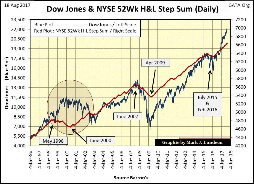
Last week I noted the NYSE began producing more 52Wk lows than highs, but it was too early to say if this is a new trend in the market. This week the NYSE continued producing more 52Wk lows than highs, but it’s still too soon to call this a new trend in the market. How will we know if this is a new trend in the stock market? The NYSE 52Wk H-L step sum (Red Plot) has yet to turned down in the chart below until it does I’m not going to make that call.
So as of the close of this week, I’m still assuming the path of least resistance for the Dow Jones continues to be up. But it won’t take much for me to jump off that train should we begin seeing frequent days of extreme market breadth and volatility in the coming weeks (see last week’s article).
© Mark Lundeen
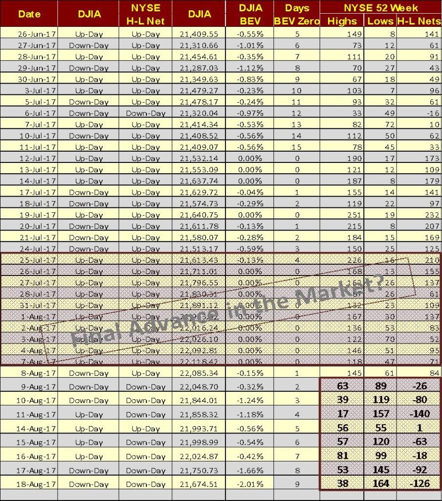
Back to NYSE’s 52Wk High & Lows; the thing to notice is before last week, even on Dow Jones’ down days, the NYSE was producing more 52Wk Highs than Lows, real bull market action. Then after August 8th, the NYSE began producing more 52Wk Lows than Highs even on the days the Dow Jones closed higher. The two columns to the far left in the table below, noting up and down days for the Dow Jones and the NYSE 52Wk H-L nets illustrate this point.
© Mark Lundeen
This is not a positive development in the stock market. Should it continue in the weeks to come, it will place a lot of downward pressure on stock market valuations. The thing to watch for now is whether in the days and weeks to come if the Dow Jones responds with a day of extreme volatility (a daily decline of over 2% from a previous day’s close) and/or the NYSE sees a day of extreme market breadth, a 70% A-D down day.
Keep in mind this is a market where the big bulls are the global central banks, whose funding for purchasing stocks and bonds is unlimited. If they want to keep the stock market advancing, they can do it. Their only limiting factor is the credibility of their “monetary policy.” That’s why it’s so important for them to keep the price of gold and silver under control. As long as bond yields and interest rates behave themselves, these central banks will control valuations in financial assets and the precious metals markets if they choose to.
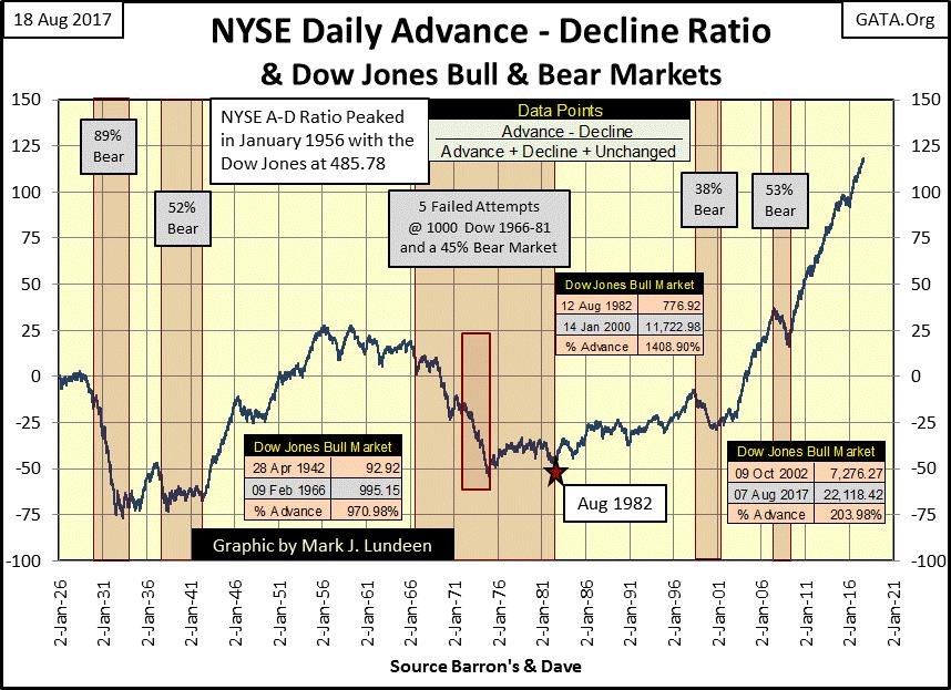
We should note how since the January 2000 market top for the high-tech issues, the stock market hasn’t operated as it had in decades past. The chart below (two charts down) for the NYSE Advance – Declining Issues Ratio beautifully displays how something had fundamentally changed in the stock market after the January 2000 top in the High-Tech market.
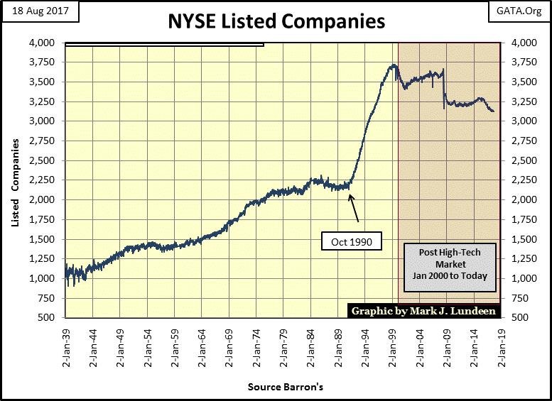
This plot isn’t an A-D line for the NYSE market breadth data. Using this data as a typical A-D line isn’t realistic since in 1926, there were only about 650 listings in total on the NYSE, and frequently there were days with less than 450 listing trading. It wasn’t until 1937 that the NYSE saw days where over 1,000 issues traded, and today there are over 3,000 companies trading daily on the NYSE.
Here’s a plot using weekly market breadth data showing NYSE listings since 1939. Seeing a day where 1,000 listings advance or decline in 1939 was something totally different from what it would mean today.
© Mark Lundeen
To normalize this data spanning decades, I used the daily breadth data to create the A-D Ratio plotted below:
Advancing Issues – Declining Issues / Advancing + Declining + Unchanged
Using this data as a ratio gives each day an equal weighting with all other days in the data series, regardless of the number of issues actively trading on the NYSE on any day. The point of this plot is that when it rises, it informs us when the NYSE is seeing more advancing listings than decliners, and when it declines, we know those periods of market history when NYSE daily market breadth was dominated by declining issues.
Except for the 1932-37 bull market (effectively a 365% dead cat bounce) separating the two historic bear markets of the Great Depression, I highlighted the bull and bear markets of the past ninety years.
A point I’ve made in the past is at the start of a bull market, just about everything goes up with the Dow Jones. However, as the bull market matures, it becomes increasingly selective of what market sector or stocks advance with the Dow Jones.
Turn your attention to the 1942-1966 bull market, and how the A-D Ratio moved during it. From 1942 to 1956, the ratio advanced with the Dow Jones until the ratio peaked in January 1956 as the Dow Jones advanced to only 485. This was only half of the Dow’s total gains of this bull market. However, from this point on the broad stock market itself, as seen in the A-D Ratio, began to be increasingly selective of which stocks were advancing with the Dow Jones.
1966 to 1982 was a period of market history where the Dow Jones attempted, or actually broke above 1,000 five times, but failed to stay above 1,000. Looking at the A-D Ratio, it isn’t hard to see the problem. From 1966 to the bottom of a 45% bear market bottom in December 1974 (Red Rectangle), daily market breadth at the NYSE was dominated with declining issues.
© Mark Lundeen
Then came August 1982 (Red Star), the beginning of what could be argued to be a bull market that continues today. In the eighteen years from 1982 to 2000, the Dow Jones advanced 1400%. The A-D Ratio also advanced with the Dow Jones but didn’t advance as it had from 1942 to 1956, far from it. I can’t say exactly why this is so. But if I had to speculate, it’s because the post-WWII bull market from 1942 to 1956 was broader-based (harder to pick losing investments at the NYSE) than it was from 1982 to 2000.
Beginning in October 2002 (continuing to today), the NYSE A-D Ratio began its most amazing advance of the past ninety years. Yet in these fifteen years, the Dow Jones itself has only risen by 203%. One would think that with advancing shares totally dominating decliners at the NYSE, the Dow Jones would have seen an advance significantly more than just over 200% over this decade and a half.
But then the 2007-09 credit-crisis bear market was the Dow Jones’ second deepest bear market since 1885 (a 54% decline). However, taking this fact into consideration, doesn’t that make the 2009-2017 advances in the A-D Ratio even more remarkable? Take a moment to study the chart from 1926 to the close of this week – what’s going on here?
I expect it’s something simple. This amazing advance in the NYSE A-D Ratio, beginning in 2002, is just another one of those fingerprints left on the market by the “policy makers.”
“Policies have contributed to a stronger stock market just as they did in March 2009, when we did the last iteration of this. The S&P 500 is up 20% plus and the Russell 2000, which is about small cap stocks, is up 30% plus.”
– Doctor Benjamin Bernanke, CNBC Interview with Steve Liesman 13 Jan 2011 (1:40 PM).
Clearly, Doctor Bernanke was also targeting the small-cap issues in his “policy”, and we see exactly that in the NYSE A-D Ratio above, a “policy” the current FOMC continues.
As a result of the bull market Alan Greenspan’s inflationary “monetary policies” created during the 1990s, he became a central-banking super star. In the last years of the 1990s, Alan Greenspan may have globally been a more popular celebrity than Michael Jordan. Jordan may have been the master of the basketball court, but from New York to Singapore everyone knew Greenspan; “the maestro” was the guy making stock portfolios advance by double digits annually and the world loved him for it.
Central banking super-star status was never awarded to Doctor Bernanke or Janet Yellen. Rather, these central bankers were seen as the ambulance drivers coming to the market’s rescue whenever it began upchucking dollars after an overdose of “liquidity.” But one of these days the old “policy” tricks will fail to work, and I fear we’ll all experience that market history together.
Whether society as a whole will learn anything from these past decades of unremittent monetary inflation flowing from the Federal Reserve, and other central banks in the global central banking cartel is altogether another story. However, seeing how the corporate media collectively hates our president Donald Trump and continues looking towards the idiot savants staffing the FOMC for economic guidance, isn’t an encouraging indication for what is to come.
But at the close of the week, the step sum chart for the Dow Jones isn’t as bearish as I am. The Dow (Blue Plot below) has continued advancing since last November without even a 5% correction, and its step sum plot has advanced nicely after seeing a bull box close. Seeing the Dow Jones decline down to its 21,000 line (5%) or more would be an entirely normal development after the advances of the past nine months.
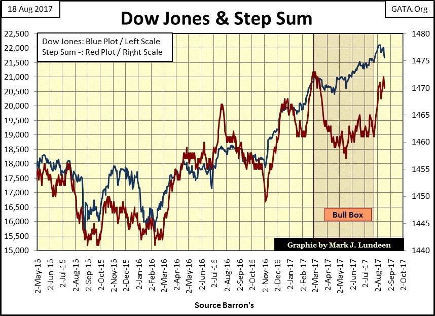
© Mark Lundeen
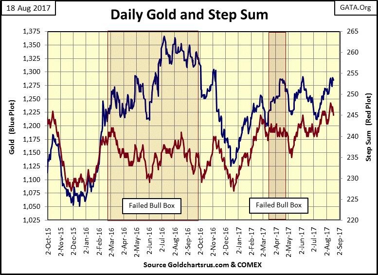
Here’s gold’s step sum chart. Early in Friday’s trading gold broke above $1300, but that wasn’t going to last. At the close of trading at the “regulated” COMEX market, gold’s last trade was $1285, and that was that.
But who knows what next week will bring? Both gold’s price and step sum plots have been advancing since early July, so this is a market that wants to go higher.
Maybe next week will be the big break out, and then maybe not. But one of these days!
© Mark Lundeen
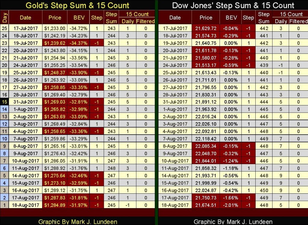
Here are gold and the Dow Jones step sum tables. Gold has seen more downward pressure than the Dow Jones. At the end of the week its 15 count ended at -1 where the Dow’s closed at +5, that’s a big difference. And since July 17th gold’s step sum has advanced by only 2, while the Dow Jones step sum advanced by 6.
So how is it that since July 17th the price of gold is up by 4.2% while the Dow Jones is basically unchanged after five weeks of more advancing than declining days? Market momentum could now be moving out from the stock market, and into gold and silver. The next few weeks should be interesting.
© Mark Lundeen
Market prognostication is no easy task. Try as I might, some (maybe more than just some) of my analysis proves to be incorrect, and sometimes the markets see developments that I totally missed. But I feel safe saying that until the stock and bond markets once again come under pressure, gold, silver and their miners will continue being very boring places to risk one’s capital in. In other words, this is a good time to take on some exposure to precious metals.
So excuse me for saying it, but for personal and very selfish reasons, I’m hoping in the coming months the financial markets will once again begin feeling the hot breath of Mr. Bear on the backs of their necks.
Meanwhile, President Trump and those Federal agencies that measure economic activity are making much of the “growing economy.” But economic demand for electric power consumption (EP) to power America’s factories and assembly lines is still far from where it was in August 2008, EP’s last all-time high.
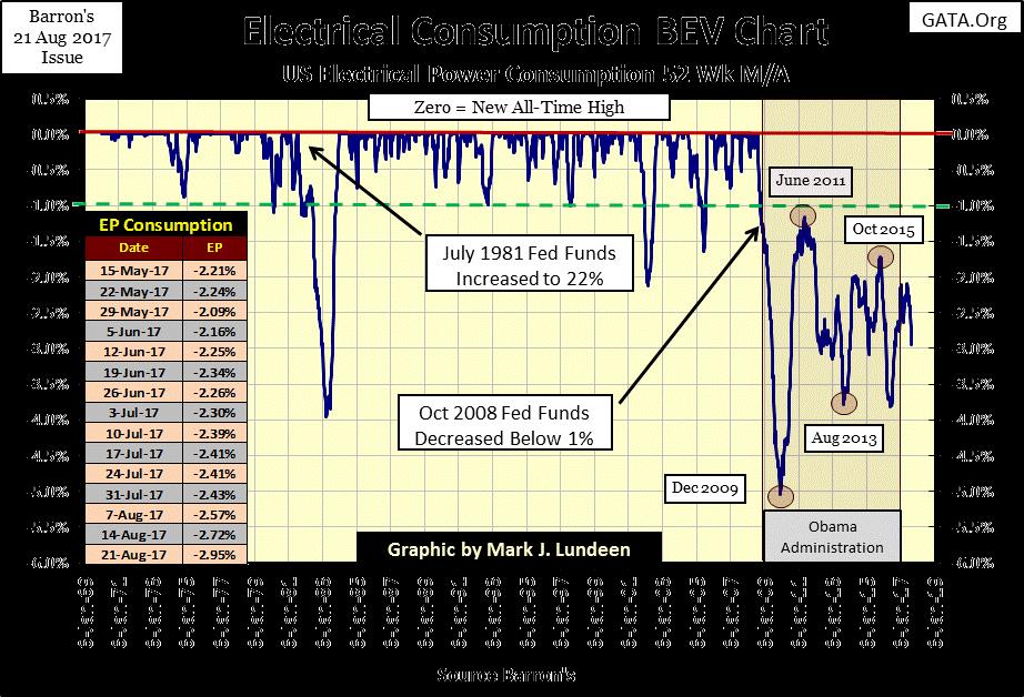
© Mark Lundeen
Until EP’s BEV chart above once again sees a BEV Zero (new all-time high), I won’t be convinced the American economy has actually turned around. And as of the close of this week, it’s now going the wrong way—down.
Should this trend in EP continue, it won’t be good for the financial markets but should be for gold, silver, and their miners.
—
DISCLAIMER: This article expresses my own ideas and opinions. Any information I have shared are from sources that I believe to be reliable and accurate. I did not receive any financial compensation in writing this post. I encourage any reader to do their own diligent research first before making any investment decisions.


XRP Under Pressure Amid Macro Forces, Fed Policy, and Regulatory Shifts
XRP remains under pressure despite easing geopolitical tensions, as macroeconomic factors and Fed policy dominate market sentiment. Liquidations and high...


Edison Accelerates Renewable Growth and ESG Impact in 2025
Edison reports strong 2025 sustainability progress, boosting renewable investments by 90% to reach 2.3 GW toward a 4 GW 2030...


New Gene Therapies Transform Rare Disease Care, but Gaps Remain
Gene therapies are transforming rare disease treatment, enabling normal lives for some patients. However, only about 6% of 7,000 rare...


Temotiva Launches Crowdfunding Campaign to Advance Preventive Mental Health
Temotiva Innovación Lab has launched a crowdfunding campaign through Santander X Explorer, marking a new phase for the University of...


Fed Policy Shift Raises Concerns Over Debt and Inflation Risks
The Federal Reserve is criticized for resuming balance sheet expansion through Treasury purchases despite expectations of tighter policy under new...
 |
|
 |  |
 |
|
-

 Fintech2 weeks ago
Temenos to Acquire Additiv to Boost AI Wealth Management
-

 Africa6 days ago
Remote Work Reshapes Sales Management: Key Lessons for Moroccan Leaders
-

 Fintech2 weeks ago
German Fintech Investment Slumps as AI Becomes Key Focus
-

 Crypto3 days ago
Crypto Market Stays Stable as Bitcoin and Ethereum See Mild Declines
You must be logged in to post a comment Login