Featured
After the economic boom: Should we be worried?
The stock market is currently experiencing record-high increases. But is it true development or an economic tumor?
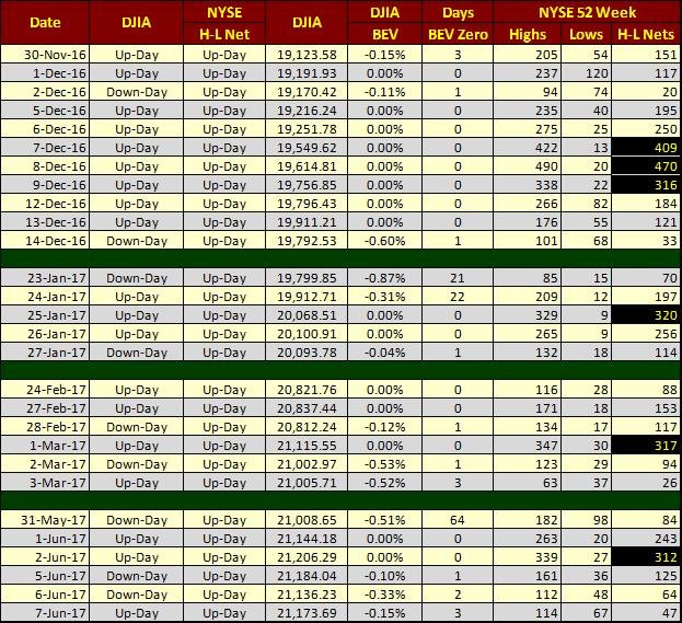
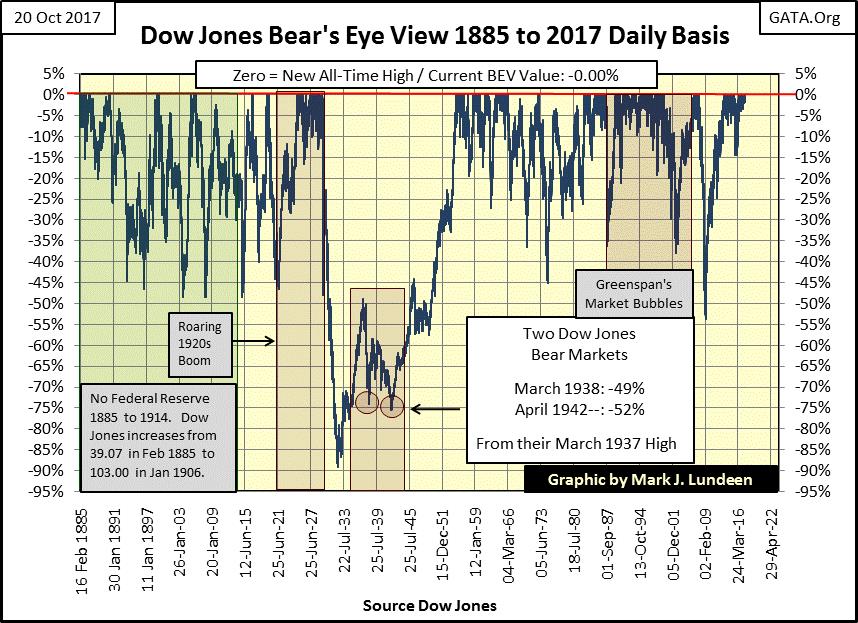
The Dow Jones this week closed at new all-time highs for each trading session, with Friday’s being the 70th new all-time high since last November’s election. That’s 70 of the 240 NYSE trading sessions since November 8th closing at a new all-time high, better than one day out of four (29%). And it goes without saying that none of the other three out of the four closed more than 3.5% away from an all-time high. The closest it got to that was on April 19th, when the Dow Jones declined 3.37% from its last BEV Zero in the BEV chart below.

© Mark Lundeen
There’s nothing magical about this 3.5% in the BEV chart above; if anything, the -5% line is the current critical level. And it’s important noting the Dow Jones hasn’t closed below its BEV -5% line above since June of 2016, a long time ago.
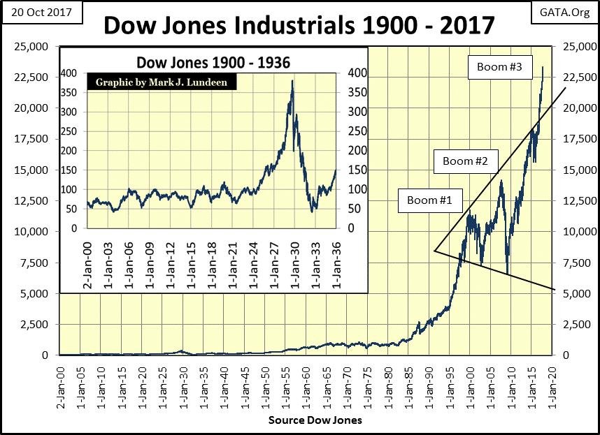
What could this mean? Moving to the chart below, it could mean the end of the world as we know it is drawing nigh. Below, I’ve plotted the Dow Jones since January 1900. In the insert, we see the Dow from 1900 to 1936, and the first financial bubble inflated into the financial markets by our Federal Reserve – the Roaring ’20s. With each boom comes the bust. And as night follows day, Mr. Bear’s deflation of the 1920s bubble is also on display – aka the Great Depression.
In the chart’s insert, note how since 1904 the 50 level proved a dependable bottom in market declines. Then came July 8th, 1932, where Mr. Bear took the Dow Jones down to 41.22, a level not seen since the turn of the 20th century. In September 1929, as the Dow Jones made its last all-time high of the Roaring ’20s, no one could have seen that coming, how it must have hurt when it happened.
“The nation is marching along a permanently high plateau of prosperity.” — Irving Fisher, Yale University October 23, 1929
Six days later after he said this, Black Tuesday occurred.
How much pain did the July 1932 bottom of 41.22 cause? I’ve seen the documentaries and read the books on the Great Depression, but on a personal level, I haven’t a clue.
However, looking at the Dow Jones advance since 1980, I have to believe the Federal Reserve’s 21st century stock market bubble (actually three bubbles stacked on top of each other) is magnitudes worse in duration and scale than anything they did in the 1920s; ergo, the deflation to follow will be greater than what Mr. Bear did in the 1930s.
© Mark Lundeen
Most “market experts” claim the current rise in the stock market is economic “growth.” It’s growth, alright; growing like a tumor. Print this chart and post it on your refrigerator, as it may be the most important chart of our current stock market advance. The chart future market historians will use to best illustrate the cause of our pending greater depression.
Note the devastating deflation following the Federal Reserve’s first bubble market in the 1920s. It was a bubble the Fed inflated for only five years, taking the Dow Jones up some 300%. And to be accurate, it wasn’t just the stock market the Federal Reserve inflated in the 1920s. In the 1920s, they also inflated bubbles in consumer finance, auto loans and real estate too.
Does that sound familiar? The only details lacking from today’s situation are a few trillion in school loans, and the bogus academic degrees they financed burdening young people, and the multi-hundred trillion dollar derivative market threatening to take out the global banking system should (when) interest rates rise above some unknown threshold. If our current situation sounds worse than the credit abuses of the Roaring 20s, it’s because it is.
Now, look at the Federal Reserve’s current bubble in the Dow Jones. Like the Dow Jones 50 level in the early 20th century, the 1000 level in the Dow Jones is also significant, a level the Dow Jones could not break above and stay above from 1966 to 1982. Then came 17 December 1982, and the Dow Jones hasn’t closed below 1000 since.
Since December 1982, the Federal Reserve has inflated not one, not two, but three massive inflationary bubbles in the stock market. And now, at the end of this week, the Dow Jones finds itself closing above 23,000 with little to no concern expressed by today’s “market experts.”
In the process of inflating this bubble, the world has totally changed over the past four decades. In 1982, thrift was still widely seen as a virtue, so people had savings and saw the wisdom of avoiding debt. Four decades later, this is no longer true, for individuals, the corporations who trade on the NYSE, or for government at all levels.
It’s fair saying that to inflate this bubble, the assets of 1982 that people and institutions then held free and clear have all been collateralized by 2017, leaving only inflated financial assets (see Dow Jones chart above) as reserves against future calamity by people, business, and government.
Collateralizing everything seen and unseen from the Atlantic to the Pacific is a significant achievement of the idiot savants devising “policy” at the FOMC, people academically brilliant but functionally simple morons in the grand scheme of things. And we won’t even get an “I’m sorry” from these ethically challenged buffoons when this bubble begins to deflate, hopefully not down below the Dow Jones’ 1000 line, as it did its 50 line during the depressing 1930s.
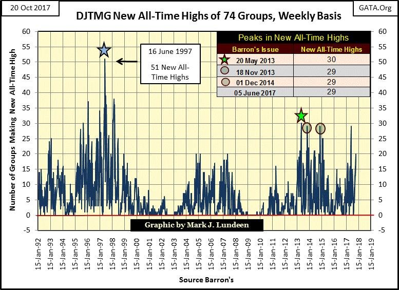
New all-time highs in the 74 Dow Jones Total Market Groups (DJTMG) I follow increased to 20 this week. This is a good time to ask if it will break above the 30 seen in May 2013. The bulls have attempted to do so three times since then and failed. I’m not going to make a prediction whether this 30 will or won’t be exceeded. This is strictly a spectator sport for me, but I’d be surprised if it did break above 30 before Mr. Bear begins deflating the current bubble in the stock market.
© Mark Lundeen
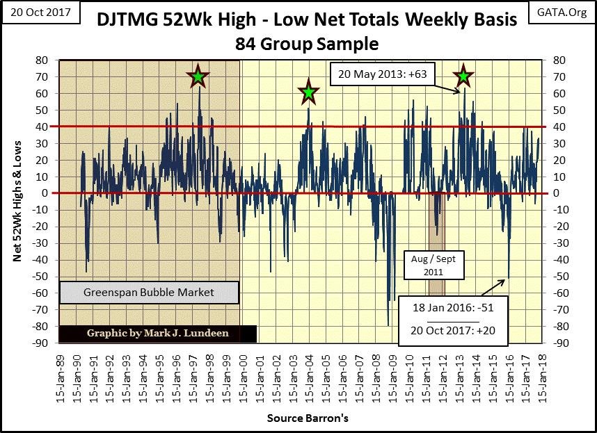
For the bulls to break above the May 2013 high of 30 in the chart above, there’s something lacking in the chart below that would enable them to achieve this: a greater supply of new 52Wk highs in the 74 groups in the sample.
In May 2013, the DJTMG saw its net 52Wk H-L at 63, of which 30 of these 63 groups also made new all-time highs. This week, the DJTMG saw its 52Wk H-L at a net of 33, of which only 20 made new all-time highs.
And here’s the rub: the DJTMG as a whole is going to have to do much better than that if it’s going to break above its high of 30 new all-time highs (63 net 52Wk H-L) seen in May 2013. However, it’s just a historical fact that as bull markets age, making new 52Wk highs becomes increasingly difficult. The last time the DJTMG saw over 40 net 52Wk H-L in the chart below was in 2014, and we wouldn’t be approaching 40 now if it wasn’t for this bizarre market advance that began with the election of Donald Trump as president.
© Mark Lundeen
Below, I have a table for NYSE 52Wk Highs & Lows (Last Three Columns). On good days, the nets for the NYSE 52Wk H-L can easily exceed 300 net 52Wk Highs, yet since November 8th of last year (election day), the NYSE has on only six occasions exceeded 300, with the last occurring on June 2nd. And the two times it exceeded 400 was last December.
© Mark Lundeen
For the bulls, this is no reason for alarm. I’m only pointing out that as the Dow Jones continues making new 52Wk and all-time highs, it does so with fewer and fewer issues trading on the NYSE following the Dow Jones’ example. That’s just what happens as bull markets mature until Mr. Bear arrives and 52Wk Lows dominate the market for the duration of the bear market.
Unless the NYSE and DJTMG broadens it base of issues and groups (seeing an increasing number of new all-time and 52Wk Highs), I expect that like an old geezer having increasing difficulties climbing steps, so too will the broad stock market, then, too, the Dow Jones itself will find it ever more difficult advancing higher.
But after looking at the Dow Jones and its step sum below, one wouldn’t think the current bull market is actually only an aging geezer. What a beautiful bull box in the chart and the development of the step sum and the Dow Jones after the bull box closed is a perfect example of what we can expect after a bull box closes.
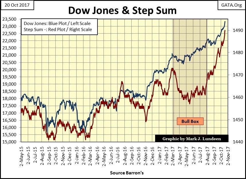
© Mark Lundeen
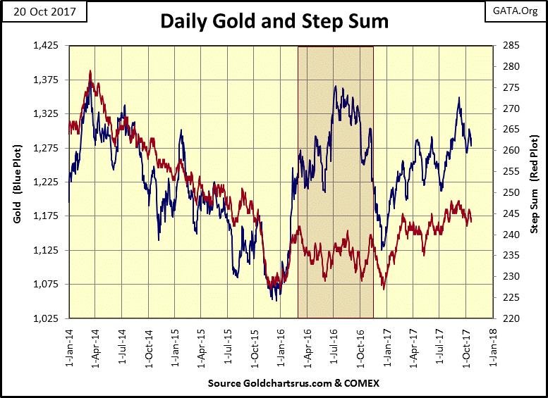
Gold’s step sum chart below also has a bull box in it; a rising price trend as the step sum trend declines or stagnates. But gold’s bull box below failed miserably, as its price trend ultimately broke down towards its step sum, not its step sum rising up to its price trend as we see in the Dow’s step sum chart above.
© Mark Lundeen
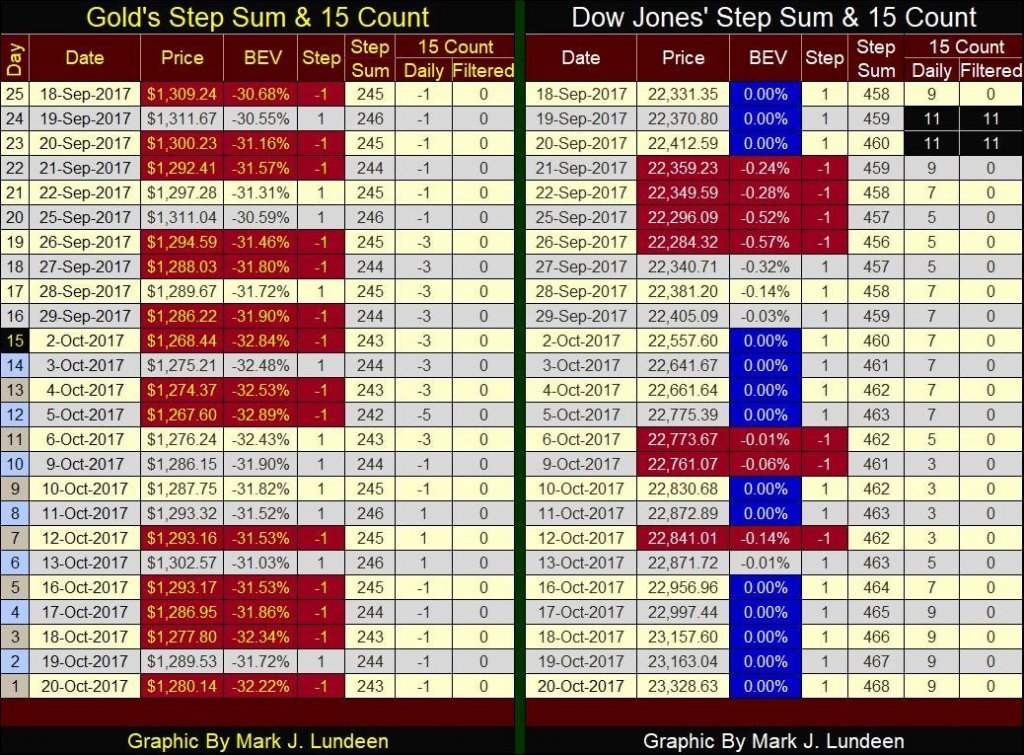
Here are gold’s and the Dow Jones’ step sum tables. Last week, I speculated the selling by the bears in the gold market was over, and the bulls would have their chance to show what they could do in the weeks to come. A week later, I see how wrong those wild assumptions were!
Four of the five trading sessions last week found gold down for the day. But try as they might, the bears have yet to create a selling panic in the gold market. And two years after the December 2015 hard bottom seen in gold’s step sum chart above, I don’t believe such a sell-off is likely.
Looking at the Dow Jones side of the table, we see history in the making. Since September 18th, the Dow Jones saw only seven down days, and on most of the days it closed higher, it did so at a new all-time high (BEV Zeros).
© Mark Lundeen
How much longer can this continue? Herbert Stein below has a thought on this exact subject:
“Things that can’t go on forever, don’t.” — Herbert Stein: President Nixon’s Chairman of the Council of Economic Advisers
That makes sense to me, especially as I haven’t a clue how much more this advance has in terms of time or points. So I’m assuming that until bond yields once again begin to rise, the stock market is destined to rise ever higher.
But the day is coming when the Dow Jones will once again find itself below its BEV -10% line. And here, I’m making my second assumption: when the Dow Jones breaches its BEV -10% line, the Dow Jones will not be able to recover to new all-time highs for many years, possibly decades to come (see Dow’s BEV chart above).
And that’s when we move to the BEV chart below, showing every Dow Jones market decline since 1885. Look at the crater in the BEV plot left by Mr. Bear after he deflated the Roaring 20s Dow Jones’ bull market.
The last all-time high (BEV Zero) of a bull market is called the Terminal Zero (TZ), and the Dow Jones’ TZ for the 1920s occurred in September 1929 as it closed at 381.17. The Dow Jones would not breach this high until November 1954 (382.74).
© Mark Lundeen
You may believe that in November 1954, as the Dow Jones finally broke above its high point of 1929, the stock market finally recovered from the Great Depression. But keep in mind that the $381.17 of September 1929 could have been used to purchase a new Ford automobile, while the $382.74 of November 1954 could only serve as a down payment for a new Ford costing around $1,000 or so.
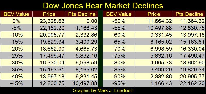
Here’s a table of potential bear market declines based on Dow Jones Friday’s close of 23,328.63.
© Mark Lundeen
In the coming bear market, I’m anticipating the Dow Jones will break the sub-prime bear market -54% decline seen above. Let’s call it a -55% decline in the table above. Such a decline would deflate all the gains made in the Dow Jones since its High-Tech market top of January 2000.
However, I believe a decline down to its BEV -70% line is very likely. From Friday’s closing price, the Dow would have to close at 6998 to achieve that. I just have this feeling that Mr. Bear will want more than that, that the coming bear market will ultimately take out the -89% decline from July 1932, call it -90% in the table above.
Is that possible? I’d say it is. Mr. Bear in 2017 will have massive amounts of unpayable debt and illiquid-garbage assets to write off of society’s balance sheets.
In Mr. Bear’s pending stress test of Wall Street’s OTC derivative positions, a market of hundreds of trillions of dollars in nominal value, I can see future counterparty failure so massive that the global banking system will fail. That was something that didn’t happen in the 1930s, but it may happen in the years to come, and such an event would take the Dow Jones far below its -70% row in the table above, or I would think so.
The “science” of economics has little in common with the hard sciences of chemistry or physics. Rather, economics as now practiced in Washington and on Wall Street is more like the fashion industry than anything else: a whimsical discipline whose laws and application are subject the greed of Wall Street and the vanity of Washington insiders.
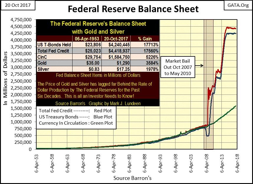
The mathematical constant of Pi has been unchanged in value and application since Archimedes first derived it in the 3rd century BC. In 1827, Georg Ohm derived a basic law of electricity, that today remains a foundation block for modern electronics – Ohm’s Law. To be sure, economists have also derived mathematical formula describing the functions of the economy. But I’d really like to see the mathematics that justifies the logic of what the Federal Reserve has done to their balance sheet below, the reserves standing behind to the global reserve unit-of-account.
Looking at this chart, we shouldn’t be surprised if many countries today want to dump the dollar and use some other unit of account in their international trade. What’s amazing is how constrained the price of gold, silver and their miners have been since 2007, when the “policy makers” at the FOMC rolled up their sleeves and went to work trashing the dollar to save the big banks on Wall Street.
© Mark Lundeen
To be fair to the current occupants of the FOMC, we have to remember it was Fed Chairman Greenspan who inflated the bubble in the sub-prime mortgages market.
“Innovation has brought about a multitude of new products, such as subprime loans and niche credit programs for immigrants. With these advances in technology, lenders have taken advantage of credit-scoring models and other techniques for efficiently extending credit to a broader spectrum of consumers. These improvements have led to rapid growth in subprime mortgage lending . . . fostering constructive innovation that is both responsive to market demand and beneficial to consumers.” — Alan Greenspan (At the Federal Reserve System’s Fourth Annual Community Affairs Research Conference, Wash D.C. April 8, 2005
When Greenspan said this in 2005, the talking heads on CNBC felt a thrill flowing up their legs when they reported it. However, in 2017, the sub-prime thrill is now long gone.
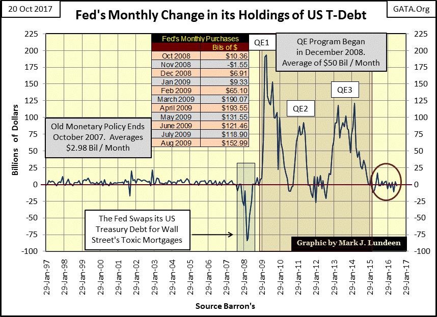
Also, as a reaction to the 2007-09 credit crisis, it was Fed Chairman Bernanke’s three QEs (see chart above) which bloated the Federal Reserves’ balance sheet. However, truth be told, if the current chairman of the Fed (Janet Yellen) didn’t fully support the legacy of Greenspan and Bernanke, she and everyone else at the FOMC would have never been allowed membership to this exclusive club of central bankers.
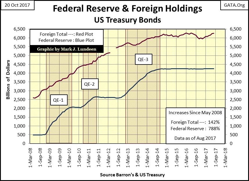
And it’s not just America’s central bankers who have been occupied with trashing their currencies (Red Plot below). Since May 1995, Barron’s has published data from the Federal Reserve on global central banks holdings of US Treasury bonds (Blue Plot). Central banks monetize these bonds and then “inject” the resulting monetary effluent into their own economies.

© Mark Lundeen
In years past, there was much speculation when these central banks would begin to sell their holdings of US T-Debt. All that changed in November 2016 (Black Triangle above). Since the election of Donald Trump, foreign central banks have once again begun monetizing Uncle Sam’s unpaid bills.
Occasionally, Janet Yellen mumbles something about reducing the Fed’s balance sheet seen above (Red Plot). To do so, the Federal Reserve would have to sell these US T-bonds to someone in the open market or maybe in a private off-market sale to parties unknown. To restore the Fed’s balance sheet to where it was in 2007, she would have to dump $3.5 trillion of them.
Their problem will be finding someone willing to buy them at current market prices. For one thing, bond yields since 2007 have fallen dramatically for the simple reason that since 2007, the Federal Reserve purchases all the bonds seen above. Selling these bonds guarantees bond yields will once again increase, and who wants to buy bonds when a central bank is promising to increase yields by selling $3.5 trillion of their US Treasury bonds held in reserve?
Okay, Yellen didn’t actually specify how many bonds she intends to sell. But even if she intends to sell only $1.0 trillion of the Treasury bonds the Federal Reserve now holds, that’s a lot of bonds no one really wants at today’s prices and yields. This will most likely remain true until bond yields increase to where they were before 2007 and maybe higher. To make matters worse, don’t expect the US Treasury to stop selling new bonds as the FOMC unloads its T-bonds by the truck full into the market. Any attempt by the “policy makers” to contract their balance sheet seen in the charts above could prove cataclysmic to market valuations in financial assets.
Realistically speaking, Yellen’s talk of reducing the Fed’s balance sheet is only talk. The deflationary consequences should she and the FOMC actually begin selling their bonds are unthinkable from a “policy maker’s” perspective. Talk is cheap. So until I actually see the Federal Reserve actually selling T-Bonds in the chart below, I won’t believe a word coming out from the FOMC on this subject.
© Mark Lundeen
China too was to implement a sell-off of their US Treasury bonds and beginning in July 2016, it appeared that they had begun doing so.
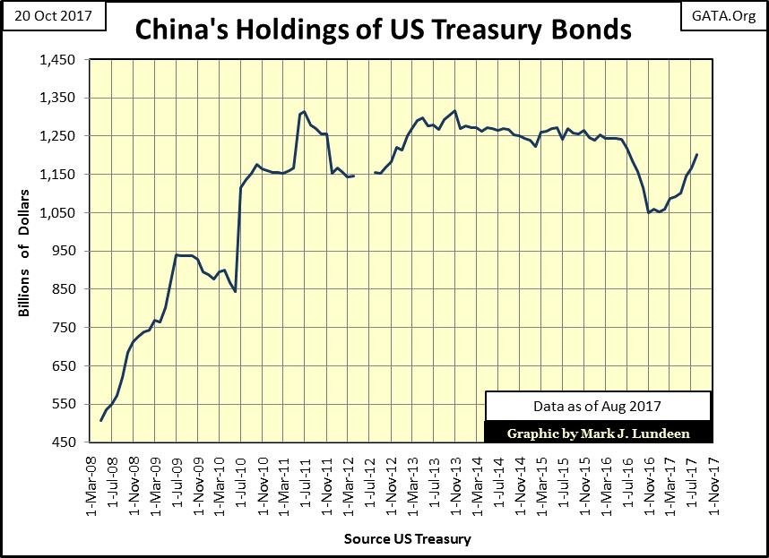
© Mark Lundeen
But like other foreign holders of T-debt (Red Plot Below), they became buyers once again after Trump won last November’s election.
© Mark Lundeen
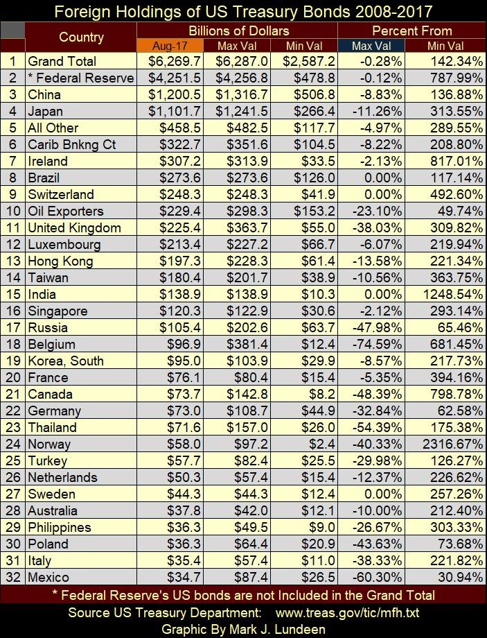
Using data from the US Treasury’s website, below is a table of who’s holding US T-debt as of August 2017. The data is sorted by the Aug-17 column by largest to smallest. Data for the Federal Reserve (#2 below) is not part of the Treasury’s data set, but I’ve included it as logically it should be.
© Mark Lundeen
(Featured image via Deposit Photos)
—
DISCLAIMER: This article expresses my own ideas and opinions. Any information I have shared are from sources that I believe to be reliable and accurate. I did not receive any financial compensation in writing this post. I encourage any reader to do their own diligent research first before making any investment decisions.


Temotiva Launches Crowdfunding Campaign to Advance Preventive Mental Health
Temotiva Innovación Lab has launched a crowdfunding campaign through Santander X Explorer, marking a new phase for the University of...


Fed Policy Shift Raises Concerns Over Debt and Inflation Risks
The Federal Reserve is criticized for resuming balance sheet expansion through Treasury purchases despite expectations of tighter policy under new...

AI Adoption in Italian Retail Stalls Despite Strong Experimentation
A survey on AI in Italian large-scale retail trade shows companies are increasingly adopting artificial intelligence, but only 1.4% have...


Crypto Market Stays Stable as Bitcoin and Ethereum See Mild Declines
The crypto market remained stable despite slight declines in major coins like Bitcoin and Ethereum. Bitcoin held near $64,362, while...


WNBA Removes Cannabis From Banned Substances List in New CBA
WNBA removed cannabis from its banned substances list in a new CBA running 2026–2032, aligning with NBA policy and allowing...
 |
|
 |  |
 |
|
-

 Fintech4 days ago
Fintech and AI: Adoption Grows, but Profits Favor Agile Innovators
-

 Cannabis2 weeks ago
Argentina Legalizes Cannabis Seed Sales Under New Regulatory Framework
-

 Business6 days ago
SpaceX IPO Sparks Déjà Vu as Market Risks Loom and Gold Bulls Stay Hopeful
-

 Crowdfunding4 days ago
Wyrmgold Launches Crowdfunding Campaign for Believe in me! (please)
You must be logged in to post a comment Login