Featured
Primer on the Bear’s Eye View
I’m waiting for markets daily volatility’s 200-day moving averages to increase to something above 1.00%, which for gold would be a welcoming and very bullish new market trend. A signal that new funds are flowing into the gold market. However, for the Dow Jones, seeing its daily volatility’s 200-day moving average increase to something above 1.00% would also be welcomed to a big long-term bear, such as myself.

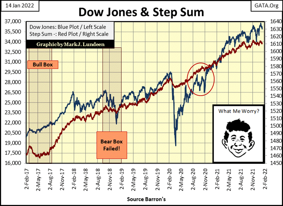
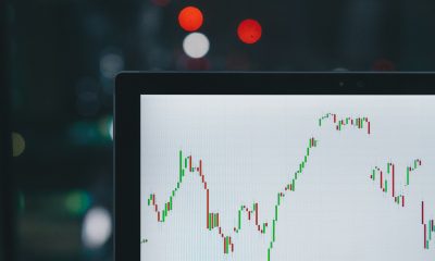
The post 23-March-2020 flash crash advance continues. During my Christmas vacation, the Dow Jones made three new BEV Zeros in the chart below, numbers #51, 52 & 53, with #53 on January 4th. But before the Dow Jones did all that, it first deflated below its BEV -5%. Falling down to a BEV -6.62% on December 1st of 2021. Now we wait to see how far the Dow Jones deflates next time it goes below its BEV -5% line, and when.
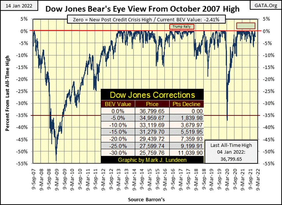
As this is my first article for 2022, I thought I’d review my Bear’s Eye View (BEV) technique for analyzing market data. I didn’t invent this technique. I first saw it in a Richard Russell’s Dow Theory Letter. An unusual chart was submitted to him by a subscriber for the S&P 500 going back a decade or so. It was a bear bone chart; no title or explanations of what was there. But I could make out what it was, each new all-time high was represented by a 0.00%, all data points not a new all-time high, were registered as a negative percentage decline from its previous all-time high.
In effect, the S&P 500 was condensed into a spectrum of only 100 possible percentage points. Each new all-time high was converted into a percentage value of 0.00%. A total wipeout in valuation would be a -100% value. All other dollar values were displayed in percentage values between 0.00% and -100%.
I looked at this and thought it brilliant, as it solved a problem everyone has when charting the Dow Jones over time; the problem caused by using the inflated dollars issued by the Federal Reserve the Dow Jones is valued in. Below is a chart of the Dow Jones going back to January 1900. The Dow Jones is plotted in dollars, but the dollars used over time are not standardized.
In January 1900 the dollar was defined in terms of gold; $20.67 paper dollars per ounce of gold held by the US Treasury. That changed in March 1934 when the dollar was redefined in terms of gold; $35 paper dollars per one ounce of gold, a 70% reduction in the value of the dollar in terms of gold. Then in August 1971 the US Treasury and Federal Reserve took the dollar off the gold standard (Red Star Below).
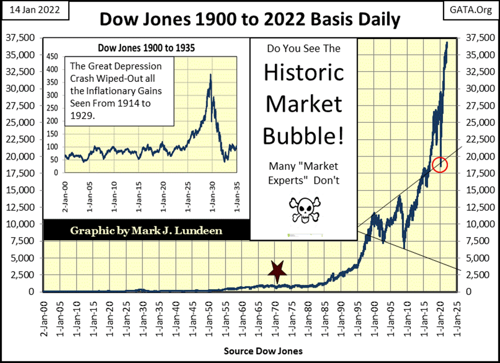
After August 1971 in the chart above (Red Star), anyone can see the change in the Dow Jones. What caused this is seen below. Beginning in 1931, the US Government instituted a monetary policy of inflation. During the Great-Depression Crash, then-President Hoover attempted to curtail the effects of price deflation with America’s first dose of quantitative easing (Red Square, Blue Plot, Chart Insert Below).
In the chart, I’ve plotted the data only to 1976 as it tells the tale. Due to paper dollar inflation, there were two runs on the US gold reserves (Red Boxes / 1931 – 1934 & 1958 – 1971), and the relentless growth of Currency in Circulation (Blue Plot CinC / paper dollars in circulation) since 1958. How relentless this growth has been can be seen in the table below, listing the quantity of paper dollars per one ounce of gold reported to be held by the US Treasury.
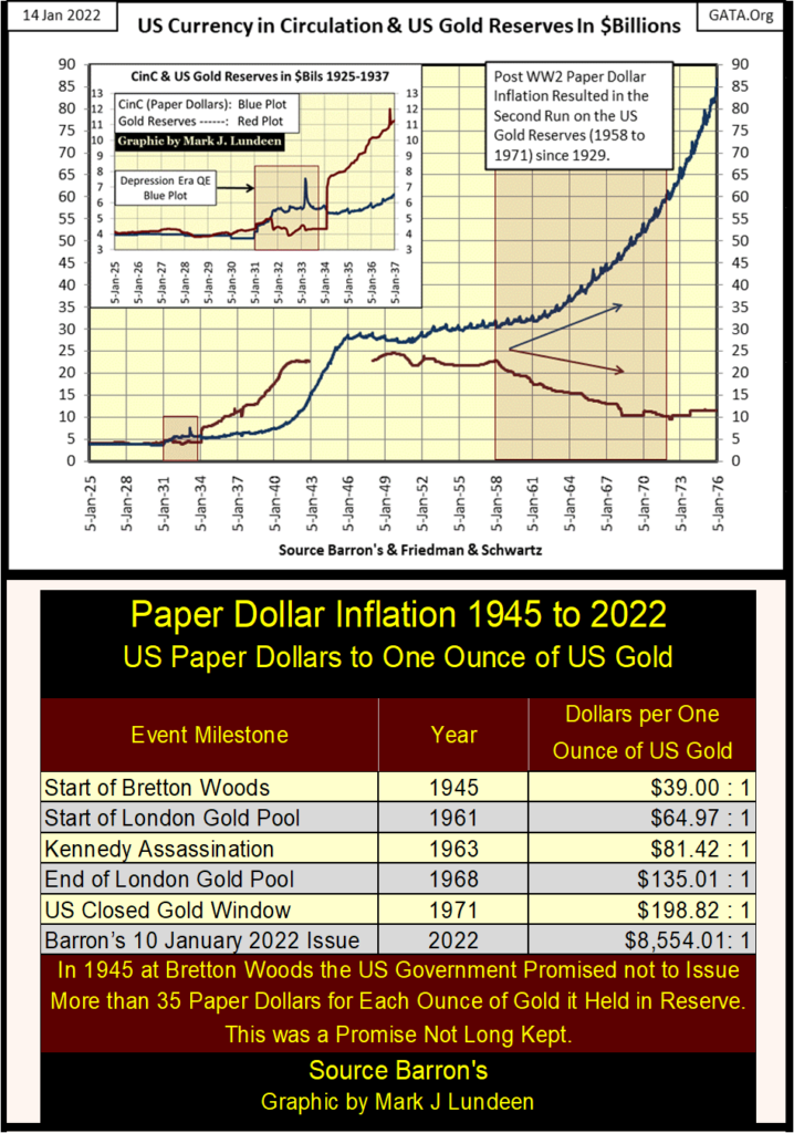
Economists and “market commentators” blame President Nixon for abandoning the Bretton Woods $35 gold peg in August 1971. But the fact is, as documented in the dusty old pages of Barron’s (where this data is from), from day one the US Government never honored the terms of the Bretton Woods Monetary Accords. This inflation of CinC was, and continues to be an act of lawlessness, as the Bretton Woods Monetary Accords was an international monetary agreement, passed by Congress, and signed into law by President Truman in July 1945.
A “temporary executive order” from President Nixon in August 1971 cannot supersede enacted law. Where is the Supreme Court on this? They are absent without leave (AWOL), as they refuse to take up any case concerning the legality of post-WWII “monetary policy.”
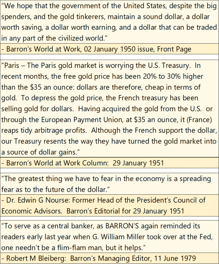
There were those who protested this program of inflation, as seen in the four Barron’s quotes below. But for the most part, everyone went along to get along. Apparently, this will be so until disaster finally does strike. When it does, count on the mainstream-financial media, and their allies in academia to hornswoggle and bamboozle the public with a tsunami of bull shit to hide the actual cause of the pending disaster – Big Government, Big Education and their allies on Wall Street.
In President Nixon’s defense, he had a very difficult presidency getting America out of the Vietnam War with honor. At that time, with honor meant to withdraw only if Vietnam returned every American serviceman, they held captive. Something the usurper president Biden failed to do last August when he abandoned 15,000 American civilians and an untold number of allied civilians in war-torn Afghanistan. Have these civilians returned from Afghanistan? Some, but five months later I doubt all have, and who in the White House or the mainstream media cares?
So, Nixon’s priorities in August 1971 weren’t to preserve the Bretton Woods’ $35 gold peg. Which if you examine the chart, table, and quotes above, obviously wasn’t a Presidential priority since July 1945 when President Truman, who signed the Bretton Woods Accords into law, was in office.
Next, is the Dow Jones’ Bear’s Eye View (BEV) plot going back to 1885, with its BEV frequency distribution tables for the past 137 years. The impression people have when looking at this very long-term BEV chart for the first time is; what is this? The answer to that is, this is how Mr Bear looks at the Dow Jones, hence the “Bear’s Eye View.” Each all-time high equal to only a BIG FAT ZERO (0.00% / aka BEV Zero), and never more as that is how Mr Bear sees each of them. All data points not a new all-time high register as a negative percentage CLAW BACK by Mr Bear.
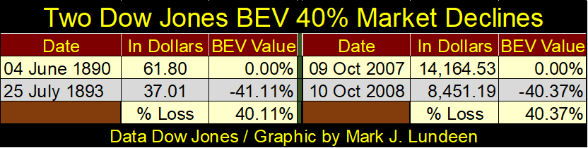
Plotting the Dow Jones in percentage terms, (condensed between 0.00% and -100%) has great advantages. In the table below, I looked at the first Dow Jones 40% market decline (June 1890 to July 1893), and when the Dow Jones first deflated 40% during the 2007-09 sub-prime mortgage market meltdown.
The difference in dollar valuations between these two 40% market declines in the Dow Jones are huge, but dollars in the 1890s were limited and defined in terms of gold. By the 2000s the dollar was something vastly different from what it was in the 1890s, and not in a good way. A direct comparison between the dollar value of the Dow Jones from the 1890s and 2000s is impossible. Go back and look at the long-term Dow Jones chart above plotted in dollars.
But looking at the Dow Jones in BEV terms (Table Below), both these declines were 40% declines, impacting the Dow Jones equally in the 1890s and 2000s – by 40%. This is something unique the Bear’s Eye View brings to market technical analysis; the ability to directly compare the Dow Jones from one decade to any other.
The biggest objection to the Bear’s Eye View (BEV) is, as it converts every new all-time high into a 0.00%, and never more, it’s unable to record market advances. To which I say; yes, and then no. Yes, because a BEV plot cannot display percentage gains over 0.00%, and then no, as it does record the volume of new all-time highs over the decades. Let’s look at the frequency distribution tables below the Dow’s BEV chart.
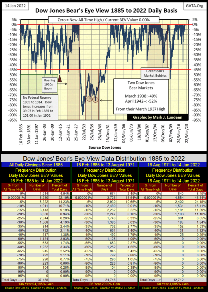
The table on the left covers all daily closes for the Dow Jones going back to February 1885. The 0% row contains every new all-time high the Dow Jones has made in the past 137 years of Dow Jones history; 1514 of them, or 4.04% of the 37,458 daily closings since February 1885. The -0.000001% row contains every daily closing just short of a new all-time high, down to -4.99% from an all-time high. I call this row of daily closings “within Scoring Position,” as any close within 5% of a BEV Zero (0.00%) can easily advance from there to a new all-time high.
To see how bullish any period of market history has been, I add up the totals in these two rows (within Red Boxes), or better yet, add the percentage of total days for these two rows. The breakdown for these three tables above are given below.
- Left Table (1885 to 2022) ————- : 26.14%
- Middle Table (1885 to August 1971): 15.99%
- Right Table (August 1971 to 2022) – : 54.29%
The left table contains every daily close for the Dow Jones since 1885. But it’s better focusing on the middle and right tables to see how the Dow Jones worked before and after the US Treasury removed the dollar from the Bretton Woods $35 gold peg. Before August 1971, the Dow Jones closed at a new all-time high, or within scoring position one day out of every 6.25 daily closes. After August 1971, the Dow Jones closed at a new all-time high, or within scoring position one day out of every 1.84 daily closes, or more than half of all daily closes for the past fifty years.
That’s amazing. It’s also a matter of concern as this bullish performance was solely the result of monetary inflation flowing from the Federal Reserve.
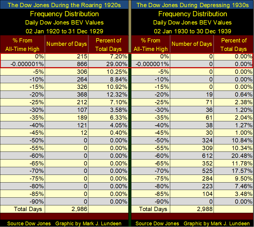
Keep in mind the deflation in market valuations of the Depressing 1930s was only a reaction to the inflation of market values, by the Federal Reserve during the Roaring 1920s. As the Bear’s Eye View allows us to compare any decade to any other, let’s compare the Dow Jones of the 1920s with that of the 1930s in the two frequency tables below. Using the Bear’s Eye View to analyze these two decades, or any other of the past 137 years of Dow Jones history, it’s a simple matter seeing which decade, the Roaring 1920s or the Depressing 1930s was bullish and which was bearish.
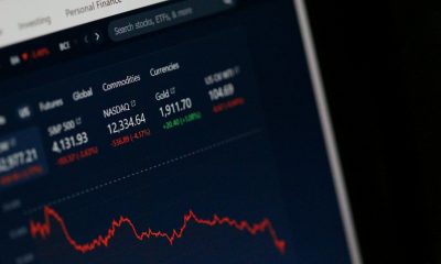
I usually include a table of major-market indexes to determine how the market, as a whole did during the past week. Below is a very rough table from this week’s close of the major-market indexes I follow. Just looking at the data as published doesn’t tell us much, and the differences in valuation of these indexes makes it impossible to compare one with another.
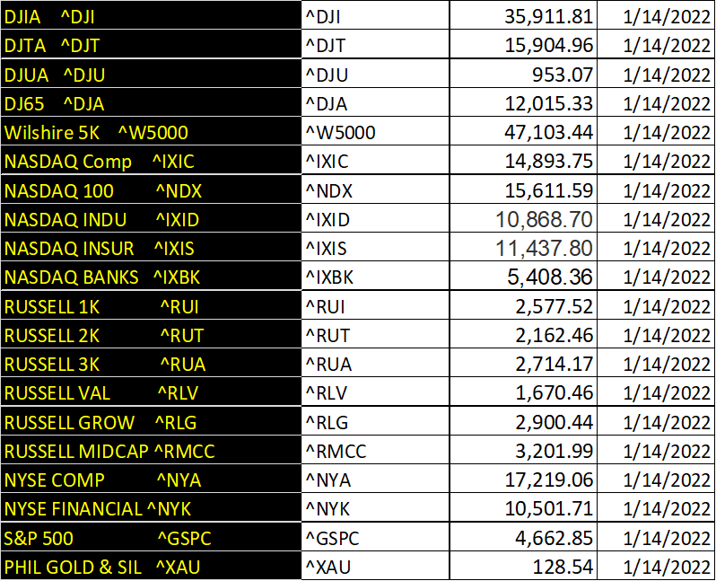
But displaying the daily BEV values of the major-market indexes above in the tables below provides an excellent graphic of how the market as a whole performed for the week. Below I have two major-market index BEV tables. The top table from the bottom of the Sub-Prime Mortgage (March 2009), the bottom table for the past week.
The 2007 – 2009 Sub-Prime Mortgage Bear Market was the second deepest percentage decline the Dow Jones has seen since February 1885, exceeded only by the Great Depression Crash (review long-term Dow Jones’ BEV chart above).
Seeing the Bear’s Eye View values (declines from all-time highs) at this historic market bottom provides an excellent graphic of the damage done by Mr Bear to the stock market as a whole. It was this market bottom (the BEV values seen in the upper table), that motivated Dr. Bernanke, and his FOMC to implement their notorious programs of Quantitative Easings to “stabilize market valuations.”
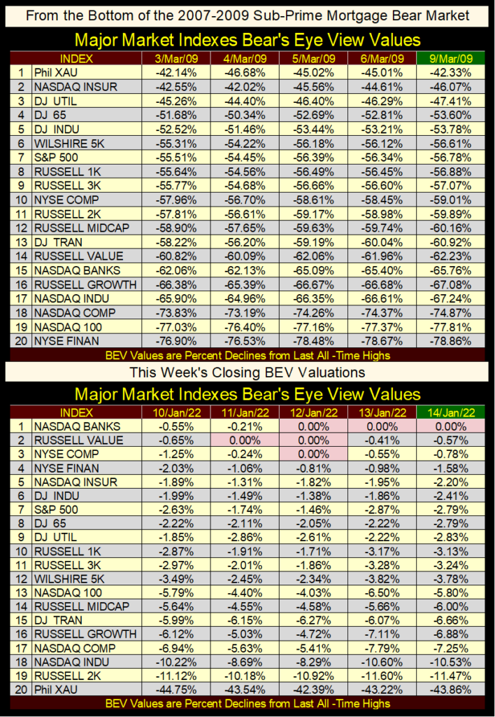
And as seen in the table above, as 2022 begins Dr. Bernanke’s three QEs, and Fed Chairman Powell’s Not QE#4 has indeed “stabilized market valuations”. But noting at how the market was “stabilized” in the chart below, with four tsunamis of monetary inflation, it’s anyone’s guess how long this market will continue to be “stabilized.”
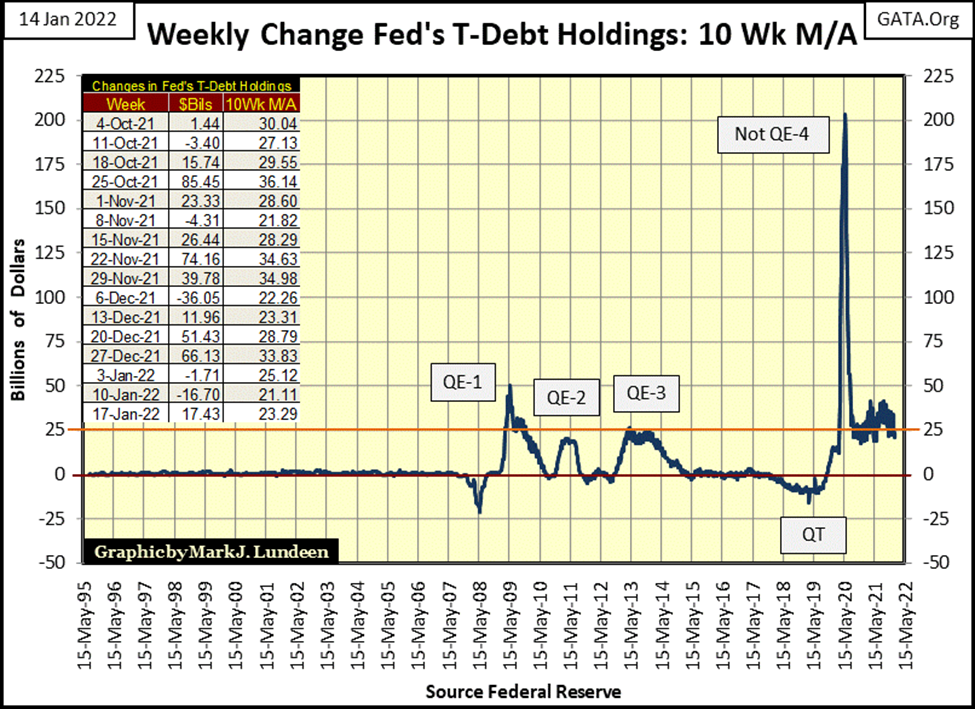
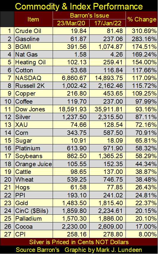
Something important began at the bottom of the March 2020 flash crash. The “liquidity” being “injected” into the financial system (Powell’s Not QE#4 seen above) began flowing into commodity prices. This is a very important point to understand; as rising CPI inflation (not the CPI as recorded by the Department of Labor seen below) will ultimately result in a bond market disaster, as happened in the 1970s, but worse.
Seeing energy and other commodity prices outperform the major-market indexes seen below is an early indication that the end of the bull market that began in August 1982 approaches. But when? Your guess is as good as mine.
Though the FOMC will continue to “stabilize” the financial markets, as seen in the chart above, at some point they will fail. The table below will capture that moment when stocks and bond valuations crash as commodity prices spike to dollar valuations not conceivable today.
Then maybe the end will work out with financial assets continuing to inflate, but at a fraction of what hard assets such as energy and food do. Call that QE-5. Ultimately, it makes no difference to the vast majority of today’s retail investors; they’ll become impoverished because, in 1913, the US Congress passed the worst act of legislation in its history – The Federal Reserve Act.
It’s like Mark Twain said; we have “the best Congress money can buy.” And with the Federal Reserve System, everyone “important” in Washington DC can be kept fat, dumb and happy.
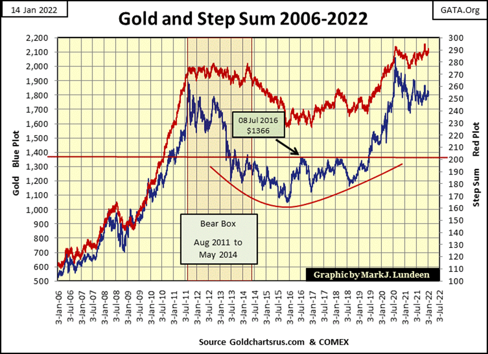
What a depressing thought all that is! Let’s think of something more uplifting, like what’s happening in the gold market. Here’s gold’s BEV chart going back to January 2018. Gold’s last all-time high ($2,061.44) happened in August 2020. Since then, it trended down until April 2021 and since has traded for the most part between its BEV -15% and BEV -10% lines in the chart below.
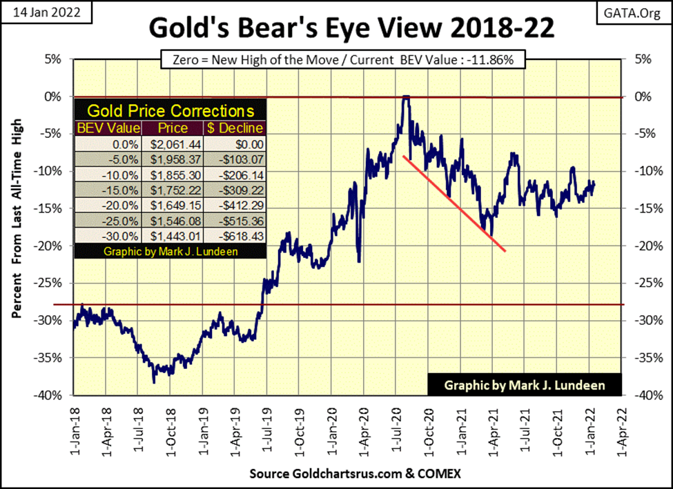
A year is a long time for a market to trade within a 5% band as seen above. It just is. One of these days’ gold is going to break out of this 5% band, and when it does it will be an important breakout, be that a breakout up or down.
Or so one would believe. As you may guess, I believe the next big thing in the gold market will be a breakout to the upside, as precious metals, like energy and food, are hard assets in an early stage of a massive bull market.
But the price of gold and silver are fixed at the COMEX futures market, where COMEX goons sell digital gold and silver, metal that doesn’t exist by tens and hundreds of tons. As long as the spot market (where the actual precious metal is transferred from seller to buyer) can deliver metal, the COMEX scam can continue to operate. But those days are numbered, though I don’t have a clue of the count of the remaining days.
Gold and its step sum below look good. Not great but good. I’d like to see the price of gold (Blue Plot / Market Reality) rise up in sympathy with its step sum (Red Plot / Market Expectations). But it would be good to see the price of gold rise up with its step sum with a bit more enthusiasm.
But the gold market doesn’t have a friend in the world when it comes to governments worldwide. The same goes with the global central-banking cartel, as the higher the price of gold goes, the more incompetent their “monetary policy” looks.
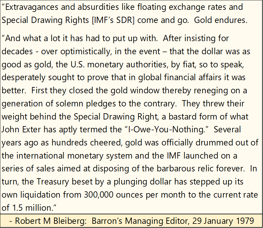
How incompetent does their “monetary policy” look? One has to go back to the 1970s to see. Robert M. Bleiberg, Barron’s Managing Editor’s quote below from 1979 nicely sums up the misdeeds of the “policymakers” over the decades.
* What is coming our way has been a long time coming. *
Here is the step sum chart for the Dow Jones. The Dow Jones is a bit ahead of its step sum, or market reality is ahead of market expectations. That isn’t a bad situation for the market to be in. In today’s world, where financial market valuations are manhandled far above where natural market forces would have them, it’s hard NOT to be short-term bullish on the stock market. But for reasons I’ve given above, this too shall pass.
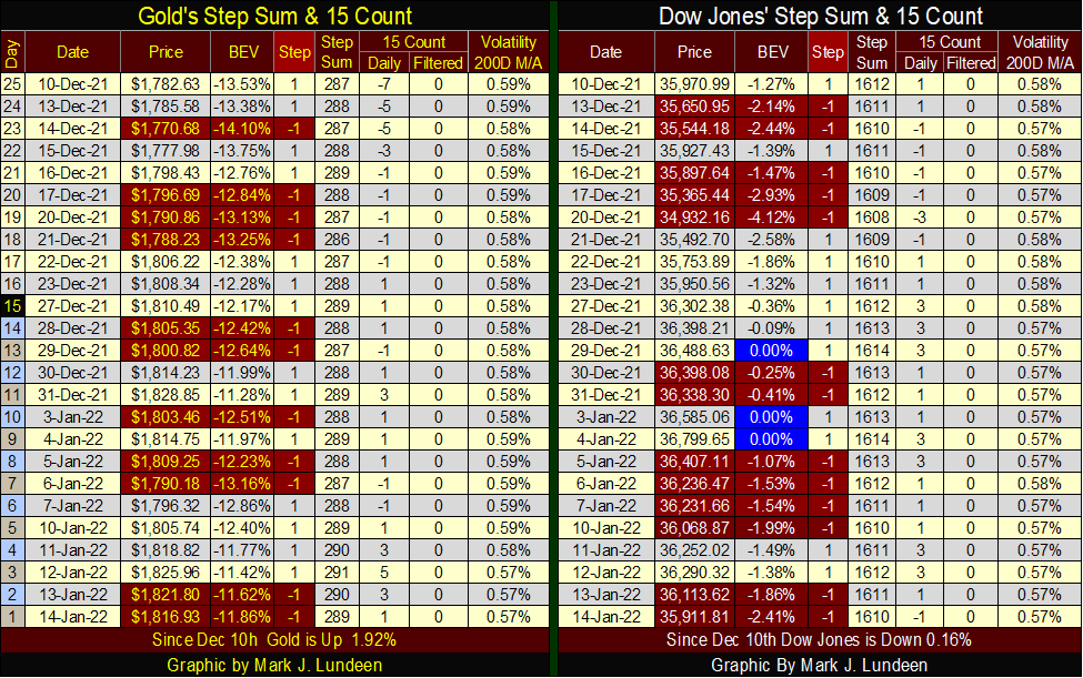
Next is gold’s and the Dow Jones’ step sum tables. Both of their 15-counts closed the week at a very neural +1 or -1, indicating that both markets are seeing about as many daily advances as daily declines, which is how things normally go during bull and bear markets alike.
I’m waiting for their daily volatility’s 200-day moving averages to increase to something above 1.00%, which for gold would be a welcoming and very bullish new market trend. A signal that new funds are flowing into the gold market.
However, for the Dow Jones, seeing its daily volatility’s 200-day moving average increase to something above 1.00% would also be welcomed to a big long-term bear, such as myself. Historically speaking, seeing this market metric increase to something above 1.00% has always been a sure indication the stock market is seeing a significant selloff.
__
(Featured image by sergeitokmakov via Pixabay)
DISCLAIMER: This article was written by a third-party contributor and does not reflect the opinion of Born2Invest, its management, staff, or its associates. Please review our disclaimer for more information.
This article may include forward-looking statements. These forward-looking statements generally are identified by the words “believe,” “project,” “estimate,” “become,” “plan,” “will,” and similar expressions. These forward-looking statements involve known and unknown risks as well as uncertainties, including those discussed in the following cautionary statements and elsewhere in this article and on this site. Although the Company may believe that its expectations are based on reasonable assumptions, the actual results that the Company may achieve may differ materially from any forward-looking statements, which reflect the opinions of the management of the Company only as of the date hereof. Additionally, please make sure to read these important disclosures.


From Confiscation to Cooperation: Funding Casa de la PAZ’s Social Transformation
A crowdfunding campaign on Produzioni dal Basso seeks funds to renovate a former drug-trafficking building in Cali, Colombia into Casa...


Bitcoin Surges Toward $110K Amid Trade News and Solana ETF Boost
Bitcoin nears $110,000 after a 3.5% daily gain, driven by U.S.-Vietnam trade news and the successful launch of a Solana...


Morocco Charts a Citizen-Centered Path for Ethical and Inclusive AI
The National Conference on Artificial Intelligence in Rabat united officials, researchers, and partners to shape Morocco’s ethical, inclusive AI strategy....


Cannabis Company Adopts Dogecoin for Treasury Innovation
A U.S. cannabis company is using Dogecoin (DOGE) as part of its financial reserves, aiming to blend innovation with flexibility....


Ripple Launches EVM Sidechain to Boost XRP in DeFi
Ripple has launched an Ethereum Virtual Machine (EVM) sidechain on XRPL, aiming to bring XRP into the DeFi space. With...
 |
|
 |  |
 |
|
-

 Impact Investing2 weeks ago
EU Eases CO2 Tax Burden on SMEs with Revised CBAM Rules
-

 Fintech2 days ago
Robinhood Expands to Europe with Tokenized Stocks and Perpetual Futures
-
 Business1 week ago
America’s Debt Spiral: A $67 Trillion Reckoning Looms by 2035
-

 Crowdfunding7 days ago
Tasty Life Raises €700,000 to Expand Pedol Brand and Launch Food-Tech Innovation