Featured
Reasons to sell the stock market and buy the old monetary metals
The Dow Jones has been on the rise. However, gold and silver are not looking so hot right now, but there’s still hope for them.
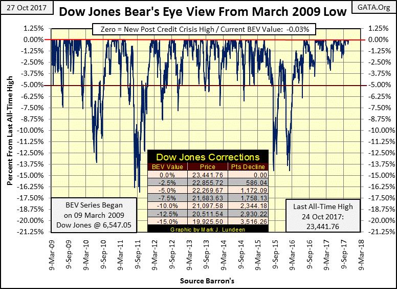
Not much new with the stock market last week—with the market advancing that isn’t bad news. The week before that, the Dow Jones closed at new all-highs on each day but did so only on Tuesday. Still, on a weekly basis, the Dow Jones found itself at a new all-time high on Friday’s close. On a daily basis, as seen in the Dow Jones BEV chart below, it ended the week only a hair’s width from breaking above last Tuesday’s daily all-time high (7.75 points / 0.03%). Expect the Dow Jones to continue making new all-time highs again next week.
© Mark Lundeen
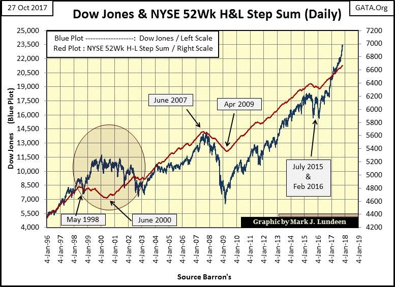
Below is the Dow Jones (Blue Plot) going back to 1996, with the NYSE’s 52Wk net H-L step sum (Red Plot). For the 52Wk net H-L step-sum plot, each day with more 52Wk Highs than Lows it’s a +1, more 52Wk Lows than Highs and is a -1; this data is then used to construct a single item A-D line I call a step sum. A rising red plot identifies those periods of market history where 52Wk Highs dominated the NYSE, a declining red plot those times when 52Wk Lows dominated.
Typically, the 52Wk net H-L step sum and the Dow Jones are in synch with each other. However, that wasn’t true during the last half of the 1990s high-tech bubble. The reason for that was the late 1990s was a bubble in high-tech and not much else. So, many NYSE issues actually began deflating in their own private bear market as much as two years before the NASDAQ and Dow Jones.
The question I have is why DIDN’T the Dow Jones, a distinctly old fogey market metric from the 19th century, top in 1998 as did the NYSE’s 52Wk net H-L step sum? Well, it didn’t. Instead, it continued going up with Microsoft, Intel, and the NASDAQ until 2000, making yet another of those oddities we find in today’s highly “regulated” marketplace.
© Mark Lundeen
As it turned out, at the October 2002 bottom of the High-Tech bear market, the Dow Jones and the NYSE’s 52Wk net High-Low step sum recoupled, and they have remained so for the past fifteen years. Currently, the NYSE’s 52Wk net H-L step sum plot turned up in February 2016, and like the Dow Jones has been going up ever since.
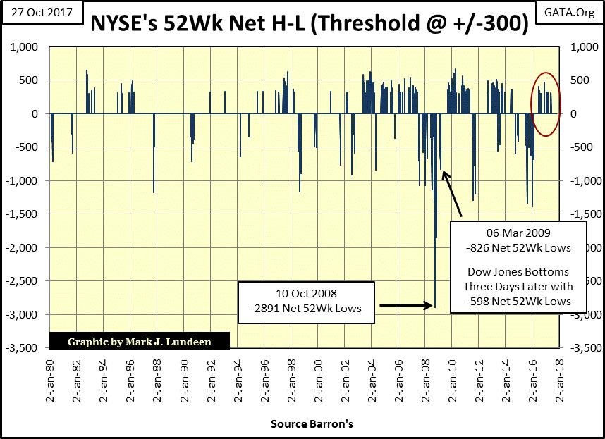
But the day is coming when the NYSE’s 52Wk net H-L step sum will once again reverse, and most likely taking the Dow Jones with it. Is there any indication of that happening soon? Not really, but I also plot actual NYSE net 52Wk H-L data, using 300 net highs or lows as a threshold (chart below). I wouldn’t say having a net of 300 daily 52Wk Highs or Lows at the NYSE a rare market event, but the fact is that as bull markets approach their tops, they become increasingly rare market events.
This data is also very useful in bear markets. During the credit-crisis bear market, the #2 all-time biggest percentage decline for the Dow Jones since 1885, 52Wk Lows maxed out on 10 October 2008 with a net of 2891 52Wk Lows. It’s interesting noting that that was also the same day the Dow Jones broke below a 40% decline from its last all-time high, something it hadn’t done since December 1974.
Five months later at the actual credit-crisis bear market lows for the Dow Jones (53.78% decline), there was only a net of 826, 52Wk Lows. That was it for the #2 bear market of all time, as shortly thereafter 52Wk highs once again began to dominate the NYSE.
Just take a moment to study at this data since 2008. The current advance in the Dow Jones (Red Circle below) has occurred with the fewest number of NYSE 52Wk Highs since the end of the High-Tech bear market in 2002.
© Mark Lundeen
So, it’s important keeping in mind that the last net +300 52Wk High day occurred on June 2nd of this year, five months ago. I can’t say this is the last +300 net 52Wk High day of the advance. However, considering the Dow Jones has advanced 2227 points (10.7%) since June, with 52Wk Highs increasingly becoming rarer at the NYSE, I’d say this is an indication the current advance market is approaching a top, if not THE top.
But exactly when the top will come in, and then pass on into history, this data is silent on. A better data series to determine will be found looking at the Fed Funds Rate and the yield for the US Long Bond below.
The top of both the High-Tech and Sub-Prime Mortgage bull markets can easily be identified below: when the Blue Fed Funds Rate was increased by the FOMC above the yield of the US long bond. And we also see when the FOMC began inflating bubbles in the sub-prime mortgage market, as well as our current bubble where everything is being inflated when the Fed Funds Rate is driven far below the yield of the US long bond.
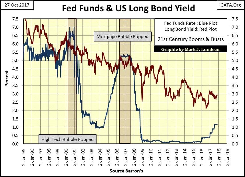
© Mark Lundeen
The FOMC began raising its Fed Funds Rate in January 2016, and if they continue doing so they will terminate this market advance. Will they? I don’t know if they will or won’t, but the academics in charge of “monetary policy” like to believe they are in control of the markets and their valuations, no matter what is happening in the economy.
I think Mr. Bear would disagree with these idiot savants on that notion. And no one is better situated to toss a monkey wrench into the gears of “policy” than he with one of his black swan events.
Check out this story from Zero Hedge: near-bankrupt Illinois issuing a new mini-bond yielding a juicy 3.74% coupon.
I saw a recent article where Illinois hasn’t even been keeping track of how much, and to whom it owes money to, only that they know it’s in the billions of dollars. Yet in our “regulated financial markets,” the bond rating agencies still classify Illinois muni bonds as investment grade as only a few see the problems with that.
I don’t blame Moody’s or S&P for rating any problematic bond as investment grade. During the Obama administration, S&P merely attempted to place the credit situation for the US Treasury on a credit watch, the first step to downgrade the US Treasury’s credit to something less than AAA. Obama sent in Federal agents Lefty and Knuckles to show S&P’s management the errors of their ways, and the problems at the US Treasury simply disappeared. And like Illinois, and many other bond issuers, the US Treasury is still rated investment-grade, debt safe for widows and orphans, and will remain that way until unregulated reality finally imposes itself on the debt markets.
Damn the “policy makers” at the FOMC and their Fed Funds Rate. It will be exactly something in this vein of corruption and chronic mismanagement of public and corporate affairs that will trigger a massive, market-wide reassessment of the risks in the market that will result in a market decline that will take our collective breaths away. Counterparty risk will once again become a four letter word, not said in polite society!
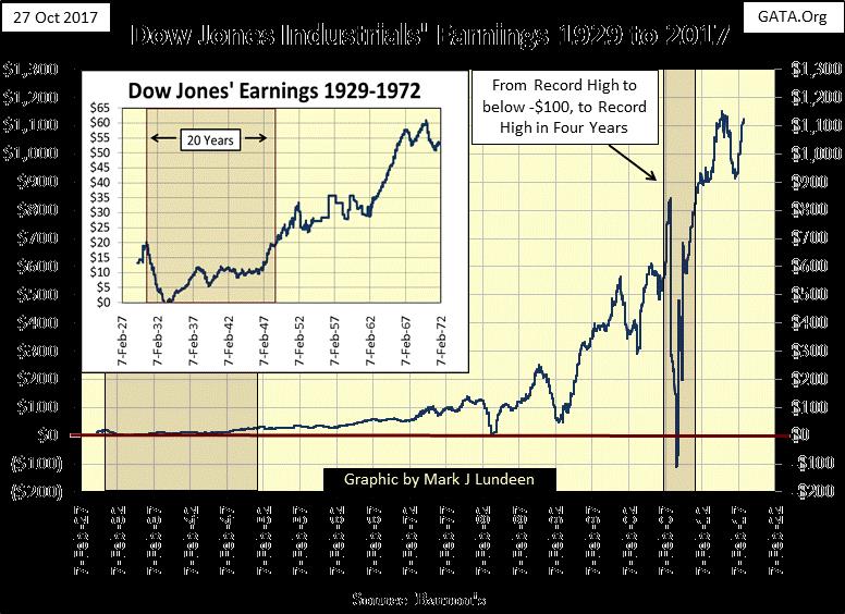
But that could be months or years from now, or maybe next week. As for now, the Dow Jones is hitting it on all cylinders. Not just on its rising valuation but with its earnings and dividend payouts too. Since Alan Greenspan became chairman of the Federal Reserve in August 1987, earnings gained preeminence to dividend payouts in the minds of market participants. However, before the Greenspan Fed things were different.
Barron’s began publishing the dividend yields and payouts for the Dow Jones in its 12 October 1925 issue, but earnings for the Dow Jones were not published until the late 1930s. The Dow Jones earnings going back to 1929 seen below I got from a stacked bar chart Barron’s published in the late 1930s; each year was a bar with the earnings for four quarters stacked on them. But the point is that before Greenspan, investors, and fiduciaries were more interested in the dividends a company paid than a company’s earnings, and for good reason.
© Mark Lundeen
The earnings seen above can be impacted by many factors, and not just whether or not a company is actually making or losing money. I’m not an accountant or tax-lawyer, but I believe I’m on solid ground stating that changes in tax laws and accounting standards over the decades have from time to time impacted the Dow Jones earnings seen above to one degree or another; from not at all, to a lot.
A good example is what happened during the credit crisis. Going into the crisis the Dow Jones contained AIG, J.P. Morgan and Citigroup, all financial institutions that in the coming year would see their earnings go negative, as did the Dow Jones itself as we see above. Had the market “regulators” not altered Wall Street’s accounting standards, these companies, and many others would have been forced to close their doors.
As it turned out, in the four years following the credit crisis, earnings for the Dow Jones, and the big banks on Wall Street returned to where they were before the crisis. But I wonder how earnings in the stock market would be a year from now if the accounting standards of 1950 were once again imposed on Wall Street?
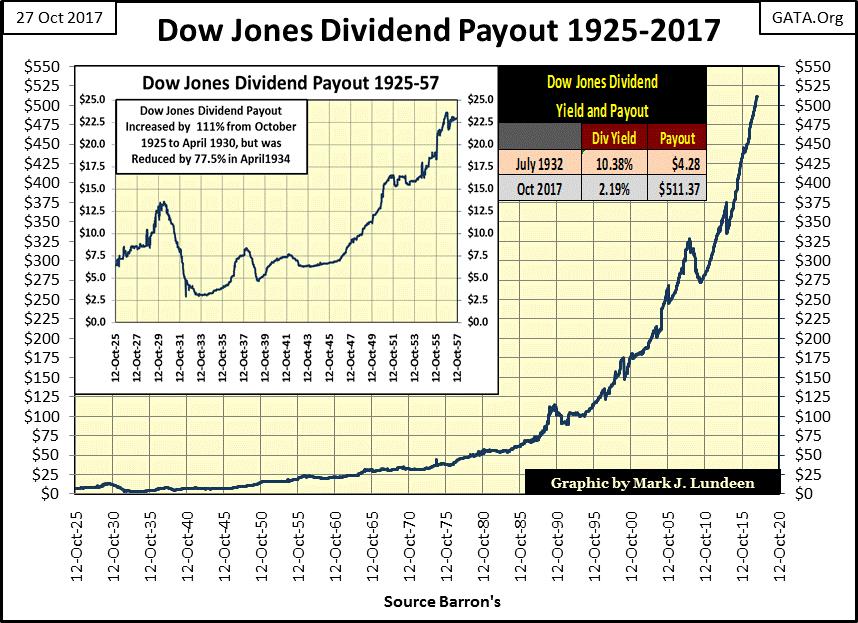
Dividend payouts are different because they are sent out to shareholders as a cash payment. Management with their lawyers and accountants can’t fake that! So like market participants of long ago, I favor following dividends to earnings.
Here are the dividend payouts for the Dow Jones going back to 1925. Dividends are supposed to be a profit sharing plan put in place by a corporation’s management. However, like so much of our current era, this concept has been corrupted to some unknown degree.
Big blue-chip companies, like those in the Dow Jones, have begun funding their dividend programs in the corporate bond market to various degrees. Some companies with well-known names have become dangerously overleveraged and will find themselves in dire straits in the coming economic turndown. So don’t confuse the huge increase in dividend payouts seen by the Dow Jones since 2000 with an increase in corporate profitability. The day is coming where we’ll see the dividend payout for the Dow Jones plotted below go down faster than they went up.
© Mark Lundeen
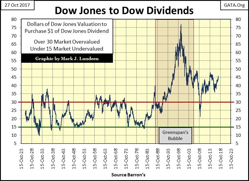
I usually show the dividend yield for the Dow Jones in my articles covering dividends. A dividend yield is computed by dividing the Dow’s payout by its valuation. I thought I’d do something different this week by plotting the Dow’s valuation by its dividend payout or how many dollars of valuation for a dollar of dividend payout. It’s exactly like a Price to Earnings Ratio (PE Ratio), except I’m using Dow Jones dividend payouts instead of its earnings.
I really like this series. It’s only the inverse of the Dow’s yield, but it really puts into perspective just how horribly Alan Greenspan inflated market valuations during the 1990s and has remained to this day in our “regulated market.”
© Mark Lundeen
Market valuations during the Roaring 1920s never became as bloated as where they are today, let alone to where they were in January 2000. One looks at this chart and feels compelled to say something significant. As a former fleet sailor, I don’t lack the vocabulary required to best describe what’s seen above. But gentleman that I now am, and fearing the wrath from the women in my life should I rendered this service to my readers, I’ll leave to you how best to describe what’s woefully apparent above.
I’ll just note in the ten decades of market history plotted, this series only once went single digit, in Barron’s 11 July 1932 issue @ 9.63 – at the absolute bottom of the Great Depression bear market. Since the Greenspan Fed, we’ve seen history made to the upside. Before Mr. Bear fully deflates the decades of “liquidity injections” from Greenspan, Bernanke and now Yellen from the financial markets, don’t be surprised should that 9.63 from July 1932 be broken too.
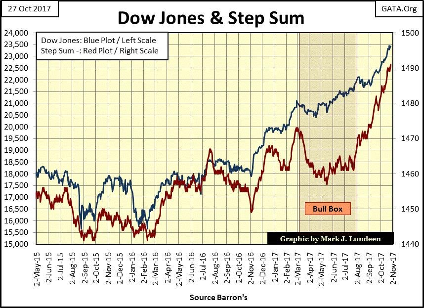
But looking at the Dow Jones and its step sum below, that isn’t going to happen next week. Since the Dow Jones broke out of its bull box below, it has been advancing like there’s no tomorrow.
© Mark Lundeen
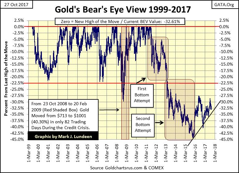
Sorry to say, the same isn’t true for gold and silver. But gold’s BEV chart below give good reason to be optimistic about the future. I placed a rising trend line from the December 2015 bottom, and the price of gold has seen good support from it for the past two years. That may not make many people happy, but unhappy people are what market bottoms, and buying opportunities are all about.
© Mark Lundeen
I can show anyone a historical chart of a market series like the Dow Jones or the price of gold, and they can point out the exact periods, to the day where they would have sold at the top and bought at the bottom. The only problem with that is we can’t go back to September 1929 to sell, or July 1932 to buy the stock market.
No, investors are forced to deal with the uncertainty of the present, and presently it feels comfortable being bullish on the stock market and avoiding exposure to gold, silver, and the precious metal miners. If market history has anything to tell us, it’s that we should go against our emotions: sell what everyone else is buying, and buy what no one else wants.
In other words (and looking at the second chart in this article), the time to have purchased stocks was in March 2009 when everyone was fleeing for their lives from the stock market. Eight years later it’s time to sell what everybody else is now paying top dollar for; the same stocks that were so despised in March 2009. Looking at gold’s BEV chart above now is the time to take a position in gold, silver and the mining shares, before everyone else comes rushing in, driving up the price as they do so.
I really like what I see in gold’s BEV chart above! Look at the decline from August 2011 to December 2015. Yes indeedy, the bears really took it to the bulls during these four years. But after achieving a 45% decline in the price of gold during these four years, I think it’s safe assuming now in October 2017, that the bears have expended most of their ammo.
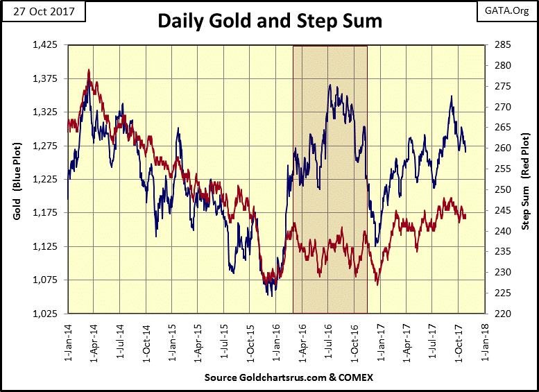
So, the bears may be able to take gold down below the trend line I placed on the chart, but the December 2015, 45% decline in the price of gold is a hard bottom they can’t break below. Not unless the bears can do a reprise of what we see in gold’s step sum chart (below) from August 2014 to December 2015. Twenty months of down days overwhelming advancing, with a climatic three months from October to December 2015 where the step sum and the price of gold collapsed in darkest despair.
© Mark Lundeen
So sad, and what a depressing situation for the battered bulls! But in the perverse world of the markets, December 2015 was exactly when you should have bought gold and silver.
But we can’t go back in time. No matter, I expect that five years from now buying in October / November 2017 will still earn you the bragging rights of buying near a market bottom in the gold and silver market.
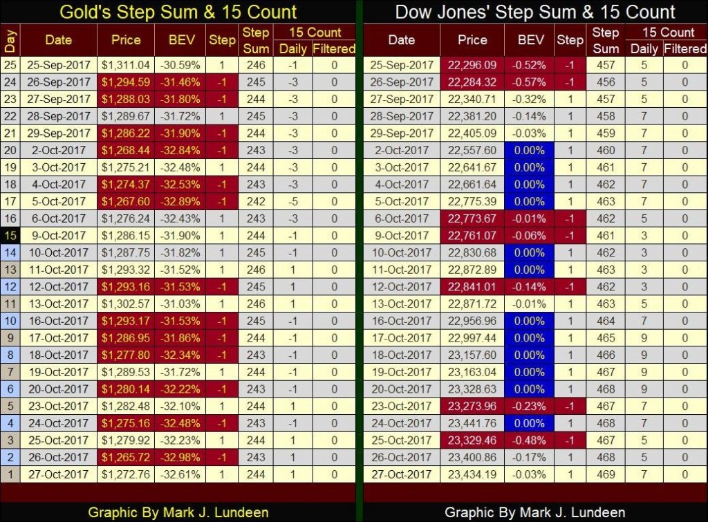
Gold’s step sum table below supports my theory that the worst in the gold market is now best observed in the market’s rear view mirror. Yes, every time the bulls take gold above $1300, the bears come in with overwhelming down days and knock it down. But the bears don’t have what it takes to drive gold down below its $1225 level or even below $1250.
At least not yet, and the longer they take in doing so, the least likely it is that they will be able too. If you’re looking for a safe entry point into the old monetary metals and their miners, market conditions such as this are what the proverbial climbing a wall of worry would feel like.
© Mark Lundeen
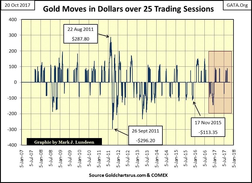
Look at my next chart showing the gains and losses in the price of gold over a twenty-five day span. What’s so special about a twenty-five-day span? It’s the span we see in gold’s step-sum table above, the movement in the price of gold from day #1 today #25 in the table. The series has a cutout threshold of $50, so the 25-day movement of less than +/- $50 are not shown as they aren’t significant.
I placed a red box in it to highlight an important point. The last time the bears succeeded in dragging the price of gold down over $100 in the chart was almost a year ago, last December. And they succeeded in driving gold down $73 last summer in July. Now compare that to what the bears could do, and did do from August 2011 to December 2015.
Then look at all the bulls did in the past year; five times they took gold up almost to +$100 before the bears knocked them down by flooding the COMEX with nonexistent-digital gold, gold that’s never delivered into the real market.
It’s a rigged game. But it’s also a fraud on the gold market, and all frauds eventually come to a bad end. And I want to be there when it does because gold, silver and their miners are going to do things that will simply amaze you when unregulated reality imposes itself on the COMEX gold and silver futures market’s bears!
© Mark Lundeen
As far as the Dow Jones’ side of the step sum table goes, it’s hard to see how it could be better. Its 15 count remains in the mid to high single digits, lots of new all-time highs, and it’s been that way for a long time. This is exactly the kind of market the smart money sells into. They prefer buying when there’s “blood in the streets”, and hold off their selling for market conditions such as we see above.
This sounds so simple, but it’s not as it also requires the patience to wait for what they want in a market, despair for buying, and euphoria to sell into. That sound like good advice to me.
So, if you’re thinking of buying something, my advice would be to avoid the stock market and buy gold and silver bullion as well as taking a position in their miners, and having the guts, and patience to wait until the market turns our way.
(Featured image via Deposit Photos)
—
DISCLAIMER: This article expresses my own ideas and opinions. Any information I have shared are from sources that I believe to be reliable and accurate. I did not receive any financial compensation in writing this post. I encourage any reader to do their own diligent research first before making any investment decisions.


Sustainable Restoration of the Haus Hövener Garden in Brilon
The Brilon Construction Workers Association is restoring the Haus Hövener garden into a cultural community space, funded through a €10,000...


Temenos to Acquire Additiv to Boost AI Wealth Management
Temenos is acquiring Zurich fintech Additiv to strengthen its digital wealth management and expand AI-driven financial orchestration. Additiv’s platform connects...


EFPIA Warns Limited SPC Reform Could Weaken EU Pharma Competitiveness
EFPIA supports the EU Biotechnology Law and a 12-month SPC extension but warns the current proposal is too limited. A...


EU Approves €23B Italian Renewable Energy Plan to Boost Climate Goals
The European Commission approved Italy’s €23 billion aid scheme to boost renewable energy and meet 2030 climate goals. Supporting wind,...


Institutional Bitcoin Buying and LiquidChain Presale Signal Market Optimism
Institutional Bitcoin buying, like Strategy’s 1,550 BTC purchase, signals confidence, stabilizes prices, and may trigger bullish momentum. Meanwhile, infrastructure projects...
 |
|
 |  |
 |
|
-

 Biotech1 week ago
Early Use of Tirzepatide Shows Strong Results in Type 2 Diabetes Study
-

 Fintech2 weeks ago
Credit Saison Invests in RedGirasol in Landmark Mexican Fintech Impact Deal
-

 Africa4 days ago
Morocco at an Energy Crossroads Amid Global Gas Volatility and Critical Minerals Opportunity
-

 Impact Investing1 week ago
Italy Advances Recycling but Infrastructure Gaps Threaten EU Targets
You must be logged in to post a comment Login