Featured
How Stock Markets Have Acted During a Recession
We look at price performance for some selected assets over time. Gold is a leader which may surprise many. Worst performer is bonds. We also examine the potential for a recession. In our opinion, the heavily inverted yield curve is pointing to a potentially severe recession even if now there doesn’t look like there is one let alone one coming. The banking crisis is not over and lurks in the background.

April is supposed to be the best month for stocks. Well, at least for the Dow Jones Industrials (DJI), it is ranked number one. For the S&P 500 it is number 2. April, of course, is a part of the so-called best six months: November to April. May? That brings us to “sell in May, and go away.” Or is it “buy when it snows, sell when it goes”? Low and behold, the DJI Is up 0.6% so far in April. The S&P 500? Off a little, down 0.1%. According to the Stock Trader’s Almanac (www.stocktradersalmanac.com), the DJI is supposed to see good gains before Good Friday and have the best move after the U.S. tax deadline on April 18, 2023. Finally, given this is a pre-election year, April is supposed to deliver stellar returns. The DJI has returned 3.9% in April during pre-election years vs. only 1.9% on average. The data starts in 1950.
What’s good about using the information from a publication such as the Stock Trader’s Almanac is it doesn’t care what is going on. It just provides statistics. It filters out the noise. Politics, climate change, wars—they are just background noise. Yes, they can explain what happened, but then the result is just tabulated with all the other observations to see if one can come up with a consensus of how markets might perform. History shows us that markets inexorably go up, but serious corrections can come along. The markets may have fallen over 50% from 2007 to 2009, but ten years later markets were substantially higher. Markets have experienced six occasions where they lost 30% or more since 1950, but each time they recovered and went on to new highs. On the other side, we had nine periods that the DJI gained 80% or more, the best being the 295% run from October 1990 to July 1998.
All markets go through periods where they have solid gains and then they are followed by a corrective period. What that means is one shouldn’t be focusing on the here and now, but instead look at what the long-term trend is. Consistent performance over a longer period of time is better than a snapshot. Typical performance reports look at one year, three years, five years, ten years, and since inception.
We put together a little table to see if anything emerged. It is impossible to include everything and in some instances, the data we have doesn’t go back far enough. We have not included any sub-indices or specialty indices nor, for the sake of clarity, any non-North American indices. We have included the Dow Jones Industrials (DJI), S&P 500, TSX Composite, gold, and the U.S. 30-year treasury bond. Not all the data were available. The TSX data only went back to February 1980 while the 30-year treasury bond only went back to January 1978.
Price Performance for Selected Indices 1971–2023
| Year-to-Date | One Year | Three Years | Five Years | Ten Years | Twenty-Five Years | Since August 1971 | |
| Dow Jones Industrials (DJI) | 0.7% | (3.8)% | 52.2% | 38.4% | 128.8% | 278.7% | 3,784.3% |
| S&P 500 | 6.3% | (10.0)% | 57.8% | 54.4% | 159.8% | 269.8% | 4,164.8% |
| TSX Composite | 3.9% | (7.8)% | 50.6% | 31.0% | 57.9% | 166.3% | 1,014.6% * |
| Gold | 11.5% | 4.2% | 27.5% | 53.4% | 27.5% | 571.2% | 4,700.9% |
| 30-year Treasury (USB) | 6.3% | (10.3) | (24.7)% | (8.0)% | (6.9)% | 35.2% | 72.7% ** |
- * TSX dates from February 1980
- ** USB dates from January 1978
A note on small-cap indices such as the S&P 600, the Russell 2000, or the TSX Venture Exchange (CDNX)—they tend to be quite volatile. Since the inception of the CDNX, as an example, it has barely had a return. However, its bull markets can be quite lucrative while, for its bear markets, you don’t want to be anywhere near them. Spectacular gains are followed by gut-wrenching declines. Those markets tend to be smaller and that lack of liquidity can produce great gains and equally great losses.
What stands out on our table is that only two—S&P 500 and Gold—have been the leaders. It certainly sends the message that one should have gold in their portfolio. Over time, it has been the top performer. When we say gold, we mean the physical metal, not the gold stocks. There is a tendency to equate the two, but that is also wrong. Gold, unlike stocks, has no liability. It tends to perform well during periods of financial and geopolitical stress. But it underperforms when all seems well. That explains the S&P 500’s leadership over three, five, and 10 years. However, when periods of financial and geopolitical stress pick up, then gold shines, as witnessed by its performance for year-to-date and one year. Gold also has performed over a long period of time, leading for both 25 years and since August 1971 when the world was taken off the gold standard.
Recession or no recession
There are those who argue that, while we may have a slowdown or a mild recession, we shouldn’t have a hard-landing, steep recession. However, from what we are seeing, the odds are good it could be a hard landing. Our clue is in that inverted yield curve. We have never seen it so inverted for such a long period, nor so steep. The 3-month–10-year went negative back in October 2022 and has been there ever since. The 2-year–10-year spread went negative in July 2022 and has also been there ever since.
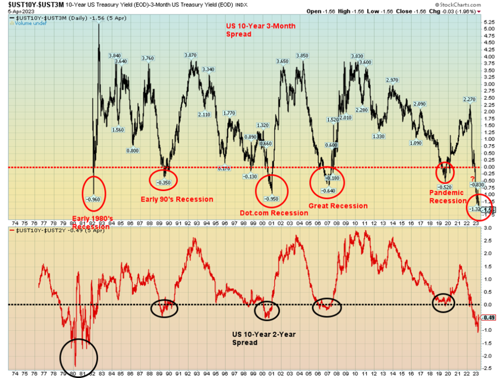
A sustained negative yield curve has preceded every major recession for which we have data since the early 1980s. For the 3-month–10-year we have never seen it so negative. Currently, it is at negative 156 bp. The negative yield curve is the prime reason behind the failure of SVB Bank, Signature Bank, and the crypto-focused Silvergate Bank. It also led to the forced merger between UBS and Credit Suisse and recent troubles (again) at Deutsche Bank.
Banks operate best in a normal yield curve environment. Banks lend long and borrow short, mostly through demand deposits. When trouble arises, the deposits flee. That’s what happened to SVB Bank and Signature Bank. Banks can take in long money, usually through debt issues or even some long GICs, etc. And they can hedge themselves through derivatives such as futures, options, interest rate swaps, and future rate agreements (FRAs).
When the yield curve turns negative, deposits flee, and the previously inexpensive deposits soar in yield, then the bank has a problem. Intra-bank lenders then take them off their credit list. It can sell securities that are liquid to replace the deposits, but only at a loss. There is not much they can do with loans except attempt to call them in. Again, probably at a loss. The sophistication of management is also an issue. Many smaller banks such as SVB had little or no experience with the current environment. Large institutions such as J.P. Morgan Chase would have large sophisticated trading desks, but even they could suffer losses.
There is an estimated $7 trillion of uninsured deposits in the U.S. banking system. We don’t know the number in Canada. In the U.S., the Federal Deposit Insurance Corporation (FDIC) covers up to $250,000. In Canada, the Canada Deposit Insurance Corporation (CDIC) covers only up to $100,000. The fact that deposits were flowing out, often to money market funds that, while not insured, offer more diversity caused a big problem with banks and, in turn, a problem for the Fed. What to do?
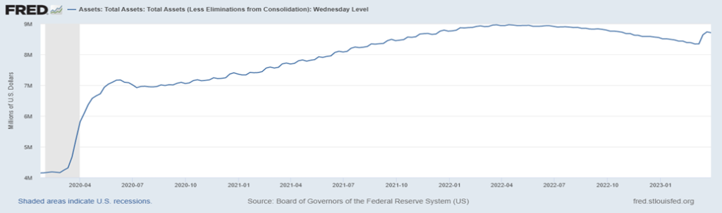
The 2010 Dodd-Frank Act guaranteed uninsured deposits under “systemic risk” exceptions. Regulators covered SVB’s uninsured depositors, raising concern as to whether they would they cover everyone. The Fed even created a new lending facility called the Bank Term Funding Program (BTFP). Is that quantitative easing (QE) by another name? So far, from what we can see, some $53.7 billion has been drawn.
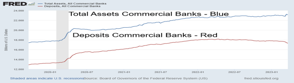
Our chart on the next page shows, while assets at all commercial banks have gone up $280 billion, deposits have fallen $857 billion since peaking in April 2022. The Fed’s balance sheet has exploded $364 billion in the last month alone as they move to protect the financial system. As we said, it’s QE by another name. So what happened to quantitative tightening QT?
As our colleague Mike Ballanger stated, there is more than one cockroach in the cupboard. The banks that failed may only be the tip of the iceberg. What else lies out there? It was U.S. regional banks that failed. But the larger crisis may be with European banks. For years they suppressed interest rates and even went negative. If the situation with the U.S. banks is bad it could be even worse in the EU. All that previous sub-zero interest rate debt is now severely in a loss position. Are Europeans withdrawing deposits? Credit Suisse and Deutsche bank may also just be the tip of the iceberg except the iceberg could be bigger. Then we are also overlooking the potential for a sovereign debt crisis.
In our opinion, all this points to is that the recession, rather than being mild, could be quite steep. At the heart of every recession usually lies a financial crisis. And bank failures are just a part of it. Add in the risks of the escalating war between U.S./China/Russia plus the negative (and costly) impact of climate change and the risk of a deeper crisis grows.
As we noted, we’ve never seen a yield curve so negative. And that spells considerable trouble, not just for the financial industry but for the regulators (Fed) and the economy.
Commercial Bank Assets and Deposits 2020–2023
Fed Balance Sheet 2020–2023
Recession and the stock market
We thought we’d provide a little table on recessions and the stock market since 1970. We have had eight recessions since 1970. The last one, known as the pandemic recession, was both the shortest and the steepest. In terms of length, the Great Recession 2007–2009 was the longest. That recession also saw the steepest stock market decline as the Dow Jones Industrials (DJI) fell 53.8%. All stock market periods and declines are the DJI.
| Recession Year Name | Period Range | Duration (Months) | Peak Unemployment | GDP Decline (Peak to Trough) | Stock Market Decline Period (DJI) | Duration (Months) | Stock Market Loss Peak to Trough |
| Recession 1969–1970 | Dec 1969–Nov 1970 | 11 mths | 6.1% | (0.6)% | Dec 1968–May 1970 | 17 mths | (35.9)% |
| Recession 1973–1975 | Nov 1973–March 1975 | 1 year, 4 mths | 9.0% | (3.2)% | Jan 1973–Dec 1974 | 23 mths | (45.1)% |
| Recession 1980 | Jan 1980–Jul 1980 | 6 mths | 7.8% | (2.2)% | Sep 1978–Apr 1980 | 19 mths | (16.4)% |
| Recession 1981–1982 | Jul 1981–Nov 1982 | 1 year, 4 mths | 10.8% | (2.7)% | Apr 1981–Aug 1982 | 16 mths | (24.1)% |
| Early 1990s Recession | Jul 1990–Mar 1991 | 8 mths | 7.8% | (1.4)% | Jul 1990–Oct 1990 | 3 mths | (21.2)% |
| Dot.com Recession | Mar 2001–Nov 2001 | 8 mths | 6.3% | (0.3)% | Jan 2000–Oct 2002 | 33 mths | (37.8)% |
| Great Recession | Dec 2007–Jun 2009 | 1 year, 6 mths | 10.0% | (5.1)% | Oct 2007–Mar 2009 | 17 mths | (53.8)% |
| Recession Year Name | Period Range | Duration (Months) | Peak Unemployment | GDP Decline (Peak to Trough) | Stock Market Decline Period (DJI) | Duration (Months) | Stock Market Loss Peak to Trough |
| Pandemic Recession | Feb 2020–Apr 2020 | 2 mths | 14.7% | (19.2)% | Feb 2020–Mar 2020 | 1 mth | (37.1)% |
| ? Recession | ? 2023?-? | Jan 2022–present | 14 mths to date | (9.4)% to date |
Oddly enough, the dot.com recession was the weakest in terms of GDP decline. It impacted mostly the high-tech sector. There was a stock market rally during the period from September 2001 to March 2002 that saw the DJI gain 29.1%. However, we focused on the entire decline from January 2000 to the final low in October 2002 because, despite the strong rebound, no new highs were made. The stock market decline was in two tranches: from January 2000 to September 2001 when it fell 29.7% and then from March 2002 to October 2002 when it declined 31.5%.
There is no official recession yet; however, the stock market has been down from its January 2022 peak for 14 months. The decline is not considered over until we make new highs above January 2022. At that point, we can identify and confirm the final low.
All unemployment numbers and GDP decline numbers are from official sources such as the National Bureau of Economic Research (www.nber.org), the Bureau of Economic Analysis (www.bea.gov), and the Bureau of Labour Statistics (www.bls.gov).
Note that only once was the stock market decline largely over before the recession began. That would be the 1969-1970 recession. In all other cases, the stock market bottom came during the recession or in some cases, it didn’t occur until the recession was over. The recession, officially at least, has not even started. That suggests to us that the stock market decline is not likely over.
Canada job numbers
Canada’s job numbers continue to surprise. In March, they created 34,700 jobs, well above the expected 12,000. Jobs grew in warehousing, business building, finance, real estate, and leasing but fell in construction. Most of the gain was in the private sector, with very little in the public sector. Full-time employment was 18,800 while part-time employment grew 15,900. Ontario was the big winner with a gain of 21,000 jobs while Alberta had 14,000.
The unemployment rate was steady at 5% for the fourth consecutive month. The market had expected it to rise to 5.1%. The R8 unemployment rate (which includes discouraged searchers and the waiting group of involuntary part-time workers) rose to 7.5% from 7.2%. R8 is the highest unemployment rate tabulated by Statistics Canada. Six months ago, the R8 rate was 6.3%. While the labor market appears strong there also appears to be some underlying weakness. The labor force participation rate was 65.6%, down from 65.7% the previous month.
The strong number was a bit of a surprise for the market. Many pundits have already weighed in on what it means for the Bank of Canada (BofC). It raises the possibility that the BofC will be forced once again to start raising rates. However, the Bank has noted they will be guided by forward-looking data. The strong job numbers also potentially point to a stronger-than-expected Q1 GDP. All this is great for workers but puts the BofC in a difficult spot. On a somewhat moderating note, average hourly wages rose year over year (y-o-y) by 5.2%, below the expected 5.5% and February’s gain of 5.4%.
This coming week, Wednesday is the BofC’s interest rate decision. It is widely expected that the BofC will stand pat once again at 4.5%. Will the strong numbers force them to change their mind?
U.S. job numbers
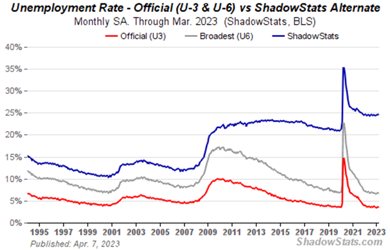
We guess that, occasionally, they predict numbers right on the money. Nonfarm payrolls (NFP) for March came in with a gain of 236,000 jobs, just below the consensus of 239,000. The February NFP was a gain of 326,000 and the average over the past six months has been 334,000/month. A slowing? The number of unemployed and the unemployment rate changed very little. The number of unemployed was down slightly (official number) to 5,839 thousand vs. 5,936 thousand in February. In February 2020, it was 5,708 thousand. The U3 unemployment rate was 3.5%, down slightly from February’s 3.6%. The U6 unemployment rate (U3 plus short-term and discouraged workers and other marginally attached workers working part-time who want full-time work) was 6.7% vs. 6.8% in February. The Shadow Stats (www.shadowstats.com) unemployment number (which is U6 plus discouraged workers defined out of the labor force in a revision in 1994 and workers unemployed one year or longer) was steady at 24.6%. In February 2020 that number was 21.3%.
The civilian labor force grew 480,000 in March while the total number employed or employment level rose 577,000. The total population of working age rose by 160,000. Reconciling these numbers is an exercise in futility. Full-time workers grew by 1,155 thousand while part-timers were up by 342,000. Those not in the labor force fell by 320,000. Retirees are 57,985 thousand while the disabled are 8,747 thousand, making up most of those not in the labor force (99,541 thousand).
The labor force participation rate was 62.6% vs. 62.5% in February and 63.3% in February 2020. The employment-population ratio was 60.4% vs. 60.2% and 61.1% in February 2020. Both those ratios have an impact on the unemployment rate. The higher the labor force participation rate, the higher U3 would be. What it all means is that fewer people are actually working as a percentage of the population.
The number of unemployed for 27 weeks or longer rose by 47,000. The average workweek slipped to 34.5 hours from 34.6 hours while average hourly earnings fell to a gain of 4.2% y-o-y vs. 4.6% in February.
On Thursday, the initial jobless claims came in at 228,000, well above the consensus of 200,000. Could higher interest rates finally be biting into the labor market? That was the highest number in weeks. Markets responded by selling off on Friday, but then so did gold. With markets closed on Good Friday, it is difficult to say how they will respond on Monday when they are open again. However, there was nothing in this report to suggest that the Fed is about to pause its rate hikes, and we fully expect another 25 bp hike at the May 2–3 FOMC meeting. Futures trading on Friday suggested that stocks could open higher on Monday while bonds sold off. By extension, it might suggest we’ll see a higher US$ Index and lower gold prices as the job numbers were in some respects rosy.
The big news out this coming week is the March inflation numbers, both CPI and PPI.
It was a mixed week for the stock indices. The S&P 500 fell a small 0.1%. The Dow Jones Industrials (DJI) appeared to be reflecting some flight to safety as it rose 0.6%. But the Dow Jones transportations (DJT) diverged, falling a sharp 3.3%. That was probably a negative reaction to the jump in oil prices where WTI oil gained 6.7%, after the unexpected cut in OPEC production until the end of 2023. Brent crude also gained, up 6.1%. But really, do we need to see WTI over $84 to convince us that we could reach $90 or higher? Over $95 we are likely headed to $100. Natural gas (NG) continued its woes falling to fresh 52-week lows off 9.5%. NG at the Dutch Hub followed losing 9.9%.
The NASDAQ also fell, off 1.1%, while the mid and small-cap stocks fell. The S&P 400 (Mid) was down 2.6% while the S&P 600 (Small) was down 2.7%. They are in some ways more reflective of the market. Maybe even more reflective was the S&P 500 Equal Weight Index, down 1.1%, while the NY FANG Index was off 2.1%. Leading the FAANGS down was Tesla, losing 10.5%, and once again Elon Musk was knocked out of the #1 richest man in the world position. Bitcoin also finally fell, down 2.1%, but still holding near $28,000 and keeping the bulls thinking we are headed to $32,000 and higher.
In Canada, the TSX Composite gained 0.5% but the small-cap TSX Venture Exchange (CDNX) was off 1.3%. The EU was mixed, with the London FTSE up 1.4%, the EuroNext off a small 0.1%, the Paris CAC 40 flat, and the
German DAX off 0.2%. In Asia, China’s Shanghai Index (SSEC) rose 1.2%, the Tokyo Nikkei Dow (TKN) was down a big 12.7% while Hong Kong’s Hang Seng Index (HSI) was off a small 0.3%. They actually seem to be expecting a recession in Japan and fear the BOJ might tighten to help the sinking Japanese yen. Japan has been a major seller of U.S. treasuries to combat the weak yen. Japan’s holdings of U.S. treasuries have fallen $195.5 billion in the past year even as they rose $28.1 billion in January.
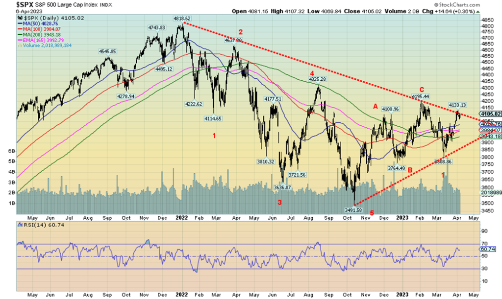
We continue to believe that the S&P 500 made an ABC-type correction from the low in October to the high in February. That wave down that followed came in five, suggesting to us that we are embarking on another wave to the downside. Other indices such as the Russell’s are exhibiting declining waves. Our correction has taken us up to the downtrend line from the January 2022 top. Despite futures indicating that we could be higher into Monday after Friday’s nonfarm payrolls, we believe it shouldn’t hold and we will soon embark on another wave to the downside. All that despite April being supposedly a good month for stock indices, as we noted in our main essay. We now have our March low near 3,800 and our December low near 3,765. Watch them carefully, because if they break the rally is over.
Could we go higher first? A move over 4,200 would suggest higher prices and tell us that maybe the correction is not over just yet. But, as we have so many divergences in the markets, we are not optimistic that any gains will hold for any length of time. We haven’t even started the recession and markets believe they will go higher? As our earlier table shows, it is rare that the markets bottom before the recession even starts. The only one in our table was the 1969–1970 recession where the stock market bottomed before the recession was even underway.
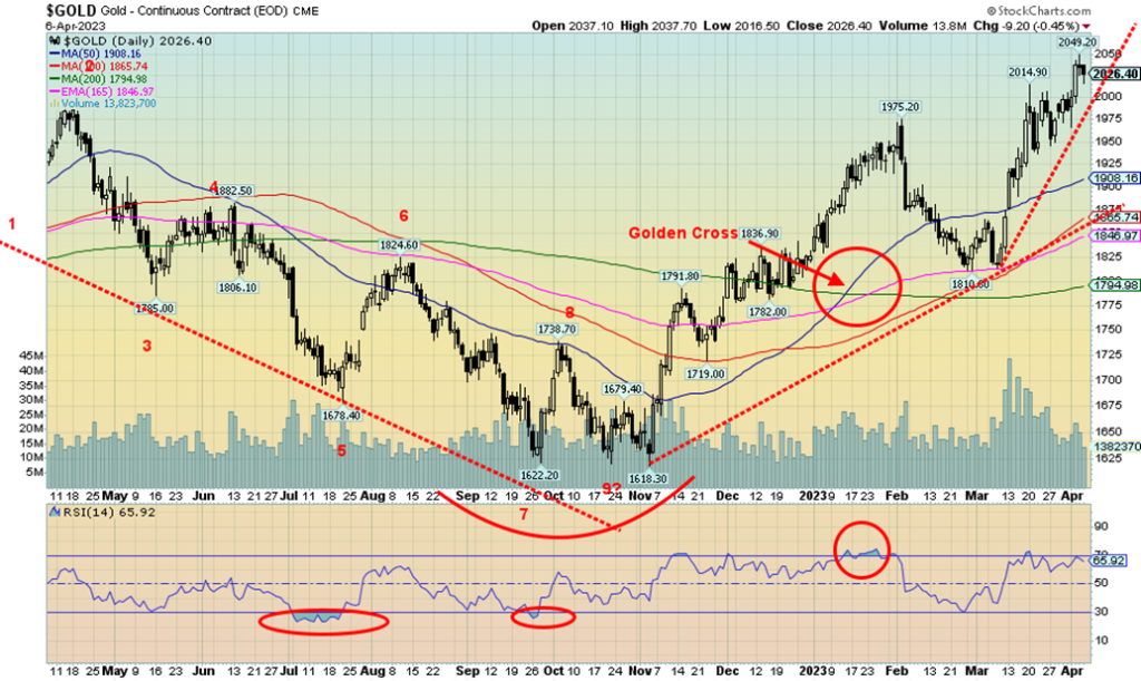
Gold continues its upward march, breaking above the key $2,000 level this past week. Gold made 52-week highs. The highs of August 2020 at $2,089 and March 2022 at $2,079 are now firmly within sight. On the week, gold gained 2.0% and is now up a solid 11.0% on the year. Gold continues to reflect thoughts of a slowing economy, recession, and continued global geopolitical instability. As well, political instability continues in a number of countries, including France and Israel. The arraignment of former president Donald Trump on felony charges, a historic first, furthered the divide and political instability in the U.S. Not surprisingly, Trump pleaded not guilty.
Silver finally joined the new highs parade, closing at $25.09. That was (finally) fresh 52-week high. However, we continue to note that silver is well off its old high near $50 while gold is now within shouting distance of its old highs. Platinum also rose, gaining 1.4%, but palladium continued its woes, off 0.4%, while copper fell 1.7%. The gold stocks enjoyed a good week with the Gold Bugs Index (HUI) gaining 6.1% and the TSX Gold Index (TGD) up 6.2%. The HUI is now up 18.3% on the year while the TGD is up 17.6%. The gold bugs are happy, but the sentiment is rising quickly and that is not necessarily a good sign.
Gold’s RSI has slipped to 66, down from just over 70; however, the HUI and the TGD both have an RSI over 70 in overbought territory. That doesn’t mean they can’t go higher, but it is not recommended that one buys at these levels. Nonetheless, the bull boards are raging with thoughts about gold going higher. Friday’s nonfarm payrolls were as expected and are showing signs of slowing, but is that enough to send gold prices higher? The US$ Index firmed on Friday in front of Friday’s job numbers.
Speaking of the US$ Index, it fell 0.7% this past week as other currencies rose. The euro gained 0.8%, the Swiss franc was up 1.2%, the pound sterling up 0.9%, and the Japanese yen up 0.7%. The Cdn$ was also higher, up 0.4%. Bonds rallied on continued fears of a recession and further bank failures. The 10-year U.S. treasury note fell to 3.30% from 3.48%, the lowest level seen since September 2022. However, after the jobs report, the 10-year rose to 3.40%. After a probable 25 bp hike at the May FOMC, markets now expect the Fed will pause. That’s good for gold. The hugely inverted yield curves (discussed earlier) continue to point to a recession that many economists expect to start no later than Q3.
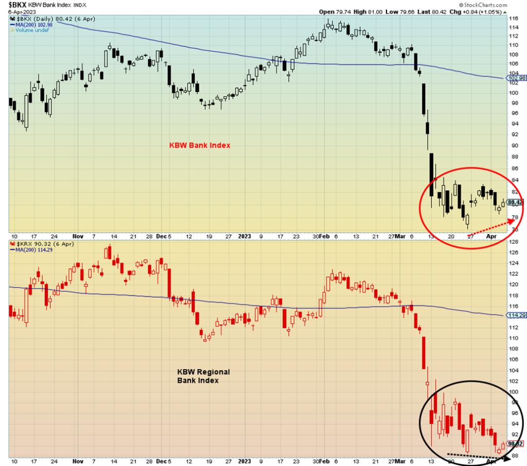
We were quite fascinated to look at the banking indices in the U.S. Our chart on the next page shows the KBW Bank Index vs. the KBW Regional Bank Index. Regional banks have been the big ones that have failed, led by SBW Bank. Note the potential divergence between the KBW Bank Index and the KBW Regional Bank Index. The divergence is small but it is there. Could they soon rally?
With the Good Friday holiday, it is no surprise that there is no CFTC COT report. That comes out on Monday. Yes, the commercial COT has been falling lately, but it is not yet at levels that suggest that a top could be nigh. Speaking of tops, now that gold has successfully cleared $2,000, it is first important to hold that level and also important that it fulfills potential targets to the upside on this wave. Based on that first wave up from $1,618 to $1,975, this wave could rise to the $2,160/$2,170 zone where that wave would equal the first wave to the upside. Clearly, gold must break over the double top high of $2,079/$2,089 to achieve that level and as well clear $2,100. This past week’s high was $2,049. Given that early futures indicators show that stocks are up, the US$ Index is up, and bond yields are higher following the release of the March job numbers, we’d expect that gold could be down on Monday. But as long as $2,000 holds then we should be okay.
To the downside, a break of $1,975 could suggest a top. A break of $1,950 would confirm that a top is in. For silver, a break of $24 would confirm a top. We broke above $25, but it is not as yet fully convincing. The gold stocks are becoming overbought with RSIs well above 70; however, the Gold Miners Bullish Percent Index (BPGDM) is still only at 62. Once it is over 80, one can think about profit-taking.
Gold’s uptrend is intact, as is silver’s. But we are also getting long in the game. We had expected a potential spike into April and we are getting one. The question is, does this spike have further to go? A correction could then follow that takes us into June/July before another potential rally gets underway. A failure here would not be good as it would confirm the bull’s fears that a wipeout could follow. That’s why it is important we see new highs on this move. That would also make the $1,618 low potentially our 7.83-year and 23.5-year cycle low and suggest that period of rising gold prices is still ahead of us.
Markets & Trends
| % Gains (Losses) Trends | ||||||||
| Close Dec 31/22 | Close Apr 6/23 | Week | YTD | Daily (Short Term) | Weekly (Intermediate) | Monthly (Long Term) | ||
| Stock Market Indices | ||||||||
| `S&P 500 | 3,839.50 | 4,105.02 | (0.1)% | 6.9% | up | up | up (weak) | |
| Dow Jones Industrials | 33,147.25 | 33,485.29 | 0.6% | 1.0% | up | up | up (weak) | |
| Dow Jones Transport | 13,391.91 | 13,966.32 | (3.3)% | 4.3% | down | neutral | up (weak) | |
| NASDAQ | 10,466.48 | 12,087.96 | (1.1)% | 15.5% | up | up | neutral | |
| S&P/TSX Composite | 19,384.92 | 20,196.69 | 0.5% | 4.2% | neutral | up | up | |
| S&P/TSX Venture (CDNX) | 570.27 | 625.85 | (1.3)% | 9.8% | up (weak) | up (weak) | down (weak) | |
| S&P 600 (small) | 1,157.53 | 1,150.01 | (2.7)% | (0.7)% | down | down (weak) | neutral | |
| MSCI World Index | 1,977.74 | 2,118.63 | 0.9% | 7.1% | up | up | neutral | |
| Bitcoin | 16,535.23 | 27,947.86 | (2.1)% | 69.0% | up | up | neutral | |
| Gold Mining Stock Indices | ||||||||
| Gold Bugs Index (HUI) | 229.75 | 271.70 | 6.1% | 18.3% | up | up | neutral | |
| TSX Gold Index (TGD) | 277.68 | 326.53 | 6.2% | 17.6% | up | up | up (weak) | |
| % | ||||||||
| U.S. 10-Year Treasury Bond yield | 3.88% | 3.30% | (5.2)% | (15.0)% | ||||
| Cdn. 10-Year Bond CGB yield | 3.29% | 2.79% | (4.1)% | (15.2)% | ||||
| Recession Watch Spreads | ||||||||
| U.S. 2-year 10-year Treasury spread | (0.55)% | (0.53)% | 5.4% | (3.6)% | ||||
| Cdn 2-year 10-year CGB spread | (0.76)% | (0.84)% | flat | (10.5)% | ||||
| Currencies | ||||||||
| US$ Index | 103.27 | 101.52 | (0.7)% | (1.7)% | down | down | up | |
| Canadian $ | 73.92 | 74.32 | 0.4% | 0.5% | up (weak) | down | down | |
| Euro | 107.04 | 109.22 | 0.8% | 2.0% | up | up | down (weak) | |
| Swiss Franc | 108.15 | 110.55 | 1.2% | 2.2% | up | up | up | |
| British Pound | 120.96 | 124.41 | 0.9% | 2.9% | up | up | down (weak) | |
| Japanese Yen | 76.27 | 75.85 | 0.7% | (0.6)% | up | up | down | |
| Precious Metals | ||||||||
| Gold | 1,826.20 | 2,026.40 (new highs) | 2.0% | 11.0% | up | up | up | |
| Silver | 24.04 | 25.09 (new highs) | 3.9% | 4.4% | up | up | up | |
| Platinum | 1,082.90 | 1,016.80 | 1.4% | (6.1)% | up | up | neutral | |
| Base Metals | ||||||||
| Palladium | 1,798.00 | 1,462.40 | (0.4)% | (18.7)% | neutral | down | down | |
| Copper | 3.81 | 4.02 | (1.7)% | 5.5% | down (weak) | up (weak) | up (weak) | |
| Energy | ||||||||
| WTI Oil | 80.26 | 80.70 | 6.7% | 0.6% | up | neutral | up (weak) | |
| Nat Gas | 4.48 | 2.01 (new lows) | (9.5)% | (55.1)% | down | down | down | |
New highs/lows refer to new 52-week highs/lows and, in some cases, all-time highs.
Copyright David Chapman 2023
__
(Featured image by AbsolutVision via Pixabay)
DISCLAIMER: This article was written by a third party contributor and does not reflect the opinion of Born2Invest, its management, staff or its associates. Please review our disclaimer for more information.
This article may include forward-looking statements. These forward-looking statements generally are identified by the words “believe,” “project,” “estimate,” “become,” “plan,” “will,” and similar expressions. These forward-looking statements involve known and unknown risks as well as uncertainties, including those discussed in the following cautionary statements and elsewhere in this article and on this site. Although the Company may believe that its expectations are based on reasonable assumptions, the actual results that the Company may achieve may differ materially from any forward-looking statements, which reflect the opinions of the management of the Company only as of the date hereof. Additionally, please make sure to read these important disclosures.
David Chapman is not a registered advisory service and is not an exempt market dealer (EMD) nor a licensed financial advisor. He does not and cannot give individualised market advice. David Chapman has worked in the financial industry for over 40 years including large financial corporations, banks, and investment dealers. The information in this newsletter is intended only for informational and educational purposes. It should not be construed as an offer, a solicitation of an offer or sale of any security. Every effort is made to provide accurate and complete information. However, we cannot guarantee that there will be no errors. We make no claims, promises or guarantees about the accuracy, completeness, or adequacy of the contents of this commentary and expressly disclaim liability for errors and omissions in the contents of this commentary. David Chapman will always use his best efforts to ensure the accuracy and timeliness of all information. The reader assumes all risk when trading in securities and David Chapman advises consulting a licensed professional financial advisor or portfolio manager such as Enriched Investing Incorporated before proceeding with any trade or idea presented in this newsletter. David Chapman may own shares in companies mentioned in this newsletter. Before making an investment, prospective investors should review each security’s offering documents which summarize the objectives, fees, expenses and associated risks. David Chapman shares his ideas and opinions for informational and educational purposes only and expects the reader to perform due diligence before considering a position in any security. That includes consulting with your own licensed professional financial advisor such as Enriched Investing Incorporated. Performance is not guaranteed, values change frequently, and past performance may not be repeated.


Ecobnb Turns Sustainable Tourism Into Measurable Impact
Ecobnb’s sustainable tourism platform generated significant environmental and social impact in 2025, avoiding 58,207 kg of CO₂ and adding 583...


Sugar Markets Balance Biofuel Demand and Global Supply
Sugar markets in New York and London were mostly unchanged as the Iran conflict renewed interest in biofuels. Drought concerns...


The $40 Trillion Trap: Disinflation Is Not Deliverance
U.S. debt has reached $40 trillion, with $24 billion weekly interest, while deficits accelerate. Despite disinflation in CPI, from cooling...


FinTech Matures as AI and Infrastructure Drive the Next Growth Phase
Fintech markets are entering a mature phase, shifting from rapid growth to consolidation, specialization, and sustainable business models. Zurich and...


Bitcoin, and Ethereum Rise, While Cardano Enters Transition
Bitcoin and Ethereum posted modest weekend gains, supported by ETF inflows. A new proposal may protect Bitcoin from quantum threats....
 |
|
 |  |
 |
|
-

 Crowdfunding2 weeks ago
Lemonaid Offers Shares to Consumers for the First Time
-

 Crypto5 days ago
Bitcoin’s Price Drops as Investors Turn to Layer 2 Solutions
-

 Crowdfunding2 weeks ago
East Crema Coffee Launches €3.5M Crowdfunding Campaign
-
 Markets8 hours ago
Sugar Markets Balance Biofuel Demand and Global Supply