Featured
Signs point to impending American recession as interest rates fall
Market volatility is back as the global economy is flashing warning signs of an impending recession. President Trump tried to save the day by delaying tariffs on China. However, China is putting out economic numbers showing a slowdown. In the same vein, the German economy contracted in the second quarter, while the United Kingdom appears to be headed to a messy Brexit affair.

Doom and gloom. Dow Jones Industrials (DJI) falls 800 points in a day. Inverted yield curves. A slowdown in China. A contraction in Germany. Trade wars. Currency wars. Brexit. Iran and the Gulf of Hormuz. Negative yield bonds ($15 trillion and counting). Protests in Hong Kong. Argentina. Kashmir. The Arctic burning. Japan/Korea trade wars. Did we miss anything? An American recession, perhaps? Dare we say Jeffrey Epstein? “The horror… the horror…” (Colonel Walter E. Kurtz, Apocalypse Now, 1979).
Don’t cry for me Argentina

That’s the S&P Merval Index of Argentina shown above. It plunged 38% in one day after the defeat of President Mauricio Marci in the presidential primaries this past weekend. It didn’t stop with the stock market. The Argentinian peso crashed 25% while Argentina’s 100-year 7 1/8% 6/28/2117 bonds crashed 20%. 100-year bonds for Argentina? Who in their right mind would buy 100-year bonds of Argentina, a well-known serial defaulter with the most recent incident being in 2001 on $100 billion of bonds? Argentina has defaulted eight times since its independence in 1816.
Argentina has a government debt to GDP ratio of 86.2%, although many expect it to reach 100%+ by year-end. High? Well, the U.S., the world’s most indebted nation with government debt totaling $22.5 trillion has a government debt to GDP of 105.6%. Argentina is considered a basket case. U.S. government bonds are rated AA+ by S&P with a stable outlook. Argentina’s government debt was last rated at B by S&P with a negative outlook. This week, Fitch cut Argentina debt three notches to CCC. That signifies a substantial default risk and puts Argentina’s debt on par with Zambia and the Republic of Congo. Argentina’s debt is now essentially junk. By the way, Canada’s debt rating, by contrast, is still rated AAA, amongst the few with the highest AAA rating. President Marci came out with a series of relief economic measures as a result of the chaos created in the Argentinian markets. But whether this will do any good is questionable, as Argentinians have sparked a run on the banks, withdrawing U.S. dollars.
But, Argentinian debt woes aside, the financial world seemed to be having a nervous breakdown over the inversion of the yield curve. The closely watched U.S. 2-year—10-year spread went negative this past week for the first time since the 2007–2008 financial crisis. It immediately prompted an attack by President Trump on his favourite whipping boy: Federal Reserve Chair Jerome Powell. Trump tweeted that “…China is not our problem…our problem is with the Fed. Raised too much too fast…thank you to clueless Jay Powell and the Federal Reserve.” Hmmm. We thought Trump also said that the U.S. has “the greatest economy in the history of our country.” But with Trump, it’s all about him.
Market volatility is back as the global economy is flashing key warning signs of an impending American recession. Trump may have tried to save the day by pushing out the date for imposing further tariffs on China from September to December 15, 2019. However, the next day China put out economic numbers showing a slowdown, the German economy contracted in the second quarter, while the United Kingdom appears to be headed to a messy Brexit with no-deal. The pound sterling fell to the lowest level in 34 years on August 9 before recovering.
So, is this it? After 10 years of no recession and the longest bull market in the stock market in history, are we about to hit the skids? Yes, an inverted yield curve has preceded a recession every time over the past 60 years. But the average lag is 14 months. On that basis, with the 2–10 spread just finally going negative, we may have over a year before a recession hits. The 3-month—10-year spread went negative in May.
At 14 months an American recession may not hit until July 2020. The shortest period was a 7-month lag. That could imply a recession to hit by year-end. So, with an inverted yield curve and such low rates, does that mean that we will soon have a recession? Of course not. But it is a warning sign and the chances have greatly increased.
So how could we have a recession? Unemployment (U3) is at a 50-year low, wages are rising, the U.S. has led the G7 in economic growth. During the first quarter, 76% of S&P 500 companies beat estimates. No wonder the stock market soared to record highs. Even now as there are signs of slowing, Walmart reported strong 2nd quarter sales. Walmart stock leapt over 4%. The consumer is still buying. But despite record highs in the stock markets, they have gone nowhere over the past two years once Trump launched his trade wars in January 2018. The Dow Jones Transportations (DJT) never confirmed the most recent high in the DJI. The DJT has now firmly broken down under its 200-day MA and is threatening to break its May 2019 low. Is the DJT leading the way? Could be.
Following the DJI’s 800-point drop. the stock markets tried to hang on. And in the background are warning signs. Industrial production fell 0.2% in July. What’s worse, the manufacturing component was down by 0.4%. Capacity utilization came in at 77.5% for July, the lowest level in two years. Jobless claims are ticking higher, albeit from the lowest levels since the 1960s. But retail sales were up 0.7% for July when the expectation was for a gain of only 0.3%. But then consumer credit is rising, just as we’re seeing signs that the overall economy may be slowing. Walmart reported strong second-quarter sales up 2.8% with sales up 3.7% year over year and e-commerce sales up 37% year over year. But Walmart is the sales bin of America. So, does it mean anything with consumers holding record debt, most living paycheck to paycheck, with many holding down two jobs to make ends meet and many not able to afford a vacation? It was not a surprise to see the preliminary August Michigan consumer sentiment index fall to 92.1. The market had expected a reading of 97.2. The final July reading was 98.4.
While things may still be good in the U.S., it hasn’t been the case elsewhere. Growth can only be best described as sluggish throughout the eurozone. The largest economy, Germany, reported a contraction in the most recent month. The United Kingdom is tied up in Brexit and showing signs of moving towards a recession. A no-deal Brexit most likely will push the U.K. into a recession. Asia is doing better overall with still strong but slowing growth in China and India. But Japan, Taiwan, South Korea and Hong Kong are showing sub-par growth and Singapore reported negative first quarter growth. In Latin America, many including Argentina, Venezuela, Brazil, Chile, and Peru are in recession or worse. Key African economies such as South Africa are in recession.
It’s Trump that batters the market around with his pronouncements. One day it’s tariffs, and then the next day he changes what he said the previous day. It forces China into responding and Trump may not like how they respond, even if he believes they won’t do so. As we have seen in the past, they do respond—whether it’s more tariffs on the U.S., blocking them from rare earth metals, not buying their agriculture products, to resetting the yuan rate. Or not buying their bonds as we note that as of June 30, 2019, Japan is now the largest holder of U.S. treasuries with China falling to number 2. Not by much, mind you. In many respects, China could hurt the U.S. even more than has thus far. They’ve held back.
Meanwhile, the U.S. dollar continues to climb hurting holders of U.S. denominated debt outside of the U.S. while the rate on U.S. treasuries continues to fall. The 30-year U.S. Treasury fell below 2% for the first time; the 10-year U.S. Treasury fell to 1.50% the lowest in over three years.
With stock markets in disarray, it is gold that is now shining. Gold is even rising against the U.S. dollar. As our chart below shows, the normal pattern for what we call “the dance” of the U.S. dollar and gold is that as the U.S. dollar rises, gold falls and vice versa. Not so of late. The U.S. dollar’s latest rise got underway in January 2018 coinciding with the first volley in the trade wars. Gold initially pulled back into August 2018 but then began to rise once again even as the U.S. dollar has been rising. Since September 2018 gold is up roughly 29% even as the US$ Index is also up 5%. It is rare that gold and the US$ Index move in tandem. The result has seen gold make new all-time highs in over 70 currencies, including the Canadian dollar. Gold in Canadian dollars is now over $2,000 approaching $2,050. Gold in euros appears poised to make new all-time highs as well.

Volatility has returned to the markets. Trump is worried about the economy now as he sees a slowing economy and falling stock market hurting his re-election chances. Given he came into the office following seven years of an economic recovery and a stock market up over 200%, odds were not in his favor that would continue. The market has only added roughly 30% or so since Trump took office and has been essentially sideways since he launched his trade wars in January 2018. The odds now favor the downside and a looming American recession. But will stimulus, lower interest rates, and QE be far behind? But gold is shining. So, there is something to be positive about amidst all the doom and gloom.
Markets and trends
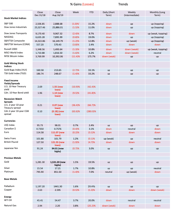

For the third consecutive week, the U.S. stock markets closed lower. Short-term trends have turned down and, in some instances, the intermediate trend is turning down. The S&P 500 lost 1.0% this past week while the Dow Jones Industrials (DJI) fell 1.5%. The Dow Jones Transportations (DJT) were hit harder, losing 2.4% while the NASDAQ fell 0.8%. The small-cap Russell 2000 was down 1.3%. Elsewhere, the TSX Composite fell 1.2% and the TSX Venture Exchange (CDNX) was down 3.8%. Overseas, the MSCI World Index fell 1.6%, the London FTSE was down 2.2%, the German DAX off 1.4%, the Paris CAC 40 down 0.8%, and the Tokyo Nikkei Dow (TKN) down 1.3%. Bucking the trend was China’s Shanghai Index (SSEC), up 1.8%. The beleaguered Hong Kong Hang Seng Index fell 0.8% and appears poised to break lower.
We remain onside that the S&P 500 and the DJI have both made what we call broadening patterns over the past year and a half plus since the markets first topped in January 2018. Since then, we have seen struggling new highs in October 2018 and again in July 2019 with lower lows in February 2018 and again in December 2018. We believe the broadening pattern could be signaling a potential final top as we enter a period of a bear market. Others believe that, yes, the market will fall but once a low is found we could rise to new all-time highs once again. We don’t dismiss that possibility. But one thing we believe is true of a broadening pattern is that the current wave down should take us to the bottom of the broadening pattern before we see a final low. That could see the S&P 500 fall to 2,200 a decline of roughly 24% from current levels. The S&P 500 is already 4.6% off its recent all-time high of 3,028. It is, however, finding support around the 100-day MA. We note the consolidation taking place right now looks eerily like the consolidation that took place in February/March 2018 and again in October/December 2018 before plunging to new lows. The 50-day MA at 2,945 appears to be acting as resistance just as it did in the other two instances. The consolidation has been ongoing now for only a couple of weeks, so we could see some further back and forth before we break once again to the downside. Overall, this is a consolidation pattern forming not a bottom. September tends to be the worst month of the year and this year could prove to be no exception. Maybe look for an October/November low? The question is, at what level will the S&P 500 be at? A decline to 2,200 would catch a lot of investors unaware. The reality is that with a slowing global economy, trade and currency wars, the conditions are ripe for a sharp correction. By many measurements, the markets remain overvalued, although many would disagree.

We have continued to believe that the record high seen in the NYSE advance-decline line has been a head fake. In other words, the advance-decline soared to new highs but the S&P 500 struggled to new highs. An odd divergence, but nonetheless the sharp rise in the advance-decline line seemed designed to suck many into the market. Now the S&P 500 is breaking down clearly under its 50-day MA now while the advance-decline line continues to hold its 50-day MA. The advance-decline line should eventually break down, which would be confirmed with a break under 40,000.

Volatility has returned. That is no surprise given the recent gyrations in the market. But the VIX volatility index is not yet signaling a potential low in the market. At a recent high of 24.59, the VIX is well short of the spike high seen in February 2018 and December 2018 when the market did make a more significant low. The market appears to be breaking down. The VIX is rising but a market low/VIX high is not yet here. The market just isn’t bearish enough yet to suggest a low.

There were those who heralded the end of the mini-bear of the past few weeks when the put/call ratio leapt into hallelujah territory with more puts than calls outstanding. But a funny thing happened on the way to the forum and the recent bounce-back in the market swiftly took the put/call ratio into more neutral territory. As we saw in 2018, there were a number of forays into puts exceeding calls territory but each time they snapped back and at one point even went into more calls than puts territory. It was a head fake and after the market collapsed the put/call ratio spiked, signaling the bear might finally be over.

The divergence between the Dow Jones Industrials (DJI) and the Dow Jones Transportations (DJT) is nearing confirmation. Once again, the DJI made new all-time highs but the DJT wasn’t even close. The DJT is now trading under its 200-day MA, suggesting it is entering a bear market. The intermediate trend for the DJT has turned down. The averages are supposed to confirm each other, but they haven’t even been close.

The small cap stocks continue to struggle. The Russell 2000 represents the small cap stocks here and this chart looks like an accident waiting to happen. We are down 14.3% from the all-time high seen in September 2018. We are trading under the 200-day MA. We are making declining tops. We could even say it is making a double top on the charts with the neckline at 1,450. A breakdown under that level could see the Russell 2000 fall to 1,290, another almost 14% decline from current levels. That would bring us close to the December 2018 low of 1,267. The small cap S&P 600 is showing a similar pattern. In bull markets, small caps tend to outperform large caps, while in bear markets the opposite occurs. The Russell 2000 and the S&P 600 are signaling we are in a bear market and the large caps should soon follow.

The comparison between bitcoin and the DJI continues to fascinate. This week the DJI lost 1.5% while bitcoin fell 11.4%. we continue to note how the two appear to top and bottom relatively close to each other. Bitcoin does appear to have topped and the next move should be to the downside once it breaks under $10,000 once again. It could swiftly fall to $7,000 and support. So far, we have viewed the recent rise for bitcoin as merely a correction to the long decline that occurred from December 2017 to the bottom in December 2018. Volume and other factors have not supported the move despite some hype that we could rise above $20,000 this time. If that’s correct, then the odds more likely favour a drop below $3,000, not a rise above $20,000. Many cryptos have not participated in this rally for bitcoin—that’s a sure sign of trouble that cryptos’ day may be slowly passing them. With a global market cap of $264.7 billion, the entire crypto market is pretty small. Bitcoin’s market cap is $182.3 billion representing a huge 69% of the entire market. Surprisingly, there are still 2,454 different cryptos listed at Coin Market Cap. The closest to bitcoin is Ethereum and its market cap is only $19.7 billion. The top ten cryptos represent 90% of the market cap of the entire crypto market.

The TSX Composite continues to appear to be on the verge of some trouble. The TSX appears to have made a double top at 16,672 in April and again at 16,641 in July. The neckline is roughly at 16,000 and a breakdown under that level could project down to 15,290. Volume has been falling as the pattern develops. This is not unusual or surprising as hesitation creeps into the market. On the week the TSX Composite was down 1.2%. Of the 14 sub-indices five were up on the week. Indices that appear to be still in good uptrends are Income Trusts, Consumer Staples, Gold, Global Mining, Materials, Real Estate, Information Technology, and, Utilities. The others are either topping (Industrials, Telecommunications) or have turned down (Consumer Discretionary, Energy, Financials, Health Care). Health Care and Energy are the worst—avoid them. The TSX Venture Exchange (CDNX) continues to struggle, losing 3.8% this past week. The junior exploration gold miners that dominate continue to struggle and have not as yet gained traction despite the rise in gold and silver. They will, but they are often later stage risers, and once they get going the rise can be spectacular.

The 10-year U.S. Treasury note fell to its lowest level since 2016, hitting down to 1.50%. The 2016 low was at 1.37%. That is also the all-time low. The 10-year bounced back at the end of the week, closing at 1.55%. The 30-year U.S. Treasury bond hit a record low this past week at 1.91%, the first time the long bond has ever traded under 2.00%. The bullish consensus for bonds hit 93% this past week. All of this suggests that we may have hit our nadir or trough, depending on which way one wishes to look at it (note: bond prices move inversely to yields). We are a long way from the 50-day MA currently at 1.98% so a snap back towards to the 50-day MA wouldn’t be all that surprising.
American recession watch spread

Once our closely watched 2-year U.S. treasury note—10-year U.S. treasury note spread broke under 15 bp it was a swift decline. The spread actually went briefly negative this past week for the first time in a dozen years. But then it bounced back, closing the week at a positive spread of 7 bp. These spreads may be signaling the potential for an American recession, but realistically, and based on experience, any recession still might be months away.
American recession watch spread 2

While the 2–10 spread bounced back this past week the 3-month—10-year spread kept widening, closing at a negative 32 bp. We continue to note that the last time this spread went negative back in 2006 the stock market kept on rising until October 2007. That actually coincided with the spread starting to turn positive again. The spread continued to become more positive throughout 2008 and was at its widest by the time the Lehman Brothers moment took place. The spread is negative, usually heralding a potential American recession. But we might be more concerned that one is on the way if the spread turns positive again.
BBB spreads to U.S. 10-year Treasury Notes

The spreads between U.S. 10-year treasury notes and BBB-rated corporate bonds are slowly starting to tick higher. Currently, they are at 1.67%, not far from the recent high of 1.71% seen in June 2019. The high for the year was at 2.03% in January 2019. The all-time high was 7.84% in December 2008. Overall, this spread is still pretty benign. Our expectations are that as credit conditions deteriorate and the potential for defaults rises this spread should rise. That last serious rise was in late 2015—early 2016 when the Fed ended QE and began to tighten.

Has the US$ Index topped? Hard to say. The type of pattern that has played out over the past two years is complex. It could continue or it could break down. Certainly, Trump wants a lower U.S. dollar. Aggressive interest rate cutting would help that scenario. But will Powell help him? The U.S. could help its own cause by dumping dollars through the Exchange Stabilization Fund (ESF). The ESF is controlled by the U.S. Treasury under Steve Mnuchin, who, incidently, is one of the few senior cabinet ministers who appears thus far to have survived Trump. The US$ Index gained 0.7% on the week. The losers were just about everybody else with the euro down 1.0%, the Swiss franc off 0.6%, and the Japanese yen down 0.7%; however, the Brexit-challenged pound sterling bounced back, gaining 0.9%. The Canadian dollar fell 0.5%. The weakness in all the other currencies has been golden for them as gold has made new all-time highs in over 70 currencies. Gold in Canadian dollars closed at $2,020 on Friday after hitting a high of $2,047. For the US$ Index the breakdown point remains at 96. But, so far, it seems to repel that level, keeping alive thoughts that this pattern could still play out with another higher high for the US$ Index. We can’t dismiss the possibility. Another break under 97 could be the signal for the first sign of trouble.

Gold continued its recent run, once again seeing new 52-week highs at $1,546. Gold was up 1.5% on the week while silver gained 1.7%. Platinum continues to underperform, losing 1.4% while palladium remains the best performer, up 1.6% on the week and 20.4% on the year. We can’t help but note that gold was up as was the US$ Index (up 0.7%). As we noted earlier, it is unusual for the U.S. dollar and gold to be rising together. But then gold is rising now in all currencies with over 70 of them seeing new all-time highs. If there is something to worry about this rise it is the daily sentiment that has soared over 90%. The 10-day MA is at 91% bulls, the most extreme since the 2011 peak. So, it is a warning sign that we could be soon faced with a top even if it is temporary top. The commercial COT is also low at 23%, another sign that we could be at or near a top. The positive side is that the movements so far appear to be consolidative. However, we also know things can change quickly. Volume has been rising on the move, a positive sign. Since the low at $1,269 in May there has so far only been one period of what we would term a correction. We’ve labelled that wave 2 up. RSI is also high at 74, but then in a strong market RSI can remain over 70 for weeks. Gold is responding to a slowing global economy, the potential for more stimulus, the trade wars, and interest rates to fall further. All a perfect storm for gold. We have noted before and note again that it took four years for gold to fall from a peak of $1,923 in 2011 to the bottom in December 2015 at $1,045. Since then, we believe we have seen a corrective ABCDE-type pattern play also over four years to its final low in May 2019. It is highly unlikely the C and final wave would end after only three–four months. Our expectations are that this rise could last up to two years. Major lows such as we saw in February 2001, October 2008, and December 2015 only occur roughly every 7.8 years. So, the next major low is not due until late 2022 to late 2024. We have ultimate targets up to at least $1,725, but it could be even higher. Some suggest this could be a move like we saw from 1976 to 1980 where gold rose 775% or from 2008 to 2011 where the gain was 182%. If it was the latter, that could take gold towards $3,500. That would catch people’s attention. We don’t want to get ahead of ourselves or build up too many hopes. A break back under $1,450 would be of concern and a break under $1,390 would suggest the rally is over. We still have unfulfilled targets up to around $1,590 so it remains possible to see that level before a more meaningful correction sets in. Overall, however, we believe this market has a lot further to go before we see the final high. The trend is now firmly to the upside, but a corrective phase would be positive for the long run.

The gold commercial COT remains somewhat negative as it was unchanged on the week at 23%. The large speculators COT (hedge funds, managed futures, etc.) was also unchanged at 86%. There was little change on the week for both long and short open interest. We continue to view the commercial COT as being somewhat negative for gold going forward. But it doesn’t necessarily stop prices from moving higher. We have seen that in the past where the COT became more negative but prices kept rising.

Silver prices rose 1.7% on the week and are now up 10.8% on the year. Prices spiked to $17.49 this past week before settling down, closing at $17.12. We wouldn’t be too concerned about silver prices unless they were fall back under $16.50. A breakdown would get underway below $16. Note the high volume on this move, a positive development. Potential targets for this move appear to be up at $17.75, but a firm break above that level could suggest the next level at $18.70. Silver continues to lag gold as we note that a spike to $18.29 in 2017 remains intact. While gold took out its 2013 rebound high at $1,434, silver is long way from its 2013 spike high at $25.12. Even the 2016 spike high at $21.23 seems a long way off. Gold took out its 2016 high of $1,377. Our preference is that gold and silver be making new highs together, so this ongoing divergence is somewhat concerning. But silver’s trend has turned up and don’t fight the trend. A break of $17.50 should send silver to its next target at $17.75 and possibly towards the 2017 high of $18.29. A reminder that daily sentiment remains high with a number of readings over 90% bulls.

The silver commercial COT improved this week to 36% from 34% the previous week. Long open interest rose roughly 8,000 contracts while short open interest fell about 2,000 contracts. The large speculators COT fell to 63% from 65% as they cut their long open interest by roughly 8,500 contracts while increasing their short open interest by roughly 2,000 contracts. The silver commercial COT has improved but not to the level that could suggest a major bottom. Silver prices can continue to rise despite a slightly negative commercial COT.

While both gold and silver enjoyed another up week, the gold stock indices paused. The TSX Gold Index (TGD) fell 1.4% while the Gold Bugs Index (HUI) was off 2.7%. Both indices are up nicely on the year with the TGD gaining 33.2% and the HUI up 33.1%. Stellar performances, especially considering that at one point both indices were down on the year. Since that low in May the TGD is up 40%. Making it more interesting is evidence that suggests major funds are still not in the sector. If they decide they have to get in then the TGD could really soar. It is a small market after all. The junior exploration stocks are still not rising to a great extent, largely because many do not believe this rally. That tells us we are still in early stages of what could see a significant rise for gold stocks. Once they get over the disbelief stage the next stage is “maybe we better get in.” The final stage, of course, is the euphoria stage where they believe nothing will stop this market. Smart money will be selling. The all-time high for the TGD is 455. We are still down 46% from that high seen in 2011. Lots of room to move higher. The most recent high was at 260. The pullback appears normal. Initial targets for the TGD were at 233 (achieved). The next target level was 250 (achieved). Since we took out that level the next target zone appears to be 278. The rally only becomes in doubt if we were to break under the recent low at 223.

This is a wrinkle on the Dow/Gold ratio. Instead, this is the TGD/TSX ratio or to put it in full the TSX Gold Index (TGD)/TSX Composite (TSX) ratio. When the ratio is rising one wants to be long gold stocks and when it is falling one would choose to be long TSX stocks other than gold stocks. In many respects the ratio is not that dissimilar to looking at the gold price. Interestingly enough, it peaked in 2009 long before the actual peak in the TGD seen in 2011. The ratio bottomed in late 2015 coinciding with the low in gold prices in December 2015. While the index has been rising, a breakout does not occur until we are over 0.02. Nonetheless the chart appears as a potential double bottom with the potential to rise to 0.0315. It is confirming our thoughts that one should be long gold stocks.

After a long absence, volatility has returned to the gold sector as demonstrated by the GVZ volatility index above. The return of volatility has coincided with the multi-year breakout for gold prices once $1,350/$1,370 fell. Still, we are long way from the peaks seen from 2013–2016 and nowhere near the peak of 2011. Unlike the VIX volatility index, the GVZ records volatility in the same direction as gold prices. The indicator breaks out over 18. The VIX methodology is applied to the GVZ using the options on SPDR Gold ETF (GLD-NYSE).

Unless the Gulf of Hormuz heats up between the U.S. and Iran, the trend of oil prices appears to be planted firmly to the downside. Despite being buoyed by the U.S. moving out the date for slapping tariffs on China, WTI oil prices turned south again on reports of weakness in China and Germany. We look now at the technical picture and what we see is a series (three) of declining highs and a rather stable bottom. That usually suggests to us a descending triangle which is bearish. The pattern isn’t as clear on the U.S. Oil & Gas Index (XOI), but it too has been falling. On the week, WTI oil was up 3.7% but that was largely because of a strong few days at the beginning of the week. It didn’t save the indices as the XOI was down 2.8% and the TSX Energy Index (TEN) lost 3.5%. Natural gas prices continue to drag along the bottom and while they were up 3.8% on the week, they are still down over 25% on the year. Foreign companies continue to pull out of Canada’s oil sands, including most recently the Koch brothers. The energy sector appears to be an area to avoid. Only a major heating up in the Gulf of Hormuz might change the picture. A breakdown under $50 could see WTI oil fall to $40.
Chart of the week

It has been some time since we last looked at the Dow/Gold ratio. This well-followed ratio uses the Dow Jones Industrials (DJI) as the numerator and gold as the denominator or, to put it another way, the ratio expresses the DJI as a multiple of the price of one ounce of gold. It allows us to look at stock prices, in this case the bluest of blue chips, in terms of the price of gold. It shows us the direction of the stock market and of gold. When the ratio is rising stocks are outperforming gold and one wants to be in stocks. When the ratio is falling, gold prices are rising faster and one wants to own gold. It is the same whether we’re in a bear market or bull market. In a bull market stocks usually rise faster than gold prices, but in a bear market it may just be that gold prices are not falling as fast as stock prices.
After all, there are a lot more stocks outstanding vs. gold. As of December 31, 2018, the market cap of the DJI was $6.5 trillion but the market cap of the NYSE was around $18.2 trillion. The estimated market cap of all global stock markets is around $70 trillion. All the gold in the world, even at today’s price of $1,500, is estimated to be about $9 trillion. U.S. GDP is $21.3 trillion while U.S. government debt is $22.5 trillion and all the debt in the world exceeds $250 trillion. Gold represents only about 0.5% of all global financial assets. So, it puts gold in some perspective. That’s especially important, given that gold is increasingly difficult to find at lower grades even as production grows, albeit slowly.
The Dow/Gold ratio appears to be making a potential awkward looking head and shoulders top pattern. We say awkward looking as the characteristics of the top pattern don’t fit the textbook definition of a head and shoulders top. The left shoulder is supposed to be higher than the right shoulder. It isn’t. The neckline is supposed to slant upward. It’s not; the neckline is sloped downward. However, we’ll accept it for what it is. If correct, then the breakdown point is around 16.50 and potentially projects down to 11.40. Based on today’s prices, that would put the DJI at 17,200 or gold at $2,270. The implication is that either the stock market is going to fall or gold prices are going to rise. The ratio peaked in August 1999 at 44.17 and most recently bottomed at 5.69 in August 2011. Previous cycle lows were in 1933 at 1.94 and January 1980 at 1.29. Peaks were seen in August 1929 at 18.36 and January 1966 at 27.85. Historically it has had some wide swings. There is a time to own stocks and there is a time to own gold. Right now, the odds are favouring gold.
Below is an interesting long-term chart of the Dow/Gold ratio. We could argue that it is huge broadening pattern forming. If that’s correct, then the ratio could fall below 1 this time. Yes, that is correct: gold prices and the DJI at the same price or even DJI lower than the gold price. Since the formation of the Fed in 1913 the Dow/Gold ratio has had some wild swings. Note that, in what appears as similar action as to what happened in the mid-1970s, the Dow/Gold ratio reached the mid-line. It was after that point that gold went on its historic bubble run from $100 to $875. Could something similar happen again?

__
DISCLAIMER: David Chapman is not a registered advisory service and is not an exempt market dealer (EMD). We do not and cannot give individualized market advice. The information in this article is intended only for informational and educational purposes. It should not be considered a solicitation of an offer or sale of any security. The reader assumes all risk when trading in securities and David Chapman advises consulting a licensed professional financial advisor before proceeding with any trade or idea presented in this article. We share our ideas and opinions for informational and educational purposes only and expect the reader to perform due diligence before considering a position in any security. That includes consulting with your own licensed professional financial advisor.


Graph Therapeutics Secures $5M to Advance AI-Driven Precision Therapies
Biotechnology company Graph Therapeutics raised 5 million dollars in a funding round led by Daphni, with support from existing investors....


DEA Hearing Signals Historic Turning Point for U.S. Cannabis Policy
The DEA has begun a key hearing on reclassifying cannabis from Schedule I to Schedule III, following a recommendation from...


Italy Leads Europe in Digital Sustainability Reporting for SMEs, EFRAG Finds
Italy leads Europe in digital sustainability reporting tools for SMEs, according to EFRAG’s second mapping of VSME platforms. The ecosystem...


RLUSD Launch in Japan Amid XRP Price Decline and Uncertain Outlook
Ripple and SBI launched the RLUSD stablecoin in Japan after JFSA approval, signaling strong progress in tokenization. However, XRP fell...


Youth Cannabis Use in Colorado Is Falling — But the Full Story Is More Complex
The 2026 Colorado survey shows teen cannabis use fell to 10 percent in 2025, down from 21 percent in 2015....
 |
|
 |  |
 |
|
-
 Cannabis7 days ago
Tilray (TLRY) Falls as Bearish Momentum Persists Despite Marketing Push
-

 Biotech2 weeks ago
New Gene Therapies Transform Rare Disease Care, but Gaps Remain
-

 Biotech2 days ago
Abivax Shares Surge as New Trial Data Eases Safety Concerns Over Ulcerative Colitis Drug
-

 Crowdfunding1 week ago
Ithaca: Climate Road Trip RPG on Climate Resistance