Featured
Silver – the metal that gets no respect
A double digit 15 count usually marks an important turning point in a market. In November 2015 just weeks from the December 2015 bottom for gold and silver, both gold and silver’s 15 count went into deeply oversold condition, with silver’s 15 count actually seeing a -15, or fifteen continuous down days, and gold a -13. So far for 2020 silver has seen seven extreme days of volatility.

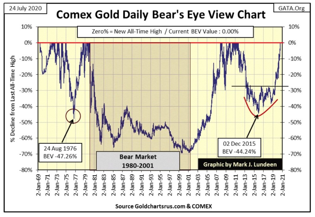
This week all the excitement was in the old monetary metals, so for a change let’s start with gold which closed the week at a new all-time high of $1900.88, or a 0.00% in the BEV Chart below. Gold hasn’t seen a new BEV Zero since August 2011, almost nine years ago.
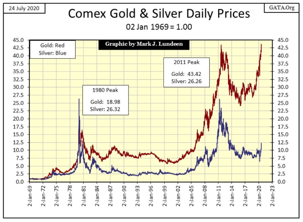
For a historical comparison between gold (Red Plot) and silver (Blue Plot), I took their indexed values going back to 1969 and plotted them below. Not since their January 1980 top has silver outperformed gold on a long-term basis. For a short while from July 2010 to April 2011, silver bullion not only outperformed gold but most of the tech stocks on the NASDAQ too. Then came the 75% market decline that bottomed in December 2015, and so investment interest went somewhere else.
It’s been over a hundred years since silver has gotten any respect. Before 1873 the Industrialized West was on bimetallic monetary standard, one that used both silver and gold as money. Then in Virginia City, Nevada they discovered vast deposits of silver in the Comstock Lode, which threatened the global-monetary standard.
The problem was a familiar one. The price of silver was fixed by law, as was gold, so a certain weight of silver purchased an ounce of gold. Twenty silver dollars were of equal value to one $20 gold eagle. But the flood of Virginia-City silver into the economy made silver much cheaper in terms of gold.
This problem was no different than the flood of paper dollars from 1945 to 1971; the increase in the supply of silver was motivating people to exchange their cheap silver dollars for more expensive gold at a rate disadvantageous to the holders of gold money.
This motivated the American and European banking establishment to demonetize silver and go on to a pure gold standard. Of course being bankers, and having inside information of what was to come, they made sure they had most of the gold and someone else had most of the silver when their monetary systems shifted into a pure gold standard.
When President Ulysses S. Grant signed into law the Coinage Act of 1873 (also known as the Mint Act of 1873 or the Fourth Coinage Act), silver was demonetized, and those who held their wealth in silver soon discovered their silver was about as much money as a bushel of corn or wheat when they attempted to deposit their silver in a bank.
After 1873, until 1964, silver continued to function in the US as money for change for retail purchases:
- Half Dollars
- Quarter Dollars
- Dimes
But after what was called the Crime of 73, banks no longer accepted silver as money.
The Crime of 73 has one big benefit for people today; 19th century Morgan silver dollars can still be found in outstanding condition because when banks received bags of these dollars from the US Mint, they would lock them up and not allow them to circulate as they would for half and quarter dollar coins.
Silver production became subsidized by the federal government, as the US Treasury’s stock pile of silver increased by many billions-of-ounces that had no purpose other than subsidize mining jobs in the United States.
The first real use for the Treasury’s silver was in the Manhattan Project during WWII. To separate uranium 235 from uranium 238 required huge electro magnets. The A-bomb’s project engineers were told the war effort consumed all of the copper wire they required. The solution was for them to use US Treasury silver. As silver is a better electrical conductor than copper, they had no problem doing so.
But that was then, and this is now. The huge multi-billion ounce stock piles of silver around the world are only a memory today, sold at a price far below their real value. The US Treasury sold its last silver bar in its reserve in 2002. But silver, an indispensable metal in industry today, trades at prices relative to gold as if these vast reserves still exist.
When the realization that silver is actually a rarer commodity than is gold becomes widely accepted, and that the price of silver has been suppressed since 1873, who knows what the price of silver could advance to? Could an ounce of silver become more expensive than an ounce of gold? I’d be foolish to predict that, but that’s not impossible either. It’s best to just get a few Monster Green Boxes or even a few tubes of silver eagles and see what happens in the years to come.
Let’s look at silver’s step sum chart below. I love silver as an investment, but don’t cover silver much as it acts so weird in my technical work. From May 2011 to December 2015 silver saw a 75% market decline, yet its step sum for the most part ignored the collapse in the value of silver. The step sum (red plot) plots market sentiment, and market sentiment for silver is always bullish.
I expect this is so because the big buyers of silver aren’t in the silver market for investment purposes but for purchasing silver for industrial reasons. What does Apple or General Motors care if the price of silver declined by 75%? No matter what, they will come into the market to purchase the silver they need at the going price. They will never suffer from buyer’s regret in a bear market as do purchasers of gold or shares of high-tech companies, should they see a large reduction of valuation.
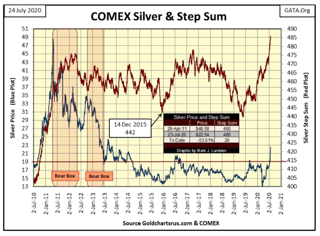
Looking at silver’s step sum and 15 count table below, its step sum is on fire, as since June 19th silver has seen only four daily declines, moving its step sum up by a net of sixteen advancing days.
Silver’s 15 count went double digits on Thursday and Friday this week, deep into overbought condition.
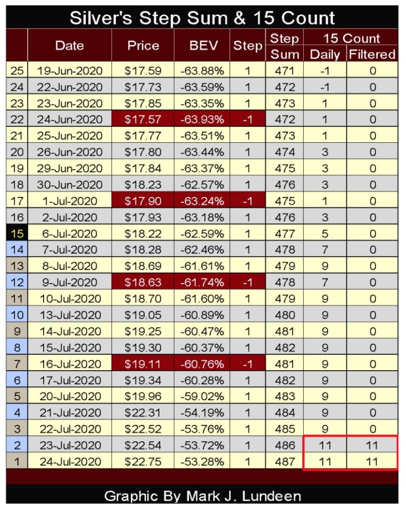
A double digit 15 count, in this case a plus eleven for silver, is one of those rare market events I love seeing. Exactly how rare is seen in the table below. Since December 1970, silver has closed with a 15 count of plus eleven on 47 occasions, or 0.38% of its 12,460 daily closings of the past half century. That silver this week has done this for the forty-sixth and forty-seventh time since 1970 must be telling us something.
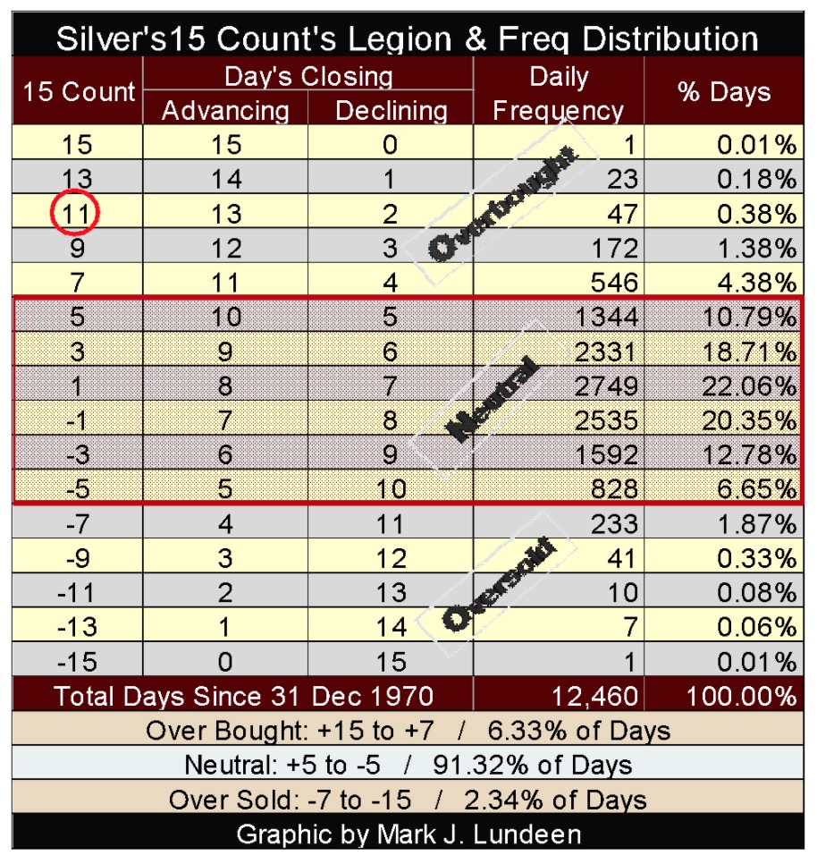
A double digit 15 count usually marks an important turning point in a market. In November 2015 just weeks from the December 2015 bottom for gold and silver, both gold and silver’s 15 count went into deeply oversold condition, with silver’s 15 count actually seeing a -15, or fifteen continuous down days, and gold a -13.
Normally seeing silver with a plus eleven 15 count would be interpreted as a negative market signal, a flashing strong sell signal. But I think it will be different this time; that this plus eleven15 count is flashing silver is finally breaking free of the market machinations it has traded against for decades. If so we may see silver’s 15 count increase up towards 15 as the big banks close out their short positions at great losses to themselves, cosmic justice for their Crime of 73 some 147 years ago.
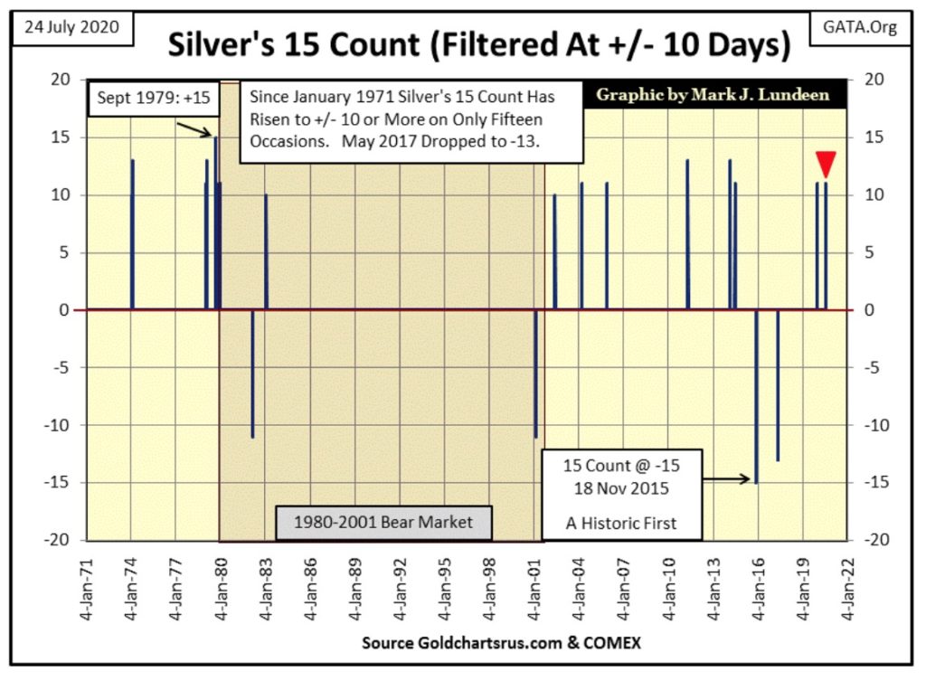
FYI; here is a chart for silver’s double digit 15 count since 1970. The red triangle marks our +11.
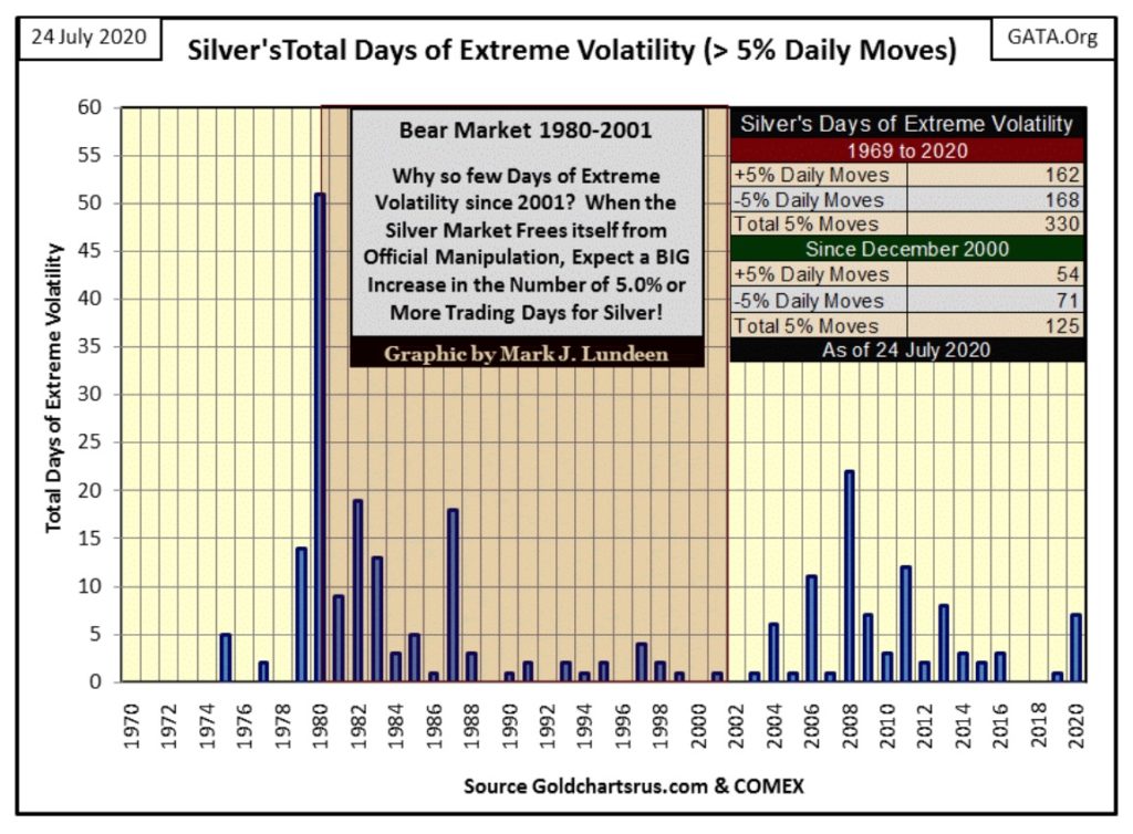
Silver also saw a day of extreme volatility this week on Tuesday, which for silver is a > +/- 5% day. So far for 2020 silver has seen seven extreme days of volatility, which is a very positive development for the silver bulls.
Let’s go deeper into the potential for a massive gold and silver bull market in the years to come.
Precious metal assets are due for an epic advance. Why would I say that? Since their January 1980 market top (forty years ago), gold, silver and their miners have been underperformers in a world where monetary inflation ran riot. But for gold and silver devotees those were the bad old days, as things are about to change.
To be sure gold and silver have had their moments of brilliance since 1980. In the spring of 2008 and again in 2011 they were top performers in the market, but those runs lasted only a few years. Soon after their 2011 tops, investors in gold, silver, and their miners ultimately suffered massive losses as almost everything else that’s traded on Wall Street went from one new all-time high to another.
Here’s the precious metals bear markets from 2011 to 2015:
- Gold: 44% Bear Market
- Silver: 75% Bear Market
- XAU: 83% Bear Market
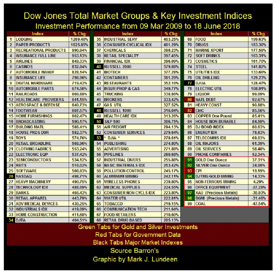
Here’s a table I used in an article two years ago using the Dow Jones Total Market Group (DJTMG) along with the major market indexes I follow plus precious metal assets. I’d use an updated table, but two years ago Barron’s stopped publishing data for the DJTMG in the public domain.
Look at the red tabs (#80 national debt & #82 CinC). Reckless expansion in the national debt and currency-in-circulation is something one would think would be favorable for the old monetary metals and their miners. But since the dollar was decoupled from its $35 gold link in August 1971, just about everything else has seen its valuation inflate far more than gold, silver and their miners. Seeing no precious metal investment (green tabs) in the table below breaking above #90 is typical of their market performance for the past four decades.
The chart below plots the XAU in dollars (top graphic) and in BEV format (bottom graphic). The dollar plot includes every daily close since the XAU first began trading December 1983. The XAU is an excellent index for options trading, as gold mining is a volatile market sector. However, for those who wanted to buy and hold an investment for the long term, mining shares have not delivered the expected long-term returns in our inflation driven market place.
Since 1983, every time the XAU generated excitement as it advanced, a massive bear market decline of 65% or more was soon to follow as is painfully evident in the lower graphic plotting the Bear’s Eye View of the XAU.
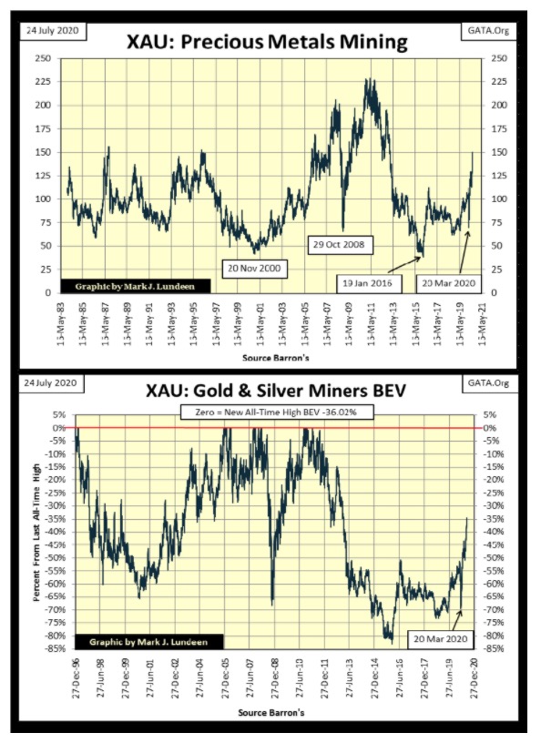
Since December 1983, when the XAU first traded, the FOMC has increased US Currency-in-Circulation (CinC) from $168Bil to $1,978Bil, an almost twelvefold increase. This is a massive increase of dollars circulating in the economy. Yet as seen above, the XAU today isn’t trading much above where it was in 1983 as monetary inflation has yet to flow into precious metal assets.
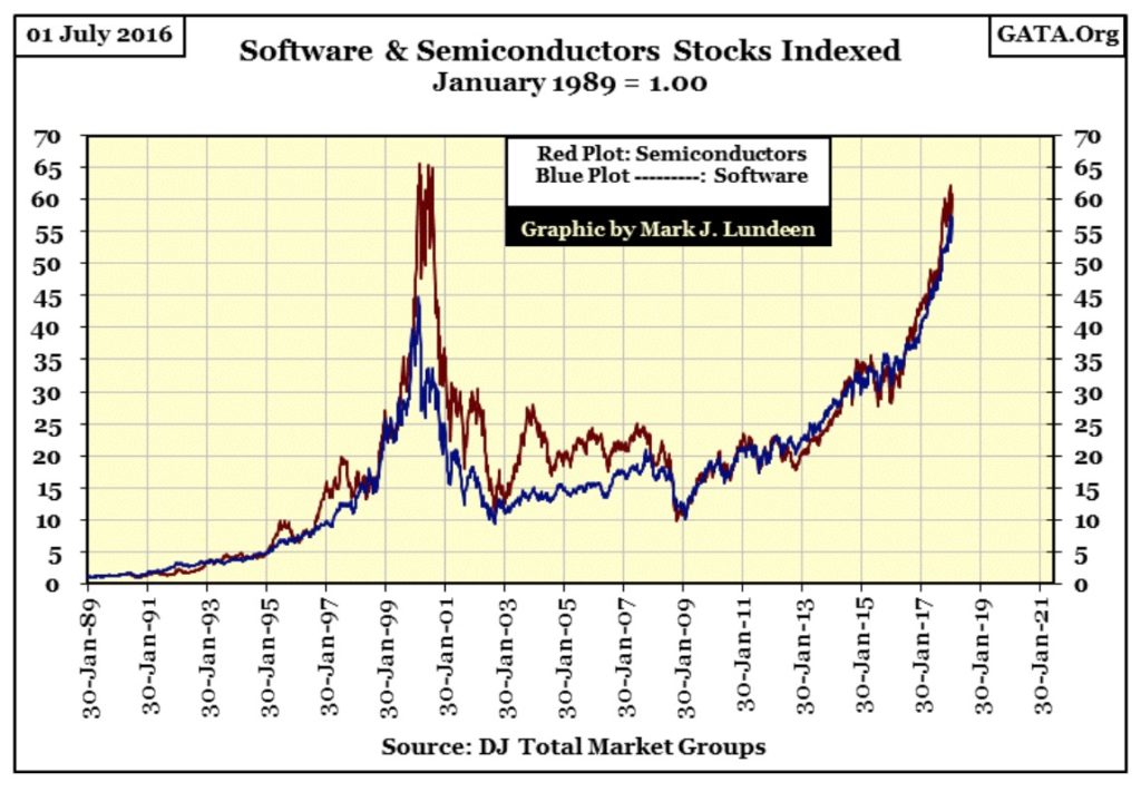
Where have these inflationary dollars flowed into? Lots of places like NASDAQ glamor issues, real estate and the bond market. Next is another chart from my now discontinued DJTMG data set plotting the indexed values for software and semiconductor stocks up to July 2018.
The best the XAU has ever done was to increase by a factor of 2.25 from December 1983 (chart above), and it took twenty-eight years to do it (1983 to 2011). In eleven years (1989 to 2000) software increased by a factor of 45 and semiconductors by a factor of 65. And since the March 2009 market bottom, to July 2018 (latest data), these high-tech indexes have outperformed the XAU by a significant margin. In a market such as this, as it has been since gold and silver’s January 1980 top, whoever invested in gold mining would soon regret it.
But key to the success of these high tech issues, and the distress for the XAU was a global perception that the US$ was a desirable asset to hold, regardless of the reckless monetary policy of the FOMC. That global perception is now changing.
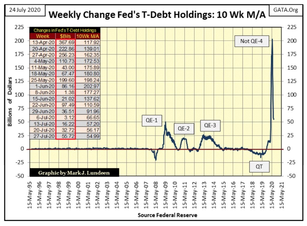
During the 1990s until October 2007, the FOMC routinely “injected” on average $3Bil dollars into the financial system a month. Let me repeat that; PER MONTH! Today that doesn’t seem like much, but it was enough to inflate huge valuation bubbles in the high-tech shares in the 1990s, and inflate a massive bubble in single family real estate in the 2000s.
But in the aftermath of the deflating mortgage market the FOMC was forced to increase its “injections” of “liquidity” to “stabilize market valuations” as seen below. Where before October 2007, $3Bil * A MONTH * was all that was required to inflate huge bubbles in the market, today the FOMC must now “inject” tens and sometimes hundreds-of-billions-of-dollars into the financial system * A WEEK * just to maintain “market stability.” Now it’s the law of diminishing return that is running riot!
On the table in the chart below, these weekly “injections” of “liquidity” by the FOMC are listed within the red box. They wouldn’t be trashing their balance sheet like this unless they had to as, it makes their “monetary policy” look terrible!
Thanks to the financial mainstream media, retail investors remain ignorant of this. But those who manage billions-of-dollars of other people’s money for pension funds and insurance companies are fully aware of what is going on. That in the last year gold, silver and precious metal mining companies are finally advancing is most likely managed money’s (professional money) reaction to what we are seeing below.
With the pending public awakening to the failure of the FOMC to manage the dollar responsibly (see chart above), the investment markets will undergo a paradigm shift. Valuations in once hot investment classes seen in my DJTMG table, as well as real estate and bonds above will deflate by 50% and more. Capital flight from these deflating markets will flow into undervalued precious metal assets resulting in a historic precious metals bull market.
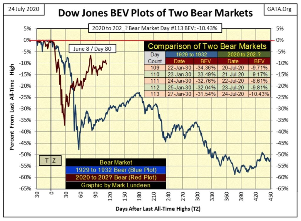
Now on to the Dow Jones, which after an advance that began in March 2009, is now feeling its age. For the past month I’ve been waiting to see whether the Dow Jones will break above its BEV -5%, or below its BEV -15% lines. And for the past month the Dow Jones continues hugging on to its BEV -10% line. This too shall pass, but the longer this goes on, the more significant it will be when the Dow Jones does rise up or fall below these critical BEV levels of -5% and -10%.
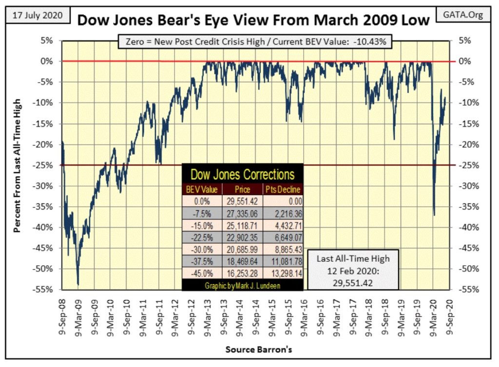
Next are my BEV values for the major market indexes I follow. We saw some market history being made on Monday as the top four indexes made new BEV Zeros. They came close to making more on Tuesday and Wednesday, but on Thursday and Friday Mr Bear began clawing back some of their gains.
Things could change quickly here. All it would take is an “injection” of “liquidity” of sufficient magnitude from the FOMC to make this market advance once again. But as seen above, the FOMC “injected” $55.72Bil into the financial system just this week, and all the bulls got for that was what we see below – not much.
Left to its own resources, with no meddling from the Federal Reserve, this is a market that wants to go down. Personally, I see more risk than reward exposing your capital to a market such as this. This is especially so when we note the excellent opportunities to be had in the precious metal sector.
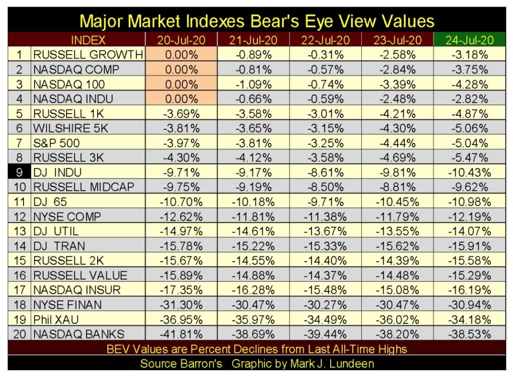
One more comment on the table above; for the third week in a row the XAU (gold mining) closed above the NASDAQ Banking index, and the gap between them widens.
Here’s the Dow Jones in daily bars. It’s good seeing daily volatility come down, but the Dow Jones remains directionless.
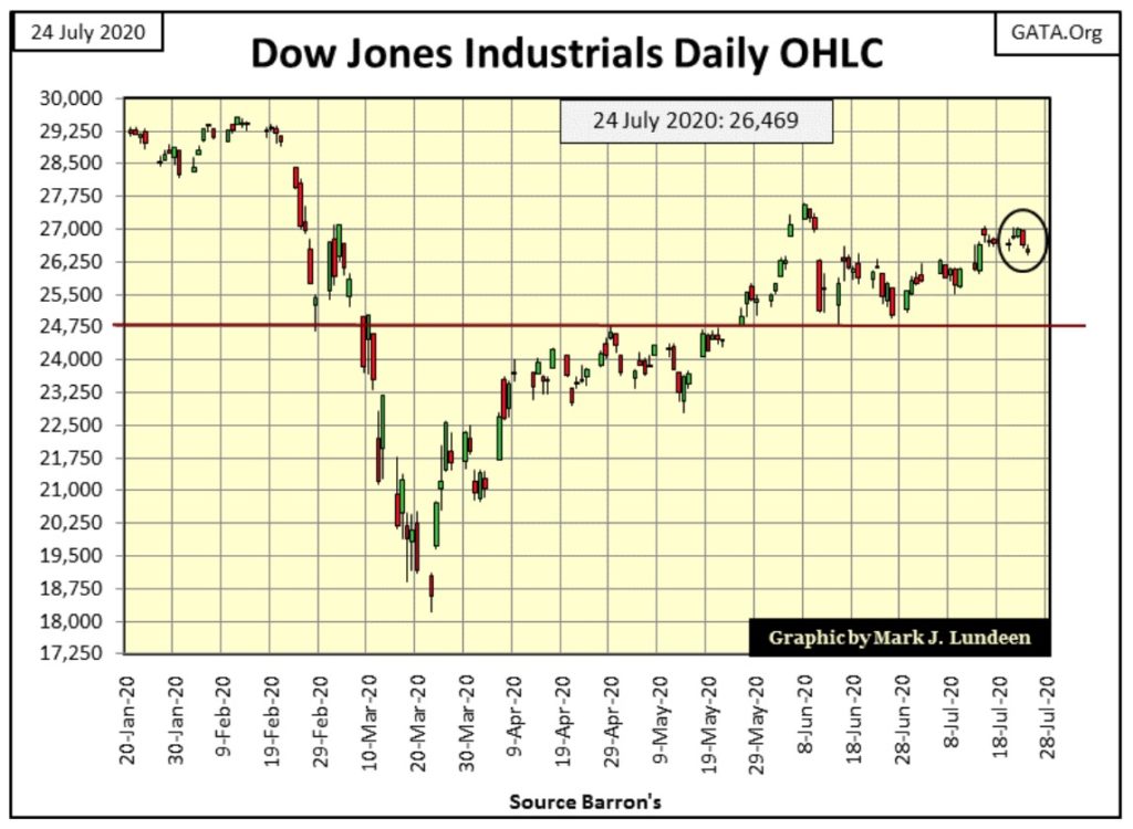
This week I could have ignored the stock market as it’s becoming tedious. But that’s how things go with us market watchers. And what this market watcher is watching is the Dow Jones’ BEV -15% line below. Should the Dow Jones slip below this critical level, in my opinion, one of two things is going to happen;
- The Dow Jones will continue deflating down to levels only God knows.
- The FOMC will boost its weekly “injections” back up to HUNDREDS-of-Billions-of Dollars into the financial system to prevent that from happening.
- Or maybe both as the financial system may have finally become too bloated to bailout.
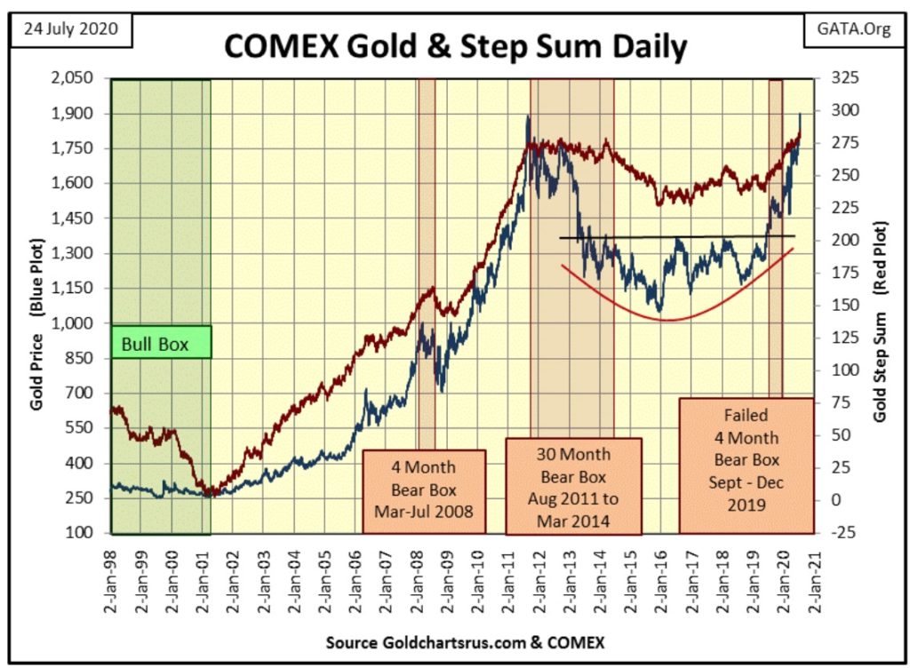
Next is gold’s step sum chart, and what a powerful chart it is too! From 2011 to just this Friday, when gold took out its August 2011 high of $1888, gold and its step sum plot has formed a terrific base for gold to move significantly higher in the year(s) to come.
Last July, for gold to rise above $1360, and then stay above $1360, and daring to believe it could possibly advance $540 to a new all-time high was the impossible dream. Yet that dream, has become our reality a year later in the chart below. What’s this chart to become a year from now? I’m dreaming gold could rise up to and then close well above $2500, as silver and the mining shares catch on fire.
I’m really optimistic about my net worth in the coming year. The only thing I’m pessimistic about is whether or not I’ll enjoy it. Since the 1968 Democratic Party convention in Chicago where the Communists (aka “the progressives”) rioted in the streets, this once-great American party has been infiltrated by Marxists. Now a half-century later the commies are rioting in the streets again and that isn’t a good thing. But it may drive the price of gold well north of $3500 by next July, whether we like it or not.
That’s a depressing thought. Here’s something to cheer you up:
“And we know that all things work together for good to them that love God, to them who are the called according to his purpose.”
“And we know that all things work together for good to them that love God, to them who are the called according to his purpose.”
Romans 8:28
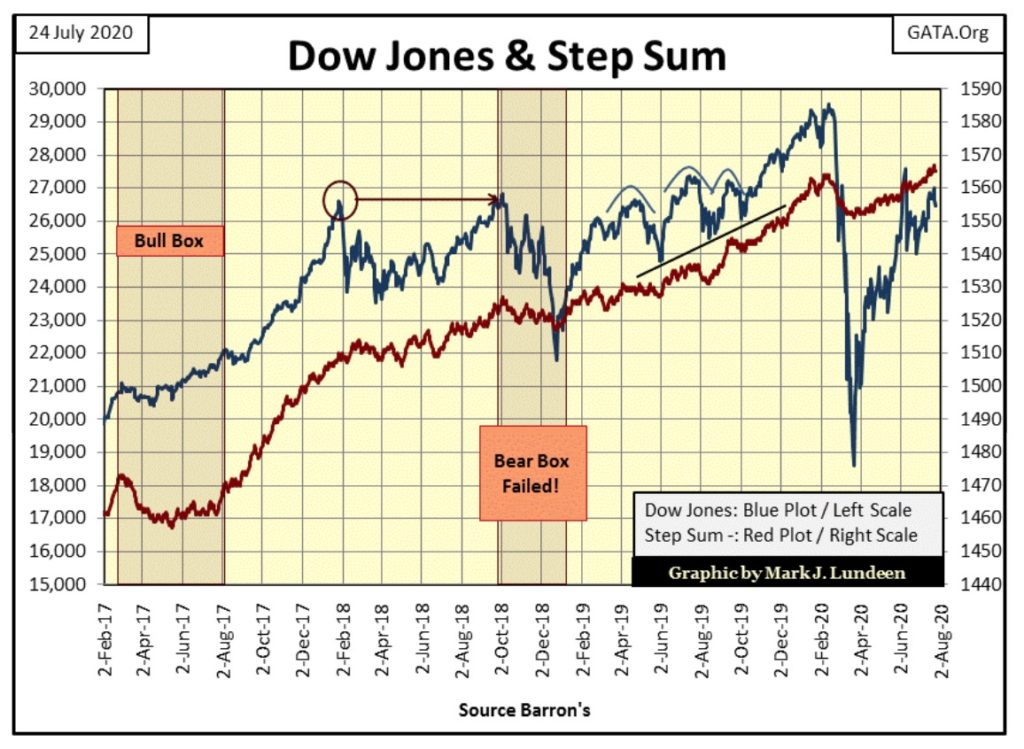
Next are the Dow Jones and its step sum plot. Not much to say about it except we’re waiting to see what the Dow Jones decides to do next; break above its high of early June and keep going on to a new all-time high, or break below 25,000 on its way down to much lower levels. I’m not smart enough to say what is next to come for the Dow Jones, but I’m inclined to be bearish when it comes to the stock market.
For gold’s step sum table below, since June 19th gold’s step sum has increased by a net of eight daily advances. That’s a nice advance for a step sum. Gold also closed the week with a 15 count of +7, meaning gold is overbought. Typically, seeing a 15 count of +7 or more indicates that particular market is due for a pullback, and seeing how gold made a new all-time high this week, a pullback from here wouldn’t be out of order in a bull market.
But silver’s 15 count closed the week at a +11 (see silver above) and yet the sun still shines, so maybe gold is destined to become even more overbought in the weeks to come as it advances ever deeper into record all-time high territory. Things like that happen in bull markets.
Gold maybe overbought, but I don’t believe this advance has become over heated, meaning the gold market has not yet become a feeding frenzy. Not with its daily volatility’s 200Day M/A only at 0.77%, silver’s is at 1.34%. Expect some real excitement in the gold and silver markets when gold’s daily volatility’s 200Day M/A increases to something over 1.00% and silver’s over 1.50%.
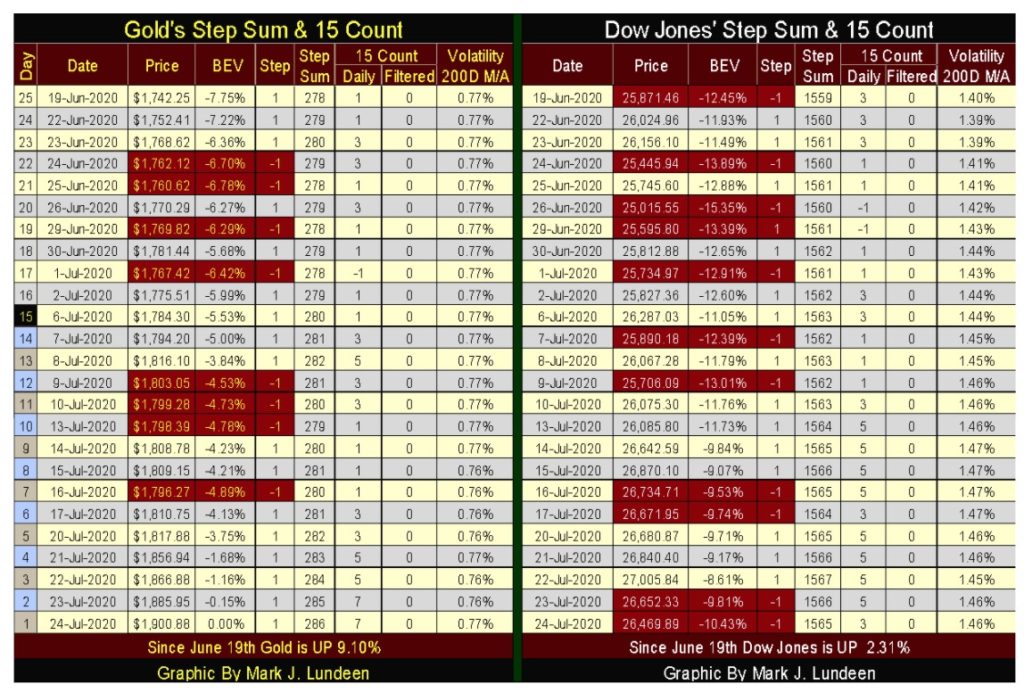
For the Dow Jones, its step sum has advanced by six net daily advances since mid-June, which is good. With a 15 count of +3, the Dow Jones is neutral, not being in overbought or oversold territory. As it has advanced in the past month, there is a good chance it will continue doing so in the next. But I wouldn’t guarantee that. With a daily volatility’s 200Day M/A of 1.46%, an extreme daily volatility typically reserved for deep bear-market bottoms, one could believe the market is flashing a strong buy signal.
But since March 23rd the Dow Jones has bounced off of a 37% market decline and closed the week only 10.43% from making a new all-time high. Just contemplating this odd occurrence of huge market volatility with the Dow Jones so close to making a new all-time high makes my crystal ball become cloudy with a dense fog. So I’m going to wait until next week before I say anymore on the stock market, as there’s no sight like hindsight.
—
(Featured image by Gino Crescoli via Pixabay)
DISCLAIMER: This article was written by a third party contributor and does not reflect the opinion of Born2Invest, its management, staff or its associates. Please review our disclaimer for more information.
This article may include forward-looking statements. These forward-looking statements generally are identified by the words “believe,” “project,” “estimate,” “become,” “plan,” “will,” and similar expressions. These forward-looking statements involve known and unknown risks as well as uncertainties, including those discussed in the following cautionary statements and elsewhere in this article and on this site. Although the Company may believe that its expectations are based on reasonable assumptions, the actual results that the Company may achieve may differ materially from any forward-looking statements, which reflect the opinions of the management of the Company only as of the date hereof. Additionally, please make sure to read these important disclosures.


Bitcoin Stalls Near $60K as Strategy Moves, ETFs Outflow, and EU MiCA Rules Take Effect
Bitcoin hovers near $60,000 with ETF outflows, while Strategy boosts reserves, sells BTC, and raises dividends to reassure investors. Ethereum...


Cannabis Dominates Global Drug Use: Trends, Risks, and Shifting Markets
Cannabis remains the world’s most widely used illicit drug, with 256 million users in 2024, surpassing all others combined. Growth...


Italy Approves First Hydrogen-Powered Train for National Rail Network
ANSFISA has approved Italy’s first hydrogen-powered train, the Alstom HMU214, for use on the Brescia–Iseo–Edolo line. Capable of 140 km/h,...


Cotton Market Weakness Persists Despite Brief Rebound
Cotton prices fell to new lows last week before a modest rebound. USDA data shows crop conditions remain worse than...


Eli Lilly Hits $1 Trillion Valuation Amid Strong Bullish Momentum
Eli Lilly stock hit a record high, surpassing $1 trillion market value after strong product demand. Shares surged over 7%,...
 |
|
 |  |
 |
|
-

 Biotech2 weeks ago
Bavarian Biotech Sector Expands with Record Funding and Startup Growth in 2025
-

 Africa2 days ago
BOAD Approves Major Funding Boost to Drive West African Development
-

 Business1 week ago
Markets Diverge as Oil Falls, Rates Hold, and Inflation Persists
-

 Impact Investing6 days ago
Coastal Cities Lead as Heat Strains Italy’s Urban Livability