Featured
Step sum boxes for the Dow Jones and gold
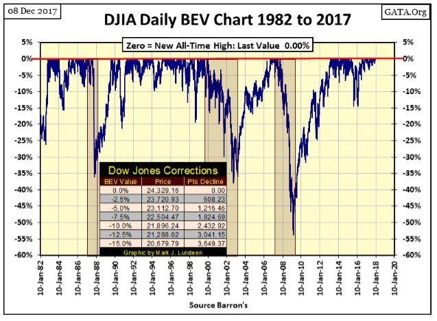
The Dow Jones’ daily closings for the previous year have been at new all-time highs.

Once again, the Dow Jones closed the week at a new all-time high, another BEV Zero in the Bear’s Eye View chart below. That makes 82 new all-time highs since last November’s presidential election. That’s 30% of the Dow Jones’ daily closings of the past year have been at new all-time highs. Also, going back to 1982 in the BEV chart below, the true beginning of the current market advance, never before have we seen a concentration of BEV Zeros that simply refuses to correct down to the BEV -5% line. It’s been that way since July 2016.
© Mark Lundeen
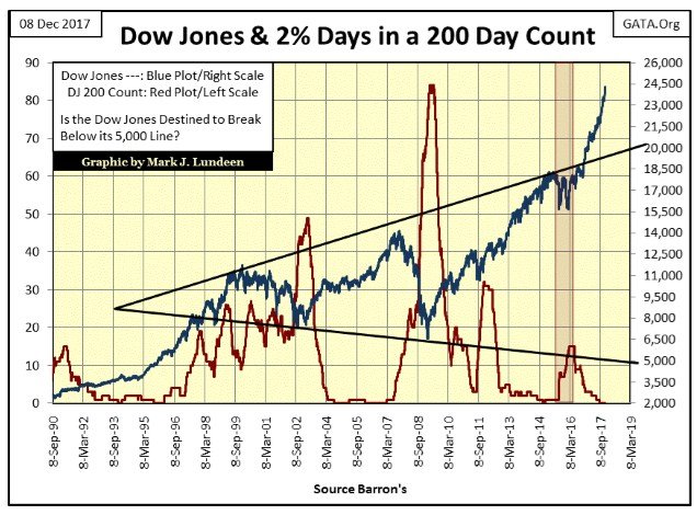
Next is the Dow Jones (Blue Plot) with its 200-count (Red Plot), the number of days the Dow Jones has moved +/- 2% from a previous day’s closing price in a running 200-day sample. You can tell when Mr. Bear is near; the Dow Jones’ 200 count begins rising as the Dow Jones itself comes under pressure.
Currently, the Dow’s 200 count is at zero and has been since August 23. Small wonder as the last time the Dow Jones saw a 2% day (day of extreme market volatility) was on November 7th of last year. The day before Donald Trump was elected president, the Dow Jones saw a 2.02% decline from its previous day’s closing price. Since then it’s been up, up and away with the Dow Jones advancing 6,070 points or 33.24% in the past thirteen months.
© Mark Lundeen
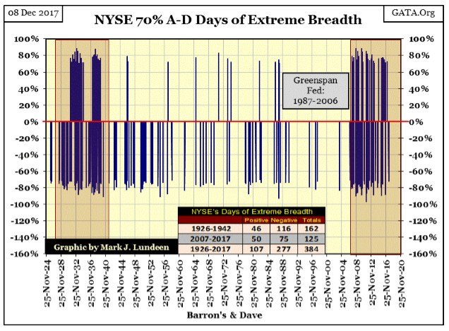
What will the next thirteen months bring? I’m out of the market prognostication business, so don’t ask me. I’m just sitting in the bleachers, eating peanuts and enjoying the game. This is my market strategy until I see the 200 count for the Dow Jones above begin rising up from its current zero. There’s just no reason to expect the stock market to come under pressure until that happens, plus a return of days of extreme-market breadth (NYSE 70% A-D Days / chart below) as common market events.
The last NYSE 70% A-D day occurred on August 10th of this year, a -71.89% A-D ratio. In other words on a day where 3088 issues were traded at the NYSE, only 406 of them closed higher, while 2626 closed down and 56 UNCH. Keep in mind NYSE 70% days are rare market events. Since 1926 there have been only 384 NYSE 70% A-D Days, though in the chart they appear more numerous than that. But the vast number of them have occurred in the two clusters, one during the depressing 1930s, the other beginning in early 2007.
The current cluster began in February 2007, as the sub-prime mortgage debacle first entered the public’s awareness. What’s interesting is during the eighteen years of Alan Greenspan there were less than ten NYSE 70% days. A year into the Bernanke Fed, all that changed when NYSE 70% A-D days became frequent market events. Ten years later a monstrosity of a cluster of days of extreme market breadth (NYSE 70% Days) has formed in the chart below, a technical pattern not seen since the Depressing 1930s.
© Mark Lundeen
What does it mean? Well, in my professional opinion – nothing good. Keep in mind the financial markets today are managed, but the market stands on a fragile foundation of tens of trillions of dollars of dubious debt, and hundreds of trillions in derivatives to hedge “market risks.”
That our cluster of extreme days of daily breadth at the NYSE began as the sub-prime mortgage market first began showing cracks in early 2007 is telling us something. I believe it’s that for all the apparent success the financial markets currently are having, disaster is only one black-swan event away. An unanticipated event in the debt or derivatives markets that the market’s managers will prove to be a day late and a dollar short of correcting.
Keep in mind how before the sub-prime mortgage crash of 2007-09, the global banking system was insanely leveraged. In 2008 it only took a 5% to 10% decline in real estate valuations to wipe out the equality positions of the big houses on Wall Street; they were flooded with counter-party claims to derivatives they wrote that they couldn’t pay. Wall Street owed trillions they didn’t have, so Washington’s entrenched political class bailed the banksters out with tax payer’s money.
If today the Dow Jones can’t seem to make a correction of only 5%, there is a reason why that would be. The most likely is that the “market’s regulators” are concerned that such a decline creates the possibility of another derivative disaster, as happened in 2008 with sub-prime mortgage derivatives.
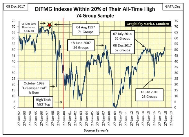
But as Christmas of 2017 approaches, the famine of extreme days of volatility and market breadth in the stock market tells me all is well. Well, as good as things can be in a world wallowing in consumptive debt hedged with fraudulent derivatives. How good is that? The Dow Jones Total Market Group (DJTMG)’s top 20 increased to 52 at the end of the week. Last summer I wouldn’t have believed that was possible, but here in December, this is now our reality.
© Mark Lundeen
The next level to watch is the 54 from June 2007, a high seen just months before the Dow Jones sub-prime bubble market top.
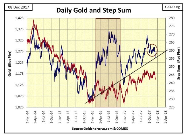
As I expected last week, gold broke out of the tight range it’s been in since early October (circle in the chart below) and it did so to the downside. It ended the week resting on the rising-trend line I placed on the chart.
The best thing that could happen now would be seeing gold leap up off this rising trend line, and closing above $1300 by the end of next week. It could happen, but I expect we’ll see further declines in the weeks to come. I’m still a big bull on gold and silver, and as long as gold holds above its lows of last December ($1125), it’s doing fine.
© Mark Lundeen
And even if gold does break below its lows of 2016, or even the lows of December 2015, it’s only because the managers of the old monetary metals have flooded the COMEX futures markets with millions of ounces of gold that doesn’t exist – it’s a fraud.
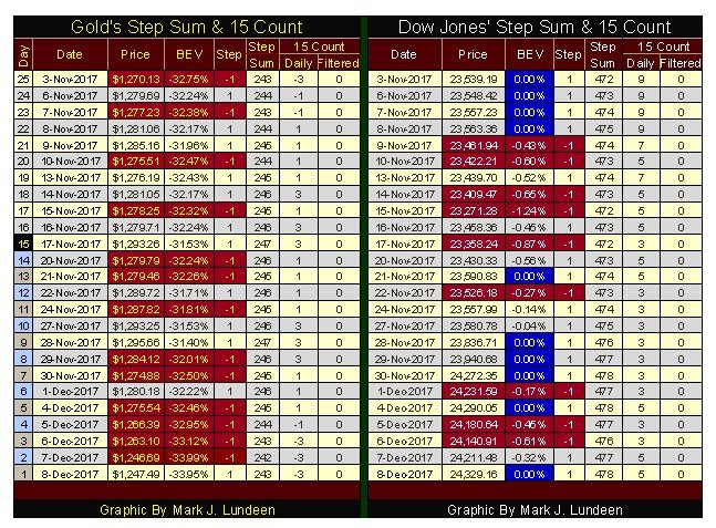
But I’m not that pessimistic. I expect gold will hold above $1200 before it turns around and advances once again. Looking at gold’s price action in its step sum table below, from November 3 to December 4 the price of gold didn’t do much at all, until this week. Tuesday and Thursday saw good size declines (0.72% & 1.30%), but these are tiny moves when compared to the volatility gold saw in autumn 2011 and the spring of 2013, when daily moves of well over +/- 2% were common.
© Mark Lundeen
If this is the best the big banks can do at the COMEX, promising to deliver gold that they don’t have, and doesn’t exist, I don’t expect the current decline in the price of gold to continue much longer in terms of time or price.
Still, I’m going to limit my expectations of what gold, silver, and their mining shares can do for me until the financial markets come under pressure. This is actually a good time to be buying the precious metals since few people or “market experts” are thinking about them. That’s what makes them cheap.
What gold and silver need to take off in price are wild days in the stock and bond markets, with rising bond yields and declining stock & bond prices motivating capital to seek a safe harbor in precious metal assets. When that happens, people will come to see how cheap the old monetary metals and their miners are at today’s prices.
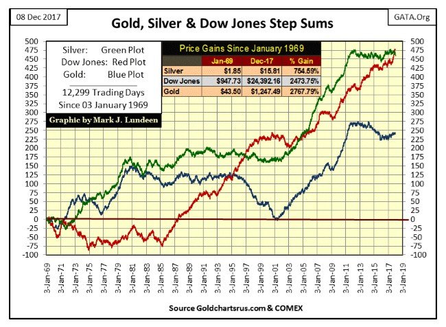
The step sum is a single item Advance – Decline Line (A-D Line) using the daily advances and declines in the price of a market series as its input. Below I’ve plotted the step sums for silver (Green Plot), the Dow Jones (Red Plot) and gold (Blue Plot) from January 1969 to the close of this week. In effect, the step sum displays the net daily advances and declining in a price series.
Though I use daily data, I suspect this technique would work equally well with weekly data or even 5-minute bars in a modern trading software package. As the three-step sums plotted below are all positive, these three markets have seen more advancing than declining days since January 1969.
It goes without saying how advancing days take a market up in price while declining days take a market down in price. Nonetheless, of the three markets silver and the Dow Jones have seen the most net advancing days in their step sums, yet it’s gold, the market with the smallest number of net advancing days that enjoys the largest percentage increase in price since January 1969.
Since 03 January 1969, there have been 12,299 trading days in these markets. That’s a lot of trading sessions. Still, none of the step sums seen below have ever increased to above 500 net advancing days. This’s because come bull or bear market, over time all markets see about as many advancing as they do declining days. Though, in bull markets, the step sum does tend to rise, while in bear markets it tends to decline; but as we’ll see, this is not always true.
© Mark Lundeen
This is especially so for silver. From January 1980 to 2002, silver saw a bear market that took its price down 90%, but one couldn’t have guessed that looking at silver’s step sum (green plot) above. The most logical reason why for this is that silver’s primary demand is industrial, and so is different from gold.
When gold sees a big price correction, the market sees a corresponding decline in demand for gold from investors who become wary of buying in a falling market. Silver with its industrial demand is different. Industrial users of silver are never put off by a large decline in the price of silver, so are never hesitant to enter the market after a big price decline as silver to them isn’t an investment, but a required input in their line of business. This explains the difference between gold’s and silver’s step sum plots above from 1980 to 2002.
For this reason, I typically ignore the silver market when I cover step sums, because silver’s step sum either goes up during silver advances, or flat-lines even during a massive 90% market decline.
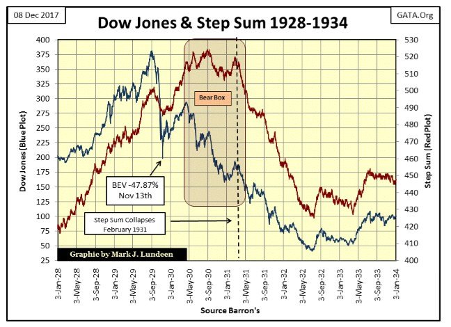
The important point about a step sum is that it’s a market sentiment indicator of the most important people in any market, the people who enter the market each day to buy or sell. Let’s take a look at the Dow Jones from 1928 to 1933, the 1920’s bull market and the Great Depression Crash to see how market reality (Price Action / Blue Plot) can be at odds with investors’ expectations (Market Sentiment / Red Plot).
Additional comments need to be said about the step sum.
- Unlike price, the valuation of a step sum contains no useful information. The utility of the step sum plot is found only when comparing it to the price plot. Are the price and step sum plots rising and falling together, or have they decoupled from each other, in which case a step sum box is formed. I disregard step sum boxes until they have gone on for a minimum of eight weeks.
- As a general rule, a market series’ price plot is a superior indicator of future than is its step sum plot, but not always.
So why use a step sum when analyzing a market? Let’s look at the Great Depression Crash to find the answer to that question.
From January 1928 to September 1929, the tail end of the Roaring 1920s bull market, the Dow Jones’ price plot (Blue Plot / Market Reality) and its step sum plot (Red Plot / investors’ expectations) agree with each other; as they do during the initial phase of the Great Crash (September – November 1929). The same is true during the dead cat bounce of November 1929 – April 1930.
However, as the dead-cat bounce terminated in April 1930, the phase of the Great Depression crash that made the 1930s so depressing began. As it did, the Dow Jones’ red step sum plot decoupled from its blue price plot, signaling the market bulls were in denial of market reality expressed by the Dow Jones’ declining price trend, thus forming a step sum Bear Box.
Why a bear box? I call it a bear box because market reality as defined by the collapsing price of the Dow Jones demands that I do. Also, seeing investor sentiment decouple from market reality at so obvious and painful a moment in market history deserves a catchy moniker, hence I call the box in the chart a bear box.
From April 1930 to February 1931, being a bull on Wall Street became increasingly painful; still bullish market sentiment (as measured by the red step sum plot) stubbornly refused to admit defeat. Most likely, bulls on the market were expecting to catch the profitable bottom of the massive bear market.
In the bear box, each down day was seen by the bulls as a buying opportunity to scoop up cheap stocks; so the following day they returned to the market to buy, preventing the Dow Jones’ step sum plot to follow its price plot down. A quick look at the blue price plot within the bear box shows how wrong the bulls were.
© Mark Lundeen
In February 1931 (dashed line), the Dow Jones’ red step sum plot once again comes in synch with its price plot, closing the Great Depression’s bear box. The red step sum plot begins its collapse as bullish market sentiment begins to evaporate. No longer were big down days seen as buying opportunities by the dwindling herd of bulls. Advancing days were now understood by a growing number of people as selling opportunities, as wealth fled for its life from the NYSE.
Note how over half of the Dow Jones’ point decline of the Great Depression crash occurred before bear box closed in February 1931. Within the box, the decoupled step sum plot shows there was always hope that things would turn around, a widely held belief by the bulls that the worse had passed, or soon would. With the collapse in the Dow Jones’ step sum, all hope held by investors proved forlorn as the Great Depression crash approached its brutal conclusion in July 1932. Of the 380 points the Dow Jones sported in early September 1929, only 41 of them survived in July 1932, a collapse in valuation of 89%.
Epic bear boxes, as we see in the Dow Jones of the early 1930s, are rare technical formations, but they do occur, and studying them will prove useful to investors today. How could anyone in the early 1930s know when the bottom was in? Well, if they maintained a step sum plot of the Dow Jones, seeing the Dow Jones price and step sum plots rise up briskly after the July 1932 bottom provided a solid buy signal by September 1932; proof that the Great Depression Crash was now best seen in the market’s rear view mirror.
We see the exact step sum chart formation in the gold market from August 2011 to December 2015 below, as the Dow Jones above saw in the early 1930s.
From 2006 to August 2011, gold’s price and step sum plots both trended upwards, but note how after gold’s high of August 2011, its step sum plot soon decoupled from its price plot. For the best part of the next four years the price of gold continued declining as its step sum plot (bullish market sentiment) refused to follow. And as with the Dow Jones’s bear box above, a good indication the bottom in the gold market was nowhere at hand.
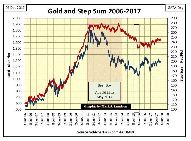
© Mark Lundeen
After gold’s step sum began its collapse in May 2014 (closing the bear box) the gold market entered into it final phase of the August 2011 – December 2015 bear market, a market decline which shaved 44% from its highs of August 2011. I placed a black box around the final collapse in the step sum. That was when I was receiving mail from my readers, always polite but wondering how someone like me could have anything positive to say about such a loser investment as gold and silver was proving to be.
But that was two years ago. Today I look at the December 2015’s upward reversal in gold’s price and step sum plots in the chart above, and understand them to be the same as Dow Jones’ price and step sum plots upwards pivot in the summer of 1932 proved to be – a historic buying opportunity. Will it be?
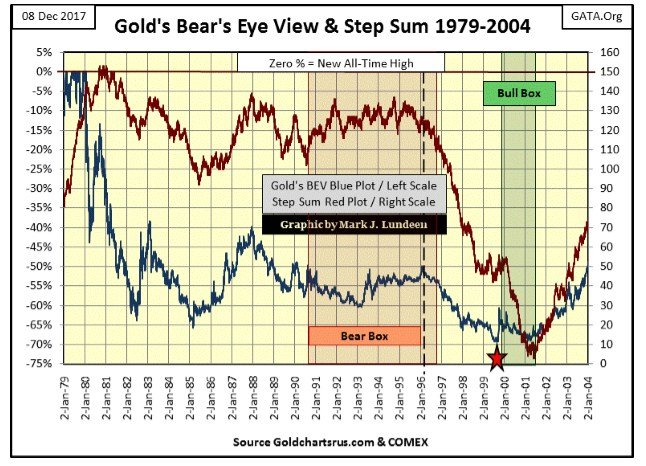
That was the case following another epic bear box in the gold market occurring in the first half of the 1990s. I’m not going into much detail in describing this chart. If you understand what I said in the Dow Jones bear box of the 1930s and gold’s from 2011 to 2014, what you see below from 1990 to 1999 is exactly the same. Except that this is the MOTHER of all step sum bear box formations. It took the best part of a decade for it to fully play out by the summer of 1999 (Red Star).
© Mark Lundeen
The red star marks the 1999 absolute bottom in the 1980-2001 bear market in gold, but note that gold’s bull market didn’t really get interesting until 2001. In between July 1999 and February 2001 is a three year bull box where market sentiment continued crumbling with little effect on the price of gold – call it a step sum bull box.
During the 1999 – 2001 collapse in market sentiment (collapsing step sum plot) the July 1999 $253.70 low of the 1980-2001 bear market held. At the conclusion of the collapse in market sentiment in the bull box, all the bears could achieve was another low in the price of gold in February 2001 of $255.10. It wasn’t long after this double bottom in gold, the $253.70 in July 1999 and the $255.10 in February 2001, when gold’s price and step sum plots both enthusiastically reversed and advanced upward, signaling the start of our current bull market in the old monetary metals.
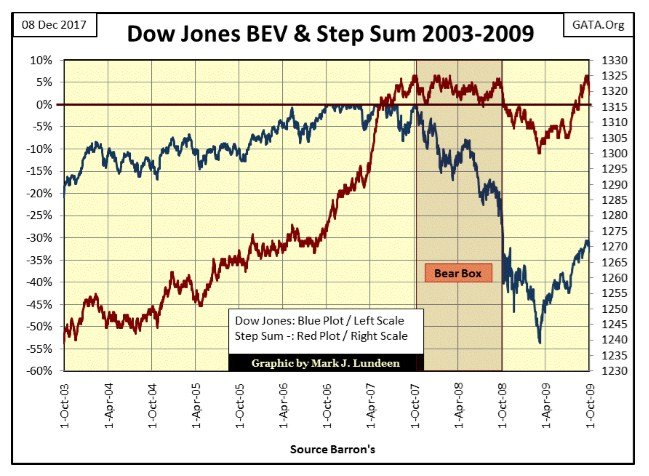
One last step sum chart using the Dow Jones in BEV format from October 2003 to 2009. The chart below covers the Credit Crisis bear market, the #2 Dow Jones percentage decline since 1885. The Dow Jones and its step sum was forming another epic bear box formation as it did in the Great Depression, and as gold did in the 1990s and again from 2011 to 2014.
© Mark Lundeen
And at the time it looked as if it was going to be a real whopper. A year into this bear market (October 2007-08) the Dow Jones had declined to its BEV -40% line for the first time since 1974, as its step sum had yet to break below 1315. This is what stubborn market bullishness in the face of bear-market reality looks like! But reality can be denied for only so long. Soon after the Dow Jones deflated below its -40% line in October 2008, its step sum began its inevitable collapse in market sentiment.
But as we see in this step sum chart, this was not to be as Doctor Bernanke began practicing bear-market interruptus with his quantitative easings, robbing Mr Bear of his chance of making history in the years following 2009. As it was the step sum only collapsed by a pathetic 24 net down days from October 2009 to March 2009, because Doctor Bernanke flooded the financial markets with a deluge of monetary inflation seen below.
© Mark Lundeen
I can’t say that the coming bear market in the Dow Jones will develop an epic bear box formation as it did in April 1930 to February 1931, or as from October 2007-2008. It’s possible in the coming bear market, a bear market that will cleans the global balance sheet of grossly inflated valued assets, and force the ejection of worthless assets now posing as reserves in the banking system, will never see its price and step sum plots decouple.
But I don’t think this would be likely as bear boxes are born from the unrealistic expectations of investors. Today, that would be the unrealistic expectation that central banks ultimately have control over the financial markets. And in the coming bear market, Mr Bear is sure to make the point that they don’t. But it may take a year or two before investors see things Mr Bear’s way, and during those years, I expect we’ll see another epic step sum bear box, followed by one hell of a collapse in market sentiment.
(All charts are courtesy of Barron’s, Goldchartsrus.com & COMEX)
—
DISCLAIMER: This article expresses my own ideas and opinions. Any information I have shared are from sources that I believe to be reliable and accurate. I did not receive any financial compensation in writing this post. I encourage any reader to do their own diligent research first before making any investment decisions.


Bitcoin Stalls Near $60K as Strategy Moves, ETFs Outflow, and EU MiCA Rules Take Effect
Bitcoin hovers near $60,000 with ETF outflows, while Strategy boosts reserves, sells BTC, and raises dividends to reassure investors. Ethereum...


Cannabis Dominates Global Drug Use: Trends, Risks, and Shifting Markets
Cannabis remains the world’s most widely used illicit drug, with 256 million users in 2024, surpassing all others combined. Growth...


Italy Approves First Hydrogen-Powered Train for National Rail Network
ANSFISA has approved Italy’s first hydrogen-powered train, the Alstom HMU214, for use on the Brescia–Iseo–Edolo line. Capable of 140 km/h,...


Cotton Market Weakness Persists Despite Brief Rebound
Cotton prices fell to new lows last week before a modest rebound. USDA data shows crop conditions remain worse than...


Eli Lilly Hits $1 Trillion Valuation Amid Strong Bullish Momentum
Eli Lilly stock hit a record high, surpassing $1 trillion market value after strong product demand. Shares surged over 7%,...
 |
|
 |  |
 |
|
-

 Markets1 week ago
Cocoa Market Faces Mixed Trends Amid Rising Supply and Weak Demand
-

 Africa6 days ago
Bank of Africa Expands Sino-African Trade Partnerships in Beijing
-

 Biotech2 weeks ago
Bavarian Biotech Sector Expands with Record Funding and Startup Growth in 2025
-

 Africa1 day ago
BOAD Approves Major Funding Boost to Drive West African Development
You must be logged in to post a comment Login