Featured
The stock market drags while gold stocks become cheap
The stock market maintained a state of volatility with stocks rising up and then came crashing down with a hard, low close.

Just when you thought it was safe to go back into the stock market, along comes something to smack you in the chops. The markets topped back on April 17, 2018, then started what appeared to be a slow decline. On April 24, however, the Dow Jones Industrials (DJI) fell over 500 points before recovering into the close. In one fell swoop, volatility was back again. The triggers were the threat of a trade war with the European Union, the U.S. 10-year Treasury note hitting 3%, and Trump’s threats against Iran of tearing up the nuclear agreement.
Volatility briefly spiked, but then “happiness” engulfed the market very quickly. Everyone realized that the threats against the EU were just that—threats—until new trade agreements were negotiated. Trump even showed signs of backing off on Iran when French President Emmanuel Macron suggested he might be open to negotiating with Iran to tweak the deal. Of course, the latter depends on Iran as well, which had indicated that a “deal is a deal.” The Iranian nuclear deal was signed by the five permanent members of the United Nations Security Council (U.S., Britain, France, Russia. and China) plus Germany and the EU.
But the prime reason the markets rebounded was the focus once again shifting to earnings. And here, the news was nothing but “happiness.” Netflix, Facebook, Amazon, and others reported solid earnings, generally beating the street. The stock market cares about earnings. It doesn’t care about Iranian nuclear deals unless things fall apart and a shooting war gets underway. Then more likely, it would buy oil stocks.
Our chart of S&P earnings (EPS) shows earnings may have reached the top of a channel that has been building since records were kept dating back to the late 1800s. Two collapses in earnings stand out. First, the collapse in earnings following the market peak in 1919 was more severe than the collapse following the stock market crash of 1929 and the subsequent Great Depression. Second, the collapse following the stock market peak of 2007 and the subsequent financial crash was the most severe since that collapse back in 1920. Given that earnings have potentially reached the top of the channel, our suspicion is that the next decline would most likely not be as severe as the one that occurred in 2008/2009. But a decline back to the middle line would not be surprising or even slightly under that level. That middle line appears to define the long-term trend. The collapses in 1920/1921 and 2008/2009 were basically the only two that were significantly outside the long-term uptrend, except for the dip under during the Great Depression and another one in the mid-1940s.
S&P 500 Earnings
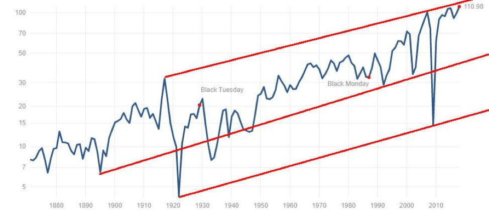
© David Chapman
While trade wars are definitely a concern, one thing we have observed is that while the U.S. (Trump) threatens tariffs and trade sanctions following outrages, expressions of concern, retaliation, and more, Trump appears to be backing off and suggesting negotiations. It may well be a bargaining ploy, but keep in mind that a number of the tariffs and sanctions put in place are also hurting U.S. business and the agriculture sector and that Trump is hearing that right away. The same appears to be the case with the Iranian deal. Is it just bluster and threats in an attempt to get a better deal? Or will he really tear up the agreement, considering he has little or no support with the other parties to the agreement and Iran has effectively said that “if you tear up the deal we will resume our nuclear program”? And the U.S. cannot be trusted.
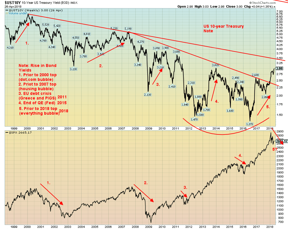
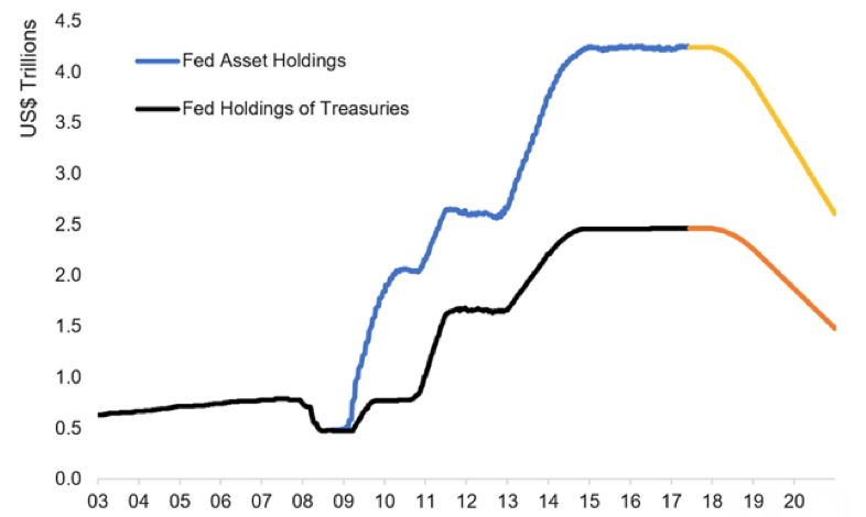
That leaves rising interest, and that is a concern. And lest we forget, add in the Fed’s “Quantitative Tightening” (QT) whereby they are reducing the Fed balance sheet at the rate of $10 billion a month, which will rise to $50 billion a month by September 2018. Rising interest rates preceded every market collapse since the turn of the century, usually with a 6–10-month lag. They did before that as well, but for illustrative purposes, we focused on the record since 1999. Every stock market collapse—2000–2002, 2007–2009, 2011, 2015–2016—was preceded by a rise in interest rates. The 10-year U.S. Treasury note started rising in late 2016, which coincided with the Fed starting to raise its rate. Rising interest rates finally kicked in, and the stock market topped in late January 2018.
© David Chapman
US Federal Reserve: Balance Sheet Policy
© David Chapman
Inflation has also been rising, thanks to rising commodity prices as a result of trade and sanctions tensions. While some commodity prices have come off recently from their highs as tensions ease with thoughts of negotiations, the trend remains up. This, in turn, is also behind some of the rises in interest rates and puts continued pressure on the Fed to hike interest rates.
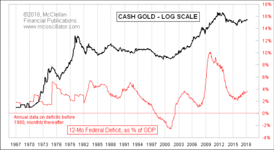
Something else to keep a close eye on is rising deficits in the U.S. Below, Tom McClellan’s chart (McClellan Financial Publications) of the Federal deficit as a percentage of the GDP and gold is interesting in a number of ways. While the correlation is not perfect, it appears to suggest that as the deficits rise as a percentage of the GDP, gold prices start rising too.
While not shown, rising deficits as a percentage of the GDP also seemed to precede a stock market collapse or correction, although not always. Gold seemed to do poorly during periods of falling deficits as a percentage of the GDP, as was seen during the 1990s. But as deficits rose after 9/11 and the dot-com collapse, gold prices started rising.
Gold prices really took off as the deficits soared after the financial collapse of 2008. But when the deficits eased off, gold prices also came off. Now, the deficits are rising again, and Trump’s $1.5 trillion tax cut is expected to raise deficits for the next decade. It is noteworthy that since Trump was inaugurated in January 2017, the U.S. debt has leaped by over $1 trillion. It is expected that a $1 trillion deficit is not far behind. Rising deficits also put pressure on interest rates as other borrowers are pushed out to accommodate growing demand from the U.S. Treasury.
© David Chapman
Two things would bring down interest rates: a geopolitical crisis and a financial shock along the lines of 2008. Both are clearly possible. While the markets are concerned about rising interest rates, their focus right now is on strong earnings. However, since January, this focus has been interrupted by trade concerns, geopolitical concerns, and rising interest rates and QT. Those are not going to go away, and they could yet be the undoing of the market. But they could also result in rising gold prices as an alternative safe haven.
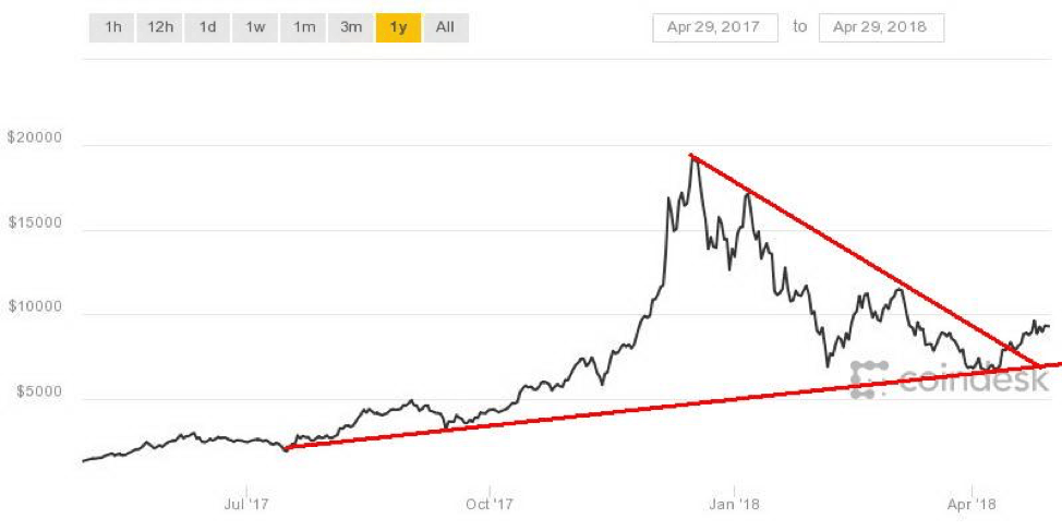
Bitcoin watch!
© David Chapman
Bitcoin continues its recent rise: it has successfully tested $9,000 and seems poised to move higher. The next major zone of resistance appears to be up around $9,800 to $10,000. The most recent high was seen just under $9,800 before Bitcoin pulled back. After hitting those levels, Bitcoin did pull back and went back under $9,000. Given Bitcoin shrugged off what appeared to be a bearish drop under $9,000 it should now move higher.
A move back under $8,700 would be bearish, and a drop to $8,400 could then be in the works and even down to $7,800 to $8,000, where there would be better support. On Wednesday, April 26, 2018, the Bitcoin futures contract saw its largest by volume one day ever. The day closed with Bitcoin higher. That would be a positive development, considering that the day before, Bitcoin had what appeared to be an outside reversal day and closed lower. Follow-through to the downside would have been negative, but instead, Bitcoin reversed again and rose on a surge of volume.
We can’t help but notice the cryptocurrency world just keeps on growing. According to Coin Market Cap, there are now 1,591 different cryptos, up from 1,574 of the previous week. While we keep calling for the number of different cryptos to drop and many to just disappear, the opposite seems to be happening. The universe keeps on getting bigger. Either the crypto world is made up of fools or it is us and our sense that says this remains in a bubble of huge proportion that is being made a fool of.
The total market cap is $421 billion, and Bitcoin (BTC), Ethereum (ETH), and Ripple (XRP) represent 61.3% of the market. That’s interesting as the Fibonacci number is 61.8. A total of 28 have a market cap in excess of $1 billion. Dogecoin (DOGE) is still listed as the 38th largest with a market cap of $640 million. It is an admitted “parody” and was introduced as a “joke currency.” Yet it thrives. It is yet another sign of the bubble that cryptos remain in despite a drop of upwards of 60% from the highs. The bulls, of course, would say it is a sign of the strength and staying power of cryptos that are expected to continue to grow and eventually supplant fiat currencies.
That is interesting as regulators continue to circle and there continue to be stories of scams and outright cases of fraud that, in some cases, have cost investors millions. Central banks have shown no interest in getting involved in cryptos even as some countries try to create their own crypto. A survey at one time suggested that some 16 million Americans owned cryptocurrencies and 5% owned Bitcoin.
The trouble with these cryptos is that the people who start them up probably own the biggest share and that only a small percentage globally hold significant amounts. The vast majority of holders are in Asia, particularly Korea, Japan, and even China. Another story suggested that one in three millennials will own a cryptocurrency by the end of 2018. Millennials, given their understanding and use of computers, are in many respects more attracted to cryptos. Older people are more likely to shun them.
It is possible that growing demand is pushing cryptocurrencies higher, particularly the big three. But with now almost 1,600 different cryptos, one fails to see the logic that all of them are going to be acceptable for transactions. We await a push to $9,800/$10,000 resistance. Support continues at $8,700/$8,800.
Markets and trends
© David Chapman
© David Chapman
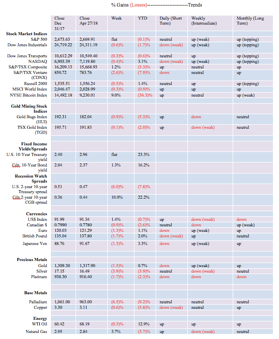
The markets faltered this past week, failing to build on the previous week’s gains. The Dow Jones Industrials (DJI) fell 0.6%; however, the S&P 500 was flat on the week. The NASDAQ lost 0.4% despite stellar earnings from Netflix, Facebook, and Amazon. The Dow Jones Transportations (DJT) were off 0.3%, while the small-cap Russell 2000 dropped 0.5%. In major international markets, the MSCI World Index and the German DAX both fell 0.3%.
But others gained with the London FTSE 100 up 1.9%, with the Paris CAC 40 jumping 0.8%, the Shanghai Index (SSEC) up 0.1%, while the Tokyo Nikkei Dow (TKN) rising 0.7%. The DJI had a big down day on April 26, when at one point, it was some 500 points off due to fears of trade wars with the EU, war with Iran, rising inflation, and the 10-year U.S. Treasury note going through 3%. But when more stellar earnings came out, the markets rebounded. Amazon earnings were a catalyst.
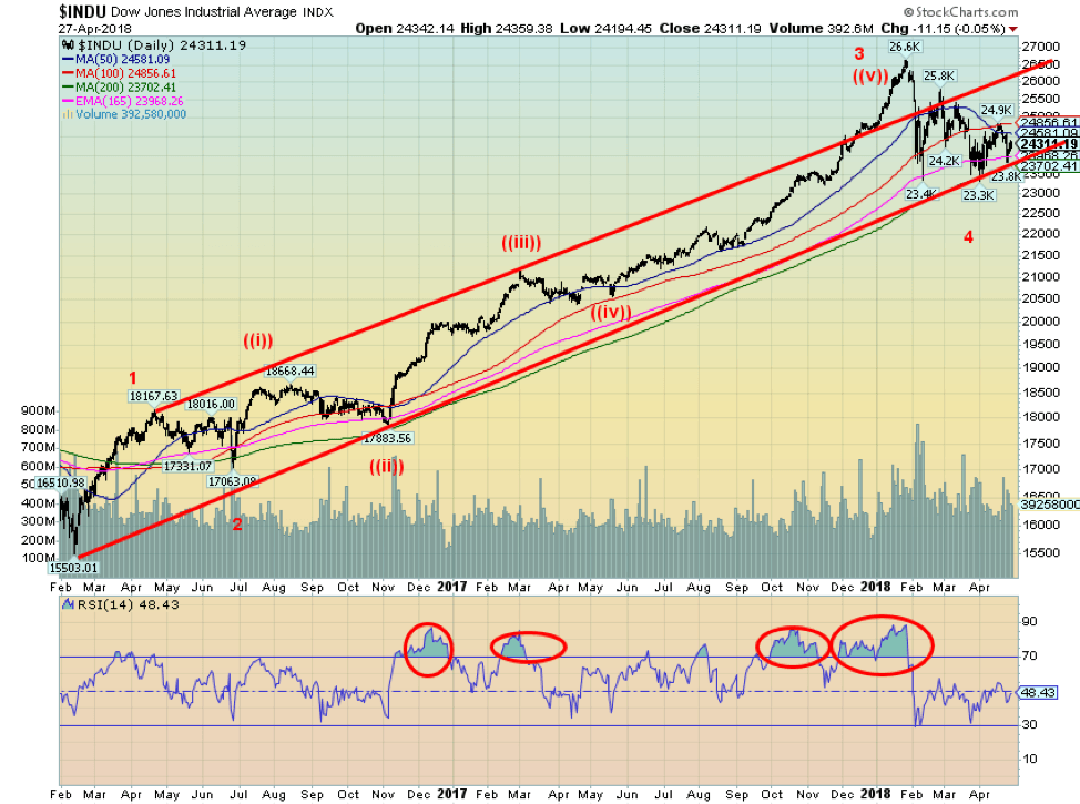
The market hesitated on Friday but couldn’t gain enough to put it in the plus for the week. The DJI has considerable resistance up to 25,000, but above that level, a run towards 26,000 should get underway. Generally speaking, the DJI has consistently found support down around the 200-day MA. It is also holding that trendline up from the February 2016 low. We continue to label this recent correction as wave 4 up from the February 2016 low. This differs from Elliott Wave International, which believes that the market made its final top in January 2018. It may be correct, but what we need is confirmation with a solid close below the 200-day MA and persistent trading below that watermark. As well, we have yet to see any significant divergence with the DJT. Usually, at important tops and bottoms, the DJI and the DJT diverge from each other. So far, they have been moving in sync. That is why one more high might give us that divergence with one of them making new all-time highs but the other not confirming. Dow Theory suggests the markets must confirm each other.
© David Chapman
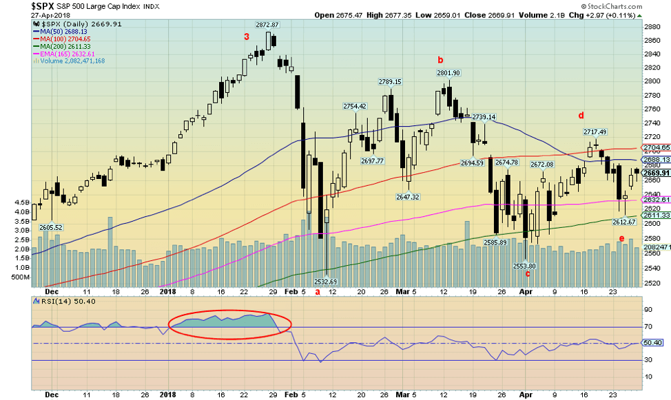
It was interesting to read this week that Elliott Wave International noted a potential alternative wave count for the U.S. stock markets. Up until now, it had consistently said that the stock markets topped in January and that it was the final one. We deferred and wondered whether, instead, this may just be a wave 4 correction. We thought it had all the earmarks of one, given it was short and swift, falling 10% or so. Elliott Wave is now offering an alternative that suggests the market may be tracing out an ABCDE type of correction.
Naturally, it is inconclusive so far. And Elliott Wave does note it is an alternative and not its preferred count. It is just recognizing there are other possible interpretations. And Elliott Wave is very interpretive. Given consistent testing of the 200-day MA and so far holding that level, it may be that the S&P 500 has completed its ABCDE wave and is now poised to move higher. Naturally, we need to take out the recent high at 2,717 and even more preferably eventually take out the March 2018 high at 2,801.
Potential minimum targets to the upside could be 2,952 with maximum potential up to almost 3,200. Right now, we wouldn’t bet on any more than the minimum target, largely because we realize whatever this wave might be, it should be the final one before a more significant market correction sets in. That market correction that would have multi-year ramifications and probably not bottom until at least 2020 and even as late as 2022.
© David Chapman
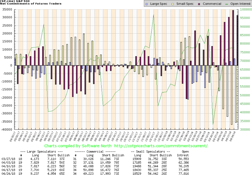
The commercial COT for the S&P 500 remains bullish despite a drop this week to 73% from 76% the previous week. Long open interest fell roughly 1,600 contracts, while short open interest grew about 1,500 contracts. Not surprisingly, the large speculators COT (hedge funds, managed futures, etc.) jumped to 65% from 60% as they increased their long bets by roughly 1,500 contracts. The S&P 500 commercial COT is off its highs seen just four weeks ago but remains relatively bullish. It may well be, and it would not be surprising that as the market rises, the commercials (banks, etc.) are lightening their long positions.
© David Chapman
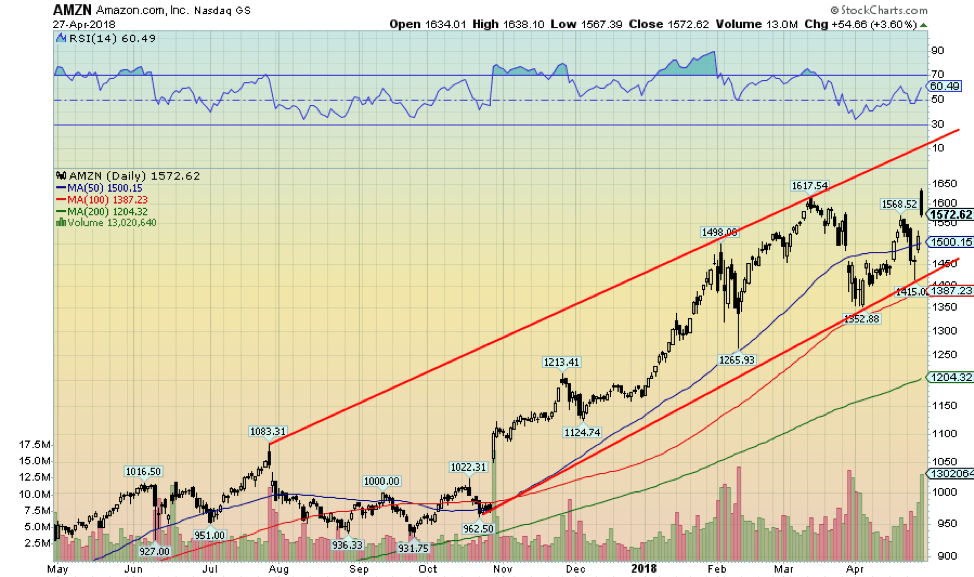
Given its stellar earnings report, it may have been no surprise that Amazon (AMZN-NASDAQ) leaped to new all-time highs this past week. Whether that can be sustained is another question, but if the market were to continue on its current trajectory, then it is possible that Amazon reaches the top of that bull channel near 1,750. By then, numerous negative divergences would be showing up in the indicators and a warning sign that Amazon could suffer another corrective down move.
© David Chapman
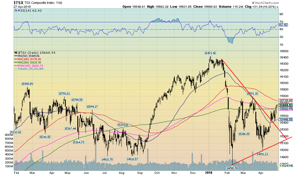
While the U.S. stock markets stumbled this past week, the TSX Composite did not, rising 1.2% and defying the weakness seen in the U.S. markets. The TSX Venture Exchange (CDNX) did not fare as well, falling 2.6%. Despite the gain this past week, the TSX Composite remains down 3.3% on the year. Leading the upward charge for the TSX was Financials with a gain of 2.5%.
Consumer Staples and Industrials both gained 2.4%. The big losers were Health Care, down 3.4%, and Metals & Mining, off 2.9%. The TSX Composite appears to have broken out of a downtrend line and has regained above the 200-day MA and the 165-day EMA. Above lies resistance at the 100-day MA, currently at 15,735. The triangle formation suggests a potential move to just over 17,000. As they have already demonstrated, one of the leading sectors may well be Financials along with Industrials. Energy is also showing positive signs, and if it ever gets going, Golds should rise, which would take Materials with it. In the interim, there is resistance up to at least 15,800 to overcome.
© David Chapman
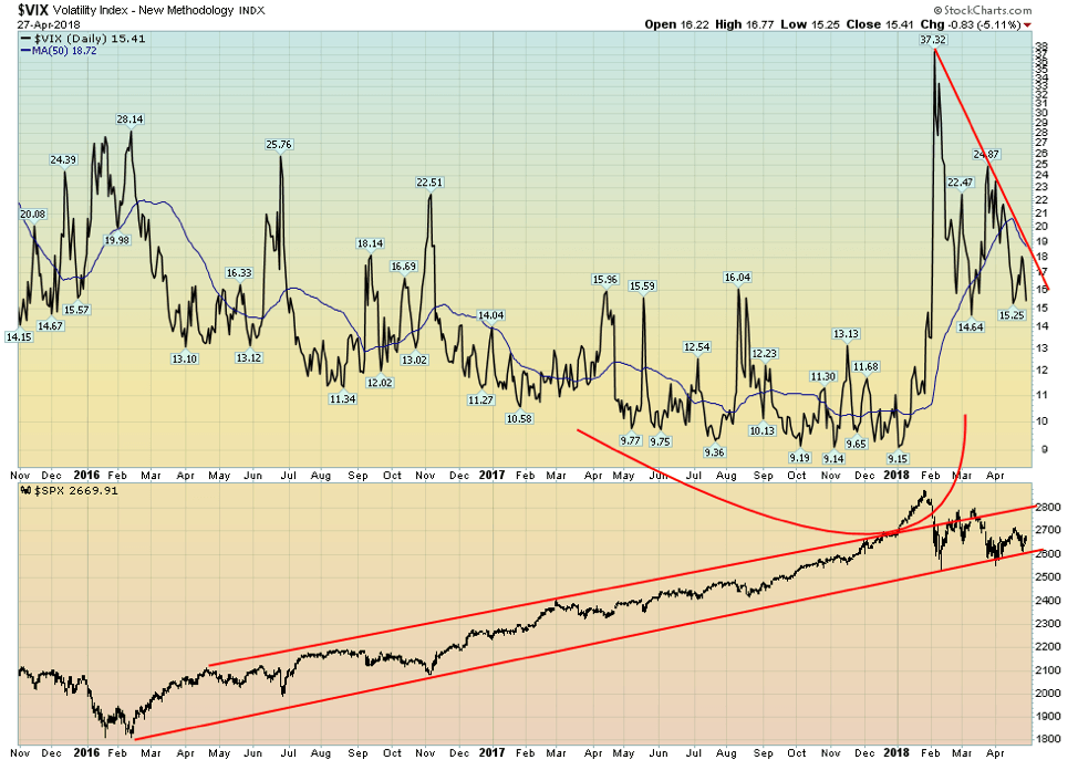
The recent action in the stock market has coincided with a drop in volatility. The VIX volatility indicator briefly spiked this past week when the stock market (DJI) fell some 500 points but quickly resumed its downtrend when there was no downside follow-through. The low volatility levels seen throughout 2017 are no doubt a thing of the past. Even if the stock market were to move to new highs, the expectation here is the VIX indicator will come nowhere near the lows seen in 2017. It is a sign that volatility has returned to the markets and also a warning sign that volatility could get worse at a later date.
The chart of the S&P 500 from the important February 2016 low shows how it overthrew its trendline at the top into January 2018. Since then, the S&P 500 has returned to its longer-term up channel. It may very well test the top of the channel, currently near 2,900, but we do not expect another overthrow. We are showing this chart to demonstrate how volatility rose during the recent drop in the market and that, while volatility is down from its peak, the likelihood of it reaching the lows of 2017 is virtually nil. That is another sign that this market is on its last legs before a more significant market correction potentially sets in.
© David Chapman
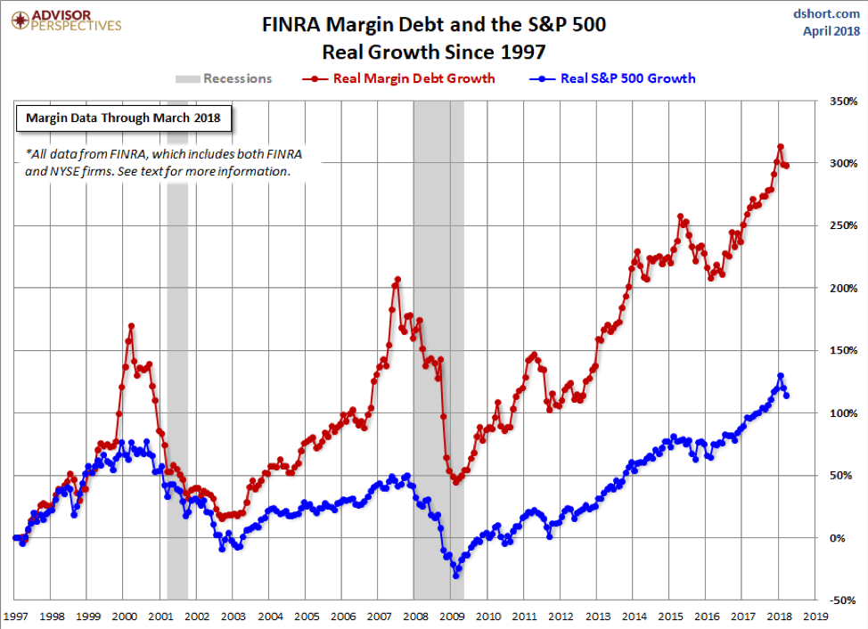
Rather than show actual margin debt vs. the S&P 500 the above chart shows real growth of margin debt vs. growth in the S&P 500 from 1997 onward. Margin debt grew with the market up to 1999, and then, for whatever reason, took off into the stratosphere and peaked in March 2000 at the same time as the S&P 500. Naturally, margin debt contracted with the stock market during the dot com/high tech collapse of 2000–2002.
After that, margin debt started growing again but generally at a faster pace than the S&P 500. In 2006, the margin debt growth took off and peaked significantly just before the stock market top in October 2007. Both the stock market and the margin debt collapsed during the financial crisis of 2008. As seems to be always the case, the latter started recovering with the stock market into 2011 when a correction occurred because of the EU/Greek/PIGS debt crisis.
The stock market didn’t fall all that much, so after a hiatus, the margin debt started growing again. Only the pace quickened. Except for the drop in 2015/2016 with the market correction following the end of QE, the growth in margin debt just kept on going up at a much faster pace than the stock market. Now, here we are in 2018, and it has grown an incredible 300%, while the stock market is just up over 100%. The growth of margin debt is another sign of the bubble that has taken place in the stock market, and its huge growth is yet another warning sign that a more severe correction could soon be on its way.
© David Chapman
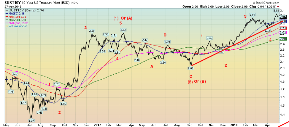
The 10-year U.S. Treasury note broke the 3% barrier this past week, hitting a high close of 3.03%. It, however, failed to hold the level, dipping back below 3% to close the week unchanged from the previous week at 2.96%. All this came against the backdrop of GDP growth for Q1, reported at 2.3% annualized, and an employment cost index that rose 0.8%, contributing to a year-over-year growth of 2.7%, the highest since 2008.
The Q1 GDP growth was above the expected 2% but below the Q4 growth of 2.9%. Bonds had also been driven by rising commodity prices that were contributing to an uptick in inflation. However, commodity prices pulled back this past week as the US dollar strengthened on the higher-than-expected GDP, wage growth, and solid earnings reports. The 10-year at 3% also attracted buyers as it was the best yield seen since 2013, the last time a yield of 3% or higher was seen on the 10-year.
The charts are still telling us that potential targets for the 10-year are up at 3.15% to 3.20%. Following a pullback, the expectation is the 10-year would resume its upward trek. However, a break of 2.85%/2.86% suggests the rise in yields may be over. Major support can, however, be seen down to 2.50%. Not surprisingly, the commercial COT for the 10-year rose to 57% this past week from 56% the previous week.
The same was seen for the long 30-year U.S. Treasury bond, where its commercial COT rose to 52% from 49%. Seems that as the yields went past 3%, the major players in the market started buying and placing bets that bonds were attractive and could soon fall in yield. Prices move inversely to yields, so as prices rise, bond purchasers would benefit.
Recession watch spread
© David Chapman
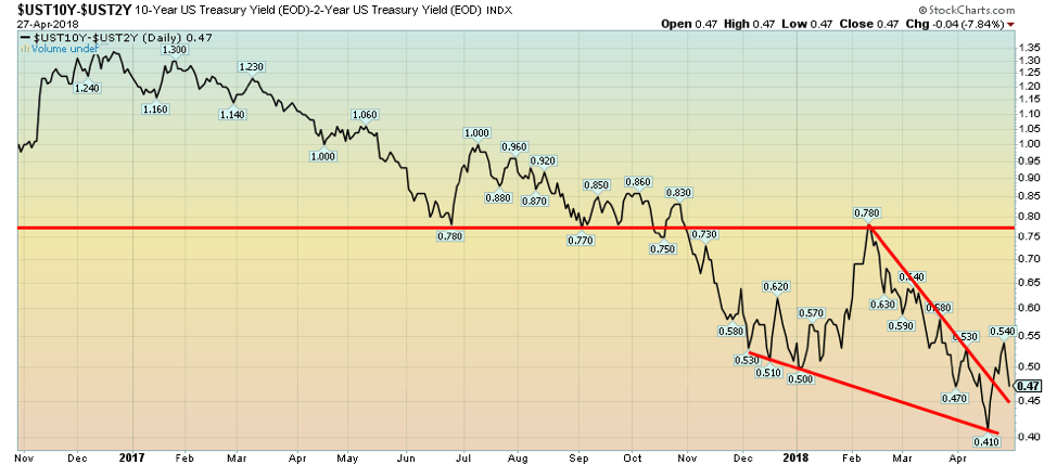
With the 10-year U.S. Treasury note pulling back this past week after hitting over 3%, it sparked a decline in the 2–10 spread as the 2-year U.S. Treasury note was relatively stable. The 2-year is more sensitive to the machinations of the Fed where many expect the Fed to hike the key rate at least two more times in 2018. As a result, the 2–10 spread, which earlier in the week had hit a high of 0.54%, fell quickly to close the week at 0.47% down from 0.50% the previous week.
The trend of the 2–10 spread remains down but is not yet at levels that might be signaling an impending recession. However, given that the trend remains firmly to the downside, the spread is flashing a warning sign. Remember, the spread fell despite higher-than-expected Q1 GDP and wage growth. The narrowing spread is signaling that despite the rosy numbers, all may not necessarily be well.
© David Chapman
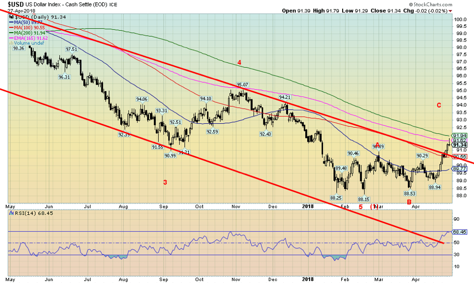
Pushed by higher interest rates as the 10-year U.S. Treasury note cracked 3%, plus better than expected Q1 GDP results and faster than expected wage growth, the US$ Index broke out to the upside, busting the downtrend line that had been in place for months. To no one’s surprise, the stronger dollar had a negative impact on commodities and in particular gold and silver as they fell in price. It is clear now that all the sideways movement that had been taking place since February was merely a setup to break to higher prices.
We now know for sure we are in the process of correcting the down move that got underway back in January 2017 at 103.82. Minimum objectives could be at least a move to 91.85. We are currently near that level with Friday’s close at 91.34. The next level could be up at 94.15 and even as high as 96.00. Given the proximity to the initial target, the suspicion is the US$ Index would have further to climb. The Euro has started falling and could have further to fall against the dollar. But all currencies are suffering. Support is now defined down to 90.50.
Only a breakdown under 89 would suggest to us that the rally is over and we are in the process of resuming the downtrend. Rather than a big straight up move, the US$ Index is more likely to undergo sideways action with an upside bias. We could be wrong, but…who knows? Next resistance is at 92.50 and up to 94.
© David Chapman
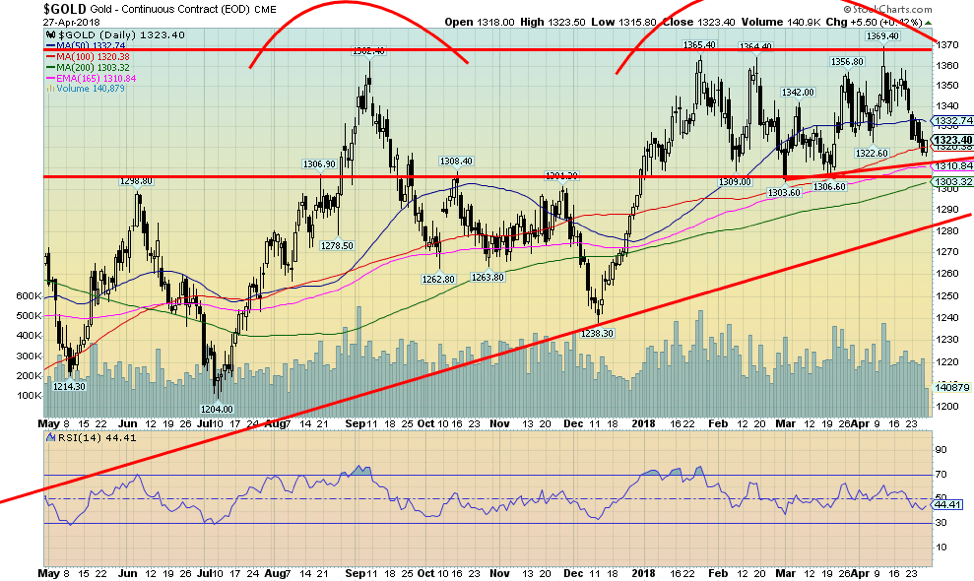
Given the stronger dollar, it is probably no surprise that gold and silver both lost ground this past week. Gold was off 1.5% on the week, while silver was even weaker, losing 3.9%. Key support for gold is seen down to $1,310, but under that level, a decline to $1,300 is likely. Under $1,300, gold could fall to major support between $1,280 and $1,290. Overall, our cycles for gold are not particularly negative at this time, so the weakness is surprising.
However, weakness into June/July is not unusual. Gold can rally even if the dollar is rallying. One of the most notable periods was January 2005 to May 2006 when both rose together. Gold also rose with the dollar from January 2010 to June 2010. But generally, gold tends to rise when the dollar falls and vice versa. Gold has resistance up to $1,330, and major resistance continues at $1,370.
We feel confident there is another significant leg up in gold to come, but we may not get underway until July when seasonals turn positive once again. It is not that the seasonals are weak right now as gold often did well into May but then faltered seasonally into June/July.
© David Chapman
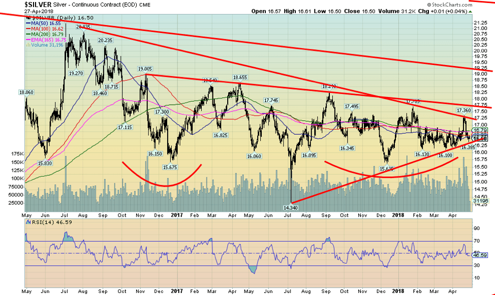
After bursting through to what looked like a breakout, silver reversed and came tumbling back down this past week. It ended the week not only down 3.9% on the week but also back under the key MAs of 50, 100, and 200-day MAs. That put quite a damper on what was believed to be a good breakout. Tellingly, silver failed at a downtrend line from highs seen in July 2016. The high for the move was at $17.36, which was short of breaking out over the high of January 2018 at $17.70.
Silver’s major breakout doesn’t occur until it is over $19. Despite the continued strong bullish commercial COT, the silver chart is now looking a little shaky again. But silver remains cheap compared to gold. We note volume picked up on this breakout to $17.36 but faded once the market turned around and fell again. Silver continues to form what we believe is a significant bottom pattern. But we admit it is frustrating that a major breakout is taking so long.
Resistance up to $16.80 and to $17.00. Silver could break uptrend support under $16.25 and target lower down to $15.65 support. Something has to give. The triangle is getting tighter—or it could just waffle through the triangle.
© David Chapman
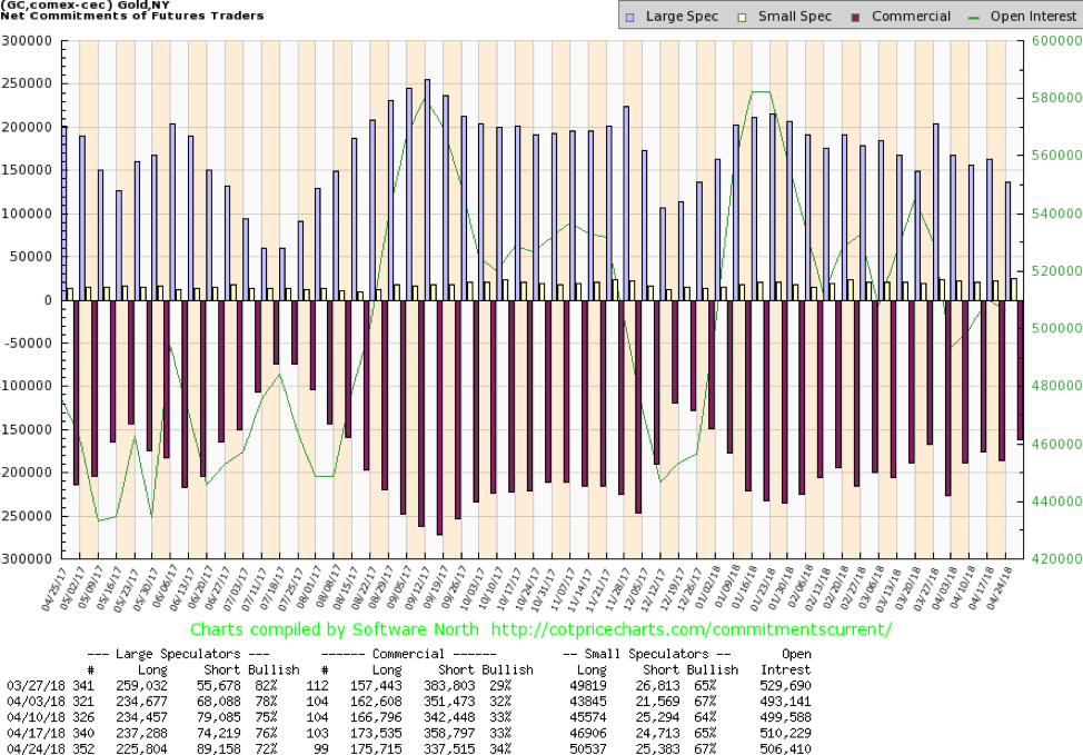
The gold commercial COT actually improved this past week to 34% from 33% while the large speculators COT fell to 72% from 76%. The commercial COT was encouraging against the backdrop of weak gold prices and a rising dollar. Long open interest rose just over 2,000 contracts, while short open interest fell some 21,000 contracts, indicating that the commercials were covering shorts as the gold price fell. The commercial COT remains mildly bullish. Strongly bullish would be readings over 40%.
© David Chapman
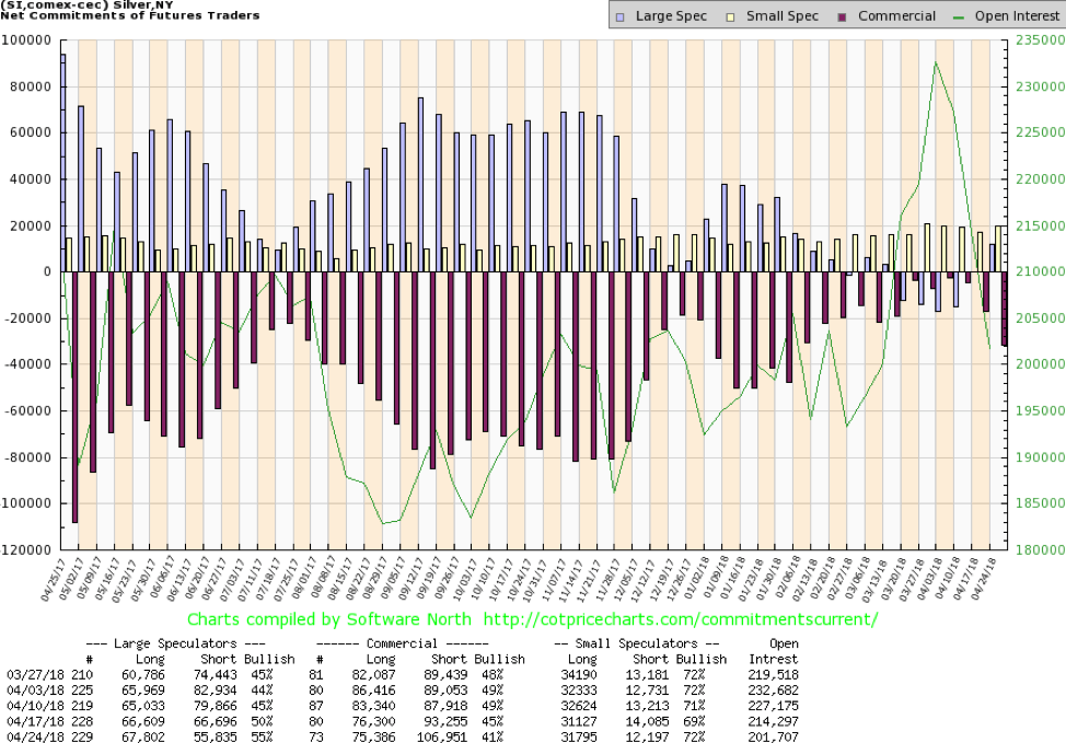
The silver commercial COT slipped this past week to 41% from 45% as commercials added to their short open interest by roughly 13,600 contracts. Long open interest fell about 1,000 contracts. It was disappointing, and the silver price took a hit this past week after reaching resistance. Not surprisingly, the large speculators COT jumped to 55% from 50% as they mostly covered shorts rather than adding to longs.
The commercial COT is still bullish, just not as bullish as it has been. Next week’s COT will be interesting to see if the commercials picked up silver during this past week’s drop. Given how cheap silver is, we would be surprised to see the commercial COT fall further.
© David Chapman
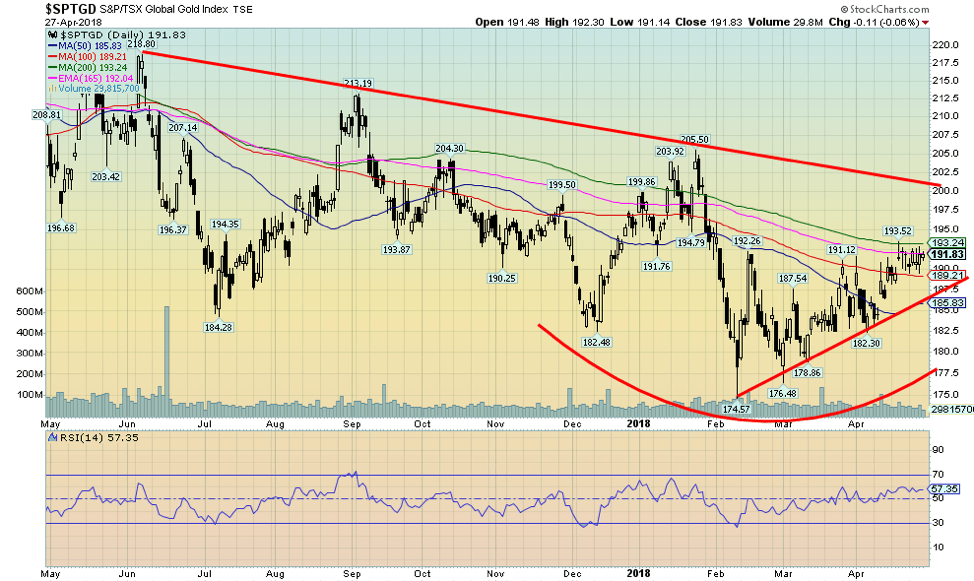
The TSX Gold Index (TGD) went sideways this past week losing a small 0.1%. The Gold Bugs Index (HUI) didn’t fare quite as well off 0.9%. Both remain down on the year with the TGD off about 2% and the HUI down 5.3%. The TGD appears to have stalled out just under the 200-day MA. The TGD has moved up nicely since the low seen in February, gaining just under 10%. Sentiment towards the gold stocks remains low but has been improving.
The TGD remains down roughly 7% from its high seen in earlier in the year. The TGD made an interesting divergence to the price of gold at its February low. The TGD made a lower low below the December 2017 low whereas gold did not. We view that as a potentially bullish sign. Major resistance is seen up at 200 with some further resistance up to 210. Above 210, the TGD has potential to rise sharply and quickly. Support is seen down to 185 and then to the February low near 175. The TGD has been establishing a nice slow uptrend since the low in February.
© David Chapman
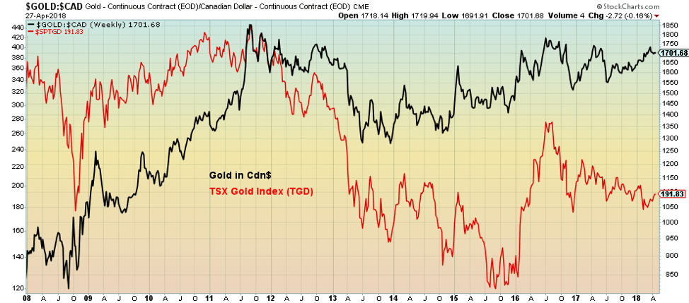
Since the 2008 financial crisis, gold and the gold miners have been on a rollercoaster ride. The bottom was seen in September/October 2008 for gold and the miners. Since then, gold in CA$ is up 109%, but the miners (TGD) is only up about 27%. Pretty pitiful. At one time, the miners were up over 200% in September 2011. Gold in CA$ peaked back then at $1,905. Today, it is $1,702, only off about 11% from that high vs. the TGD down 58% from its top.
The reality is that gold mining shares are much more speculative and carry a higher degree of risk. Timing is important for the gold stocks vs. gold itself. For those that buy and hold, holding the physical metal is a better investment strategy than holding gold stocks. It is actually easy to buy physical gold and store it. One can purchase it in a mutual fund through BMG Group or a closed-end fund through Sprott Securities or Central Fund. There are ETFs and others, but they are not necessarily physical gold.
The gold stocks today are cheap compared to gold. So as a speculative investment, the gold stocks can be a better purchase. The most speculative are the junior gold mining exploration stocks that trade predominantly on the TSX Venture Exchange (CDNX), often for pennies. But they also have potentially the biggest reward. The best is to hold gold itself as a hedge against government and digital and systemic risks to the international monetary system.
Chart of the week
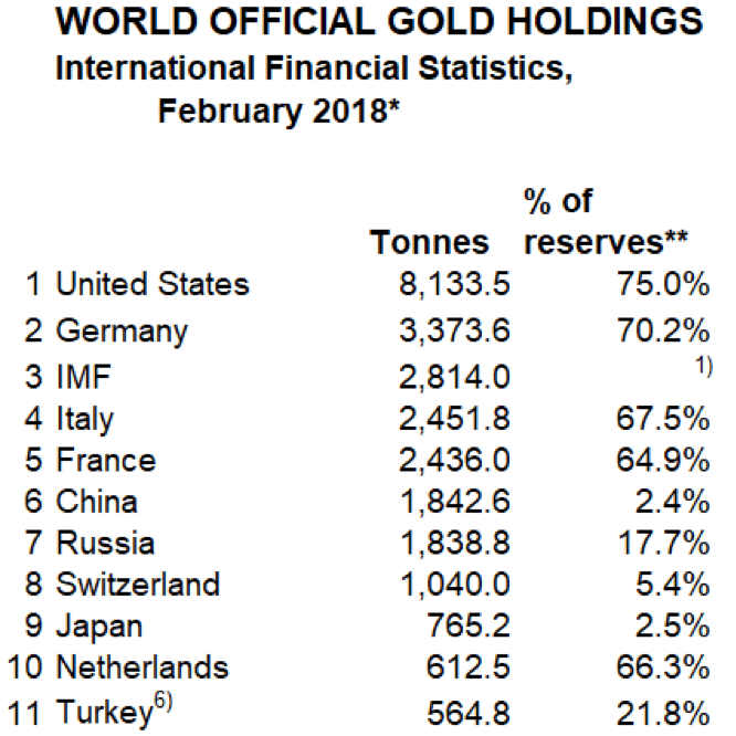
(Source: World Official Gold Holdings)
Since the end of World War 2, most countries held their gold reserves in with the Fed (U.S.) or the BOE (U.K.). They held their reserves there because the two were considered the safest place to keep their reserves. That is not so much the case anymore. Recently, Hungary joined a growing line of countries repatriating their physical gold reserves from the U.S. or the U.K. Hungary is merely joining a long line-up of countries that have included Germany, Netherlands, Austria, and more recently Turkey in repatriating gold. The Netherlands brought back 120 tons, while Austria took back 15 tons.
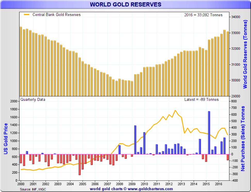
Gold reserves, instead of falling, have actually gone up during the past few years. According to the World Gold Council, the world’s central banks hold some 33,800 tons of gold. The big growth has come largely since the 2008 financial crisis. Back in 2008, central bank gold reserves had fallen under 30,000 tons. The financial crisis of 2008 spurred a number of central banks to increase their gold reserves.
This was led by China and Russia, which both wanted to strengthen their currencies, the Yuan and the Ruble. Today, both hold over 1,800 tons of gold. But Chinese gold reserves represent a mere 2.4% of their total reserves. They continue to hold over $1 trillion of U.S. Treasury securities. Russia’s gold reserves constitute 17.7% of their reserves. They hold roughly $100 billion of U.S. Treasury securities.
© David Chapman
The world’s largest holder continues to be the U.S., holding 8,133.5 tons of gold reserves representing 75% of their total reserves. The holdings of Germany and the IMF are considerably lower. So why do countries continue to hold gold reserves when we constantly hear that gold is a useless asset? Well, it seems those are the same reasons why everyone should probably hold some gold reserves.
Central banks themselves have noted they hold gold for numerous reasons—non-correlated asset, crisis prevention, diversification of currency reserves, emergency reserve, a safe-haven asset, liquidity, nobody’s liability, gold’s historical role in the international monetary system, a contingency against unseen events, to enhance confidence in the currency, an inflation hedge, and a store of value.
Gold has been around as money for at least 3,000 years, possibly longer. The Greeks started issuing gold coins (electrum actually containing gold and silver—ancient Lydian coinage contained 45%-55% gold, the rest in silver) as far back as 600 BC. The world has, over the centuries, been through numerous periods of gold standards and gold coins being the reserve currency. Yet today, in some circles, gold is just a barbarian relic. The world has been off the gold standard since August 1971 when we embarked on the latest fiat currency experiment.

Electrum Stater – Kyzikos, Mysia c. 550-450 B.C.
(Source: www.forumancientcoins.com)
No, gold has not gone away. Indeed, judging from the rise in gold reserves since the 2008 financial crisis, it has once again become an important cog in the international financial system. Given that some countries are repatriating their gold, they are either more confident of holding it themselves or nervous about leaving it with a foreign country, where it could be subject to confiscation.
One final note. One central bank holds no gold. They sold all of it, including gold coins they held. That central bank is our very own Bank of Canada (BofC). Obviously, they did feel gold was just a barbarian relic. Others see it differently.
—
DISCLAIMER: David Chapman is not a registered advisory service and is not an exempt market dealer (EMD). We do not and cannot give individualised market advice. The information in this newsletter is intended only for informational and educational purposes. It should not be considered a solicitation of an offer or sale of any security. The reader assumes all risk when trading in securities and David Chapman advises consulting a licensed professional financial advisor before proceeding with any trade or idea presented in this newsletter. We share our ideas and opinions for informational and educational purposes only and expect the reader to perform due diligence before considering a position in any security. That includes consulting with your own licensed professional financial advisor.


El Dorado Raises $9M to Expand Cross-Border Fintech Platform
El Dorado, a Latin American fintech improving cross-border financial services, raised a $9 million Series A led by Paradigm with...


Bitcoin Stalls Near $60K as Strategy Moves, ETFs Outflow, and EU MiCA Rules Take Effect
Bitcoin hovers near $60,000 with ETF outflows, while Strategy boosts reserves, sells BTC, and raises dividends to reassure investors. Ethereum...


Cannabis Dominates Global Drug Use: Trends, Risks, and Shifting Markets
Cannabis remains the world’s most widely used illicit drug, with 256 million users in 2024, surpassing all others combined. Growth...


Italy Approves First Hydrogen-Powered Train for National Rail Network
ANSFISA has approved Italy’s first hydrogen-powered train, the Alstom HMU214, for use on the Brescia–Iseo–Edolo line. Capable of 140 km/h,...


Cotton Market Weakness Persists Despite Brief Rebound
Cotton prices fell to new lows last week before a modest rebound. USDA data shows crop conditions remain worse than...
 |
|
 |  |
 |
|
-

 Fintech2 weeks ago
Fintech and AI: Adoption Grows, but Profits Favor Agile Innovators
-

 Fintech5 days ago
PayPal’s Slowdown: From Fintech Leader to Low-Growth Dividend Stock
-

 Impact Investing1 week ago
Edison Accelerates Renewable Growth and ESG Impact in 2025
-

 Cannabis7 days ago
Spain Cannabis Laws: Private Use, Fines, and Grey Areas
You must be logged in to post a comment Login