Featured
Stock prediction: Step aside, Mr. Bear, the bull continues
There’s a market turnaround based on rising trade volume while gold’s step sum continues its advance.
CNN Money reports that the bull market isn’t over just yet. However, personally, I’m still thinking the advance that began in March 2009, 10 years ago is getting pretty long in the tooth.
Take this news from General Electric. It’s not enough GE in the past year was removed from the Dow Jones, where it’s been since horses pulled taxis down Wall Street, a time when high-tech was steam-powered locomotives. In the past year, its dividend has been cut from $0.24 to $0.01. That plus now in October 2018, the SEC and Justice Department are conducting investigations into GE’s accounting.
I’m no accountant. But I’m not ignorant of the ways basic economics affect human beings, including people with degrees in business.
How many times have you heard promotors of real estate advise people to buy now while mortgage rates “are still cheap”? I’m sure quite a few times in the past decades, as real estate prices, for the most part, have done nothing but go up.
In a world where money is no longer gold or silver, but whatever that engine-of-inflation the Federal Reserve says it is, finance (not price), the old “can we afford the monthly payments” has become all. And like prospective working-class homeowners, GE and you can bet many other famous American corporations over the past 10 years have taken on acquisitions not because the deals were actually good, but because the money from the Federal Reserve was so cheap they simply couldn’t say no if they wanted to “grow” and stay competitive.
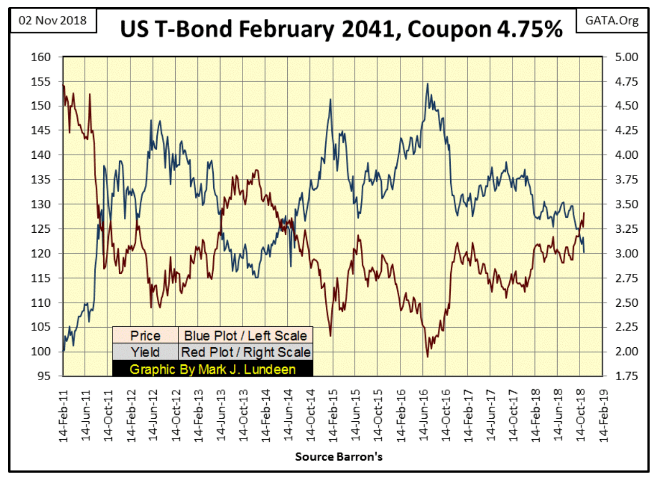
Well, who could have guessed this was to happen—interest rates are now rising, and the underlying asset purchased with this debt is deflating. The following chart of a US Treasury bond provides us with maybe an imperfect example, but I believe a valid one as many corporate assets have been collateralized in their M&A (Mergers & Acquisitions) activities.
© Mark Lundeen
I imagine GE management’s situation is something like this: They’re trapped like rats holding assets they paid too much for, assets that have done nothing but lose money, assets they now can’t sell.
And sell to who? The entire global corporate structure in November 2018 is now dangerously over-leveraged. In the coming year, corporations are going to discover how scheduled payment of the debts they’ve taken on these past 10 years is getting harder all the time. And with rates and bond yields rising; everything is becoming “too expensive” fast, even as collateral valuations deflate.
GE’s management must have attempted to hide the details of their self-inflicted wounds in their accounting, which ultimately led to investigations by the SEC and DOJ. So who’s next is the question in my mind. Watching to see which blue-chip company wants to drastically cut their dividend, as GE did in November 2017 seems to be key in knowing who’s in trouble.
After all, for a corporation to cut their dividend payout, even to nothing, only upsets their shareholders. However, failure to make even a single coupon payment to their bondholders is, in fact, declaring the corporation is bankrupt. So keeping an eye on reductions in dividend payouts will prove to be key in identifying exactly who is having cash flow problems in the near-term future.
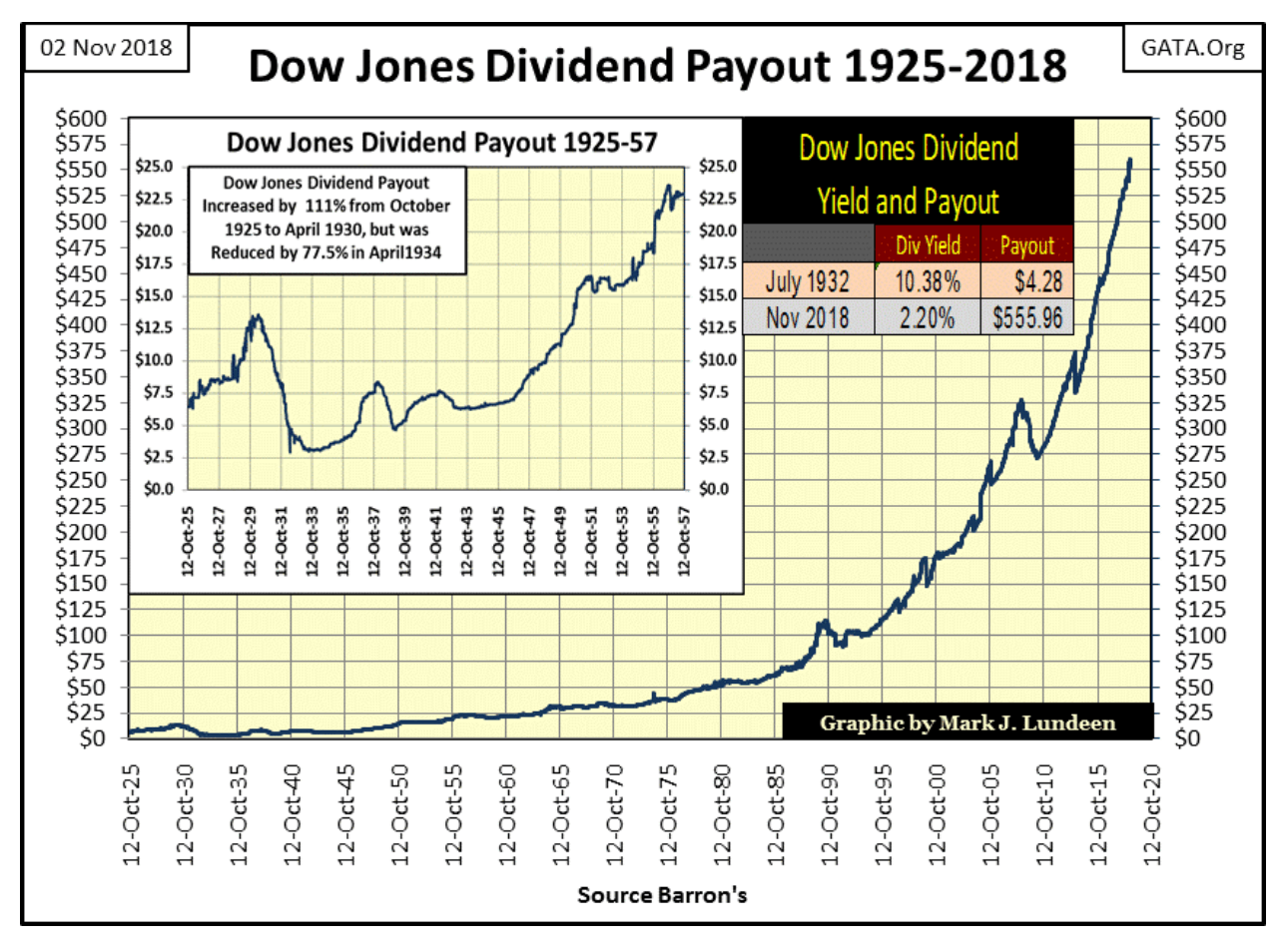
Currently, the Dow Jones is paying out a record dividend, and since October 2010, it just goes up and up. It will be interesting seeing how much longer this can continue. During the Great Depression Crash dividend payments from the Dow Jones were reduced by 77.5 percent.
© Mark Lundeen
This is what Mr. Bear does: He stress tests business assumptions made during the good times to see if they remain valid when everything is going to hell. And after four decades of “monetary policy” set by Greenspan, Bernanke and Yellen, four decades of innovative finance coming from Wall Street’s investment banking industry, there are many, many trillions of dollars underwriting brilliant (not!) financial inventions like “structured finance” and OTC derivatives that Wall Street has ensnared their captive-corporate clients, and you and me in.
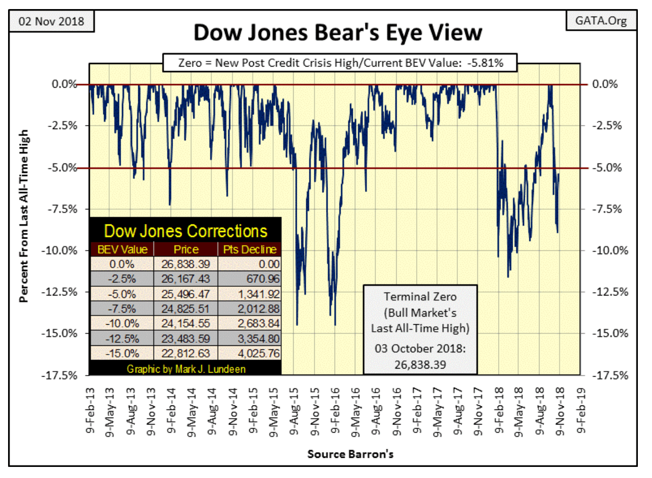
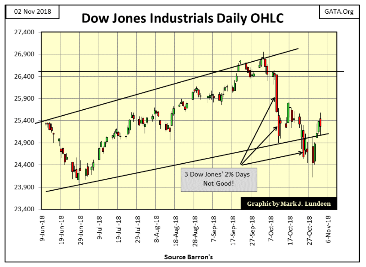
But putting all that aside at the close of this week, the Dow Jones apparently wants to go up again. Its current correction bottomed on Monday as its BEV plot below declined to -8.89 percent from its last all-time high of October 3, but recovered to -5.81 percent on the close of Friday.
© Mark Lundeen
Daily volatility for the Dow Jones is calming down. Well, beginning on Wednesday anyway as is apparent in the Dow Jones’ daily bar chart below. Though not yet the daily baby steps seen before October 3, we may see daily volatility subside in the weeks ahead of us. And if we do, we may see the Dow Jones make a few more new all-time highs. After all, at week’s close, it’s only 5.81 percent from its last BEV Zero (last all-time high). The market decline seen since October 3 really isn’t much, and technical damage to the Dow Jones minimal.
© Mark Lundeen
The problem with making any market predictions in this market is the “policy makers” are always there to interfere; making any market prognosticator’s opinion at odds against their “policy” appear ignorant of their trade.
Before Alan Greenspan became Fed Chairman, buyers and sellers set market prices. Investors (people attracted to rising prices), buying shares resulted in rising trading volume, and deflating prices drove investors and their money away, resulting in declining trading volume.
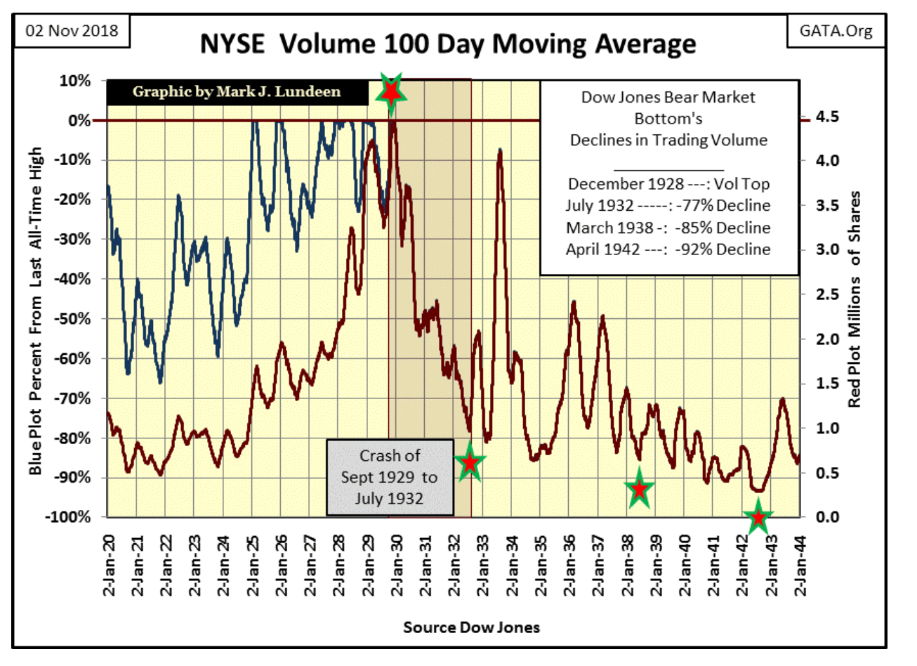
Below is a chart of the NYSE daily trading volume’s 100-day moving average from 1920 to 1944. There are actually two plots in it, one is the blue BEV plot (Left Scale), the other is the Red millions of shares plot (Right Scale).
From 1920 to 1930, these two plots are distinct from each other. But after NYSE volume’s 100 day M/A peaked in December 1929, by scaling the plots properly, a BEV Plot can precisely overlap its underlying data plot. This will continue to be so until the underlying data plot reaches a new all-time high. So from 1930 to 1944, the combined plots (now a single Red plot) can be read by its BEV value by looking to its Left BEV scale, or in millions of shares by looking to its millions of shares scale to the right.
Looking at the data:
- Rising trading volume (Red Plot) all during the 1920s indicates growing public participation in the 1920s bull market.
- During the Great Depression Crash, trading volume crashed by 77 percent in July 1932 as the public exited the market.
- A year later, the Dow Jones saw its best year ever, increasing by 156 percent from July 1932 to July 1933 as NYSE trading volume almost returned to 1920s levels.
- The Dow Jones saw a nice advance until its peak in March 1937, on good trading volume
- Which was followed by a double-bottom bear market: March 1938 & April 1942, both bottoms occurred on declining trading volume.
So there you have it:
- Rising Dow Jones = Rising NYSE Trading Volume
- Declining Dow Jones = Declining NYSE Trading Volume
And that was how the stock market worked until January 2000.
© Mark Lundeen
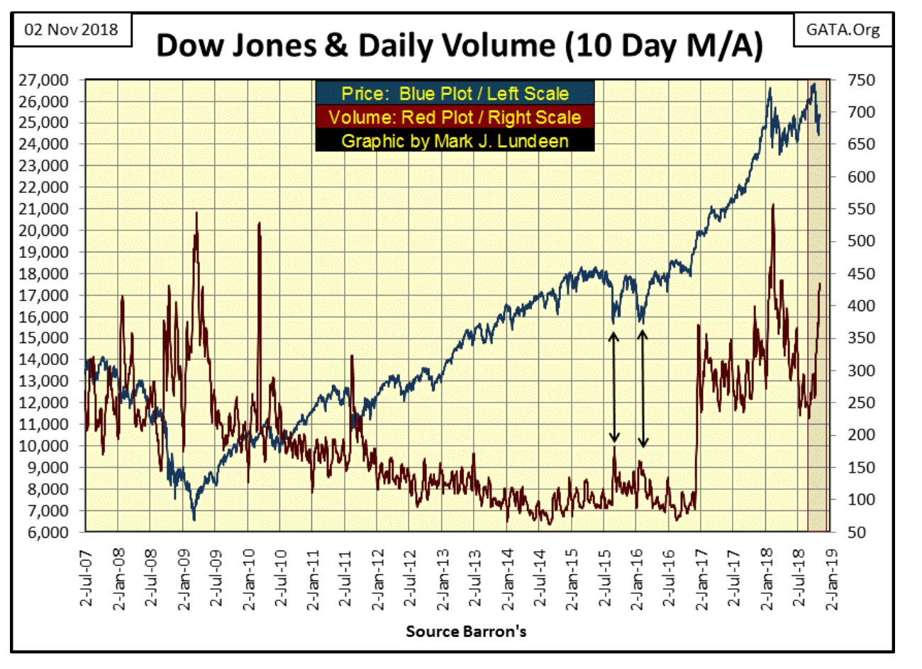
After January 2000 (chart below), advances in the Dow Jones occurred on declining trading volume, and historic bear market bottoms (March 2009) occurred on record trading volume; a complete reversal in the Law of Supply and Demand.
When a major market violates the laws of economics for almost two decades now, you just know it’s a “market policy” thing. It’s not you or me “injecting” the market with “liquidity”; so it has to be the “policy makers” doing their thing again as we see in the narrow red box below, with rising trading volume (Red Plot) once again on a Dow Jones (Blue Plot) 8.87 percent decline. And look at the declining trading volume in the Dow Jones from March-October 2018 as the Dow Jones recovered to new all-time highs.
© Mark Lundeen
This is all wrong, but there it is.
This is why I’m not big in making predictions on what or when the market is going to do anything, because on the other side of that trade are the “policy makers” who lie, cheat and steal as they inflate the money supply and manipulate market valuations with their unnatural (inflationary) market demand. As it is, with artificial demand from the FOMC entering the stock market, there is nothing stopping the Dow Jones from rising to new all-time highs sometime in the future.
But this can’t continue forever. Just ask the management of GE of what the ultimate consequences of living on cheap money and credit are. And that is what we are looking at above: cheap money and credit coming from the FOMC manipulating market valuations.
Look at the March 2009 bottom of the sub-prime mortgage bear market – the #2 all-time greatest percentage decline in the Dow Jones. It happened on historic record trading volume; yet another fingerprint left behind by the “policy makers.”
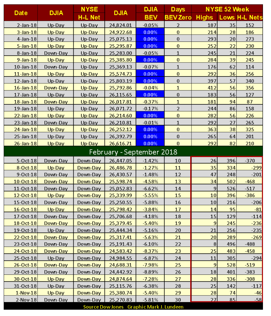
You can see the current flow of inflation into the market in the NYSE 52Wk Highs and Lows below. The upper part of the table lists the specifics for last January when the Dow Jones was surging to new all-time highs on almost a daily basis (Blue 0.00 percent / aka BEV Zeros). As it did many listings on the NYSE were doing the same (NYSE 52Wk Highs).
© Mark Lundeen
The last all-time high for the Dow Jones was on October 3, but note how only two days later (October 5) NYSE 52Wk Lows were overwhelming 52Wk Highs. Then on Wednesday, October 31 the volume of NYSE 52Wk Lows began to shrink as trading volume in the stock market expanded.
This is a situation we’ve seen before; a market turnaround on rising trading volume, and since January 2000, it always led to new all-time highs in the Dow Jones.
That being the case, and I hate to do it, but I’m going along with CNN and predict that the bull continues. But ultimately, what we are seeing above is bad, as the “liquidity” the “policy makers” are “injecting” into the stock market is only raising the total amount of debt needed to be serviced somewhere in the economy.
If I’m going to make a prediction, this is it: The day is coming when even the “policy makers” are going to find themselves in their very own GE moment.
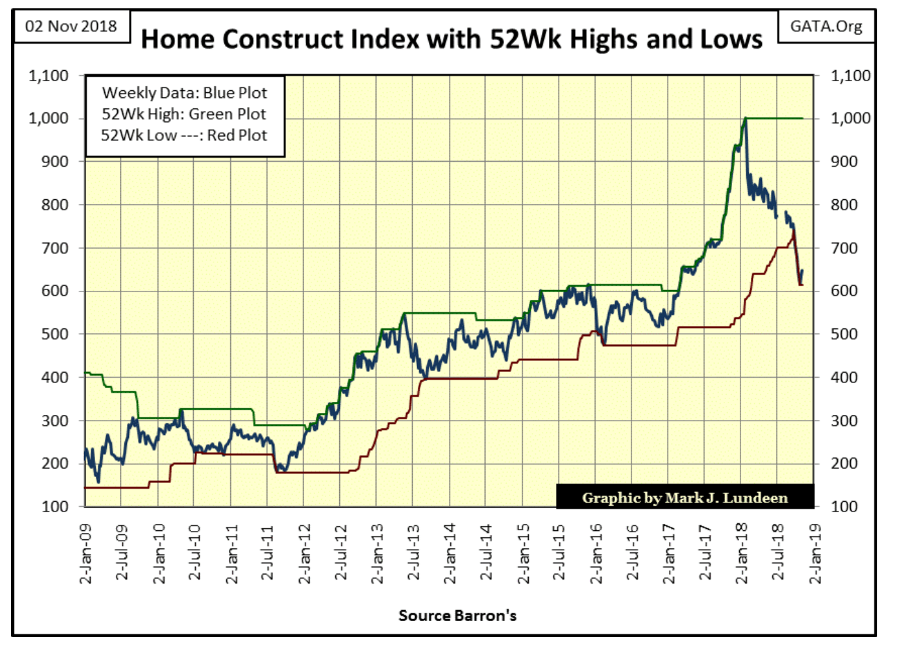
That seems to be the current case for the home construction companies below. They’re down about 40 percent from last January, and at current prices, they still aren’t bargains in my opinion.
© Mark Lundeen
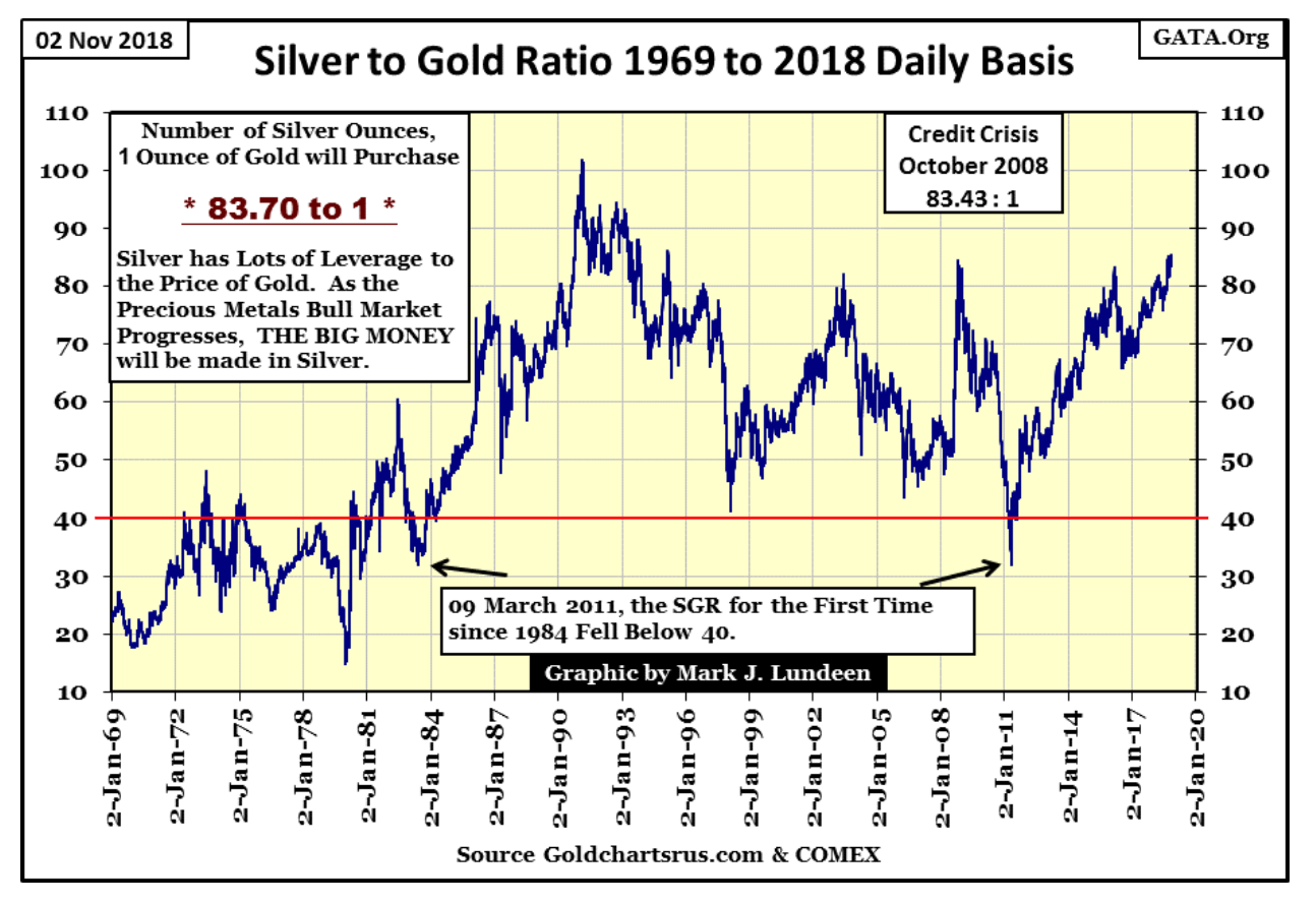
Let’s look at the Silver to Gold Ratio (SGR), or the number of ounces of silver a single ounce of gold can purchase. On Friday, the ratio closed at 83.70 ounces of silver for one ounce of gold.
The history of the SGR is that during precious metals bull markets this ratio contracts. On precious metals bear markets, it expands. The implication to the history seen below is that during the gold bear market, the big money is lost by holding on to silver. That’s the bad news. The good news is that with the ratio at its current 83.7 the SGR is now flashing a buy signal. When the bull market in gold and silver resumes, more money will be made holding on to silver than to gold.
© Mark Lundeen
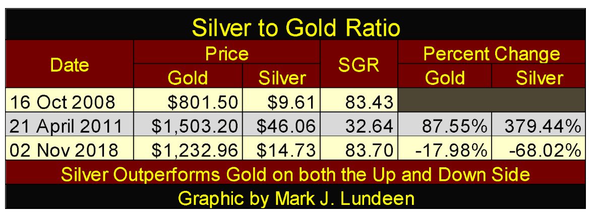
The table below gives the specifics for the SGR at key dates (turning points in the SGR) seen above since October 2008. As you can see, silver is much more volatile than is gold, but during advances in gold and silver, this hyper-volatility works in the favor of investing in silver.
© Mark Lundeen
Silver today isn’t much more expensive than it was in October 2008. For retail investors working with $100,000 or less, say like $1000 or $500; with the SGR at its current 83.70, buying silver bullion (not gold) is the way to go.
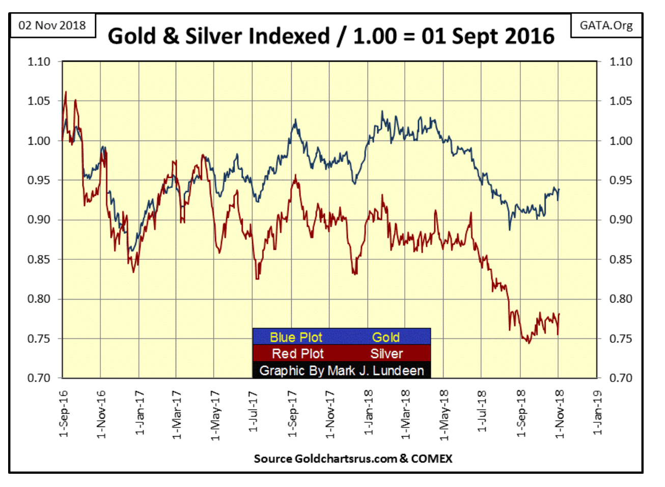
Here’s the price of gold and silver indexed to 01 Sept 2016 = 1.00, or looking at gold and silver in a horse race. Both metals have apparently bottomed a few months ago, but since then have been running like two broken-down nags.
© Mark Lundeen
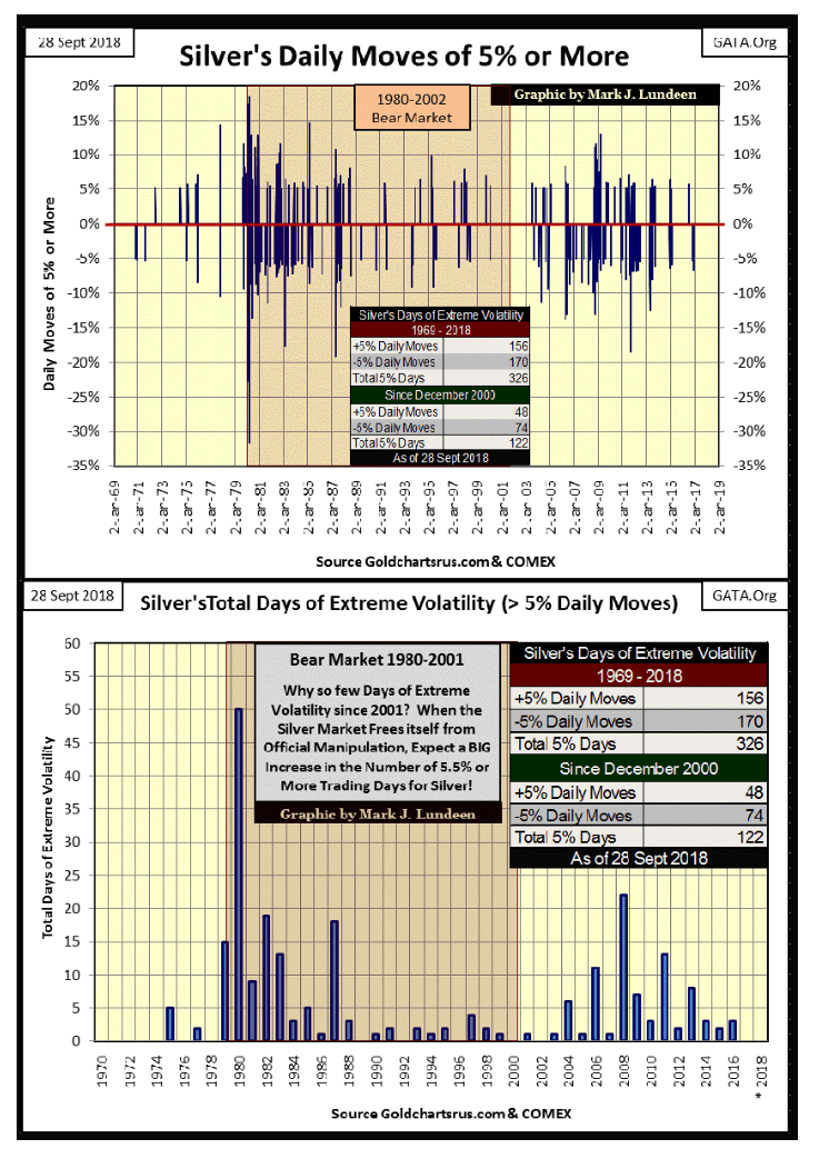
What the old monetary metals need is an increase in market volatility, which for precious metals assets is a good thing. It’s been two years now since gold has seen a >3 percent day or silver a >5 percent day, and you can see the resulting, lackluster market action in the chart above. Some time ahead of us we’re going to see multiple big-daily moves in gold and silver, and that will change everything.
Here’s a chart I published a few weeks ago. Note how 2017 was free of 5 percent days, as has 2018 up to November. What goes for silver also goes for gold, and we’ll know when the bull market in the old monetary metals resumes when extreme market volatility once again becomes a regular feature in the metals.
© Mark Lundeen
Take another look at the chart above. A two-year period where the silver market was free from extreme volatility hasn’t been seen since 1974. This is a real historical anomaly, and historical anomalies don’t go on forever.
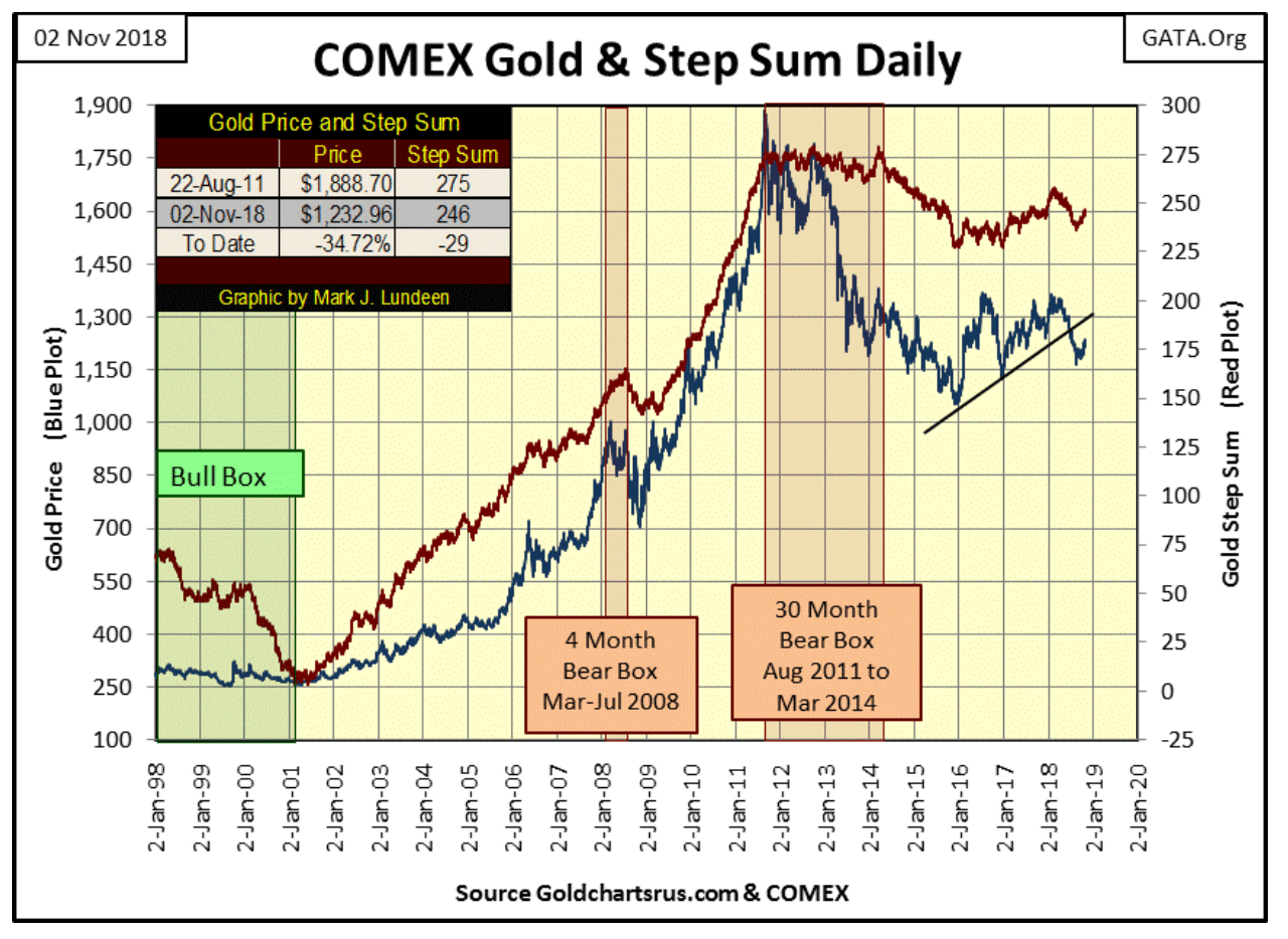
Here’s gold’s step sum chart; nothing new below from what we saw last week.
© Mark Lundeen
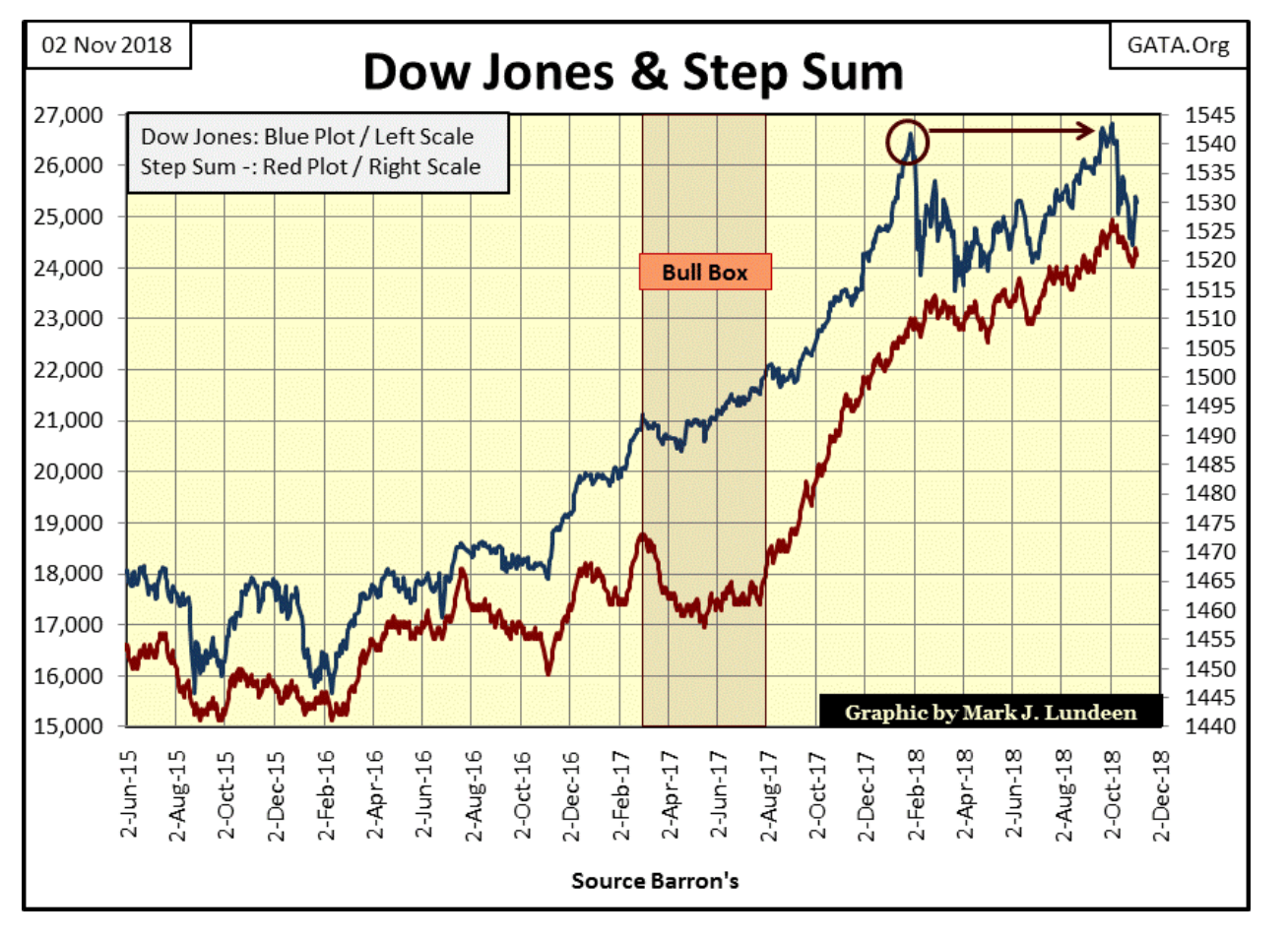
On the other hand, the Dow Jones and its step sum have much improved from last week.
© Mark Lundeen
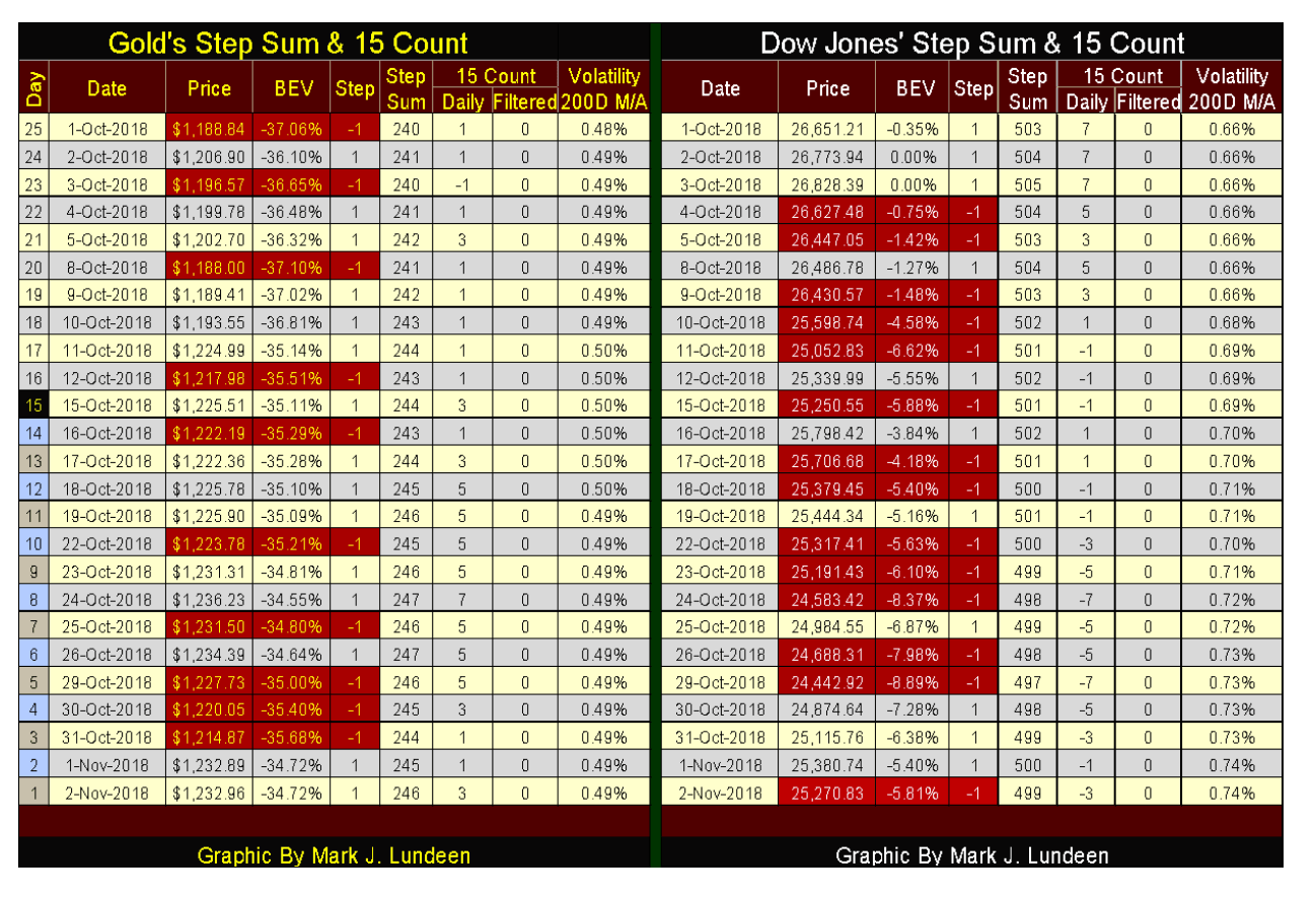
As daily volatility is as important to us for gold (and silver) as it is for the Dow Jones, I expanded my gold step sum table to include its daily volatility’s 200-day moving average, exactly as seen on the Dow Jones table.
I’m not expecting much in the way of excitement from gold until its volatility’s 200 day M/A rises up far above its current 0.49 percent. But as long as gold’s step sum continues advancing, along with its price, I’m grateful for what God is sending my way.
© Mark Lundeen
The Dow Jones saw a nice reversal this week after it hit bottom on Monday the October 29. With inflation flowing into the NYSE (rising daily trading volume seen earlier) I’m expecting additional new all-time highs in the weeks to come.
(Featured image by DepositPhotos)
—
DISCLAIMER: This article expresses my own ideas and opinions. Any information I have shared are from sources that I believe to be reliable and accurate. I did not receive any financial compensation for writing this post, nor do I own any shares in any company I’ve mentioned. I encourage any reader to do their own diligent research first before making any investment decisions.


Tilray Acquires HelloMD to Expand Medical Cannabis Digital Platform
Tilray Brands acquired HelloMD, a digital healthcare and medical cannabis platform, pending court approval on June 29, 2026. The deal...


Spanish Crowdfunding Market Reaches Record €761.6M in 2025, Driven by Real Estate and Crowdlending Growth
Spanish crowdfunding market reaches record €761.6M in 2025, driven by strong real estate dominance and rapid crowdlending growth, while donations...


Swedish fintech Lysa is preparing to enter the European ETF market
Swedish fintech Lysa is entering the European ETF market, registering its first ETF and expanding beyond its robo-advisor model. Managing...


Bitcoin Stalls Near $60K as Strategy Moves, ETFs Outflow, and EU MiCA Rules Take Effect
Bitcoin hovers near $60,000 with ETF outflows, while Strategy boosts reserves, sells BTC, and raises dividends to reassure investors. Ethereum...


Morocco’s Growth Holds at 4.6% as Agriculture Offsets Economic Pressures
Morocco’s economy grew 4.6% in Q1 2026, driven by a strong agricultural rebound offsetting declines in industry. Services expanded moderately...
 |
|
 |  |
 |
|
-

 Fintech1 week ago
Talentir Secures €4M to Transform Global Payouts
-

 Biotech2 weeks ago
New Gene Therapies Transform Rare Disease Care, but Gaps Remain
-

 Cannabis4 days ago
Youth Cannabis Use in Colorado Is Falling — But the Full Story Is More Complex
-

 Impact Investing1 week ago
EU Weighs More Free Emission Permits in ETS Review to Boost Industry Competitiveness
You must be logged in to post a comment Login