Featured
Strange things with the NYSE 52Wk H-L Ratio
Since 1980, the NYSE 52Wk H-L net has never exceeded 675 during market surges, but it regularly breaks below -1000 during panics in the stock market. After seeing this I’d say fear is a greater market motivator than is greed. For investors who want to sell into market strength, and buy into market weakness, which is everyone, tracking NYSE 52Wk H-L nets is extremely useful information.
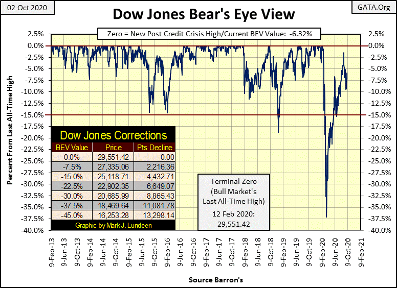
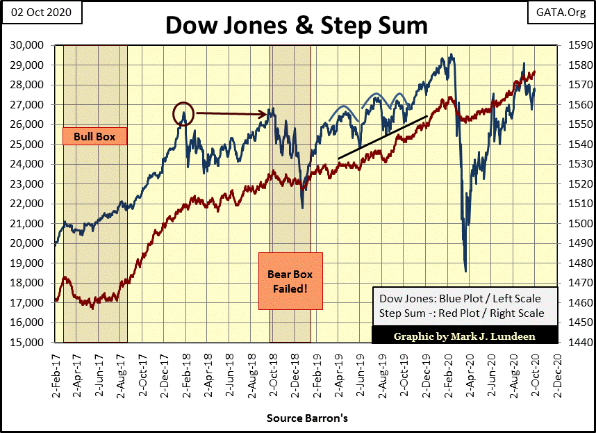
Again this week, the Dow Jones avoided closing below its -10% line in its Bear’s Eye View chart below. If next week it rises up into scoring position (above its BEV -5% line), and advances toward its current high of the move (-1.53%), the Dow Jones will be in good shape to break above its last all-time high of 29,551 from last February.
Doing this in a BEV chart, the Dow will register only one more BEV Zero rising up to the red line in the chart below, because to Mr Bear every new all-time high is only a big-fat zero.
Looking at the BEV values for the major market indexes I follow below, it’s been just short a month since any of them have seen a BEV Zero. The Dow Jones Transports (#1) came close to doing so on Monday but drifted lower as the week came to a close. Everything else this week failed to even get into scoring position, above their BEV -5% levels.
This is one of those times when it’s best to just hold your position, whether it’s short or long, and wait to see what next week brings our way. With the presidential election coming early in November, something big happening in the market is a real possibility, as is the possibility of nothing big happening at all.
For myself, I’m a big bear on the stock market. The only thing that would make this market attractive to me would be substantially lower prices, prices below last March when the Dow Jones corrected 37% in less than a month. That would mean some of the indexes below finding themselves below their BEV -50% levels.
In time this will happen. But I wouldn’t be surprised should the Dow Jones rise up to new all-time highs before it does.
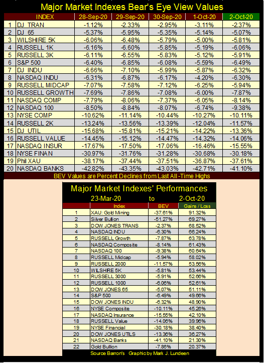
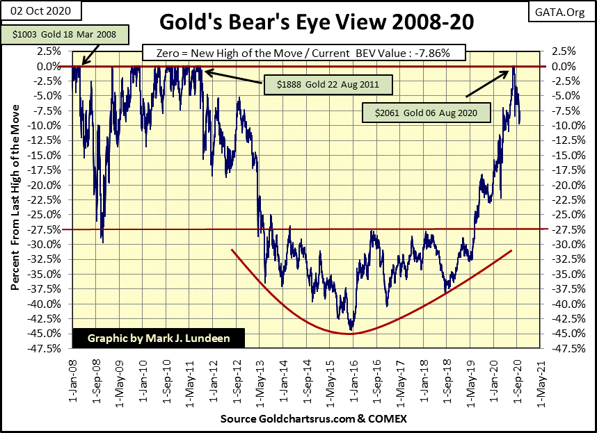
The XAU remains at the #1 spot in the market performance table above, with silver bullion at #2. Gold bullion came in dead last at #22. But that’s okay as far as I’m concerned as it also closed the week only 7.86% away from making a new all-time high, which at week’s close would be a close above $2061.44.
There is something about gold closing above $2000 that demands the market’s attention. Well, a hundred years ago gold was money, by act of law money was fixed at $20.67 for an ounce of gold. Today we’re waiting for gold to rise up a hundred-fold, to above $2000 an ounce as the FOMC floods the economy with trillions of dollars in monetary inflation. There just isn’t a good reason not to have a position in gold.
And if you like gold, you have to love silver, which at week’s end is still 51.28% from its last all-time high from January 1980. What else in the market today is still 50% below its price of January 1980? Silver has to be the most undervalued asset in the world.
It would take slightly more than a doubling in the price of silver to see it break into a new all-time high; let’s say $50 silver. When this happens, it will be big news in the market.
Eskay Mining had a good press release issued on September 22nd. They have the results of a core sample where eleven meters contained Eskay Creek type of mineralization, aka rich paydirt.
The company expects they’ll pull out three kilometers, or 1.84 miles of core samples for assaying from this summer’s exploration program. Should additional core samples produce similar results, Eskay Mining’s share prices could have a big jump in the months to come. But this is mineral exploration, so no guarantees can be made for share price performance.
Should Eskay Mining break above $0.75, or maybe $1.00, I’m going to sell enough to get my initial investment out of it, plus a nice profit and let the rest ride. I recommend anyone who followed me into it do the same.
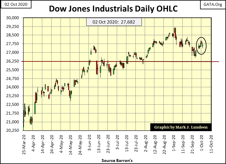
Looking at the Dow Jones in daily bars below, the Dow bounced off its lows of last week. If it continues advancing as it did this week, it may just break above its current all-time high of 29,551 sometime in October or early November.
Next is my comparison between the Great Depression and our bear markets.
Is our current advance a bear market? As I see it, until the Dow Jones makes a new all-time high, the current advance could just be a massive dead-cat bounce in a continuing bear market. And anyways, why did the Dow Jones rebound off its lows of last March, or day #27 in the BEV chart below? Maybe because the FOMC “injected” over two trillion dollars of “liquidity” into the financial system. If they hadn’t, the Dow Jones wouldn’t have closed the week only 6.32% from last February’s all-time high.
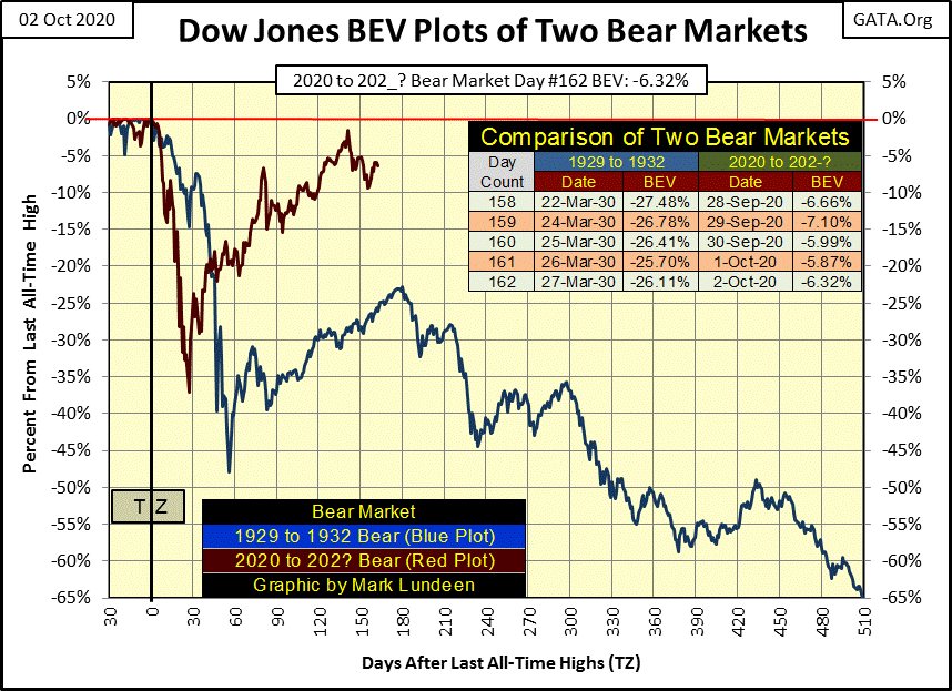
Listen up here; if you’re making money on this advance, well good for you. But don’t deceive yourself by believing the Dow Jones’ rise from:
- its high-tech bear market bottom of October 2002,
- its credit-crisis bear market low of March 2009,
- and now off its March 2020 37% market crash,
are the workings of a free market. Warren Buffet told everyone it wasn’t seventeen years ago in 2003;
“Give me a few trillion dollars and I will show you a good time too!”
-Warren Buffet (comments upon the economic recovery efforts of the Federal Reserve of 2003).
Dr. Bernanke confirmed the same in January 2011 on CNBC;
“Policies have contributed to a stronger stock market just as they did in March 2009, when we did the last iteration of this. The S&P 500 is up 20% plus and the Russell 2000, which is about small cap stocks, is up 30% plus.”
– Doctor Benjamin Bernanke, CNBC Interview with Steve Liesman 13 Jan 2011 (1:40 PM).
The events of the past two decades are proof the financial markets’ valuations are managed by a cabal entrenched in the Federal Reserve System. One of these days these “policy makers” are going to be overwhelmed by the Frankenstein Monster they’ve created, who I call Mr Bear.
NYSE 52Wk high & low nets haven’t been much of a factor in the market since the rebound off its March lows. Since mid-May, the NYSE’s 52Wk highs have outnumbered its 52Wk lows, but not by much until last week when four out its five trading sessions the 52Wk lows outnumbered its 52Wk highs. A turn in the tide? Maybe.
I have NYSE 52Wk high and low data going back to August 1932, but I don’t use it as I don’t know what it actually is; highs and lows in the past 52Wks, or highs and lows based on the first daily closing of the year. Today we have computers that can do immense calculations on the market in an instant. But in 1932 to maybe the mid-1960s, the computers who calculated much of Wall Street’s mundane market data used a pencil on paper to do their long division.
Computing by hand NYSE’s daily Advances & Declines is easy. But I doubt the ability of the Wall Street Journal or Barron’s or anyone else to compute with paper and pencil actual daily 52Wk high and low data for each issue trading at the NYSE from one day to the next, until well into the second half of the 20th century. I may be wrong, but I don’t think so. And then maybe I’m making too much out of this.
Below is a plot of NYSE 52Wk H-L nets going back to January 1980. I filtered out all daily nets failing to rise above 300 or below -300 (the vast majority of daily closings), to highlight when the bulls were running wild and free and when Mr Bear was clawing back gains made by the bulls. This was the case last March when the NYSE saw a 52Wk H-L net of -2375, a net exceeded only by the H-L net of -2891 seen on 10 Oct 2008 during the sub-prime mortgage panic.
Had the FOMC not “supported market valuations” last March with trillions of dollars of monetary inflation, the stock market today would be far from where it is now.
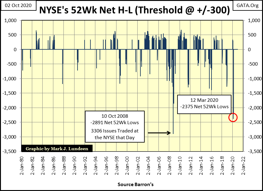
The chart above answers the question whether greed or fear is a bigger motivator in the market. Since 1980, the NYSE 52Wk H-L net has never exceeded 675 during market surges, but it regularly breaks below -1000 during panics in the stock market. After seeing this I’d say fear is a greater market motivator than is greed.
For investors who want to sell into market strength, and buy into market weakness, which is everyone, tracking NYSE 52Wk H-L nets is extremely useful information, but don’t ask me for it.
If you want to download NYSE Breadth Data, and just about anything else you need, then go to Nick Laird’s Gold Charts are US site. Nick is a former shrimp boat captain from Down Under who hurt his back while out at sea, and now compiles market data for sale at reasonable prices. He doesn’t make much doing so. Rather it’s a hobby to keep himself occupied, a hobby that pays his rent and maybe a few beers to keep his morale up.
Let’s look at the step sum for the NYSE 52Wk highs & lows going back to January 1996 (Red Plot below) along with the Dow Jones. What’s a step sum? For the Dow Jones, its step sum is a single item A-D line using its daily closings as inputs. Should the Dow Jones close higher than the day before, it’s a plus step (1), should it close lower than the day before it’s a negative step (-1). To construct the actual step sum just add the daily 1 & -1 as each day passes.
It’s a little different for NYSE 52Wk highs and lows step sum. More daily 52Wk highs than lows creates a plus step (1), more daily 52Wk lows than highs creates a negative step (-1).
The NYSE 52Wk H-L step sum eliminates the excitement the NYSE has seen since January 1996, as it can only rise or fall by a single step on any given day, while the NYSE 52Wk H-L nets can see huge swings as seen in the chart above.
Looking at the two plots below confirms the obvious; when the NYSE sees more 52Wk highs than lows the Dow Jones advances, as the Dow Jones declines when the NYSE sees more 52Wk lows than highs. The exception to this rule was during the top of the 1990s high-tech market to the bottom of the following bear market, where I’ve placed a circle around.
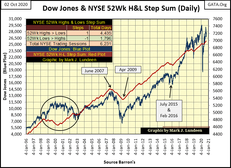
What’s with that?
The high-tech mania of the late 1990s was just that; a high-tech mania where anything else but high-tech was spurned by investors. This being the case, non-high-tech stocks began their bear market in mid-1998 as the NYSE 52Wk H-L step sum turned down. Predictably, non-high-tech stocks began their recovery from their market lows as the Dow Jones topped in January 2000, when the NYSE 52Wk H-L step sum bottomed and began turning up. This was a unique episode in market history, something that wasn’t repeated since.
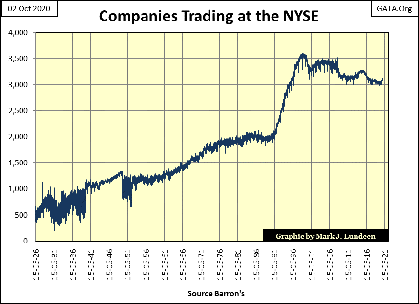
Let’s look at the daily NYSE Advance – Decline Ratio (two charts down). I don’t use an A-D line in this chart as the volume of NYSE issues trading over these nine decades has changed greatly. In 1932, as few as 345 issues may have traded at the NYSE on any given day, today we typically see over 3,100 issues trading.
To normalize this data over these nine decades, I’ve converted the daily advances and declines into ratios;
NYSE Advance – Decline
NYSE Advance + Decline + Unchanged
to give equal weight to each day’s breadth data in the plot.
I’ve also identified the five big Dow Jones’ bear markets since 1926, and the three secular Dow Jones bull markets, with tables, giving their start and stop dates and values. Our current bull market saw its last top on 12 February 2020.
This chart shows how the market has changed since 1926. Looking at the Dow Jones’ first bull market (1942 to 1966), the A-D Ratio peaked in January 1956 as the Dow Jones advanced to almost 500, just half of the advance it would ultimately see ten years later in 1966.
Note; in 1956 the NYSE A-D ratio began a decline that would continue to 1974. This was in accordance to how bull markets once functioned, where early in a bull market most stocks trading at the NYSE followed the Dow Jones up. After the bull market had aged, the market became more selective of which NYSE issues advanced with the Dow Jones. At the top of a bull market, the only shares advancing with the Dow Jones would be the era’s glamor stocks.
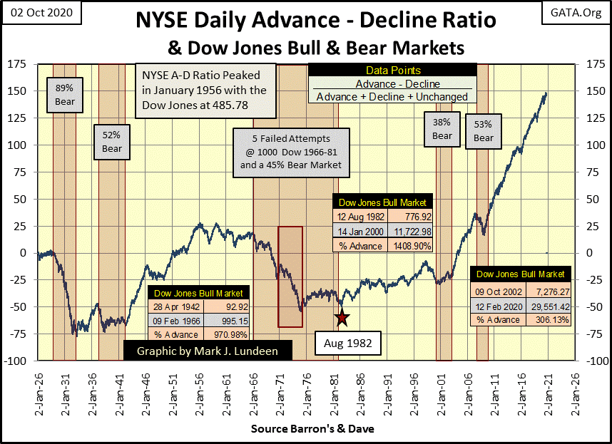
But all that changed for the second bull market seen above (1982 – 2000), where for most of these eighteen years, the A-D Ratio advanced until it finally turned down in 1997, three years before the Dow Jones entered a 38% bear market. The Dow Jones during these eighteen years advanced 1408%.
I began our current bull market at the bottom of the high-tech bear market in October 2002, and except for the Dow Jones sub-prime bear market (2007-09), the NYSE A-D Ratio has advanced, unnaturally in my opinion during these eighteen years. But note how the Dow Jones itself has advanced only 306% during a time when daily advances at the NYSE has overwhelmed its daily declines as in no other period since 1926.
That’s really strange, as seen in the table below. Both these bull markets lasted eighteen years, but the 1982 to 2000 bull market saw the Dow Jones advance by 1400% as its A-D Ratio increase by 25.59 points. The 2002 to 2020 bull market saw the NYSE A-D Ratio increase by whopping 170.79 points, which managed to drive up the Dow Jones by only 281% as of the close of this week.
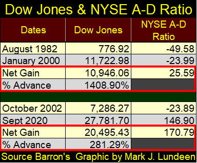
So, what’s with this? I’d say we’re looking at the law-of-diminishing returns having its effect on the “policymakers” best efforts in maintaining the American financial system in a state of perpetual-bull market.
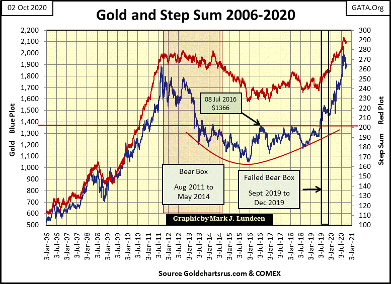
Like the Dow Jones, gold this past week also refused to break below its BEV -10% line in its BEV chart below.
The current problem gold has, if we can call it a problem, is its last all-time high was over $2000 an ounce, and the bears are having difficulties accepting $2000 an ounce gold.
The same thing happened in March 2008 when gold first closed above $1000 an ounce; the bears then had a fit and sold gold down by 30%.
In August 2011 when gold closed at $1888, just $112 short of $2000, the bears went into overdrive and drove the price of gold down 45% in the next four years.
Now in October 2020, two months after gold closed above $2000 in early August, the bears are having problems selling gold down by 10%. The problem the bears are having today is one of their own making; gold is rebounding off of a 45% bear market bottom. That plus the market is beginning to accept that maybe the Federal Reserve’s balance sheet has inflated to the point of becoming obnoxious. That’s not good for the dollar, but it is for gold, silver and the mining shares.
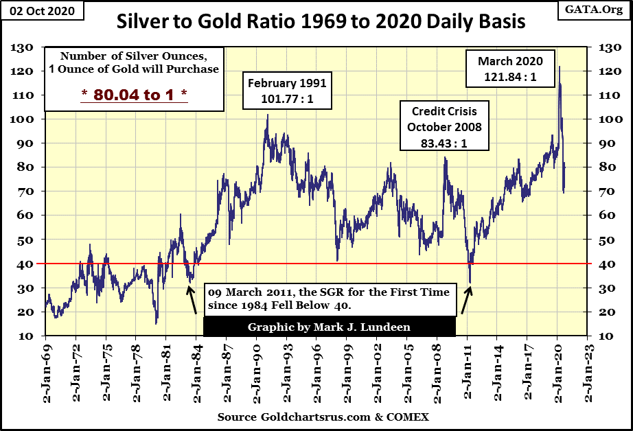
The Silver to Gold Ratio (SGR / chart below) closed the week at 80 ounces of silver for one ounce of gold. That up from 70 in early August, but down from last March’s 121. A declining SGR is a solid indicator that a precious metals bull market is in progress.
Gold and its step sum below remain positive; well maybe not positive but definitely not bearish, though for some recent buyers of gold may now have buyer’s regret on their purchases. Well anything can happen in the markets, but the likelihood of gold falling back to its lows of December 2015 is very slight.
Look at what happened after gold broke above $1000 in March 2008; it corrected down to $700 before it advanced to $1888, a gain of 169% in the next three years. A repeat performance for gold in the years to come would take it up towards $4000 from here.
If you believe precious metal assets are in a bull market, then you have to believe that something like this, or possibly even better is possible in the coming years. If you find it impossible to imagine gold rising up to over $4000 in the coming years, but fear that gold might collapse down to its lows of December 2015 ($1100), then you’re a bear. So, why did you buy gold, because it seemed like a good idea at the time? Maybe you’re really not a bull or a bear; possibly you’re just confused.
Markets can be frustrating! Take a few deep breaths, and then go along for the ride into precious metals market history, and stop looking at gold and silver prices every five minutes.
I’ll tell you who have no doubt their bull market is an ongoing, perpetual money making machine; the bulls running wild and free on Wall Street. The FOMC has been bailing them out since Alan Greenspan promised to supply the market with “ample liquidity” during the October 1987’s flash crash. But this too shall pass.
As far as the Dow Jones step sum chart goes (below), should the Dow Jones continue advancing, the nascent bear box we were looking at is going away. Not just yet, but if the Dow Jones close well into the 28,000s. But should the Dow Jones deflate to say 26,500 as its step sum refuses to follow it down, then maybe we have an ongoing step sum bear box in the chart below.
And what does a bear box do for us? About the only thing, and it’s not a small thing, a bear box tells us when bullish market psychology in a market decline reverses. In a nut shell, when a market is deflating as its step sum refuses to follow it down, tells us the bulls see the market’s sell off as a buying opportunity. When the bear box closes, the point where the step sum finally collapses down, to recouple with the an index’s deflated price plot, tells us the bulls are now former bulls and see every market advance as a selling opportunity.
As bear boxes typically do, they’re really good at calling the turn in a bear market decline, providing excellent buying signals at a bottom when both the price and step sum plots stop going down and reverses upward together. But most bear markets don’t develop bear boxes, but when they do form, it’s good to be aware of them.
Looking at gold’s step sum table below, we see plenty of down days since August 28th. Gold hasn’t seen a positive 15 count since September 1st, and after all this selling, all the bears could do is drive gold down by $162 from August’s BEV Zero at the end this week. As noted before, so far gold has refused to correct by 10% (a $206 decline) from its all-time high ($2061) of early August.
In early 2021, I expect we’ll look back at this week and see gold’s current correction as the market’s reaction to seeing it close above $2000 for three days in early August. At some point in the coming weeks, gold will once again see fewer down days as its 15 counts become positive once again as gold advances well above $2000.
On this pending rebound in the price of gold, expect to see some days of extreme volatility, which for gold are days that close (+/-) 3% or more from a previous day’s close. At current prices, a positive 3% day would move the price of gold up $57 in a single trading session, but I wouldn’t be surprised seeing gold move up a $100 or more in a single trading session.
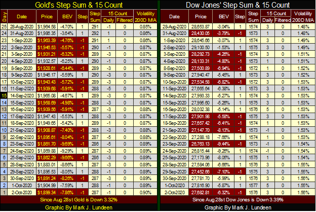
The Dow Jones’ bear box is evident in its step sum table. Since August 28th the Dow Jones itself is down 1000 points as its step sum has advanced by a net of two daily advances. Then there are all those +3 & +5 15 counts the Dow Jones has seen in these past twenty-five trading sessions; a sure indication its step sum (bullish market sentiment) remains stubbornly bullish as the Dow Jones itself declines.
_
(Image by Csaba Nagy via Pixabay)
DISCLAIMER: This article was written by a third party contributor and does not reflect the opinion of Born2Invest, its management, staff or its associates. Please review our disclaimer for more information.
This article may include forward-looking statements. These forward-looking statements generally are identified by the words “believe,” “project,” “estimate,” “become,” “plan,” “will,” and similar expressions. These forward-looking statements involve known and unknown risks as well as uncertainties, including those discussed in the following cautionary statements and elsewhere in this article and on this site. Although the Company may believe that its expectations are based on reasonable assumptions, the actual results that the Company may achieve may differ materially from any forward-looking statements, which reflect the opinions of the management of the Company only as of the date hereof. Additionally, please make sure to read these important disclosures.


The TopRanked.io Guide to 2026’s Biggest and Best Affiliate Opportunities
Want to earn affiliate commissions on literal billions of dollars worth of revenue? Then this week, we've got something special...


Eni Advances Energy Transition with Major Investment and Emissions Cuts
Eni showcased its “Just Transition” report in Rome, highlighting stakeholder collaboration and progress toward decarbonization goals. The company invested over...


The German Fintech Market Shows Resilience and Strong Investment Growth in 2026
Germany’s fintech sector remained resilient in 2026 despite economic crisis and rising insolvencies. Investments reached €14.2 billion, showing strong investor...


Cannabis Legalization in Germany: A Mixed Interim Assessment
Germany’s cannabis legalization has reduced criminal cases and eased pressure on the justice system, while the black market is slowly...


Sustainable Restoration of the Haus Hövener Garden in Brilon
The Brilon Construction Workers Association is restoring the Haus Hövener garden into a cultural community space, funded through a €10,000...
 |
|
 |  |
 |
|
-

 Crowdfunding2 weeks ago
Prestadero Sees Rising Female Loan Participation in Mexico
-
 Business1 day ago
The TopRanked.io Guide to 2026’s Biggest and Best Affiliate Opportunities
-
Business1 week ago
TopRanked.io Weekly Affiliate Digest: What’s Hot in Affiliate Marketing [+ The Best Affiliate Program Directory on the Internet]
-

 Crowdfunding2 weeks ago
Spain’s Crowdfunding Sector Surges as Real Estate and SME Financing Expand