Featured
Suffering from the lingering effects of battered-bull syndrome
Dow Jones announces a prospective increase in gold but states that it is not significant enough to garner attention in the market.
As far as the market trends I usually follow went this week, there is nothing new in the broad stock or precious metals markets, more of the same old stuff. The Dow Jones made another new all-time high on Wednesday, the 95th since the November 2016 election. But besides that, it seems the bulls on the stock market are taking a bit of a breather. Gold continues advancing, but not so much as to attract much attention.
I can tell you what will attract a lot of attention when it finally happens: when the Dow Jones finally corrects to its -5% BEV line below. This is something that hasn’t happened since June 2016. Historically, seeing the Dow Jones correct 5% from an all-time high has never been a big thing. But right now, with the stock market bloated with “liquidity” from the global central banking cartel, the Dow Jones would have to decline by over 1,300 points to do so. And a 1,300 point decline in the Dow Jones has always had a way of attracting the public’s attention.
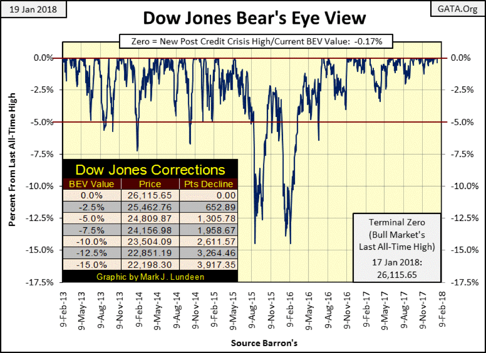
© Mark Lundeen
After the Dow Jones finally does see a 5% correction, I expect this will also be the time when a critical threshold of public opinion on the markets will finally begin looking at the stock market in line with the following chart, awaken to the fact that the stock market is in a historic bubble.
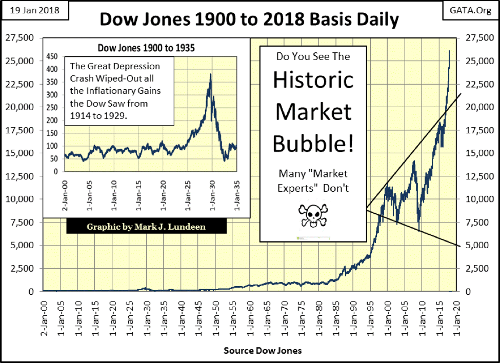
© Mark Lundeen
This is when people stop looking up and begin wondering how far the Dow Jones could decline, and I expect it ultimately will decline far more than most “market experts” believe possible today. Looking at the October 2007 to March 2009 decline above, it doesn’t appear like much of a bear market in the chart. But actually, that was the second deepest percentage decline in the Dow Jones since 1885, a huge 54% decline in the Dow.
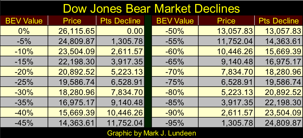
Looking at the Dow Jones bear market declines table below, a similar 55% decline from its current all-time high would take the Dow Jones down to 11,752. But when the Dow Jones last saw a similar percentage decline from October 2007 to March 2009, it took all the king’s horses and all the king’s men to get Humpty Dumpty (the global banking system) back on the wall again.
© Mark Lundeen
Can the “policy makers” do it again should another derivative disaster strike Wall Street? I doubt it, but who knows?It’s like what Clint Eastwood said in Dirty Harry, but now with Mr. Bear speaking to the “policy makers” sitting in the FOMC: “You’ve gotta ask yourself one question: ‘Do I feel lucky?’ Well, do ya, punk?”
They can’t feel too lucky now with Trump as president. Obama bent over backward for the big banks, and his Attorney General, Eric Holder, publically stated he couldn’t prosecute the many obvious breaches in the laws these banks committed for fear of crashing the economy. So he had them fined a small percentage of their illegal gains, payable to the US Treasury, and let the banksters go on their merry way.
Imagine that, the Department of Justice admits the financial system is based on fraud and promised to do nothing about it. Eight years later, will Trump be as pliant as Obama when it comes to enforcing the law come the next crisis? We’ll see.
Speaking for myself, I don’t at all feel lucky, so I expect we’ll see the Dow Jones passing the -55% market decline at best a speed bump as it goes ever lower in the table above. Yep, I’m a big bad bear, but I wouldn’t be surprised to see the Dow Jones break above 30,000 before it comes tumbling down.
So why am I so bearish? Hardly anyone else is. Well, at the top of a mature bull market advance, the public and “market experts” on the whole never are pessimistic. Look at the Conference Board’s Consumer Confidence Index below, it peaked at the top of the high-tech and sub-prime mortgage market bubbles. If this data is available for the 1920s, how high would it have been at the top of the Roaring 20s bull market, or how low would have the depressing 1930s taken consumer confidence? I can’t say as I don’t have the data, but I know in the years to come we’ll see how low consumer confidence can go after this monster of a bubble finally deflates.
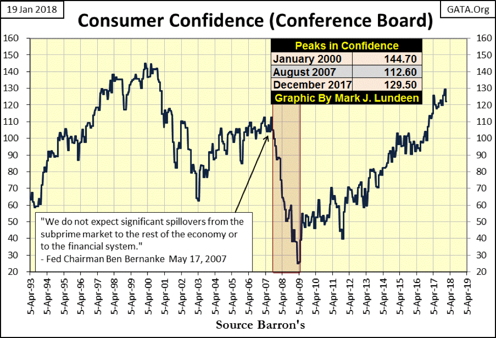
© Mark Lundeen
CinC inflation (Red Plot below) and the earnings for the Dow Jones (Blue Plot) is beginning to decouple, again. This is an unusual chart. It appears as if I indexed CinC and the Dow’s earnings, but I didn’t. The series plotted below are the as published data.
Obviously, these two data series aren’t bolted together, but for the 50 years from 1929 to 1979, for each billion dollar increase in CinC, the Dow Jones saw about a $1 increase in its earnings. Then after 1979, eight years after the US Government severed the dollar’s link to the Bretton Wood’s $35 gold peg, earning for the Dow Jones began oscillating for the next four decades as it never had before.
And we should all note how since April 2014, the expansion in CinC has had little effect on earnings for the Dow Jones. I’d say it looks as if something fundamental has changed, and that can’t be anything good for the Dow Jones at its current lofty levels.
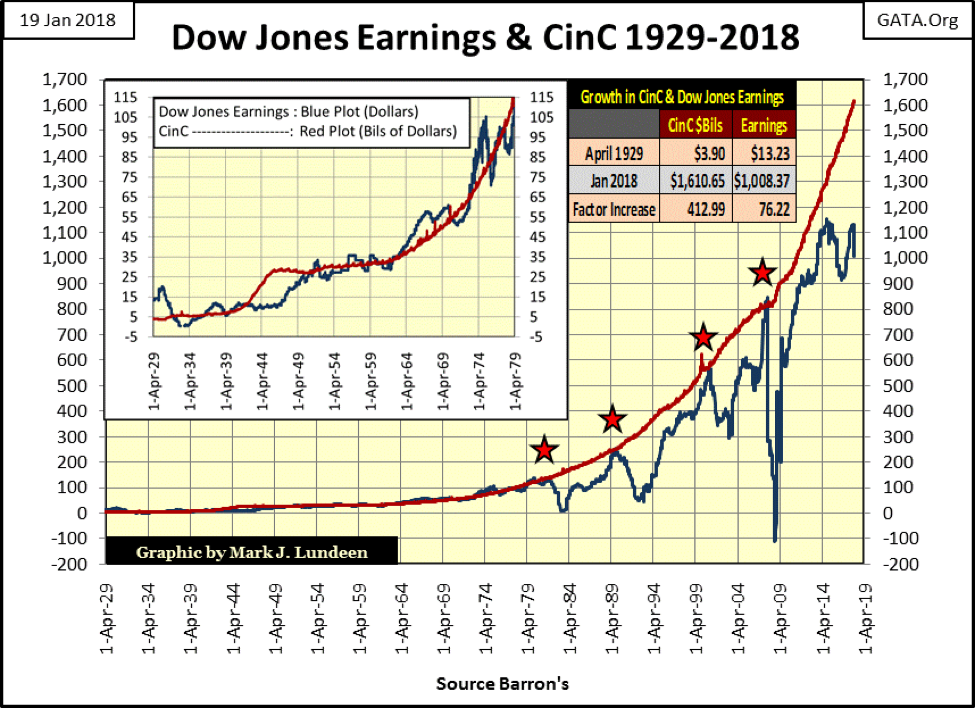
© Mark Lundeen
The first wild oscillation was in the early 1980s, which seems strange in today’s understanding of the stock market as this was also the start of the 1982-2000 bull market. Believe it or not, the Dow Jones began a historic advance (August 1982) as its earnings were crashing 93% from August 1981 to May 1983 (far left star).
Decades ago, seeing the Dow Jones decouple from its earnings trend wasn’t even news. Heck, the best year in the history of the Dow Jones was from July 1932 to July 1933, when the Dow Jones increased 153% as its earning collapsed and then went negative during the entire advance. When the Dow Jones’ earnings once again became positive in July 1933, that was it for the best one-year gain for the Dow Jones.
But that was then, and this is now, and what everybody believes now is earning trends are a leading indicator of future trends in prices. That’s exactly what happened at the other post-1984 declines in Dow Jones’ earnings (other three stars); a painful decline in the Dow Jones followed its earnings down.
But since the 2014 peak in earnings for the Dow Jones, it appears the Dow Jones price trend has once again decoupled from its earnings. I see little comment on it, as there is nothing so bullish a market can do but go up, and that’s what the Dow Jones has been doing for the past few years. But I noted how this week earnings for the Dow Jones dropped a big $117 and how little everyone cared as the Dow Jones itself continues to advance.
I’m not an accountant. I know less than nothing about fundamental analysis for corporate earnings. However, I’m noting how earnings for the Dow Jones peaked four years ago, and now for the second time since 2014, earnings for the Dow Jones are going the wrong way to support its rising valuation. Is this going to become a problem? I suspect someday it will should this continue.
Will earnings for the Dow Jones continue declining? Maybe not next week or next month, but I think its peak seen in 2014 will stand for the current advance in the Dow Jones, and a period of earnings contraction will once again set in as it always has since 1981. My concern has to do with the aforementioned consumers who currently feel so confident, as there is little reason for them to feel good about the future.
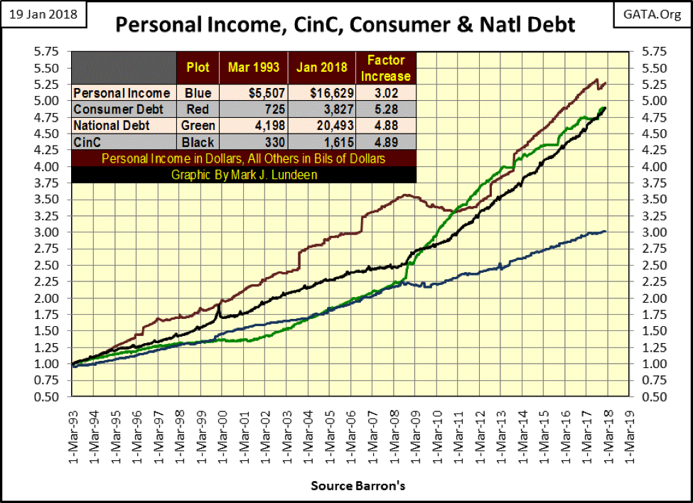
Here’s a chart plotting Personal Income (Blue Plot), Consumer Debt (Red Plot), the National Debt (Green Plot) and monetary inflation as measured in CinC (Black Plot) going back to 1993, 25 years ago. Data indexed to March 1993 = 1.00.
The problem with this data is that all of the series are liabilities, except for personal income, which over the past 25 years has grown at about half the rate of the other series. This is a problem as it is the consumers’ personal income that has to service all of these liabilities. Oh sure, everyone knows the Federal Government is going to stimulate the economy with its deficit spending, and corporate spending is a huge factor in the economy.
But let me tell you a little secret: the Federal Government only spends what it either taxes from people or borrows in the debt markets in the taxpayers’ name. And though corporations do in fact generate lots of money, should their customers (the consumers) go on a buyers strike because of massive unemployment or if consumers become so overstretched in debt for mortgages, credit cards, school loans, and car payments, that they can no longer “consume” the goods and services provided by these corporations, it will amaze “market experts” everywhere just how quickly corporate earnings can evaporate.
© Mark Lundeen
I see no tripwire in the data series above. So these trends will continue until they no longer do. I just want to point out that the current economic prosperity isn’t built on thrift and savings but on a flimsy foundation of dubious debt creation.
Another thing that concerns me is that economic demand for Electrical Power (EP) still isn’t what it should be in a growing economy and hasn’t been since August 2008. I noted Doctor Bernanke’s Operation Twist in this EP chart. He claimed the FOMC was instituting lower bond yields to “stimulate” the economy, but as we see below, four months later in May 2011, EP collapsed and hasn’t done much since.
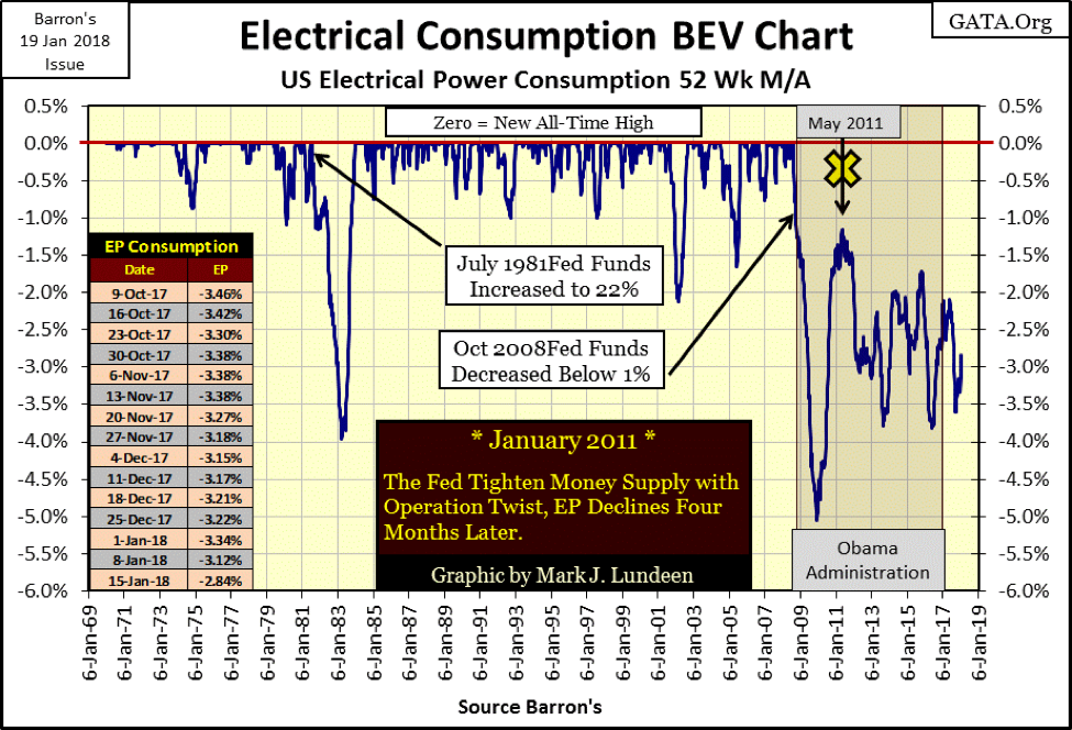
© Mark Lundeen
Why is that? A portion of the contraction in the demand for EP seen above is the result the shipping off of America’s industrial and manufacturing base to China. Now that Trump is having some success in bringing back manufacturing jobs to the United States, it will be interesting following this data series in the years to come. Of course, come a major economic depression, factories whether located in China or the United States will be shutting down their assembly lines for lack of demand. So we may yet see another low in demand for EP that exceeds the -5% from the 2007-09 credit crisis.
When Mr. Bear once again arrives to do what he always does—to stress test everyone’s financial assumptions about the world they like to believe they live in—there will be lots of disappointments. How could there not be? For decades, the solution chosen by the “policy makers” to solve deflation in the economy has been to get people, the government and corporations to assume ever more debt.
I’ve always liked this quote from Robert McTeer, former president of the Federal Reserve Bank of Dallas: Remarks before the Richardson, Texas, Chamber of Commerce, February 2, 2001. These comments were given a year into the high-tech bear market.
“My term for what happened to the economy as we were gliding in for the proverbial soft landing is that we hit an air pocket. Fortunately, we were flying high enough so that the sudden decline in growth didn’t cause us to crash-land. If we all join hands and go buy a new SUV, everything will be all right. Preferably a Navigator.”
– Robert McTeer, President Dallas Federal Reserve Bank: Remarks before the Richardson, Texas, Chamber of Commerce, 02 Feb 2001
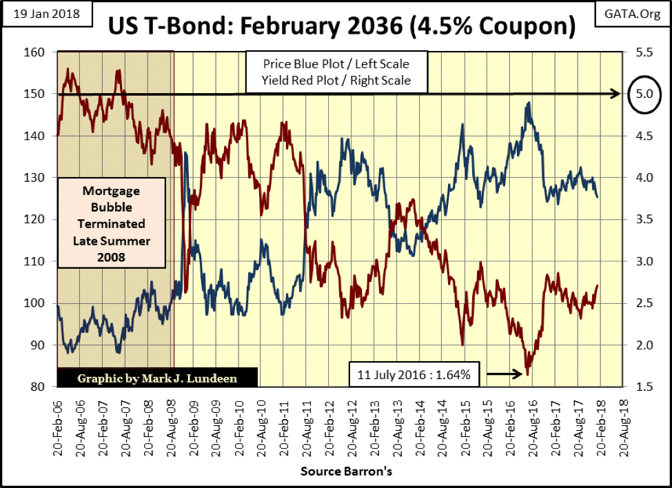
Interest rates and bond yields are rising again. Since July 2016 when this T-bond (chart below) saw a preposterous current yield of 1.64%, it’s risen to an equally preposterous 2.72% at the close of the week. Why is that? Because since 2011, when Doctor Bernanke began his “Operation Twist,” the Federal Reserve has dictated long-term bond yields as well as its Fed Funds Rate.
Former Fed Governor Kevin Warsh has made some insightful comments on this exact topic.
“Market participants, for example, need a clearer, better understanding of large financial institutions to be good policemen themselves. But the financial statements, the annual reports, the 10Ks, the 10Qs of the largest banks around the world tell us so little about their true risks. If you spend a few hours reading the financial statements of Wal-Mart or Proctor & Gamble, then you would understand their business and financial statements reasonably well. It is virtually impossible to do so for the largest global banks.”
– Kevin M. Warsh, member of the Federal Reserve Board of Governors, February 2006—March 2011. Quote from May 2011 issue of Central Banking (pages 32-40)
* * *
“The policymakers are finding it tempting to pursue ‘financial repression’ — suppressing market prices that they don’t like.” He added, “Efforts to manage and manipulate asset prices are not new.”
– Fed Governor Kevin M. Warsh, Wall Street Journal Quote
* * *
“Now that I am out of government, I can tell you what I really believe.”
– Central banks are now so heavily influencing asset prices that investors are unable to ascertain market values. This influence is especially evident, with the Fed’s purchase of government bonds, which has made it impossible for investors to use bond prices to learn anything about markets.
– Kevin M. Warsh: Former Federal Reserve Governor. Comments made to the Stanford University Institute for Economic Policy Research, 25 Jan 2012.
This means that nowhere in the debt market is free market-price discovery fixing prices and yields. Instead, the post-2010 data seen below are only central-bank fantasies. How much longer can that continue? I can’t say, but when it stops, we’ll all know about it as Humpty Dumpty (the global banking system) has written many hundreds of trillions of dollars in derivatives that hedge against rising bond yields and interest rates.
© Mark Lundeen
Currently, those derivatives are out of the money and so not a factor weighing down earnings for the big banks. However, when bond yields once again increase to something above 4% or 5% seen above, it will result in another banking crisis exactly as seen in 2008-09; when derivatives, these banks were counterparties to come into the money, and the banks’ counterparties to these contracts demanded specific performance to the tune of many hundreds of trillions.
Well, the banks can’t make good on these obligations, and neither can the Federal Reserve, and they all know it. So the FOMC does what they can to keep bond yields below a derived line of death that exists somewhere between this weeks close and 5%.
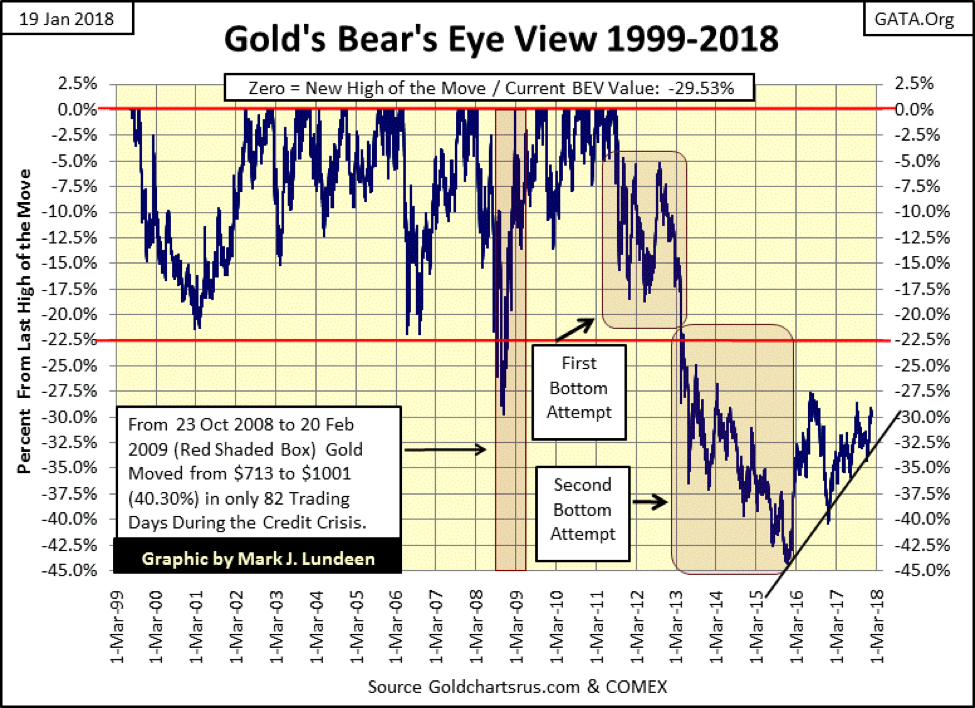
Uggh! What a mess!! Well, it is what it is, and we have to deal with it as best we can, while we still can. So let’s move on to what gold did this week. Gold closed above its BEV -30% line in the chart below, remaining well within a firmly established uptrend that began in December 2015. Seeing a financial asset that has ZERO counterparty risk in a two-year uptrend is encouraging.
It’s hard writing about the stock and bond markets as there are so many bearish factors bearing on them. And with government regulation as it is today, the full weight of the American banking and government establishments are doing everything in their power to prevent the markets and economy from deflating. All that does is drag out the process, and force bears like myself, to remain bearish for many more years than is necessary, and I don’t like being bearish.
So, understand I do find joy in saying when the house of cards the “policy makers” have constructed in the financial markets comes tumbling down, it will be to the great benefit of holders in precious metals assets. There will be tens of trillions of dollars, euros and yen looking for a safe harbor in the storm, a function the old monetary metals have always provided for the past 5000 years.
© Mark Lundeen
The following chart is an enjoyable study. The current bull market in gold began as a bull box closed in 2001. Look at the collapsing step sum. From 1998 to 2001, gold saw more down days than advancing, yet all those down days had little effect on the price of gold for those three years. Then from 2001 to 2011, gold advanced from $253 to $1888 (646%). Not a bad 10 years in the gold market.
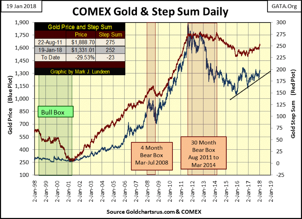
© Mark Lundeen
The remarkable thing I remember about that advance was how horrible market sentiment was for most of it. I couldn’t talk to my friends and family about gold or silver without their rejections to even the consideration of their holding the old monetary metals as an investment.
Yet since January 2000, gold and silver—currently near their 2011-15 bear market lows—have still outperformed the Dow Jones currently at perilous market highs (see chart below). I think the difference between myself and most of the other people in my social circles is I no longer follow the mainstream media as a source of information. If you’re someone who prefers the stock market to the old monetary metals, I expect the difference is that you’re still watching the mainstream media like CNN and CNBC, establishment media outlets for information on the world around you.
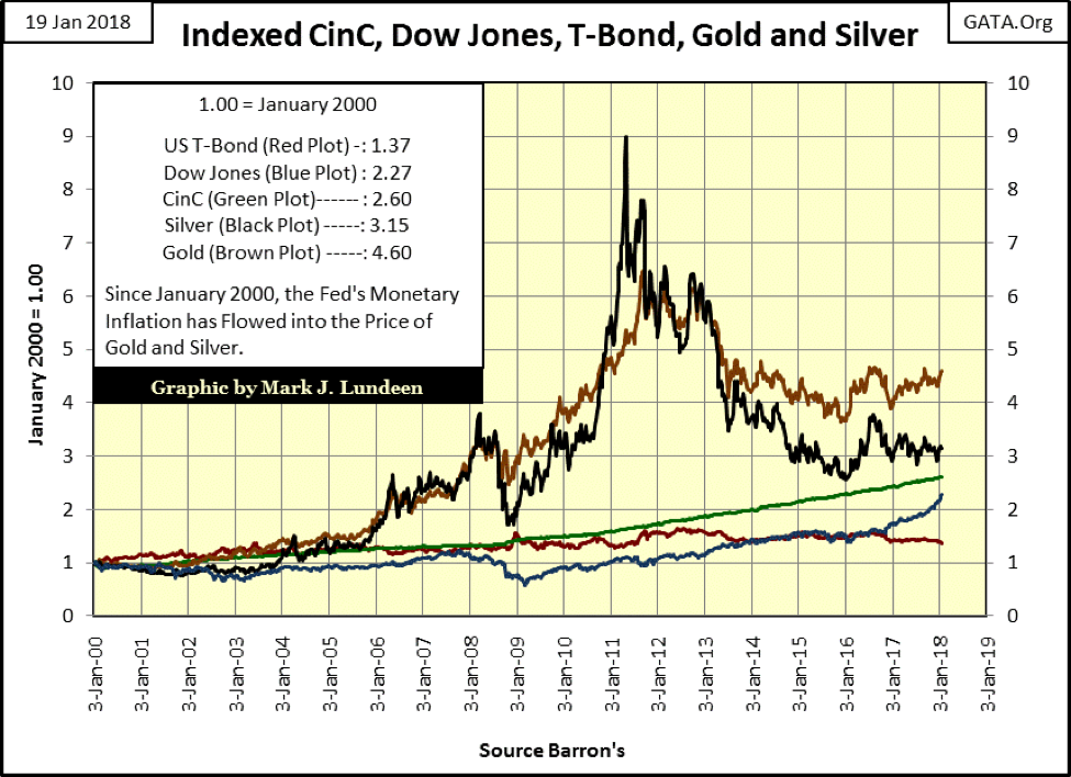
© Mark Lundeen
Returning to gold’s step sum above, seeing gold endure a 30-month bear box, followed by a two-year collapse in its step sum (market sentiment), liquidated any “irrational exuberance” hidden in the gold market by the time the gold market turned in December 2015. This places the current advance in the price of gold on the solid ground. Gold may not be advancing as you and I would like it to, but the prospects of seeing it decline back down to its lows of December 2015, or even to its lows of December 2016, is almost nonexistent. The only thing gold and silver needs now to become a much-favored asset is deflation in the financial markets. Come a bear market in stocks and bonds, I anticipate some real excitement in everything rare and precious.
But that isn’t going to happen just yet, as evident the Dow Jones step sum chart below. The rise in the Dow’s step sum since last August shows the power this market has had, and I don’t see any indications of it waning anytime soon. So bear that I am, I’m still reluctant to bet against the bulls for fear of my personal net worth.
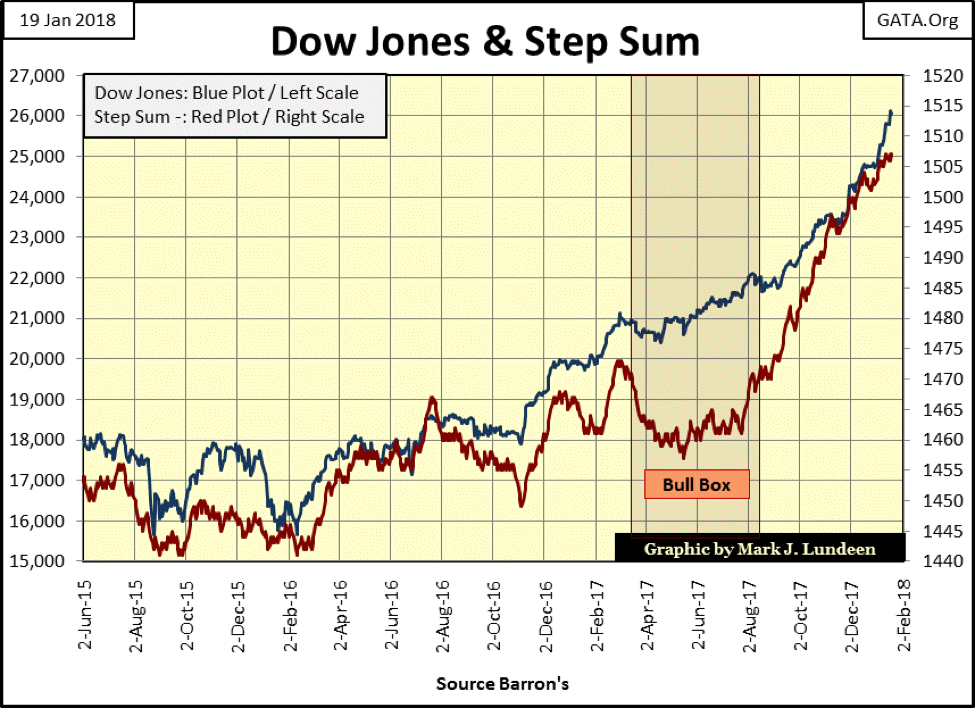
© Mark Lundeen
But we still have to be realistic. The Dow Jones has advanced 10,000 points in the past two years. How much longer can this go on; longer than we can believe possible. Personally, I’m waiting for the Dow Jones to see its first 5% correction since June 2016 and a return of days of extreme market breadth and volatility before I even consider if this advance is over.
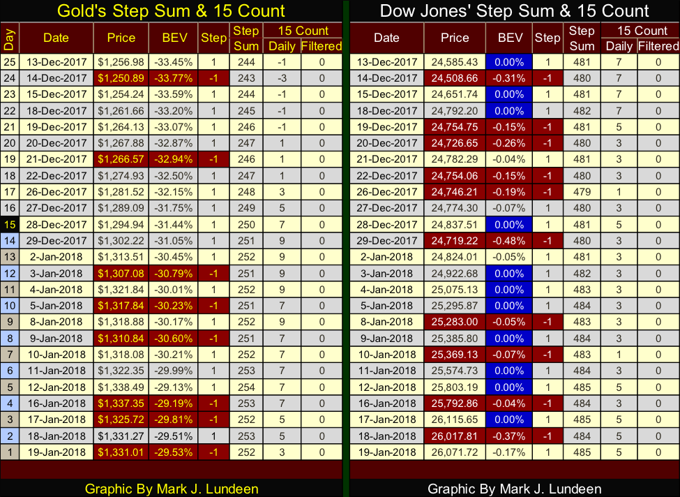
Here are gold’s and the Dow Jones’ step sum tables. Gold’s table looks darn good. It closed above $1,300 on the last trading day of 2017 and has remained there to this day. However, so far in 2018, its step sum hasn’t advanced much. Deep inside me, I have this feeling that something bad is coming at gold and silver in the not to distance future.
© Mark Lundeen
Well, I’m human, and the problem with that is that my emotions all too frequently get in my way of making a rational decision in the markets. So I took a quick look at gold’s step sum chart above, and it’s one hell of a positive chart for gold. I’m just going to assume any current discomfort I’m having with being bullish on gold, silver or the mining shares is from suffering from the lingering effects of the battered-bull syndrome.
Since their 2011 tops, gold and silver have delivered far more pain than pleasure to their owners, and people are going to remember this. But when you’re betting against the political and financial establishment, such as investing in gold and silver, the “policy makers” are never going to make it easy on renegade investors like us. But this too shall pass.
Looking at the Dow Jones’ step sum table, it too has seen its step sum slow down, advancing by only a net of four advancing days since December 13th. Yet, it still has seen 11 new BEV Zeros in the past 25 trading days. Nine years after the sub-prime mortgage bear market, I doubt anyone in the stock market is still suffering from the lingering effects of the battered-bull syndrome, and maybe that’s their problem.
There are some political events in the works that may have a big impact on both gold and the Dow Jones in the coming weeks.
Let’s face it, there are entrenched interest in Washington and on Wall Street who for decades have had the freedom to act outside the limits of the law, and it appears that with the election of Donald Trump as President of the United States, these people are now being called to account exactly what they have done.
Infowars has been covering this exact topic for the past 18 months, so this really isn’t news for viewers (like me) of this much-maligned media outlet. But I have to admit looking forward to seeing CNN having to admit they’ve been dupes for the deep state since Trump announced his candidacy for president in 2015.
This new item is going to become very interesting, and the best place to keep up with the development of this story will be on Infowars. And this is an important topic to keep up on as we’re looking at Wall Street’s political cover coming under attack by the Trump administration.
Wall Street didn’t donate a dime to Trump when he ran for president, and Trump didn’t ask for any money from them. Laws have been broken by the Wall Street gang. Let’s see what the new sheriff in town does with these rowdy drugstore cowboys currently managing the financial market’s valuations.
—
DISCLAIMER: This article expresses my own ideas and opinions. Any information I have shared are from sources that I believe to be reliable and accurate. I did not receive any financial compensation in writing this post. I encourage any reader to do their own diligent research first before making any investment decisions.


El Dorado Raises $9M to Expand Cross-Border Fintech Platform
El Dorado, a Latin American fintech improving cross-border financial services, raised a $9 million Series A led by Paradigm with...


Bitcoin Stalls Near $60K as Strategy Moves, ETFs Outflow, and EU MiCA Rules Take Effect
Bitcoin hovers near $60,000 with ETF outflows, while Strategy boosts reserves, sells BTC, and raises dividends to reassure investors. Ethereum...


Cannabis Dominates Global Drug Use: Trends, Risks, and Shifting Markets
Cannabis remains the world’s most widely used illicit drug, with 256 million users in 2024, surpassing all others combined. Growth...


Italy Approves First Hydrogen-Powered Train for National Rail Network
ANSFISA has approved Italy’s first hydrogen-powered train, the Alstom HMU214, for use on the Brescia–Iseo–Edolo line. Capable of 140 km/h,...


Cotton Market Weakness Persists Despite Brief Rebound
Cotton prices fell to new lows last week before a modest rebound. USDA data shows crop conditions remain worse than...
 |
|
 |  |
 |
|
-

 Business1 week ago
Markets Diverge as Oil Falls, Rates Hold, and Inflation Persists
-

 Impact Investing6 days ago
Coastal Cities Lead as Heat Strains Italy’s Urban Livability
-

 Fintech2 weeks ago
Trade Republic Brings Back Human Support and Launches Customer Council
-

 Biotech2 days ago
Eli Lilly Hits $1 Trillion Valuation Amid Strong Bullish Momentum
You must be logged in to post a comment Login