Markets
The bond market warning
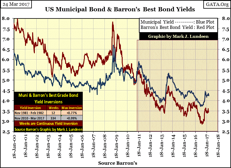
When the Federal Reserve pushed short-term interest rates down to almost zero in 2008, people have been dying for income. Yet the market clearly prefers lower yielding taxable corporate bond income to higher yielding tax-free income from muni bonds.

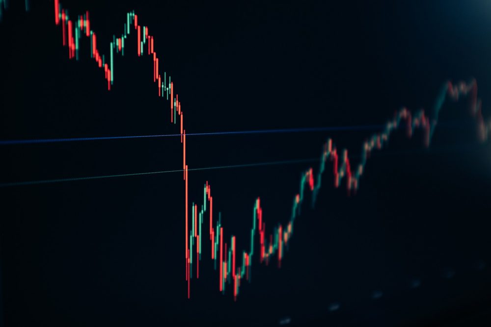
Gold has been stable this past week. Dow Jones had its last all-time high three weeks ago. The bond market warns of pending problems in the finances of local and state governments.
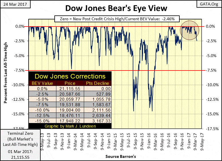
The Dow Jones made its last all-time high on March 1st, and since then its valuation has been slowly deflating. It closed this week only nine Dow Points away from breaking below its BEV -2.50% line in the chart below.
After the amazing 32 new daily all-time highs the Dow Jones has made since the November elections, it’s only right we cut the Dow some slack and not presume the current decline is just the first step down in a historic market decline. But I can’t help it; something in the back of my mind is constantly nagging me we’ll soon be living in historic times.
© Mark Lundeen
For one thing, President Trump threatens the established order in Washington and New York; the people responsible for all the market shenanigans of the past four decades. How many times has the taxpayer bailed out Wall Street when one of their highly levered-harebrained schemes went bust? Since 1982, three times by my count with the fourth and biggest bust pending.
Geeze Louise, the big NY banks are a counterparty to tens of trillions of interest rate derivatives, which only made them obscene profits as long as interest rates went down. But like T-bond yields, corporate (Red Plot below) and municipal bond (Blue Plot) yields bottomed last summer and are now rising. Not good for Wall Street!
After a four-decade long bull market, it’s time for Mr. Bear to make his presence felt in the fixed income market. Should bond yields return to where they were in 2008, I expect the big banks will once again come knocking on Congress’s door asking for another bailout. And for the same reason – their interest rate derivative positions are underwater by a few tens of trillions of dollars.
With Trump now in the White House, what happens then? With Democrats everywhere calling for his impeachment or assassination, and establishment Republicans doing as little as possible in pushing his agenda forward, they must fear Trump’s reaction to the pending panic on Wall Street they know is coming, as well as everything else he stands for.
© Mark Lundeen
The above chart of best grade corporate and muni bond yields shows a historic market anomaly, an anomaly that has now gone on for 334 weeks.
Muni bond coupon payments are tax-free, while corporate bonds are taxable. For this reason, yields in muni bonds were below those of corporate bonds, and with few exceptions, have always been since 1938 when Barron’s began publishing this data. Then came November 2010, and as you can see in the chart above, all that has changed.
When the Federal Reserve pushed short-term interest rates down to almost zero in 2008, people have been dying for income. Yet the market clearly prefers lower yielding taxable corporate bond income to higher yielding tax-free income from muni bonds.
This is the bond market’s warning of pending problems in the finances of local and state governments. People purchasing bonds issued by cities like Chicago, or states like California because they currently offer higher yields to corporate bonds, will one day regret holding the IOUs of the crypto-commies running the Democratic Party’s political machines.
Of course Wall Street has bundled these muni-bonds with a credit-default swap, exactly as they did with sub-prime mortgages in 2007. And we remember how that worked out. When mortgage defaults began to rise in 2007-08, Wall Street couldn’t make good on its obligations to its counterparties to those swaps because they spent all the money instead of holding reserves. People should have gone to prison! Instead, Congress and the Federal Reserve came into bail these criminals out.
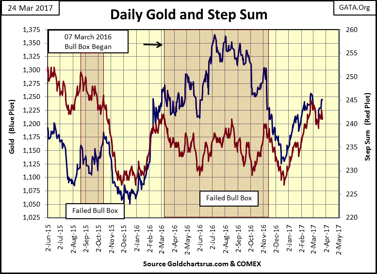
Gold is looking pretty good in its step sum chart below. Hopefully, it will clear its $1,250 level next week, but if it doesn’t, I’ll just have to live with that. It looks as if its lows of last December are going to hold. But even if that doesn’t, I could even live with that too.
The key thing to keep in mind with holding gold and silver is that our world is heavily indebted by weak credits and rickety banks; and so is pregnant with counterparty risk. Gold and silver have no counterparty risks. The day is coming when trillions of dollars in flight capital are going to flee the deflating financial asset markets and attempt to squeeze into the tiny gold and silver markets. I believe a day is coming when the price of gold and silver will rise to levels that are simply unbelievable to people today.
But an ounce of gold, either at $35 or $35,000 is still an ounce of gold. It’s the dollar, or euro, or yen that has changed, and not for the better when the price of gold and silver are rising. People who refuse to believe that the entire global political and financial establishments are doing everything possible, legally and illegally to prevent gold and silver from finding their actual free market prices simply don’t understand the situation the current monetary system now finds itself in.
© Mark Lundeen
Remember that at the beginning of the 20th-century gold and silver WERE money. Paper money a hundred years ago was understood by all to be a debt payable in gold and silver bullion. This metallic monetary standard prevented the banking system from inflating the money supply, and created economic stability in the marketplace, and government finance that is totally missing today.
But after two world wars, and a cold war with Communism, the old monetary metals were demonetized as central banks and politicians monetized the gullible belief in the full faith and credit of a central government.
Of course, central banks in our current monetary system have issued an excess of dollars, euros, and yen; they’ve issued more money than can ever fit into the tiny gold and silver markets in a financial panic. And come that day you’ll be glad you have a nice position in the precious metal miners too.
In such a market a precious metals exploration company could go from pennies to dollars over night. So, staking 5% of your allocation for precious metals investments in a mineral exploration company in today’s market is warranted.
As I’ve said before, I like Eskay Mining; ESK TSE Venture Exchange. Silver Standard will soon begin a multi-million dollar drilling program on Eskay’s flagship property in British Columbia this coming summer. Hopefully, owners of Eskay Mining will receive some good news next autumn.
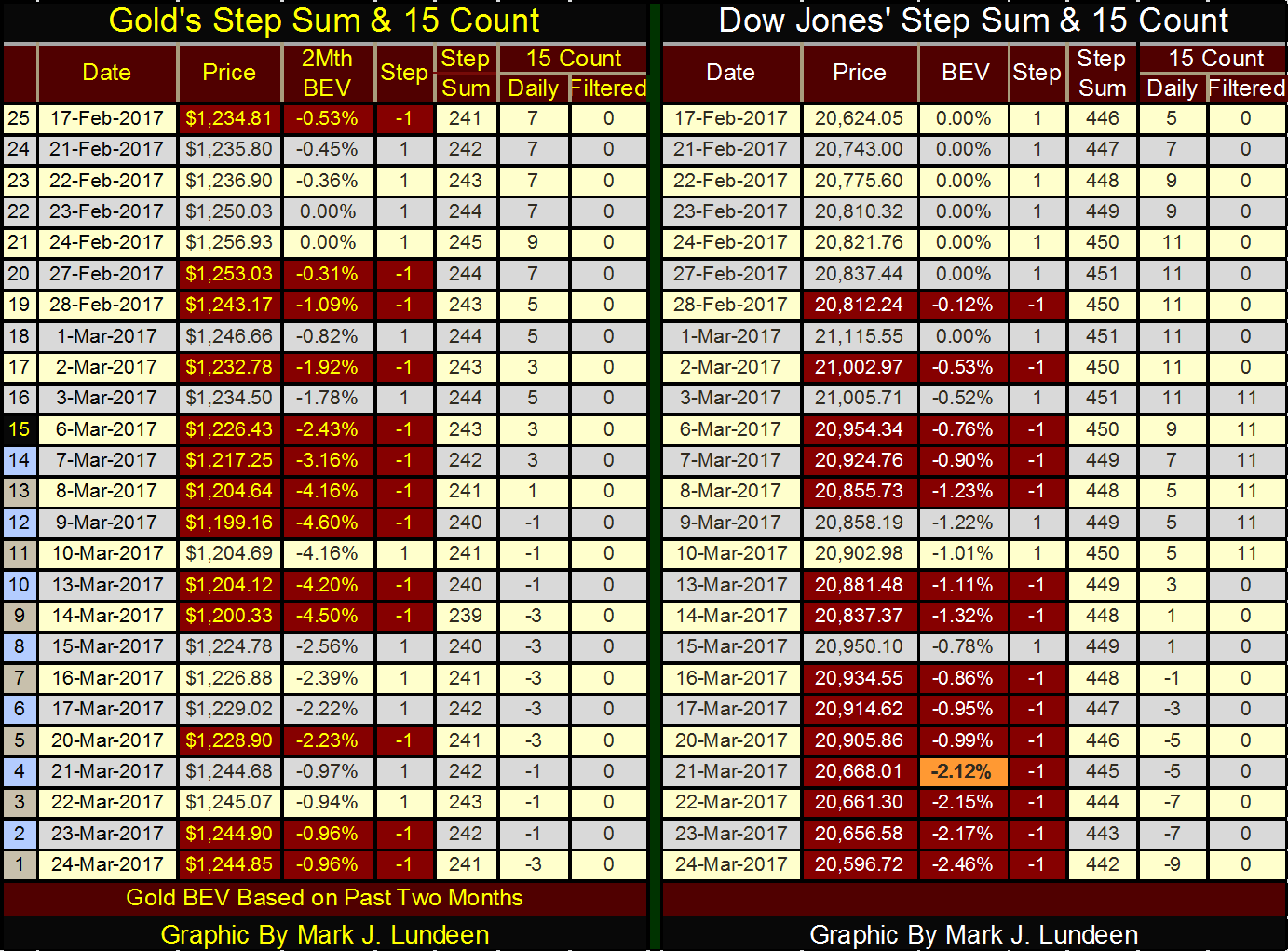
Moving on to gold and the Dow Jones’ step sum and 15 count table below, we see selling pressure for both gold and the Dow has increased in the past month. But gold’s response to its stagnating step sum and declining 15 count has been to increase its valuation, and that is darn bullish!
The Dow Jones response to its overwhelming down days has been to lose 2.46% from its last all-time high of March 1st. Look at March 21st. The Dow Jones saw a big down day and has slowly lost altitude since. Things can change in the next week. Being less than 2.5% away from its last all-time high, the possibility of the Dow Jones making a new all-time high next week can’t be ruled out. But I think that would be unlikely.
What I think is likely is that the Dow Jones’ 15 count of +11 seen from February 28th to March 3rd, was a market extreme marking the high water mark of the March 2009 to March 2017 market advance. I expect we’ll find the Dow Jones and the other major market indexes much lower six months from now and gold, silver and their miners higher.
© Mark Lundeen
Mainstream economists and “market experts” stand in awe of the FOMC as they “execute monetary policy.” But what is “monetary policy?” At its most basic level it’s actually very simple; “monetary policy” is how best to direct the monetary inflation flowing from the Federal Reserve System into “economic growth” as seen in rising asset valuations, rather than flowing into consumer prices (inflation).
It’s no more complicated than that. And since the creation of the Federal Reserve in December 1913, the FOMC has been responsible for all too much “economic growth” and consumer price inflation.
At its birth, the Dow Jones was at 78.11. A hundred and four years later the Dow broke above 21,000. In December 1913 US first class postage for a letter was $0.02; today it’s $0.49. And both the tremendous “growth” as seen in the Dow Jones and the terrible inflation in the cost of US first class postage stems from monetary inflation flowing from the Federal Reserve.
“Liquidity” flowing from the Federal Reserve goes everywhere, like into the earnings of the Dow Jones, as seen below. But look at the table on the chart. CinC has increased by a factor of 392 since 1929, while earnings for the Dow Jones has been up by only a factor of 75. And since 1982, every time the Dow’s earnings rose up to the CinC plot in the chart, earnings for the Dow Jones has crashed and appears to be doing so again.
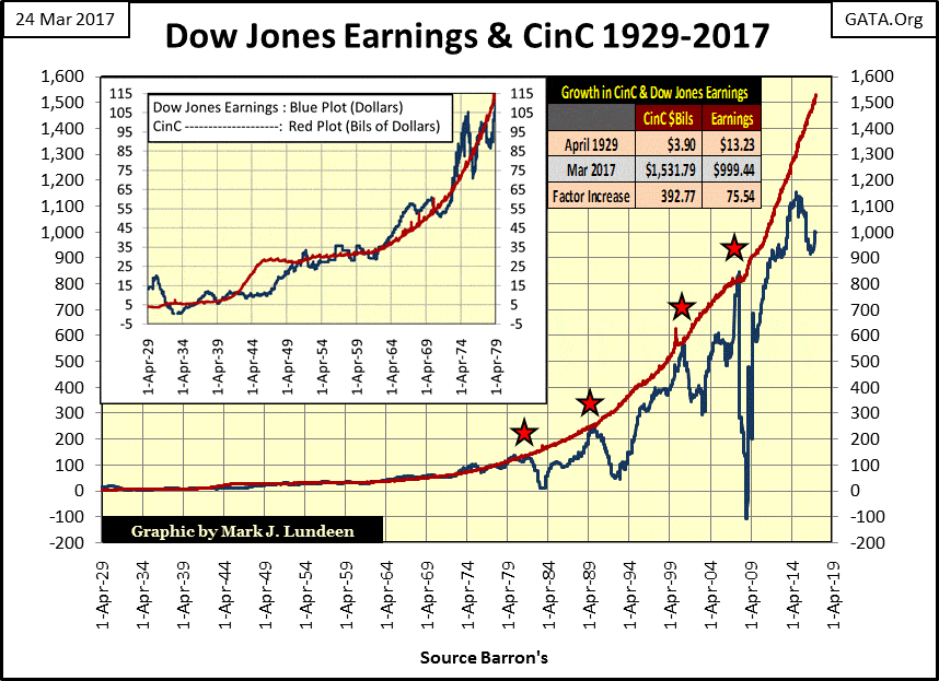
© Mark Lundeen
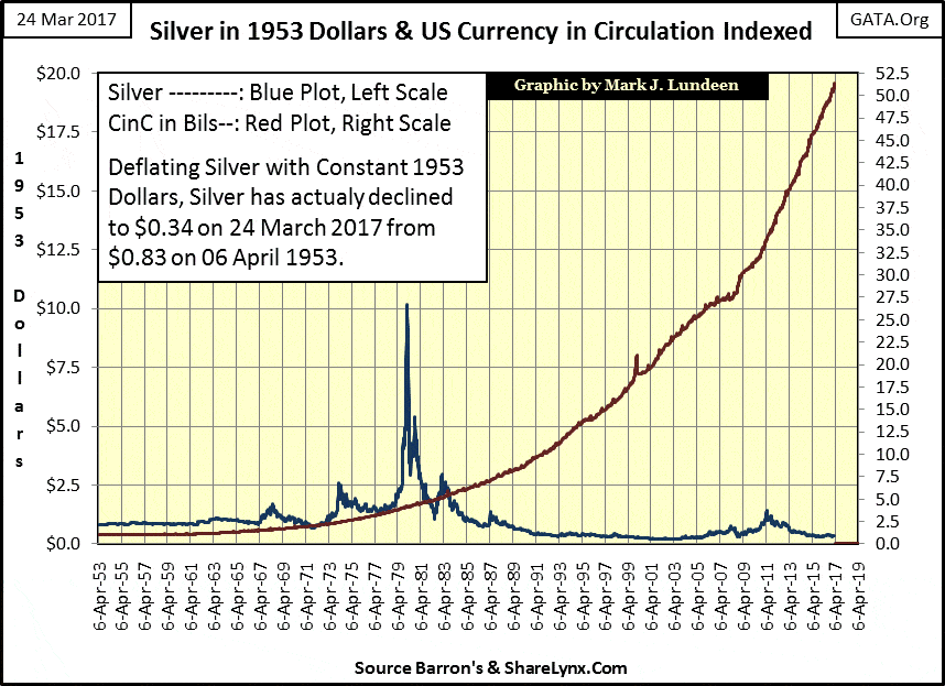
Here’s an interesting chart I haven’t published for some time, plotting CinC indexed to 1.00 = 1953. I then use these indexed values of CinC to construct a ratio with the weekly prices of silver to derive silver’s valuation in 1953 dollars.
In nominal dollars (the published price of silver), silver traded for $0.83 an ounce in April 1953 and closed this week at $17.76. In nominal dollar terms, silver’s price increased by a factor of 21.39 over the past sixty-four years. However, CinC (paper money inflation) has increased by a factor of 51.39 over the same period of time. To convert this week’s silver’s closing price into constant 1953 dollar terms, divided this week’s closing price by CinC’s factor increase;
$17.76 / 51.39 = $0.34 (1953 dollars)
One might say that silver today can be purchased for less than half of what it sold for in 1953. And when one is buying something for investment purposes; cheap is good!
© Mark Lundeen
“Investment professionals” have always been strong proponents for investing in America via the stock market, not gold and silver. But after taking CinC inflation into consideration, more often than not, since 1929 the stock market has been a mug’s game for retail investors.
Of course, the trick to all this is that the financial media has allowed these same people managing “monetary policy” to define what “economic growth” and consumer price inflation are:
-“Economic growth” is the success of the “policy makers” to divert their “liquidity” (monetary inflation) into a financial market’s valuations, such as stocks, mortgages or anything else Wall Street peddles to money managers and the public as “investments.”
-Consumer price inflation is exactly what they say it is, as defined by the Labor Department’s bogus Consumer Price Index (CPI), which as currently constructed has little relationship with our current rising costs of living.
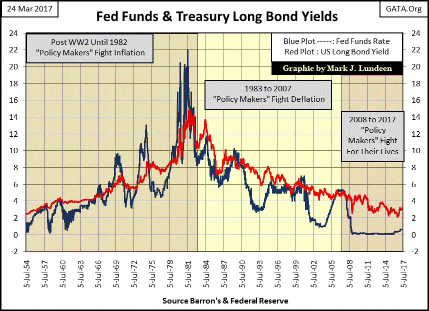
The past seven decades of US Treasury Long Bond Yields and Fed Funds Rates are plotted in the chart below. Using this data, it’s not hard discerning where monetary inflation flowing from the Federal Reserve System has been flowing to, and what the FOMC’s reaction has been.
I’ve divided the chart area into three epochs of “monetary policy”:
-Where the “policy makers” were fighting inflation (1954 to 1982),
-Where the “policy makers” were fighting deflation (1983 to 2007)
-Where the “policy makers” are fighting for their lives (2008 to present)
In the epoch where the FOMC was fighting inflation, we know that their monetary inflation was flowing into consumer prices because bond yields (Red Plot) were rising. The fixed-income market began demanding an inflation premium to compensate bond buyers for the loss of purchasing power of the US dollar. The “policy makers” response to rising consumer prices is seen by the frequency, extremes and durations their Fed Funds Rate (Blue Plot) has been raised above bond yields.
Note: when the FOMC sets its Fed Funds Rate above bond yields they’ve inverted the yield curve and “monetary policy” is called tight. By intent; inverting the yield curve brakes business activity and pushes up the unemployment rate. And the higher the Fed Funds rate rises above bond yields (the more extreme the curve inversion) the more extreme is the resulting recession in the economy.
The first inversion in the yield curve occurred in the mid-1960s, a mild inversion resulting in a mild recession. But bond yields in the following years continued rising in response to rising consumer prices, forcing the FOMC to invert the yield curve to increasingly greater degrees of tightness for longer periods of time.
By October 1981 the US Long Bond Yield had risen to 15% as the Federal Reserve increased its Fed Funds Rate to 22% in their effort to force their inflationary flows away from consumer prices, and channel their expanding money supply into financial asset valuations.
After three decades of failed attempts to inhibit their monetary inflation from flowing into consumer prices, the “policy makers” were finally successful.
Bond yields peaked in October 1981, marking the beginning of a four-decade long bull market in bonds. In August 1982 the stock market began its best advance of the 20th century as monetary inflation flowing from the Federal Reserve System now flooded into financial assets instead of consumer prices.
© Mark Lundeen
The next epoch in “monetary policy” seen above spans from 1983 to 2007, an epoch best described as the “policy makers” fight deflation in the financial markets whose valuations they’ve inflated. Economists don’t like to speak of it, but the simple fact is that someone can’t “deflate” anything until they’ve first inflated it. And from 1983 to 2007, what the “policy makers” have been inflating were bubbles in the stock, bond and real estate markets.
The first market bubble deflated was the Leveraged Buyout (LBO) mania of the mid-1980s.
Unlike the huge yield inversions of the era when the “policy makers” were fighting inflation, the yield inversions from 1983 to 2007 were small but devastating when they occurred. With the tiny yield inversion of the late 1980s, the LBO bubble began deflating, along with the bubbles in the Japanese stock and real estate markets. Times on and off Wall Street were bad. So in the early 1990s, Alan Greenspan lowered his Fed Funds Rate down to (at the time an incredible) 3.00%, thus igniting a bubble in the NASDAQ High-Tech shares.
But this bubble too was doomed to deflate when from January 2000 to March 2001 Greenspan increased his Fed Funds Rate above the Treasury’s long bond yield. Go up and take a quick look at the yield inversion of 2000-01. It wasn’t much of an inversion. But unlike the LBO era; the 1990s High-Tech bubble was a true mania that swept in the public, making the resultant deflation that much more damaging.
The “policy reaction” chosen by Greenspan in response to the Tech-Wreck of the early 2000s was identical to his response to the deflation in the LBO bubble; he lowered his Fed Funds Rate far below the long bond yield. But this time Greenspan, fully supported by Congress, inflated a bubble in the sub-prime mortgage market.
The economy saw incredible “growth” as seen in rising prices in single family homes, until as was the case with the LBO and High-Tech bubbles, the FOMC increased its Fed Funds Rate above long bond yields from July 2006 to September 2007.
As seen in the chart above, the 2006-07 yield inversion wasn’t much of an inversion in the yield curve. In fact, it was the smallest yield inversion since 1954. But market valuations in real estate, the stock and bond markets had become so grotesquely bloated by decades of “economic growth” flowing from the Federal Reserve System that the resulting deflation threatened to take down the entire global banking system.
The “policy makers” response to the credit crisis was exactly the same, except even more so. Which brings us to the third epoch of monetary policy; where the “policy makers” are fighting for their lives. Since December 2007 the FOMC has implemented the most inflationary monetary policy since its creation in 1913, as seen in the chart above and tables below.
© Mark Lundeen
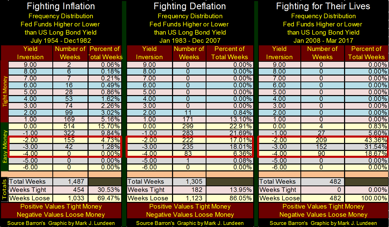
Looking at the totals at the bottom of the tables tells the tale. When the “policy makers” were fighting inflation from 1954 to 1982 they implemented tight money policy for 30% of the 1487 weeks in the sample. When fighting deflation from 1983 to 2007 tight monetary policy was implemented in only 14% of the 1305 weeks in the sample. But since January 2008, the “policy makers” haven’t implemented tight money (increase their Fed Funds Rate above the long bond yield) for a single week for fear of the deflationary consequences in the financial markets they know would result.
—
DISCLAIMER: This article expresses my own ideas and opinions. Any information I have shared are from sources that I believe to be reliable and accurate. I did not receive any financial compensation in writing this post. I encourage any reader to do their own diligent research first before making any investment decisions.


PayPal’s Slowdown: From Fintech Leader to Low-Growth Dividend Stock
PayPal has shifted from fintech leader to low-growth, value-style stock, losing over 25% in market value and trading at a...


Tilray (TLRY) Falls as Bearish Momentum Persists Despite Marketing Push
Tilray (TLRY) fell 3.32% to $4.44, remaining below key moving averages and signaling continued bearish pressure. Despite a £1 million...


ESG Gap Persists as Firms Struggle to Link Sustainability to Financial Value
KPMG’s Global Survey shows a major gap between ESG awareness and financial integration. While 72% of managers understand sustainability strategies,...


Bitcoin and Ethereum Slide as Market Pressure Builds Amid Strategy Concerns and Layer 2 Disruptions
Bitcoin fell below $60,000 with heavy ETF outflows, pressured by concerns over Strategy’s finances and its STRC stock decline. Ethereum...


AI Venture Builder Launches €600K Crowdfunding Round to Scale Secure AI Solutions
AI Venture Builder, an Italian-British firm developing AI applications and vertical startups, returns to CrowdFundMe with a equity campaign. After...
 |
|
 |  |
 |
|
-

 Biotech2 weeks ago
AseBio 2025 Report Highlights Growth and Future Potential of Spanish Biotechnology
-
 Cannabis2 days ago
Tilray (TLRY) Falls as Bearish Momentum Persists Despite Marketing Push
-

 Biotech6 days ago
New Gene Therapies Transform Rare Disease Care, but Gaps Remain
-

 Crowdfunding4 days ago
Ithaca: Climate Road Trip RPG on Climate Resistance
You must be logged in to post a comment Login