Featured
The current markets and the fall of Wall Street of 1929
This week is the 90th anniversary of the stock market crash of 1929, which was the trigger that plunge the world into the Great Depression. Could there be a 90-year cycle of economic depressions? Like many periods before the collapse, the predictions are that it won’t happen. The experts say that this time is different but is that the truth? Or are we already on the way for another crash.

Keeping your ear to the ground in the Markets is a sound investment.
Amah Lambert, author, Cracking the Stock Market Code
Big market price changes happen when lots of people are forced to re-evaluate their prejudices, not necessarily when the world actually changes.
Jack D. Schwager, author, Market Wizards; b. 1948
There is no cause to worry. The high tide of prosperity will continue.
Andrew W. Mellon, Secretary of the Treasury, September 1929; banker, industrialist, philanthropist, art collector, politician; 1855–1937
October 28–29 marks the 90th anniversary of the infamous 1929 stock market crash. W.D. Gann was a famous stock and commodity trader (1878–1955) who reportedly made $50 million trading in the early part of the last century. He was a big believer in long-term cycles and developed theories about them. One of his key long-term cycles was 90 years, largely because of the arc of 90 degrees and its importance in geometry and as one-quarter of the circle 360 degrees.
The cycle of 90 would also apply to days and months as well. Half that is 45 degrees, so the half-cycles would be 45 days, 45 months, 45 years. So, this being the 90th anniversary of a very famous stock market crash, it is not surprising that we have read some tomes predicting that another stock market crash of some magnitude could soon be upon us. There are also many who believe and predict the opposite.
Could there be a 90-year cycle of economic depressions, wars, and panics? There is some evidence of it. The long-term cycles like the Kondratieff wave (40–60 years), the 75-year cycle, and the 90-year cycle coincide roughly with the lifespan of a generation. The next generation repeats the mistakes of its parents and ancestors, even if the reasons vary.
War is often at the heart of these cycles, but the last example of the 90-year cycle was the Great Depression and in North America, at least, no war took place. Financial panics are common as are periods of speculation that build up before the panic. That doesn’t seem to change even if the speculation is different than the previous one.
Like many periods before the collapse, the predictions are that it won’t happen. The experts always say that “this time is different.” As the economists Carmen Reinhart and Kenneth Rogoff wrote in their book This Time is Different, Eight Centuries of Financial Folly (Princeton University Press, 2009) the claim is “the old rules of valuation no longer apply and that the new situation bears little similarity to past disasters.” They are usually wrong. And no doubt they will be wrong again. The question is, when will it happen? Not, will it happen again—it will. The question is when.
They claim they avoided the economic disaster following the 2008 financial crisis. Yes, they did by lowering interest rates to levels never seen before in history, and by pumping trillions of dollars into the markets through bond purchases with a market mechanism known as quantitative easing (QE). As many would claim, it worked.
In all probability an economic depression was avoided or, should we say, delayed. Instead it was called the Great Recession. It set off a new upward wave for global stock markets, but it also unleashed an unprecedented wave of borrowing. Since 2008 global debt has exploded by over $100 trillion and it now stands near $260 trillion. Financial collapse is all about debt collapse.
Since 2008 we have had our share of economic crises. A list: Iceland financial crisis 2008–2012; Irish banking crisis 2008–2010; Russian financial crisis 2008–2009; the European sovereign debt crisis 2009 and ongoing; Greek debt crisis; Portuguese debt crisis 2010-2014; Spanish debt crisis 2008–2016; Venezuela debt crisis 2012–; Ukrainian debt crisis 2013–2014; Russian financial crisis 2014; Chinese stock market crash 2015; Turkish currency and debt crisis 2018; Argentina debt crisis 2019.
None have caused global contagion. But that doesn’t mean the next one won’t. Wars have also been common including the Syrian civil war, the Yemeni civil war, and the conflict in the Ukraine. Other wars such as Iraq, Afghanistan, the war against ISIS, and the civil war in the Sudan have been ongoing. All have resulted in millions of deaths and refugees, and involved the Great Powers, particularly the U.S. and Russia but China as well.
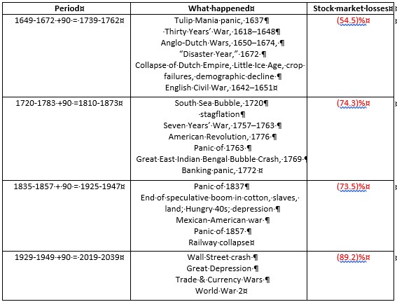
Source: www.goldchartsrus.com
The above table outlines how we see the 90-year cycle going back four centuries. Others have done studies going back to ancient times and also uncovered long-term cycles roughly 90 years apart. Here we have used stock markets starting with the Dutch stock market of the 17th century, the British stock market of the 18th century, then the U.S. stock market from the 18th century onward.
We started it at stock market highs and ended with the lows, except for the Great Depression and War cycle where we ended it at the 1949 low, the acknowledged end of the Great Depression and War, even though the absolute low was seen in 1932. The decline in the stock market was taken from the high to the absolute low.
None of this is say that we are about to enter a period of economic depression. But the potential is there, particularly given the high level of global debt and stock markets propped up by historically low interest rates, QE, and debt. Many cycle followers have acknowledged that the 2008 financial crisis was most likely the 75-year cycle stock market low (1932+75 = 2007).
Going back 75 and 150 years, significant stock market lows were also seen in 1857 and 1783. Using Gann’s cycles of 90 and its half-cycle of 45, one can go back 45 years where there was a significant stock market low in 1974. Forty-five years before that it was 1929 and the top of the stock market. The “Gilded Age” stock market top occurred in 1881 which was 48 years before 1929, certainly within the range.
The final low came in 1896. Going back 45 years again and we come to 1836. The stock market top was 1835. Finally, 45 years before that was 1790 and we find a significant stock market low in 1789. History may not repeat itself, but it often rhymes (attributed to Mark Twain).
What is going on in the Repo Market?
The Fed is at it again. We had thought the Fed had ended its intervention in the repo market after the big jump in repo rates in September 2019. For the uninitiated, the repo market is one of the largest securities markets in the world where firms and banks offer U.S. Treasuries and other high-quality securities as collateral to raise cash, primarily overnight to finance their trading and lending activities. The next day, borrowers pay back their loans plus a nominal rate of interest and get their bonds back.
Well, it seems that the Fed is not finished. In what has to be a completely understated and under-reported story, in the financial press we learned that on October 24, 2019 the Fed would be spending upwards of $120 billion a day in repo loans to Wall Street security firms. That is a $45 billion increase from a previously announced $75 billion a day injection. The Fed is also increasing its 14-day term loan program to $45 billion, raising this program to $90 billion a week. Altogether, the program now totals some $690 billion.
We think the expression is “WTF.” This compares with the program seen during the 2007–2010 financial crisis where some Wall Street firms received upwards of $2 trillion in cumulative loans over 2 ½ years. All of this is being done without any approval from Congress or authorization from any official such as Treasury Secretary Steven Mnuchin, nor has anyone come out and announced a financial crisis. Although we are sure President Trump will approve.
And it’s being done seemingly without the awareness of the larger public. We found very few stories on this, although what we are reporting is largely from those few stories—in The Financial Times, a blurb on CNBC, an article in Wall Street on Parade. The program is to last into the 2nd quarter of 2020.
What is truly astounding about this program is the loans are not being made to banks but instead to primary dealers. Curiously, we found four Canadian dealers amongst the listing, including Bank of Nova Scotia, BMO Capital Markets, RBC Capital Markets, and TD Securities (USA). Most of the dealers listed are foreign. Significantly, it includes Citigroup, Deutsche Bank, Goldman Sachs, J.P. Morgan, Morgan Stanley, and Wells Fargo.
The question is: is this a bailout of a problem? We have mentioned Deutsche Bank in the past and all of these dealers are huge derivative dealers operating in the global derivatives market. The global derivatives market is estimated at $524 trillion, but in fact its market value is estimated at $12.7 trillion.
That’s still significant. Remember that $524 trillion is notional value. The market value is a lot less as noted. Deutsche Bank’s derivative book is estimated at €43.5 trillion (Dec 31, 2018) or US$ 48.2 trillion. That’s notional and based on the above for market value it is about US$1.2 trillion. That is considerably more than Deutsche Bank’s capital of €68.7 billion (2018).
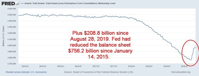
Source: www.stlouisfed.org
The Fed balance sheet has leaped since August 28, 2019, up $208.8 billion. It took 4 ½ years to reduce it by $756.2 billion. The Fed is bailing out these large dealers and bank holding companies. Yet no one has authorized it, and, no one has stated why. Is this QE4? Tellingly, these same banks sit on the board of directors of the New York Fed. Five of these primary dealers have admitted to criminal felony charges brought by the U.S. Department of Justice for frauds against the unsuspecting public.
Even as they were doing this, apparently the loans were oversubscribed; meaning that the demand was growing for these funds.
As we said—what is going on????
Source: www.stockcharts.com. David Chapman
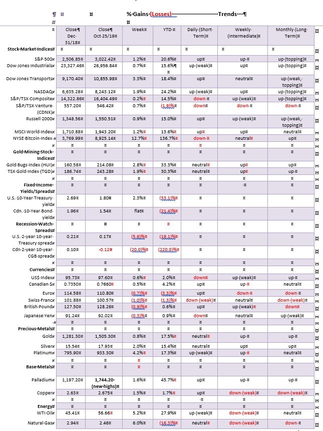
Note: For an explanation of the trends, see the glossary at the end of this article. New highs/lows refer to new 52-week highs/lows.
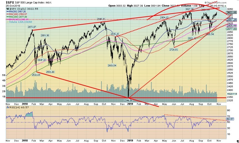
Source: www.stockcharts.com
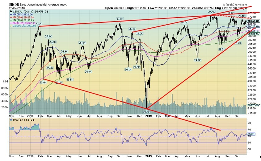
The S&P 500 came within a hair’s breadth of making a new all-time high this past week. The high was 3,027.39 vs. 3,027.98 seen on July 26, 2019. The odds would seem to favour new all-time highs this coming week. This past week the S&P 500 rose 1.2%. The Dow Jones Industrials (DJI), however, was up only 0.7% and, as we see in the next chart, remains below not only its all-time high but two other slightly lower highs.
The Dow Jones Transportations (DJT) is steaming ahead right now, gaining 3.3% this past week while the NASDAQ was just short of its all-time high gaining 1.9%. The small cap Russell 2000 was up 0.9%. Here in Canada the TSX Composite gained a lethargic 0.2% while the TSX Venture Exchange (CDNX) showed some life, up 0.7%.
Internationally, the MSCI World Index gained 1.2%, the London FTSE gained 2.6%, the Paris CAC 40 was up 1.5%, and the German DAX jumped 2.1%. In Asia, the Shanghai Index (SSEC) was up 0.6% and the Tokyo Nikkei Dow (TKN) gained 1.2%. Beleaguered Hong Kong saw the Hang Seng Index remain relatively flat, off 0.2%.
All in all, it was a good week for stock markets everywhere. We now have to pose the question? Is QE once again having a positive impact on global stock markets? Against the backdrop of a slowing global economy, it seems governments and central banks everywhere do not hesitate to hit the panic button and start pumping liquidity into the financial system at the first sign of trouble.
The ECB announced new QE back in September and cut the bank deposit rate to -0.5% in its attempt to revive the dormant EU economy. China has pumped up injections to combat trade wars. Japan seems to be in endless QE. And in the U.S. the Fed started its mysterious bond buying back on September 17 via its repo program. Now it seems to be accelerating the program even if they don’t announce it.
Since hitting a low on October 3, the S&P 500 has jumped 5.8%. Other indices have shown comparable gains with DJI up 5.4%, the DJT up 11.8%, and the NASDAQ gaining about 7.1%. If there is a problem, it is that volume has been waning, suggesting a slowdown in momentum even as the market moves to potentially new all-time highs.
Even the smaller stocks are jumping as the S&P 400 Mid-Cap is up 5.2% and the S&P 600 Small-Cap is up 5.3% since Oct 3. Nonetheless, no index is as close to making new all-time highs as the S&P 500. Divergences? Well they are only divergences until they are confirmed with a breakdown or at some point going forward all of them make new all-time highs.
The S&P 500 remains within the confines of the broadening channel. But there is room to move higher to at least 3,060/3,065? A potential wedge triangle tops out currently around 3,080. So, it is easy to argue that most likely we should move higher near term. But will it last? Or could we burst even higher?
If our thoughts on QE are right, then the markets could burst to the upside in a potential blow-off move. We could argue that the S&P 500 is forming a rising triangle, given higher lows in May, July, and October. We have the potential top of the triangle with highs in July (3,028) and September (3,022).
The triangle, if valid, has potential to see the S&P 500 rise to just over 3,300. That would get everyone excited. So, who will win? A possible ascending (rising) triangle, or the broadening channel or ascending wedge triangle. Rare to see so many potential technical patterns at once and conflicting ones at that.
To follow are some other indices that are also showing bullish signs (note: we can’t show them all).
The current breakdown point is now at 2,900 with a confirmation on a breakdown under 2,800. The 200-day MA is currently at 2,877 and rising. Support is at 2,950.
Source: www.stockcharts.com
The diverging DJI is an argument as to why the markets may not rise. Note that the DJI is making (so far) a lower high below its July and September highs. We are also still under the Oct 15 high. So, this is a divergence that needs to be resolved. The NASDAQ is also just below its July and September highs. The DJT appears poised to break out to the upside, although it will face resistance between 11,000 and 11,600.
Nonetheless, the breakout at this point seems real and could measure the DJT to over 12,000. We will watch for resolution of these current divergences. Like the S&P 500 we could argue that the DJI is forming a potentially bullish ascending triangle. We also see the broadening channel and a possible ascending wedge triangle both bearish.
Source: www.stockcharts.com
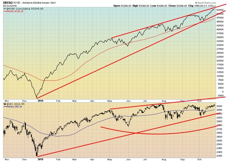
The bull’s big argument has been the charging NYSE advance-decline line that keeps steaming to new all-time highs. What is needed now is the S&P 500 to confirm the AD line. While not shown, the NASDAQ advance-decline line is not showing the same bullishness as the NYSE AD. It remains well below its highs, but it is rising and arguably could be poised to break out to the upside.
Source: www.stockcharts.com
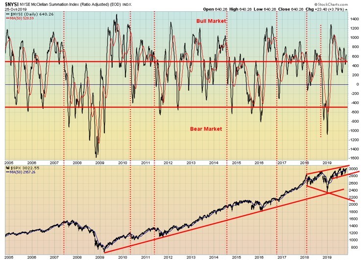
The McLellan Summation Index (ratio-adjusted), known as the RASI, is back above 500. It is making lower highs even as the S&P 500 is close to new all-time highs. We have seen in the past the RASI make lower highs even as the index makes new highs so it is not necessarily something to get too excited about. But it is worth noting as divergences build between indicators and the indices.
Source: stockcharts.com
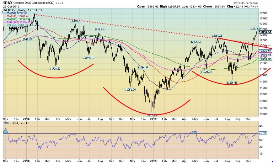
The German DAX is one of the indices breaking out that appears to be making the argument that markets are poised to move higher. The power of QE. The ECB is one of the biggest abusers of QE in an attempt to keep the moribund EU economy alive and fend off the ravages of Brexit. The DAX has broken out of a 2-year downtrend and has potential to move to 13,800.
We are seeing these breakouts on a number of indices including emerging markets. We could argue that the DAX has formed a multi-year head and shoulders bottom with potential to rise to 15,000. Numerous international ETF’s and indices are also breaking out to the upside.
Source: www.stockcharts.com
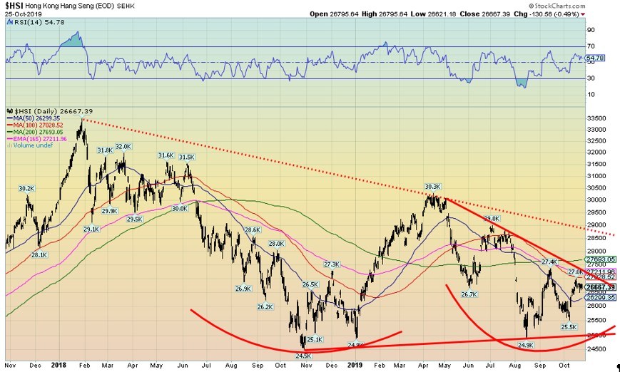
Moving over to Asia, it is rather surprising (or maybe not) to see the Hong Kong Hang Seng Index potentially poised to break out to the upside. After months of strife in Hong Kong everyone may be getting tired and if things calm down, Hong Kong could get back to business. We are showing the Hang Seng Index as having potential to break out to the upside given a rather interesting triangle forming with higher lows. Some indices such as Taiwan have already broken out.
Source: www.stockcharts.com
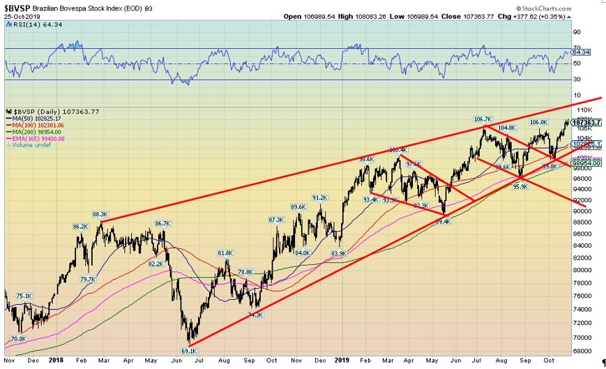
Latin America may be stuck with Argentina, Venezuela, and, surprisingly, strife in Chile but the Brazilian Bovespa is breaking out to new highs. Grant you, the top of the channel is up just above 110,000 but still… We’ll see if the channel stops this up move. However, the breakout of the Brazil index is in fitting with others also breaking out.
Source: www,stockcharts.com
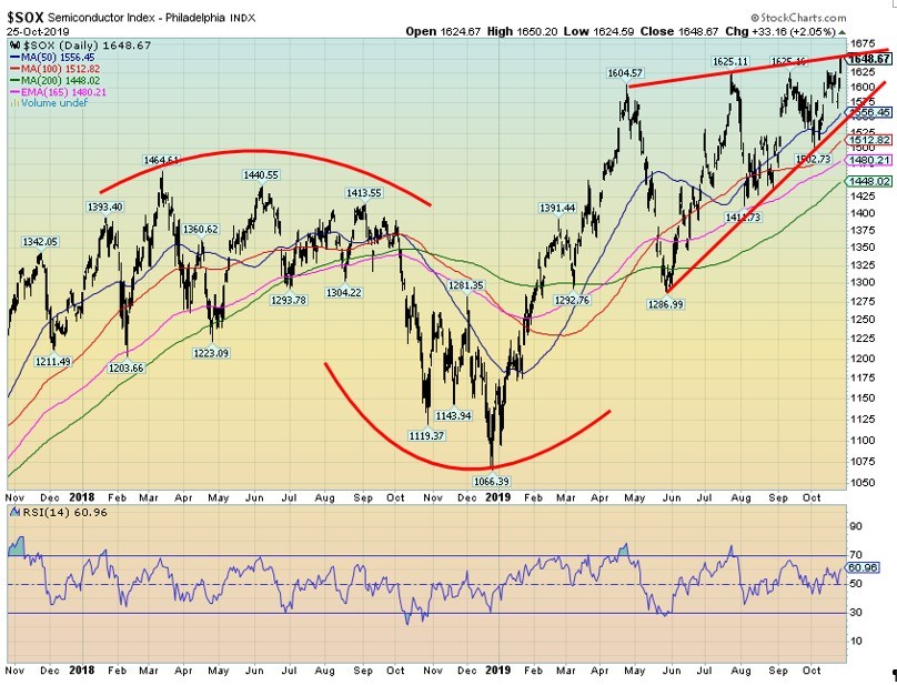
The Philadelphia Semiconductor Index is at an important juncture. It is either going to break higher from here or it has hit the top of a potential ascending wedge triangle. To us it appears as the latter. So, if correct, the high-tech semiconductor sector may not join any stock mania party. However, it has to halt here and then break down under 1,575.
Source: stockcharts.com
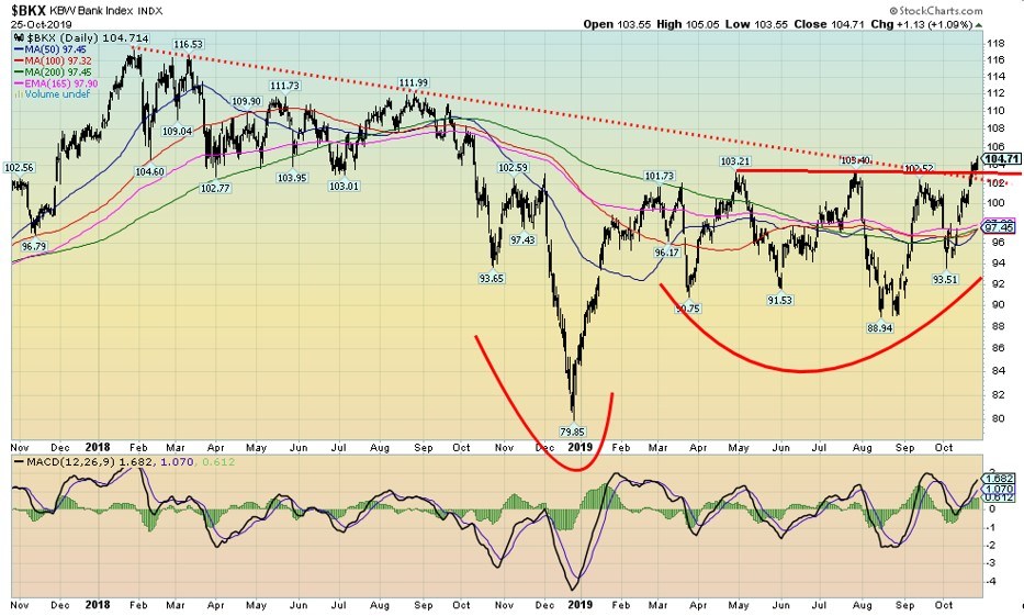
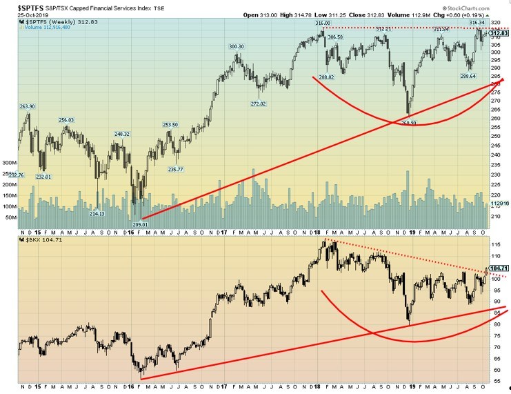
The argument that we could be breaking out extends to the banks as the KBW Bank Index appears to be busting above a year-long consolidation pattern. The pattern appears as a potential head and shoulders bottom. It has measuring implications to 117. The BKX also appears to be breaking out of a 2-year downtrend.
We note that some other banks are also showing signs of breaking out. If the Fed’s repo program is in response to a problem in the banking sector, it is not showing up on the charts (except the European banks that all look terrible). But the U.S. banks appear to be breaking out as seen here with the KBW Bank Index. The power of QE.
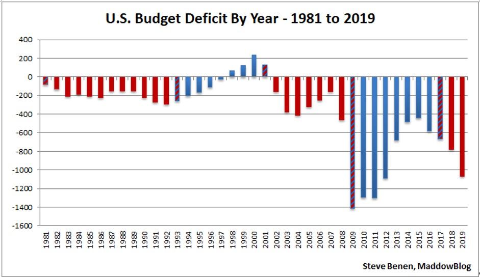
President Trump may be undergoing an impeachment crisis but he also is undergoing a deficit crisis. The budget deficit of 2019 is now expected to exceed $1 trillion. Indeed, it could be headed for $1.2 trillion. The current projection is a budget deficit 4.8% of GDP.
The last trillion $ deficit was seen in 2012 and when Trump took over, trillion $ deficits appeared to be a thing of the past. Well, it appears not. Large government deficits tend to add to crowding out in the bond market as the government’s insatiable need overwhelms other lesser credits also seeking cash.
Source: www.stockcharts.com
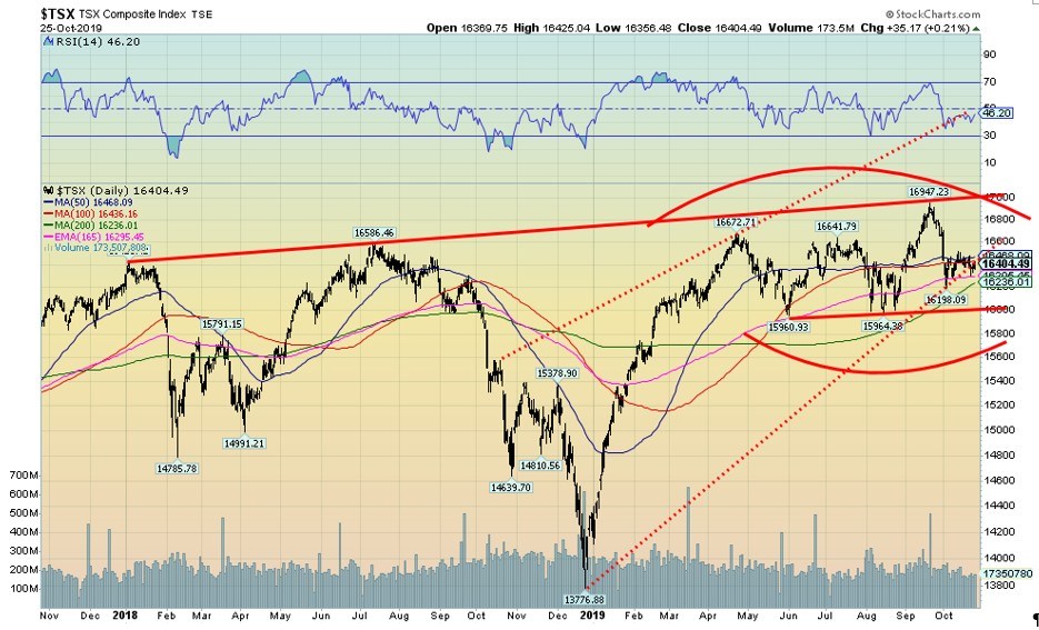
Is the TSX poised to move higher or break down? Unlike everyone else, the BofC has not executed a QE program. What can be said is that the TSX tends to follow the other indices so if they are breaking out to the upside then the TSX would follow. The pattern looks like a top, but if the TSX were to recover back above 16,650 then odds would favour an upside breakout. Still channels suggest there is considerable resistance up to 17,000. The breakdown is at 16,000.
Source: www.stockcharts.com
If the KBW Bank Index is breaking out, could the TSX Financials Index (FS) also do so? The FS appears to be forming a 2-year head and shoulders bottom so it is clearly possible. The breakout point is above 316.00 (or to be safe 316.50) and could project up to 371/372. The pattern on the FS actually looks better than the KBW but, unlike the KBW, the FS has not yet broken out to the upside. So, keep an eye on this one as that would be positive for Canada’s banks.
Wednesday is D day for the FOMC and many are expecting the Fed to cut another ¼%, lowering the Fed rate to 1.50%–1.75%. If they do that as expected, many are now also expecting that to be the final one this year. Dec Fed funds futures are flattening out, suggesting no further rate cuts. After all, the Fed now has what we believe is a QE program that is expected to last into the New Year.
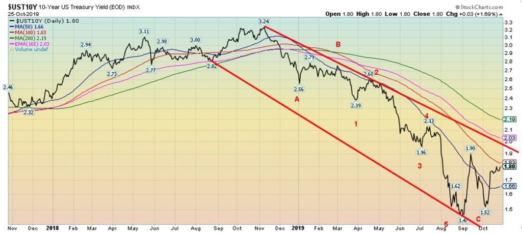
Trillion $ deficits, however, could put upward pressure on U.S. interest rates. The U.S. 10-year Treasury note rose 4 bp this past week to 1.80%. With a low at 1.47% and a higher low at 1.52% our expectations are that U.S. interest rates have bottomed. The question is, will they break out further to the upside? There is resistance up to 2.00% and then up to 2.20%. A breakout above 2.20% would set our sights on a move to 2.50%.
The wild card for interest rates remains the same with U.S.-China trade talks and Brexit. But trillion $ deficits put more pressure on raising funds and potentially squeezing out other borrowers. Next week’s nonfarm payrolls and employment numbers will be interesting. Any signs of weakness could send rates lower again. But a strong number could send rates higher. The current expectation for nonfarm payrolls for October is a gain of 120,000 and unemployment to remain at 3.5%.\
It is an important week for the central banks as not only is FOMC this week but the BofC will also make its decision followed by the BOJ on Thursday. Watch for the Q4 Treasury refunding program out on Wednesday.
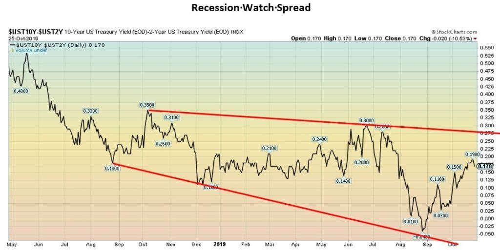
Recession? Or no recession? With a positive yield spread of 17 bp our recession watch 2–10 spread is not suggesting a recession. However, it did go briefly negative back in August. We have always noted that once it goes positive again after a period of being negative it raises the odds of a recession.
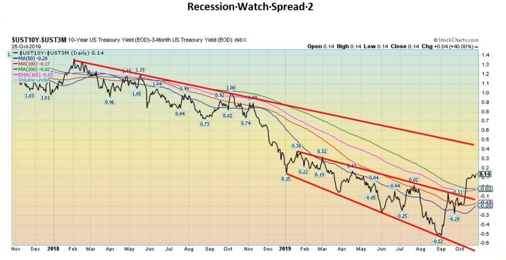
The same is being seen on the 3-month–10-year spread as it has turned positive to +14 bp. This follows a negative period where it bottomed at -52 bp in August. But it has now swung positive again and has broken out to the upside. Major resistance is seen up at +40 bp.
Source: www.stockcharts.com
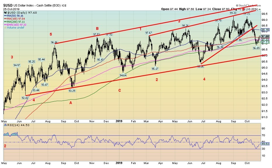
For the moment at least, the US$ Index has found support at 97 and has started to rise again. The power of QE may be seeing funds flow back into the U.S. stock market and in turn that raises the US$ Index. The US$ Index rose 0.6% this past week while the euro fell 0.7%, the Swiss franc dropped 1.0%, the pound sterling fell 0.9% over confusion on Brexit, and, the Japanese yen was off just under 0.3%. The Canadian dollar bucked the trend, gaining 0.5% as oil prices rose and the election returned a Liberal government, albeit a minority one.
With the expectation of a rate cut by the Fed this week and it being the last one of year that would also boost the U.S. dollar. Resistance up to 98 but above 98 the next resistance is 98.50. A move above 99 would raise expectations of new highs. A breakdown under 97 could set in motion a test of major support at 96. As it is, right now we see this up move as a countertrend and our expectations are that once this counter move runs out, we should resume the downtrend.
Source: www.stockcharts.com
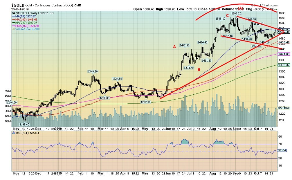
Gold managed to rise almost 0.8% this past week, but once again it ran into stiff resistance near $1,520 and the 50-day MA. The close Friday was negative, considering that at one-point gold was up around $10 but ended the day only up 60 cents. Silver had a good week, gaining 2% but it too reversed on Friday. Gold is now caught between a rising trendline and a falling one.
The breakdown point is seen at $1,490, but a major breakdown would occur under $1,460 and especially under $1,440. We note the 200-day MA is down near $1,380 and a test of the 200-day MA is not unusual in a bull market. Volume has tailed off during this consolidation period. What we once thought might be a head and shoulders top forming has instead morphed into a potential flag or pennant. That could prove to be bullish but gold needs to break out over $1,550 to suggest to us new highs and a run to $1,600 or higher.
We still have potentially unfulfilled targets up to $1,725. We believe that gold is going higher, but we need to work our way through this corrective period that could last into mid-November or even early December.
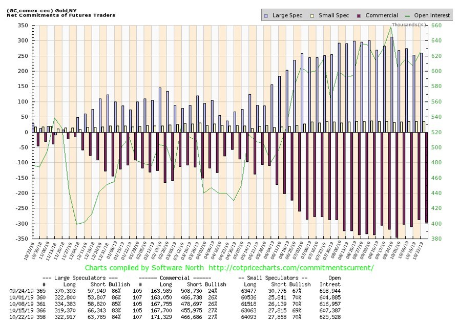
Source: www.cotpricecharts.com
The commercial COT for gold remains bearish, coming in this past week unchanged at 27%. There was a small increase in long open interest of about 3,500 contracts but short open interest also rose roughly 11,000 contracts. Until we see the commercial COT at least up into the 30’s we remain cautious and somewhat bearish for gold. The large speculators COT (hedge funds, managed futures, etc.) was at 84% this past week, still too bullish for our liking.
Source: www.stockcharts.com
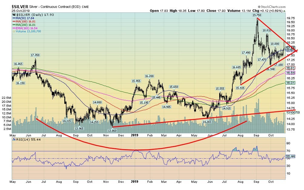
Silver spiked on Friday to a high of $18.35, then reversed and came right back down again, closing at $17.93. It was a gain of 2% on the week. Platinum had a good week, gaining 4.2% while palladium continued its record run, gaining 1.6%. Copper rose 1.5% as there were some positive vibes on the U.S.-China trade front and Brexit. Silver continues to form what appears to be a large symmetrical triangle.
We believe it is a consolidation triangle rather than a top triangle. A firm breakout over $19 would convince us we are going higher with probable new highs above $19.75. The triangle has potential measuring implications to $21 if it can break out. Silver breaks down under $17.25 but the key zone for a breakdown is not seen unless it fell under $16.50. The 200-day MA is down at $16. Major long-term support is seen at $14.75.
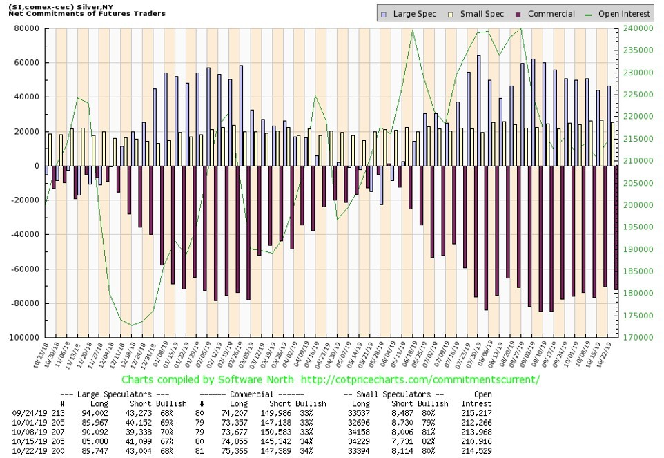
Source: www.cotpricescharts.com
Like the gold commercial COT, the silver commercial COT was unchanged last week at 34%. There wasn’t a lot change as long open interest rose about 500 contracts and short open interest was up about 2,000 contracts. The large speculators COT rose to 68% from 67%. Overall, little movement meant our view hasn’t changed. We remain somewhat mildly bearish. We’d like to see an improvement above 40% to suggest a more bullish tone.
Source: www.stockcharts.com
The gold stocks had a decent week with the TSX Gold Index (TGD) gaining 1.9% and the Gold Bugs Index (HUI) up 2.3%. Nonetheless, both indices hit a resistance zone on Friday and soon gave back all of their Friday gains. Note how the TGD failed at the 50-day MA. We are not so convinced now that the TGD is forming a head and shoulders top as the right shoulder is taking far too long to form. Normally that doesn’t happen.
Still, we continue to note a breakdown zone at 230 which could suggest a drop to 180. There are a number of critical support zones, however, at 220 and 210 and 200. For that reason, we suspect the 180 target is not really in play. We could be forming a pennant or flag formation and the breakout point to the upside is now at 250. Above that, targets could be 290. This has become a case that one has to wait and see which way the market breaks.
Source: www.stockcharts.com
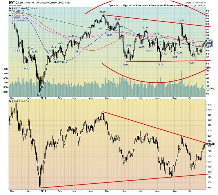
WTI oil rose this past week, gaining a healthy 5.2%. That helped the oil stocks as the Arca Oil Index (XOI) rose 5.2% and the TSX Energy Index (TEN) jumped 2%. Signs of peace on the U.S.-China trade front and a potential delay in Brexit (and an election) helped firm oil prices. Also helping was a reduction in U.S. oil stocks and a temporary shutdown in a pipeline.
Still, there remains a steady supply of oil and the world still probably has too much. So, our expectations here are not for a sustained rally. A move above $58 would be positive and we test up to $62, but we’d really need to break firmly above $62 to suggest a more powerful rally. We doubt it. $50/$52 remains critical support and below $50 a move down towards $40 would be underway. For the XOI it could well break out over 1,250 suggesting a potential major breakout.
We’d feel better on a move over 1,280/1,300. Still, one can get a breakout on the oil stocks that is not fully confirmed by a rise in oil prices. Natural gas prices are rising a bit once again as NG gained 6% this past week. And that too helps the energy stocks.
Source: www.stockcharts.com
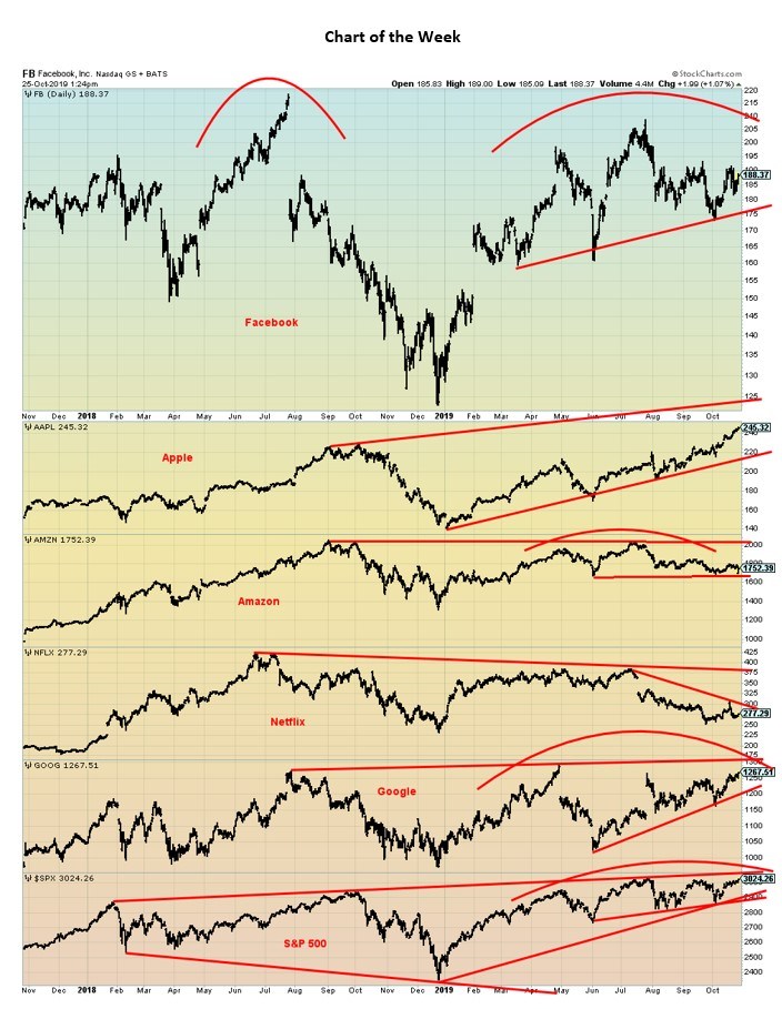
The FAANGs (Facebook, Apple, Amazon, Netflix, Google) were the major leaders on the way up. But, with the exception of Apple, none of them are making new highs even as the S&P 500 is making new highs. Facebook looks dangerous as not only has it made a lower high in 2019 but it appears to be forming a topping pattern. Amazon appears to be making a multi-year topping pattern. Netflix is already in a downtrend and appears poised to move lower. Google could also be making a multi-year topping pattern.
Meanwhile, the S&P 500 is making new all-time highs but still within the confines of the broadening channel that has formed over the past two years. The markets have been moving higher, but the signs are there that suggest massive distribution is going on even as it appears others are prepared to break out to the upside. The question is—when, not if, the market cracks and what will trigger it.
—
(Featured picture by Austin Distel via Unsplash)
DISCLAIMER: David Chapman is not a registered advisory service and is not an exempt market dealer (EMD) nor a licensed financial advisor. We do not and cannot give individualised market advice. David Chapman has worked in the financial industry for over 40 years including large financial corporations, banks, and investment dealers. The information in this newsletter is intended only for informational and educational purposes. It should not be considered a solicitation of an offer or sale of any security. The reader assumes all risk when trading in securities and David Chapman advises consulting a licensed professional financial advisor before proceeding with any trade or idea presented in this newsletter. David Chapman may own shares in companies mentioned in this newsletter. We share our ideas and opinions for informational and educational purposes only and expect the reader to perform due diligence before considering a position in any security. That includes consulting with your own licensed professional financial advisor.


Bitcoin Stalls Near $60K as Strategy Moves, ETFs Outflow, and EU MiCA Rules Take Effect
Bitcoin hovers near $60,000 with ETF outflows, while Strategy boosts reserves, sells BTC, and raises dividends to reassure investors. Ethereum...


Cannabis Dominates Global Drug Use: Trends, Risks, and Shifting Markets
Cannabis remains the world’s most widely used illicit drug, with 256 million users in 2024, surpassing all others combined. Growth...


Italy Approves First Hydrogen-Powered Train for National Rail Network
ANSFISA has approved Italy’s first hydrogen-powered train, the Alstom HMU214, for use on the Brescia–Iseo–Edolo line. Capable of 140 km/h,...


Cotton Market Weakness Persists Despite Brief Rebound
Cotton prices fell to new lows last week before a modest rebound. USDA data shows crop conditions remain worse than...


Eli Lilly Hits $1 Trillion Valuation Amid Strong Bullish Momentum
Eli Lilly stock hit a record high, surpassing $1 trillion market value after strong product demand. Shares surged over 7%,...
 |
|
 |  |
 |
|
-

 Fintech1 week ago
Mollie Expands Across EEA With €350M Investment to Strengthen European Payments Network
-

 Cannabis2 weeks ago
Europe’s Cannabis Shift: Rising Use, and New Risks
-

 Crowdfunding5 days ago
AI Venture Builder Launches €600K Crowdfunding Round to Scale Secure AI Solutions
-

 Impact Investing2 weeks ago
AI Adoption in Italian Retail Stalls Despite Strong Experimentation