Featured
Trade wars and geopolitical tensions give rise to ‘doozy’ bear market
It wasn’t a great week for global markets as the bear is baring its claws, but there is a light that shines in gold which was flat in the previous week.

“If Santa Claus should fail to call, bears may come to Broad and Wall”—Old Wall Street saying
“Let me end my talk by abusing slightly my status as an official representative of the Federal Reserve. I would like to say to Milton [Friedman]: regarding the Great Depression, you’re right; we did it. We’re very sorry. But thanks to you, we won’t do it again.”—Ben Bernanke, Fed Chairman 2006–2014, speech 11/8/02
“I was absolutely unemotional about numbers. Losses did not have an effect on me because I viewed them as purely probability driven, which meant sometimes you came up with a loss. Bad days, bad weeks, bad months never impacted the way I approached markets the next day.”—James Leitner, trader, hedge fund manager, Falcon Management Corp.
We are now moving into the silly season. By silly season we are referring to all sorts of seasonal sayings that seem to permeate the stock markets during this time of the year. We had previously noted that, while October is famous for its crashes, it is also when we often see bear market bottoms. Almost as if on cue, the market bottomed on October 29, 2018, and so far, it has held for most of the major indices. October’s tradition of being a “bear killer” has so far at least worked. With the calendar turning into November, it begins what is known as the “best six months.” The period also goes by the quip “buy when it snows; sell when it goes.” It snowed in November. Since 1950, the Dow Jones Industrials (DJI) has averaged 7.5% from November to May with 54 up periods and only 14 down periods vs. a 0.5% gain from June to October with 41 up periods and 27 down periods. The most recent May to October period saw the DJI gain 3.9% despite the October 2018 weakness.
We just passed the midterms and they too have their aura. Records show there is a tendency for the market to be bullish following the midterms. Bottoms usually occur in October before the midterms. What happened this year? The market bottomed in October and the Democrats took back Congress. But since then the market has gone back down, peaking as it did two days following the midterms.
Next up comes the “Thanksgiving” market, followed by what is known as “Black Friday” and the official start of the Christmas season. Records show that the markets tend to be up the Wednesday before Thanksgiving and also up on the Friday after Thanksgiving. The theory is: go long into Thanksgiving and take your profit after. How did we fare this year? Wednesday saw the DJI jump on the opening, but it couldn’t hold the gains and by the close, the DJI was down 0.95 points. Verdict—inconclusive as that was considered flat. However, the Dow Jones Transportations (DJT) jumped 1.5%, the S&P 500 was up 0.3%, and the NASDAQ gained 0.9%. Friday didn’t hold and the markets fell. The DJI dropped 0.7%, the S&P 500 was off 0.7%, and the NASDAQ lost 0.5%. The DJT was the star as it was essentially flat on the day. Is the Thanksgiving market portending more trouble ahead?
It is December/January that brings out the annual “Santa Claus” rally and the beginning of the “January effect” that supposedly gets going in mid-December. The so-called “Santa Claus” rally is one that generally gets underway during the last five days of the year and the first two days in January. Since 1969, the phenomenon has brought on average a 1.3% gain, according to Jeffery & Yale Hirsch in their annual Stock Trader’s Almanac. According to their study, two periods do stand out. The period in late 1999 and early 2000 brought a 4% loss. What followed was the high-tech/dot.com crash that took the DJI down 37.8% and the NASDAQ down 78% into the bottom of October 2002. Once again, in late 2007—early 2008 the market also suffered although the loss this time was only 1.7%. We know what happened later in 2008 as the blow-up of the sub-prime crisis and Lehman Brothers triggered the worst bear market since the Great Depression—as the Crash of 08. The DJI fell 54% while the NASDAQ lost 56%.
Other ones that brought a negative return during the so-called “Santa Claus” rally occurred in 1979, 1990, and 2014/2015. In 1980, the DJI fell 21% from February to April but did recover in the latter part of the year and finished the year up. In 1991, the DJI fell roughly 10% into January but the market did recover and closed sharply higher by the end of the year. When the bears came to Wall Street in late 2014 and again in late 2015, both 2015 and 2016 brought us mini-bear markets: the DJI fell 16% from May to August 2015, and, after a recovery, the DJI fell 14% from October 2015 to February 2016. In total, since 1969 there have been 37 periods of flat or higher prices during the “Santa Claus” rally and only 12 down periods. Maybe there really is a Santa Claus.
For whatever reason, the “Santa Claus” rally appears to work. It is a period when the institutions want to “window dress.” It is also a feel-good period so mood and psychology do play a role. New funds coming in the early part of a quarter often help the first few days of January. That is why, if the market is down during the period, one should probably pay attention. It might well be signaling trouble for the upcoming year. But, as a reminder, it sometimes gives false signals. One that comes to mind was the “Santa Claus” period in late 1972—early 1973. That was the end of what was known as the “nifty fifty” rally. The market was up 3.1% during that short period. What followed was the 1973–1974 bear market when the DJI fell 45%.
For the record, the last six days of December 2017 and the first 3 days of 2018 saw the DJI rise 1.8%. The market kept going up in January, sending the signal that 2018 should be a good year. It ended abruptly on January 26. A 12% decline followed. It was followed from April to October by an almost 16% rise. During October 2018 the DJI fell 11%.
Despite all of the ups and downs in the market, it remains overvalued. The Shiller PE ratio (shown below) has come down from its highs but remains at levels seen in 1929 and well above levels seen before the stock market crash of 1987 and before the crash of 2008. The Shiller PE ratio hit its zenith in 1999 before the high-tech/dot.com crash of 2000–2002.
There continue to be other signs that the market is overvalued. Earnings growth rates have slowed considerably, even as S&P 500 earnings remain at or near record highs. Dividend growth has also slowed, even as the dividend yield remains at or near record lows. Earnings yield is also at or near record lows.
© David Chapman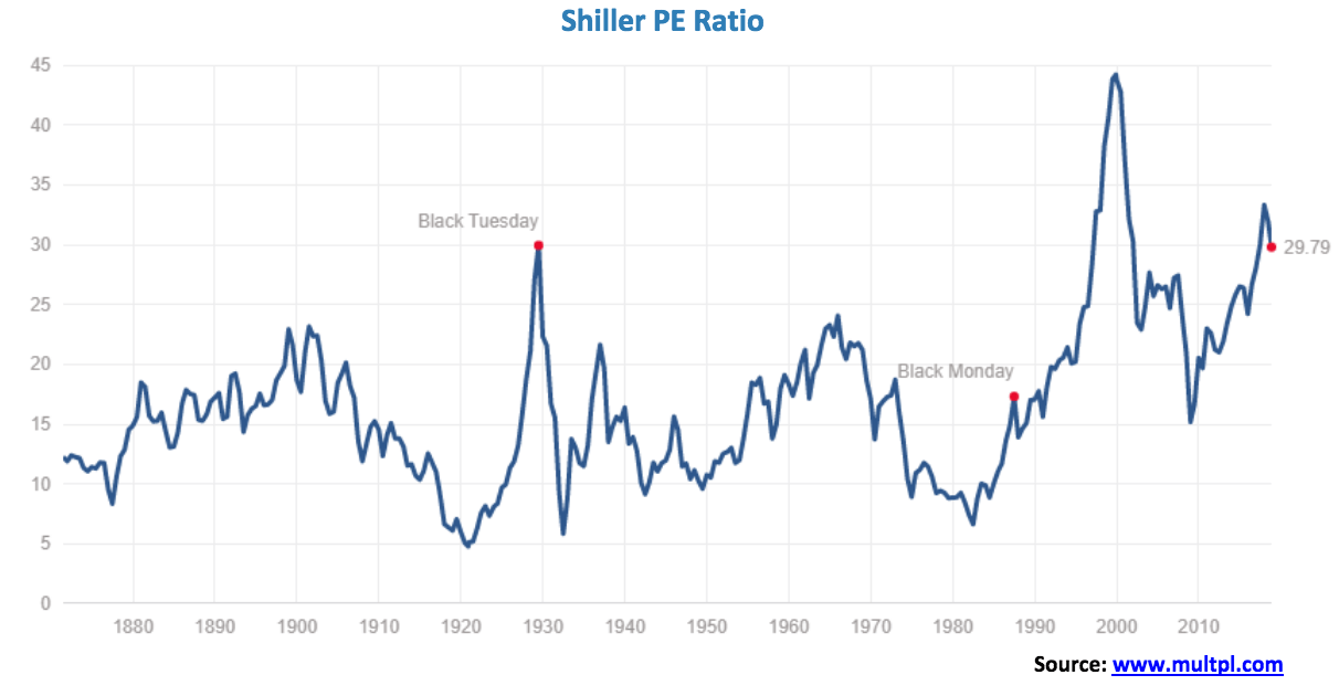
With all of the troubles this year in the stock market. it might come as a surprise to many that what led the market up is also taking the market down. Yes, the FAANGs (Facebook, Apple, Amazon, Netflix, and Google). We may look back years from now and call the incredible bull market of 2016–2017 the “FAANG rally or FAANG market” Like its predecessor the “nifty fifty” rally of 1972, the bull market of 2016–2017 heavily leaned in favor of the FAANGs. It was by definition a very narrow rally. This was a warning sign that all was not well. In a strong bull market, it should be all boats rising, not just a few.
But the FAANGs topped out earlier this year. Facebook (FB) topped in July and since then has fallen 38.3%. Apple’s (AAPL) top came in October with the market. Since then it has fallen 24%. Amazon (AMZN) topped out September and then dropped 26%. It is no longer a $1 trillion company. Netflix (NFLX) is facing increased competition as it topped out in June and since then has crashed 38%. Finally, Google (GOOG) topped in July then fell 18.5%. It’s been the star. But the S&P 500 is only down about 10% during that time. It demonstrates that FAANGs that were the “stars” to the upside have become the “dogs” to the downside.
Despite all the recent problems for the FAANGs they remain, for the most part, up over the past year. Facebook is the major exception, down 27.2%. But Netflix is still up 31.8% and Amazon remains up 29.9%. The S&P 500 is clinging to a 1.4% gain over the past year but is now down in 2018. Apple has turned negative over the past year, down about 0.1% while Google has also slipped into negative territory, off 1.2%. But it could be worse. They could be Bitcoin. Bitcoin has fallen 77% in the past year and has taken the entire cryptocurrency market down with it. What goes up also comes down. Maybe they can hope Santa Claus will give them a reprieve.
© David Chapman
Bitcoin watch!
© David Chapman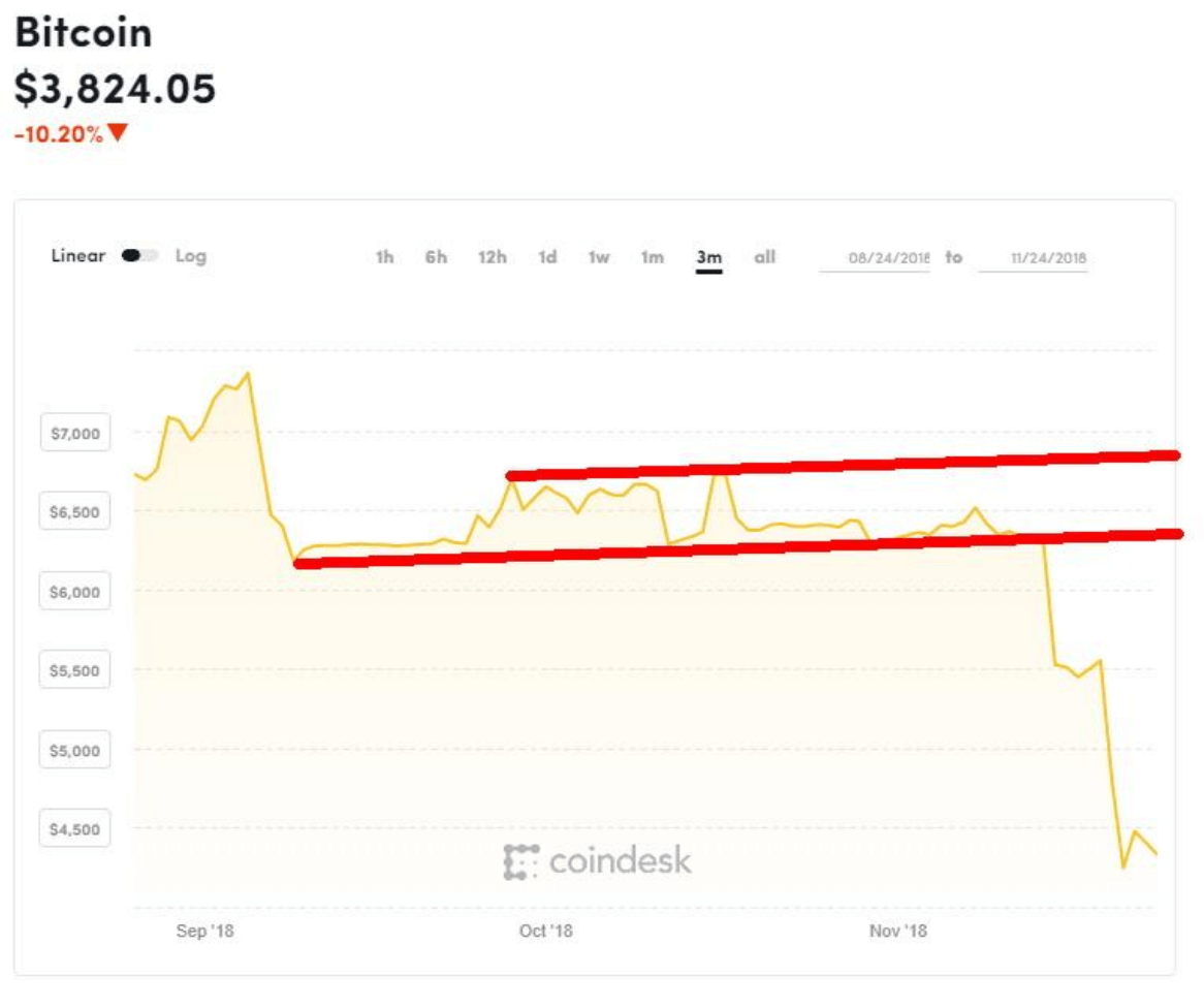
How low can Bitcoin go? This past week Bitcoin broke down through $5,000, hitting a low so far of around $3,800. Bitcoin is now down 80% from the high a year ago December. The descending triangle breakdown suggested a collapse to at least $3,900 now achieved. And that’s the best case. The worst case is a collapse to around $650. We are sure Bitcoin defenders don’t want to hear that one. Many cryptocurrencies are down over 90% from their highs and some are just disappearing forever. We are now reading that ETFs and stocks created to tap the cryptocurrency sector are now blowing up. When the dust clears it will be noted that billions were lost. We also expect that only a few will be left standing in the end.
First our weekly review. Bitcoin’s market cap has fallen to $68.0 billion. At its peak, it was $324 billion. There are now only 8 cryptos with a market cap over $1 billion, down from 14 only a week ago. The market cap of all the cryptos at Coin Market Cap has fallen to $127.4 billion, down from $184.6 billion a week ago. A big decline of $57.2 billion or 31% in one week. The number of cryptocurrencies listed has fallen to 2,071 down from 2,082. We expect this decline to continue. We are not sure where the dead coins disappear to as the number listed at Dead Coins has fallen to 934, down from 935 a week ago. Maybe they came alive again? But why?
Trying to list all the reasons why Bitcoin and the crypto world have gone from boom to bust could fill a book. But the crypto world had considerable misconceptions right from the get-go that was going to bite them. First, they thought they could create an unregulated sphere where everything was anonymous. But an unregulated sphere just gives rise to hacks, scams, thefts, and money laundering. Quite simply—you can’t. It is just chaos. And then the regulators come cracking down.
The fact that the entire cryptocurrency sphere was open source was also a problem. Developers were squabbling amongst themselves, resulting in split-offs or, in their parlance, the creation of forks. More chaos. The creators of cryptocurrencies thought that everyone would jump on the bandwagon and soon you would be buying your Starbucks with cryptocurrencies rather than cash or tap. Not happening. But speculative trading proliferated and some success was found with online gambling and porn sites. Finally, governments themselves were looking at getting in on the game. Even Christine Lagarde, head of the IMF, postulated that governments might wish to create digital currencies. If governments got involved it would clean up the sphere but the whole raison d’etre of cryptocurrencies would be lost forever.
The collapse of Bitcoin and the cryptocurrency market will soon be joining Tulip Mania, the South Sea Bubble, and the Mississippi Land Scheme amongst the greatest bubbles and manias ever. Charles MacKay may have to come back from the dead to add another chapter to his classic book Extraordinary Popular Delusions and the Madness of Crowds. The book was originally published in 1841. It was actually written in three volumes: National Delusions, Peculiar Follies, and Philosophical Delusions. Charles MacKay was born in England in 1814 and passed away in 1889. The book is a must-read for anyone interested in investing, history, psychology, or human nature. We still refer to it today. With Bitcoin and the cryptocurrencies, one can understand why.
© David Chapman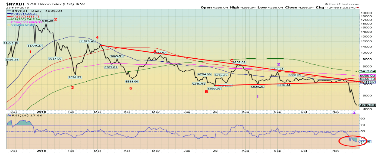
Markets and trends
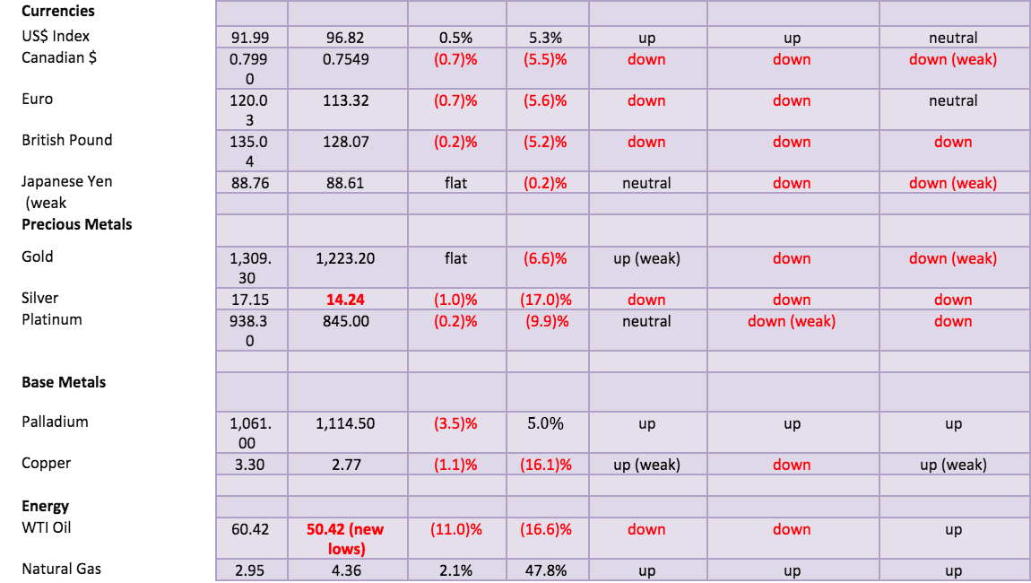
Note: New highs/lows refer to new 52-week highs/lows. © David Chapman
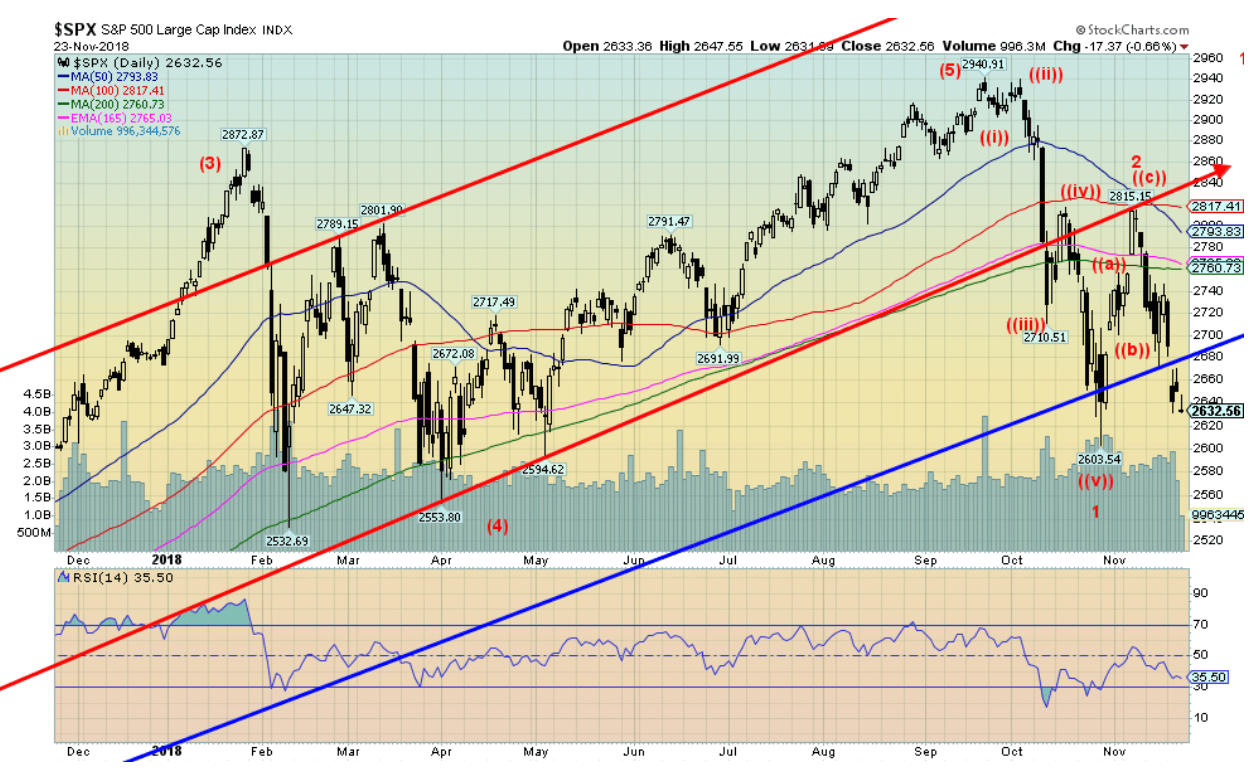 © David Chapman[/caption]
U.S. and international stock markets fell this past week, threatening to blow up the growing bear market. With the week highlighted by U.S. Thanksgiving, there was little to give thanks for. The S&P 500 fell a sharp 3.8%, gapping down and closing below the uptrend line from the March 2009 low. Lying just below is the earlier October low along with the February and April lows. Once that level breaks, the bear market will be confirmed and it will also signal that the current wave down has much greater downside potential.
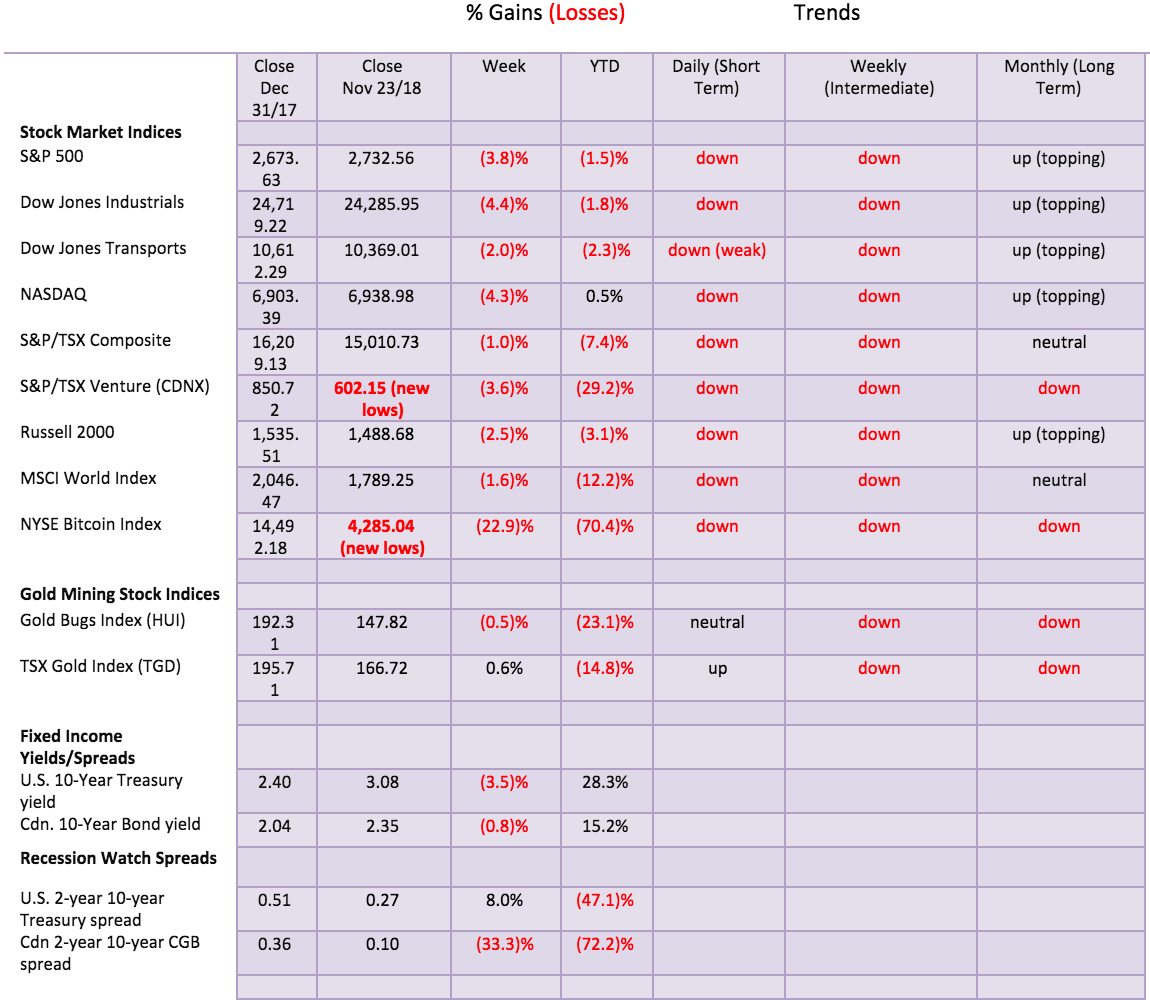
For the record, the Dow Jones Industrials (DJI) fell 4.4%, the Dow Jones Transportations (DJT) dropped 2.0%, and the NASDAQ fell 4.3%. The small cap Russell 2000 Index was down 2.5%. Here in Canada, the TSX Composite was off 1.0% as it was held up by Materials, but the woeful TSX Venture Exchange (CDNX) fell to new 52-week lows, losing 3.6%. Internationally, the London FTSE 100 dropped 1.0%, the Paris CAC 40 fell 1.4%, the German DAX was off 1.3%, China’s Shanghai Index (SSEC) fell 3.7%, while the Tokyo Nikkei Dow (TKN) was a star, only down 0.2%. The global MSCI World Index dropped 1.2%. All are trading below their 200-day MAs and 40-week MAs, indicating bear markets. Of the indices, we follow we found none that were up on the week.
None of this is a comfort for investors. Unless you are in T-Bills there are few places to hide. As we do show later, gold has outperformed the stock indices and could be on the cusp of a significant rise. Gold continues to act as a safe haven. Despite the drop this past week, December is traditionally a friendly period for the stock market. December is ranked #1 for the S&P 500 and the Russell 2000. It is the second-best month for the DJI and the NASDAQ. The worst December was in 2002 when markets fell generally 6% and the NASDAQ dropped 10%. The December option expiration week is the most bullish option expiration of the year. Still, since 1950, the DJI has experienced 20 down months out of 68. So, if December 2018 can recover from this recent drop there is opportunity to restructure. We are not expecting a crash at this time. It is still too early in the bear market. Rather than one that starts out with a bang—as it did in 1929 when, after a recovery, it then plunged relentlessly down—our expectations are more like 2007–2009 or even 2000–2002 where the market toyed for several months before going off the deep end. Our expectations over the next two years are for a drop of 30% to 50% in total. Possibly more.
The S&P 500 has support down to 2,600, then down to 2,500/2,550. A breakdown under 2,532, the February low, would signal a new phase to the downside for the market. This drop could also be a ‘b’ wave to the downside with a ‘c’ wave to the upside to come as this wave corrects the October drop. Bear markets have many twists and turns and our expectations are no different this time.
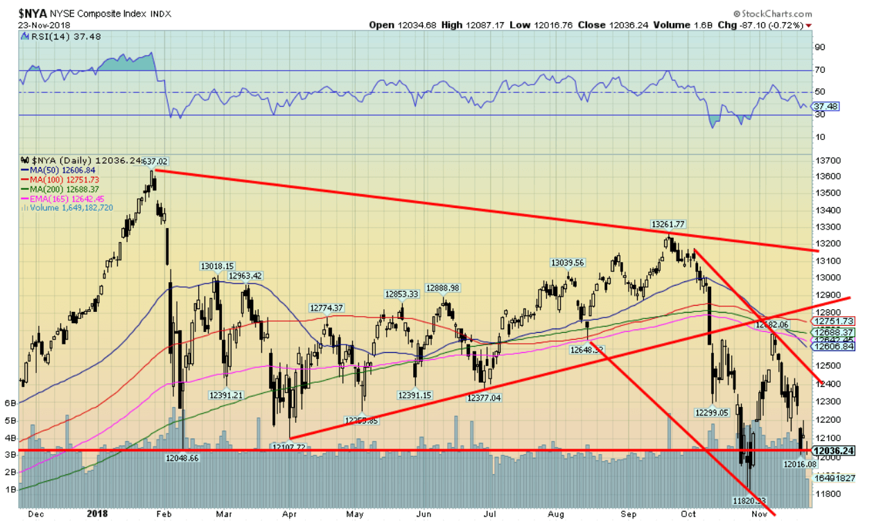
© David Chapman
We thought we’d show the NYSE Composite as it took out the February 2018 low. It wasn’t the only one, but it was significant given the NYSE broad holdings. Note as well how the NYSE failed to come anywhere near its January 2018 high. The NYSE Composite Index contains over 1,900 stocks. It is all the stocks listed on the NYSE. Therefore, its breadth is a much better indicator in many respects than the DJI 30 stocks or the S&P 500 stocks. It is significant that the NYSE has broken its February low. It is another good signal that a new bear market is most likely unfolding.
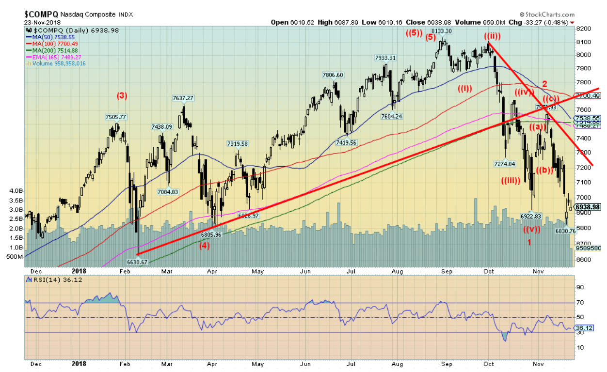
© David Chapman
The NASDAQ, dominated as it is by the FAANGs, took out the earlier October low but so far it remains above the February low. Nonetheless, like the other indices, the NASDAQ is ultimately pointed lower. The key MAs of 50, 100, and 200 should act as resistance on any rebound. There are positive divergences shaping up on the daily charts. They indicate that another rebound attempt could take place, but they are not a guarantee of another rebound at this time. As with the other indices, new lows below February’s 6,630 could be signaling a new phase in the bear.
© David Chapman
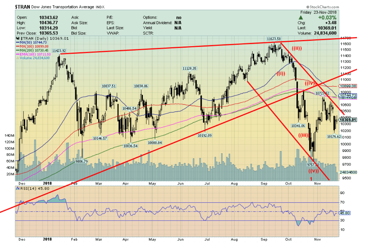
The DJT is holding up well compared to the other major indices. We can’t help but notice that the DJT did take out the February low, but a small one so far. In making a small new low the DJT has diverged with the DJI that did not take out its February 2018 low. The decline this week saw the DJT lose the least of the major indices. So, it could be a signal that we might get another temporary reprieve before resuming the bear.
© David Chapman
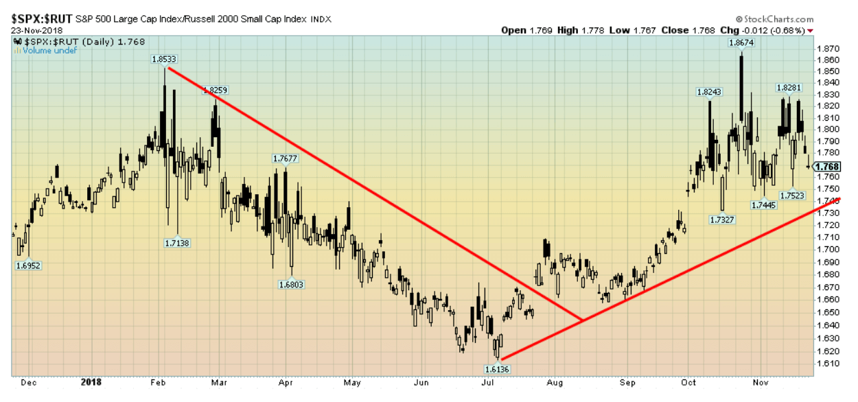
Our expectations in a bear market are that the large cap stocks should outperform the small stocks. The S&P 500/Russell 2000 ratio is a good indicator of that phenomenon. Since July, the S&P 500 has outperformed as would be expected given the recent decline in the markets. It did, however, top in late October with the market and since then the Russell 2000 is performing marginally better. It could be another sign that we might get a reprieve into December before the bear resumes in the New Year.
© David Chapman
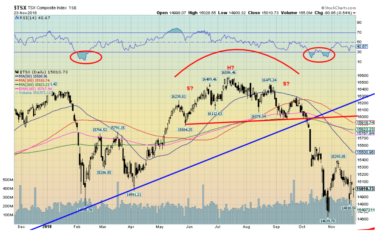
The TSX Composite did take out its February 2018 low during the recent drop. The TSX is being led down by the Energy index. But not all TSX sectors are falling equally. Holding up remarkably well so far are the TSX Income Trusts, TSX Consumer Staples, and, surprisingly, the TSX Global Mining Index. The TSX Health Care Index has also held up. Some, such as the TSX Industrials Index, appear to be on the cusp of a breakdown. The TSX Real Estate Index is also holding above its uptrend line from 2011 as is the TSX Telecommunications Index. It has been the dominance of the TSX Energy Index that has helped drag the TSX down. Financials, consumer discretionary, and utilities are areas of weakness. Gold, we have noted, appears to be trying to rise following a long corrective period.
© David Chapman
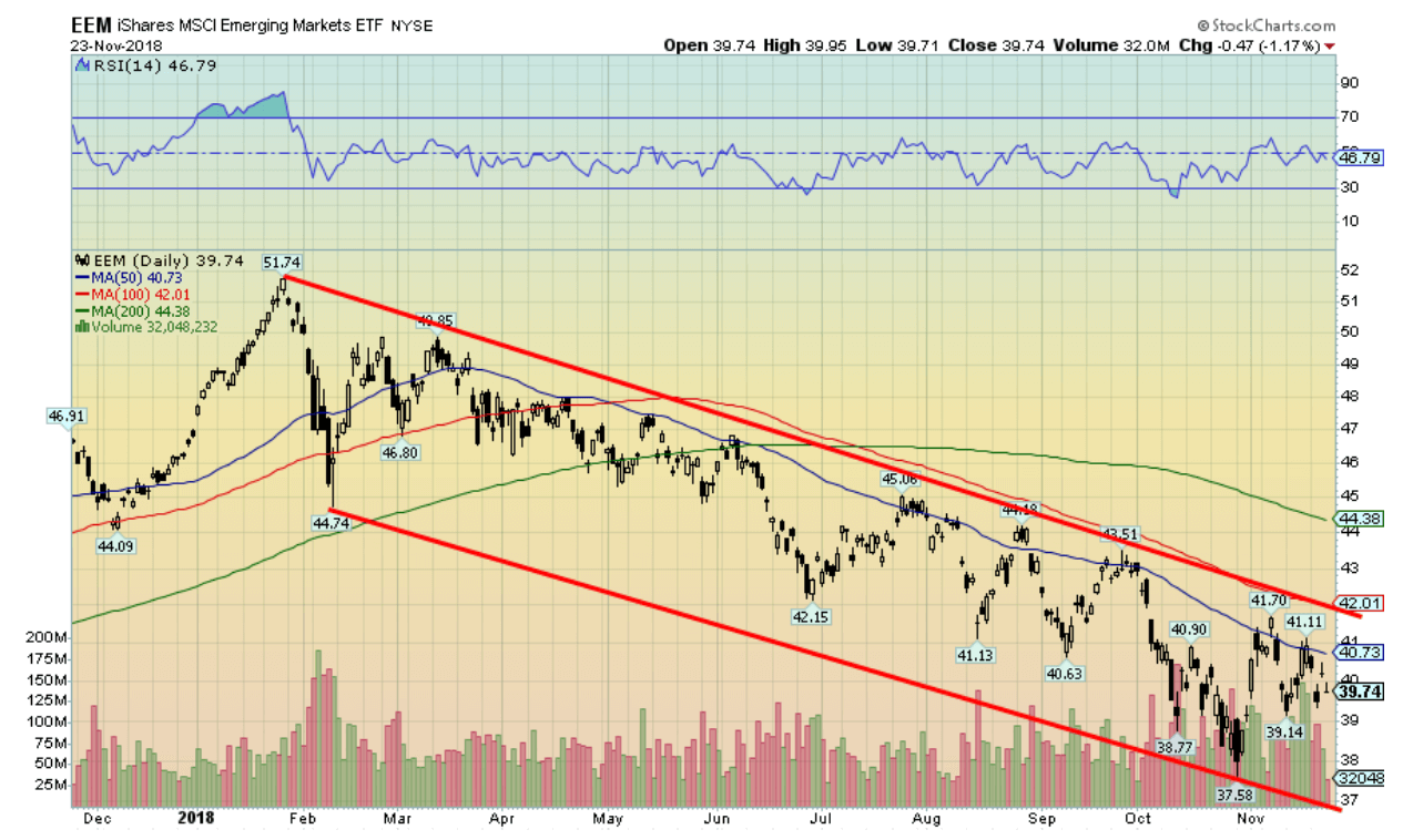
The iShares MSCI Emerging Markets ETF (EEM) is a clear example as to how the emerging markets are dragging everyone else down. Emerging markets are laden with debt, much of it in U.S. dollars. Rising interest rates in the U.S. coupled with a high U.S. dollar are pressuring the emerging markets. The EEM (and the MSCI) topped out in January and it has been a steady downward trend ever since. No sign of a bottom here.

© David Chapman
The percentage of stocks in the S&P 500 trading above the 200-day MA remains at about one-third. To put things in perspective, at the bottom of the market in March 2009 only 1% of the S&P 500 stocks were trading above their 200-day MA. During the first good solid wave down in 2007–2008 into a low in January/February 2008 the percentage of stocks trading above the 200-day MA fell to 15%. At the bottom in 2011, only 9% were trading above the 200-day MA. In theory, we have a long way to go before we could declare this bear over.
© David Chapman
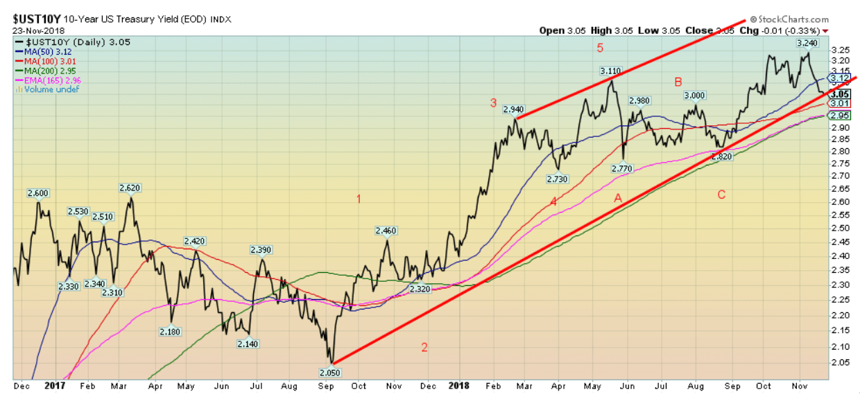
The 10-year U.S. Treasury note fell this past week to 3.05% from 3.08% the previous week. A falling stock market and falling oil prices prompted the decline as traders dumped stocks for the safety of U.S. Treasuries. The 10-year now sits on the cusp of potentially breaking its uptrend line from the September 2017 yield low of 2.05%. If that happens, the odds start to favor that the 10-year has topped (in yield – prices move inversely to yield). Our target for the 10-year was 3.45% but that could change with a close under 3.05% and especially a close under 2.95%. Only new highs above 3.24% would suggest that the 3.45% target is back in play. As the stock market declines, and short rates are hiked, long-dated bonds become more attractive.
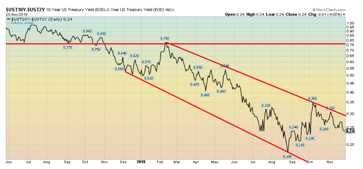
Recession watch spread
© David Chapman
Despite the U.S. 10-year Treasury note falling in yield this past week the 2–10 spread fell as well, losing 3 bp down to 24 bp. That was primarily because the 10-year fell, but the 2-year rose or at least stood still. The 2-year is influenced more by the Fed rate. The FOMC meets December 12–13 and it is widely expected that the Fed will hike the Fed rate by 25 bp once again. The 2–10 spread is nowhere near recession levels. Thoughts of a recession only come into focus once the 2–10 spread turns negative. That is not expected until at least sometime in 2019 and even then, we would probably need up to six months of trading at negative spreads to suggest a recession. At least, that was the experience before both the 2000–2002 recession and the 2007–2009 recession.
© David Chapman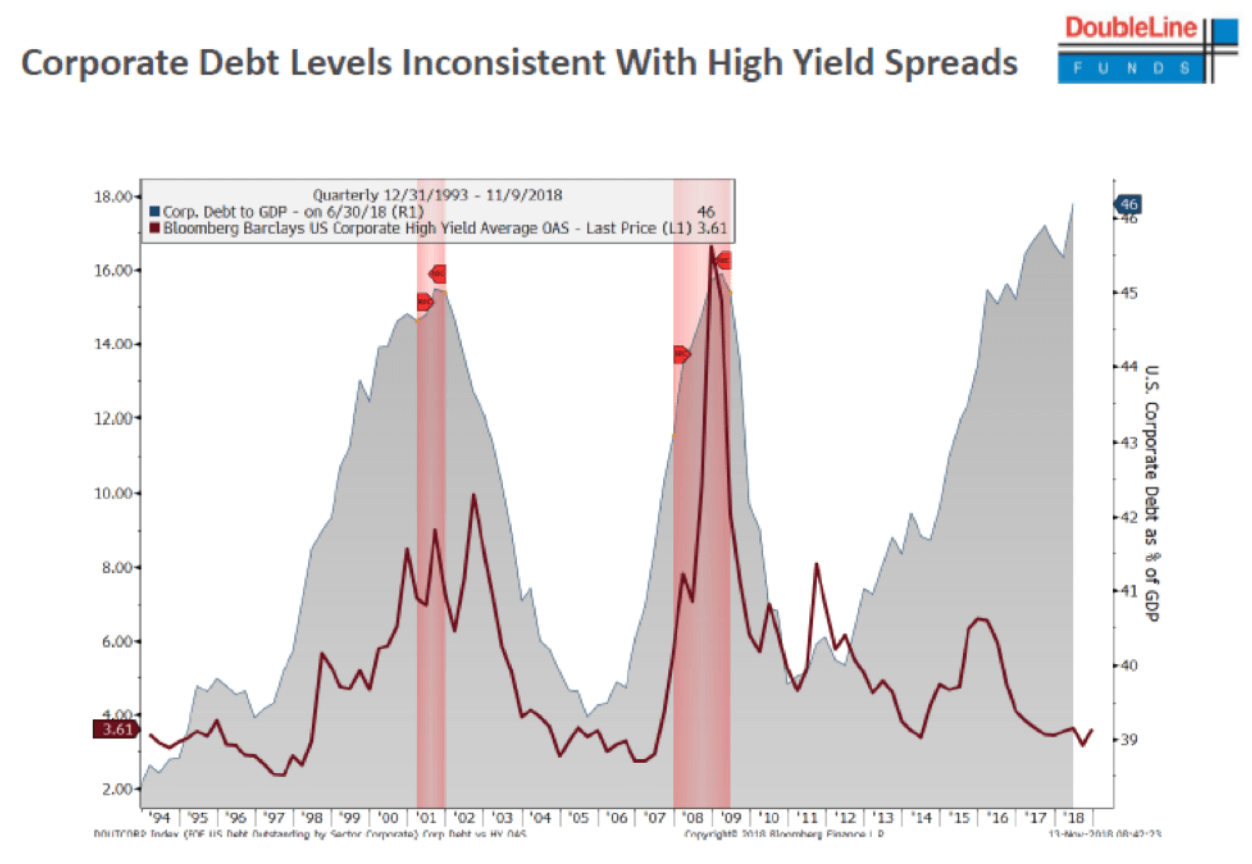
We found this a rather interesting chart to share. What it demonstrates is that as corporate debt grew in both the late 1990s and during the housing bubble of the mid-2000s the spread between the corporate bonds and U.S. Treasuries of a similar maturity rose with the rise in the level of corporate debt. The growth in corporate debt is depicted in the shady area while the spread between corporate debt and U.S. Treasuries is the red line. Spreads rising as debt levels grew was pretty consistent during the late 1990s and up until about 2013. Since then it appears to have fallen off the rails as spreads remain tight, but the debt level has grown astronomically to record levels. Corporate debt today in the U.S. stands at a record $9.4 trillion with a debt to GDP ratio of 46%. That’s higher than the levels seen in 2001 or 2008. Add in almost $1.6 trillion in student loans, another record, and $1.1 trillion in car loans as delinquencies rise for both and there is a sense of unease.
If the spread levels were consistent with the rise in leverage that this represents then it would be consistent with what was seen previously. But it is not. This is an accident waiting to happen. If a shock hits the market the spread could leap precipitously and debt defaults could leap with it as barely investment grade debt is pushed into junk territory. With central banks wanting to shrink their balance sheets (quantitative tightening) this might only add to the problem. Stock markets are also falling even as corporations appear to have levered up sharply in the past few years. Trade wars and others are not helping as most countries are quite dependent on exports, more so than the U.S. Meanwhile, deficits are growing, particularly in the U.S. because of the tax cuts. The problem isn’t going to hit tomorrow, but ask us next week.
© David Chapman
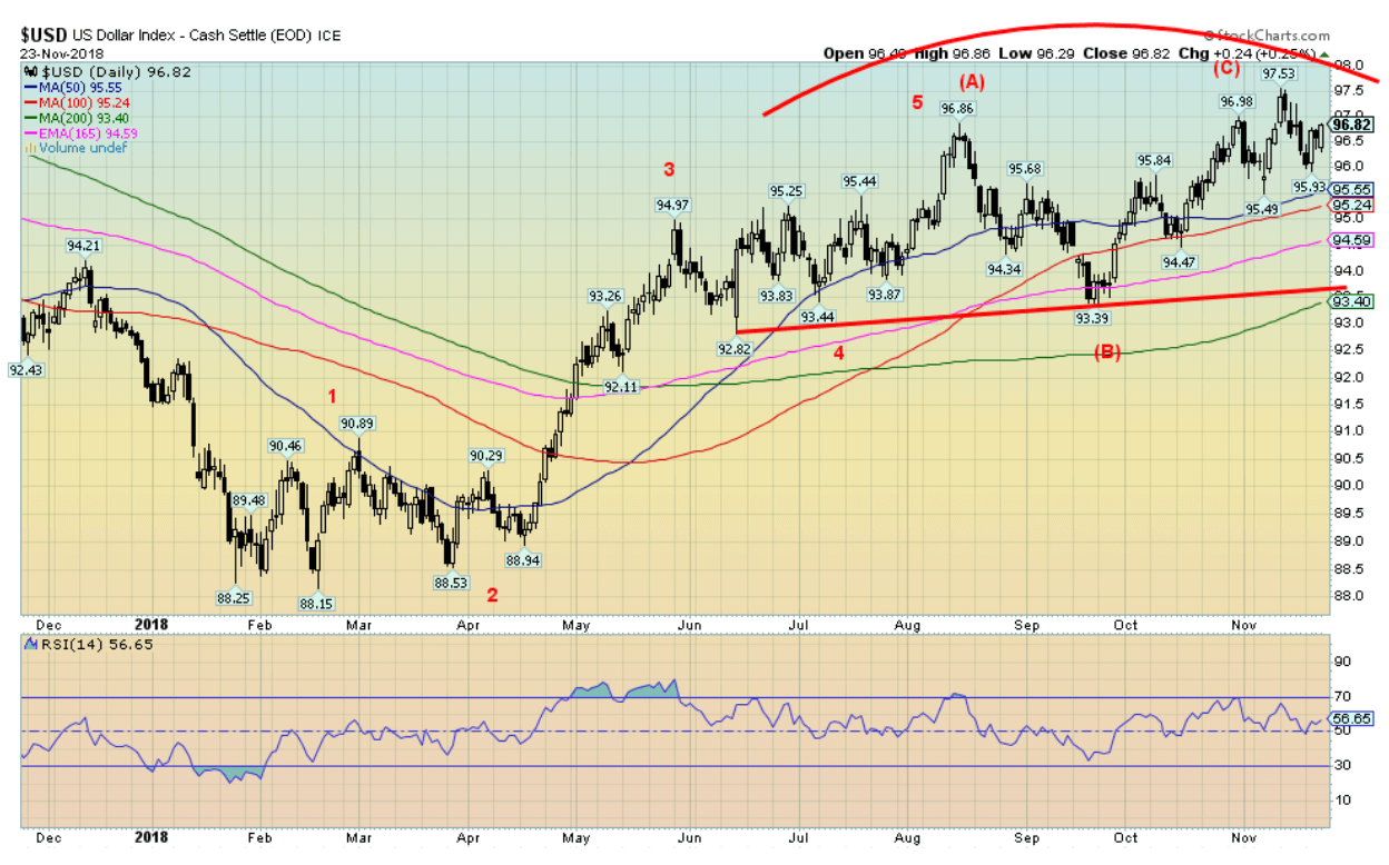
We continue to believe that the US$ Index has topped. Despite the gain of 0.5% this past week, the US$ Index remains below its recent highs at 97.53. Thin trading on Friday because of U.S. Thanksgiving may have played a role in the US$’s rise this past week. We believe there have been a rather interesting three thrusts to high for the US$ Index over the past six months. The first high came at 94.97 in May, the second at 96.86 in August, and the third at 97.53 in early November. We note that while gold made a potentially important low in August as the US$ Index was making its high, the higher high for the US$ Index in November did not see gold making a lower low. Instead, gold made a higher low, a potential positive divergence. We revised our wave count for the US$ Index and now believe it completed an important ABC type corrective pattern to the 97.53 high. That suggests that a decline could soon get underway. New highs above 97.53 could negate it or at least put the decline on pause. But the 97.53 high looks good right now. Any decline now through 95.93 the recent low would set the US$ Index down to its next potential targets near 95. Any close below the recent 95.93 low would confirm we are on our way down.
© David Chapman
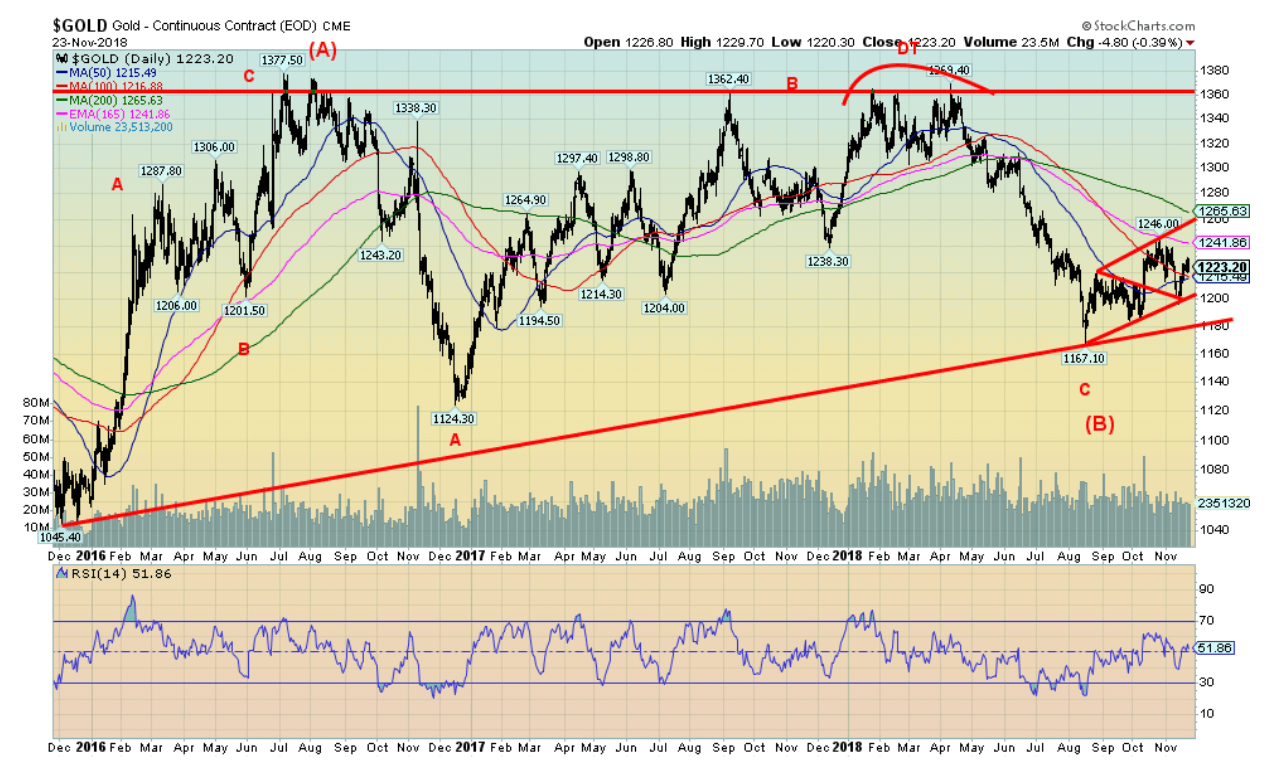
Friday’s sharp jump in the U.S. dollar helped push gold prices lower, almost wiping out the week’s gains. Gold managed to a small gain of 0.02% on the week which means it was essentially flat. With a high of $1,230.90, gold fell short of the recent high of $1,246. There is support here for gold at $1,220 and down to $1,210. Below $1,210 there is strong support at $1,200, but below that solid support doesn’t come in again until $1,180. Only below $1,180 are any thoughts of a seasonal rebound thrown out. Gold’s positive seasonals should be soon kicking in. The positive seasonal pattern lasts until the end of February and sometimes extends into March. However, the strongest move often doesn’t get underway until the New Year. The upcoming FOMC is on December 12/13. We are reminded that FOMC meetings dating back to 2015 have sparked gold rallies. Since gold topped in September 2011, we have seen important gold lows in December 2011, 2013, 2014, 2015, 2016, and 2017. December 2012 was the only instance of a significant top. While the August 2018 low looks good, the pullback at the end of the week raises thoughts that we could be setting up for another December low. It would be significant if it were a higher low.
There is no COT report this week as U.S. Thanksgiving has delayed the report until Monday. We do note that the previous COT report remained quite bullish for both gold and silver. Friday’s decline in prices that almost wiped out the week’s gains were sparked by a jump in the U.S. dollar as the U.S. stock markets fell. Funds instead moved into bonds as witnessed by the decline in yields this past week for U.S. Treasury securities.
To the upside, gold needs to take out $1,250 and preferably regain above $1,260. Interim resistance would be seen at both $1,230 and $1,240.
© David Chapman
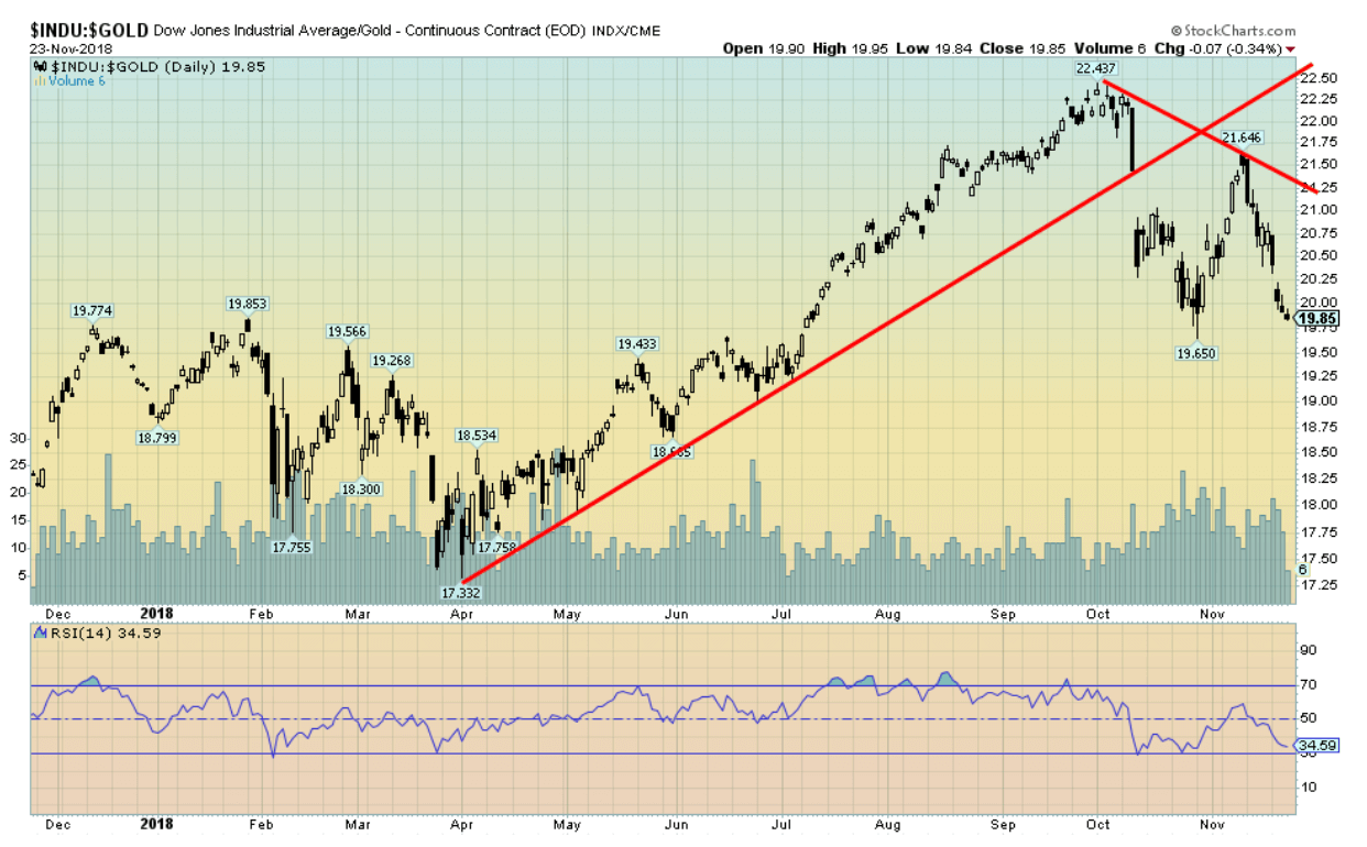
If there is one thing that the gold bugs can take some consolation in it is gold’s performance vs. stocks since the stock market corrections got underway. Above is the DJI/Gold ratio over the past year. As the stock market found its low in April, the next several months saw the DJI clearly outperform gold. That changed dramatically in October as the DJI embarked on a 10% plus decline while gold rose just under 2%. It doesn’t seem like much, but it was enough to send the DJI/Gold ratio lower. It is now down 11.5% since the high in late September. A rising ratio favors the DJI over gold, while a falling ratio favors gold over the DJI. This is a theme we have noted previously. There remains further potential to the downside including a return to the April low near 17.
© David Chapman
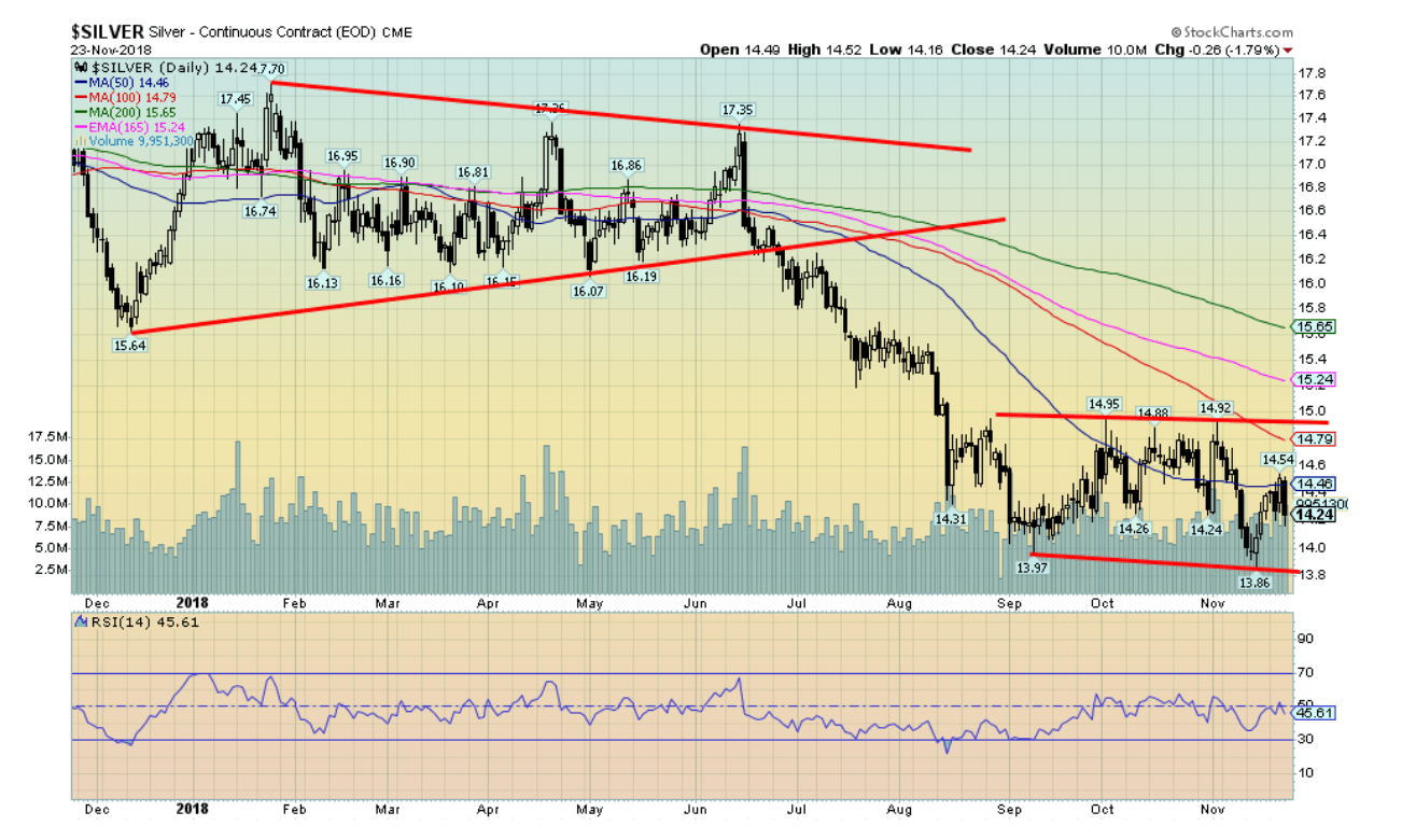
Silver looked to be poised to add to its gains this past with a run to a high of $14.54. Resistance lay at $14.50/$14.60. Then came Friday and a strong U.S. dollar and the gains on the week were wiped out in one fell swoop. Instead of a gain on the week, silver ended down about 1%. The failure to break through once again puts the focus on the support at $14 and down to the recent low at $13.86. If the pullback seen at the end of the week can hold in the $14.10/$14.20 zone, then odds favor that silver would continue its recent advance. Bullish consensus for silver remains abysmal, down around 10% despite the recent gains. As with gold, there was no COT report this week because of the Thanksgiving holiday. We’ll await the report early this coming week. Resistance is at $14.50/$14.60 initial support $14.10 but below that level $14 and down to the recent lows at $13.86. Because the gold/silver ratio remains ridiculously high over 85 and near record high levels, silver has more upside potential once a solid rebound gets underway.
© David Chapman
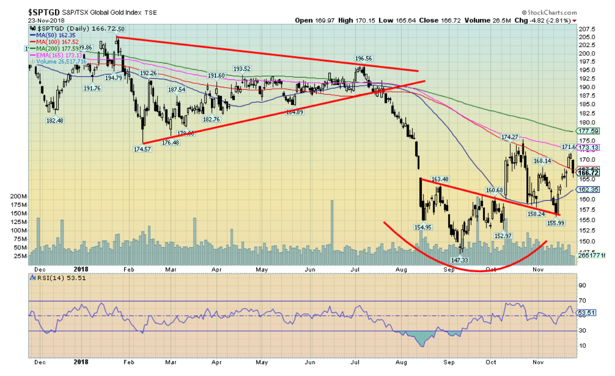
Just as the gold stocks appeared poised to break out to the upside this past week they were dashed with reality as the U.S. dollar strengthened sharply on Friday. On Friday the gains on the week were almost wiped out. Still, the TSX Gold Index (TGD) managed to close up on the week by 0.6%. The U.S-based Gold Bugs Index (HUI) didn’t fare as well, losing 0.5%. Given the up move this past week failed to take out the earlier highs, it does give rise to the potential for further declines this coming week. Support comes in at 162 then down to the breakout line near 155. It is noted that volume was low on Friday given the Thanksgiving holiday so the 2.8% decline could be primarily because there were so few traders around. The move down from the recent high appears to have been corrective but then the move up from the 147 low in September also appeared corrective. So, there may be a bit more work to do here before we start a more sustained up move. Positive seasonals should help the gold stocks going forward. Many gold stocks that are components in both the TGD and the HUI are showing very positive signs. It’s a question of when as opposed to if the gold stocks commence a major up move. Resistance is seen at 170, then 175/180. There is potential for the next move to take the TGD up to 195 once clearly through 170.

© David Chapman
Oil prices crashed this past week. After falling steadily from a high of $76.90 back on October 3, 2018, WTI oil crashed 11% this past week. In all, a 34% decline in less than two months. No, it doesn’t rival that collapse in 2008 that saw WTI oil fell 77% in less than 8 months. Then again, this crash may not be over. Our original target for this decline was $52.50. That target fell easily this week. Our next target is $44. Below that, the target could be $30–$32. It is always difficult trying to predict where it is going in a free fall. Oversold is almost meaningless. During the 2008 collapse, oversold conditions first appeared after WTI oil had fallen to $90. It still had almost another $60 to fall. Collapsing oil prices take their toll on the economy. Oversupply can only be curtailed by sharp production cuts. Except everyone wants the other guy (company or country) to cut, not them. And therein lies the problem. Oversupply as each country tries to outdo the other in production. Russia, Saudi Arabia, U.S—they are all to blame as are other oil producers. The Iranian sanctions on oil never materialized. There was too high of a dependence on it and users; the EU, China, India, and others screamed.
The energy stocks are also in a free fall. The Philadelphia Oil & Gas Index (XOI) has fallen only 21%. The TSX Energy Index has been hit harder, down 29%. There is no sign of a bottom except that both are oversold. But, as noted, oversold is almost meaningless in a free fall. Neither WTI oil nor the oil & gas indices are showing any signs of bottoming. Buoying the indices is natural gas that is up 35% during the same period as WTI oil has fallen 34%. Making things worse for Canada and Alberta, in particular, is the price of Western Canadian Select that has fallen hard to about $14.65/barrel, a sharp negative differential to the price of WTI oil. The weak energy sector weighs on the TSX Composite that itself is now down 7.4% in 2018. With the collapse this past week, WTI oil has hit new 52-week lows. Quite the feat when one considers it was on October 3, 2018, that WTI oil hit a new 52-week high. It is rare to see new highs and new lows all in the same year. All we can note is that the markets are in a free fall and there are no signs of a bottom.
What is to be done to push oil prices back up again? Production cuts? But by whom and by how much? Most can’t agree or they have no incentive to cooperate with each other. As to enforcing sanctions against Iran, that might not work as workarounds are sought. Iran has threatened to disrupt the oil market if sanctions hit their oil industry. Iran sits beside the Straits of Hormuz where 1/3 of the world’s oil flows through. That would be disruption and could cause oil prices to do the opposite—soar to the upside.
The charts suggested the breakdown under $66. Target achieved and then some. But with little sign of a bottom, the next targets may become a reality.
Chart of the week
© David Chapman
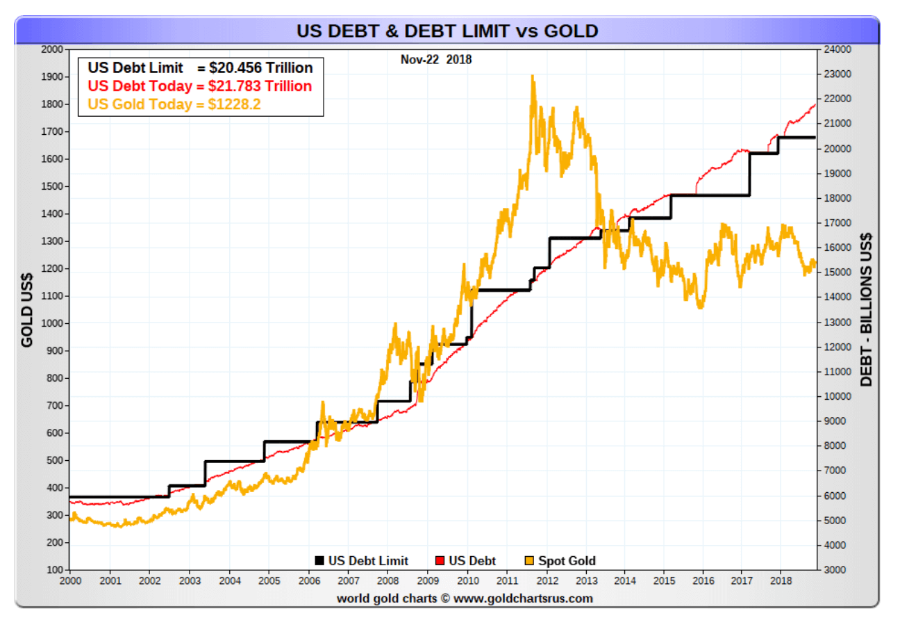
The U.S. debt has hit $21.8 trillion according to Treasury Direct www.treasurydirect.gov. That’s an increase of more than $1.2 trillion in the past year. As it currently stands the US is allowed to borrow as much as is needed through March 1, 2019. After that, the debt ceiling would have to be hiked once again. As can be seen, the U.S. has already exceeded the current debt ceiling by over $1.3 trillion. President Trump has threatened to shut down the government unless he gets his way with “the wall” between the U.S. and Mexico. The amount of debt/U.S. citizen is $66,190. The amount of debt/U.S. taxpayer is $178,338. In essence, the debt will never be paid back. It is probably destined to keep on rising.
By contrast, China’s national debt stands at only $2.4 trillion. Compared to the Western nations represented in the G7 that is peanuts. When one considers debt to GDP the U.S. is at 105.5%. But its G7 partners Japan and Italy are even higher. Surprisingly, even ones considered to be basket cases such as Argentina are on a debt to GDP basis appear to be in better shape.
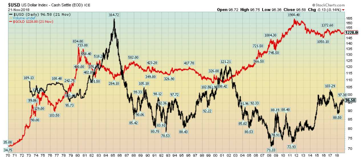
Gold has a history of following the rise in the U.S. debt. It all dates back to August 1971 when President Nixon removed the world from the gold standard. Under the gold standard, the value of the U.S. dollar was directly linked to gold at $35/ounce. The gold standard was replaced by the implementation of a debt ceiling or supposed credit limit that was based on “trust us” rather than being linked to anything tangible. Naturally, after that, the debt exploded, not only for the government but for corporations and consumers as well. We live in a world of illusion of wealth, largely because we have so much debt. And it is debt backed by nothing except “trust us.” Maybe we should add “Trust us, we’re the government”.
The rise in debt and the subsequent rise in the price of gold have, according to studies, a 91% correlation. Over the past seven years that correlation appears to have been broken. Odds are, however, that the relationship will reassert itself once the U.S. dollar starts to fall once again. It is noted that since August 1971 the U.S. dollar has been in three major declines. Each time gold prices rose sharply, the U.S. Dollar was falling (Gold in red, US$ Index in black).
© David Chapman
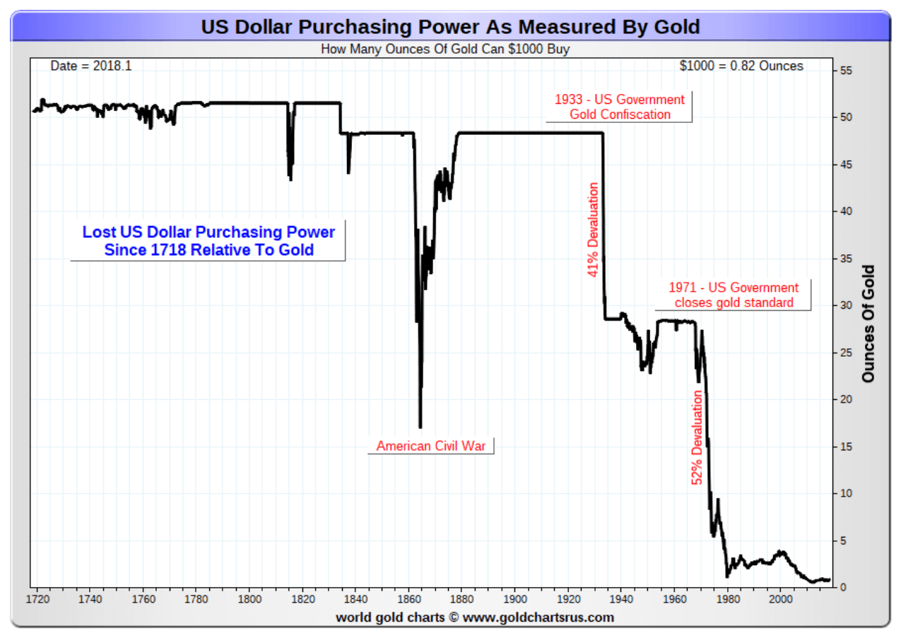
At the same time, the U.S. dollar was also losing its purchasing power. Back in the early 1930s when gold was fixed at $20.67/ounce, US$1,000 would buy you 48.4 ounces of gold. After the U.S. devalued the U.S. dollar with the Gold Reserve Act of 1934 raising the price of gold to $35/ounce, US$1,000 would buy you only 28.6 ounces of gold an instant 41% devaluation. The U.S. dollar was further devalued when President Nixon closed the gold standard. It resulted in another 52% devaluation. Today, US$1,000 will buy you only 0.82 ounces of gold. That’s a 98% devaluation since 1934.
Our final chart below (next page) shows the history of the collapse of the U.S. dollar’s purchasing power since 1718. If history holds, gold will eventually catch up to the U.S. debt once again.
© David Chapman
(Featured image by DepositPhotos)
—
DISCLAIMER: David Chapman is not a registered advisory service and is not an exempt market dealer (EMD) nor a licensed financial advisor. We do not and cannot give individualised market advice. David Chapman has worked in the financial industry for over 40 years including large financial corporations, banks, and investment dealers. The information in this newsletter is intended only for informational and educational purposes. It should not be considered a solicitation of an offer or sale of any security. The reader assumes all risk when trading in securities and David Chapman advises consulting a licensed professional financial advisor before proceeding with any trade or idea presented in this newsletter. We share our ideas and opinions for informational and educational purposes only and expect the reader to perform due diligence before considering a position in any security. That includes consulting with your own licensed professional financial advisor.

-

 Crowdfunding2 weeks ago
Peru’s Crowdfunding Sector Shrinks Amid License Revocation
-

 Crowdfunding4 hours ago
Democratizing Farmland Investment: The Rise of Farm Fractions in Agritech
-

 Crowdfunding1 week ago
Cyberpunk Trading Card Game Surges Past Goals on Kickstarter
-

 Business3 days ago
Markets Volatility, Geopolitics, and Signals of a Potential Trend Shift


You must be logged in to post a comment Login