Featured
How the 9/11 attacks and the near-collapse of the world market are affecting today’s markets
It’s been years since the deadly attacks on Sep. 11, 2001, and the brink of collapse of the global financial system. How has the market fared since?
“I will hurt the shorts, and that is my goal.”—Dick Fuld, CEO Lehman Brothers, April 2008
“Our capital position at the moment is strong.”—Ian Lowitt, CFO Lehman Brothers, 5 days before Lehman filed for bankruptcy
“I’m not gonna go to the Fed and sit outside some goddamned board room while Paulson and my enemies decide my fate!”—Corey Johnson as Dick Fuld, CEO Lehman Brothers from the film “The Last Days of Lehman Brothers“
This past week marked two important historic events. This is the 17th anniversary of the attacks on September 11, 2001. The second was the near collapse of the global financial system following the bankruptcy of Lehman Brothers (LEHNQ-Pink Sheets) on September 15, 2008. Two dates that will live on in infamy. The first triggered endless wars in the Mid-East where upwards of two million have been killed and millions more have been made homeless, sparking a surge of mass immigration and refugees into whatever country would accept them. The second triggered the collapse of hundreds of banks in the U.S. and the EU and tens of thousands of people losing their homes, followed by the deepest recession since the Great Depression.
While the focus of the 9/11 attacks remains in the Mid-East, the event also triggered a stock market crash including the closing down of major stock exchanges in New York, London, and elsewhere. It was only the third closure ever in the history of the NYSE. The first was in 1914 during WW1 and the second during the Great Depression in 1933. The event triggered $40 billion in insurance losses, the largest ever. The U.S. dollar fell sharply, gold soared, and oil prices soared.
The travel and entertainment industries were hit hard. Airlines were grounded. Over the next few months, thousands lost their jobs, and many businesses, especially near the World Trade Center, were forced to close their doors. Security at borders and airports tightened sharply. The Fed was forced to flood the financial system with liquidity to the tune of at least $100 billion per day during the days following the attack. Since the attacks, the U.S. has spent an estimated $5 trillion to conduct wars in the Mid-East, primarily in Afghanistan and Iraq, but also in Syria and other countries.
Our chart of the S&P 500 shows that collapse. By the time the market bottomed on September 21, 2001, the S&P 500 was down 29 percent on the year and down 39 percent from the high of March 2000. Following a recovery into early 2002, the high tech/dot.com crash fell into its death throes and the markets fell sharply into October 2002.
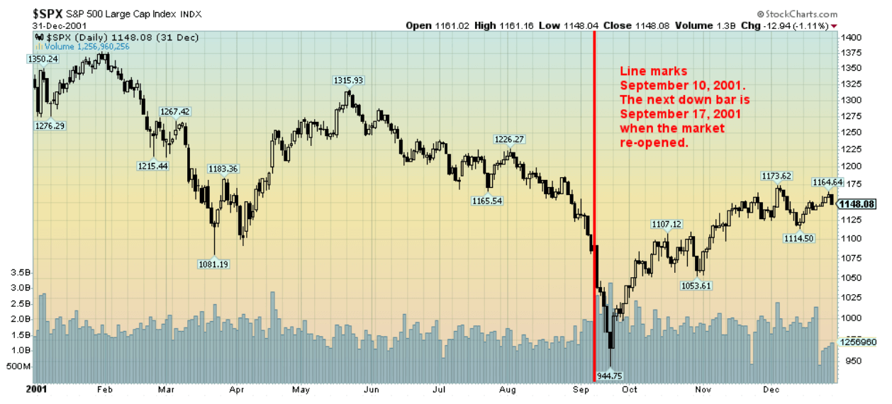
© David Chapman
At the time, it was a historic bear market given the 50 percent collapse in the S&P 500. The tech/dot.com-heavy NASDAQ fell 78 percent. That was short of the Dow Jones Industrials (DJI) 1929–1932 collapse of 89 percent. The Federal Reserve flooded the financial system with funds and also cut interest rates sharply, while the Bush administration embarked on an expansionary fiscal policy and tax rates were slashed. Economic growth was generally well below previous recoveries, but with the low interest rates and the flooding of the financial system with money—along with encouragement from the Bush administration to lend, especially for housing—banks did just that.
The stock market recovered eventually, rising barely above the levels seen in 2000. The economy limped along and never fully recovered, posting sub-standard results compared to previous recoveries. But debt exploded. The national debt went from $5.7 trillion in 2000 to $10.6 trillion in 2008, a gain of 85 percent. Total debt rose even more up 90 percent. But GDP only grew by 44 percent. It took $5.70 of new debt to purchase $1 of GDP during the period—an unheard-of amount. The monetary base grew from $600 billion to $1.4 trillion, an increase of 133 percent.
The massive increase in debt encouraged by the Bush administration and the financial institutions saw massive growth of mortgage debt and a huge increase in derivative instruments such as mortgage-backed securities (MBS) and Credit Default Swaps (CDS). These sowed the seeds of the next debt collapse in 2008.
Note the chart below showing GDP annual percent change dating back to the 1980s. The chart is from Shadow Stats. Growth from each successive recession was progressively lower than it was from the previous recession. Shadow Stats GDP numbers reflect methodological changes made by the government coupled with adjustments to inflation all of which tend to give an upside bias to the official numbers. Shadow Stats growth numbers show that the U.S. has actually been in a constant rolling recession since the high tech/dot.com collapse save for a few quarters in 2004. This doesn’t surprise us as the recoveries have generally benefitted a few quite well and another group has also done well while the rest, the majority of the population, stagnates and poverty or near poverty grows.
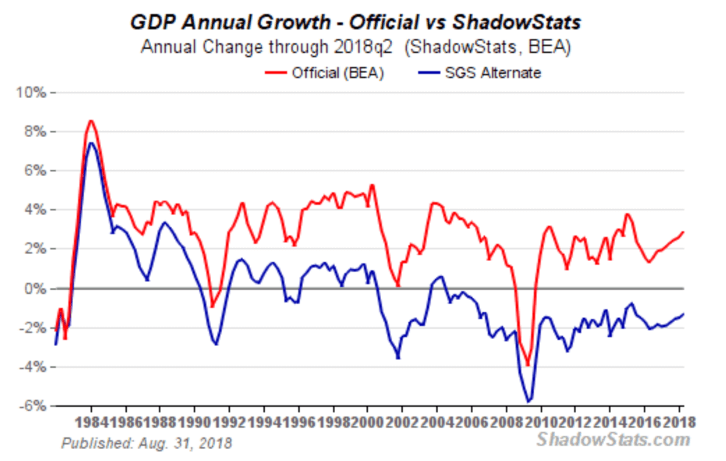
© David Chapman
The trouble started in 2007 when some Bear Stearns hedge funds that were highly leveraged collapsed in July 2007. Continued problems popped up in the sub-prime mortgage market over the next several months. The stock markets made their final top in October 2007. The shock came on September 15, 2008, when Lehman Brothers declared bankruptcy. They were holding over $600 billion in assets with only $22.5 billion in capital. They had become a highly leveraged real estate hedge fund.
The collapse of Lehman Brothers caused the financial system to seize up. It almost brought down the global financial system. The stock market collapsed and it wasn’t until March 2009 that it found its final bottom. Altogether, the S&P 500 fell over 57 percent from the October 2007 high—the steepest collapse in the stock market since the Great Depression. The subsequent recession was the steepest since the Great Depression.
Besides Lehman Brothers, others including Merrill Lynch, AIG, Freddy Mac, and Fannie Mae in the U.S. were close to bankruptcy, while overseas Royal Bank of Scotland, Hypo Bank, Fortis, and HBOS Plc., a subsidiary of Lloyds Banking Group, all faced bankruptcy and required massive bailouts. The FDIC closed 465 banks in the U.S. Some of the banks that collapsed included Indy Mac, Countrywide Financial, and Washington Mutual. Many were taken over by other financial institutions to save them. Large investment dealers like Goldman Sachs and Morgan Stanley converted to banking institutions to be eligible for FDIC bail-outs.
The chaos went further than just financial institutions collapsing. Trade fell and, in many respects, has never recovered. Because of the financial seizure, financial institutions effectively closed their doors.
Credit, as a result, was no longer supplied to the economy. Governments pulled back and the resulting austerity exacerbated an already bad situation.
Below is our chart of Lehman Brothers during the financial collapse. Lehman still exists, trading on the OTC Pink Sheets for about a penny. Quite the comedown for what was a legendary firm.
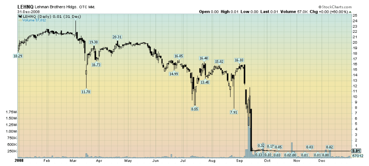
© David Chapman
Central banks slashed interest rates to zero and eventually went to sub-zero, especially in the EU and Japan. The central banks flooded the financial system with funds and governments prepared massive bailouts to prevent the collapse of the financial system and the likelihood of bringing on another Great Depression. Central banks in the U.S. and the EU and even in Japan and China embarked on a program known as quantitative easing (QE) whereby they purchased bonds from the financial institutions, thus providing huge infusions of funds into the financial system. The result was the U.S. monetary base soared from $875 billion in June 2008 to over $4 trillion. The Fed’s balance sheet also exploded with a huge portion of it holding mortgage-backed securities (MBS) and other derivative instruments purchased from the financial institutions. This prompted some to call the Fed the world’s biggest hedge fund.
The result was that the economy improved but growth has been sub-standard compared to other recessions, despite the massive injection of liquidity into the financial system. But the stock markets soared as the funds from QE, coupled with a massive increase in debt, were poured into financial instruments and other investments.
A few did exceptionally well, while another large group did quite well. But for the bulk of the population wages stagnated and homelessness grew. By the end of 2017, it was estimated that 1 percent of the population held 46 percent of the assets while 70 percent of the population held only 3 percent of the assets. It is estimated that some 9 million people lost their homes during the collapse. In the EU, many also lost their homes. Unemployment rose sharply. Bankruptcies by consumers rose sharply.
The bitterness continued well beyond the financial collapse of 2008. As inequality grew, leading to the rise of populist politicians playing on how the people were treated vs. the elites that were bailed out. This, along with the massive immigration fleeing wars, famine, and more in the Mid-East and Central America triggered an immigration backlash and the rise of xenophobic politics in both the EU and the U.S. The polarization of society that had been growing for years became even more stark.
Debt exploded following the financial collapse. We have outlined before how global debt has exploded by upwards of $100 trillion since 2008 rising now to almost $250 trillion. In the U.S. alone, total debt grew from $50.6 trillion to $71.2 trillion, a gain of $20.6 trillion. But GDP has grown by only $6.5 trillion. Unemployment has been cut in half, falling by some 8 million from the peak even as many of the new jobs were part-time with no benefits.
The banking system has been shored up as banks had to fund themselves with more equity and less debt. Banks in the U.S. and the EU have to go through constant stress tests to ensure they could survive a financial crisis. Banks today are less dependent on trading operations for generating income, and they have less reliance on short-term borrowing to finance their activities, shifting instead to more stable deposits. Derivative activity is more controlled and banks and other financial institutions have to ensure they are protected against a disaster scenario so that an AIG couldn’t happen again. One of the biggest changes is governments passed legislation that if there were another financial crisis, banks would be subject to bail-ins, not bail-outs, as occurred following the 2008 crisis. That puts bondholders and depositors at risk rather than the taxpayer as was the case following the 2008 collapse.
But many dangers remain. As consumers de-leveraged, corporations have leveraged up given the low interest rate environment. Leveraged loans and junk bonds issued by U.S. corporations have more than doubled over the past decade, growing from $5 trillion in 2008 to $11.7 trillion in 2018. The U.S. housing market remains exceptionally vulnerable, and there are an estimated 8 million households whose value is less than they paid for it, with many still tied down with mortgages worth more than the value of the house. Fierce weather in the form of hurricanes on the east coast of the U.S. and fires on the west coast have further damaged the housing market. One year after Hurricane Harvey buried Houston in a wall of water, many people continue to live in homes that should be demolished because of mold and more. Having no insurance, they can’t afford to rebuild, and help, if any, has been slow or non-existent.
China’s real estate companies and corporations have also leveraged up along with what is known as the shadow banking system. Leveraged loans have been packaged into what is known as collateralized loan obligations (CLOs) and sold off to investors. Rating agencies such as Moody’s have actually warned about them, given the risks.
Other risks are well known. The housing market in the United Kingdom is on the verge of collapse, and that in turn could pressure U.K. banks who are already facing stress because of Brexit. There is stress on the Euro as the single currency for 19 countries in the EU plus three other small countries that are in the Eurozone but not part of the EU. Pressures have been building up given the varying fiscal policies of each EU member who also have their own central bank. There are banking problems in Greece, Italy, Spain, Portugal, and Ireland. Most of the problems in the Eurozone are caused by the different size of the countries given powerful, rich countries such as Germany and France alongside poorer countries such as Latvia, Slovenia, and Slovakia. If they have an advantage, it is that they are backed by the rich countries as EU members. But in a severe banking crisis, will they have the backing of Germany and France? As the Greek crisis showed in 2011 backing came with a steep price and Greece today remains mired in banking problems and poverty.
Currency wars are ongoing as are trade wars. All of this is centered on the U.S. who has placed sanctions or tariffs on upwards of 30 countries. Currency collapses have taken place in Turkey, Iran, Argentina, Venezuela, and more, sparking hyperinflation, economic chaos, and potential debt defaults. Russia and China are leading the charge to break away from what is known as U.S. dollar hegemony. Even the EU led by Germany is beginning to want to get out from under the yoke of U.S. dollar hegemony. That in turn is a major part of the ongoing currency wars.
The events of 9/11 and September 2008 have been the two seminal events of the current century. The effects of both continue. Not surprisingly, the authorities didn’t see it coming or if they did they failed to tell anyone. To save the world from financial chaos that would have followed, the central banks of the world slashed interest rates to zero and flooded the financial system with money. The ability of the Western central banks to deal with a third crisis is extremely limited in a world that is awash with debt and leveraged securities. Where and how the next financial crisis comes from is unknown. But it is not a question of if, it is a question of when. After 10 years of massive debt build-up, the day of reckoning is getting closer. History is littered with financial collapses and economic depressions and debt is at the center of them. And, even more so, history is littered with financial authorities who didn’t see it coming.
Bitcoin watch
© David Chapman
There was a story this past week in Bloomberg that the cryptocurrency crash of 2018 has now surpassed the NASDAQ dot.com crash of 2000–2002. To be fair, Bitcoin, the largest and best-known crypto, at its worst was down only 70 percent from its December 2017 high.
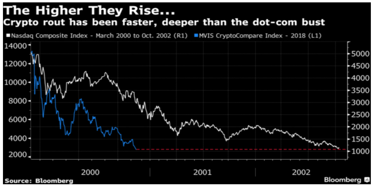
© David Chapman
There are quite a number of MVIS crypto indices. We tried going through a few of them. The MVDA10 Index, which is made up of 10 large cryptos with the largest weighting to Bitcoin (33.2 percent) and Ethereum (24.7), fell at its worst down 84 percent. The MVIS 100 Index (MVDA), made up of the 100 largest cryptos with Bitcoin making up 57.4 percent of the index, was at its worst down 83 percent. The mid-Cap Index (MVSAMC) was at its worst down 91 percent while the small cap index (MVDASC) had fallen almost 92 percent at its low. We had frequently stated that the cryptos were going to fall anywhere from 80 percent to 100 percent before they could even begin to think of a bottom. Despite the fact that the crypto indices have fallen over 80 percent, we suspect there is even more downside.
The bulls, however, continue to fight yesterday’s game and believe that Bitcoin and the cryptos are headed to the stars once again. Here’s a story on CoinDesk that highlights that belief. Hope springs eternal.
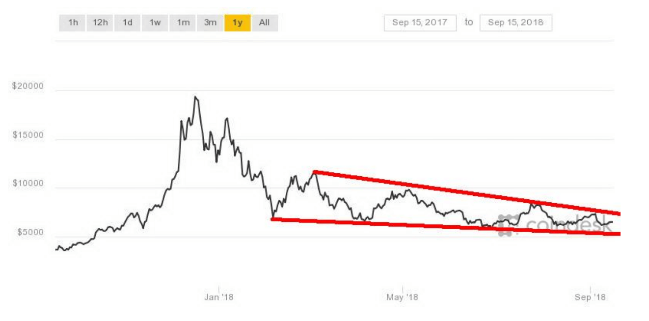
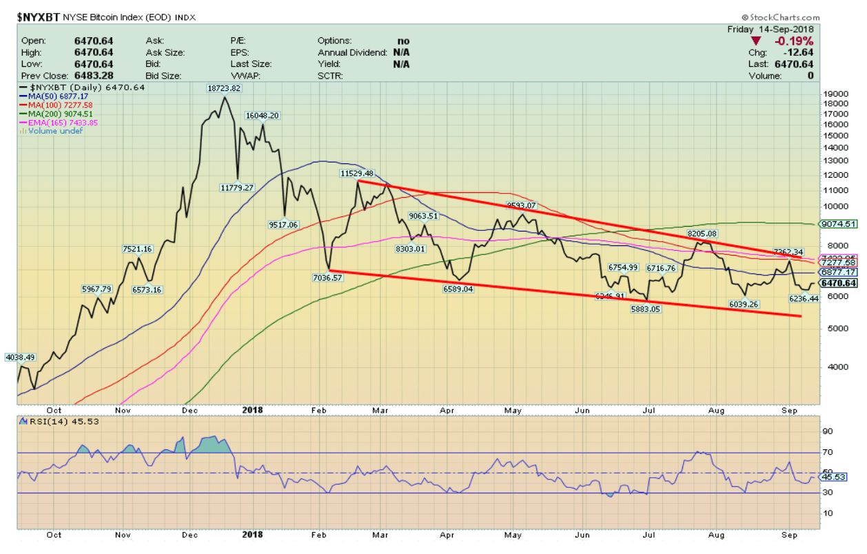
There is no sign that we see that suggests to us the final bottom is in. A series of lower highs with a relatively flat series of lows suggests to us a descending triangle which should eventually break to the downside for Bitcoin. A bottom will be found when there is complete despair in the market and many of the cryptos have just shut their doors, leaving their investors with nothing but losses.
As of September 14, 2018, there were 1,950 cryptos listed at Coin Market Cap, compared to 1,921 a week ago. To quote P.T. Barnum, “there’s a sucker born every minute.” And most of the suckers are still piling into cryptos. When this list starts to decline, then we will know we are getting closer to a bottom. The total market cap of all the cryptos was $198.5 billion compared to $202 billion a week ago. There remain 15 cryptos with a market cap of $1 billion or higher, unchanged from the previous week. This is led by Bitcoin with a market cap of $111.6 billion. That’s down considerably from the high of around $324 billion. The dead coin list at Dead Coins remains at 911.
Bitcoin remains trapped, trading between roughly $6,000 on the downside and $7,000 on the upside. A break under $6,000 would suggest that we should fall at least to the $5,000 level. A break above $7,000 might get a rally going, but we don’t think much higher than $7,500. There remain too many problems with cryptos and the regulators continue to hover.
If there was any consolation to the crypto collapse it was that it only wiped out billions. The NASDAQ collapse wiped out trillions. A few will make a lot of money. Most people will likely lose everything they invest in cryptos.
© David Chapman
Markets and trends
New highs/lows refer to new 52-week highs/lows. © David Chapman
© David Chapman
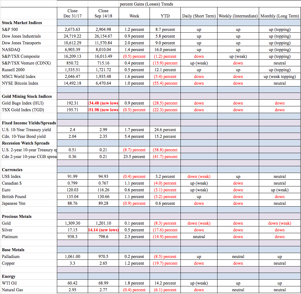
With continued positive economic numbers, coupled with interest rates that are not at a level to threaten the stock markets, the markets shifted back to the upside this past week. The S&P 500 gained 1.2 percent and is now up 8.7 percent on the week. But others were up as well. The Dow Jones Industrials (DJI) gained 0.9 percent and is up 5.8 percent on the year, the Dow Jones Transportations (DJT) was up almost 2 percent and is up 9 percent on the year, the NASDAQ jumped 1.4 percent on the week and is up 16 percent on the year, while the Russell 2000 small cap index was up 0.5 percent and held a gain of 12.1 percent on the year.
Elsewhere, the MSCI World Index gained 1.6 percent but is down on the year by 5.6 percent, China’s Shanghai Stock Exchange was down 0.8 percent and is down 18.9 percent on the year, the Paris CAC was up 1.9 percent and is up 0.8 percent on the year, while the German DAX was up 1.4 percent on the week but is down 6.1 percent this year. The London FTSE was up a small 0.4 percent on the week but is down 3.8 percent on the year as it looks nervously at Brexit. The Tokyo Nikkei Dow (TKN) jumped 3.5 percent and is up a smaller 1.4 percent on the year. In Canada, the TSX Composite shed 0.5 percent and is now down 1.2 percent on the year while the TSX Venture Exchange (CDNX) was up 0.4 percent on the week but remains down 15.9 percent on the year.
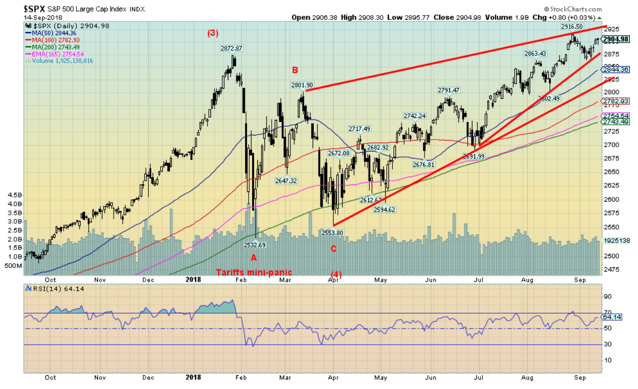
The general picture is that the U.S. indices are doing well but the rest of the world not so good. The pattern continues to look like a rising or ascending wedge pattern. That pattern is usually bearish. It breaks under 2,875 but only suggests a decline to around 2,700. That would be another test of the rising 200-day MA. Friday’s move seemed to suggest a hesitation ahead as, despite the positive background news, the markets closed feebly. It is possible that the markets just meander for the next week awaiting the Fed on September 24/25 in order for it to start something new.
© David Chapman
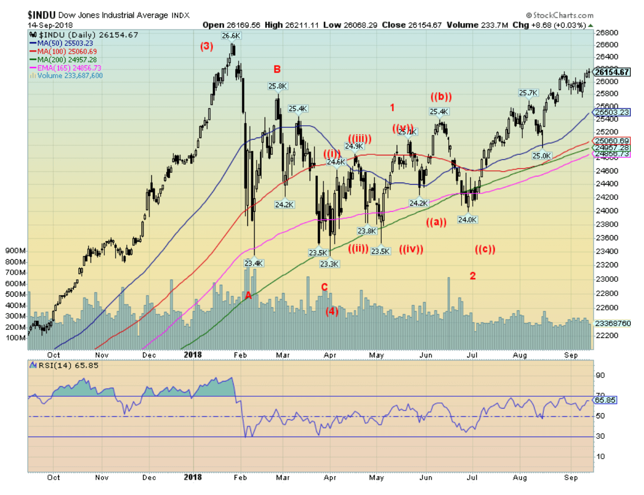
The Dow Jones Industrials (DJI) continues to be the only major index that has not made new all-time highs lately. This is a divergence that needs to be reconciled. But, that said, there are many ways to interpret the recent action and the conclusions can differ. One conclusion is the bearish case that all of this action is merely a large ABC type pattern that will eventually crack. The other one is that we are working a new up-leg that could well run into 2019 before we see the final top, probably sometime in the first quarter.
Still, the fact that the two key indices, the DJI along with the Dow Jones Transportations (DJT), are diverging could mean we may already have seen our final high. We recall back in 2000 that the DJI made its final high in January, but it wasn’t until March that the NASDAQ and the S&P 500 made their final high. It is now September and the DJI made its high in January. That is for a lot longer period as both the NASDAQ and the S&P 500 amongst others have only recently made new highs. Markets tend to signal when they might have made a top or one can play it safe and say below what level will it tell us that a major top is no doubt in. The first break is under 25,500. But the key breakdown level is under 24,950, or to be safe 24,900. Otherwise, the trend is up.
© David Chapman
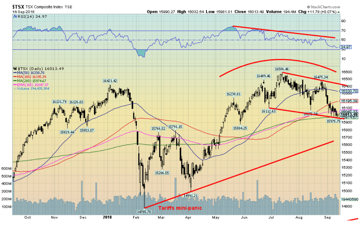
The TSX Composite is getting dangerously close to breaking down. We don’t like the slanted pattern. It is barely holding above the trendline and the 200-day MA currently near 15,975. A breakdown under 15,975 could see the TSX fall to the uptrend line near 15,500. Under 15,500, the breakdown would continue towards the February 2018 lows of 14,700. The best scenario is that the TSX finds support here and works it way back up to the upper end of the downtrend currently near 16,400. Channels are funny in that they can hold and continue to trace out a discernible channel or they can just break down. The levels are designated. One will have to see a recovery in the dominant energy sector to suggest a move to the upside. A strong move by Materials would also help.
© David Chapman
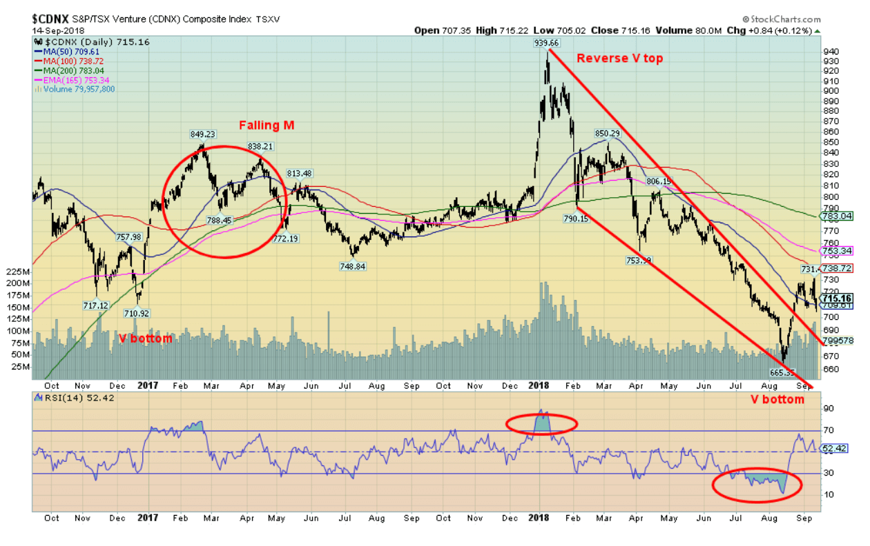
The TSX Venture Exchange (CDNX) continues to trace out what appears to be a bottom. That would be a savior for long-suffering holders of junior mining stocks and all the other junior companies on the CDNX. A reminder that the CDNX is 50 percent junior mining stocks in both precious and regular metals. The CDNX appears to have broken its downtrend line and has been trying to stay above the 50-day MA. We believe there is considerably more upside here and a return to the early 2018 highs near 940 is not out of the question, given the CDNX’s history of wide swings.
© David Chapman
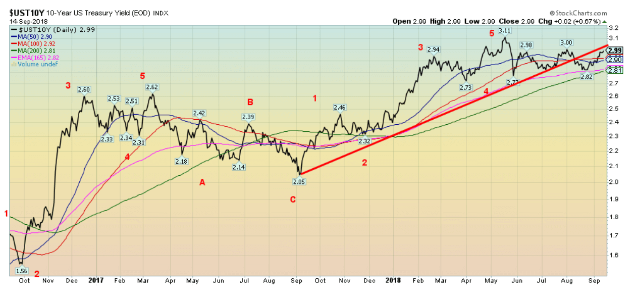
Given some better than expected economic numbers which we outline under our US$ commentary, the 10-year U.S. Treasury note rose this past week to 2.99 percent from 2.94 percent the previous week. Higher inflation numbers also had the 10-year testing 3 percent.
Given that the 10-year has jumped above the Mas, it is now possible for the 10-year to push through 3 percent. While it remains possible, it is not a guarantee. The 10-year has meandered here for the past few months, generally between 3 percent and 2.80 percent. It continues to look like a top so the next significant move should be down, not up. The 10-year also looks like it might be forming a head and shoulder top even as the left shoulder is not as well formed as the possible right shoulder. A breakdown under 2.80 percent would confirm the pattern that could then fall to 2.40 percent.
The only caveat is that the high of the right shoulder has been 3 percent vs. the high of the left shoulder at 2.94 percent. The right shoulder should be lower than the left shoulder. A firm move through 3.00 percent would suggest that the 3.11 percent high could be tested and thus a double top could form. Or we go right past the 3.11 percent high. But, right now, we don’t see that happening as we don’t believe the conditions are there as slowdowns are growing elsewhere and that eventually translates into the U.S. as well.
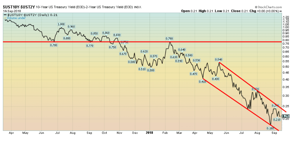
Recession watch spread
© David Chapman
The 2–10 spread slipped 2 bp this past week to 0.21 from 0.23. Really, nothing much has changed here. The 2–10 spread (2-year U.S. Treasury Notes – 10-year U.S. Treasury notes) continues an irregular downward trend. But a reminder that it is nowhere near a negative spread that might signal a recession. And even if it does go negative it is not a guarantee that a recession is imminent. It is merely a sign that one could soon be upon us. History has supported that premise. See the chart below.
Funny—I read that Warren Buffett doesn’t even look at these spreads or much in the way of economic numbers. He doesn’t really care. He just goes on the premise you buy a good company and hold it for life and the rest is just noise. But, for the rest of us non-billionaires, we have different concerns—as in during a recession we might lose our job or our portfolio might crash. Buffett losing a billion here or a billion there is all very well for him. But the rest of us aren’t Buffet. So, we pay a little more attention.
© David Chapman
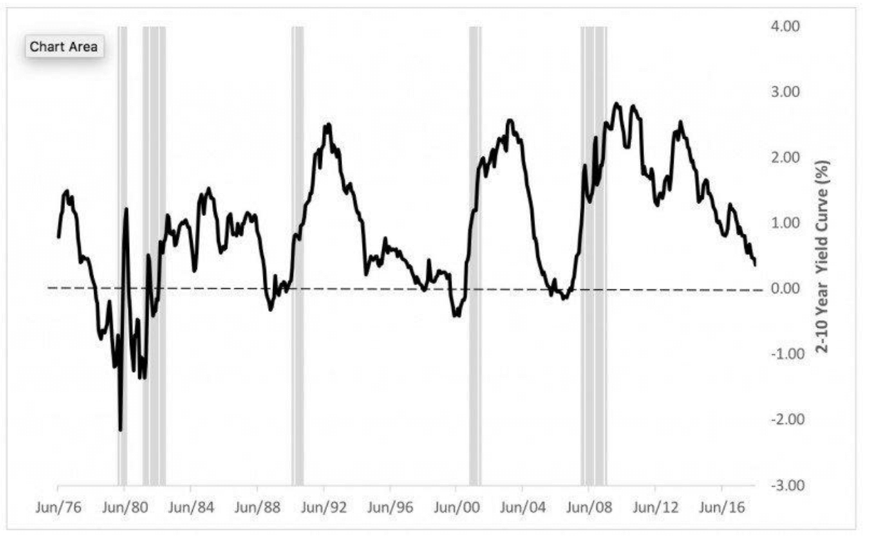
Here’s a long-term chart from the late 1970s on the 2–10 spread. Note that each time the spread went negative, in the late 1970s, in the late 1980s, in the late 1990s, and in the mid-2000s a recession followed. Since following the spread from the 1970s, there has been no period where the spread went negative and a recession did not follow.
It has been a reliable predictor of recessions. But note there is always a lead time and often the spread starts to rise again before the recession actually hits. We have to also consider as to whether the Fed is accommodative or contractionary. Given the Fed has embarked on QT to replace QE that we consider being contractionary. Also, money supply growth is sliding even as inflation is rising. Inflation is expected to be 2.5 percent in 2018 while the three-month Treasury bill is currently at 2 percent for a negative yield of 0.5 percent.
© David Chapman
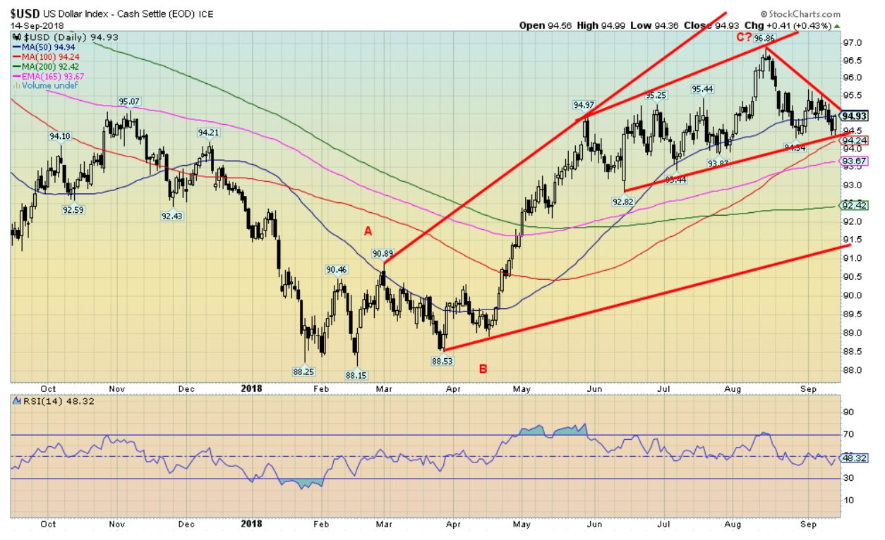
Following downward pressure most of the week on the US$, the US$ rallied on Friday following the release of Friday, September 14 economic numbers. While U.S. retail sales disappointed, industrial production did not, coming in at 4.9 percent vs. an expectation of 3.6 percent. The Michigan Sentiment indicator also surprised, coming in at 100.8 vs. an expectation of 96. Together that was enough to spark a U.S. dollar rally and the US$ Index jumped 41 bp.
The market seemed to ignore another round of tariffs against China. Those tariffs come and go depending on Trump’s mood, so people are beginning to just tune them out. The rally saved the week, but the US$ Index still closed down 0.4 percent on the week.
The euro gained 0.6 percent while the British pound, despite Brexit, was up 1.1 percent. The Cdn$ surprised with a 1.1 percent gain, despite numerous threats to its economy growing. The Japanese yen was the only major loser on the week off 0.9 percent.
Technically, the US$ Index has held an uptrend line dating from June 2018. On one hand, we could be forming a head and shoulders top pattern, but then this could be some sort of rising triangle.
The trouble with the H&S pattern is that the right shoulder has already made a higher high (95.82) than the left shoulder high (95.44). That makes us suspect, as in the classic H&S pattern, the right shoulder is below the left shoulder. We’d want to await a break below 94.25 and even below 93.70 to suggest that a top is in and that we are now moving into breakdown mode.
The upcoming Fed meeting September 24/25 could be important for the US$. The wide expectation is that the Fed hikes rates by another 25 bp, but listen to their concerns about the economy and if they sound dovish the US$ Index should fall. But right now, some decent economic numbers and higher bond prices supported the US$ Index.
© David Chapman
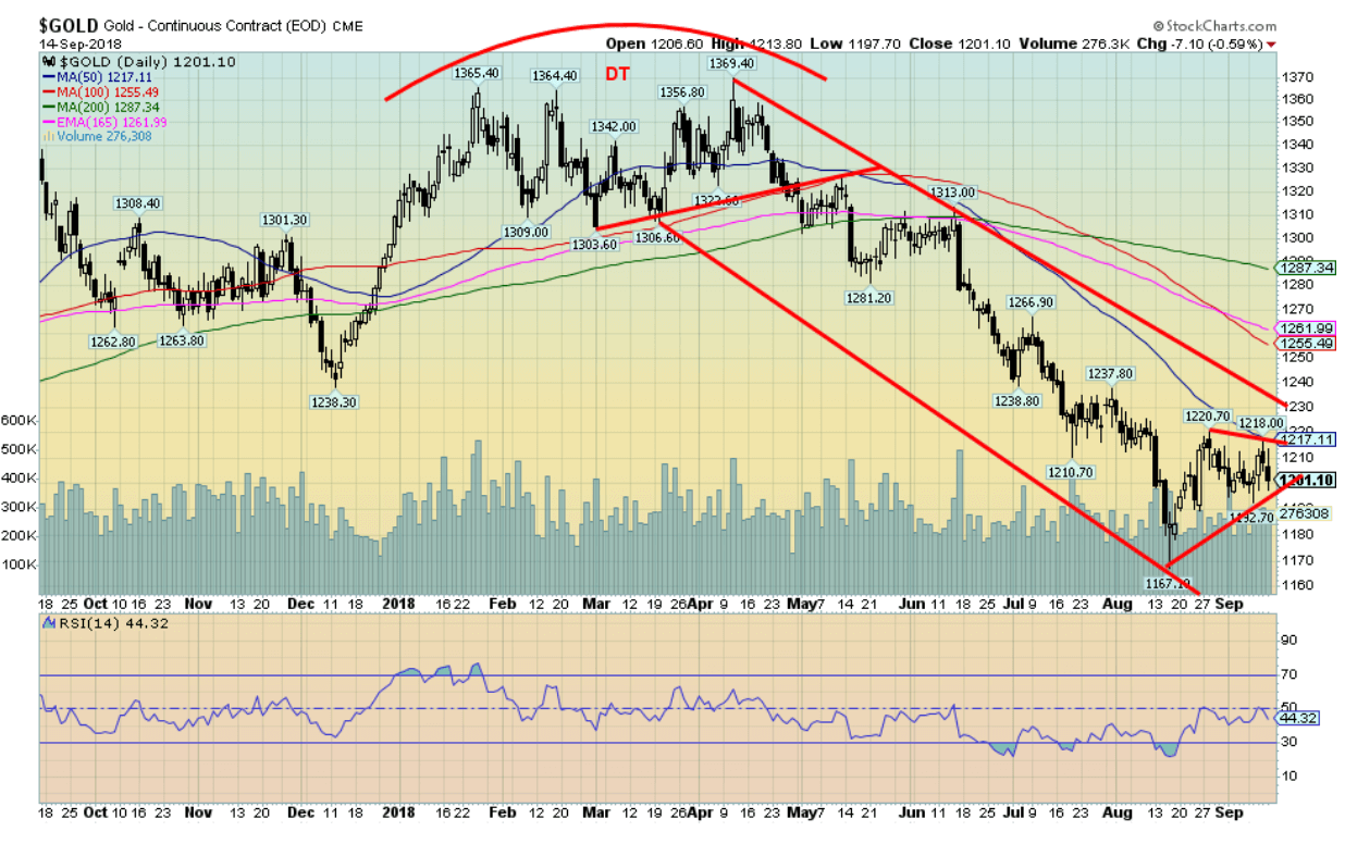
Gold continues to try and find a footing. The rise in gold prices was feeble but at least it was up. The gain was less than 0.1 percent. We are encouraged by what appears to be a forming triangle on gold. And we are encouraged that as silver and the gold stocks (HUI, TGD) continue to make new 52-week lows, gold has not.
On the futures, gold continues to trade around and above $1,200. But resistance from $1,210 to $1,220 remains elusive. The pattern appears as a potential bull pennant triangle but we acknowledge the break has to be to the upside. Breakout appears around $1,217 but it would safer to say $1,220. Once through that level, a run to $1,270 is possible. Heaven help, a breakdown that could take us to $1,140 with a break under $1,195.
Gold is facing headwinds with the knowledge that the Fed is going to hike the key Fed rate another 25 bp at their September 24/25 meeting. As well bond prices pushed higher this past week with the 10-year testing to 3 percent. The U.S. economy continues to surprise at least on the surface and that is all that matters. In turn, this helps push the U.S. dollar higher and that pushes gold lower in U.S. dollars.
Yes, gold is doing quite well in sinking currencies like the Turkish lira, the Argentinian peso, and other sinking countries. But in the key U.S. dollar and even the euro, the pound, the yen, and the Cdn$ gold continue to struggle. If there is some consolation we have picked up stories that some money managers are seeing value in gold at these levels and are beginning to build positions. But most of their concentration is on the metal itself, not on gold stocks.
Sentiment remains abysmal, but the commercial COT is positive for the first time ever it seems. Indicators are oversold but are coming out of their funk. Our expectations are that gold is going to continue to meander this coming week with no sense of direction one or the other. But we believe the Fed meeting will prove to be a watershed and gold could well rally out of that event. The Fed meetings are September 24/25. The technical picture looks positive and sentiment and the COT are also pointing to higher prices. The COT, in particular, suggests to us once a gold rally gets underway there will also be a short squeeze because of the record short position of the large speculators. We are just going to have to be patient.
© David Chapman
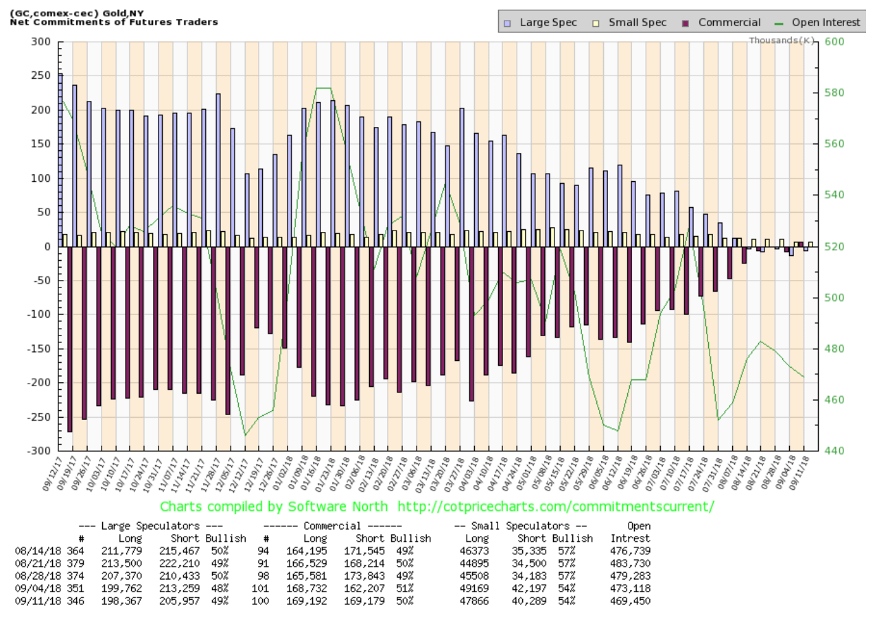
The gold commercial COT slipped slightly this past week but remains as bullish as we have ever seen it. The gold commercial COT came in at 50 percent vs. 51 percent the previous week. Long open interest rose only about 500 contracts while short open interest jumped about 7,000 contracts. Despite the slip, the gold commercial COT remains positive and quite bullish. The large speculators continue to hold record short positions even as it rose to 49 percent from 48 percent. Notably, they appear to have covered some 7,000 short positions this past week.
© David Chapman
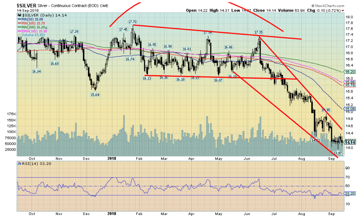
Silver prices looked into the abyss this past week, but then turned around and managed to close up 0.5 percent on the week. By looking into the abyss as silver prices briefly dipped under $14, the low of December 2015 at $13.62 suddenly loomed large. But fortunately, silver reversed and closed at $14.14. That was down from the high of $14.39 seen on September 13.
Silver sentiment remains abysmal and the silver price remains grossly oversold. But that does not a rally make. No, we need to take out points above to confirm a low. The first level of resistance is seen just above $14.40. Silver then needs to regain $15 to suggest that a final low is in. Right now, that seems distant following the devastation that has been wrought. But note those big down days seen on August 13 and 15, and on September 4. Up days of that nature can also occur and have in the past. Support now ranges down to $14. We think a low might be in, but the reality is we need some positive upside closes to confirm.
© David Chapman
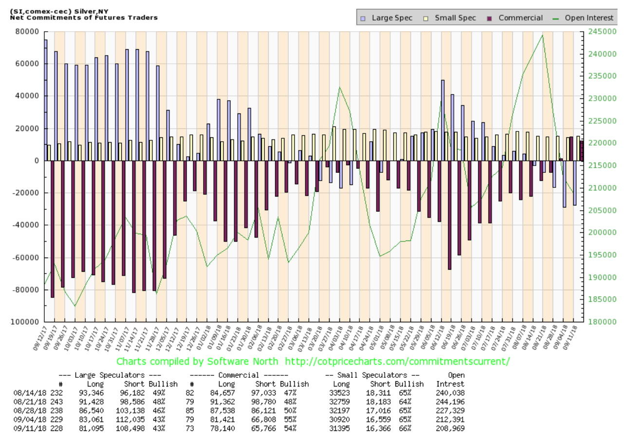
The silver commercial COT continues to be fine despite a small pullback this past week. The silver commercial COT came in at 54 percent vs. 55 percent the previous week. Long open interest fell roughly 3,000 contracts while short open interest fell roughly 1,000 contracts. The large speculators COT was steady at 43 percent and the managed futures continue to maintain a record short position. We continue to view the silver COT has quite bullish.
© David Chapman
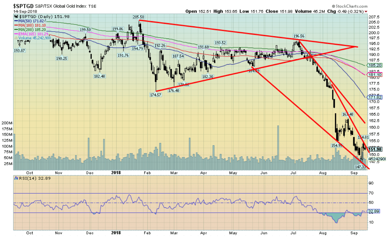
A bit of light at the end of the tunnel. Let’s hope it’s not a train. While the TSX Gold Index (TGD) lost 0.5 percent this past week the Gold Bugs Index (HUI) was up 0.9 percent. Numerous gold stocks put in a positive week, the first in a while. Wednesday saw a huge up day following another new 52-week low for the move down. It constituted a reversal.
While the TGD has had, so far, not much in the way of follow-through, we are encouraged by the reversal and it is a sign that the pain might be over or nearly over. No, we cannot confirm a low just yet. At minimum, we’d like to see a close over 162.50. The key MAs are a long way off with the closest, the 50-day MA way up at 171.80. That seems a lifetime away. However, in watching gold stocks over the years and recognizing their volatility both up and down, that distance could be closed in a nano-second.
Sentiment remains abysmal at multi-year lows. We have just come through a long period of sub-30 RSI that has lasted more than a month. Can’t remember the last time we saw that. Not even during the 2015 low did the RSI last this long under 30. The low at 147 defines ultimate support. As long as that level holds, (and preferably 150) the TGD should start to work its way higher. At worst we should have a relief rally. At best, a low is in and we start a new upward swing.
© David Chapman
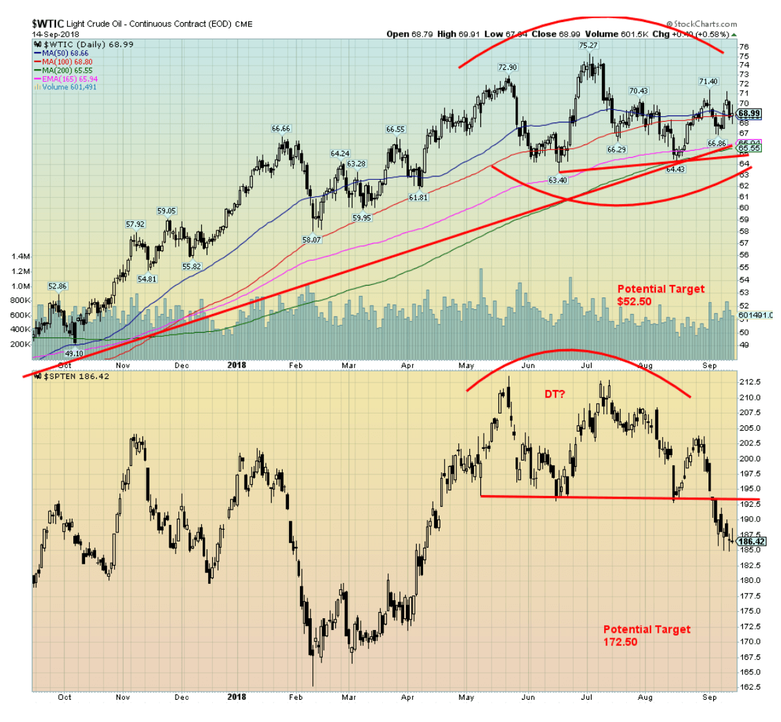
Concerns over global supply, particularly with the pressure building against Iran that could see at least 2 billion barrels a day removed, WTI oil prices rose this past week. However, a stronger U.S. dollar on Friday put a damper on the rebound and WTI Oil prices backed off. They did finish up on the week by $1.24 or 1.8 percent. Prices stalled out just above $70.
Key will be taking out the previous $71.40 as that could be peak of the right shoulder of a potential head and shoulders top pattern. The neckline is currently around $64.75 and, if firmly broken, could project down to around $52.50. Taking out $71.40 would put that in question and taking out the left shoulder high of $72.90 would suggest new highs above $75.27.
Despite the rise in oil prices, the oil stocks continue to suggest that there is a problem and the S&P Energy Index (TEN) fell 1.9 percent this past week. The TEN is looking negative, having broken down under what may have been a double top pattern. It projects down to 172.50. The TEN is trading under its key 200-day MA, suggesting it has moved into bear territory. Only regaining above 200 might the TEN show real signs of recovery.
Chart of the week
© David Chapman
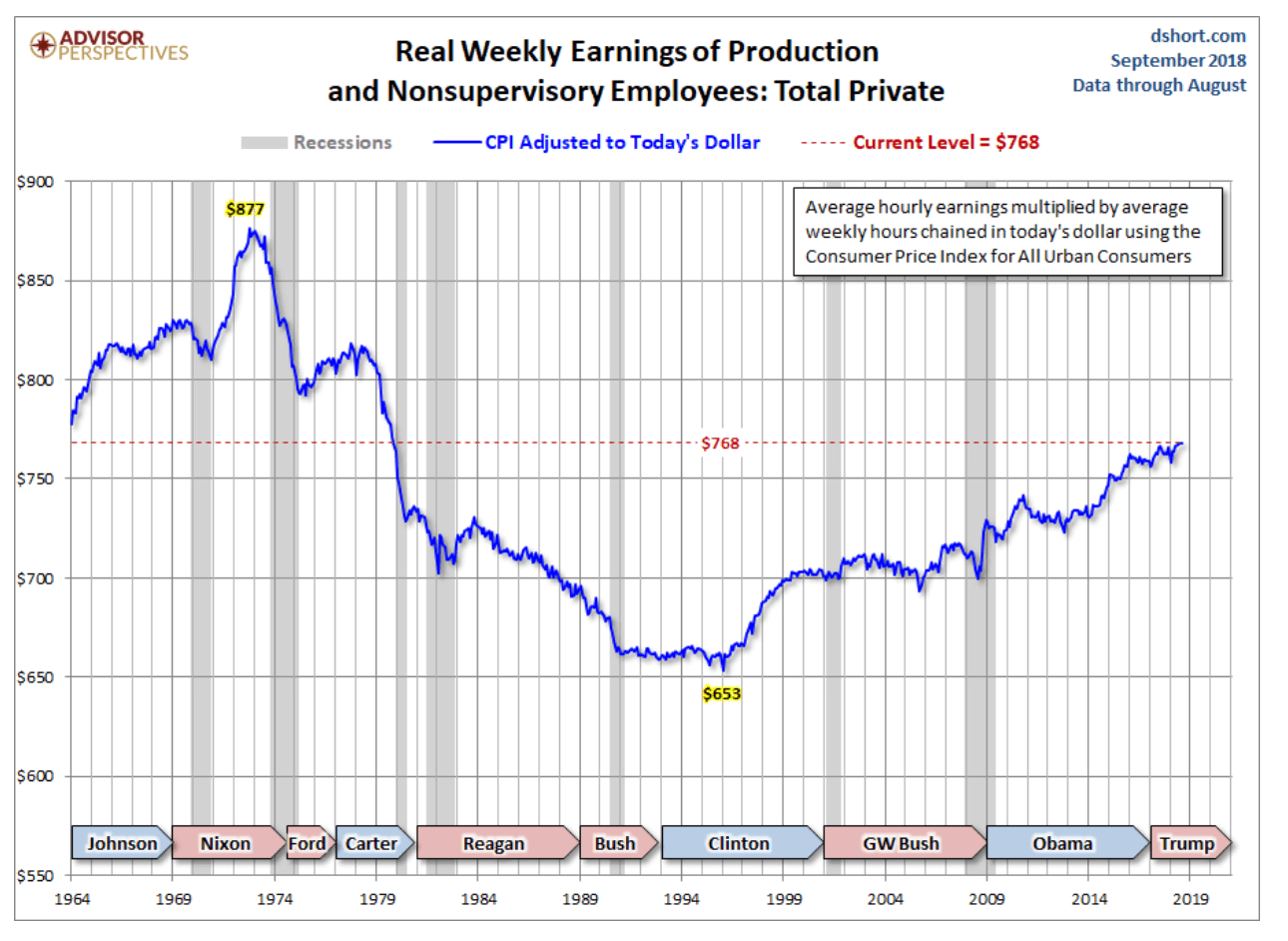
We have often noted that despite the so-called recovery over the past decade wages have stagnated. Worse wages have been stagnating for 40 years. The chart above is for the U.S., but the same thing could be applied to Canada. These are weekly earnings in real terms. As the chart shows, they are barely back to where they were in 1979 under President Carter. Wages back to where they were in the late 1960s under President Nixon seem to be a pipe dream.
We should also note that not only has inflation taken a toll on wages, but, overall, people are actually working less hours overall than they did a decade ago before the Great Recession got underway as a result of the financial crash of 2008.
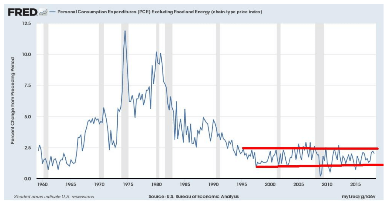
Our second chart below shows Personal Consumption Expenditures (PCE), excluding food and energy. This is annual change. Since 1995, the annual growth in the PCE has been essentially flat.
Despite the claim that the consumer is spending, this suggests he really isn’t. Given the sluggish growth in spending, coupled with a desire to pay down debt and actually save, no wonder there is sluggish growth in spending. Wages are sluggish and so is inflation. But there is one area that is absolutely growing.
© David Chapman
The area that is growing is debt. As we have noted, total U.S. debt (public, corporate, and consumer) has gone from $50.6 trillion in 2008 to $71.2 trillion today, a gain of $20.6 trillion. However, GDP has grown from $14 trillion in 2008 to only $20.5 trillion today, a gain of $6.5 trillion. It’s taken increasing amounts of debt to purchase an additional $1 of GDP.
Yet the current period has actually been lower than some previous periods. Note the 1980s and the 2000s, two periods where U.S. debt exploded, first under President Reagan and secondly under President Bush II.
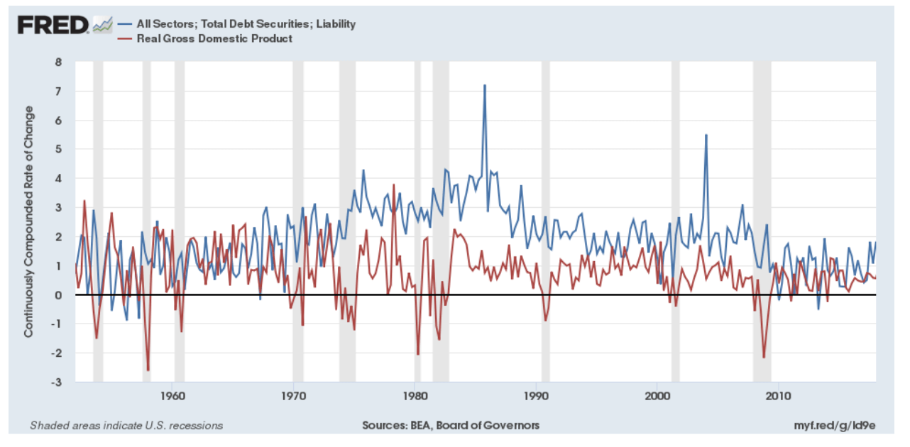
Our third chart below shows the annual change for debt securities vs. the annual change for real GDP. As we noted, the huge spikes in the 1980s and the early 2000s were periods of unbridled debt growth. Note how. during the 1960s. the two were roughly in sync. It was only in the 1970s that debt growth took off and it is been climbing into the stratosphere ever since.
Incidentally, that happened with the end of the gold standard and the end of currencies linked to the U.S. dollar. Almost 50 years later we are in the midst of currency wars. A reset of gold could correct this. It has happened before when President Roosevelt revalued gold to $35 from $20.67 in 1934. Curiously. the U.S. carries its gold on its books at roughly $42. The odds of a gold reset, however, remain remote at this time. However, it is a consideration that has been discussed.
© David Chapman
Stagnant wages, stagnant spending, all add up to stagnant GDP growth. but it hasn’t stopped borrowing. And borrow more and more they do. And that’s what causes debt collapse, recessions, and depressions.
(All charts are courtesy of Stock Charts and COT Price Charts.)
(Featured image by DepositPhotos)
—
DISCLAIMER: David Chapman is not a registered advisory service and is not an exempt market dealer (EMD). We do not and cannot give individualized market advice. The information in this article is intended only for informational and educational purposes. It should not be considered a solicitation of an offer or sale of any security. The reader assumes all risk when trading in securities and David Chapman advises consulting a licensed professional financial advisor before proceeding with any trade or idea presented in this article. We share our ideas and opinions for informational and educational purposes only and expect the reader to perform due diligence before considering a position in any security. That includes consulting with your own licensed professional financial advisor.


AI Venture Builder Launches €600K Crowdfunding Round to Scale Secure AI Solutions
AI Venture Builder, an Italian-British firm developing AI applications and vertical startups, returns to CrowdFundMe with a equity campaign. After...


Gilead HSV Plan Could Transform Market Outlook
Gilead’s upcoming development plan for Assembly Biosciences’ HSV drugs could reshape the herpes market. ABI-5366 and ABI-1179 have shown strong...


Talentir Secures €4M to Transform Global Payouts
Talentir, an Austrian-Swiss fintech, raised €4 million led by Redstone to scale its AI-powered payout platform. Using stablecoin infrastructure, it...


Coastal Cities Lead as Heat Strains Italy’s Urban Livability
Italy’s 2026 Climate Livability Index shows coastal cities, led by Ancona, outperform inland areas as global warming intensifies. Adriatic locations...


Bank of Africa Expands Sino-African Trade Partnerships in Beijing
Bank of Africa strengthened Sino-African ties by signing partnerships in Beijing with CIEC Group and CCCME to boost trade, investment,...
 |
|
 |  |
 |
|
-
 Impact Investing7 days ago
AI Adoption in Italian Retail Stalls Despite Strong Experimentation
-

 Cannabis2 weeks ago
Cannabis Legalization in Germany: A Mixed Interim Assessment
-

 Impact Investing2 days ago
EU Weighs More Free Emission Permits in ETS Review to Boost Industry Competitiveness
-

 Impact Investing1 week ago
SBTi Net-Zero Standard 2.0 Enhances Corporate Climate Action
You must be logged in to post a comment Login