Business
Until Further Notice, the Markets are Going Nowhere Fast
From 1933 to 1958, as per Barron’s data plotted below (and I’m sure this was so long before 1933), stock dividends yielded more than bonds. Investors could actually time profitable exit and entry points for the stock market using this data. When dividend yields were higher than bond yields, when investors were properly compensated for taking the risks for owning stocks, they’d sell bonds to buy stocks.

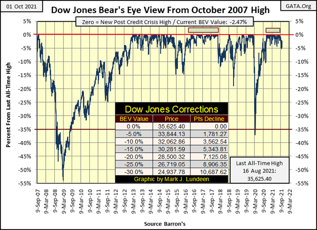
A week ago on Thursday, the Dow Jones closed with a BEV value of -5.00%, which was a daily close outside of scoring position. It was just the tiniest bit outside. No matter, it was still a daily close not within 5% of its last all-time high. This was a first since last November, the first in 226 daily closings. I felt the Earth’s magma move beneath me. For a moment I had the feeling something significant, something big, bad, and possibly very nasty was emerging from its cocoon.
Then this week came and went, and the magma moved no more. Not with the Dow Jones closing in scoring position every day this week, and closing on Friday with a Bear’s Eye View value of -2.47%. Thank God last week I didn’t predict something ill-advised; something like we’re on the edge of “the big one.”
I’m just going to have to accept this managed market remains manageable by the idiot savants at the FOMC. When Mr Bear does finally pick up the ball and begins running with it, those of us in the market’s peanut gallery will finally see some real downfield running; some big Dow Jones 2% days. Until then, I’m just going to have to calm down and enjoy the show as best I can.
That doesn’t mean that the stock market will now enter another period of rapid advancement. Though it could. But the stock market has seen impressive advances off its lows of March 2020. The possibility of seeing the next eighteen months repeating the last is small.
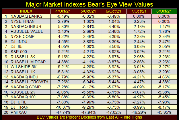
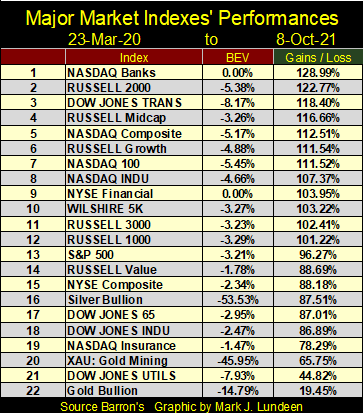
A likely scenario for the weeks and months to come is seen in the table below, listing the major market indexes’ BEV values. The indexes saw a few BEV Zeros at the end of the week. With the Chinese real estate market in continuing turmoil, Evergrande et all, I find it odd the financial stocks this week saw the new all-time highs.
How bad is Chinese real estate? The following video by ADV China is revealing. The hosts of ADV China have lived and worked in China for over a decade. Both speak and write Mandarin Chinese, and have traveled throughout China. The corruption in Chinese construction is astounding.
Why Evergrande Collapsed – Our Chinese Houses Crumbled – YouTube
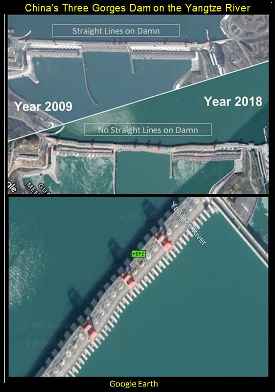
And it’s not just real estate that Chinese enterprise has cut corners on. China has sold toxic pet food and baby formula to the global market. It’s famous Three Gorges Dam is cracking after only a few years on line (see photo below). What else is there to say, but that the CCP’s China is famous for low quality, shoddy products. I should note the CCP’s corona viruses are world class.
China can’t keep the lights on. In the coming winter, people are going to freeze in Northern China.

Mainland China is a mess; a mess capitalized by money from the West. Maybe Wall Street’s exposure to Evergrande itself is limited. But if Evergrande pulls down the Chinese economy, creating shockwaves of defaults in the Chinese finance system, know that American finance has great exposure to China. When China goes, it’s hard imagining the American stock market wouldn’t follow it down.
But this week none of the above mattered, as the financial indexes were the top performers, as the other indexes trending within, or very close to scoring position. Of course, the gold and silver miners in the XAU remain in a funk. But then they have no friends at the FOMC.
If this market refuses to go down, this pattern seen below may just be what we should expect, until we all feel the magma once again move beneath our feet.
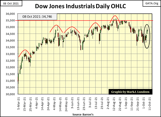
The following chart plotting the Dow Jones in daily bars is a better model of what I expect we’ll see until Mr Bear comes for what is his in this market. From its lows of March 2020 (18,591), the Dow Jones advanced through its millennian lines with ease. Then came May of 2021, and for the past six months the Dow Jones has struggled with its 35,000 level.
We may still see the Dow Jones close above 36,000, but it may be a while before it does, as the other major market indexes seen above perform likewise.
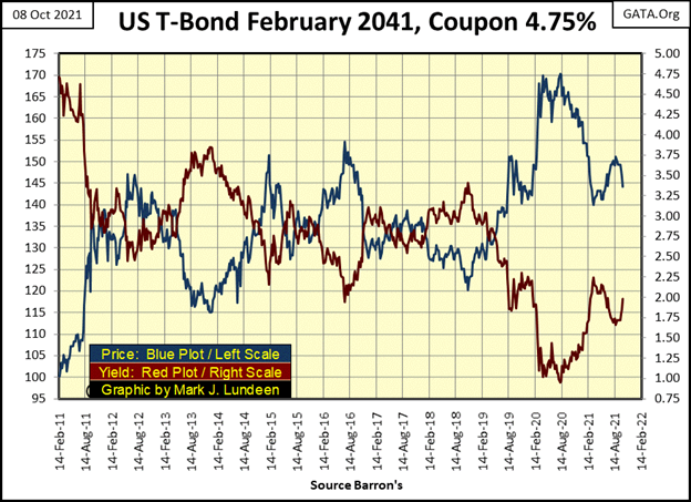
Bond yields have been rising (Red Plot below) and bond prices deflating (Blue Plot) these past few weeks. This 30 Yr. T-Bond was issued in February 2011, so in October 2021 it’s actually a 20 Yr. T-Bond. But the “policy makers” have manhandled its current yield from its original coupon of 4.75% down to 0.95% early in August 2020.
I expect this low from a year ago will prove to be the absolute bottom for bond yields in the current cycle, a cycle that began in the autumn of 1981. If so, there is nowhere for bond yields to go but up. With the massive market manipulation the bond market has seen since October 1981, I’m expecting bond yields will once again see the highs of forty-years ago. It’s Newton’s 3rd Law of Motion applied to the financial markets; for every action, there is an equal but opposite reaction.
What the yields curve looked like in September 1981 (Blue Plot below), as well as just prior to the sub-prime mortgage market fiasco (October 2007, Red Plot) and incredible lows of the cycle in August 2020 (Green Plot), are all plotted below.
I call the members of the Federal Reserve’s Open Market Committee idiot savants, because they are. These people are actually brilliant, but they lack wisdom. They lowered the yield curve, yes they did down to nothing since the sub-prime mortgage debacle (Red Plot), knowing governments, corporations, and individuals would load up on the abundant credit they supplied (debt to you and me), at the very attractive rates of almost nothing for years now (Green Plot below). Junk bonds formerly yielded double digits. Today they yield what savings accounts at banks offered their depositors before 2008 because of the FOMC’s idiot savants.
And for what purpose did these idiots do all of that? To yet again reflate market valuations, as they have since Alan Greenspan first “provided ample liquidity” to Wall Street in October 1987. Like heroin, this four-decade long bull market has become a pernicious-bad habit.
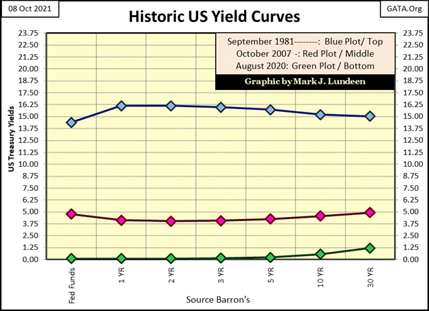
In October 2021, too many balance sheets groan under their burden of debt service. Should the yield curve merely shift back up to where it was in October 2007, it won’t be only me feeling the magma moving under my feet. When the yield curve once again visits the highs of September 1981 (and it will), Wall Street itself will collapse as flows of lava bury lower Manhattan.
Maybe I’m exaggerating a bit in the text above. But it’s no exaggeration saying the multi-tens-of-trillions-of-dollar OTC derivatives market will meltdown the global banking system with specific-performance failure should interest rates and bond yields return to where they were in 2007.
Why do people buy shares of companies trading on the NYSE and NASDAQ? In the inflation-driven financial system of 2021, it’s a bet a dollar wagered, will gain two or three dollars in return.
But it wasn’t always this way. During the gold standard, the financial system’s access to money was restricted by the limits imposed on it by the availability of gold. Gold as money, being rare and precious, restricted runaway price increases within the system, including valuations in the stock market.
So, why during the gold standard would people buy stocks? Stocks long ago weren’t understood as a vehicle to make a killing in the market, as they are today. Investors of long ago saw stocks as a means of obtaining greater income than they could get with bonds or by saving money in a bank.
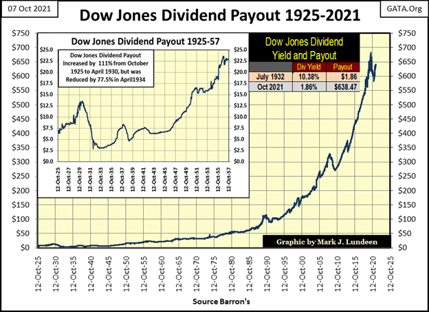
Buying shares is purchasing fractional ownership of a company, and fractional ownership entitles shareowners to a share of profits from a company’s operations; dividend payouts. And unlike a bond’s fixed payout, dividend payouts have increased greatly in the past century (chart below). Yes, like everything else, this “growth” in dividend payouts has been driven by monetary inflation flowing from the Federal Reserve. But for investors, it’s a heck of a lot better than the fixed, never expanding payout a bond offers.
But look at what happened during the Great Depression Crash. Dow Dividend payouts deflated by 77%. In 1932, people who had a bond’s fixed payout were grateful they owned bonds issued by General Electric rather than its shares.
There’s an old law-of-economics that today is mostly forgotten (ignored?); that the higher the rate of return, the higher the risk an investment has. Something to consider when looking at the gains the stock market has seen since March 2020 below.
Keeping that thought in mind, let’s look at my next chart plotting the dividend yield for the Dow Jones (Blue Plot) and Barron’s Best Grade Bond Yields (Red Plot). My data for Best Grade Bond Yields begins in 1933, but I’m sure the pattern seen below was applicable during the gold standard era, that dividend yields were higher than bond yields. And correctly so, as risks to income from ownership of common stocks were higher than with bonds.
Bonds are legal contracts for debt. Investors buy a bond knowing the company has an absolute legal obligation to pay them their coupon payments in a timely manner. Any company that fails to pay their bondholders their coupons are by legal definition – insolvent, which results in the liquidation of the company’s assets for the benefit of the company’s bondholders. The defaulting company’s owners, the shareowners, get the crumbs left over after paying the bondholders their due.
Or so this was true until General Motors became insolvent in 2008. Then-President Obama (a former “community organizer” from Chicago) stiffed GM’s bondholders their due, for the benefit of GM’s unions, and most likely other “progressive organizations.”
Dividend payouts, as a matter of law, must come after the payment of a company’s bond obligations. That plus, companies aren’t legally obligated to pay their shareholders a dividend payment, which during times of economic distress, they may not, with no legal recourse for the company’s shareholders.
From 1933 to 1958, as per Barron’s data plotted below (and I’m sure this was so long before 1933), stock dividends yielded more than bonds. Investors could actually time profitable exit and entry points for the stock market using this data. When dividend yields were higher than bond yields, when investors were properly compensated for taking the risks for owning stocks, they’d sell bonds to buy stocks. When dividend yields were approximately equal to bond yields, they were no longer compensated for the risks of owning stocks. So, they’d sell stocks and buy bonds, and wait until dividend yields once again increased to levels that compensated shareholders for the risks of owning stocks.
This system of choosing stocks for bonds, or bonds for stocks ensured investors exited the stock market near bull market tops in the stock market, and re-entered near bear market lows.
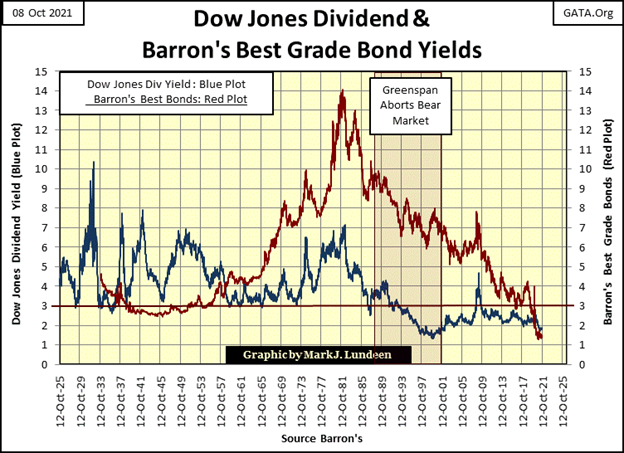
This system of switching back and forth from stocks to bonds ended in 1958, when bond yields began soaring far above dividend yields. Which coincidently was also the first year of a gold run on the US Treasury, the consequence of over-issuance of paper dollars (CinC), unbacked by US gold reserves into the economy. This run on the US gold reserves continued until August 1971, when the US Government terminated the Bretton Woods $35 gold peg.
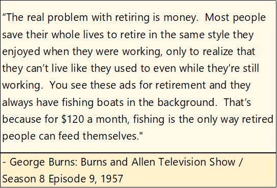
Below is a quote from 1957 by George Burns from the popular Burns & Allen Comedy Show. I’m assuming the $120 a month was the typical Social Security payment of the time. What it was in August 1971? I don’t know, but it was more than $120 a month. The increase in Social Security payment wasn’t from the government being generous, but from its recognition of the ever-decreasing purchasing power of the dollar the US Treasury and Federal Reserve had mismanaged for decades.
The effects of the US Government’s inflationary monetary policy on the financial markets can be seen in the chart above, where bond yields from 1957 to 1981 increased from below 4% up to 14%; far above dividend yields. Post 1958, risks in owning bonds increased greatly. In fact, they became guaranteed losers; “certificates-of-confiscation” (as documented in the dusty old pages of Barron’s from long ago) when taking these fixed-income assets’ inflationary losses into consideration.
Following the peak yields of October 1981, the bond market once again began to be very profitable as bond yields collapsed. Today, with bond yields now below 2%, bond prices haven’t much room for continued valuation inflation. And the cash flow coming from an investment yielding much less than the actual rate of CPI inflation, makes the entire bond market in 2021 is very unappealing. You can be sure Mr Bear has big plans for the fixed income / bond market in the years to come.
The history of the stock market post 1958, was much more profitable than it was for bonds. This was especially so after August 1982, when the Dow Jones began a multi-decade long advance that continues to this day.
The take away from the chart above plotting stock and bond yields, is in 2021, yields for stocks and bonds have for decades been manhandled to levels far below where economic and market realities would have them. During the gold standard era, seeing a stock or bond yielding below 2% suggested it was a low-risk asset. But those days are long gone. In our world of ever-increasing monetary inflation, market risks present today are not compensated with the current low yields now offered by stocks and bonds.
The day is coming when Mr Bear and his clean-up crew will put things right, and drive stock and bond yields far into double digit percentages. The Big Furry Fellow isn’t going to first ask the Federal Reserve for permission to do so. He intends on instigating a valuation blood bath in the financial markets. It’s not advisable to hold financial assets, like stocks and bonds, in a market pending a major, and historic upward adjustment in yields.
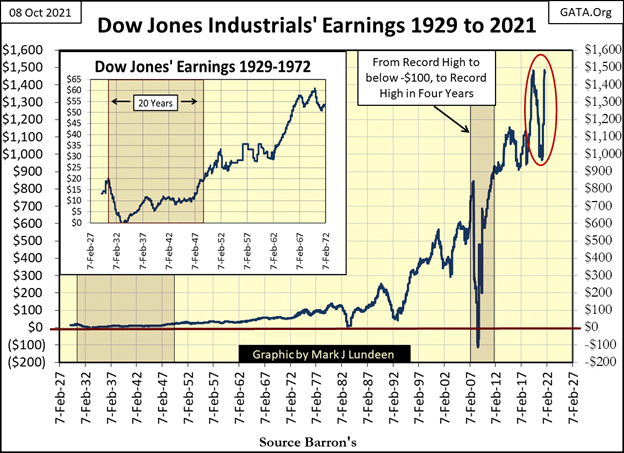
It’s not just today’s low yields that worry me. Look at the earnings for the Dow Jones from 1929 to today (chart below). During the Great Depression Crash (1929 to 1932) Dow Jones earnings went from $20 down to below Zero. It took twenty years before they returned to 1929 levels.
The next time Dow Jones earnings went negative was during the sub-prime mortgage crash of 2007-2009. But this time it only took four years for the Dow Jones to recoup its earning back to 2007 levels. Really, all that in only four years?
Something similar happened to the Dow Jones’ earnings from June 2019 to September 2021, where the Dow Jones lost 30% of its earnings, and then rebounded back in only two years (Red Circle).
“Market experts” and economists have looked at this data, and haven’t a problem with it. If they did, wouldn’t they warn the public? Yeah, sure; you betcha they would.
But I’m not a “market expert”, so seeing the Dow Jones earnings rebound from a 30% decline, back to a former all-time high during a so-called pandemic is something that catches my attention. Just how secure are today’s earnings, and dividend payouts for companies trading on the stock exchanges?
In my mind; with all the many tens-of-trillions-of-dollars-of-debt American corporations must service with their earnings today, come the next turndown in the economy, I expect earnings for the Dow Jones once again go negative for the third time since 1929. That would not be good for bond holders for these corporations, or for their shareholders expecting a share of their profits from these very unprofitable companies.
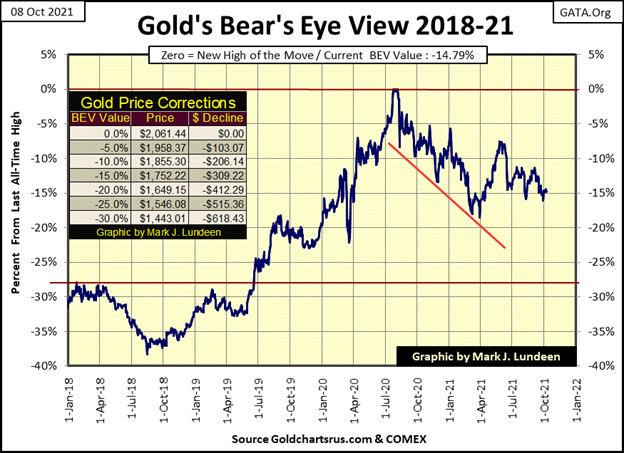
Let’s move on to gold’s BEV chart. Like the Dow Jones with its refusal to break out of scoring position above, since early April gold has refused to break below, and then stay below its BEV -15% line.
Who knows exactly what the future will bring us? I sure don’t. But, though gold bugs are the sort that fear debt creation by the FOMC may result in massive dislocations in the Earth’s tectonic plates, causing lava flows to cover New York City, they still like to think of themselves as optimists. Looking at the chart below, they would think any market that refuses to go down, ultimately is destined to go up.
What do I think? I’m not too sure about that tectonic plate stuff. But seeing gold taking off in the chart below in the not too distance future sounds good.
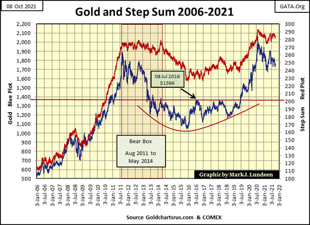
Looking at gold’s step sum chart below, though it has changed little since last April, I’d say there is good reason to be optimistic for a continuing rise in the price of gold from its lows of December 2015. I’ve said this before, but that doesn’t make it any less true today, that since August 2011 gold has formed a decade-long, picture-perfect teacup with a handle technical formation.
At times, investing in the old monetary metals seems a frustrating exercise in futility. Which is especially so for anyone who regularly accesses the mainstream financial media for their insights on the markets. I just keep in mind that CNBC, and other mainstream media outlets are only the propaganda organs for the deep state (aka: “the policy makers”), and they intend to do me no good. So, I keep to my charts and tables, which to my eyes are extremely bullish, even if today the precious metals’ market action bore me to tears.
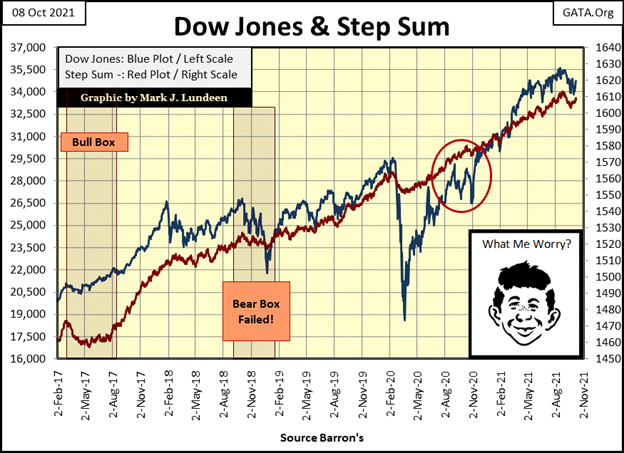
Here’s the step sum chart for the Dow Jones. The pathetic little 5% correction in the Dow Jones appears to be over. The rebound in the Dow Jones step sum plot confirms this.
So where does the Dow Jones go from here? Apparently to its 36,000 level, but I wouldn’t be surprised if it took a few months to close the 1,253 points that separate today’s close from that lofty level. As far as the stock market goes, since last May the thrill is gone.
In gold’s and the Dow Jones’ step sum tables below, both have seen considerable selling pressure since early September. But the Dow Jones with its 15 count of -9 on September 20th has seen more selling. Yet since September 3rd the Dow Jones is down by only 1.76%, while gold is down 3.88%.
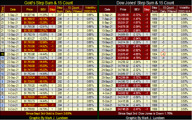
Not that any of this matters. What matters is that both markets are currently range bound, and have been for months. Gold refuses to break below, and stay below its BEV -15% line. The Dow Jones refuses to break below, and stay below its BEV -5% line. Until one or both of these markets either break below their current support levels, or advance significantly higher, there really isn’t much to comment on in their tables above.
__
(Featured image by Erol Ahmed via Unsplash)
DISCLAIMER: This article was written by a third party contributor and does not reflect the opinion of Born2Invest, its management, staff or its associates. Please review our disclaimer for more information.
This article may include forward-looking statements. These forward-looking statements generally are identified by the words “believe,” “project,” “estimate,” “become,” “plan,” “will,” and similar expressions. These forward-looking statements involve known and unknown risks as well as uncertainties, including those discussed in the following cautionary statements and elsewhere in this article and on this site. Although the Company may believe that its expectations are based on reasonable assumptions, the actual results that the Company may achieve may differ materially from any forward-looking statements, which reflect the opinions of the management of the Company only as of the date hereof. Additionally, please make sure to read these important disclosures.


Youth Cannabis Use in Colorado Is Falling — But the Full Story Is More Complex
The 2026 Colorado survey shows teen cannabis use fell to 10 percent in 2025, down from 21 percent in 2015....


Morocco’s Growth Holds at 4.6% as Agriculture Offsets Economic Pressures
Morocco’s economy grew 4.6% in Q1 2026, driven by a strong agricultural rebound offsetting declines in industry. Services expanded moderately...


Abivax Shares Surge as New Trial Data Eases Safety Concerns Over Ulcerative Colitis Drug
Abivax shares surged nearly 36% after positive updated trial results for its ulcerative colitis drug obefazimod reassured investors following earlier...


El Dorado Raises $9M to Expand Cross-Border Fintech Platform
El Dorado, a Latin American fintech improving cross-border financial services, raised a $9 million Series A led by Paradigm with...


Bitcoin Stalls Near $60K as Strategy Moves, ETFs Outflow, and EU MiCA Rules Take Effect
Bitcoin hovers near $60,000 with ETF outflows, while Strategy boosts reserves, sells BTC, and raises dividends to reassure investors. Ethereum...
 |
|
 |  |
 |
|
-

 Biotech6 days ago
Gilead HSV Plan Could Transform Market Outlook
-

 Crypto2 weeks ago
Crypto Market Stays Stable as Bitcoin and Ethereum See Mild Declines
-

 Impact Investing1 day ago
Italy Approves First Hydrogen-Powered Train for National Rail Network
-

 Fintech1 week ago
Mollie Expands Across EEA With €350M Investment to Strengthen European Payments Network