Featured
US stock markets keep rising despite interest rate hike while gain was less than 1%
The US stock markets’ increasing value is not seen as a favorable sign while international exchanges are dwindling.
The end of the year is approaching. It has been a remarkable year. Three things stand out. Record after record in the U.S. stock market, Trump, and Bitcoin. What will 2018 bring? Will it be the end for them as well?
As was widely expected, the Fed hiked interest rates. They also gave us a “look see” into 2018. The Fed indicated there would be three rate hikes in 2018; they expect economic growth to be faster and the labor market to stay strong, and they plan to increase the monthly balance sheet run-off to $20 billion/month starting in January as was planned. There were two dissenters to the interest rate hike and their concern is the ongoing low rate of inflation. Currently, the core rate of inflation is 1.7% as it remains below the Fed target of 2%. The dissenters believe the Fed should wait until they do have 2% core inflation. The Fed rate now stands at 1.25% to 1.50%, a level that is still below the core rate of inflation.
For the record, the BofC left the bank rate unchanged at 1% at their 6-December-2017 meeting. The BofC at the time was surprisingly dovish on the economy causing a sell-off in the Cdn$. This appears to be in sharp contrast to the more bullish comments from the FOMC. At 1%, the bank rate is roughly equivalent to Canada’s core inflation rate of 0.9% year over year.
This was Fed Chair Janet Yellen’s last FOMC given she retires in February. Ms. Yellen has already announced that she will not be coming back. This gives the incoming chair Jerome Powell room to create his own Fed but it also subtracts a knowledgeable, experienced hand. Yellen also commented she does not expect Trump’s tax-cut package to result in significant, strong growth for the U.S. economy. She also expressed little concern for Bitcoin, which she says, “plays a very small role in the payment system.”
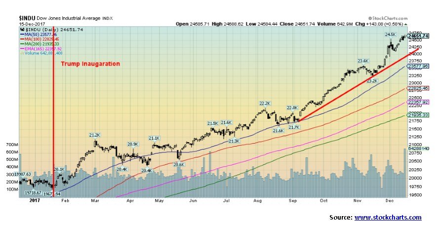
Gold responded to the rate hike by jumping over 1% while silver was up over 2%. If there was a surprise for many it was the sharp drop in the US$ as it fell 0.7%. The stock market (as usual, it seems) moved to new all-time highs. If there is a Santa Claus rally, it has been one year-long party. Some might even argue it has all been because of Trump. Since his inauguration day on January 20, 2017, the stock market is up 24.1%. Some would conclude that Trump policies are a prime driver behind the stock market rise even as his legislation has constantly been stalled, although the tax-cuts seem to be poised to pass. However, a reminder that under Obama the stock market was up 145%. The Trump rally has continued the Obama rally.
© David Chapman
As the end of the year approaches, we continue to see an array of forecasts for 2018. Given the record stock market, it bears repeating the stock market has become one of the most overvalued in history. Mish Shedlock of Sitka Pacific Asset Management recently wrote “Six ways US Stocks most overvalued in history.” Mr. Shedlock noted stocks today are more overvalued than they were in 1929 and 2000. His six ways include:
- Price to sales
- Price to book
- Enterprise value to sales
- Enterprise value to EBITDA
- Price to earnings
- Enterprise value to free cash flow
We have no argument with this analysis. 2018 is the eighth year of the decade. Years ending in eight tend to be strong years for the stock market. Since 1831, the record is 14 up years and only 4 down years. Maybe it was a cruel twist of fate that the last year ending in eight, namely 2008, was the worst performing year ending in eight with a loss of 33.8% for the Dow Jones Industrials (DJI). Interestingly 2008 was only equaled or exceeded on three other years: 1930, 1931, and 1907. The 2008 collapse was truly historic.
2018 is also the year of the mid-terms of the Presidential Cycle. Given the strong up year in the post-election year, we examined how the stock market performed following a strong post-election year in the past. It was rare that following a strong post-election year the mid-term year was also strong. The mid-term year tended to be weak by comparison. It was noteworthy both Presidents Clinton and Obama experienced strong post-election years in both their terms but the ensuing mid-term year was considerably weaker even while it was still positive. While Trump’s post-election year has been strong, it was nowhere near the record post-election year experienced by President Franklin Roosevelt in 1933 as the DJI leaped 66.7% that year.
January often acts as a barometer for the entire year. The so-called January barometer, developed by Yale Hirsch of Stock Trader’s Almanac has a 0.746 batting average since 1950. The first five days of January are also a barometer with an incredible 83.3% accuracy since 1950. A down January has usually been a strong signal that the year would also be down. There have been exceptions, of course—most notably in 2003 and 2009 where January was down but the year ended on a strong note. 2003 was influenced by the impending war against Iraq while 2009 was the beginning of the new bull market and the final bottom was seen in March 2009.
Cycles may come into play in 2018. Ray Merriman of The Merriman Market Analyst cites a number of cycles. His longest-term cycles for the U.S. stock market are 75-years, its half cycle of 37.5-years, and the quarter cycle of 18.75-years. Merriman believes they bottomed with the 2008 financial crash on March 6–9, 2009. For the record, the previous 75-year cycle bottomed in 1932, the previous 37.5-year cycle bottomed in 1974, and the previous 18.75-year cycle bottomed in 1987. All cycles have ranges so they are never exact.
The 18.75-year cycle tends to sub-divide into two 9.375-year cycles (range 7.5–11 years) or three 6.5-year cycles (range 5–8 years). Sometimes it contains both. The last 6.5-year cycle bottomed in August 2015, which in turn was roughly 6.5-years from the March 2009 bottom. Starting from the key December 1974 bottom clear lows were seen in 1980, 1987, 1994, 2002, and 2009. The next 6.5-year cycle low is not due until February 2022 but the range could be from 2020 to 2023. If, as has happened in the past, the cycle low is a combination of the 9.375-year and 6.5-year cycle then the range for the 9.375-year cycle low is December 2016 to February 2020. There was an important low in February 2017 so, in theory, it is possible that was the low.
There is also a well-known 4-year cycle that tends to appear although somewhat irregularly. Its range is 3-5 years. The August 2015 low came in almost 4 years after the October 2011 low. The next one is due August 2018 to February 2020. There is considerable overlap with the 9.375-year cycle and the 6.5-year cycle, adding strength to the potential for something to occur over the next couple of years especially following an 8-year upmarket. The question is, when does the current market make its final crest?
One very long cycle we rarely see written about is a possible 90-year cycle of financial collapses and depressions. The last one occurred during the Great Depression with the cycle low in July 1932. 90 years earlier was 1842 and the U.S., in particular, was in the grip of a depression stemming from the Panic of 1837 when the economic policies of President Andrew Jackson sparked a banking panic. The depression lasted well into the 1840s and ended only with the Mexican-American war of 1846–1848. Ninety years earlier was 1752 when the U.S. and world were once again gripped in an economic depression surrounding the Seven Years War of 1756–1763, followed by the American Revolution. Ninety years before was 1662, where once again we found the world gripped in an economic depression surrounded by wars. The depression lasted until 1696. It is curious that we are entering a period now roughly 90 years from the Great Depression.
We have cited numerous reasons as to what could spark a financial and stock market panic. Citing reasons as to what could spark a financial or stock market panic followed by a recession is not limited to what one would call the “usual cranks” and “doomsayers.” We have seen a number of economic forecasts from major, respected financial institutions, and economic think tanks. The risks should be taken seriously. Without going into details, we note the following:
- Central banks are in a tightening phase led by the Fed. Not only are interest rates being hiked but the Fed is exiting from years of quantitative easing (QE). The ECB is also signaling that they could be exiting their version of QE in 2018. There will also be new leadership at the Fed in 2018. While Jerome Powell is expected to continue the policies of his predecessor there are concerns, given that he was appointed by Donald Trump. Will he be guided by data as was Janet Yellen, or will the Fed become politically driven?
- Given rising inflation not only in the U.S. but also in the EU, the long period of negative interest rates is most likely coming to an end. Falling bond prices could cause dislocations resulting in a bond panic, something we have seen in the past as bond prices fall following many years of being exceptionally low. The current period of exceptionally low bond yields has been unprecedented in history.
- Could a Bitcoin (and cryptocurrencies) crash spark wider panics and crashes?
- Inequality continues to be a major problem and is not being helped by the round of tax cuts currently working their way through the U.S. Senate. This encourages populist politicians and gives rise to the growth of populism.
- Could the Mueller investigation lead to even more indictments and get closer to President Donald Trump in 2018 leading to a crisis of confidence and even a constitutional crisis? A Nixonian “Saturday Night Massacre” would shake markets. It is very possible.
- The U.S. mid-terms are in November 2018. Given the recent results in elections, including the recent Senate upset in Alabama, could the mid-terms bring a major turnover to both Congress and the Senate resulting in more pressure on the Trump administration?
- Other important elections in 2018 could spark upsets and conflict including Italy, Britain, Ireland, and Russia, although the latter is not expected to result in any upset.
- Could housing bubbles in Canada, Australia, and elsewhere burst in 2018?
- The Chinese banking system is becoming overburdened with non-performing loans. Could a banking crisis develop in China given the high level of debt? The high-level of debt around the world is a major concern. In the U.S., student and automobile loans are becoming a major problem as non-performance and defaults rise.
- Geopolitical concerns in the Mid-East (witness the growing chorus against Iran and the growing protests against the U.S. moving the embassy to Jerusalem), North Korea, China/USA, and Russia/USA (NATO) come to a head, resulting in more wars.
After eight years of a bull market that has had only two corrections of significance—2011 and 2015/2016—both under 20%, ending cycles and rising risks could give way to a bear market, starting in 2018. More likely, however, is that 2018 could prove to be a transition year. The record for bull markets belongs to the great bull market of the 1990s: 1990–2000 where there was only one correction of significance (1998) and it was under 20%. A bull that lasted 3,382 days. While 2000 turned out to be a down year, the bear did not get underway until 2001. The year 2000 turned out to be more of a transition year. The current bull has endured since March 2009, a period of 3,203 days. If the current bull can survive past June 12, 2018, it will truly become a historic bull market. What are the odds? The question everyone needs to ask is, what could possibly go wrong.
Bitcoin Watch!
© David Chapman
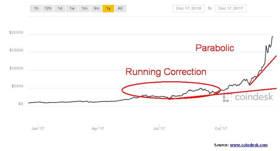
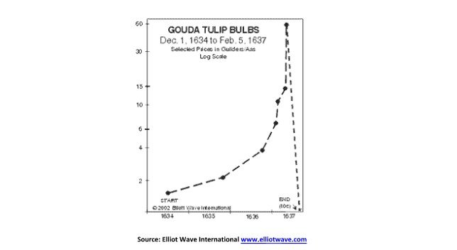
The mania continues. Bitcoin hit a high this week (so far) of $19,783—up 36% from a low seen barely a week ago. Bitcoin is up over 80% in December and about 2,000% in 2017. Where will it end? We are now reading that people are taking out mortgages to buy Bitcoin. To describe that as less than wise is an understatement. We have also learned that Bitcoin has officially surpassed Tulip Mania as the biggest bubble in world history. That is hard to imagine given such famous bubbles as Bre-X Minerals and, more recently, the incredible rise of Amazon.
We first read about Tulip Mania in a book titled “Extraordinary Popular Delusions and the Madness of Crowds” (Charles MacKay, 1841). Of the many manias described in this remarkable book, Tulip Mania always stood out for its sheer insanity. At its peak, Tulips were actually being quoted and traded on stock exchanges (Amsterdam, London). The modern comparison is that Bitcoin is now being traded on futures exchanges (CME, CBOE) and cryptocurrency stocks are being listed.
© David Chapman
When the Tulip bubble burst, caused by defaults on contracts, the plunge not only ended what was known as the Dutch Golden Age but it triggered a depression and left many bankrupt. Speculative investments took a beating after that.
None of this suggests Bitcoin mania is ending anytime soon, but horror stories abound of exchanges not working properly, hackers breaking in and stealing Bitcoin and/or other cryptocurrencies, and regulators tearing their hair out trying to figure out how to control this. Yet Janet Yellen said that Bitcoin “plays a very small role in the payment system.” She also said it wasn’t the Fed’s role to regulate it.
We would most likely agree that Bitcoin may not yet be ready for its collapse. We wouldn’t be surprised to see the market cap of Bitcoin surpass $1 trillion before the end comes. That would imply a Bitcoin price up around $50,000 or higher. Bitcoin’s market cap now exceeds $300 billion. That is more than Special Drawing Rights (SDRs) held by the IMF (estimate $290 billion) and also surpassing J.P. Morgan Chase as the world’s ninth largest company by market cap (Bitcoin’s current market cap is at US$326 billion). With Bitcoin now becoming the biggest mania in history one can only marvel at it. But a collapse of a mania has to take as many people as possible with it. That is why even we would agree that Bitcoin could have further to rise in price.
Bitcoin futures are now trading on the CBOE and because of price surges, there has been more than one trading halt. This week Bitcoin begins trading on the rival CME as well. Trading on the CBOE seemed to ratchet up the trading and volatility of Bitcoin. What will adding it to the CME do? As with Bitcoin itself, Bitcoin futures trading has been extremely volatile.
Crazy statements about Bitcoin are becoming commonplace including one suggesting it will lead to the demise of all banks. Another believes Bitcoin has resulted in the suppression of the gold price. Other crazy things we learned this week were that Bitcoin Wallet saw over one million downloads in the past week alone. In Venezuela, many are buying Bitcoin because of the collapse of the Bolivar and the difficulty in obtaining US$ except through black market dealers. With Bitcoin, all you really need is a cellphone.
But regulators continue to circle trying to figure out how to get a handle on this mania. There are many who believe that regulators will not be able to gain control. More merchants are embracing Bitcoin for payment. Maybe they think that they too can “get rich quick” on the sharp rising cryptocurrency. We read that police are targeting Bitcoin for forfeiture as part of the seizure of ill-gotten gains. The result has seen sales by police forces of Bitcoin to realize funds from the seized assets. But regulators are moving on Bitcoin, particularly in Asia and more specifically Korea where frenzied trading has taken place. Banning banks from trading in cryptocurrencies is but one measure being taken. In any case, the mania continues, and the ink doesn’t even get to dry on a new high price before the next high is seen. Such is a mania.
© David Chapman
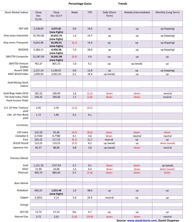
Note: For an explanation of the trends, see the glossary at the end of this article.
New highs/lows refer to new 52-week highs/lows.
© David Chapman
The U.S. stock markets just keep marching inexorably higher. Once again, the S&P 500, the Dow Jones Industrials (DJI), the Dow Jones Transportations (DJT), and the NASDAQ made new all-time highs. This has become so commonplace talking about it almost seems boring. Friday was options expiration day and triple witching. As a result, rebalancing took place, primarily on the S&P 500 and the Russell Indices. Volume surged to 10.7 billion shares, the highest in 2017. Despite the volume surge, the gain was under 1% as the market continued a relentless, slow climb rather than spiking to new highs. The markets rose this past week against the backdrop of yet another interest rate hike by the Fed (widely expected) and the Fed targeting potentially another three rate hikes in 2018.
So, why is the market continuing its march to new highs? Well, it’s pretty straightforward, really—tax cuts and continued good economic numbers. Look at this month alone: we have had an unexpected surge in nonfarm payrolls, industrial production gained 0.2% in November (although it was below the expected 0.3%) and is up 3.35% on the year, retail sales surged 0.8% in November and net of inflation were up 0.4% even as the numbers were distorted by the hurricanes, and real median income has been rising to record highs (adjusted for inflation). All-in-all, these are good news stories. The market continues to ignore any potential bad news and the market rarely looks beyond the headline numbers.
Technically the market remains overbought. We have rarely seen such consistent readings of the RSI above 70 as we have recently. Corrections continue to be shallow. Breakdown levels keep rising. It is possible now that the S&P 500 could rise to our next target zone of 2,980. We would need to see more evidence to confirm that could be a target. An advance through 2,700 would go a long way to suggest the next level might be achievable. Other technical indicators such as the CBOE put/call ratio that is at a four-year extreme and the VIX volatility indicator that continues to hover near record lows are more indicative of an aging bull rather than one that could have further advances.
A break now of 2,625 could be the first sign of an impending top. A break under 2,600 would be more convincing. And even at that, we may not be making the final top. While the subdivision of Elliott waves has become somewhat confusing it is possible that we are still awaiting a wave 4 before we make the final advance. More convincing would be a breakdown under 2,400. The monthly charts don’t break down until we go back under 2,000.
In the interim, the trend is up and it is difficult to fight the trend. Santa Claus continues to bear gifts even as the period through the Christmas season tends to see a slow market. Of bigger interest will be to see how the market performs in the first week of January (see our earlier January barometer comments). The market is “long-in-the-tooth,” but before we make the final high it may become even more “long-in-the-tooth” and continue to defy predictions of its demise.
© David Chapman
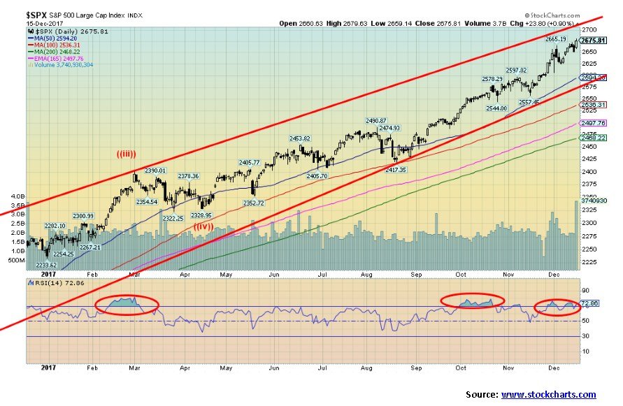
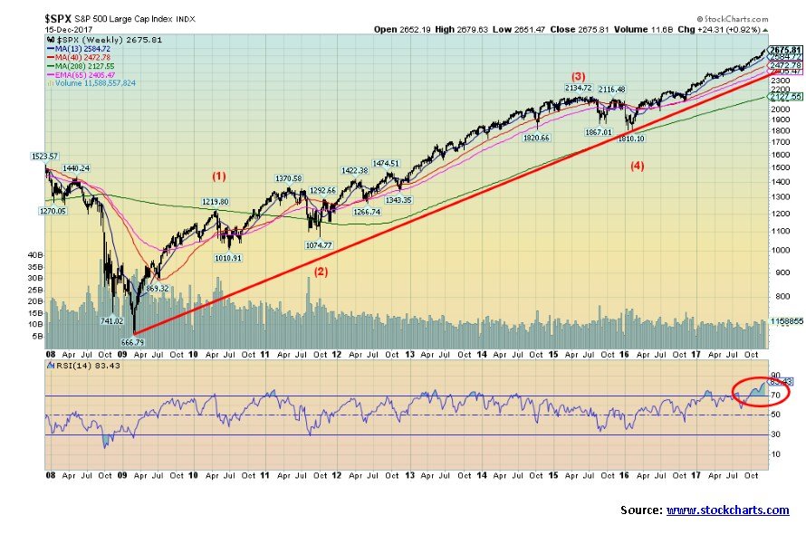
The big picture. Here is the S&P 500 since the major lows in March 2009. Four advancing waves can be seen on the chart. Wave 1 completed in April 2010. What followed was the correction related to the EU/Greek crisis. It was a running correction with the B wave-making new highs. It concluded in October 2011. Wave 3 advanced until May 2015 when the end of QE and hints that the Fed would begin a tightening phase sent the markets into another corrective mode (wave 4). We are now in the fifth and final wave to the upside.
The weekly RSI has shot to an unheard-of 83.43. We have never seen it so high. The monthly RSI is even higher at 84.3. The monthly RSI has continually exceeded 70 since late 2016. There is an old saying about “overbought” in the stock market. The market can stay “overbought” longer than the bears can stay solvent.
© David Chapman
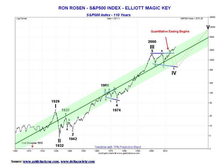
The really big picture. This is a long-term chart of the S&P 500, courtesy of Nick Laird of Gold Charts ‘R’ Us and Ron Rosen of the Ron Rosen Precious Metals Timing Letter. Ron has an interesting perspective on the Elliott Wave count that may actually differ from Elliott Wave International. Since the Great Depression and its bottom in July 1932 the U.S. stock markets have been in a long cyclically up wave. Rosen believes the top seen in 2000 was the start of a major cycle down wave that has not as yet completed. Despite the strong bull market since March 2009 Rosen sees this up wave as the D wave of a complex ABCDE type pattern.
What it implies is once this wave is completed the market will collapse to new lows, possibly below the levels seen in March 2009. Once that cycle wave is complete, the markets will then begin a new long-term bull market to the upside. Rosen’s view would fit with our musings on the 90-year cycle described earlier. The 90-year cycle has tended to be a period of sharp stock market corrections coupled with an economic depression. Many would naturally disagree with this scenario. As we noted earlier, the last 90-year cycle was the stock market collapse of 1929–1932 coupled with the Great Depression.
Certainly, we are in a period when the markets are almost universally bullish. As a result, money managers are at their highest risk levels and they are almost universally predicting the continuation of the bull market in 2018. Markets are also at a high level of leverage. It is extremely difficult to find a bear, or at least one that is still alive. The bullishness in the markets is exemplified by the mania in Bitcoin. The question is—how and when will it end, as surely it will.
© David Chapman
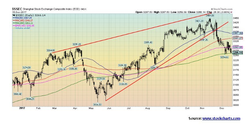
While the U.S. stock markets have been rising we can`t help but notice international exchanges are wavering. Yes, the TSX Composite made new all-time highs this past week but reversed and barely closed with a small loss on the week. Others such as the small-cap Russell 2000 and the MSCI World Index failed to make new highs along with the major indices. A possible divergence. One of the weakest recently has been the Shanghai Stock Exchange (SSEC) that has fallen just over 5% from its high seen in mid-November. Not only is the major Chinese index down from its recent highs, but it was nowhere near its all-time high seen in 2007 and a secondary high seen in 2015.
But hasn’t China been booming? Well, yes, but the boom has been on a wave of unprecedented borrowing. Its banking system is burdened with non-performing loans and the Chinese government is trying to keep up appearances with its own version of QE. China could still see a major debt collapse. A debt collapse in China would send shock waves around the world and could then ultimately impact North American markets. That’s something to keep in mind.
© David Chapman
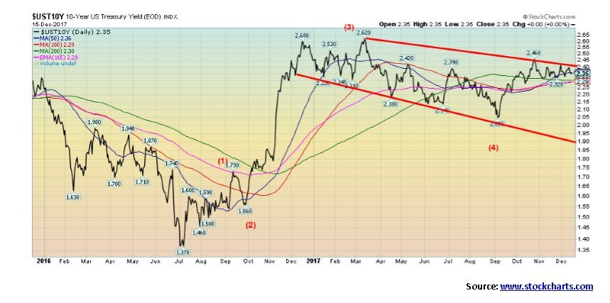
The wave structure of the U.S. 10-year Treasury note has become difficult to discern. After peaking at 2.62% back in March 2017, the 10-year Treasury note has been falling in an irregular pattern ever since. It may be that our label of wave (4) is not yet complete. Since making a high at 2.46% the 10-year note has been slowly falling. Despite the Fed hiking the Fed rate this past week the 10-year note’s yield actually fell on the week from 2.38% to 2.35%. We note that the Canadian Government of Canada 10-year benchmark bond has also been seeing lower yields. Lower yield in the bond market (rising prices for bonds as prices move inversely to yields) are usually more indicative of a period of economic slowdown. Yet the economy has been anything but slowing. Maybe the bond market is signalling that a slowdown is coming. A break under 2.30% and especially under 2.25% could send yields down to 2% or the bottom of the channel near 1.90%.
© David Chapman
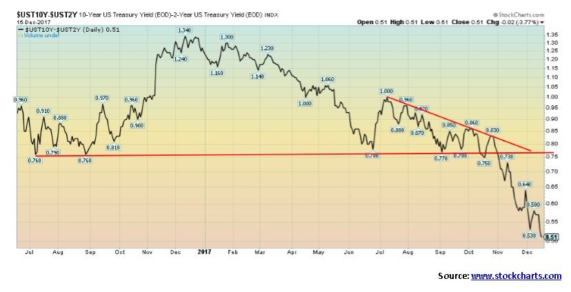
Maybe this is the real sign that the bond market is predicting a coming period of economic slowdown. The 2–10 year spread narrowed again this past week to 0.51% from 0.58% the previous week. We are now at our lowest level since October 2007. We have noted the 2–10 year spread actually went negative in 2000 before the 2000–2002 stock market collapse and recession and again in 2006–2007 before the 2008 financial collapse and the 2007–2009 recession. Since breaking key support around 0.76% the 2–10 spread has fallen 33%, all in a matter of weeks. No, it is not yet negative and even if it does go negative it most likely would have to stay there for several weeks before real signs of an impending recession were seen. We continue to monitor the important 2–10 spread as a sign of weakness in the broader economy. Its current positioning is at odds with the economic numbers that are being reported.
© David Chapman
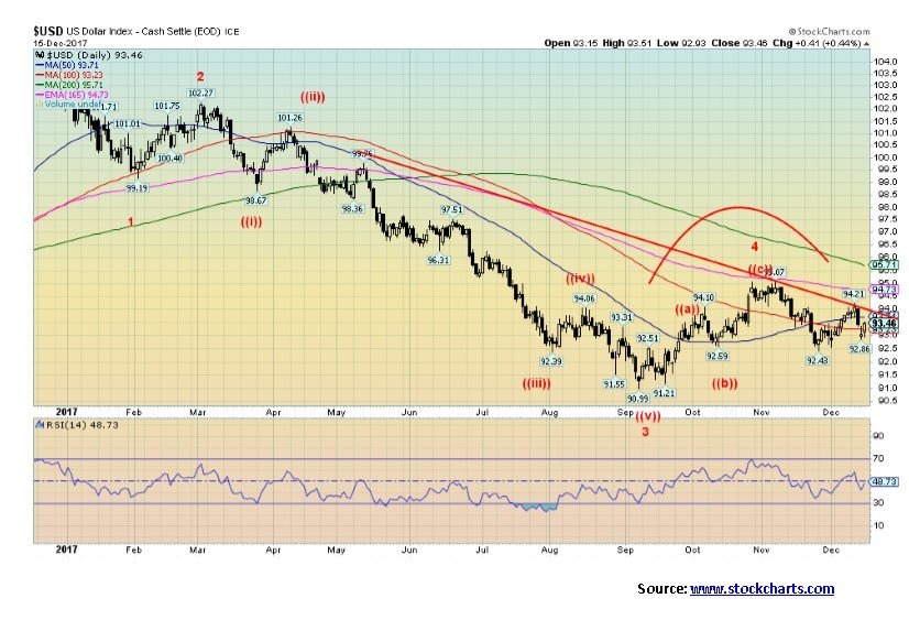
The US$ Index is sitting in a bit of no man’s land right now. After running into resistance at 95 and 165 day exponential MA the US$ Index pulled back. The low thus far was seen at 92.43. There are two ways of interpreting this move. The bullish case is that this was merely a pullback within the context of the advance that got underway in September at 90.99. If this is correct, then once the US$ Index breaks out above 94 odds favour it to move to the next good resistance at 96. The bearish case is that if the US$ Index were to break under the recent low at 92.43 then the trend should shift firmly to the downside and a retest and breakdown under 91 are very possible.
The US$ Index reacted negatively to the widely expected interest rate hike this past week. This was the opposite reaction to gold that reacted positively. It is possible the US$ Index is forming a small head and shoulders top as well that would have target implications to 89.80 once a breakdown under 92.43 is confirmed. The US$ has been responding positively to interest rate hikes and the ongoing positive economic numbers that are coming out for the U.S. economy. However, the failure to respond positively to the Fed hike on Wednesday may be a sign that the US$’s rise is just about spent.
© David Chapman
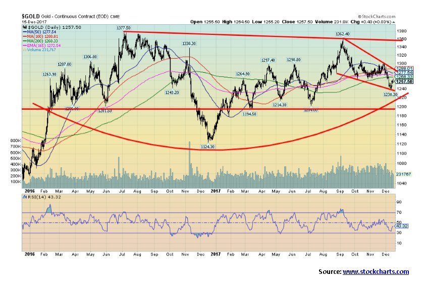
As we saw in both 2015 and 2016 the December FOMC meeting and interest rate hike proved to be a spark for gold. Gold jumped 1% on Wednesday following the interest rate hike (the classic “sell the rumour, buy the news” scenario) and closed the week up 0.7% only because gold initially sold off into the FOMC. Silver jumped 2% on Wednesday following the Fed and ended the week up 1.5%. The up week ended three consecutive down weeks. Gold fell into our target zone of $1,220/$1,240 with a low on the week of $1,238. Despite the positive week, we are probably not “out of the woods” just yet. Expect some backing and filling and even the possibility of new lows before seasonals turn positive into January (see next chart). Major support is seen down at $1,200. Any break below that level would imply the potential for new lows.
Gold faces considerable resistance above. Resistance is seen from $1,270 up to $1,300. Further resistance is seen at $1,300 to $1,320. Once above $1,320, a move to the July 2016 and September 2017 highs are very possible. Odds favor a breakthrough that zone on the third try. Overall, however, we like the potential forming bottom pattern. We are reluctant to suggest it could be a huge head and shoulders bottom pattern with the neckline up at $1,360. If the pattern is correct it has potential target implications for a move to $1,610.
Over the past several weeks, gold has been suppressed as the focus has been on the strong economy, the interest rate hike, and the mania in Bitcoin. That could be about to change.
© David Chapman
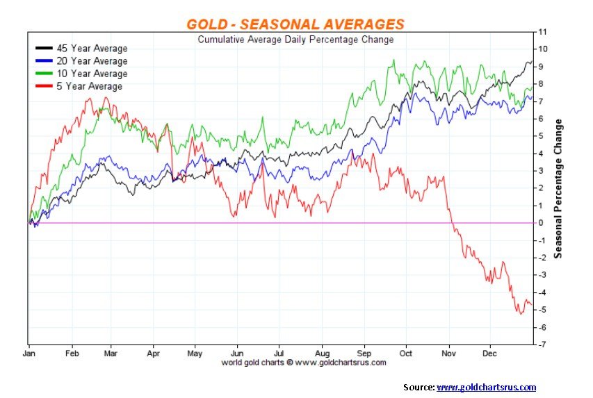
Here is a seasonal chart for gold showing averages for 5, 10, 20, and 45 years. Note the weakness shown for gold over the past five years. The selloff generally got underway in October and bottomed in December. What followed was a strong rebound rally into February/March. Historically, however, gold did show some weakness from October to November or December before beginning to rise. However, the selloff was not as pronounced has been seen over the past five years. All periods show a stronger market during the January to February/March period. Given the recent sell-off and signs of a turnaround another strong seasonal period is most likely about to occur.
© David Chapman
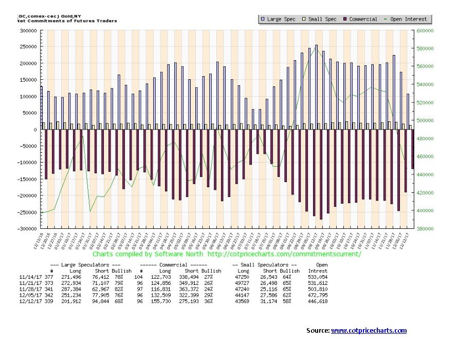
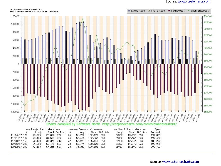
The commercial turned in its best performance in weeks this past week with a big jump from 29% to 36%. The commercials are covering their shorts just as the large speculators are putting on shorts. The commercial COT’s short open interest fell roughly 47,000 contracts this past week while long open interest jumped roughly 23,000 contracts. The large speculators went in the opposite direction as short open interest jumped about 17,000 contracts as long open interest dropped roughly 50,000 contracts. The large speculators COT fell to 68% from 76%. All of this is quite positive and while it is not indicative in itself of a bottom it is a positive sign that gold’s trend could soon change from down to up.
© David Chapman
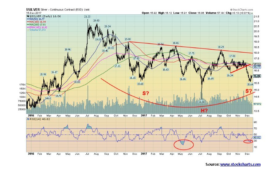
A potential huge bottoming pattern continues to form for silver. The head and shoulders pattern has potential target implications up to $22.65 once silver firmly breaks above $18. Silver does have considerable resistance from about $16.75 to $17 then again from $17 to $17.50. Above $17.50 odds increase sharply that silver should break out over $18. New lows below $15.64 could imply a further test of the July low of $14.34. It would also negate the head and shoulders pattern but possibly set up a double bottom pattern. Silver’s volatility is higher than that for gold. Silver tends to lead in both bull and bear markets. We have noted previously that the gold/silver ratio is at exceedingly high levels historically and that should change. The above pattern for silver is encouraging as is the latest COT report (see next).
© David Chapman
Just as gold’s commercial COT showed considerable improvement this past week, silver’s commercial COT also improved sharply. The silver commercial COT rose to 43% from 36%, the highest level seen since last July, just before the move that took silver from a low of $14.34 to $18.29. A similar move today could take silver up to $20. Silver’s commercial COT short open interest fell roughly 8,000 contracts this past week while long open interest rose almost 14,000 contracts. Predictably, the large speculators COT fell to 53% from 61%. The large speculators short open interest jumped about 14,000 contracts while long open interest fell almost 8,000 contracts. Like gold, this past week’s COT report is positive. Our expectations are that a strong rally could soon follow for silver.
© David Chapman
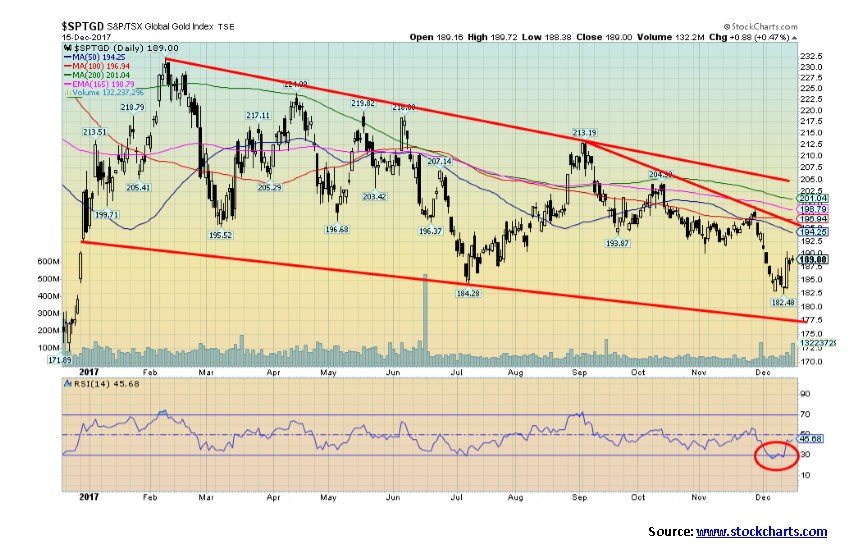
This past week the gold stocks, as represented here by the TSX Gold Index (TGD), jumped 1.7% putting in its best week in the past three. So, is this merely a relief rally or the start of a new uptrend? The TGD did make slight new lows this past week below its July 2017 low. It is noteworthy that neither gold nor silver made new lows under their July lows. The TGD has considerable support down to 177 but below that a test of the late 2016 low of 172 would get underway. The TGD is nowhere near its 2015 low of 114. There is considerable resistance for the TGD from 190 to205. If the TGD can break over 205 then potential targets are as high as 310, an almost 70% move from the current low. Given the TGD’s history of sharp moves both up and down a move like that is not impossible. We recognize, however, the considerable resistance that exists from 190 to 205. But if the TGD does break out, then the move could be swift.
© David Chapman
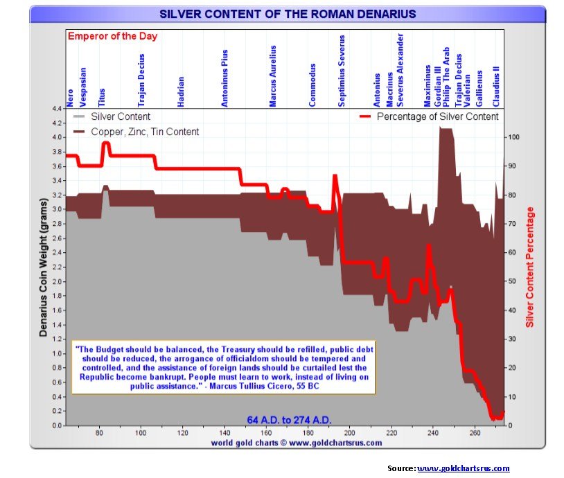
We thought we would end the year with a truly interesting chart. This is a chart of the Roman denarius. The Roman Empire reached the heights of its power on a gold and silver standard. The first denarii were minted in 211 B.C. In those heady days, the gold aureus was set at 25 silver denarii. Eventually, however, wars, expansion of the empire, and the cost of running it saw spending sharply outpace revenues (sound familiar?). Thus began the descent of the denarius. The denarius began as a 4.5-gram pure silver coin under the Roman Republic.
Becoming an empire marked a turning point for the denarius. Base metals such as copper were blended in with silver thus allowing the printing of more coins to help pay for expenditures and the cost of their army. Through the first century, the denarius was still 90% silver, but by the end of the 2nd century, it had fallen to 70% silver. A century later it was less than 5% silver and wasn’t even called the denarius any longer. It was now known as the Antoninianus. By 350 A.D., coins except for the gold aureus, which was replaced by the gold solidus (still pure gold but the size fell to 4.5 grams from 8 grams over time), were almost worthless. The exchange rate was 4.6 million coins to a gold solidus.
By the time the Roman Empire fell for good in the late 5th century coins were worthless, except for the gold solidus. If one were to take a comparable period today one has to site two events of the past century.The first was the creation of the Federal Reserve in 1913 and the second was the ending of the gold standard by former President Richard Nixon in August 1971. No, we have not yet reached the depths of the Roman Empire where coins became worthless and the empire collapsed, but the ability to print money endlessly is today’s comparison with lowering the silver content in the denarius. History does not repeat itself, but it does rhyme.
GLOSSARY
Trends
Daily – Short-term trend (For swing traders)
Weekly – Intermediate-term trend (For long-term trend followers)
Monthly – Long-term secular trend (For long-term trend followers)
Up – The trend is up.
Down – The trend is down
Neutral – Indicators are mostly neutral. A trend change might be in the offing.
Weak – The trend is still up or down but it is weakening. It is also a sign that the trend might change.
Topping – Indicators are suggesting that while the trend remains up there are considerable signs that suggest that the market is topping.
Bottoming – Indicators are suggesting that while the trend is down there are considerable signs that suggest that the market is bottoming.
(All charts are courtesy of Coindesk, Elliotwave, Delta Society, Stock Charts, Gold Charts Rus, Cots Price Charts )
_
DISCLAIMER: David Chapman is not a registered advisory service and is not an exempt market dealer (EMD). We do not and cannot give individualised market advice. The information in this newsletter is intended only for informational and educational purposes. It should not be considered a solicitation of an offer or sale of any security. The reader assumes all risk when trading in securities and David Chapman advises consulting a licensed professional financial advisor before proceeding with any trade or idea presented in this newsletter. We share our ideas and opinions for informational and educational purposes only and expect the reader to perform due diligence before considering a position in any security. That includes consulting with your own licensed professional financial advisor.


The German Biotech Industry Faces Funding Crunch Despite Market Stability
German biotech held steady in 2025 but faces ongoing financing pressures, according to EY-Parthenon and BIO Deutschland. Total capital fell...


Argentina Legalizes Cannabis Seed Sales Under New Regulatory Framework
Cannabis seeds purchase becomes legal in Argentina under INASE Resolution 260/2022, allowing open acquisition but keeping cultivation illegal without Reprocann...


Côte d’Ivoire Cocoa Price Crisis: Record Decision Turns into Market Breakdown
Three weeks before the 2025 election, Côte d’Ivoire set a record cocoa price of 2,800 FCFA/kg, based on its pricing...


Transition to a Sustainable Economy as a Strategic Global Shift in a Fragmented World
The sustainable transition is entering a decisive phase where climate, nature, resources, and social systems are converging into a single...


Bitcoin and Ethereum Stabilize as Markets Watch ETF Flows and Institutional Moves
Bitcoin and Ethereum are stabilizing early in the week, with BTC near $63,000 and ETH around $1,650, though ETF outflows...
 |
|
 |  |
 |
|
-

 Impact Investing7 days ago
ACBC and OVS Partner to Launch Sustainable Footwear Collections for 2026
-

 Impact Investing2 weeks ago
Global Sustainable Funds Return to Inflows as Passive ESG Dominates in Early 2026
-

 Crowdfunding3 days ago
Historic KiHa 2101 Railcar Restored in Japan Through Community Effort
-

 Fintech1 week ago
Barcelona Strengthens Its Position as a Southern European Fintech Hub
You must be logged in to post a comment Login