Markets
U.S. stock markets soared once again to new all-time highs
The stock markets yawned. It was against this backdrop that the U.S. stock markets soared once again to new all-time highs.
It wasn’t a clean march to new all-time highs. The Dow Jones Industrials (DJI) did but the Dow Jones Transportations (DJT) fell instead. The S&P 500 made new highs but closed lower as did the NASDAQ. So maybe it was a lonely march. The Fed came out with one of its policy statements they issue about every six weeks and the market interpreted it as bullish—or maybe dovish is a better word. Result: the US Dollar continued its recent nosedive and gold reversed and closed higher. The Fed, if one reads between the lines, has given up thoughts of rate hikes in September and December. But then again the recent release of Q2 GDP showed a US economy improving. The stock market reacted by selling off.
The Fed continues to plan to reduce its huge $4.5 trillion balance sheet. Reducing the balance sheet, which also reduces the monetary base, is actually a form of Fed tightening akin to hiking the interest rate. That could result in a slowing US economy.
All of the activity on the week helped gold to reverse to the upside and close over $1,260 an important resistance point. Gold did seem to react to the possibly dovish Fed statements but maybe gold is focused on other events too. The looming federal debt ceiling is a possible event that could once again see a government shutdown as it did in 1995 and 2013. But this time, unlike 1995 and 2013, Republicans control the White House, Congress, and the Senate. So they should find a way out of any impasse. But then, they thought that way about killing Obamacare as well and we saw what happened there. If they can’t kill Obamacare after seven years of railing about it, the debt ceiling along with tax reform, NAFTA reform, infrastructure and the infamous “wall” may face an even rougher ride.
So, all is not well in the US, except for the stock market continuing its march to ever-higher highs against the backdrop of political turmoil and a “muddle through” economy. Meanwhile, here in Canada our Prime Minister appeared on the cover of Rolling Stone. Americans can only wish.
(Source)
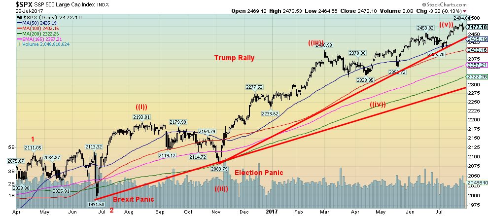
It may have been a Trumpian week of epic proportions as one headline declared, but for the stock market, it continues to be music to its ears. The Dow Jones Industrials (DJI), the S&P 500, the NASDAQ, and the MSCI World Index (MSCI) all made new 52-week highs this past week. Only the MSCI index remains marginally below its all-time high seen in April 2015. The other three made new all-time highs.
But a funny thing happened on the way to glory. Of the four, the DJI and the MSCI managed to hold their gains and closed the week higher. The S&P 500 ended the week flat as a sharp pullback on Friday cost the index the week’s gains. The NASDAQ meanwhile reversed and closed lower. The Dow Jones Transportations (DJT) diverged sharply and for the second week in a row was down. The DJT is already off 5.5% from its all-time highs seen on July 14, 2017. The Dow Jones Utilities (DJU) was also off marginally on the week and its all-time high was made back on June 16, 2017. The DJU is currently off 2% from that high. With the DJI being really the one to march to new highs and new high close all one can say is it gets lonely at the top.
Market sentiment, according to the Market Vane’s Bullish Consensus, remains at the highest levels seen since the top in 2007. The CBOE Volatility Index (VIX), a measurement of fear and greed in the market recently made a new low. The VIX moves inversely to the U.S. stock market. The market remains very bullish with signs of complacency. When the background stories suggest a meltdown but the market continues to go higher, the market begins to think it is invincible. It’s not, of course, so the question that should be on everyone’s mind is when will it drop.
Thursday was an outside reversal day for the S&P 500. It may have been a key reversal given it was made on a day when the index made new all-time highs. Naturally, the reversal needs follow through to the downside and a break of key support zones. And, no new highs. A break under 2,435 would take out the uptrend line from the election panic lows (November 2016). A break of 2,405 would take out the last significant low on the dailies. That point would also signal a break of the last weekly low. A break under 2,330 would confirm and also break another key weekly low. It would confirm that wave 3 from the Brexit panic lows has been completed.
We believe the coming corrective wave should be wave 4 up from the Brexit panic lows. It could correct anywhere from 38% to 62% of the prior move. That would drop the S&P 500 to anywhere from 2,290 to 2,175. A minimum objective would be a decline to at least 2,370. Following that the market should regroup and make another sharp move to the upside to complete wave 5 which would also complete 5 waves to the upside from the March 2009 lows. A more significant correction should follow.
Of course, there is still a chance that the market unfolds higher, but it is late in the game for this move. A top maybe, but not “the” top that could end the great bull market run that got underway in March 2009.
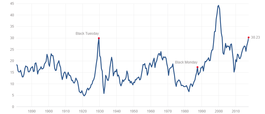
Schiller PE Ratio
(Source)
How high can the PE ratio go? Well, higher, it seems. At current levels, it is now on par with the PE before the 1929 stock market crash and the Great Depression of the 1930s. It remains, however, well short of the PE seen prior to the Dot.com crash of 2000-2002. It is also well above the PE seen before the 2007–2009 financial crash and significantly above the PE ratio seen before the 1987 stock market crash. So does this mean the stock market is about to crash? The high PE is merely a warning sign that something is amiss. It doesn’t mean the stock market is going to crash tomorrow. The PE ratio could move even higher as suggested by the 2000 peak. It does suggest, however, that it might not take much to spark a crash either. Do the good times continue forever? Investors may wish to take note.
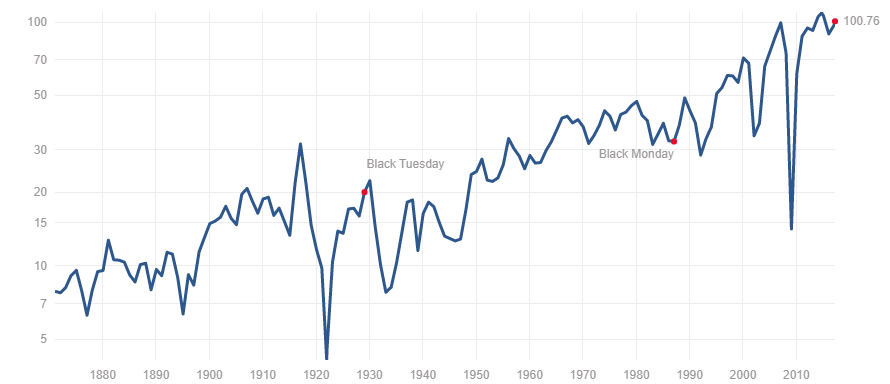
S&P 500 Earnings
(Source)
Earnings may have slowed but they are still on an upward track. Despite all the negative background noise both geopolitically and in domestic politics in the US, the US economy continues to “muddle” through. The Canadian economy is improving and the EU economy is also improving. Even Japan shows signs of life. That bodes well for US corporations whose earnings outside the US exceed their earnings in the US. While arguably, the earnings index is high there are few signs on the horizon that could negatively affect it. Of course, that could change suddenly if NAFTA breaks down, or trade wars break out or the political situation in Washington gets even more out of hand. There were numerous times in the past when earnings took a dip only to recover and move to new highs. If there is a negative here, it is that thus far the earnings index is barely above the peak before the 2007–2009 financial crash. Following the earnings peak in the late teens of the previous century, it took until the 1950’s before it was taken out. Thus far the earnings have recovered all of the financial crash and then some. Is it different this time? Unless the earnings index can pull away from the 2007 peak, it could be another warning sign that not all is well.
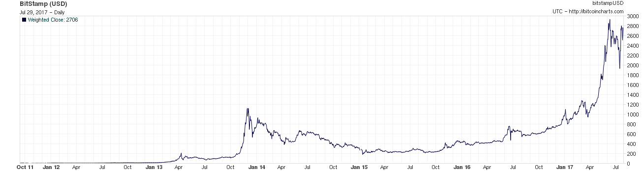
(Source)
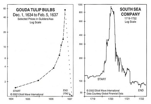
It’s a bird! It’s a plane! It’s Superman! No, no—it’s Bitcoin! Cryptocurrencies are apparently all the rage. How else does one explain a rise from apparently 6 cents back in September 2010 to $3,000 in June 2017? A gain of (difficult calculation) 50,000%!!! Of course, supply is limited and demand is high. So that helps push it to astronomical levels. It all reminds one of, well, tulips! And even of a famous real estate speculation—the South Sea Company!
(Source)
We won’t go into the details as both these events took place a long time ago. But the comparisons are striking. For tulips from 1634 to 1637, the prices rose to astronomical proportions. At its peak, one tulip could buy an estate. At the bottom, it was the price of an onion. Records are sketchy but tulip prices rose at least 6,000%. If correct, the Bitcoin bubble makes the tulip bubble look puny.
The South Sea bubble was another event of huge proportions. Land speculation in the South Seas. The speculation lasted from 1719 to 1722. But once again, investors were wiped out.
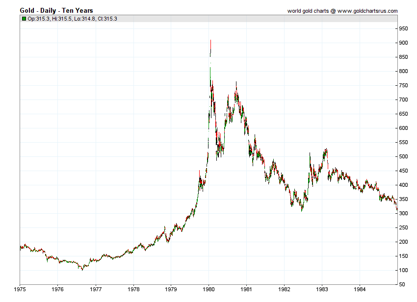
We don’t know how the Bitcoin bubble will end but our best guess is that it will end badly. Bitcoin has already had one mini-crash. It is currently in recovery mode. So far, the chart reminds us of gold in 1980 that soared to over $850, crashed then attempted to recover. Only it failed the previous high and it ushered in a twenty-year plus bear market. Buyers should beware. Tulip mania and the South Sea bubble were popularized in a book titled Extraordinary Poplar Delusions and the Madness of Crowds – Charles Mackay (1841). Maybe someday Bitcoin will join them in a new edition.
(Source)
(Source)
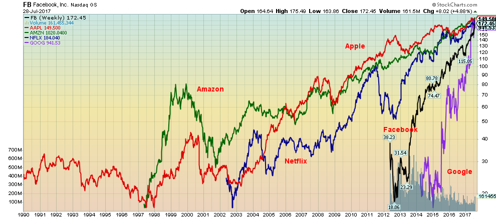
Are they in a bubble? Or is their rise just normal? Who knows but the FAANGs as they are known (Facebook, Apple, Amazon, Netflix, Google (Alphabet)) have been the main stars that have taken the markets up over the past several years. Jeff Bezos of Amazon briefly passed Bill Gates (Microsoft) as the richest person in the world this past week. Still, Jeff Bezos (Amazon), Mark Zuckerberg (Facebook), Larry Page (Google), and Sergey Brin (Google) are all billionaires who make Donald Trump (also a billionaire) look like a chump-change piker. No word on whether they tweet or not.
(Source)
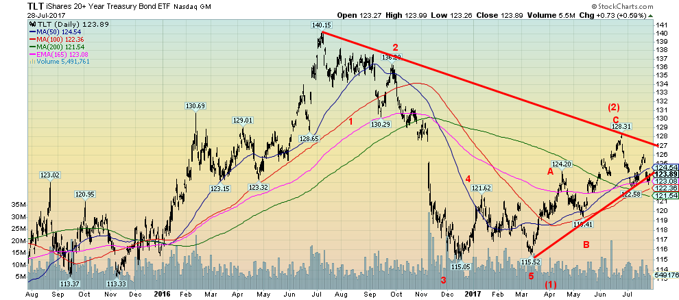
Bond prices appear to be breaking down. They appear to be breaking under the uptrend line from the March 2017 low. The late June 2017 low at 122.58 would appear to be poised to fall next. A breakdown under 121.50 could signal a return to the lows of December 2016 or at least the March 2017 low. If the wave count is correct then bonds could be entering a long-term bear market. After all 35 years is a very long bull market for bonds. We say 35 years because bond prices made their all-time low in 1981. Since then bond prices have been in an ongoing rise (yields that move inversely to prices were moving lower) through a long series of higher highs and higher lows. Rising interest rates is probably not what the Fed wants or at least interest rates rising too quickly in the bond market. It does suggest, however, investors should ensure that they become protective and move to the shorter end of the yield curve.
(Source)
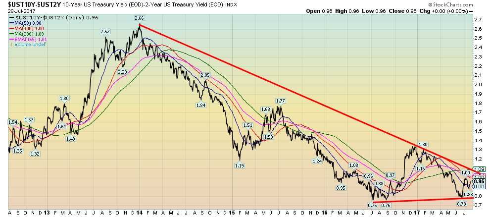
Spread watch. We have noted over the past number of weeks that the spreads between the short end of the market and the long end of the market are narrowing. Our spread watch focuses on the two-year US Treasury note vs. the ten-year US Treasury note. The spread this week was at 0.96%. It appears that it might be rising again. A breakout over 1.10% could suggest a move to about 1.65%. A widening spread might actually be somewhat positive for the economy as economic slowdown is usually signaled when the spread becomes quite low. Prior to the 2000-2002 and 2007-2009 recessions, the 2-10 spread actually went negative. Our view is that a narrowing spread is potentially a signal of a market top and a possible oncoming recession while a rising spread would appear to signal improving economic conditions. Naturally rising spreads also help trigger the potential conditions to set in motion the next fall in yields (or in this case rise in prices). We will continue to keep an eye on the 2–10 spread.
(Source)
(Source)
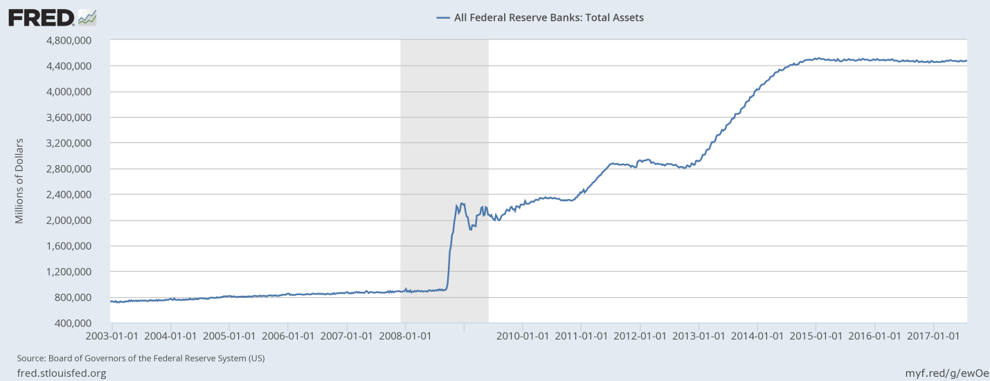
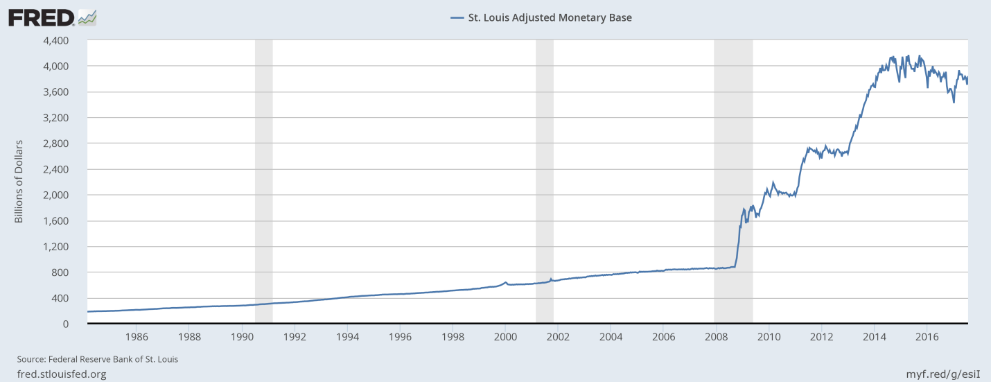
The Fed doesn’t have to hike interest rates in order to tighten monetary conditions. The Fed has said it is their intention to run-down their balance sheet by letting maturities roll off. During the long period known as quantitative easing (QE) the Fed balance sheet ballooned from around $800 billion to over $4 trillion as they purchased billions of dollars’ worth of not only government bonds but also corporate bonds and mortgage backed securities (MBS). That was also reflected in the growth of the monetary base. But since the Fed announced the end of QE the Fed balance sheet has stabilized and the monetary base has begun to fall. Effectively running down their balance sheet and allowing the monetary base to fall is the same as withdrawing funds from the financial system. It has a similar impact to hiking interest rates, as it is a form of tightening. Only this one effectively withdraws funds from the financial system. We note that the rate of growth for M2 has also slowed down to its lowest level in some time. This is another warning to the stock market. Fewer funds available in the market should eventually translate into a declining stock market.
(Source)
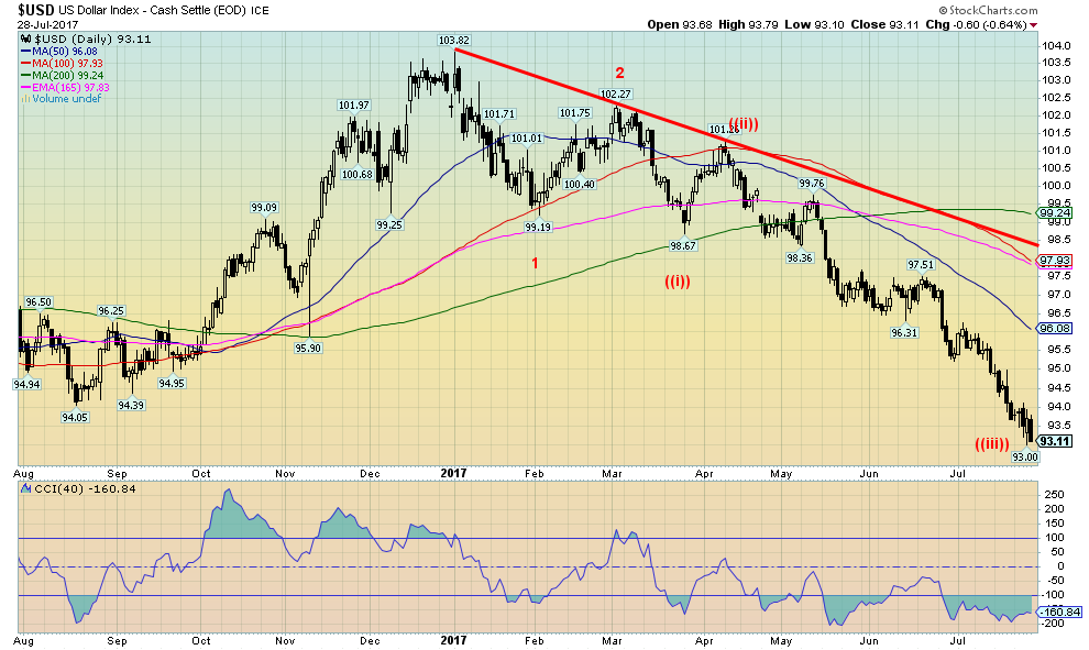
Down, down, down the US Dollar goes. How low it goes, nobody knows. The US$ Index appears to be now going into a free fall. Yes, sentiment towards the US$ is abysmally low. But that doesn’t necessarily guarantee a low. If the US$ Index is falling that means others are rising and they are as while the US$ Index has hit new 52-week lows again, the Cdn$ and the Euro are hitting new 52-week highs. The Japanese Yen and the British Pound, despite Brexit, are also rising. Our next target for the US$ Index is down around 91 to 91.50. Still, that is a long way from the 2008 low of 71.33. The four-year MA is currently at 91.88 so that alone makes the 91-91.50 target zone attractive. 91.88 also coincides with a wave (4) low seen in May 2016. We can probably safely assume that the US$ Index has topped. A breakdown under the wave (4) low of 91.88 would absolutely confirm that and it could also signal that a new US$ bear market is officially underway. After the US$ Index last peaked in 2001 it took seven years before the final bottom was seen. So far, we are not even a year away from the December 2016 top. We had noted in the past as well that the US$ does not perform well under Republican Presidents. All we can say is so far that remains the case. But we also noted that the stock market tends to perform more poorly under Republican Presidents as well. We note that during the 2001–2008 US$ decline the real decline got underway in 2003 when the US invaded Iraq under a Republican President. Previous declines were also quite swift. And that is why we warn that the US$ Index may be moving into a free fall. We’ll see what happens when it reaches the target zones.
(Source)
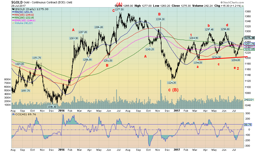
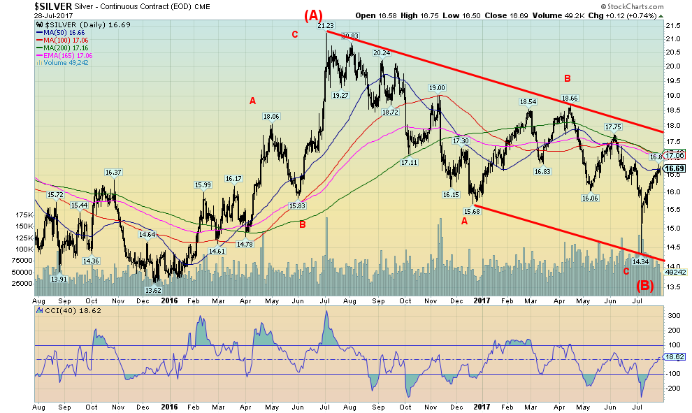
If the US$ Index is falling then gold (in US$) should be rising. Well, it is with another gain of 1.1% this past week. Still, the rise in gold prices has been sticky even as it is up just over 10% on the year so far. Silver that had struggled of late as well is only up 4.4% so far in 2017 but it gained 1.4% this past week. Going forward silver should outperform gold and our expectation is that silver could have a big catch up. Our sense is that after rising from $1,124 in December 2016 to a peak of $1,265 in March 2017 gold went into an upward correction. That meant it hit somewhat higher prices at $1,298 but overall during the period it was just a period of sharp ups and downs going nowhere. There is still a lot of work to be done, but we are now through $1,260 and $1,270. That suggests to us that the previous $1,298 high should soon fall and that the market should then be on its way back to the $1,377 high of July 2016. We believe we are in the early stages of a possible C wave. C waves can be quite spectacular. At minimum, we would expect gold to hit $1,400 and $1,500 in the next year. A best-case scenario could see gold return to the 2011 highs of $1,920 and even higher. Key now is that major support at $1,200 holds. Interim support levels are also important and we note $1,250 and $1,230 as well. But overall the action is positive and our expectations are we should soon pass through $1,300. Gold is in the sweet spot seasonally as that period runs from roughly late July to at least through September and even into early October before a correction could set in.
(Source)
At the recent lows, there was a considerable divergence between gold and silver. Silver plunged through its previous low at $15.68 and made a new low at $14.34. Gold held a comparable level making a higher low. These divergences are important and are often seen at significant tops and bottoms. In other words, the averages must confirm each other (in this case gold and silver must confirm each other). They didn’t. Silver has a lot more work to do and we can’t say firmly that a low is in even as we highly suspect a low is in. We’ll feel more comfortable once we break through $17 and especially over $18. Over $18 silver should officially enter a new bull market with potential targets up to $25. We would only become concerned if silver were to break back under $16. But we believe it should hold on any pullback.
(Source)
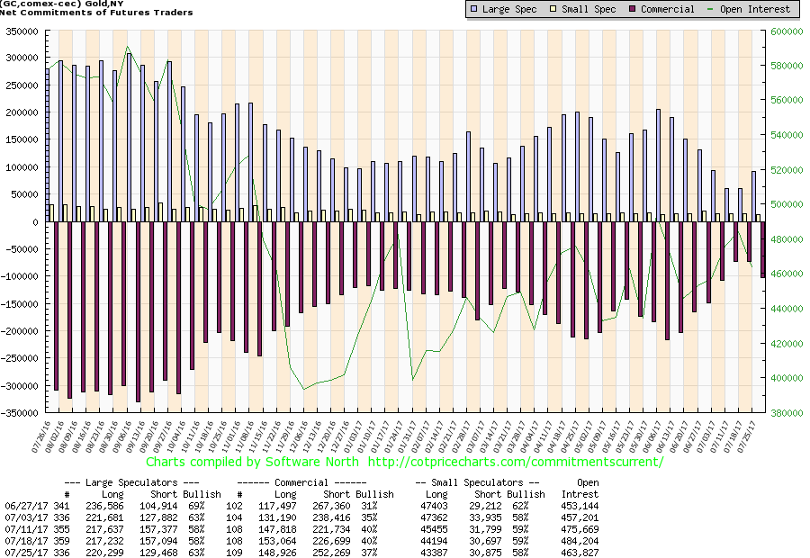
The commercial COT for gold slipped a bit this past week, but it hasn’t pulled back sufficiently to give us cause for concern. The commercial COT for gold slipped to 37% from 40% as short open interest jumped roughly 26,000 contracts and long open interest decline about 4,000 contracts. Usually, tops are seen when the commercial COT gets down around 25% or even lower. If a strong bull market does get under we note that during the period 2008-2011 the commercial COT was falling but gold kept on rising. There are lots of reasons why gold prices should rise, but our focus is on the technicals and we are currently bullish. Expectations remain that we should break through $1,300 in due course.
(Source)
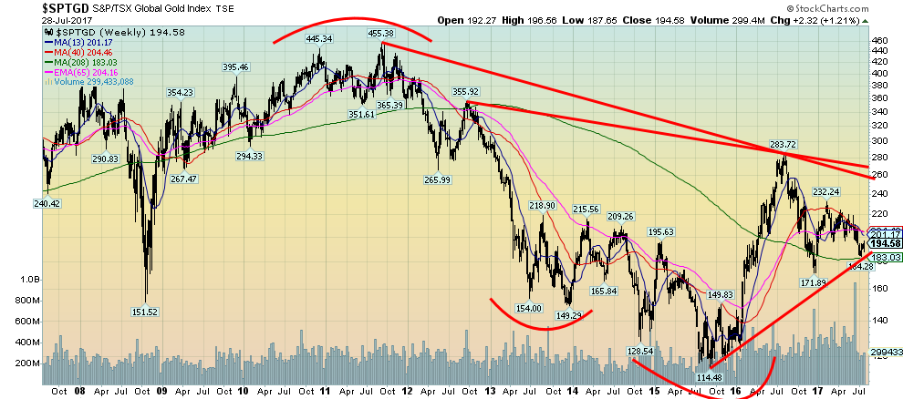
Despite all the recent struggles with gold stocks the TSX Gold Index (TGD) continues to hold above the four-year MA and is also holding the uptrend line from the 2015/2016 lows. We view this as positive. Major resistance is seen at 220 but the really big major resistance is at 260/270. Generally, we are holding in with those peaks seen in 2013, 2014, and 2015. So we view a broad zone of support stretching from roughly 170 to 220. Currently, we are the lower end of the support zone. A break above 220 could suggest a move to 268 a move that would take us right into the 260/270 resistance zone. We need 172/184 to hold on any further pullbacks. Gold stocks should lead and they have been sticky. While the Gold Bugs Index (HUI) did gain 2.4% this past week, the TGD lagged gaining only 1.2%. We confess we are a little uncertain ourselves as to how to interpret this given what appear to be positive signs for both gold and silver. But as long as the broader stock market wants to go up the gold stocks should as well.
(Source)
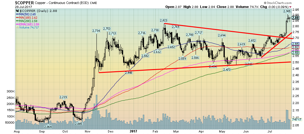
Copper has broken out of what appears as a long triangular pattern from November 2016 to July 2017. If the triangle is correct, copper could have a target zone up to around $3.05/$3.10. Rising copper prices are reflective of a positive economy. So our expectations are now that despite the turmoil in Washington the positive economy should continue. Copper is also considered a leading indicator for gold. So rising copper prices should translate into rising gold prices. Copper appears good as long as it can remain above $2.75.
(Source)
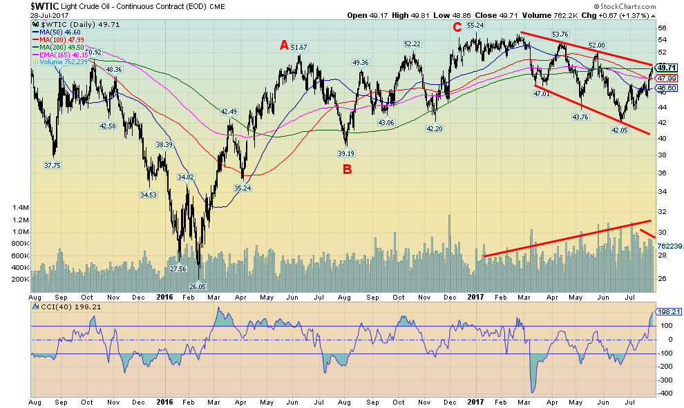
Once again oil prices are at a cusp. Either oil prices are going to fail here near $49 or they will bust through. After peaking in early 2017, oil prices fell in a sharply irregular manner on rising volume. We note that the recent run-up has been on declining volume, suggesting that this move is merely corrective. It should fail around $49/$50. We note that the 200-day MA is also here at $49.50. Another reason to suggest resistance and a potential failure. Our view would change if oil prices were to bust through $50 and especially above $52. Energy stocks are quite cheap here but that doesn’t mean they are about to rise. If oil prices fall back below $48 and especially under $46 it would confirm the failure and the downward slide should continue. But it has been volatile.
—
DISCLAIMER: This article expresses my own ideas and opinions. Any information I have shared are from sources that I believe to be reliable and accurate. I did not receive any financial compensation in writing this post, nor do I own any shares in any company I’ve mentioned. I encourage any reader to do their own diligent research first before making any investment decisions.


Abivax Shares Surge as New Trial Data Eases Safety Concerns Over Ulcerative Colitis Drug
Abivax shares surged nearly 36% after positive updated trial results for its ulcerative colitis drug obefazimod reassured investors following earlier...


El Dorado Raises $9M to Expand Cross-Border Fintech Platform
El Dorado, a Latin American fintech improving cross-border financial services, raised a $9 million Series A led by Paradigm with...


Bitcoin Stalls Near $60K as Strategy Moves, ETFs Outflow, and EU MiCA Rules Take Effect
Bitcoin hovers near $60,000 with ETF outflows, while Strategy boosts reserves, sells BTC, and raises dividends to reassure investors. Ethereum...


Cannabis Dominates Global Drug Use: Trends, Risks, and Shifting Markets
Cannabis remains the world’s most widely used illicit drug, with 256 million users in 2024, surpassing all others combined. Growth...


Italy Approves First Hydrogen-Powered Train for National Rail Network
ANSFISA has approved Italy’s first hydrogen-powered train, the Alstom HMU214, for use on the Brescia–Iseo–Edolo line. Capable of 140 km/h,...
 |
|
 |  |
 |
|
-

 Impact Investing2 weeks ago
AI Adoption in Italian Retail Stalls Despite Strong Experimentation
-
 Cannabis23 hours ago
Cannabis Dominates Global Drug Use: Trends, Risks, and Shifting Markets
-

 Impact Investing1 week ago
EU Weighs More Free Emission Permits in ETS Review to Boost Industry Competitiveness
-

 Impact Investing2 weeks ago
SBTi Net-Zero Standard 2.0 Enhances Corporate Climate Action
You must be logged in to post a comment Login