Business
Using images in your website: what you need to know
Using images in website design is critical, but only if you do it right. People are visual creatures. We love looking at pretty and interesting things. This is especially true for the 65% of the population who are visual learners. Adding the right photos to your site is one the easiest things you can do to captivate your audience. Here are the best practices for how to use images effectively on a website.
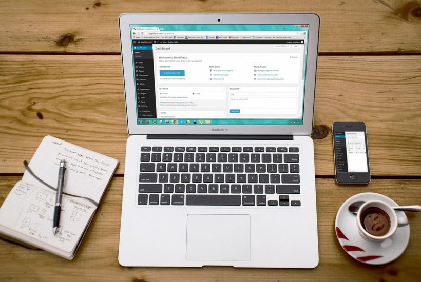
Let’s update the old cliche. If a photo is worth a thousand words, then a digital photo, on your website, is worth a thousand clicks.
That’s because using images in website design is one of the simplest things you can do to make your website more popular – both with users and with search engines.
Best practices for using photos and graphics in web design

There are many reasons to use images on your website. Images and graphics can:
- Improve your SEO,
- Help brand your company, and
- Create more user engagement.
Ultimately, a more attractive website just performs better.
Of course, images will only work if you use them properly, and we’ll cover best practices below. But first, let’s explore why you want to use photos and graphics in the first place.
Why use images in website design
Start paying attention when you’re browsing the Internet. You’ll almost never see a website that doesn’t utilize images in some way. And if you do stumble across one, it’s probably ancient, and you probably won’t be compelled to spend much time there.
No web designer worth their salt will ever publish written content without including pictures and graphics to break up the text.
A long, scrolling page of written words without any breaks is unflatteringly called a ‘wall of text,’ and no one likes to read them.

By adding high-quality, relevant images, this website makes a recent blog post much more readable, while also showcasing their work.
But we don’t just add pictures to websites because they look pretty (although they do). Using images effectively on a website can drastically improve its performance.
Here are three main reasons to use images in website design:
1. Websites images can improve your SEO
If you want lots of good, quality traffic to your website, you have two options:
- You can spend thousands of dollars on ads, or
- you can do good SEO. And including rich images is a key part of good SEO.
Search engine optimization, or ‘SEO,’ is the practice of optimizing your website for search engines.
You want to make it as easy as possible for Google (and other search engines) to understand what your website is all about, so they can show it to relevant users. The better your site is search engine optimized, the more likely you are to show up at the top of search results – and the more likely eager customers are to find you.
Remember Google is just a robot. It scans your site, looking for certain metrics like tags, headings, and written content to understand what your company is all about. When it scans your site, it also looks at images, which is why good, optimized images can help your overall SEO.
Case in point: content with images gets 94% more views than those without. So if you want more traffic, you need to use more photos on your website.
Of course, this only works if you’re using relevant images and following best practices, which we’ll cover further below.
2. Images can help brand your company
The right images can bring your brand to life in a way that text just can’t. Neuroscientists have found that we can identify images seen for as quickly as 13 milliseconds. That’s so much quicker than the blink of an eye. When you use attractive images on your website, a visitor will start to understand your brand right away.
If you have spent time developing your brand, put it to use! You don’t want your logo to sit unseen on business cards. Get people to connect with you right away, wherever they’re finding you.

By using a captivating image of a powerful businesswomen at the top of their website, this business immediately establishes their brand in the female leadership niche.
Remember graphics are also images you can use, offering a great way to subtly incorporate your brand elements and colours into your web design. You should be adding all types of visual content to your site, helping people connect with your brand immediately.
Remember too, that any images you use on your website can also be used on social media. The best images for web content will usually also work great across multiple platforms.
None of this means good written content isn’t also important on your website. It just means that good images have an immediate and lasting impact, which leads us into the final reason to use them in your web design.
3. Images Keep Users Engaged
People are visual creatures. We love looking at pretty and interesting things. This is especially true for the 65% of the population who are visual learners.
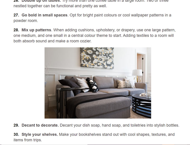
By adding images, our client Magic Home Staging makes it much more likely for users to keep reading their list of design ideas.
Adding the right photos to your site is one the easiest things you can do to captivate your audience. In fact, at least 38% of users will just stop engaging with a site when it has an unattractive layout.
On the other hand, this study from BuzzSumo found that articles using an image once every 75-100 words received double the social media shares as articles with fewer images.
Couple this with the fact that people are busy, and they tend to scan through websites. Breaking your text up with shorter paragraphs, and interspersed with interesting photos and infographics, can help make your website more accessible and user friendly.
Ultimately, images make your site more captivating and visually appealing, which means users will be more likely to spend time on your website and remember you.
As a final note, Google notices how long people engage with a website, and they reward engaging content. So when you use images to keep people on your website longer, you’ll also be improving your SEO.
~~~~~~~~
READ: How To Keep People On Your Website Longer

It’s a simple equation: the more time people spend on your website, the more likely they are to convert into a lead or sale.
So…do your website visitors like what they see when they land on your site, or are they leaving after a few seconds?
Are they choosing to buy something from you, or abandoning their cart before making a purchase?
Stats show that an average web user spends only a few seconds on a website before they decide whether to stay or go. That means you don’t have much time to make a great first impression.
Read more on our website.
~~~~~~~~
How to use photos on your website
Your website will only reap the benefits of images if you use them properly. Here are some of the best practices to keep in mind when using photos and graphics in web design:
- Keep your photos relevant. They should match the text they’re illustrating. And make use of captions when you add photos to blog posts.
- Keep the image file size small. Slow load times can negatively impact your SEO and user engagement. Images take longer to download than text, so too many large images can slow down your site (especially on mobile). This means you should compress your images, which you can do in Adobe Photoshop or with online image compressors.
- Properly label your images with search engine optimized keywords and phrases. The file name and the tags on your images should both be done with SEO in mind.
- Don’t go overboard with graphics. Cheesy, poorly made graphics can look like ads, which people tend to skim over.
- Use images with real people as much as possible, as these can help users feel more connected with your site.
- Encourage users to share photos on their own social platforms.
- Only use your own images, or images you have purchased and have the right to use. Give attribution where necessary.
As much as possible, it’s best to use your own photos that you have taken professionally.
However, depending on your budget, this may not always be possible. In this case, you’ll need to fall back on stock photographs, but use them judiciously. Try to choose photos that aren’t too staged or unrealistic.
For paid stock images, we like to use DepositPhotos.com. You can also find a lovely assortment of free photos at Unsplash which are free to use, without attribution or permissions, for all commercial and non-commercial purposes.
When used correctly, photos are one of the best ways to enhance your website. But used incorrectly, they easily clutter your design and slow down your site. This is especially true if you are unfamiliar with proper web design best practices.
_
(Featured image by 27707 via Pixabay)
DISCLAIMER: This article was written by a third party contributor and does not reflect the opinion of Born2Invest, its management, staff or its associates. Please review our disclaimer for more information.
This article may include forward-looking statements. These forward-looking statements generally are identified by the words “believe,” “project,” “estimate,” “become,” “plan,” “will,” and similar expressions. These forward-looking statements involve known and unknown risks as well as uncertainties, including those discussed in the following cautionary statements and elsewhere in this article and on this site. Although the Company may believe that its expectations are based on reasonable assumptions, the actual results that the Company may achieve may differ materially from any forward-looking statements, which reflect the opinions of the management of the Company only as of the date hereof. Additionally, please make sure to read these important disclosures.

-

 Impact Investing1 week ago
Italian Unlisted Banks Lag on ESG Sustainability
-

 Crypto2 weeks ago
The Iran War Tests Bitcoin and Crypto Market Resilience
-

 Crypto4 days ago
Euro Stablecoins Struggle to Compete with Dollar Dominance in Crypto Markets
-

 Crypto2 weeks ago
Crypto Markets Volatile as Bitcoin Hovers, Solana Eyes AI Integration
