Featured
V recovery versus K recovery: what is it going to be?
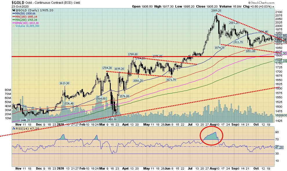
The markets continue to trace out what could prove to be an important top. There are no sell signals yet, but there are numerous divergences. We cite the continued divergence between the DJI and the DJT where the averages are not confirming each other. Interest rates are rising and appear to be pointed higher largely due to the huge deficits and signs of a revival in the economy.

With just over a week to go to what may be the most contentious election in U.S. history, it seems appropriate to look back on what has been a most difficult year. Most difficult year ever? Well, that might be a stretch. We’ve seen a few articles claiming the year 536 AD may rank as the worst year ever. Why 536? Well, a mini ice-age, triggered by a haze probably brought on by volcanic eruptions that settled over Europe, the Middle East, and parts of Asia (no word on the Americas) resulted in one of the coldest decades on record. Crops failed; famine was rampant. The haze lasted upwards of 18 months.
Then came the plague that became known as the Plague of Justinian, named after the Byzantine emperor at the time who ruled over what was the Eastern Roman Empire. The bubonic plague got underway in 541 AD and killed an estimated 100 million throughout Europe and Asia. And we think we have it bad. The combination of a mini ice-age famine and plague helped push the world at the time into what became known as the Dark Ages. Well again at least the European continent but again no word on what happened in the Americas where empires were forged, rose and collapsed.
So, what about 2020? Well, fires, floods, extreme temperatures, hurricanes, and, oh yes, a plague. Missing so far are the earthquakes, massive volcanic eruptions, and tornadoes. Yes, we have had them, but not on a massive scale. And dare we mention famines and drought? It would almost seem that we are being hit with the biblical plagues. Okay, no blood, lice, frogs, locusts, boils, and the killing of the firstborn.
These are not natural disasters but, depending on one’s view, they could be seen as disasters of another sort: the ubiquinols of surveillance technology including facial recognition technology, and the deep civil-war like divisions in the world’s supposed leading democracy. The latter is being shown in the extremely contentious Supreme Court vacancy, the attempt by white supremist groups to kidnap a sitting governor, riots in cities centered around Black Lives Matter, and accusations that ANTIFA (anti-fascists) is a terrorist organization—and, against this backdrop, an historic inequality of wealth. And we think Halloween is going to be scary?
The president thinks it is going to be a V recovery. The presidential candidate is saying it is a K recovery. Wall Street vs. Main Street. The stock markets are at/near record highs on Wall Street, with near-record unemployment and rising business bankruptcies on Main Street. One arm up, the other arm down. The K recovery.
What has driven the Wall Street arm is sure to continue past the election, no matter who wins. And this could continue to drive stock markets higher. The reason: unprecedented money printing as the money supply (M2) soars and the balance sheet of the Federal Reserve, along with other central banks, also soars; plus, interest rates are to remain negative to the rate of inflation and, in some cases, even below zero. We don’t want to “beat a dead horse” with a chart we have shown before, but this one is compelling.
U.S. Fed Balance Sheet and Money Supply (M2) 2008–present
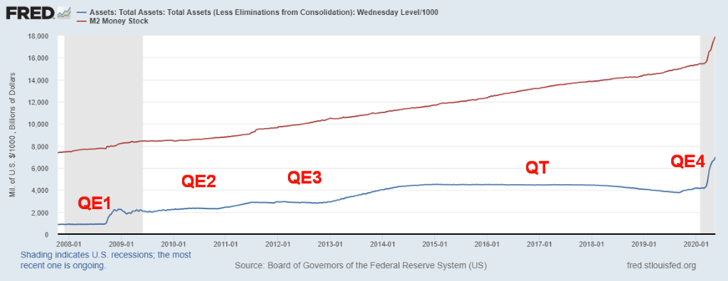
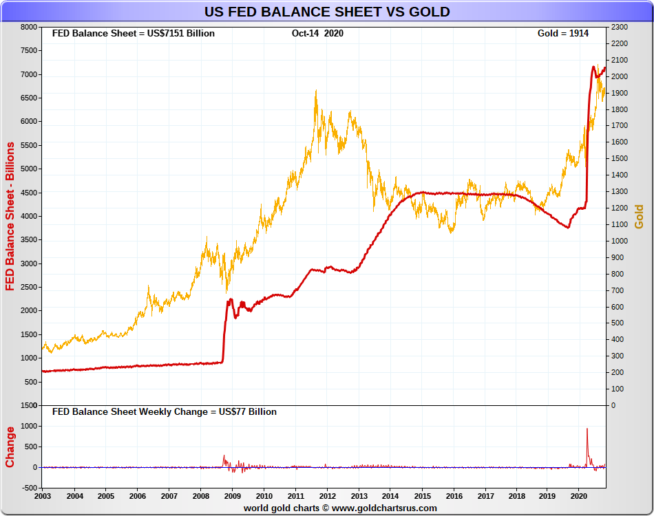
Both the money supply (M2) and the Fed’s assets are now pointed straight up. This could be what we call the “hockey stick pattern” where, after a period of steady growth, the growth suddenly goes straight up. Inflation shows up not in the form of sharply rising prices—at least, not initially—but instead in inflationary asset growth, whether it be stocks or hard assets such housing. It also shows up in rising gold prices. As the Fed Balance sheet rises along with M2 and debt, gold also rises. The message is simple—own some gold and silver, and by that we mean physical gold and silver. Gold stocks are also good as they are leveraged to the price of gold and silver, but they are paper, like any stock.
Once again for the record, since 2008 M2 Money Supply is up $10.7 trillion (132%), the Fed Balance Sheet has exploded up $5.4 trillion (304%), U.S. Federal Debt is up $16.3 trillion (151%), while gold is up $1,248 (183%). The stock market (DJI) is up 18,722 points (200%). But can the stock market maintain that rate of growth?
Since 2008 there have been only four periods where the market corrected downwards to any extent. In 2011 the DJI fell 19.2% (EU/Greek debt crisis), 2015/2016 15.8% (end of QE), 2018 18.4% (trade wars), and 2020 38.4% (pandemic). Since the 2009 financial crisis bottom that’s a sharp correction, roughly every two years nine months. We are well aware of the 4-year cycle (range 3–5 years), and the 6.5-year cycle (range 5–8 years). It is possible that the 2011 low, the 2016 low, and the 2020 low were 4-year cycle lows. The 2016 low was most likely a 6.5-year cycle low. The March 2020 low appears to have been too early for the next 6.5-year cycle coming in four years and two months later. So, another cycle low could be due somewhere between 2021 and 2024, most likely occurring in 2022. The 2009 low was also an 18.75-year cycle low (range 13–22 years). That means the next one is due 2022–2031.
For the record there have been 6 major bear markets since 1950. A major bear market is one where the stock market falls 30% of more. They were 1966, 1973-1974, 1987, 2000-2002, 2007-2009 and the most recent 2020. Two; 1987 and 2020, were relatively short-lived bears of 55 days and 39 days respectively. Being over in such a short period of time makes it difficult to call them major bear markets. But 1987 did not result in a recession, at least not until 1990, while the March 2020 collapse resulted in a recession that continues.
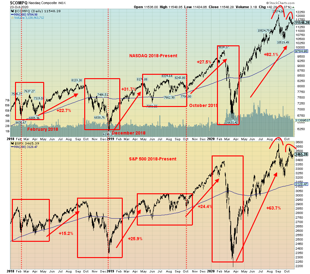
The huge rise in the stock market has been led by the technology sector. The technology-dominated NASDAQ was up 82.1% at its most recent high on September 3, 2020 (ironically, also the high of the DJI on September 3, 1929). The S&P 500 was up 63.7% in the same time period. But, as is so often noted, roughly only a third of the stocks have been rising, dominated as they are by the FAANGs plus some other high technology stocks.
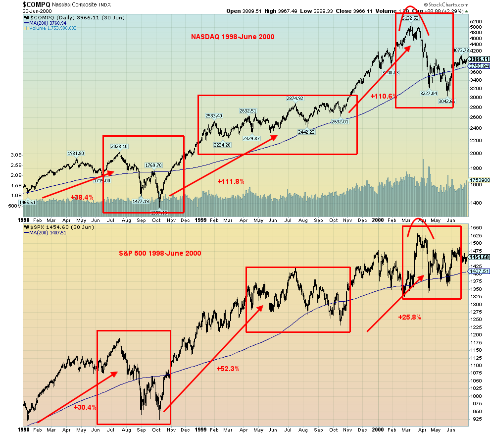
Below, we show an interesting comparison of the NASDAQ and S&P 500 during 2018–present vs. 1998–June 30, 2000. The general shape is the same, even if the periods of consolidation or declines don’t quite match up. But we are seeing what appears to be a double top on the charts today and a double top on the charts back in March 2000. Unless we see new highs soon, the word is—look out below. Can the Fed save the day again? They have saved the stock markets, so far, but not the economy.
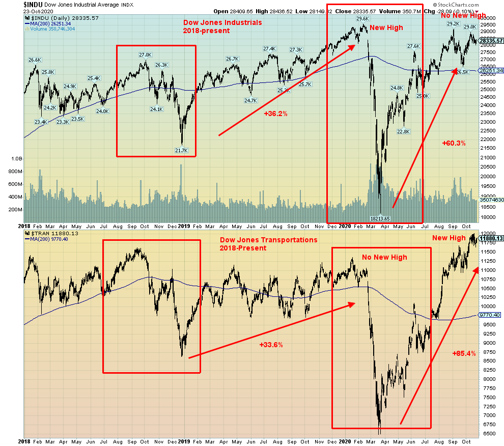
Another interesting divergence is between the Dow Jones Industrials (DJI) and the Dow Jones Transportations (DJT). One of the prime tenets of Dow Theory (Charles Dow in the Wall Street Journal) is that the averages must confirm each other. Here, we see a non-conformation with the DJI making new all-time highs in February 2020 but not the DJT. That is being repeated again in September 2020, except the roles are reversed—the DJT is making new all-time highs while the DJI is not. We note that we had similar divergences in 2000 and again in 2007–2008. In both instances, the divergence turned out to be right and stock markets fell precipitously in 2000–2002 (DJI down 38.7%, DJT down 49.4%) and again in 2007–2009 (DJI down 54.4%, DJT down 60.3%). Are we being set up once again?
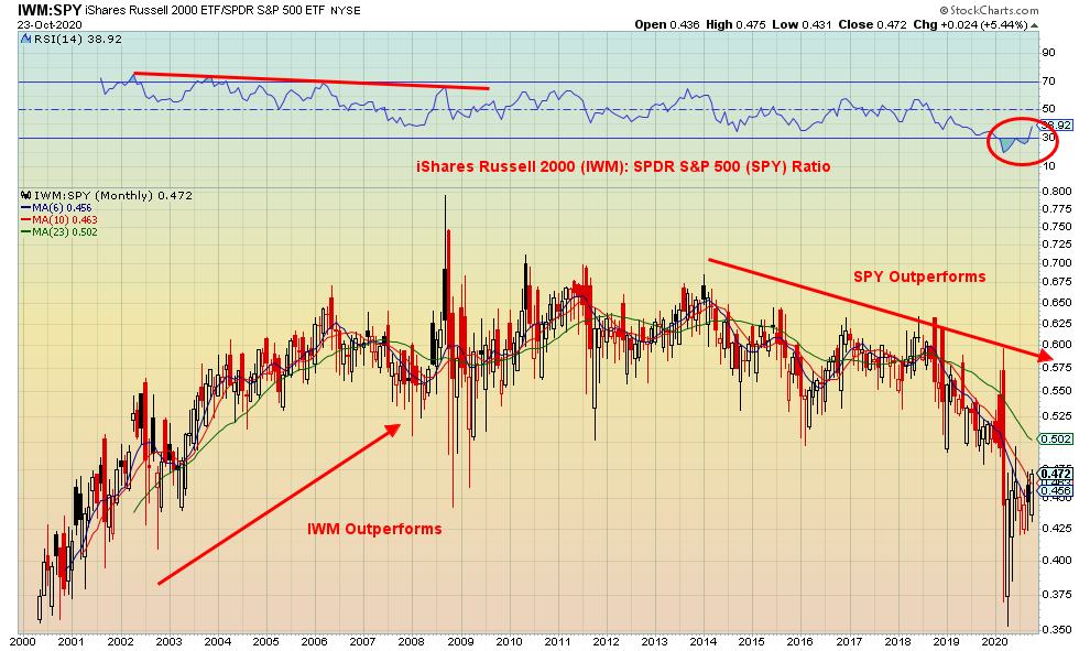
One last thing to consider is the relationship between large cap and small cap stocks. Here we show the ratio between the iShares Russell 2000 (IWM), representing small cap stocks, and the SPDR S&P 500 ETF (SPY), representing large cap stocks. Between 2000 to 2008 the IWM outperformed the SPY. After the 2008 financial crash, investors preferred large cap stocks to small cap stocks and the SPY outperformed, at least until recently. The chart below is a monthly chart so it represents the long-term. The RSI recently plunged below 30 for a number of months. But it is now starting to rise again.
Does that imply that we are beginning a new era where small cap stocks will outperform? Possibly, but as we saw in 2008 through 2011, it took several months and even years for a top to form. It was only after 2012 that the SPY began to outperform. There are no divergences seen just yet in the ratio. So, it could take several months or more for a proper bottom to form. The last sell signal (the 6- and 10-month MAs crossed over the 23-month MA) on the ratio was seen in November 2018 as the market was plunging into the December 2018 low. No new buy signal has been seen at this time. Note that in 2000–2002, as the market plunged into the 2002 low, the IWN had been outperforming for months before the final plunge of the bear market. It is also interesting that the peak for the ratio came in September 2008 as the market was preparing for the Lehman Brothers crash that followed.
We are in the midst of a pandemic. The numbers have picked up substantially with almost 500,000 cases on October 23. The U.S is now recording over 70,000 cases daily. An extremely divisive election is just a week away. Yet the Fed continues its QE program (as do other central banks) and, no matter who wins on November 3, huge stimulus packages are coming. But the signs we are seeing suggest that the stock markets could soon be entering a dangerous phase, no matter who wins. Forewarned is forearmed.
MARKETS AND TRENDS
| % Gains (Losses) Trends | |||||||
| Close Dec 31/19 | Close Oct 23/20 | Week | YTD | Daily (Short Term) | Weekly (Intermediate) | Monthly (Long Term) | |
| Stock Market Indices | |||||||
| S&P 500 | 3,230.78 | 3,465.39 | (0.5)% | 7.3% | up | up | up |
| Dow Jones Industrials | 28,645.26 | 28,335.57 | (1.0)% | (0.7)% | up (weak) | up | up |
| Dow Jones Transports | 10,936.70 | 11,880.13 (new highs) | 0.4% | 9.0% | up | up | up |
| NASDAQ | 9,006.62 | 11,548.28 | (1.1)% | 28.7% | up (weak) | up | up |
| S&P/TSX Composite | 17,063.53 | 16,304.08 | (0.8)% | (4.5)% | neutral | up (weak) | up |
| S&P/TSX Venture (CDNX) | 577.54 | 718.13 | (1.0)% | 24.3% | down (weak) | up | up |
| S&P 600 | 1,021.18 | 933.72 | 1.1% | (8.6)% | up | up | down (weak) |
| MSCI World Index | 2,033.60 | 1,883.46 | Flat | (7.4)% | neutral | up (weak) | neutral |
| NYSE Bitcoin Index | 7,255.46 | 12,943.57 (new highs) | 14.2% | 78.4% | up | up | up |
| Gold Mining Stock Indices | |||||||
| Gold Bugs Index (HUI) | 241.94 | 323.73 | (2.9)% | 33.8% | down | up | up |
| TSX Gold Index (TGD) | 261.30 | 352.77 | (3.3)% | 35.0% | down | up (weak) | up |
| Fixed Income Yields/Spreads | |||||||
| U.S. 10-Year Treasury yield | 1.92 | 0.84 | 13.5% | (56.3)% | |||
| Cdn. 10-Year Bond yield | 1.70 | 0.64 | 12.3% | (62.4)% | |||
| Recession Watch Spreads | |||||||
| U.S. 2-year 10-year Treasury spread | 0.34 | 0.68 | 13.3% | 100.0% | |||
| Cdn 2-year 10-year CGB spread | 0 | 0.39 | 21.9% | 3,900.0% | |||
| Currencies | |||||||
| US$ Index | 96.06 | 92.76 | (1.0)% | (3.4)% | down | down | down |
| Canadian $ | 0.7710 | 0.7610 | 0.3% | (1.2)% | up | up | neutral |
| Euro | 112.12 | 118.61 | 1.2% | 5.7% | up | up | up |
| Swiss Franc | 103.44 | 110.60 | 1.2% | 6.9% | up | up | up |
| British Pound | 132.59 | 130.42 | 0.9% | (1.5)% | up (weak) | up | neutral |
| Japanese Yen | 92.02 | 95.46 | 0.6% | 3.7% | up | up | up |
| Precious Metals | |||||||
| Gold | 1,523.10 | 1,905.20 | (0.1)% | 25.1% | down (weak) | up | up |
| Silver | 17.92 | 24.67 | 1.1% | 37.7% | down (weak) | up | up |
| Platinum | 977.80 | 906.70 | 4.3% | (7.3)% | neutral | neutral | neutral |
| Base Metals | |||||||
| Palladium | 1,909.30 | 2,398.60 | 2.4% | 25.6% | up | up | up |
| Copper | 2.797 | 3.13 (new highs) | 2.0% | 11.9% | up | up | up |
| Energy | |||||||
| WTI Oil | 61.06 | 39.85 | (3.1)% | (34.7)% | neutral | neutral | down |
| Natural Gas | 2.19 | 3.19 (new highs) | 15.2% | 45.7% | up | up | up |
Note: For an explanation of the trends, see the glossary at the end of this article.
New highs/lows refer to new 52-week highs/lows.
Stock markets largely faltered this past week. The presidential debate on Thursday most likely played little or no role in the markets. The mute button helped keep the debate more civil. The drop could just be nervousness going into the election or it could be a sign that the market is getting tired after seven months up from the pandemic crash of March 2020. Or the market could just be upset that no stimulus program has been announced. This past week the S&P 500 fell 0.5%, the Dow Jones Industrials (DJI) was off almost 1.0%, but the Dow Jones Transportations (DJT) continues to diverge up 0.4% and another all-time high. The NASDAQ lost 1.1%. But the S&P 600 small cap index surprised to the upside, gaining 1.1%. Are small caps poised to move higher? No new highs on the small cap indices.
Here in Canada, the TSX Composite lost 0.8% while Canada’s small cap index the TSX Venture Exchange (CDNX) lost 1.0%. The MSCI World Index was essentially flat but Bitcoin continues to surprise, making fresh 52-week highs, gaining 14.2%. Is Bitcoin pointing the way higher? In the EU, the London FTSE fell 1.0% as Brexit appears headed for the shoals, the Paris CAC 40 was off 0.5%, and the German DAX fell 2.0%. In Asia, China’s Shanghai Index (SSEC) was down 1.8% and the Tokyo Nikkei Dow (TKN) gained about 0.5%.
The FAANGs were mixed this week with Facebook up 7.1%, Apple down 3.3%, Amazon down 2.1%, and Netflix down sharply 8.0%, while Google was up 4.3%. Microsoft was down 1.6% and Tesla fell 4.3%.
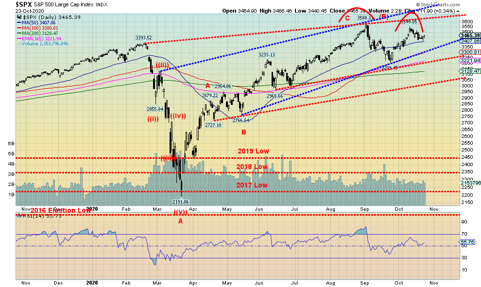
Nothing has changed our view that a potential double top is forming on the S&P 500 (also seen on the DJI and the NASDAQ; however, the DJT continues to make what appears to be an ascending wedge triangle which is bearish). The double top is not confirmed. The S&P 500 needs to break that recent low at 3,209, although a break of the uptrend line at 3,300 may suffice. Confirmation would come below 3,200. And, as we have stated, a breakdown under 3,000 could spark a panic. New highs would change this potential unfolding scenario. The DJI continues to diverge with the DJT and only new highs on the part of the DJT could change this negative scenario unfolding.
However, the unfolding election will most likely dominate the headlines going forward. That and the rising COVID-19 numbers. The failure to agree on a stimulus package is also hurting the stock markets. This is shaping up as a potentially ugly election with possible court challenges, no matter who appears to win on November 3. Both sides are entrenched and there is very little sign of compromise from either side. Civil strife could come from either side but more likely from the loser of the November 3 election. An example of these divisions is that the Democrats plan on boycotting the confirmation hearings of Amy Barrett. Current rules say that at least two Democrats need to be present. The Republicans could change the rules making Democrat attendance at the confirmation hearings moot. That is how deep the divisions are.
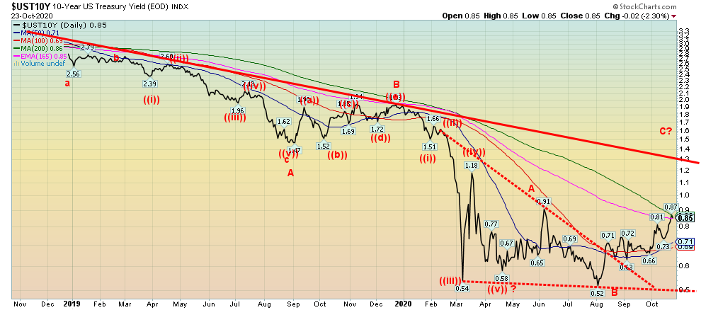
We couldn’t help but notice that interest rates could be poised to move higher. This past week the U.S. 10-year treasury note rose to 0.85%, the highest level seen since June 2020. An interesting triangle formed at the recent bottom. We could be in the throes of a C wave higher. We say C wave because previous smaller waves were all unfolding largely in waves of three, suggesting a corrective wave. Currently the 10-year is at resistance of the 200-day MA. A firm breakout over the June high of 0.91% could target a move to, at minimum, the down trendline currently near 1.30%. An extension over 1.30% could target up to 1.55%. The 10-year is responding to somewhat better economic data, particularly after the weekly jobless claims came in at 787 thousand, better than the expected 860 thousand and down from the previous week of 842 thousand. That number is still high but the direction is positive. The October PMI came in at 53.3% which was marginally below expectations but suggesting that the economy is expanding. Earlier in the week, housing starts and building permits were also better than expected and above the September levels. Canada’s 10-year Government of Canada bond (CGB) was also higher this past week at 0.64%. Better than expected economic data is driving risk sentiment and a move to higher yields in expectation of continued better economic performance. Spreads are also widening between the 10-year and the 2-year. That usually happens as the economy improves. The question is—is this sustainable, particularly given the rising COVID-19 numbers and the risk of the economy being put back into the deep freeze once again?
Not yet ready for prime time. That was gold and silver this past week. Just as both gold and silver seemed to be breaking out of what appears to us as a descending wedge triangle, both were hit back, failing at the 50-day MA. Could instead this be a descending triangle rather than a descending wedge triangle? We can’t dismiss these thoughts until the upside breakout is resolved. The appearance is wedge because of lower highs and lower lows as the triangle constricts as we move lower. A descending triangle is usually seen as lower highs and relatively flat lows.
This past week gold fell not even 0.1%, but silver gained 1.1%. Platinum, which has struggled, had a good week gaining 4.3% and palladium was up 2.4%. Copper made new 52-week highs, up almost 2.0%. Oil fell 3.1% but natural gas (NG) also made fresh 52-week highs, up 15.2%. Strong NG prices drove the energy indices higher as the ARCA Oil & Gas Index (XOI) gained 0.8% and the TSX Energy Index (TEN) was up 2.4%. NG stocks did well. But the gold stocks did not fare as well as the Gold Bugs Index (HUI) fell 2.9% and the TSX Gold Index (TGD) was down 3.3%. Are the gold stocks pointing to lower prices for gold and silver? That’s to be resolved.
If gold is continuing in a descending wedge triangle, then we should find support at $1,885 and down to $1,825. Silver looks a little more vulnerable to a decline breaking under $24 and could fall to $21. But it is will be important that those low levels hold. A breakdown under $1,825 points to a decline to around $1,600 and for silver, even scarier, down to $13. We doubt that, given the strong fundamentals. But we need to warn in case the worst case happens. To the upside, a breakout over $1,930 is needed for gold with a confirmation on a close over $1,950. For silver, the breakout needs to come over $25 and confirmed over $26.
The commercial COT for gold and silver isn’t helping as the gold commercial COT this week was steady at 22%. However, short open interest rose roughly 10,000 contracts while long open interest was up less than 1,000 contracts. The silver commercial COT slipped to 31% from 32% as short open interest rose roughly 2,000 contracts while long open interest fell about 700 contracts. Both commercial COTs remain somewhat bearish.
The US$ Index has been falling but it has failed to break down to new lows. The lack of a stimulus package is also hurting gold. Election uncertainty should be positive for gold and silver. We are in the vicinity of a potential trough for gold’s 31.3-month cycle. It would be the second one counting from the major December 2015 cycle low. The first 31.3 monthly cycle low came in August 2018. The next one is due in April 2021 +/- 5 months or the period November 2020 to September 2021. We are approaching the early part of that potential cycle low. Once that low is established, we should embark on the third and final wave up before the market falls into more significant longer-term cycles of 7.8 years and 23 years.
From our perspective, if the bullish scenario is correct, it will be important that any further pullback here holds the lows we mentioned at $1,825 for gold and $21 for silver.
__
(Featured image by Buffik via Pixabay)
DISCLAIMER: This article was written by a third party contributor and does not reflect the opinion of Born2Invest, its management, staff or its associates. Please review our disclaimer for more information.
This article may include forward-looking statements. These forward-looking statements generally are identified by the words “believe,” “project,” “estimate,” “become,” “plan,” “will,” and similar expressions. These forward-looking statements involve known and unknown risks as well as uncertainties, including those discussed in the following cautionary statements and elsewhere in this article and on this site. Although the Company may believe that its expectations are based on reasonable assumptions, the actual results that the Company may achieve may differ materially from any forward-looking statements, which reflect the opinions of the management of the Company only as of the date hereof. Additionally, please make sure to read these important disclosures.


Youth Cannabis Use in Colorado Is Falling — But the Full Story Is More Complex
The 2026 Colorado survey shows teen cannabis use fell to 10 percent in 2025, down from 21 percent in 2015....


Morocco’s Growth Holds at 4.6% as Agriculture Offsets Economic Pressures
Morocco’s economy grew 4.6% in Q1 2026, driven by a strong agricultural rebound offsetting declines in industry. Services expanded moderately...


Abivax Shares Surge as New Trial Data Eases Safety Concerns Over Ulcerative Colitis Drug
Abivax shares surged nearly 36% after positive updated trial results for its ulcerative colitis drug obefazimod reassured investors following earlier...


El Dorado Raises $9M to Expand Cross-Border Fintech Platform
El Dorado, a Latin American fintech improving cross-border financial services, raised a $9 million Series A led by Paradigm with...


Bitcoin Stalls Near $60K as Strategy Moves, ETFs Outflow, and EU MiCA Rules Take Effect
Bitcoin hovers near $60,000 with ETF outflows, while Strategy boosts reserves, sells BTC, and raises dividends to reassure investors. Ethereum...
 |
|
 |  |
 |
|
-

 Crowdfunding2 weeks ago
Wyrmgold Launches Crowdfunding Campaign for Believe in me! (please)
-
 Business2 days ago
Dow Jones Near Highs Signals Strength Until Volatility Returns
-

 Crypto1 week ago
XRP Under Pressure Amid Macro Forces, Fed Policy, and Regulatory Shifts
-
 Cannabis6 hours ago
Youth Cannabis Use in Colorado Is Falling — But the Full Story Is More Complex