Featured
Warren Buffett’s partner called him a “jerk”
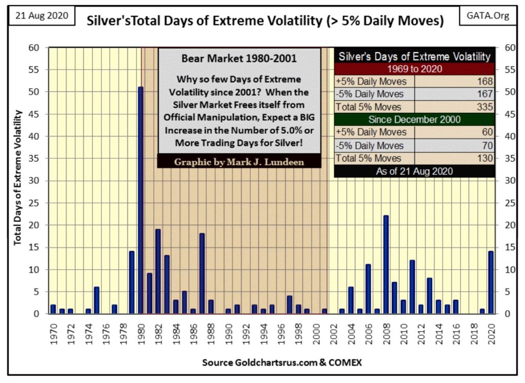
Gold’s daily volatility’s 200 day M/A is up to 0.85%, which is good. In 2020 gold so far has seen seven days of extreme volatility, or 3% days. Silver has seen fourteen extreme days (5% days) so far in 2020, with the latest, a +5.26% move just last Monday. Precious metals bull markets are volatile markets, so be happy for all the days of extreme market volatility that come gold and silver’s way.

Charlie Munger called Warren Buffett a “jerk”; really? Well, Mr. Buffett recently did take a big position in Barrick Gold.

“In the past, Buffett, the billionaire chairman of Berkshire, cautioned against investing in the metal because it’s not productive like a farm or a company. Now, gold miners are benefiting from surging bullion prices that are boosting profit margins as costs of production have steadied, making them increasingly attractive investments. * Large miners including Barrick and Newmont Corp. have been hoping to woo back generalists who fled the sector years ago.”
So what? Look at what Charlie said just ten years ago at the University of Michigan below:
“I don’t have the slightest interest in gold. I like understanding what works and what doesn’t in human systems. To me that’s not optional; that’s a moral obligation. If you’re capable of understanding the world, you have a moral obligation to become rational. And I don’t see how you become rational hoarding gold. Even if it works, you’re a jerk.”
Charlie Munger, Warren Buffet’s business partner at the University of Michigan Late Sept 2010.
Hey; what do I know? Maybe in 2020 Charlie Munger has also decided to become a “jerk.”
Hey, cut the guys some slack because at some point everyone becomes a dumb-jerk if they can’t make the connection between what the FOMC is doing with manipulating bond yields lower and market valuations higher with the advances in gold and silver.
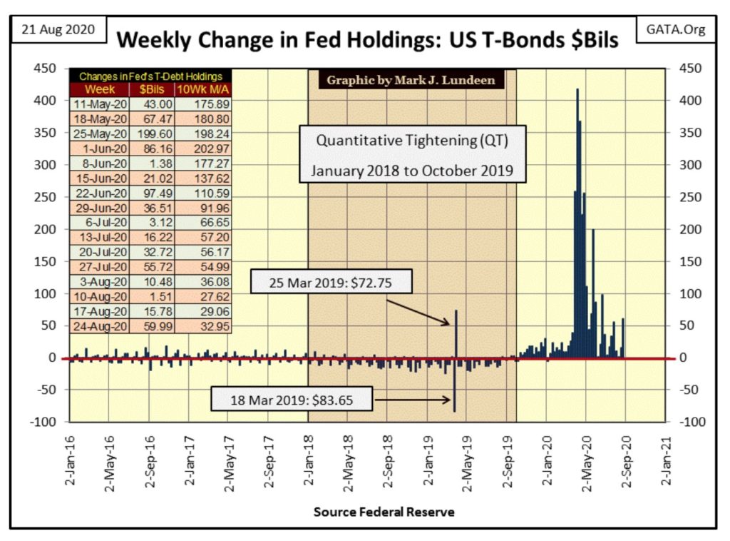
This past week(chart below) the FOMC “injected” another $59.99 billion of “liquidity” into the financial system, which is like nothing compared to the triple-digit “injections” of “liquidity” the FOMC was doing last March / April.
So, maybe Warren and Charlie have become “jerks”; but they were never dumb as they really do understand how the world works. They must know last April’s record weekly “injection” of $417.57bil by the FOMC isn’t going to be an all-time high that will stand for many years to come. Before that record high is taken out, at Mr Bear’s next market mauling, Warren and Charlie obviously want to have their position in precious-metal mining.
The current depressed share prices for precious-metals miners makes them the perfect investment for people who want to get into an investment before everyone else. It was making investments in undervalued assets, such as the gold and silver miners in today’s marketplace that made Buffett and Munger investment legends.
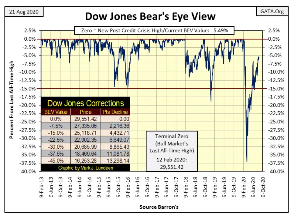
More on gold and silver later, but first let’s look at the Dow Jones BEV chart below. This will be quick; the Dow Jones closed the week one dollar below last Fridays close, moving the Dow’s BEV value from -5.48% down to -5.49% in the BEV chart below.
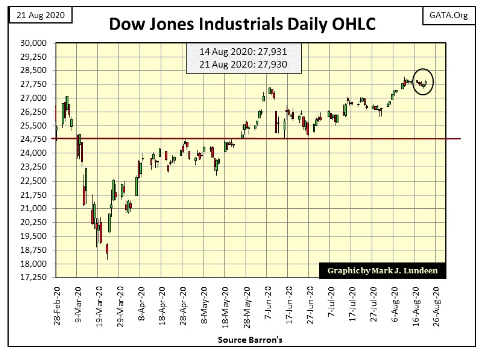
The Dow Jones in daily bar shows how the stock market has lost its extreme volatility of six months ago, which should be a big positive for the stock market, but so far hasn’t been. This is just how things go in the markets; today we’re being bored stiff by lack of action, tomorrow we’ll have more action than we can handle.
Let’s look at the Major Markets’ BEV values for the past week below. Unlike the Dow Jones, some NASDAQ and Russell indexes did make market history last week, as did the S&P-500 on Tuesday and Friday. But the Dow Jones (#10) can’t get into scoring position; that is advance to where its BEV valuation is less than 5% from its last all-time high.
I note that every day this week the XAU (#19 / gold miners) closed above the NASDAQ Banking index (#20).
It was two years ago (08 June 2018) when the NASDAQ Banking Index saw its last all-time high (0.00%). At that time the XAU’s BEV was -63.78%. A gap of -63.78% between this two indexes is huge. Two years later seeing the XAU on its way up, overtake the NASDAQ Banks index on its way down, seems to be telling us something.
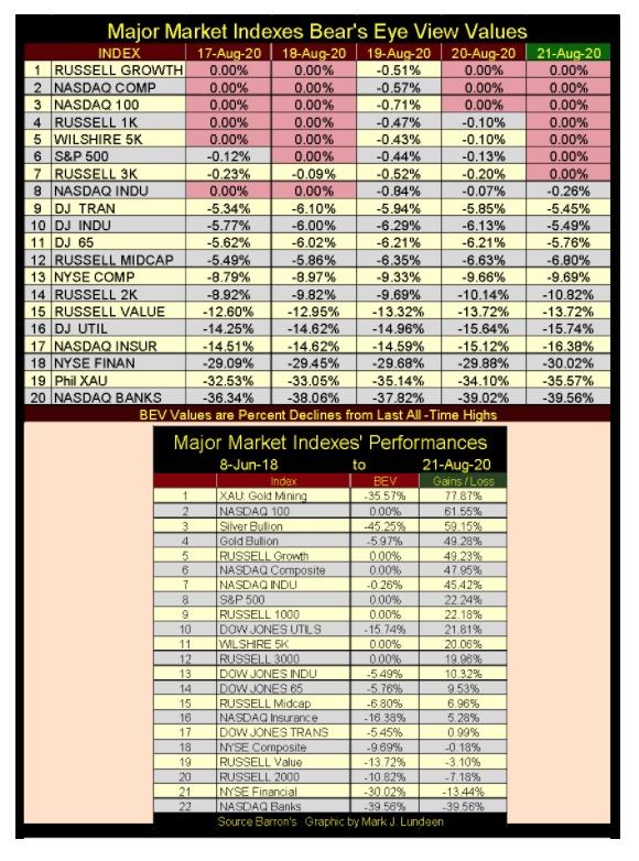
I looked at the performances of these indexes from 08 June 2018 to the close of this week in the table above. Precious metals assets have been top performers in the markets since the summer of 2018. The XAU was #1 in the table with a two year gain of 77.87%. Silver and gold bullion came in at #3&4 with silver up 59.15% and gold up 49.28%. The Dow Jones comes in at #13, with a two year gain of only 10.32%.
The NASDAQ Banking index was dead last in the table losing a whopping 39.56% loss since its last all-time high of two years ago. Buffett is known for his holding of banking stocks such as Wells Fargo and Goldman Sachs. Maybe he got tired of holding these losers, and for a change wanted exposure to something going up.
Below is a chart plotting every daily close for the XAU since it began trading in 1983. Since 1983, this chart has actually been a history of frustration for investors; from its first day of trading the XAU has gained only 38% at the close of this week. XAU’s bottoms have always offered profitable trading opportunities, which unfortunately have always been followed by market collapses of 60% or more.
For a gifted individual who has had success trading put and call options, the XAU has been the gift that keeps on giving. But for professional money managers and retail investors, the gold miners have been a tale of woe for decades.
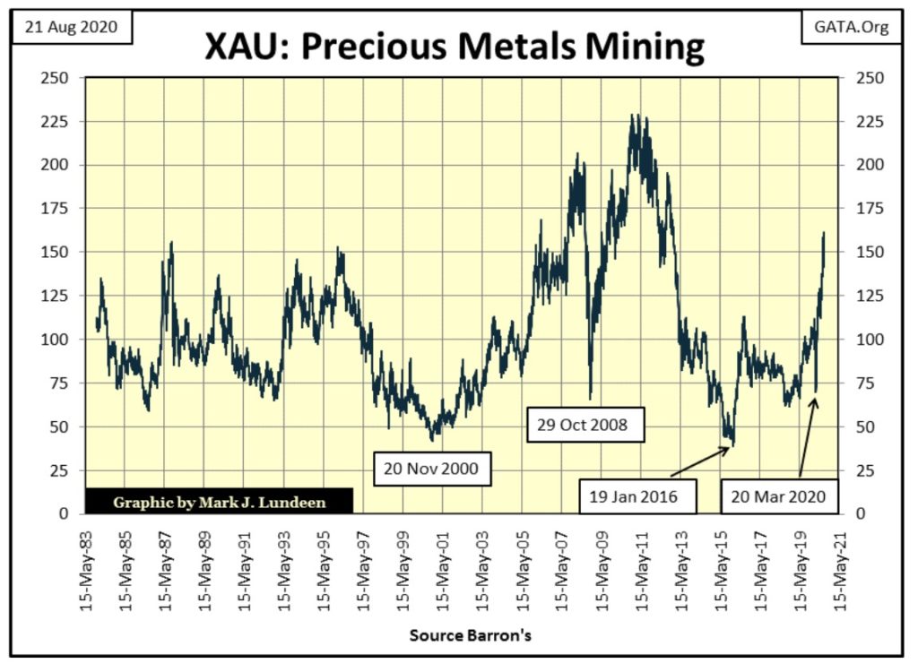
So, for investors looking for an investment that they can buy and hold for a decade or more, gold mining since 1983 hasn’t filled these investors’ order. But some investments in the stock market have been excellent long-term investments.
My major market index data begins on 27 December 1996, so using that date as a basis for the gains of these indexes for the past quarter of a century, we see their performances in the table below.
The XAU is dead last in the list, advancing only 25% since December 1996. Silver and gold bullion themselves (#9 & 10) have provided good returns for investors, even outperforming the Dow Jones who came in #18 in the list.
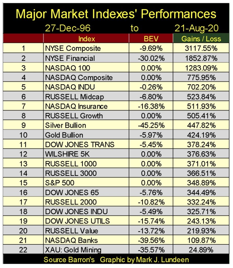
However, for the gold-mining industry I believe what we see above will soon be recognized as “the bad old days”, being last in a long list of investments.
The primary driver for this pending change in the markets will be the undeniable fact that the Federal Reserve’s “monetary policy” is no longer controlling the markets, but the markets are now controlling the Federal Reserve’s “monetary policy.” The consequences of this will prove disastrous for the dollar and the debt markets. And as we saw last March, where the bond market goes, the stock market soon follows.
This pending epiphany in the market will motivate many people to flee market sectors that have proven profitable for decades, and seek safety in gold, silver and the precious-metals mining shares. Warren Buffett may be one of the first to have transferred investment funds into a gold miner, but he won’t be the last.
Here’s gold’s BEV chart. From July 24th to August 6th, gold has made nine new all-time highs. But since August 6th, gold’s advance has been correcting. So far this correction’s deepest decline has been 8.37% seen on August 11th, and gold closed the week -5.97% from its last all-time high.
Two weeks into this correction; I’d had thought gold would have corrected by a double-digit percentage, which so far it hasn’t. Will it decline by 10% or more before this correction is over? It could, but maybe not. If not, it would demonstrate strong demand for gold in the market, promising an exciting advance into record territory when the bull market resumes.
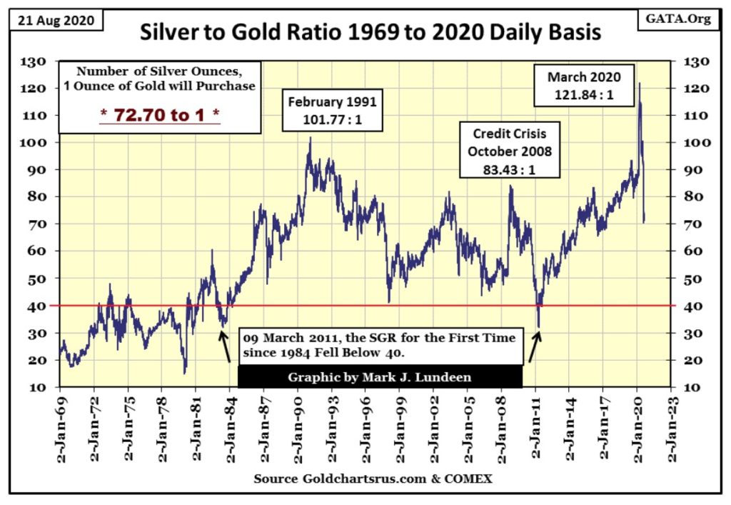
The Silver to Gold Ratio (SGR) closed the week at 72.70 ounces of silver to one ounce of gold. What a difference from last March when an ounce of gold could be exchanged for 121.84 ounces of silver.
I look at this chart and see firm evidence that the bad times since the old monetary metals highs of 2011, when the SGR declined down to 32 ounces of silver to one ounce of gold are now over.
Even with the SGR at 73, silver remains one of the most undervalued, and compelling investments around. But what were people thinking when they favored gold to silver at a ratio of 121 last March? That’s 7.5 pounds of silver for one ounce of gold! I believe this will be a record that will stand for centuries to come.
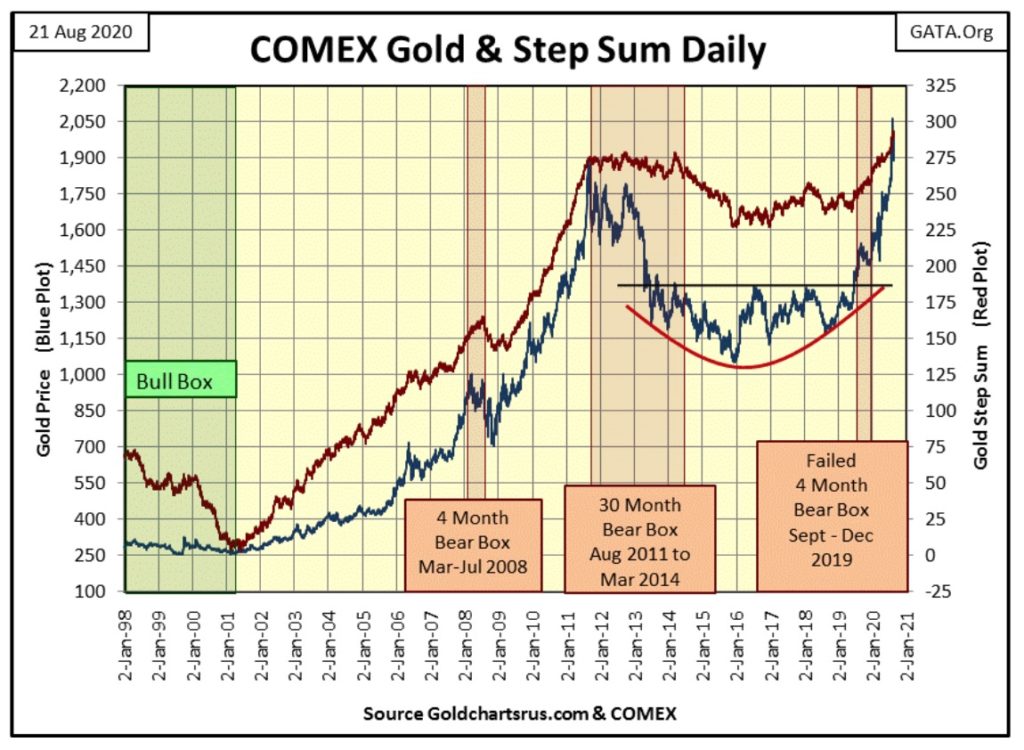
Gold and its step sum below have changed little since early August, but I have great expectations for them in the coming year. As I’ve said before; the current advance is supported by a very sturdy base that can, and will support much higher prices in the years to come.
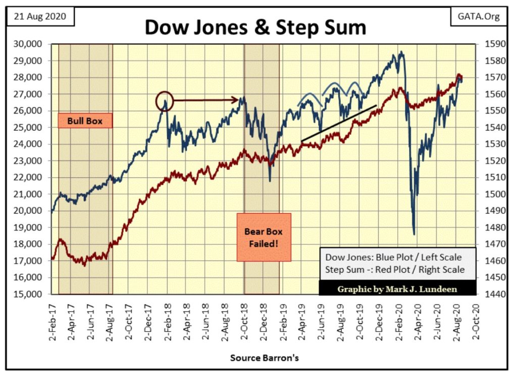
As for the Dow Jones and its step sum chart below, I don’t have much to say about it as not much has changed in it for weeks. Give it time, and we’ll either see it go on to new all-time highs, or decisively break below its lows of last March. As this is a race I don’t have a horse in, I really don’t care which will come, other than enjoying the action as a spectator.
Gold in its step sum table below was extremely overbought on August 6th when its 15 count increased to a +13. The gold market had never seen a 15 count of +13 since 1970 until August 6th 2020, just this one time in the past fifty years. So it’s not a bad thing for the gold market to now see a pause in its advance to work out this extreme in the market.

Gold’s daily volatility’s 200 day M/A is up to 0.85%, which is good. In 2020 gold so far has seen seven days of extreme volatility, or 3% days. Silver has seen fourteen extreme days (5% days) so far in 2020, with the latest, a +5.26% move just last Monday.
Precious metals bull markets are volatile markets, so be happy for all the days of extreme market volatility that come gold and silver’s way, whether they be positive or negative moves.
Democrats have controlled most state capitals and city halls for decades. That means they have issued trillions-of-dollars into the muni-bond market. So, with everyone capable (wealthy enough) of fleeing major population centers on America’s West and East Coasts, and let’s not forget Illinois in between, into the Mountain States and the Southern Bible Belt; how is the muni-bond market doing? Not so good as these municipalities are losing their tax base as these people flee from them.

“Junkies and the homeless, many of whom are clearly mentally ill, walk the palm-lined streets like zombies – all just three blocks from multi-million-dollar homes overlooking the Pacific.”
Let’s first look at muni-bond and Barron’s Best Grade Bond Yields going back to 1937 below.
We see the three decade long bond-bear market from the early 1950s to October 1981. What is so amazing about these three decades were the rising bond yields, and interest rates didn’t result in waves of defaults in the debt markets.
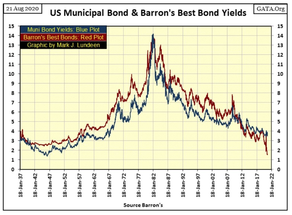
Actually, corporate management at the time understood this era’s rising Consumer Price Inflation (CPI) was always a few percent above bond yields. This created a situation where business borrowed in dollars that lost value over time, allowing these companies to repay their creditors back in dollars that were worth only $0.50 or $0.60 of what they borrowed on a 20 year bond. This was excellent for corporate America, but not so good for fiduciaries managing other people’s money in a pension fund.
Paul Volcker’s “monetary policy” of raising the Fed Funds Rate far above Treasury Long Bond Yields and Consumer Price Inflation (see chart below) from 1978 to 1982 crushed inflationary expectations in the financial markets.
That didn’t mean the Federal Reserve was going to cease “injecting liquidity” into the economy. Heck no! “Injecting liquidity” into the financial system is what the Federal Reserve does! But following the 1981 peak in bond yields, “liquidity” stopped flowing into consumer prices and began flowing into financial asset valuations. When “liquidity” flows into consumer prices it’s called “inflation.” When it flows into the stock, bond and real estate markets it’s called “bull markets.”
What made this five year inversion of the yield curve (Blue Plot: Fed Funds Rate higher than T-bond yields in chart below) so amazing was it didn’t result in waves of defaults in the bond market, as Paul Volcker instigated the greatest economic downturn since the Great Depression.
But keep in mind corporate management, and society in general during the post WWII decades were survivors of the Great Depression. People had personal recollections of the disastrous consequences of the easy credit, boom-time decade of the Roaring 1920s. So, people valued thrift and a strong balance sheet as a result. Societal consensus of the post WWII era was it was morally superior to be a creditor than a debtor; to receive than to pay interest to others.
For a generation that has assumed massive debts, such as ours, any amazement of corporate survival as bond yields increased from 2% in 1951 to 14% thirty years later, and Volcker’s five year inversion of the yield curve is ours, and ours alone.
Should the US yield curve return to where it was in January 2007 (Red Plot below), it would devastate the banking system and much of corporate America, as well as the Federal Government. With the debt loading on society and in the economy such as it is today, having to service the 5% yield of 2007 would be ruinous to many.
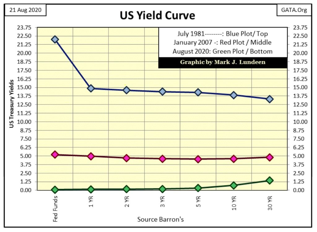
If the survivors of the Great Depression were to be amazed at anything seen above, it would be the yield curve of August 2020 (Green Plot) seen above. How could the US Treasury borrow money for thirty years at less than 1.5% when it carries $26.5 trillion dollars in debt?
But we’re not amazed. This is made possible by the FOMC “stabilizing” the economy and market valuations; what could be more normal? Maybe that the “authorities” will require us to wear surgical masks for the rest of our lives?

KEY POINTS:
- World leaders and the public must learn to manage the virus and make permanent adjustments to their daily lives to bring the virus down to low levels, the WHO said.
- Throughout history, outbreaks and pandemics have changed economies and societies, the agency said.
https://www.cnbc.com/2020/08/21/who-warns-a-coronavirus-vaccine-alone-will-not-end-pandemic.html
Thank you “world leaders” for our “new normal.” And then there is the new normal in the muni-bond market, where for the past ten years TAX-FREE muni yields (Blue Plot below) have offered higher current yields to bond buyers than best grade, and TAXABLE corporate bond yields (Red Plot).
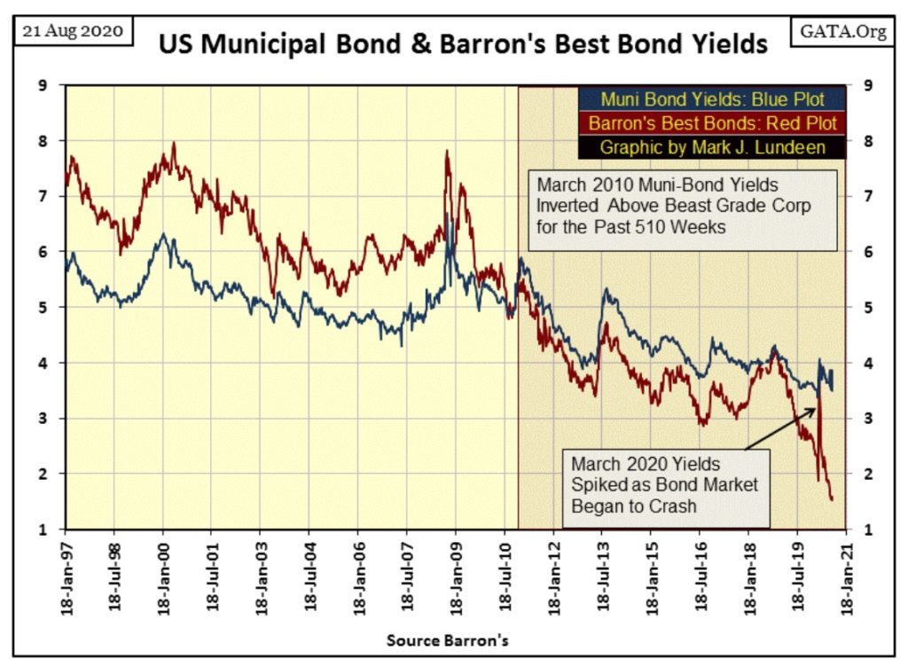
I’ve plotted the yield spread of these two bond series below. The Red Star marks March 2020, when corporate bond yields spiked upward, almost matched yields on muni-bonds (see chart above). This yield spike occurred at the same time the Dow Jones declined 38% from an all-time high in only twenty-five NYSE trading sessions. That was the fastest market decline in Dow Jones history, and it occurred during a selling panic in the corporate bond market.
As corporate bond yields spiked upward last March, the Federal Reserve announced it was beginning a program to “support market valuations” in the corporate bond market by purchasing bonds in the open market. Since then corporate bond yields for best-grade bonds have collapsed to levels not seen since 1937.
With this collapse in corporate bond yields, it’s safe assuming the FOMC has been active in the corporate bond market. But a thought continues buzzing around in my head, that the Federal Reserve isn’t accepting coupon payments on the corporate bonds they’ve purchase. I don’t know if this is true, but if the FOMC really wanted to support a distressed corporate entity, refusing coupon payments from it would be an effective thing to do.
It’s not that the Federal Reserve needs corporate coupon payments as a source of dollars to finance its needs, not when they can just create them out of nothing, as Art Rolnick admits below:
“We make money the old fashioned way. We print it.”
Art Rolnick, Chief Economist for the Minneapolis Federal Reserve Bank
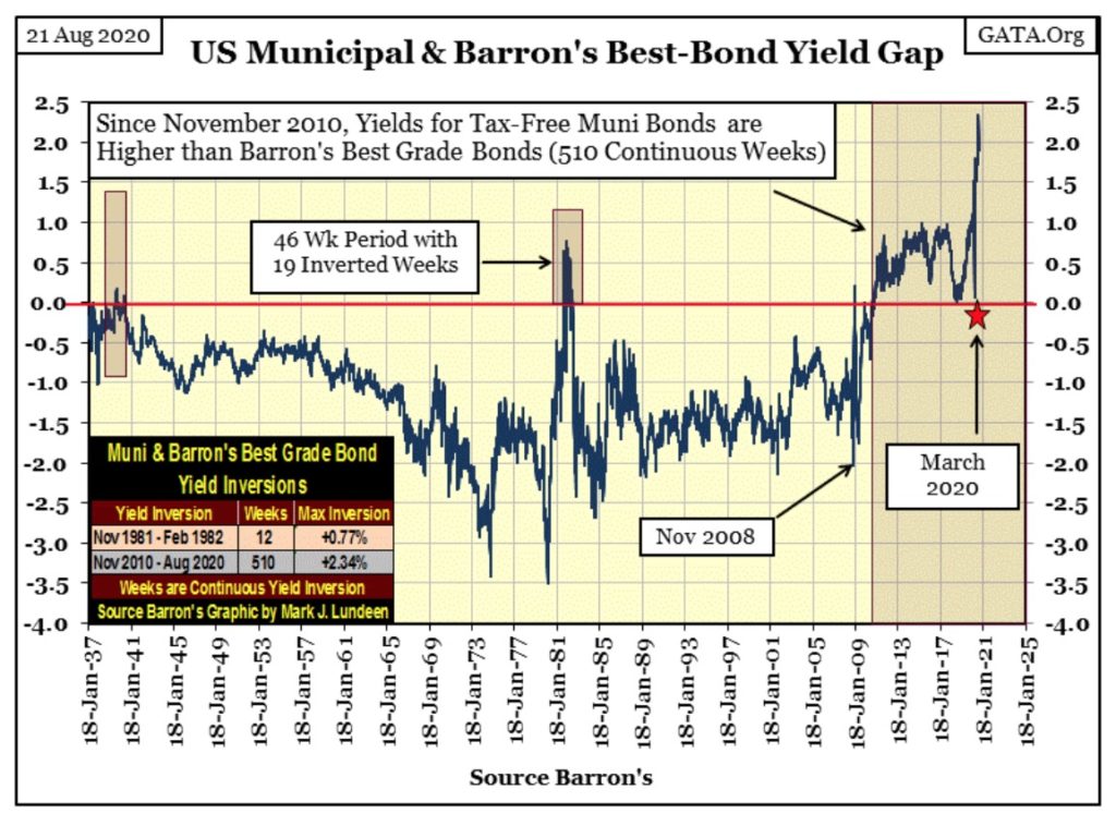
Looking at the credit spread between Barron’s Best Grade Corporate Bonds and Muni-Bonds plotted above, it’s obvious that since 1937, until November 2010, Best Grade Corporate bonds offered bond buyers higher yields than did muni-bonds.
One reason for this is income from mini-bonds is not taxed by the IRS, or by the taxing authorities of the state of issue. So, if you’re living in Iowa and are holding muni-bonds issued by New York City, Iowa’s taxing authorities are going to tax that income, while New York’s would not.
Another reason corporate bonds have higher yields than do muni-bonds is that corporations have a higher risk profile than do municipal governments such as cities and states. Bond buyers demanded a higher yield when investing in corporate bonds because corporations had a greater risk of defaulting on their debts than did local government. That was certainly true during the Great Depression.
So why in November 2010 did bond buyers begin demanding higher yields from tax free muni-bonds, than from taxable corporate bonds, and have continued to do so for the past ten years? I expect it all comes down to the increasing risks muni-bonds began to carry in the minds of bond buyers.
The Democratic party of today is a far cry from what it was decades ago. It’s accurate labeling today’s Democratic politicians as neo-Marxists. And holding on to IOUs from Marxists debtors is always a high risk / low reward investment, and that is what we’re seeing in the spread plot above since November 2010.
And just as wealthy people fled Cuba when Castro took over in the late 1950s, they are now fleeing areas of Democratic control in the United States as Black Lives Matter and Antifa activists “peacefully” protest “fascism” in Seattle, Portland, Chicago and New York as Democratic politicians do nothing to protect people and their property, but make promises to defund their police departments.
I’m not surprised muni-bond buyers demanded a 2.34% premium over best grade corporate bonds earlier this month. And I expect in the not so distance future, many of these Democratic controlled municipal governments will default on their bonds as they’ve destroyed the tax base needed to service them for absolutely no good reason.
Defaults in the muni-bond market most likely will send shock waves throughout the debt markets as counter-party risks become reassessed, including in the Treasury bond market. In other words: expect spikes in bond yields like we saw last March, only worse.
The prospects for gold, silver and companies that mine precious metals have never been better. That sounds a bit mercenary, but it’s the truth.
—
(Featured image by Adeolu Eletu via Unsplash)
DISCLAIMER: This article was written by a third party contributor and does not reflect the opinion of Born2Invest, its management, staff or its associates. Please review our disclaimer for more information.
This article may include forward-looking statements. These forward-looking statements generally are identified by the words “believe,” “project,” “estimate,” “become,” “plan,” “will,” and similar expressions. These forward-looking statements involve known and unknown risks as well as uncertainties, including those discussed in the following cautionary statements and elsewhere in this article and on this site. Although the Company may believe that its expectations are based on reasonable assumptions, the actual results that the Company may achieve may differ materially from any forward-looking statements, which reflect the opinions of the management of the Company only as of the date hereof. Additionally, please make sure to read these important disclosures.

-

 Crypto2 weeks ago
Crypto Markets React as Trump Signals Iran War End
-

 Business4 days ago
The TopRanked.io Weekly Digest: What’s Hot in Affiliate Marketing [NiftyPM Affiliate Program Review]
-

 Biotech2 weeks ago
Novo Nordisk: Stable Growth and Defensive Biotech Stock for DACH Investors in 2026
-

 Impact Investing6 days ago
Antarctica Warming Reshapes Global Atmospheric Circulation


