Featured
Why Bond Yields Continue Rising
Markets don’t like being oversold. So, I expect we may see a bounce in the Dow Jones in the coming weeks. But, should we actually see a bounce in the Dow Jones, it wouldn’t change my long-term bearish outlook on the stock market.

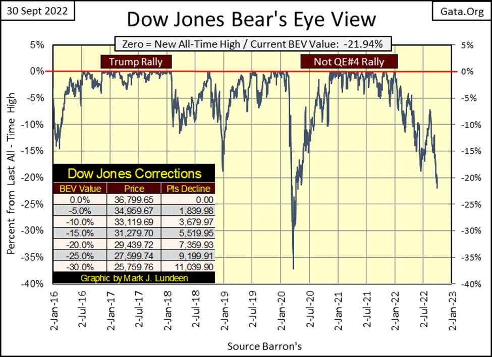
The Dow Jones continues gaining momentum to the downside, this week closing below its BEV -20% line. This isn’t going to change anytime soon, not for as long as the idiot savants at the FOMC continue denying the financial markets what they want and desperately need in a market decline; huge “injections of liquidity.”
Let’s remind ourselves of exactly why after the big -38% decline seen above during the March 2020 flash crash, the Dow Jones resumed a bull market that began four decades ago in August 1982. Because the FOMC “injected” over a trillion dollars of “liquidity” into the financial system, in only four weeks, as seen in the chart below. They then continued “injecting” massive doses of “liquidity” weekly into the market for the next two years.
Why the Dow Jones is now struggling can also be seen in this chart; the idiots at the FOMC stopped “injecting liquidity” into the financial system. Actually, as seen in the table on the chart, the idiots have been draining “liquidity” from the financial system. Far from the $40 billion a month they promised last winter, but enough to trigger a cycle of deflation in the financial markets.
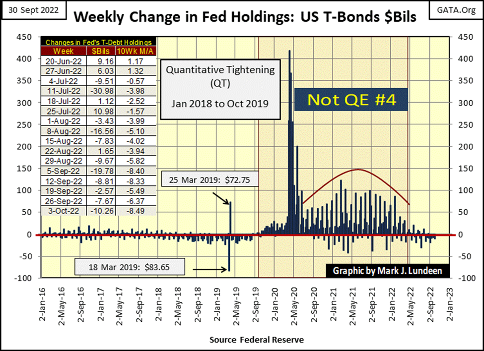
Based on past experience, I expect the FOMC will implement a new phase of QE, let’s call it the Not QE#5, which will be even bigger than the above Not QE#4, sometime in the future, as the Dow Jones approaches or breaks below its BEV -40% line.
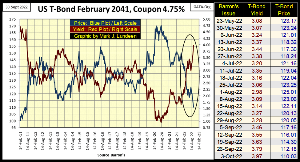
Why would they do that? Because this new phase of deflation is also deflating market valuations in the T-bond market, as seen in the chart below. Not since Barron’s 01 August 2022 issue have yields in the T-bond market gone down. At this week’s close, T-bond yields have closed higher, prices lower than the week before, nine weeks in a row.
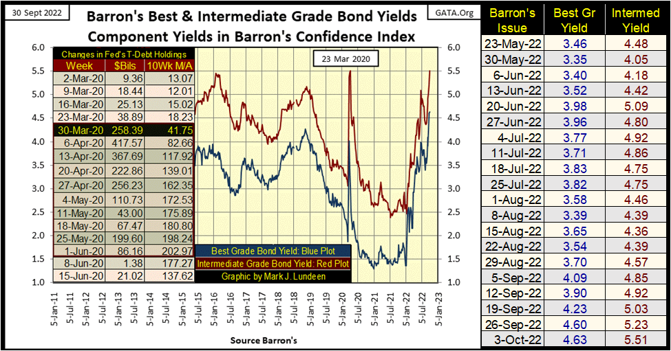
Things aren’t any better in the corporate bond market, as seen below in Barron’s Best & Intermediate Grade Bond Yields.
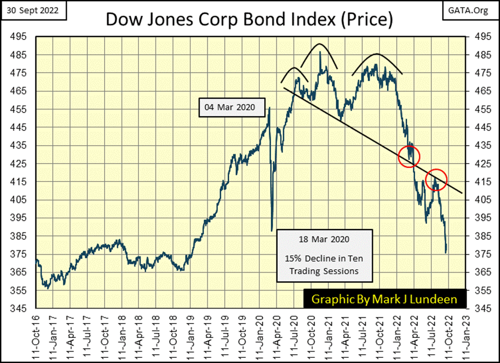
Remember, rising yields = deflating valuations somewhere in the fixed income market. To give my readers an insight into the losses taken in the corporate bond market, here’s a chart plotting the valuation for the Dow Jones Corp Bond Index; down 22% from its 2020 highs.
Today in September 2022, seeing something down by 22% seems rather normal. But, buying what was described as a safe investment grade bond, that yielded less than 1.5% two years ago, that now suffered a 22% loss in valuation at this week’s close, must be disheartening to its risk-avoiding owner. That wasn’t supposed to happen.
Unfortunately, we’ll see much more of the same as bond yields continue trending towards, and then above double-digit percentages. This is what happens when a bunch of idiots at the FOMC make the bond market their plaything when implementing their “monetary policy.”
Florida this week was hit by a massive hurricane. Insurance companies must now make good their policies by paying off many billions in claims. To do so, they will in the next month sell some of their reserves to fund these payments. A large portion of insurance companies’ reserves are in the bonds seen above. When these bond yields go into double-digits, I’d expect many insurance companies will be only one disaster away, as we saw in Florida this week, from going broke.
Foreign sovereign bonds aren’t doing any better, as seen in the German Government Bonds below.
A little while ago, German Government Bonds were yielding negative yields (Blue Plot below). I could never figure that out; how a bond that actually paid a cash coupon could see a negative yield. I set up a model for that on my Excel spreadsheet, and as long as there was a cash payout to the bond holder, the yield may become microscopic, but never negative.
But Europe has no more of a shortage of idiot savants employed in their financial industry than does the United States, so someone much smarter than I made that happen.
But in September 2022, negative bond yields are once again a moot point, as German Government bonds this week are yielding over 2%, as their valuations are down some 18%.
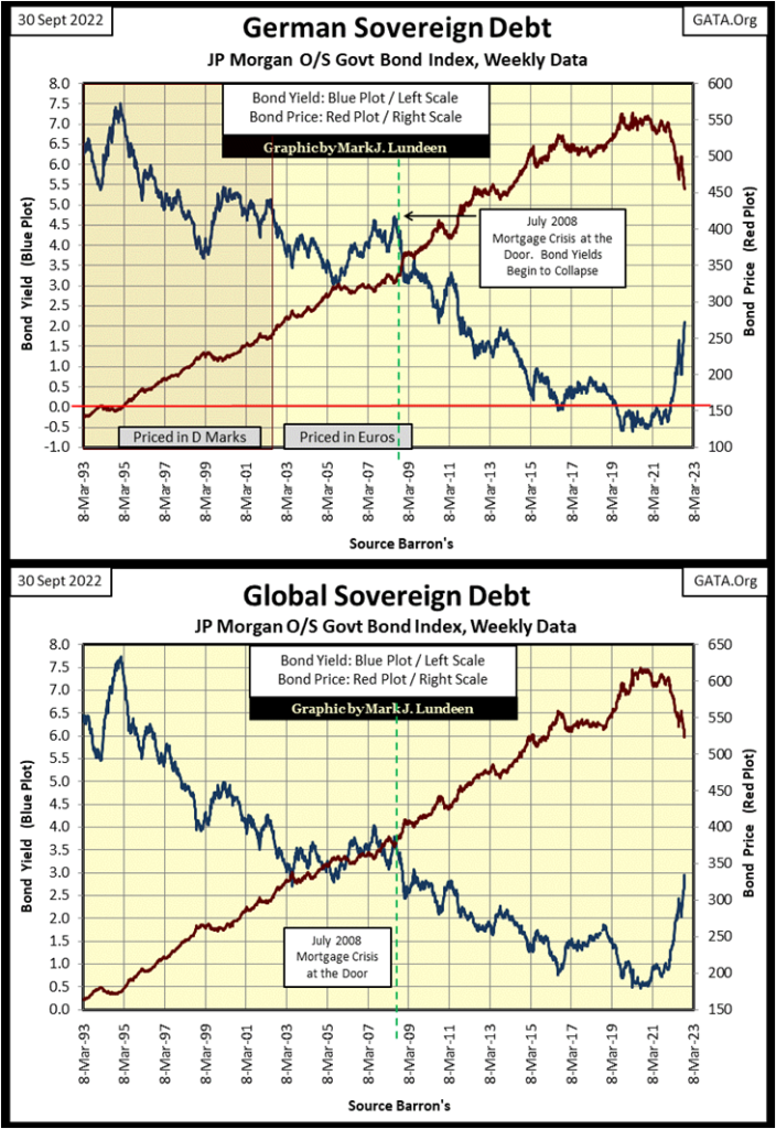
My point is made with the last bond chart above; the entire global bond market is in a bear market.
But the American stock market is our focus. So, let’s look at the BEV values for the major stock indexes I follow in the table below.
As far as the eye can see, or from line #1 to #20 in the table below, all the indexes have deflated by double-digit percentages from their last all-time high. Oddly, when considering what I said of insurance companies, and their reserves above, NASDAQ Insurance companies were this week’s top group. It will be interesting seeing how long that lasts.
Ignoring the XAU (#20), the week closed with five of these indexes down over 30% from their last all-time highs. How long before they deflate by 40%, and those now down by 20%, deflate by 30%?
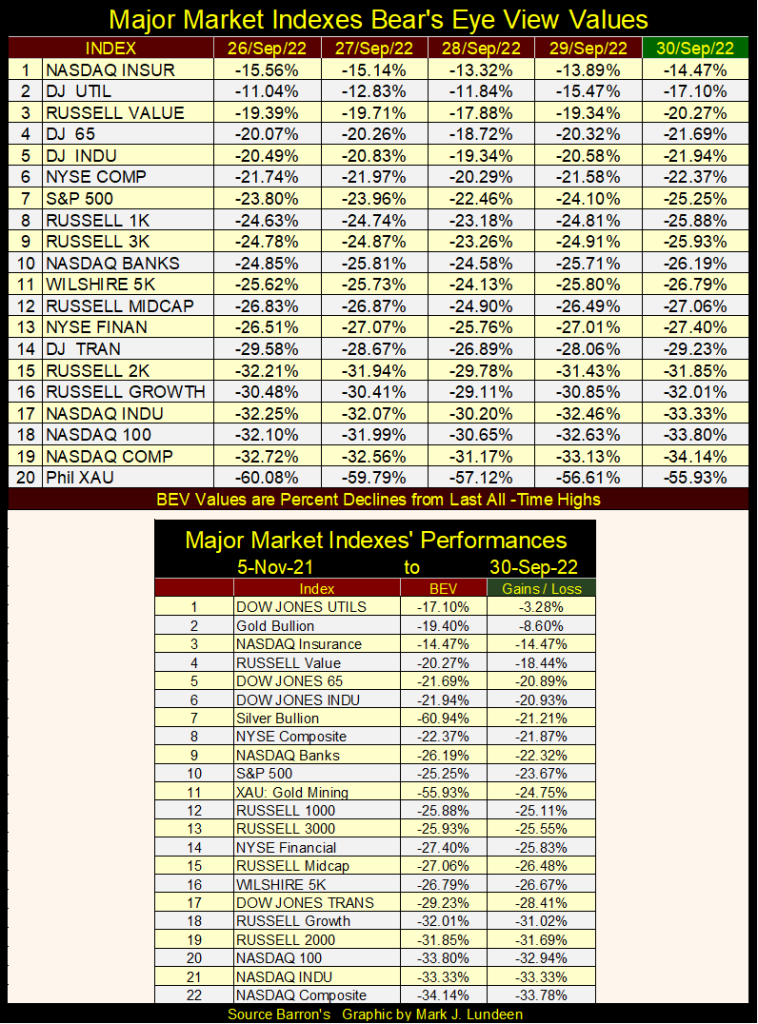
Silver bullion closed last week at #10, but closed this week at #7. Meaning, there were worse things to be exposed to in the table above than gold and silver bullion. In my opinion, the precious metals and their miners (XAU #11) are the only long-term holds in the table above. Everything else is a strong sell, though one may want to wait for a bounce in the market, that may, or may not come before selling.
The Dow Jones in its daily-bar chart below is looking very weak. In the first week of September (three weeks ago) the Dow Jones saw a nice bounce. But every week since, it has lost ground to Mr Bear, closing this week below 29,000.
We may see a bounce from this week’s close in the weeks to come, and then maybe not. I’m out of the market prediction business. Whether or not the stock market will be up or down next week or next month is a game I’m not suited for.
But there is one prediction I’m willing to make; that we are still in the early stages of a massive bear market that will be long remembered. Should future generations compare what is coming our way to the Great Depression Market Crash, I wouldn’t be surprised.
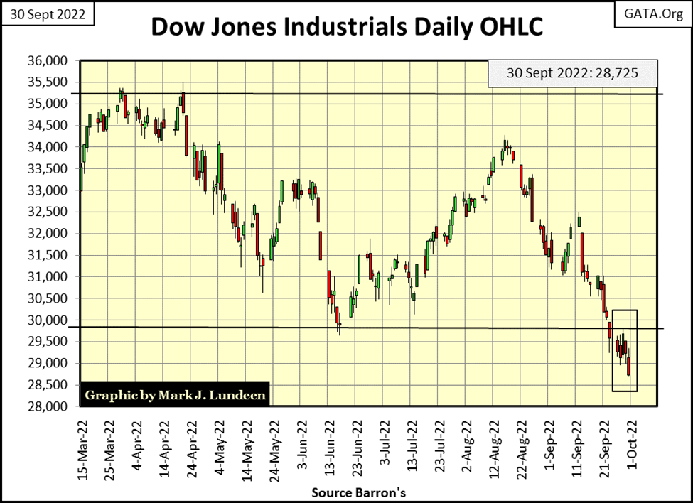
This week, the Dow Jones was also making new 52Wk lows, as I’m sure were most of the major stock indexes seen above. How long before the lows of March 2020 are taken out?
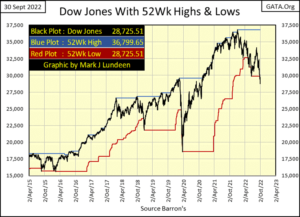
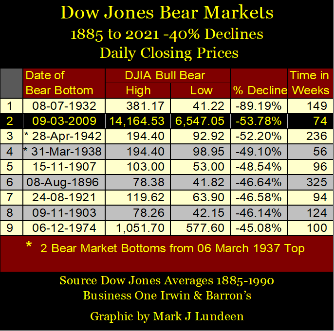
Should this happen, that would be a 49% decline from the Dow Jones last all-time high of 36,799, placing this decline at #5 for Dow Jones bear markets since 1885 in the table below. Of course, I’m inclined to believe Mr Bear has bigger things planned for our current decline, say like ultimately #1 or #2 in the table below.
Oh yeah, I’m a big bear on this market.
As promised last week, I want to cover the step sum boxes gold has seen since the 1960s, but I think it’s important to first cover why the price of gold changes at all, as once it didn’t. So, for decades gold didn’t trade as it does today. The price of gold was fixed at $35 an ounce, as per the 1945 Bretton Woods Monetary Accords. Still, it did trade in overseas markets, like the Paris gold market, where gold was allowed to find a free market valuation, a price above or below $35 an ounce.
Here’s a quote from Barron’s 29 January 1951 issue on gold trading over the Bretton Woods $35 gold peg.
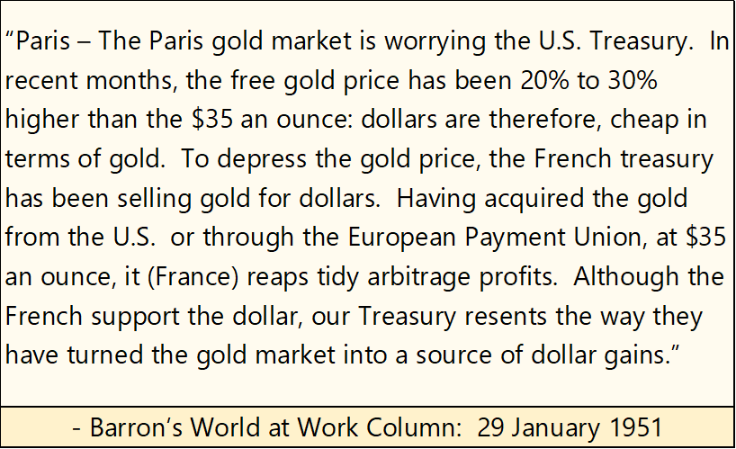
What’s this? Uncle Sam conspiring with France to manipulate the price of gold as far back as 1951?
What was the problem? The US Treasury and Federal Reserve weren’t playing by the rules; that they * NOT * issue more than $35 paper dollars for every 1oz of gold held in the US Treasury. Since the 1920s, anyone who purchased an issue of Barron’s could see, and compare CinC (paper dollars issued) and the gold held by the US Treasury.
The two quotes below are also from Barron’s. The “baloney dollar” mentioned refers to the dollar after FDR demonetized gold for US citizens, making ownership of gold bullion, or even holding gold coins minted by the US Treasury a criminal act by an American citizen, punishable by time in prison and hefty fines.
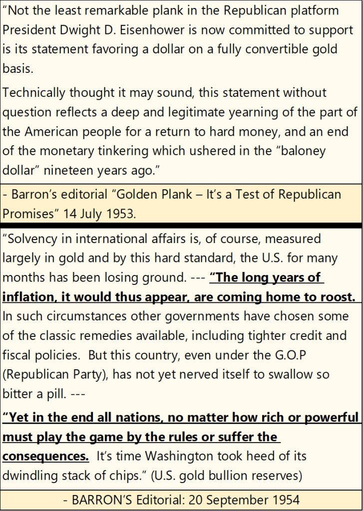
As reported by Barron’s in its 20 September 1954 issue, the United States Government has been inflating the US dollar. Though today, following the financial-mainstream media, one wouldn’t know that.
Eventually (1958), US paper dollar inflation became so bad, a run on the US gold reserves began (Red Box Below). Foreign central banks were sending paper dollars back to the US Treasury, demanding an ounce of US gold for every thirty-five paper dollars offered, as was their legal right to do. This run on the US gold reserves didn’t end until the US Treasury “closed the gold window”, in August 1971. And so began a bull market in gold, silver, precious metal miners and CPI inflation that didn’t peak until the early 1980s, nine years later.
US CinC (Blue Plot below) was $80 billion dollars in January 1975. In September 2022, it had expanded to $2.29 trillion, a 28.2-fold increase. For anyone, today to argue the case that the Federal Reserve is an “inflation fighter” is either greatly deceived, or a damned liar.
No one in the mainstream financial media covers the post-WWII monetary history of inflation by the US Government. It’s known, but unspoken. It’s a secret history I’m showing you with these charts and quotes.
The “policy makers” like it that way, as what is coming our way can then be blamed on Russia, global warming, those who refuse to be vaccinated against the Covid virus, or whatever strawman they think a gullible public will accept. Anything will do, as long as it’s not the truth; that since 1913 the “policy makers”, our dictators of “monetary policy” at the Federal Reserve did this to us, with never a shortage of eager elves to assist them in the Federal Government, the media, academia and Wall Street.
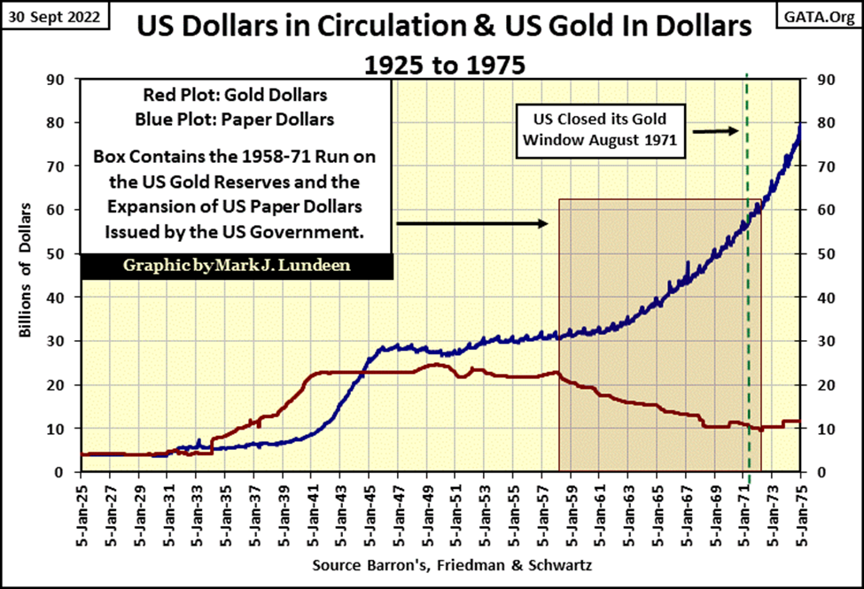
I should go over the above chart a bit. Note from 1925 to 1931, there were as many dollars of CinC as dollars in gold. That’s called the gold standard, where anyone, and not just central banks, could take their paper money to a bank and demand their paper money be exchanged into coins of precious metal. This convertibility between dollars paper and dollars gold guaranteed the US Treasury could not issue paper money in excess of the gold held in the Treasury’s reserves.
There is a little bump up in 1934 for dollars in gold (Red Plot). Before there were more paper dollars than dollars in gold. After, there were more dollars in gold than in paper, as FDR devalued the dollar in terms of gold from $20.67 to $35.00 an ounce of gold. A year earlier it became illegal for American citizens to own gold.
After 1934, the US Treasury was flooded with gold as foreign governments shipped their gold to the Federal Reserve’s New York Bank. Hitler and his National Socialist Party (NAZI) had taken over Germany, and these European governments wanted to keep their gold away from Hitler should he begin a war. As it turned out, this proved to be a good move on their part, against Hitler anyway. No so much with Uncle Sam, as seen below.
Europe’s displaced gold remained in the United States until 1958, when the US Government began inflating its CinC above what a $35 gold peg would allow. This run on the US gold reserves, was actually some of these governments getting their gold back while the getting was still good. After August 1971, the US Treasury just kept whatever gold it held in its vault, regardless of who the actual owners were.
Okay, we now know why the price of gold now trades, rising from $35 an ounce in the 1960s to its last all-time high $2,061 seen in August 2020, to $1,661 at the close of this week.
In gold’s step sum chart below, the price of gold (Blue Plot / market reality) is in the Bear’s Eye View (BEV) format, where each new all-time high is seen as a 0.00%, and any daily close not a new all-time high registers as a percentage claw-back from it last all-time high. In effect, a BEV plot compresses price data into a range of only 100 possible percentage points;
- 0.00%: new all-time high
- -100%: total wipeout of valuation.
Gold’s step sum plot (Red Plot / market expectation), is a sentiment indicator. When the market sees more advancing days than decliners, the step sum rises, as should the price of gold. When the market sees more declining days than advances, the step sum declines, as should the price of gold.
But there are times when market reality (the price of gold) and market expectations (the step sum) decouple from each other for a prolonged period of time, forming a step sum box, as seen in the chart below.
For the first two decades seen below, the price of gold and its step sum were coupled together, rising and falling together. But from 1988 to 1996, the price of gold declined as its step sum refused to follow it down, forming a bear-box in the chart below.
I understand why; the bulls in the gold market were looking at the ever-increasing volume of dollars-of-inflation coming from the FOMC. They just knew at some point; gold must respond to this inflation by rising upwards in a new bull market. Though the scale of monetary inflation was horrible following gold’s last all-time high in January 1980, the FOMC’s inflation was flowing into the stock and bond markets, not into gold and silver.
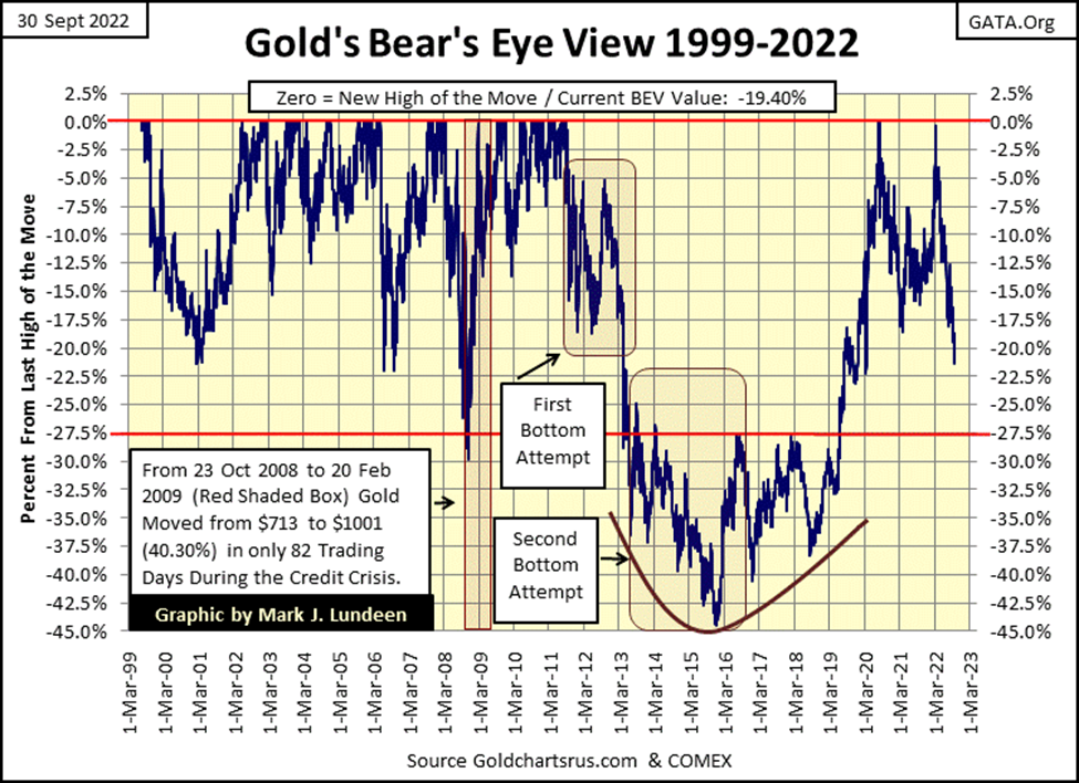
With the NASDAQ bull market in technology coming to full boil, the bulls in gold market finally gave up. Most likely many former gold bulls went over to the NASDAQ with what was left of their money. We know that as gold’s step sum finally began declining (more down than up days in the gold market). With the gold bulls finally exiting their bullish positions, the price of gold finally approached its ultimate low of the 1980 to 2001 bear market; $253.70 on 19 July 1999.
But note, a bull-box began forming. For the next three years, gold would never break below its low of July 19th, but market sentiment in the gold market remained so bleak, that gold’s step sum continued falling until 15 February 2001, when gold closed at $255.10, forming a double bottom in the gold market.
At this February 2001 second bottom, the three-year-long bull box closed, and both market reality (the price of gold) and market sentiment (gold’s step sum) recoupled, and advanced together until their August 2011 highs.
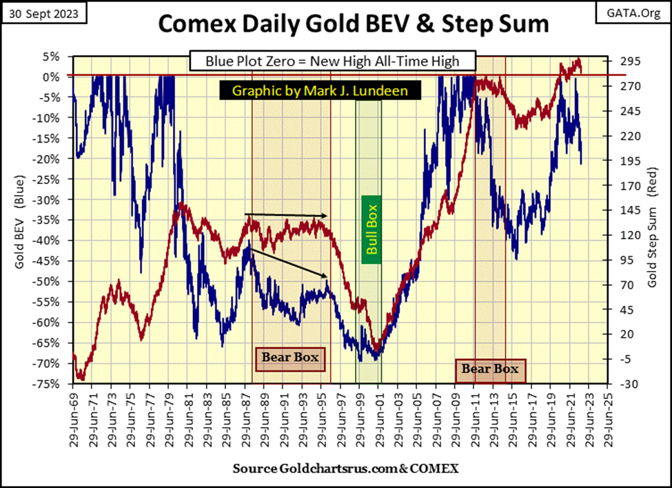
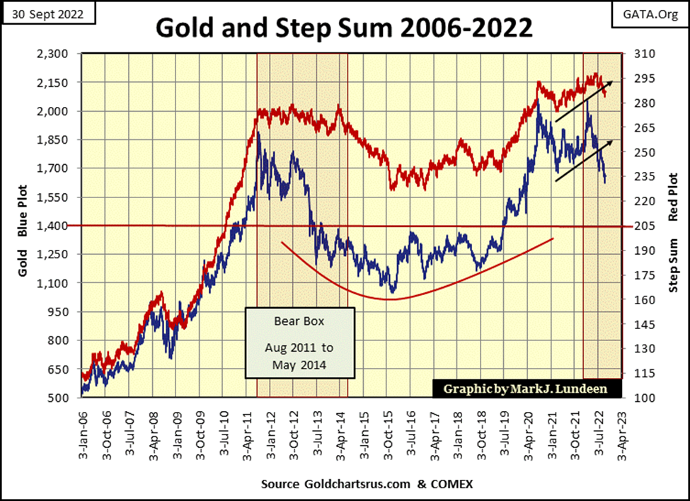
Next comes August 2011 to May 2013 bear box, which operated almost identically to the 1988 to 1996 bear box, just not as long. Once again, the bulls in this bear box refused to sell in a market decline, until the box closed, the point where the step sum began declining towards gold’s price plot.
As is typical in a bear box formation, as both the step sum, and price plots bottom, and turn up together, we are given a safe re-entry point back into the market.
Next is gold’s BEV chart for this week. How you see this chart depends on how you see a half-filled glass of water; half empty or half full. When it comes to gold, I’m a half-full glass type of guy. If gold was to continue down, it would look something like what happened between 2011 and 2015. That just wasn’t all that long ago, so I don’t believe a massive repeat collapse in the price of gold of that scale is very likely.
But the market doesn’t care what I think, so I’m just going to keep my eye on gold’s -27.5% BEV line, which since 2009 was both an important support and resistance level in the gold market.
Can the COMEX goons sell sufficient non-existence tonnage of gold to force it down below this critical level? I’m sure they would like to, but can they? We’ll see. But I don’t care if gold breaks below this level, or any other level. I’m not a seller of any precious metal in a world like this.
Moving to gold’s step sum chart below, its current bear box, which I didn’t cover above, appears to be closing, as its step sum (Red Plot) is beginning to decline down to gold’s price plot. That would be good news, that this box isn’t going to be a long-drawn-out process that takes years to resolve itself.
What will happen in the gold market in the coming weeks I don’t care to comment on, as anything I say would be at best a guess. But hopefully, by Christmas, we’ll see both gold’s price and step sum plots bottom, and begin a bounce upward, which would be a very strong buy signal.
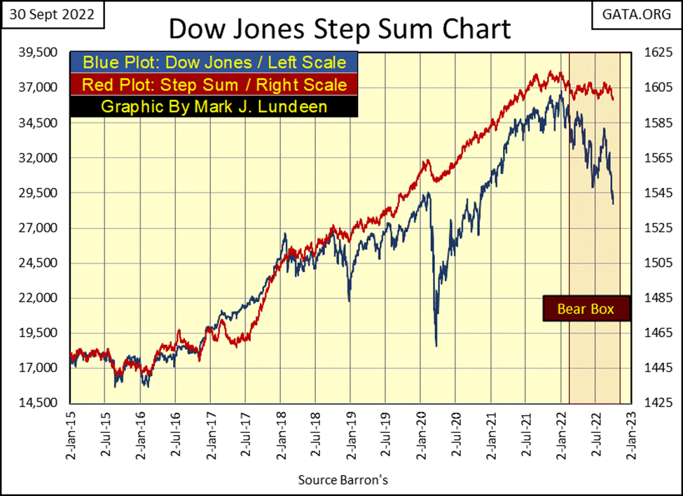
So far for the Dow Jones in its step sum chart below, the price plot (market reality) continues deflating, as its bullish step sum plot (market expectations) has so far refused to come down from its lofty levels. Let’s see how much punishment the bulls can take before they toss in the towel. A 40% market decline in the Dow Jones before its step sum begins to collapse has happened before.
Now on to gold and the Dow Jones’ step sum tables below.
Lots of down days for gold since late August, but one has to look at gold’s 15-count to see this selloff’s actual intensity. Seeing gold’s 15-count close the week at -1, up from its -7 a month ago, indicates selling pressures are abating. Also, compare the percentage price decline for gold since August 26th, with that of the Dow Jones; -4.37% for gold and -11.02% for the Dow Jones.
For the past several weeks, it’s been like that; more selling pressure on the stock market than on gold. As seen in the 15-count for the Dow Jones, which a month ago was a +1, but closed the week at an oversold -7.
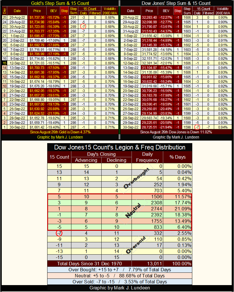
In the frequency distribution table above, why a 15-count of -7 for the Dow Jones is an oversold market can be seen. Since December 1970, the Dow Jones closed with a 15-count of -7 in only 332 daily closings, or 2.55% of the 13,011 daily closings of the past fifty-two years. So, it’s not often we see the Dow Jones this oversold.
Markets don’t like being oversold. So, I expect we may see a bounce in the Dow Jones in the coming weeks. But, should we actually see a bounce in the Dow Jones, it wouldn’t change my long-term bearish outlook on the stock market.
__
(Featured image by Anna Nekrashevich via Pexels)
This article may include forward-looking statements. These forward-looking statements generally are identified by the words “believe,” “project,” “estimate,” “become,” “plan,” “will,” and similar expressions. These forward-looking statements involve known and unknown risks as well as uncertainties, including those discussed in the following cautionary statements and elsewhere in this article and on this site. Although the Company may believe that its expectations are based on reasonable assumptions, the actual results that the Company may achieve may differ materially from any forward-looking statements, which reflect the opinions of the management of the Company only as of the date hereof. Additionally, please make sure to read these important disclosures.


Bank of Africa Launches SME Pact to Boost Business Growth
Bank of Africa launched the “SME Pact, BOA & Maroc PME” to support Moroccan MSMEs through financing, advisory services, partnerships,...


ECB Adds Climate Risk Factor to Collateral Rules
The ECB has introduced a climate factor into its collateral framework, applying additional haircuts to corporate bonds exposed to transition...


SpaceX Bitcoin Move Sparks Debate Amid Market Uncertainty
SpaceX’s recent small Bitcoin transfer sparked speculation about a possible future sale, though analysts view it as a test transaction....


Payhawk Reaches $100M ARR Milestone with AI-Driven Growth
Payhawk surpassed $100 million in annual recurring revenue, achieving rare “Centaur” status. Growth was driven by restructuring around autonomous AI,...


BIP Sells BIC Incubator to Innova, Refocuses on Core Innovation Areas
Biovalley Investments Partner (BIP) sold its entire stake in BIC Incubatori FVG to Innova, both Trieste-based firms and longtime users...
 |
|
 |  |
 |
|
-

 Impact Investing6 days ago
ReLife Recycling Acquires Palcart Recycling Operations in Verona
-

 Impact Investing4 days ago
Milione Secures €80M EIB Financing to Drive Venice Airport’s Green Transformation
-

 Cannabis2 weeks ago
Cannabis Dominates Global Drug Use: Trends, Risks, and Shifting Markets
-
 Impact Investing1 day ago
ECB Adds Climate Risk Factor to Collateral Rules