Business
Why Do People & Institutions Continue to Purchase Bonds?
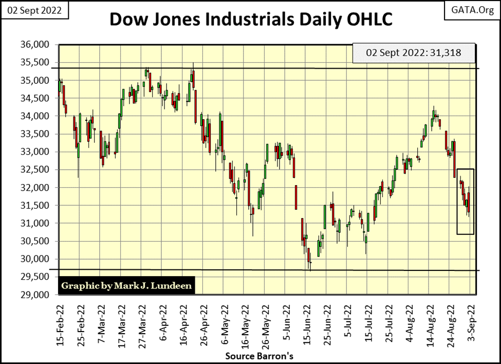
The decline of the past two weeks has been relentless. It could have been worse. Since the high of August 16th, so far there has only been one Dow Jones 2%-day; last Friday. That’s a positive. But should the Dow Jones continue to decline as seen below, it’s a safe bet the market will become a volatile market, with many Dow Jones 2%-days to follow

This week closed with the Dow Jones at the threshold of crossing below its BEV -15% line. In other words; if you’re bullish, the Dow Jones is going the wrong way. That plus How the Dow Jones is going down. Since August 16th, when it saw its recent high of BEV -7.16%, it’s been going down in a beeline, straight down.
Let’s keep things in perspective; losing 7.79 BEV points over the past fourteen NYSE trading sessions isn’t exactly a market in collapse. But for those of us who thought the “policy makers” were going to take the Dow Jones into new all-time highs before the November election, what is seen below isn’t encouraging.
The “policy makers” now have only two months to push the Dow Jones up to its red BEV Zero line. Not a lot of time for moving the Dow Jones up a full 15 BEV points, if in fact the FOMC actually wanted to do that.
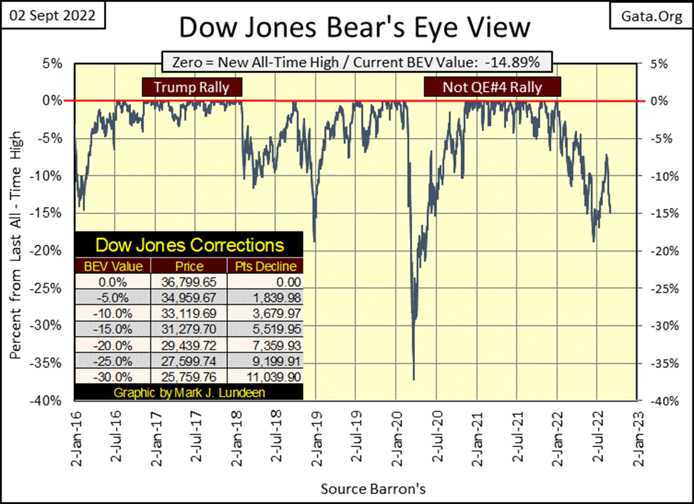
Maybe the January 4th BEV Zero; the last all-time high of the post March 2020 flash crash advance (Not QE#4 Market Rally) will prove to be this advances’ Terminal Zero (TZ), the last BEV Zero of the advance. Every market advance arrives at its ultimate, and final top sometime (January 4th), somewhere (Dow Jones 36,799) are as good of end points as any other. Seeing January’s last BEV Zero as the last all-time high of a two-year advance shouldn’t surprise anyone.
Below is the Dow Jones in daily bars. The decline of the past two weeks has been relentless. It could have been worse. Since the high of August 16th, so far there has only been one Dow Jones 2%-day; last Friday. That’s a positive. But should the Dow Jones continue to decline as seen below, it’s a safe bet the market will become a volatile market, with many Dow Jones 2%-days to follow.
If so, and maybe not. But if so, what is to follow?
Looking around the world, with Europe’s current problem with no natural gas (or petroleum products) from Russia for the coming winter, to the UK rationing electricity, and food in short supply in all too many parts of the world, I’m expecting the next twelve months to be brutal, and not just for the American stock market.
Stop and think for a moment. Two years ago, had I written the above would you have believed me? How much of the world’s industrial base will be shut down in the coming year for lack of this, or that, or the other thing? China has big problems right now with the lack of water in its rivers. And the CCP continues to quarantine anyone, and shutting down anything that smacks of covid.
We can’t have a bull market when, for whatever the reason, the world is shutting down its industrial base by some significant percentage. It’s the stuff of a historic bear market.
What is to come has been in the planning for many years. The Whack-O-Left, with their “global warming” scam, has had twenty years to implement their “Green Agenda” of wind and solar power to replace Europe’s fossil fuel and nuclear power utilities. How has that worked so far? The EU’s “policy makers” then declared war on Russia by siding with Ukraine, so Russia cut off Europe’s gas and oil. Of course Russia did! What did the geniuses of Brussels expect? Very possibly what they got.
I truly believe our elected and unelected “policy makers” are real sons-of-bitches, bastards who not only believe there are too many people living in this world, but are now going to do something about that.
How else did the world go from the prosperity of the Trump years to this, in less than two years?
Here are the major stock indexes I follow BEV values (table below). From Monday’s close, they were all down a few percent by Friday’s close. And what are BEV values? Percent declines seen by these indexes from their last all-time highs. And these indexes are all deflating from their last all-time highs. In the weeks to come, should the bottom dwellers in the table below decline below their BEV -30% levels, taking the other indexes down with them, from a bullish perspective, that wouldn’t be a good development.
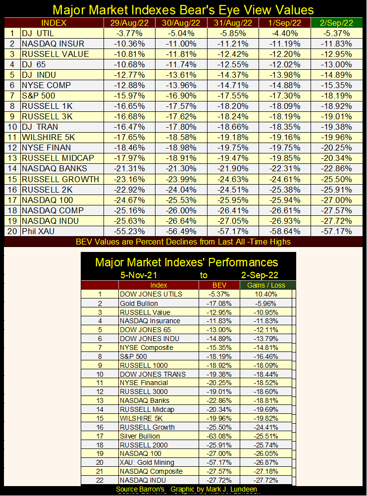
In the table below, 52Wk Highs and Lows over at the NYSE are acting poorly too. This summer, the NYSE 52Wk H-L Nets did see some positive days, days with more 52Wk Highs than Lows. I centered them to highlight them. But the bulls at the NYSE failed to generate sufficient buying to drive these positive H-L Net’s into triple-digit values.
Now, a few weeks following the highs of August (August 16th), the bears already are producing negative 52Wk H-L Nets of over 100. Thursday (yesterday) saw a negative 52Wk H-L Net of 238.
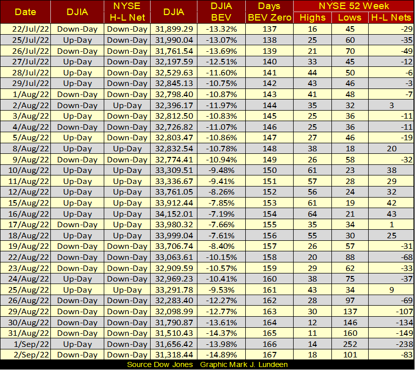
In the war between the bulls and the bears seen in the table above (the 52Wk Highs and Lows), the bulls appear to be growing weaker, as the bears grow ever stronger.
So, is the Dow Jones going to see new all-time highs before the November election? Did I really say that was possible a few weeks ago? I guess I did. Not one of my better speculations I’ve made over the years. Well, up here in the market’s peanut gallery, I only made a bet with another punter for a beer that it would. I was smart enough not to stake any real money that it would.
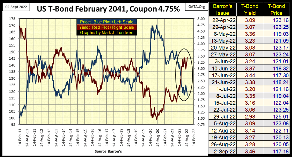
Like the Dow Jones, bond yields are going the wrong way.
Here’s a chart for a T-bond I follow. I have weekly yields and prices since April listed in the table, and this week we closed with the highest yields / lowest prices seen since last spring. I say again – this isn’t good, that’s BAD.
However, looking at the chart itself, it’s actually worse than just BAD; that this week this bond’s yield has increased, and price decrease to levels not seen since 2014.
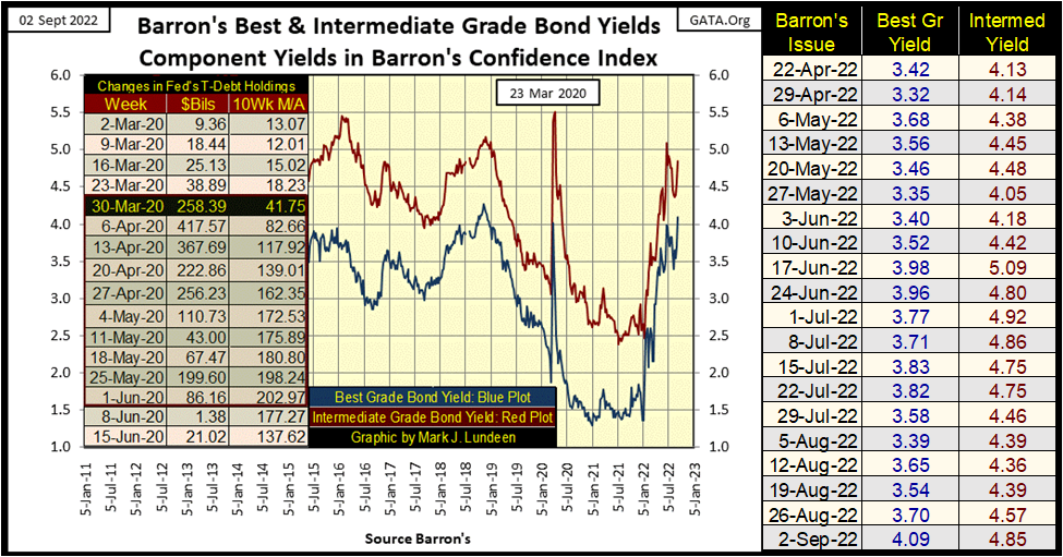
Barron’s Best & Intermediate Grade Bond Yields are also going up in the chart below. Should these bond yields continue rising from current levels, I expect we’ll look back to the market action in the bond market for 2022 as the preliminary for the historic bear market to come.
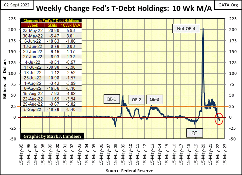
What’s happening here? The problem can be seen below; the FOMC is pulling “liquidity” from the financial system. Instead of buying bonds, the FOMC is now selling them into the bond market. This increases supply in the bond market, which results in lower prices and higher yields.
If you want to know why we got a big advance off the bottom of the March 2020 flash crash, you need look no further than the FOMC’s Not QE-4 in the chart below. They were buying trillions of dollars of bonds in the open market during March / April 2020, which provided the means of “stabilizing market valuations”, to resume the market’s advance.
The top of that advance was on January 4th, just about nine months ago, because the FOMC was still “injecting liquidity” into the market last January.
Then shortly after that, the idiot savants at the FOMC began reducing Wall Street’s credit junkies’ “injections”, and the market began to struggle. Looking at the table on the chart below, this summer the idiots actually began pulling “liquidity” from the market, and market performance responded to this lack of “liquidity” by beginning to stall.
If they keep this up, there is going to be a market crash. That is what happened following the QT in the chart below, the last time this 10Wk M/A declined below the zero line. What do you think the massive Not QE-4 was all about? It was a massive “policy initiative” to reverse the March 2020 flash crash.
It’s shocking to see what it took to reverse the March 2020 flash crash, compared to Bernanke’s three QEs needed to “stabilize” the markets during, and following the sub-prime mortgage crash. How big will the next Not QE have to be to “stabilize market valuations” yet one more time?
Let’s look at some more market history.
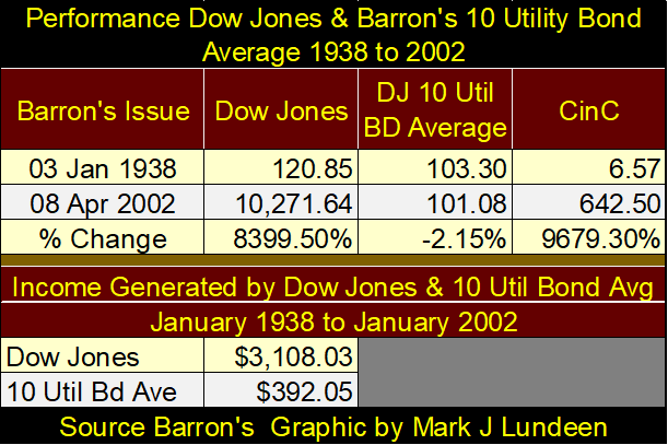
From January 1938 to April 2002, Barron’s published the Dow Jones 10 Utility Bond Average (10 Util Bd Ave). This historic bond average was discontinued, for the good reason that by 2002, no one (but me) followed it anymore. I have a soft spot in my heart for historic data series. I wished they hadn’t discontinued it, so I could still plot this data as of the close of this week.
Bonds are contracts for debt. In this case, the contract is between a utility and someone, anyone who purchased one of the utility’s bonds. Not all bonds are the same. But each has a term, call it 20 years, where you give the utility a $1000, and the utility for each of those 20 years, will send you a coupon payment of say $50. After twenty years (20 coupon payments if the payments are annual), the owner of the bond, who most likely will not be the original owner, gets the $1000 back.
That’s the contract; whoever owns that bond, will get $50 when the bond’s coupons comes due, and the original $1000 back from the utility when the utility’s bond matures.
Bonds can be traded in the bond market many times during their term, and at each sale, that bond will sell at a different price, which will change the bond’s yield. But because bonds are “fixed-income investments”, the $50 coupon, in this example, never changes. If the utility fails to pay its coupon, it goes into bankruptcy procedures.
What any bond yields, depends on how much someone paid for it. If on the day of issue, the bond sold for $1000, then the bond for the original purchaser has a yield of 5%. But if ten years later, the bond market has discounted the bond’s price down to $500, this bond, still paying out $50 annually, now has a yield of 10%.
Keep this in mind when looking at the chart below for the 10 Util Bd Ave; changes in bond prices set a bond’s yield. Lower prices, equal higher yields / higher prices equal lower yields. But the fixed income, coupon dollar payouts for these bonds never change.
The 10 Util Bd Ave was published for sixty-four years, so none of the original bonds remained in it in 2002, and that makes a difference. But this data series is what it is; a weekly average of 10 utility bonds prices and yields from 1938 to 2002, so we go with what we have.
Here it is in the chart below, every weekly datapoint published in Barron’s from their 03 January 1938, to 08 April 2002 issues. The Blue Plot is the 10 Util Bd Ave’s price, the Red Plot its yield. The first published price in January 1938 was 103.30, its last was 101.08 in Barron’s 08 April 2002 issue, creating the false impression these utility bonds over these sixty-four years were a break-even investment – but they weren’t.
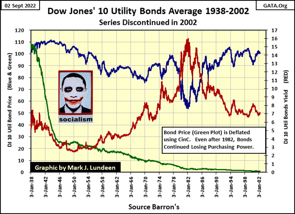
A million dollars in January 1938 allowed its owner to live the good life. For $20,000, I believe one could purchase a residence where a view high above New York’s Central Park was possible. Taking the remaining $980,000 of the million, and investing it in utility bonds provided an income sufficient for its owner to pretty much live as one wanted in New York City in the late 1930s, with the best of everything. The first published yield for the 10 Util Bd Ave was 5.22%, providing an annual income of $51,156.
But remember, bonds are fixed income. Once purchased, the income from these bonds providing this $51,156 will never go up or down – its fixed. What isn’t fixed are the prices and yields these bonds will see in the years to come. That and what the $51,156 will purchase for the owner of these bonds over time.
In 1938, only very wealthy people could boast of an annual income of $51,156. But not so in 2002, where an annual income of $51,156 in New York City was something completely different, something very middle class.
What happened? The Federal Reserve; America’s great engine of inflation happened. In January 1938, CinC (billions of dollars in circulation) was only $6.57 billion. The price for an issue of Barron’s was $0.25, the cost for first class mail by the US Post Office was $0.03.
In April 2002, CinC had increased to $642.50 billion, an increase by a factor of almost 100. The price for an issue of Barron’s increased to $3.50, and the US Post Office charged $0.34 for first class mail.
To somehow plot the loss of purchasing power the bond market has suffered from over the past decades, I took the price of the 10 Util Bd Ave and deflated it with CinC (Green Plot / chart below). So, seeing the final published price of the 10 Util Bd Ave; 101.08, so close to its first published price sixty-four years earlier; 103.30, misses the point. The Federal Reserve’s “monetary policy”, consumed most of the purchasing power of the 1938 dollar, for the benefit of our elected officials in Congress and the White House. Wall Street and academia benefitted too. It was like stealing candy from a baby.
In September 2022, CinC is currently $2,276 billion. Since 1938, CinC has now increased by a factor of 346. Since Congress created the Federal Reserve in 1913, the inflation generated by the FOMC has been horrific. I’m sick and tired of hearing “market experts” and “economists” talking about how the FOMC is “fighting inflation”. Anyone actually serious about fighting inflation would demand the termination of the Federal Reserve System as a start.
Back to 1938. Eighty-four years ago, someone with a million dollars could have also invested in the stock market. How would that have done? Using the Dow Jones, let’s take a look at the table below.
Using the same Barron’s issue dates I used for the 10 Util Bd Average, I took the data for the Dow Jones and CinC. The Dow Jones increased from 120.85 in January 1938, to 10,271.64 in Barron’s 08 April 2002 issue. A gain of 8399.50%, which was less than the gains seen in CinC, but much better than the -2.15% loss seen in the Dow Jones 10 Util Bond Ave.
Both the stocks in the Dow Jones, and the bonds in the 10 Util Bd Ave spin off cash in dividend and coupon payouts. How did stocks compare to bonds for income purposes during these seven decades. I can’t say with certainty. But what I did do was to take the price data for both the Dow Jones and the 10 Util Bd Ave at the first week of 1938, and the first week for the following sixty-four years, and multiply those prices by their yields to come up with a dollar figure for annual income. By adding these sixty-four years of income, I derived and listed their figures above.
From January 1938 to April 2002; the $120.85 invested in the Dow Jones in 1938 not only had its dollar value inflated to 10,271.64, but also generated $3,108.03 in dividend payouts. Compare that to what the 10 Util Bd Av did for investors with their $103.30. From January 1938 to April 2002, the DJ 10 Utility Bd Ave lost $2.22 of the $103.30 invested in it, as it generated only $392.05 for income during these sixty-four years.
The woes of fixed income investing in an inflationary economy, managed by a central bank, are fully apparent in the table above.
What the hell! Why do people and institutions buy bonds? Bonds became a bad habit ever since Congress created the Federal Reserve System in 1913. “Monetary policy” has rendered bonds, with their fixed income, into “certificates of confiscations.” As bond yields continue rising in the years to come, once again the bond market will become a killing field for personal wealth.
In a financial system on the brink of seeing massive increases in interest rates and bond yields, for instance in September 2022, even the stock market will come under intense deflationary pressure. In my opinion, it’s much better to have one’s wealth in gold, silver and the companies that mine them.
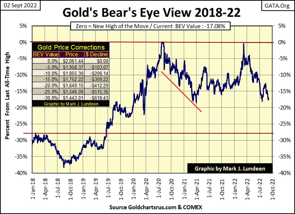
So how did gold do this week? Let’s look at gold’s BEV chart below. The market action for gold this week could have been better. With stocks and bonds seeing a bad week, in decades past (before 2000), gold, silver and their miners would have done better.
But in 2022, with the precious metals markets being tiny, microscopic markets when compared to the massive, multi-tens-of-trillion dollar markets in stocks and bonds, the “policy makers” have real concerns of what happens should untold trillions of dollars in flight capital flood into a market with a market cap currently in the tens of billions?
One may argue the market cap for precious metals is larger than that, but maybe it’s actually smaller. At a moment’s notice, in the time it takes to place a call to a precious metal bullion dealer, how much actual precious metal is available for sale at current market prices when the dealer answers their phone?
It is said that both Russia and China’s central banks have way over 10,000 tons of gold, each. But that gold will never, ever be sold for US dollars. I’d say the same is true for any gold held by the UK’s royal family, and their friends like the Rockefellers, DuPonts, Warburgs or Rothschilds, or a Persian Gulf oil emirate. Then we have the Wall Street and Hollywood elite, as well as the elite of Silicone Valley, none of who are stupid people. They too must have been acquiring gold and silver over the decades with no intension of selling any of it just because the dollar is being deliberately devalued by the Federal Reserve.
As a percentage of the total amount of gold mined since mankind first hungered for it, how much of that gold is actually available for purchase by the general public? I don’t know, but I wouldn’t be surprised should it be much less than 10% of all the gold ever mined in the past five thousand years.
So, what is the price of gold when deflation runs riot on Wall Street, and wealth flees in a panic from the financial markets in search of a safe harbor from the storm?
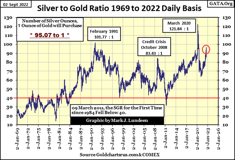
We know gold at around $1700 an ounce is cheap. But at the close of this week, with the Silver to Gold Ratio (SGR) at 95.07 ounces of silver for 1.00 ounce of gold (5.94 POUNDS of silver for 1 OUNCE of gold), they’re giving silver away!
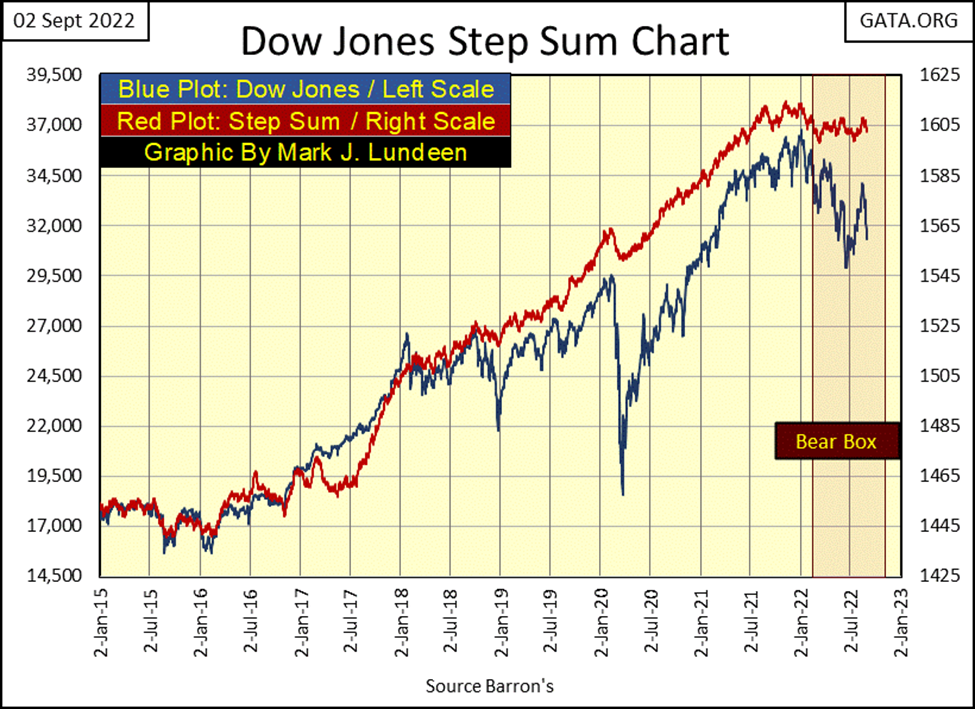
The step sum chart for the Dow Jones below is getting interesting. Currently the Dow Jones is in a bear box, where market sentiment (Red Step Sum Plot) and market reality (Blue Valuation Plot) becomes decoupled from each other. The bulls see the declining market, but insist on maintaining a bullish market outlook, because they believe the decline is only a correction in bull market advance.
A bear box is called a bear box because more times than not, the price plot remains a superior predictor of a market’s future trend than is the step sum plot. With the price plot for the Dow Jones once again breaking down, as its step sum plot continues to flat-line, it’s not a bullish development in the market. Why would that be?
Because, currently the bulls are buying on the dips. The bulls see down days as buying opportunities. That is why the step sum plot below is going sideways as the Dow Jones itself is going down. But as this box matures, the bulls will stop buying on the down days, and begin selling their losing positions on the daily advances.
We’ll know exactly when this change in bullish psychology occurs – when the step sum plot seen below once again recouples with its price plot; to the down side.
Gold in its step sum table below became oversold this week, as seen in its 15-count decreasing to a -7. I was actually hoping for a down day on Friday, that would have made the count a -9. Markets don’t like being oversold, and with gold trading around $1700, we may be near to a bottom of the current sell off.
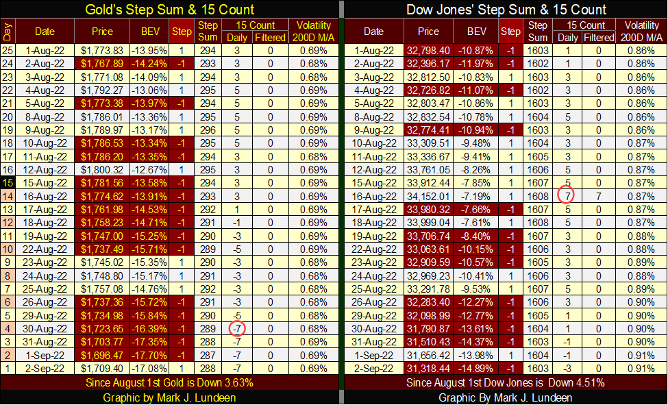
The thing to note about the Dow Jones table above is its daily volatility’s 200Day M/A continues to rise, closing the week at 0.91%. Rising volatility in the stock market is ALWAYS a bearish leading indicator. That plus the fact the Dow Jones is in a bear box (step sum chart above), and the rising volume of NYSE 52Wk Lows are all bad omens for the bulls.
For everyone who followed me into Eskay Mining, this summer has been very productive, and here are some videos on that progress. Keep in mind the company can’t talk about gold and silver in any meaningful way until the assays come in. But the geologists have been finding what they were looking for; great volumes of VMS deposits. I anticipate the assays, when they arrive will reward the company’s shareholders.
__
(Featured image by QuoteInspector.com CC BY-ND 2.0 via Flickr)
This article may include forward-looking statements. These forward-looking statements generally are identified by the words “believe,” “project,” “estimate,” “become,” “plan,” “will,” and similar expressions. These forward-looking statements involve known and unknown risks as well as uncertainties, including those discussed in the following cautionary statements and elsewhere in this article and on this site. Although the Company may believe that its expectations are based on reasonable assumptions, the actual results that the Company may achieve may differ materially from any forward-looking statements, which reflect the opinions of the management of the Company only as of the date hereof. Additionally, please make sure to read these important disclosures.


Blockchain Evolves Toward AI, Finance and Quantum Security
Blockchain is evolving beyond crypto into finance, AI applications, and digital markets, while security and regulation remain challenges. Quantum threats...


The Italian Crowdinvesting Market Faces Sharp Decline in 2026
Italian crowdinvesting market continued to decline in 2026, with fundraising falling 36.8% year-on-year to €164.19 million. Platforms and active campaigns...


Sartorius Stedim Biotech Maintains Growth Momentum in H1 2026
Sartorius Stedim Biotech reported solid H1 2026 results, with revenue reaching €1.527 billion and EBITDA rising to €479 million. Growth...


Bank of Africa Launches BOA MDM Network to Boost Diaspora Investment in Morocco
Bank of Africa launched the BOA MDM Network to channel diaspora remittances into productive investment, aiming to raise their share...


Switzerland’s Medical Cannabis Reform Advances Access, But Barriers Remain
Switzerland’s 2022 medical cannabis reform improved patient access by removing federal approval requirements, but challenges remain. MEDCAN highlights barriers including...
 |
|
 |  |
 |
|
-

 Impact Investing1 week ago
Vexuvo Secures €39M UniCredit Financing to Drive Agrivoltaic and Storage Expansion in Italy
-

 Markets4 days ago
Oil Surge, Weak Stocks, and a Potential Turn for Gold
-
 Markets2 weeks ago
Quiet Markets Await a Catalyst as Jobs and Oil Support Sentiment
-
 Crypto1 day ago
Bitcoin ETFs Lead as German Stock Exchange Debuts Mining ETF