Business
Why gold is now very oversold
The NASDAQ Composite last saw its last BEV Zero on February 12th, and closed the week with a BEV of -8.34%, or down by 8.34% from its last all-time high of Feb 12th. Looking at the Dow Jones I can feel optimistic about the coming weeks. But the NASDAQ appears to be leaking “liquidity”; can that be good?

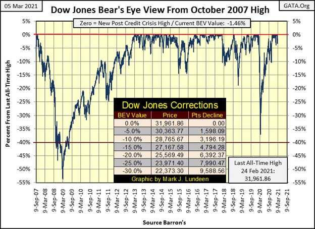
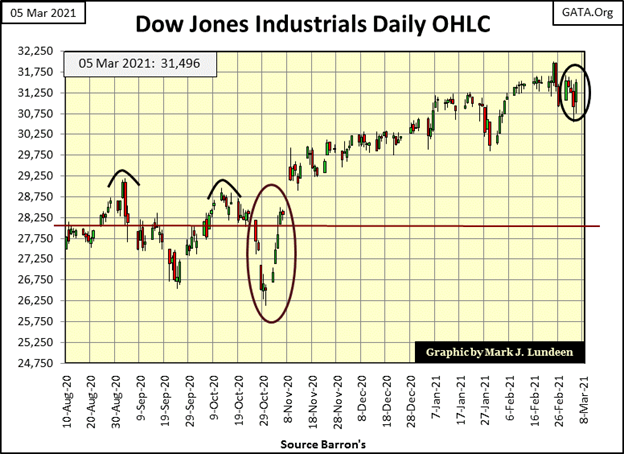
The Dow Jones saw a little selling pressure this week; down on Tuesday, Wednesday and Thursday, but up on Monday and Friday. For the Dow Jones and most of the stock market (if not the NASDAQ Composite) I’d say this week was a net neutral.
But last week the Dow Jones’ 15 count increased to a +9, or in a fifteen-day sample, it saw three down days and twelve advances. A +9 for the Dow Jones is a very overbought market condition that usually signals a pullback in the advance is due. Let’s see what happens in the weeks to come.
Are new all-time highs for the Dow Jones finished for a while, as Mr Bear claws back some of the double-digit percentage gains the bulls have been enjoying? Too early to say, but I wouldn’t be shocked seeing this March finish as a downer for the stock market.
Let’s take a look at the NASDAQ Composite BEV chart next. The NASDAQ Composite last saw its last BEV Zero on February 12th, and closed the week with a BEV of -8.34%, or down by 8.34% from its last all-time high of Feb 12th. Looking at the Dow Jones I can feel optimistic about the coming weeks. But the NASDAQ appears to be leaking “liquidity”; can that be good?
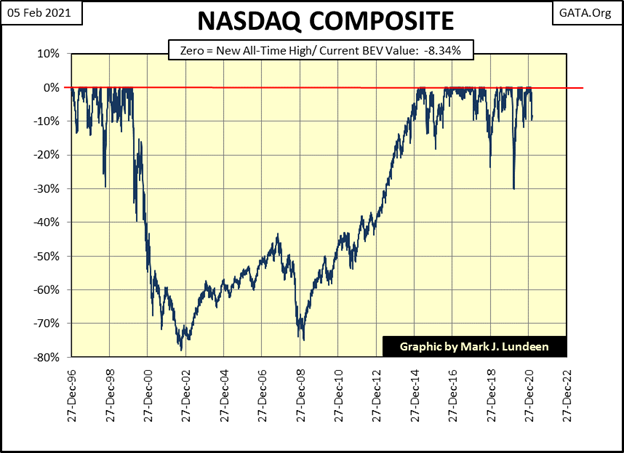
Moving to my table of Major Market Indexes’ BEV Values below, there was only one new BEV Zero this week; the NASDAQ Banks on Friday, but there were many other indexes closing the week in good scoring position. I’d say the two big losers for the week were the NASDAQ Composite and 100 indexes. Unlike #18 to 20 in the list, both these important NASDAQ indexes have seen new all-time highs in the past month, and then this week they almost sank below their BEV -10% lines on Thursday.
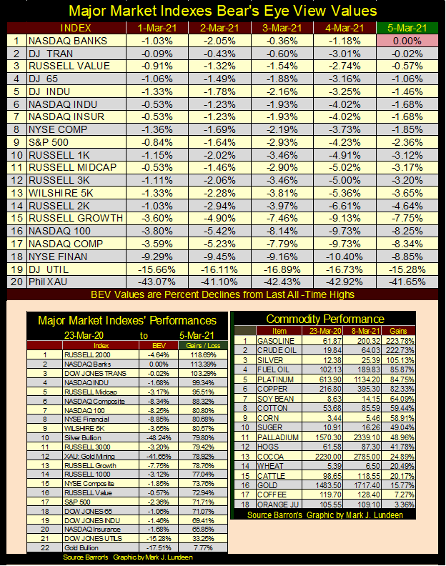
Note on gold and silver in the commodity table (right-side table). These are based on weekly closing data (not daily), and on futures prices (not spot).
As it has been for a long time now, my concern for the market is this is a very expensive market, as seen in the gains from last March 23rd’s lows (table above left side). What I find disturbing is for the past year, many commodity markets have also enjoyed big double-digit advances (table above right side). The source for this inflation in the commodity market is the same as for the stock market; the Federal Reserve’s FOMC flooding the financial system with “liquidity” as seen below.
But in the past this flood of inflationary funding flowed towards, and was contained within the financial markets. Until last year there was no overflow into basic food stuffs and other commodities. Should this continue, this will be a real game changer.
Also, President Biden has shut down much of America’s energy industry, as his former boss before him did with the coal industry. Biden has also committed the United States to the Paris Climate Agreement – woe unto you and me!
Shipmates: it’s BOHICA time once again. What’s BOHICA? It’s a salty acronym for “Bend Over, Here It Comes Again.”
Expect energy costs to increase greatly over the next four years, and these rising energy expenses will impact the price of everything as they work through the economy. Rising consumer prices will prove to be a huge headwind to the financial markets, currently priced for a sugar and spice, and everything nice future.
Rising CPI inflation will also drive interest rates and bond yields up until the debt markets overwhelm the bulls in the stock market. And rising commodity prices are already having their effects felt in the Treasury Bond Market, as seen below.
This is a 30 year T-bond whose price (Blue Plot) and yield (Red Plot) I’ve tracked weekly since it was issued in February 2011. It was issued with a valuation of 100, and early last August, its valuation peaked at 170. It was also issued with a coupon of 4.75%, but when it peaked last August, it was yielding a pathetic 0.95%.
Now imagine you were one of the unlucky souls who last August bought this turkey of a bond. Not only did you * LOCK IN * an annual return of 0.95% for the next 20 years, but Mr Bear has also clawed back 15% of your initial investment in the past seven months. It’s only going to get worse in the weeks, months and years ahead of us as commodity-price inflation continues pulling bond yields up, and bond prices down throughout the debt markets.
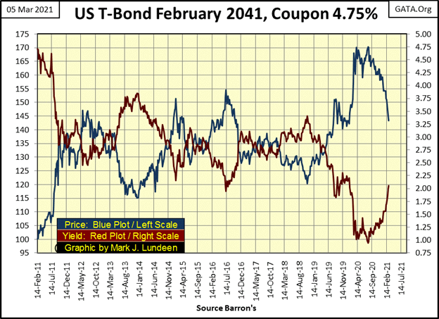
So, the stock market closed this week not far from its recent all-time highs. That’s not promising to me when I look at price inflation in the commodity markets and bond yields in the Treasury and corporate bond markets rise significantly since last August.
And you know how I feel about rising daily volatility for the Dow Jones; days of extreme market volatility (Dow Jones 2% days) are bull-market kill switches. Well, the good news is that the Dow Jones hasn’t seen a day of extreme market volatility (a 2% day) since late January. But the bad news is even if the large daily moves seen below these past two weeks haven’t been 2% days, they haven’t been the little-baby steps typical of bull-market advances either.
Sitting high up on the bleachers in the market’s peanut gallery, at the close of the first week in March, I feel very comfortable being cautious on the stock market.
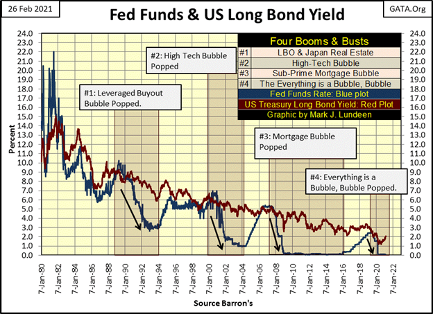
Last week I went into some detail on easy and tight monetary policy, where easy money is created when the Federal Reserve lowers its Fed-Funds Rate below the yield of the US T-long bond, and tight money when their Fed-Funds Rate is raised above the long T-bond yield. This is an important topic as it explains where we have been and where we are going.
Last week I covered monetary policy going back to 1980. This week I want to go back to 1954 as we can identify three different eras of “monetary policy”:
- 1954 to 1982 / “policy makers” fight inflation,
- 1983 to 2007 / “policy makers” fight deflation,
- 2008 to Today / “policy makers” fight for their lives.
These three different eras in “policy” are easily identifiable in the graphic below. The upper chart plots both the Fed-Funds Rate (Blue Plot) and the yield of the US Treasury Long Bond (Red Plot) going back to 1954. The lower chart plots the yield spread; the difference between the Fed-Funds Rate and Long Bond Yield.
- In the spread chart, the Red Line 0% line indicates when the Fed Funds and bond yield are the same.
- Positive values result when Fed Funds are above the bond yield (tight money),
- Negative values when the Fed Funds are below the bond yield (easy or loose money).
The upper chart is a record of interest rates and bond yields, or bond market bear and bull markets going back to 1954. Bond bear markets are identified by rising bond yields (1954 to 1982) and bond bull markets (1983 to 2020) by declining bond yields. As noted above, since August of last year bond yields have been rising and bond prices declining. Have the debt markets begun another bear market? I believe they have.
The issue that mandated these changes in “monetary policy” is where monetary inflation flowing from the Federal Reserve was flowing to. In the era when the “policy makers” were fighting inflation, “liquidity injected” into the financial system was flowing into consumer prices. Rising consumer prices not only resulted in the bond market demanding ever higher inflation premiums (ever lower bond prices and higher yields) to compensate bond buyers for eroding dollar valuations, rising consumer prices also made the “policy makers” look bad.
We can’t have that. So, the “policy makers” were big fighters of inflation from 1954 to 1982. We can see that by the frequency and severity the FOMC would invert the yield curve; raise their Fed-Funds Rate above the yield for the T- long bond.
By inverting the yield curve, the “policy makers” were attempting to pop the bubble in consumer prices they inflated by forcing their banking system to contract the credit (bank loans) extended into the economy. From 1954 to the early 1980s, these inversions of the yield curve did little to curtail CPI inflation, but they did result in reoccurring, and painful economic recessions.
The problem was consumer-price inflation (CPI) was in consumer goods. Unlike today, consumer goods from 1954 to 1982 were purchased using cash transactions, not credit cards. Contracting credit in the banking system prior to 1982 did little to contain CPI inflation, as CPI inflation decades ago was unleveraged by bank credit, and such operations did nothing to contract currency-in-circulation (CinC).
The next era in “monetary policy”; 1983 to 2007 when the “policy makers” fought deflation is best covered in the lower chart in the graphic below, but it’s important to see how during this era long T-bond yields fell drastically, from 15% down to 5% as the bond market (stock market too) entered a giant bull market.
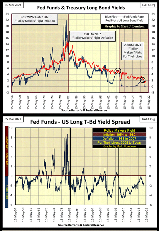
The reason for this momentous change in the bond and stock markets was because “liquidity” flowing from the FOMC no longer flowed into consumer prices but into the financial markets.
“Monetary policy” continued inflating prices somewhere in the economy. But rising consumer prices aren’t popular with anyone except for commodity speculators. So from 1954 to 1982, the “policy makers” could, and did fight inflating consumer prices by aggressively increasing their Fed-Funds Rate far above long T-bond yields, as seen above.
But after 1982 all that changed as the bubbles the “policy makers” were inflating were now called “bull markets” somewhere in the financial system. This is when the primary purpose of the “policy makers” was to fight DEFLATION in the economy, not pop their bubbles. But the “policy makers” did pop their bubbles during this era; three of them:
- Leverage buyout (1990)
- High-Tech Dot.Com (2000)
- Subprime Mortgage (2007)
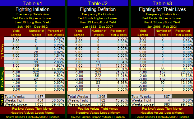
As these bubbles were inflated by bank credit (not cash as was CPI inflation), Wall Street bull markets were very vulnerable to inversions in the yield curve. The “policy makers” were very aware of this, as seen in the table below.
Table #1 / Fighting Inflation, look at the table’s bottom. Of this era’s 1,487 weeks, 30.53% of them saw tight money (Fed Funds above long-bond yields), and look at how far the “policy makers” were willing to push their Fed-Funds Rate above bond yields, as far as between 8% and 9%.
Table #2 / Fighting Deflation era saw only 13.95% of its 1,305 weeks with tight money, and not once did the “policy makers” increase their Fed-Funds Rate 2% or more above long-bond yields.
Before covering table #3 where the “Policy Makers” were fighting for their lives, review the charts above. Note how since 1954, the period of easy money during our current era was the longest between instances of the Fed-Funds Rate inverting above bond yields. For good reason too; because the “policy makers” haven’t and can’t recover from their sub-prime mortgage fiasco from over a decade ago.
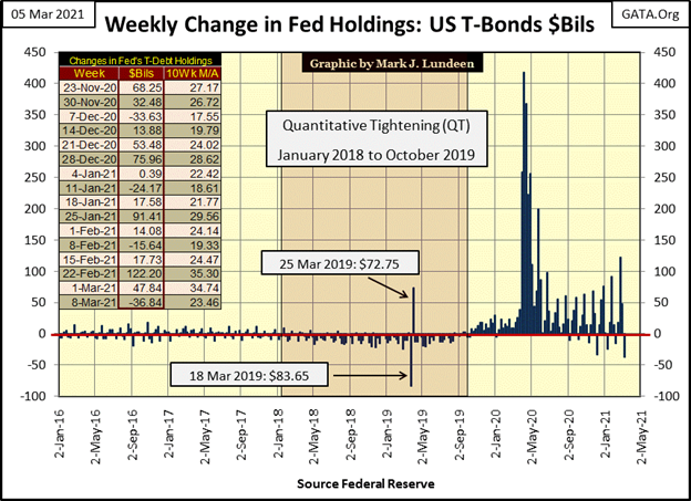
Doctor Bernanke’s QE #1-3 (below) did reflate market valuations. However, for four weeks in September / October 2019 monetary policy once again did become tight as long T-bond yields declined below the FOMC’s Fed-Funds Rate by fifteen basis points (0.15%). Chairman Powell terminated his Quantitative Tightening (QT) as problems developed in the over-night repo market as reported in the financial media.
By March 2020 (six months later) all hell broke loose. Corporate bond yields doubled in a single week, and the Dow Jones deflated by 38% in only twenty-eight NYSE trading sessions as everything was going to hell in a hand basket. Chairman Powell announced on March 23rd his FOMC was going to purchase corporate bonds in the open market – something never seen before.
Something else never seen before were the “injections of liquidity” ($1.73 trillion in March & April 2020) the Powell Fed “injected” into the financial system to “stabilize” market valuations (Below).
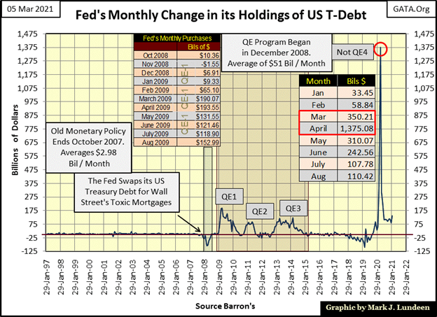
Below is a look at “monetary policy” since January 1980 and its effects on the bubbles (bull markets) the FOMC inflated into the economy. We’ve not seen much of a bear market from the “policy makers” popping their bubble #4 in September / October 2019, the Everything is a Bubble, bubble. That we haven’t yet is due to the humongous “injections of liquidity” of last year.
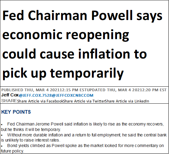
Here’s a CNBC article on Powell warning reopening the economy will be inflationary. It’s the old Phillips Curve’s “prosperity is bad” thing so often heard in the 1970s and early 1980s.
Don’t believe it, as prosperity is good. It’s Fed Chairman Powell and his FOMC that are bad. But you won’t hear that on CNBC or anywhere else in the Fake News financial media.
So, how did gold do this week? Last week gold closed close to its BEV -15% line in the BEV chart below. I had hoped gold would have begun to trend upward towards its BEV -10% line, but in fact began collapsing down to its BEV -20% line. I don’t like it, but there it is.
At times like these I always open up my Excel files and look at all the monetary inflation the FOMC is “injecting” into the financial system. That plus in March 2021 I can see yields in the Treasury and corporate bond markets rising in response to increasing consumer-price inflation (CPI).
So, if the depressing market action in gold and silver, as well as the mining shares have got you down, stop reading right now and take a quick look at the charts and tables seen earlier in this article. In the little games the “policy makers” are currently playing with us in the precious metals markets, you and I are holding the winning hand. We need only to hold on and not panic out of our positions.
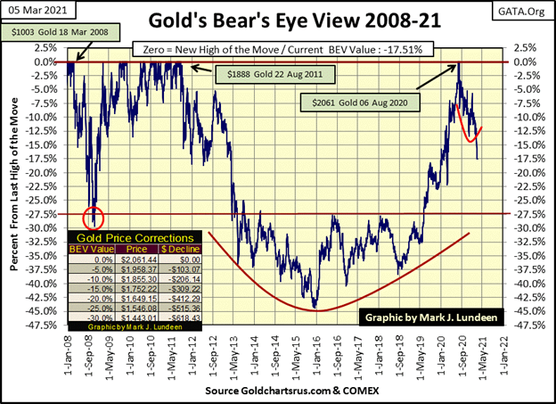
Gold and its step sum below continue to correct. Considering how far gold has advanced since it broke above its $1360 level (Red Line) in the summer of 2019, a proper correction in the advance that took gold to $2061 last August seem appropriate.
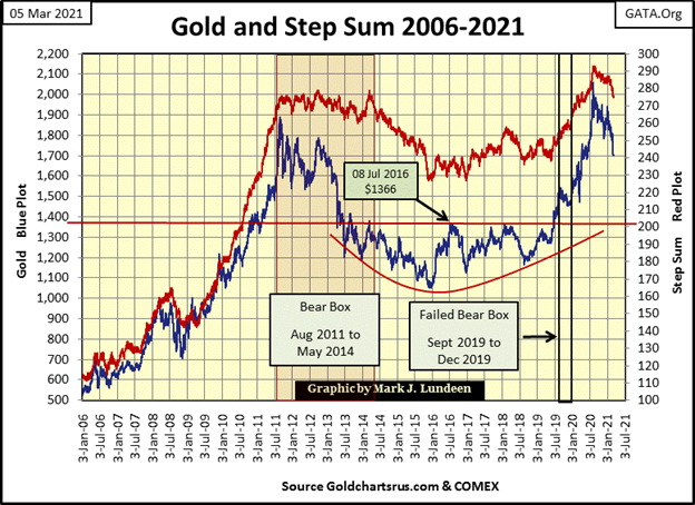
One positive development gold saw last week was its 15 count declined to a very oversold -9, as seen in its step sum table below. Geeze Louise, look at all that red on gold’s side of the table. That the bears have made this much effort in the gold market, and could only push gold down to its BEV -17.5% line is actually encouraging. That’s how I see it.
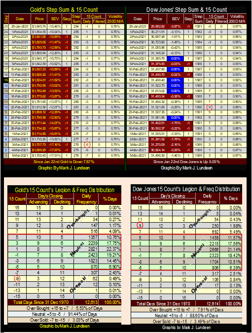
What does a 15 count of -9 mean? I’ve circled the -9 in the gold tables above, and a -9 in a 15 count takes three daily advances and twelve daily declines in a fifteen day running sample. And since 31 December 1970, 12,613 COMEX trading sessions ago, how many daily closes in the gold market closed with a count of -9? Only 62, with two of them happening just last week.
So, gold at the close at this week closed at a * VERY * oversold level and we can anticipate a rebound from this level. That’s not a promise as the bears are allowed to cheat. But just looking at the numbers, I think the gold market is very near to its bottom in this correction, and by April we could see gold once again advancing towards a new all-time high.
Last week it was the Dow Jones that had a 15 count of +9, a very overbought market due for a pullback. If you look at the step sum table above, a pullback in the Dow Jones is what happen. Nothing dramatic, but the Dow Jones has pulled back as its 15 count retreated to a +1 on Thursdays close.
Is that it; a 1037 point claw back from the Dow Jones last all-time high to this Friday’s close? It’s only been eight NYSE trading sessions since the venerable Dow last saw a 15 count of +9. Give it some time and let’s see how long before the Dow Jones sees another new all-time high, or even if it does. And if so, how much further will the Dow Jones deflate before it bottoms and then advance into history once again.
I omitted the step sum chart for the Dow Jones as looking at it is becoming tedious. Instead I’m publishing a chart plotting the Dow Jones (Red Plot) and gold’s (Blue Plot) 15 counts going back to the beginning of 2020.
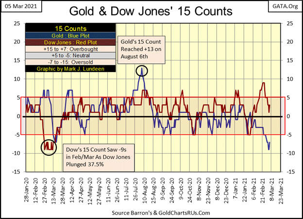
The Dow Jones a year ago also saw -9 15 counts, a very oversold market. Now a year later it has advanced by 13,369 points off its lows of March 23rd to its last all-time high just two weeks ago. That was an advance of 139%. However, its last all-time high just two weeks ago also saw its 15 count increased to a +9; a very overbought market.
Gold last August saw its 15 count increase to a +13, a massively overbought market and a historic first. Since then the gold market has been correcting. Nothing big mind you, not with the biggest percentage decline from last August’s all-time highs being last Thursday’s BEV of -17.57%, a day that also saw gold with a 15 count of -9.
But this now seven-month-long correction in gold, silver, and the precious- metals miners has become damn annoying and everyone is getting pessimistic. And now gold’s 15 count is telling us that gold is now in a very oversold market condition.
This is exactly the market psychology from where big advances come from. I’m not making any promises which way gold or even the Dow Jones is going in the next few weeks. But I believe the smart money is bullish on precious metals and bearish on the stock and bond markets as we enter into spring and summer of 2021.
(Featured image by Tumisu via Pixabay)
DISCLAIMER: This article was written by a third-party contributor and does not reflect the opinion of Born2Invest, its management, staff or its associates. Please review our disclaimer for more information.
This article may include forward-looking statements. These forward-looking statements generally are identified by the words “believe,” “project,” “estimate,” “become,” “plan,” “will,” and similar expressions. These forward-looking statements involve known and unknown risks as well as uncertainties, including those discussed in the following cautionary statements and elsewhere in this article and on this site. Although the Company may believe that its expectations are based on reasonable assumptions, the actual results that the Company may achieve may differ materially from any forward-looking statements, which reflect the opinions of the management of the Company only as of the date hereof. Additionally, please make sure to read these important disclosures.


Bitcoin Stalls Near $60K as Strategy Moves, ETFs Outflow, and EU MiCA Rules Take Effect
Bitcoin hovers near $60,000 with ETF outflows, while Strategy boosts reserves, sells BTC, and raises dividends to reassure investors. Ethereum...


Cannabis Dominates Global Drug Use: Trends, Risks, and Shifting Markets
Cannabis remains the world’s most widely used illicit drug, with 256 million users in 2024, surpassing all others combined. Growth...


Italy Approves First Hydrogen-Powered Train for National Rail Network
ANSFISA has approved Italy’s first hydrogen-powered train, the Alstom HMU214, for use on the Brescia–Iseo–Edolo line. Capable of 140 km/h,...


Cotton Market Weakness Persists Despite Brief Rebound
Cotton prices fell to new lows last week before a modest rebound. USDA data shows crop conditions remain worse than...


Eli Lilly Hits $1 Trillion Valuation Amid Strong Bullish Momentum
Eli Lilly stock hit a record high, surpassing $1 trillion market value after strong product demand. Shares surged over 7%,...
 |
|
 |  |
 |
|
-

 Fintech1 week ago
Mollie Expands Across EEA With €350M Investment to Strengthen European Payments Network
-

 Cannabis2 weeks ago
Europe’s Cannabis Shift: Rising Use, and New Risks
-

 Crowdfunding5 days ago
AI Venture Builder Launches €600K Crowdfunding Round to Scale Secure AI Solutions
-
 Impact Investing2 weeks ago
AI Adoption in Italian Retail Stalls Despite Strong Experimentation