Featured
Why Monetary Inflation is an Addiction
At first a little “injection” is all it takes to get everyone feeling really good. But over time, the monkey on every addict’s back always demands more. As seen, before October 2007, on average it took only $2.98 billion * A MONTH * to keep Wall Street’s monkey happy as the “policy makers” inflated a huge bubble in the single-family real estate market.

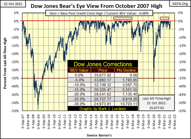
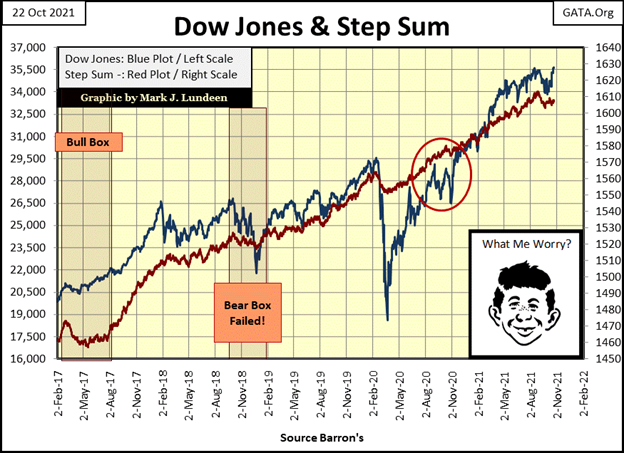
As expected, the Dow Jones closed this week at a new all-time high, a BEV Zero in its BEV chart below. This is the 43rd since it began making new all-time highs last November 16th, and since then hasn’t closed outside of scoring position. What’s scoring position? BEV values between -0.01% and -4.99%; a daily close less than 5% from one of these 43 BEV Zeros.
Though on September 30th, the Dow Jones did close with a BEV Value of -5.00%, which strictly speaking is outside of scoring position, but just barely. I’m not going to mention this again. So, officially since last November 16th, the Dow Jones has closed every day either at a new all-time high or in scoring position. And that is impressive.
As seen in my table (below) listing the Bear’s Eye View values for the major market indexes, it wasn’t just the Dow Jones making new all-time highs this week. What was noticeable is the big NASDAQ indexes, the Composite (#16) and 100 (#17) failed to do so, and both closed Friday on the weak side.
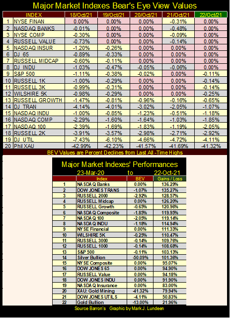
What’s with that? Most likely nothing. With the stock market now rising to valuations that should put the fear-of-God into the bulls, but never seems to, it’s a habit of mine, and a good one too, to always look for the dark cloud behind the silver lining. Because I know that one of these days, Mr Bear is going to roundup all of the bulls now running wild and free on Wall Street, and ship the dumb cows off to be slaughtered. It’s going to happen.
But not this week, and most likely not next week either. I wouldn’t lose any sleep over Mr Bear until we see bear-signs on Wall Street again; days-of-extreme volatility (Dow Jones 2% days) and days-of-extreme market breadth (NYSE 70% A-D days).
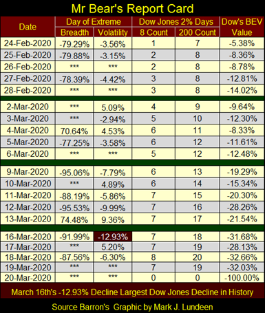
Here’s Mr Bear’s Report card from March 2020. Bull markets, exactly as we’ve seen this week, advance in small steps. But when Mr Bear comes to visit Wall Street, things can change fast. Look at the extreme-market events when he last came into our lives. After seeing what happened on February 24th and 25th in the table below, with the Dow Jones’ BEV of -8.36%, it was time to get The Hell Out of Dodge City.
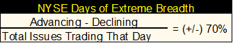
How can one know when the market sees a NYSE 70% A-D Day, a day of extreme-market breadth? The easiest way is to watch CNBC. If the “market experts” are clearly in a mental state-of-despair on a big down day in the market, that is a negative day of extreme-market breadth. If the next day the “market experts” are in a mental state-of-euphoria, as the Dow Jones recovers several percentage points lost the day before, that is a positive day of extreme-market breadth.
To be sure, download the daily breadth data for the NYSE from the Wall Street Journal at the link below;
https://www.wsj.com/market-data/stocks/marketsdiary
You can compute the data yourself using the formula below. Remember, the 70% is a threshold value. A NYSE 70% A-D Day could easily be in the (+/-) 80% and 90% range.
Every now and then I have to give credit to the Wall Street Journal and Barron’s. These fine publications have for over 100 years published market data for the benefit of the general public. They never get any credit for this, but they should. If it wasn’t for these Dow Jones publications, I’d have nothing data driven to write about, like the chart below.
The Dow Jones in daily bars (thank you Wall Street Journal & Barron’s) looks very constructive for the bulls out there. Dow Jones’ 36,000? I’d give it a month, but it could happen by the close of next week too.
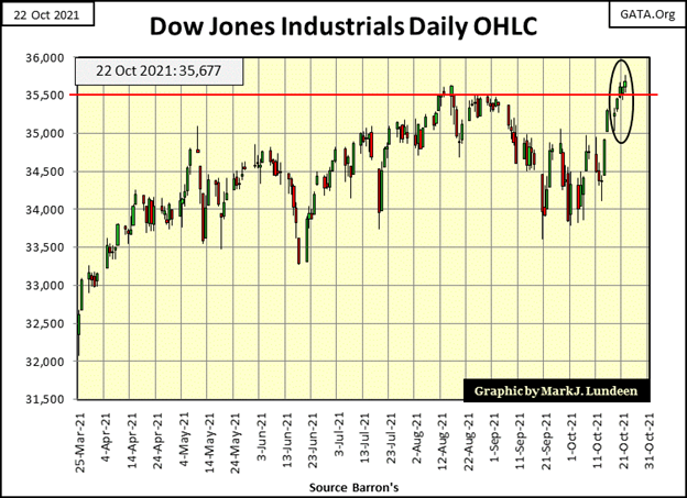
So, how far can the Dow Jones advance from here? From someone sitting high up in the market’s peanut gallery, I can only say I haven’t a clue. But I know of two hard facts that greatly affect this bull market.
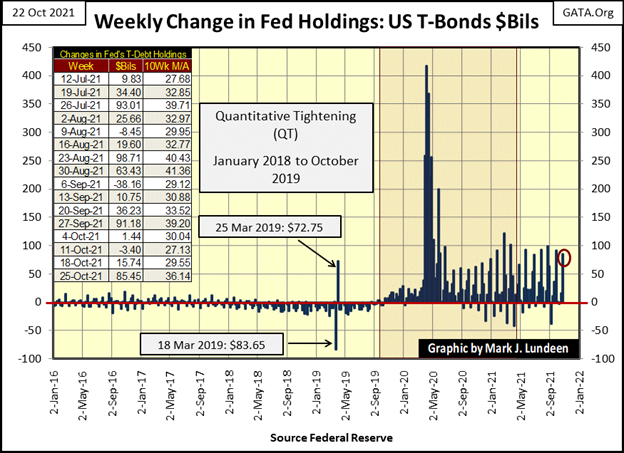
The first is, the idiot savants dictating “monetary policy” at the FOMC want the stock market to advance. I know that by looking at what they are doing, and what they are doing is “injecting liquidity” into the financial system, which is inflating market valuations. In the chart below, the FOMC “injected” an additional $85.45 billion dollars (Red Circle below) into the market this week.
The other hard fact I know is, one day this trick of inflating market valuations via “injections” of monetary inflation will no longer work. Once the market crosses that event horizon (the point of no return for a gravitational-black hole), “injecting” additional “liquidity” into the market will only increase chaos in a chaotic market.
Below are two tables containing commodity prices I track on a weekly basis. The left table contains prices from last October to the close of this week. The right table from the panic lows of March 2020 to the close of this week. What’s there to say; but “liquidity” flowing from the Federal Reserve has been flowing into consumer prices since March 2020 (see chart above).
In each table, energy prices have doubled or tripled. Just about everything else has increased by double-digit percentages. But note how precious metal prices in the left table (Red Box) are down from last October.
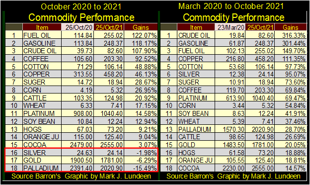
This illustrates the fallacy that precious-metal bull markets are driven by monetary inflation. If that was true, the FOMC wouldn’t “inject liquidity” into the financial system. The whole point of having the idiot savants at the FOMC inflate the money supply, is to inflate the market valuations of financial assets, such as stocks and bonds, and real estate too.
Everybody loves a good bull market, and if the “policymakers” can inflate market valuations for the things trading on Wall Street, without also inflating commodity prices, then that’s not inflation. No, no, no; don’t even think rising valuations in the stock market having anything to do with monetary inflation. No, don’t think that! Not when the market’s big brains, as seen on TV, all tell us; rising market valuations are actually “economic growth”, as expressed by the NYSE & NASDAQ.
Of course, the art-of-central-banking is to know how to direct the flows of monetary inflation into those areas of the economy (stocks, bonds, and real estate) to stimulate this “economic growth.” That plus how to keep their flows of monetary inflation from flowing into commodity prices, especially from gold and silver valuations.
However, when central-bank “liquidity” does begin flowing into commodity prices, as seen above, that’s a problem, as now they’ve created consumer-price inflation (CPI). That is something everyone, including “market experts” on TV know is bad.
Next is a graphic containing two charts. The upper chart shows the monthly changes in the Federal Reserve’s holdings of US Treasury debt. This is how they “inject liquidity” into the financial system; the FOMC writes a check from a checking account containing zero funds, to purchase T-Debt from a big bank. The bank gets the inflationary dollars, and the Federal Reserve gets the T-bonds. If you or I tried that, they’d lock us up for check kiting. But the Federal Reserve has been writing checks from the same account with zero funds in it for the past one-hundred years.
Monetary inflation is an addiction. At first a little “injection” is all it takes to get everyone feeling really good. But over time, the monkey on every addict’s back always demands more. As seen below, before October 2007, on average it took only $2.98 billion * A MONTH * to keep Wall Street’s monkey happy as the “policymakers” inflated a huge bubble in the single-family real estate market. * THIS WEEK * the FOMC had to “inject” $85.45 billion to keep the market’s monkey quiet as the Dow Jones creeped upward toward 36,000.
And the monkey on Wall Street’s back can be a very demanding monkey. In February / March 2020, the stock and bond markets began a mini-crash. The idiot savants at the FOMC knew the monkey wasn’t kidding around; not when he shaved 37% from a Dow Jones’ all-time high in only twenty-eight NYSE trading sessions, as corporate bond yields doubled. Nineteen months ago, the earth beneath Wall Street was opening up. There was only one way to stop the monkey from going full-ape on the market.
In the chart below I have a table for the monthly “injections” the FOMC has been prescribing to the market. In March 2020 the FOMC had to “inject” $350.21 billion; a then-record “injection.” Which was dwarfed by what the monkey demanded in April: $1,375 billion.
This is also another facet in the art-of-central-banking; knowing how and when to keep the market’s monkey happy. No doubt, that is how the idiots at the FOMC have come to see this endless cycle of “injecting liquidity” into the financial system.
But when one recognizes what the Federal Reserve System has done to the American financial system, that they’ve addicted everyone with their cheap credit, as they eroded the purchasing power of the dollar they’ve mismanaged for decades, one may see our current situation in a different light.
At first every addict “injects” their drug of choice for the pleasure it delivers. But at the terminal phase of the addiction, addicts no longer “inject” their drug of choice for pleasure, but to stop the pain of withdrawal.
And that is how I see the massive Not QE#4’s “injections” of March / April 2020 below. The idiot savants at the FOMC didn’t “inject” $1.73 TRILLION DOLLARS into the financial system IN TWO SHORT MONTHS for the pleasure of it. They did it to stop the pain of having the monkey on their back chewing on their necks. And they knew it was only going to get worse if they didn’t give the monkey what it wanted: $1.73 TRILLION DOLLARS, a massive dose of monetary inflation in March / April 2020.
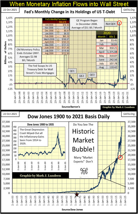
What the “economic growth” seen in the top chart has purchased, can be seen in the bottom chart; a gigantic bubble in the financial markets, as seen in the Dow Jones above. The red circle is for the lows of March 2020. Look at what Fed Chairman Powell’s Not QE#4 achieved in keeping market valuations inflated. Not all that much when considering the enormous size of this “injection.”
That’s an important point to keep in mind, as the next time the market’s monkey demands another massive fix from the FOMC, expect it to be considerably larger than Powell’s Not QE#4, and expect it to have less effect, if any, in reflating market valuations.
So, monetary inflation doesn’t inflate the valuations of gold and silver, but the things that Wall Street peddles to the public. Then, what does drive the valuations of the old monetary metals in their bull markets? That’s simple; when the bubble inflated in the Dow Jones above begins deflating, flight-capital fleeing deflation in the financial market will be forced to find refuge, or deflate with the market. What this flight capital seeks is a source of inflation in a deflationary market.
At such times precious metals, assets with zero counter-party risks, will once again become a safe harbor from the deflation consuming Wall Street. Considering how small, and illiquid precious metal asset markets are compared to the financial markets inflated by the FOMC, what price will gold and silver be when tens, maybe hundreds of trillions of dollars of flight capital begin flowing towards these tiny markets? It boggles the mind thinking of the possibilities.
But each of those possibilities are denominated in dollars; be it $10,000 an ounce gold, or $100,000. The problem is the dollar, which isn’t going to survive. Should gold increase to something over $10,000, there will be people who would rather hold on to their ounce of gold, and pass on the dollars, no matter how many dollars are offered. This is for the good reason that the day is coming when it’s not how many dollars the price of gold valued, but how many ounces of gold, or silver someone has.
But all that is for some dismal point somewhere in the future. Today, gold is still valued in dollars, and the dollar value we’re all looking at is $2061.44, its last all-time high from August 2020. So, let’s take a look at gold’s BEV chart below. Gold closed the week with a BEV of -13.00%. Though not emotionally satisfying, as say a close for the week with a BEV 0.00%. But currently, it’s about as good as we can expect. Gold’s support at its BEV -15% line is holding, and that is something to be grateful for.
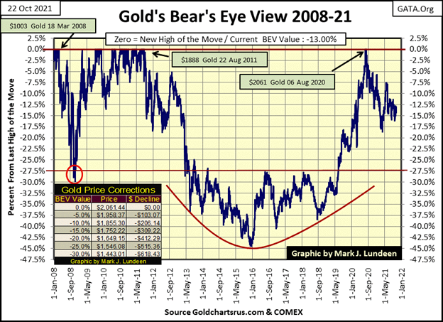
When is gold to make its next move towards a new all-time high? I don’t know. Currently, the “policymakers” are successfully executing their “policy” of inflating valuations in the financial markets, while retarding any advance in the price of gold and silver.
At times like this, it’s best not to attempt to front run a big market move that may not happen anytime soon. I’m talking about getting bearish on the stock market or bullish on gold and silver. I will say this; as far as the stock market goes, if someone got out of it, and stayed out of it, I think that’s a good move. I’ve been out for years.
For gold and silver, this is the time to buy, as the idiot savants at the FOMC are actually subsidizing your purchases by a large factor. By what; 60% to 80% of what a fair market price would demand in October 2021? Today, with gold’s BEV value at -13.00%, retail investors can buy all they can afford. In the future, when gold is going for over $2500, that may not be true. And this may ever be truer for silver.
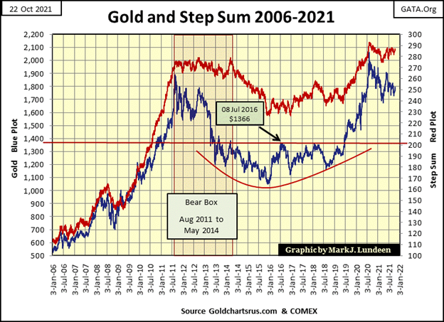
Next is gold’s step sum chart. As long as gold holds above its $1700 level, gold looks good. What would look great would be seeing gold close and then hold above its $1800 line, and from their advance towards its $1900 level. This will happen; just don’t hold your breath until it does.
With the Dow Jones closing the week at a new all-time high in the chart below, it’s obvious why Alfred is grinning. Dow Jones 36,000? Why think small, why not Dow Jones 37,000, or even Dow Jones 40,000? Yes, why not?
Well, Dow Jones at 40,000 is only a 12.11% advance from today’s close. That is less of a move than say for gold, which needs to advance 13% to make a new all-time high.
On a risk-to-reward basis, does a potential 12.11% return reward an investor for risking their money in a massive-market bubble that could collapse into pandemonium without notice? It sure isn’t enough to tempt me to get off my comfortable bench in the market’s peanut gallery.
Today, it makes much more sense to exit the stock market and take the proceeds to purchase gold and silver bullion, or shares of the precious metal miners. I say that as the potential for advancement with stocks, in this now four-decade-long bull market, are very limited. After an advance that began in August 1982, an advance that took the Dow Jones from under 800 to almost 36,000, becoming bullish, or remaining bullish for the stock market in October 2021 is unwise.
The situation for investors in the old monetary metals is completely different. Gold and silver began their bull market in 2001, so it’s a twenty years old bull market. But it’s been twenty years of frustration for their investors, thanks to the “policymakers.”
So, to money managers and the general public, gold and silver are nowhere on their radar screens. This is the promising situation early investors in any bull market benefit from, that oddly remains the situation for the precious metals now twenty years into their bull market.
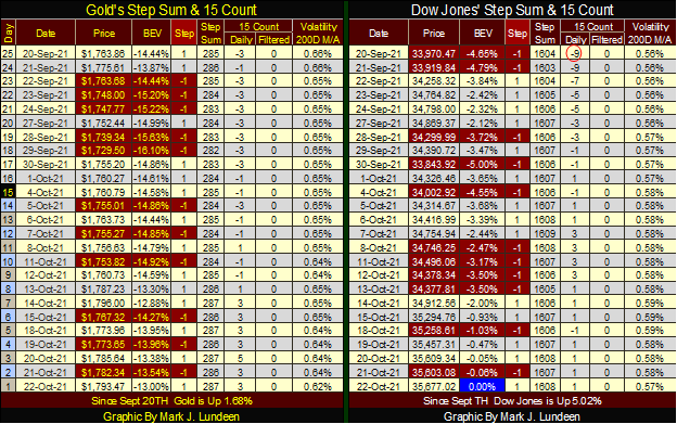
Gold, in its step sum table below, is advancing, as is its step sum. But most people and money managers haven’t noticed and don’t care. Which is the time to enter into any market, and then you wait until they do. What the gold market needs is an increase in its daily volatility. Its 200-day M/A closed the week at a 0.62%, and that’s a problem for the bulls in the precious metal markets.
The Dow Jones since September 20th has seen as many down days as gold has, yet it has advanced more. It’s nice to have friends in high places, like at the FOMC.
I keep talking about the stock market advancing until it stops and then begins something calamitous that will prove to be a great misfortune for most people. But what could cause that to come about?
Don’t forget about the Chinese real estate bubble entering a phase of deflation. The Chinese real estate company, Evergrande has one foot over its grave and the other on a banana peel. Should the massive Chinese real estate sector enter into a terminal deflationary phase, it could get very ugly worldwide.
And as I mentioned above, “liquidity” from the FOMC is flowing into commodity prices, and into the most critical commodity, the price of crude oil. Below I have weekly crude oil prices in dollars in the top chart, and in BEV values in the bottom, going back to October 1983.
There is some history to be studied below. The first drop in the price of oil seen below happened in 1985. The reduction in the price of oil doesn’t seem much in the top chart plotting crude oil in dollars. But if you look at this data in BEV terms, you’ll see this drop in the price of oil was a whopping 65% collapse in the price of oil.
This was during the same period of market history where gold and silver were in the early years of a two-decade-long bear market that saw similar percentage losses in their prices.
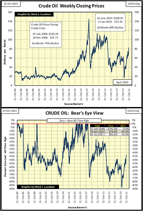
Is there a connection between the crude oil and precious metals market? There certainly was a connection in the mid-1980s.
In 1980, President Reagan ran for office vowing to fight the “Evil Empire”, the old Soviet Union, and bring it down. That he did, but Reagan first cut off the USSR’s source of income, which was selling crude oil and precious metals in the global market.
With the cooperation of the Persian Gulf’s Oil-Sheikdoms, the global crude oil market was flooded with cheap crude, and in the BEV chart above we can see the consequences of that political action on the USSR’s crude oil income – a 65% reduction in price of oil the Soviets got in the world market.
It was at this time that Western central banks also began leasing their gold reserves to London and Wall Street bullion banks. Which, as I’ve been told by people whose opinion on this topic I respect, originally began as a mechanism to crush the price of gold and silver to hurt the Soviet Union. Of course, after the USSR fell, Wall Street continued to lease central-bank gold because it was so profitable for them to do so. Then came the summer of 1999, when a spike in the price of gold and silver almost took down several major banks.
__
(Featured image by South Bend Voice CC BY 2.0 via Flickr)
DISCLAIMER: This article was written by a third party contributor and does not reflect the opinion of Born2Invest, its management, staff or its associates. Please review our disclaimer for more information.
This article may include forward-looking statements. These forward-looking statements generally are identified by the words “believe,” “project,” “estimate,” “become,” “plan,” “will,” and similar expressions. These forward-looking statements involve known and unknown risks as well as uncertainties, including those discussed in the following cautionary statements and elsewhere in this article and on this site. Although the Company may believe that its expectations are based on reasonable assumptions, the actual results that the Company may achieve may differ materially from any forward-looking statements, which reflect the opinions of the management of the Company only as of the date hereof. Additionally, please make sure to read these important disclosures.


Advances in Biomarkers and Targeted Therapies Transform Kidney Care in Autoimmune Disease
New biomarkers and targeted therapies are reshaping the management of kidney damage in autoimmune diseases like lupus and vasculitis. Experts...


Bitcoin Rises on Iran Deal as Crypto Markets React to AI and SpaceX News
Bitcoin rose above $65,000, gaining about 5% as a tentative Iran war agreement boosted markets. ETFs still show weekly outflows....

Rising Inflation, Fed Uncertainty, and Market Excess Amid War and SpaceX Mania
Rising inflation, driven by war, debt, and money growth, puts the Fed in a difficult position ahead of its meeting....


SpaceX IPO Sparks Déjà Vu as Market Risks Loom and Gold Bulls Stay Hopeful
The author compares the 2000 AOL Time Warner merger to SpaceX’s planned IPO, warning it may signal a market top....


The TopRanked.io Guide to 2026’s Biggest and Best Affiliate Opportunities
Want to earn affiliate commissions on literal billions of dollars worth of revenue? Then this week, we've got something special...
 |
|
 |  |
 |
|
-
 Crypto1 week ago
Crypto Market Slumps as Bitcoin and Ethereum Fall, Sentiment Turns to Fear
-
 Markets2 weeks ago
Markets Surge Amid Rising Risks and Economic Strain
-
 Crypto6 days ago
Bitcoin and Ethereum Stabilize as Markets Watch ETF Flows and Institutional Moves
-

 Biotech2 weeks ago
Molecular Health Insolvency Leads to Restructuring Under New Company Name Lucera GmbH