Business
Why Selectivity in the Stock Market is Bad
Last week gold’s 15-count hit a +7, making gold an overbought market. So, I’m not surprised to see gold sell-off this week, closing the week with a neutral 15-count of +5. What’s next? I don’t know, but what I’d like to see is for gold’s 15-count to continue declining down to a negative value, as the price of gold itself continues advancing. Can that happen? Yes, it can. Call it a mini-step sum bull box.

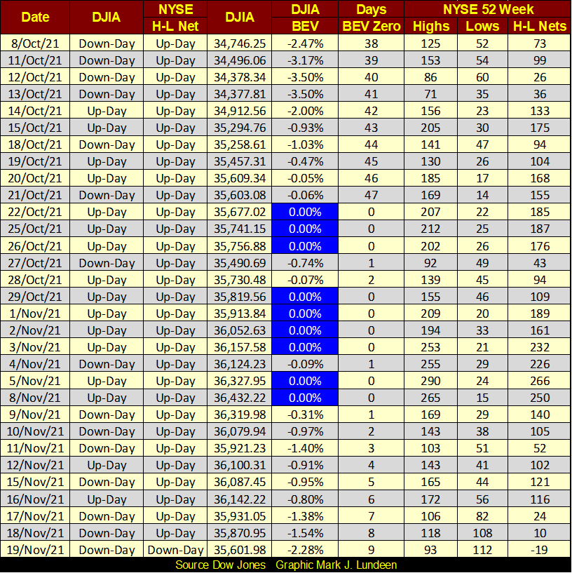
The Dow Jones closed down from last week, but not by much. Which is a bit amazing, as in the last nine NYSE trading sessions, the Dow Jones closed up for the day in only two, and down for seven of them. And after two weeks of that, the Dow Jones closed the week with a BEV value of -2.28%; well within scoring position.
So, the Dow Jones may have stopped going up, but it definitely isn’t going down. Not yet anyway. The best way to describe this market action would be to recognize the Dow Jones continues trading as it has for the past year; closing daily either at a new all-time high, or within scoring position of one; within 5% of a new all-time high. So, we are looking at nothing new going on below, but a continuation of more of the same of what we’ve seen in the past year.
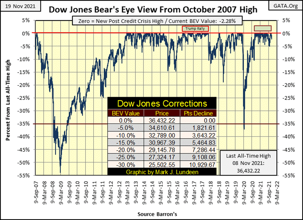
As for the other major market indexes I follow, as seen in the table below, the story they tell of the market is much the same as told by the Dow Jones for the past year, with most closing daily at either a BEV Zero, or within scoring position of a new all-time high. Look at Thursday and Friday below; a few BEV Zeros, with the rest, if not the XAU, closing within scoring position.
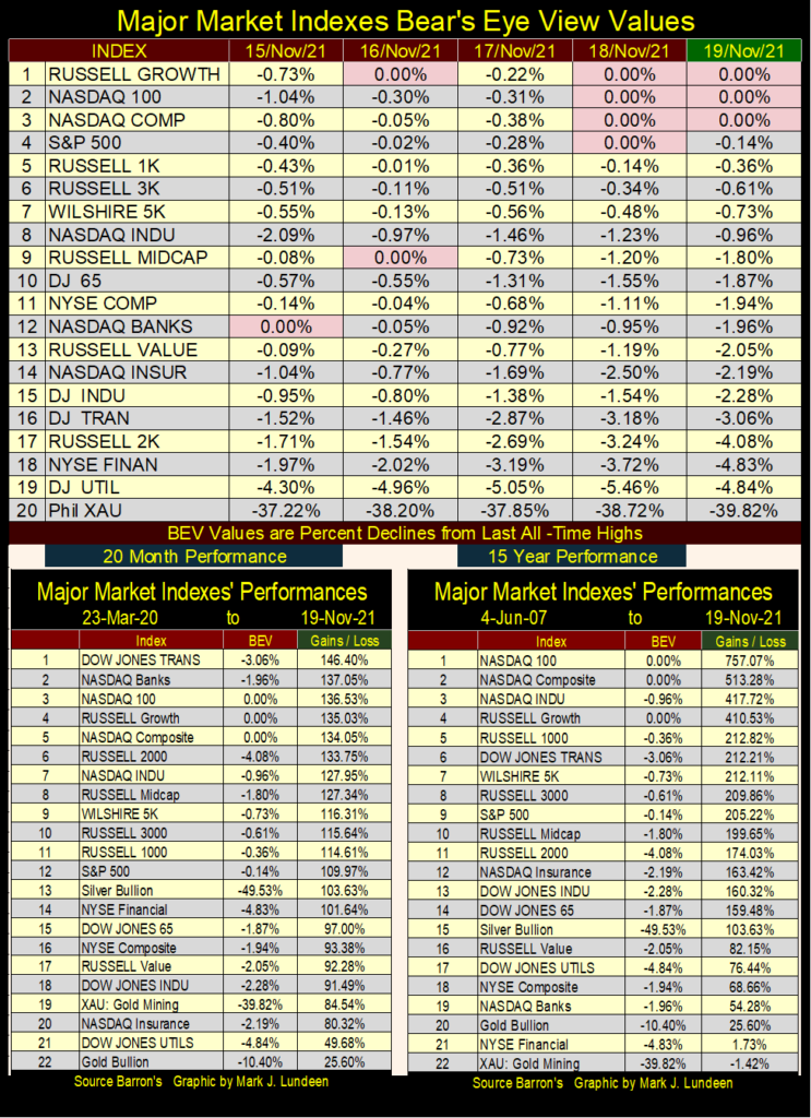
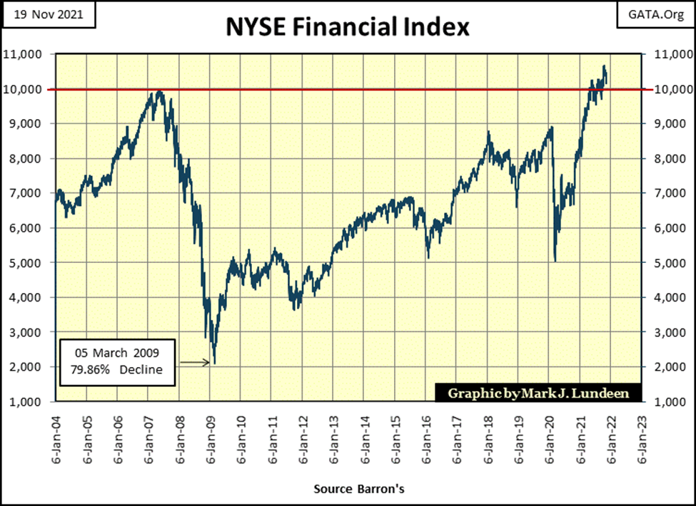
I’m looking at the NYSE Financial Index above, (#18) in the BEV value table above. From Monday to Friday’s close, it lost just under 3 BEV points. Nothing big going on here. But this is an important index, in a canary in the coal mine sort of way.
During the sub-prime mortgage crisis of 2007-09, it was these financial companies that took everything else down with them. During the subprime mortgage bull market, the Dow Jones saw its last all-time high on 09 October 2007, but the NYSE Financial Index saw its last all-time high four months earlier on 04 June 2007.
Here’s a chart for the NYSE Financials going back to 2004. During the sub-prime mortgage debacle, this index declined 80% from its June 2007 high to its March 2009 bottom. It’s taken over a decade before the NYSE Financial Index recovered the losses it took during the sub-prime mortgage bear market.
If you return to the table above, I placed a table for the 15 Year Performance of these major indexes, with the start at 04 June 2007, at the top of the sub-prime mortgage bull market for the NYSE Financials. These are companies that the Federal Reserve and US Government gifted trillions of dollars during the dark days of 2007-2009. They (the “policy makers”) also rewrote the accounting standards, so some of these companies didn’t have to declare bankruptcy. And after all that, since 04 June 2007 to the close of this week, the NYSE Financial Index is up by only 1.73%.
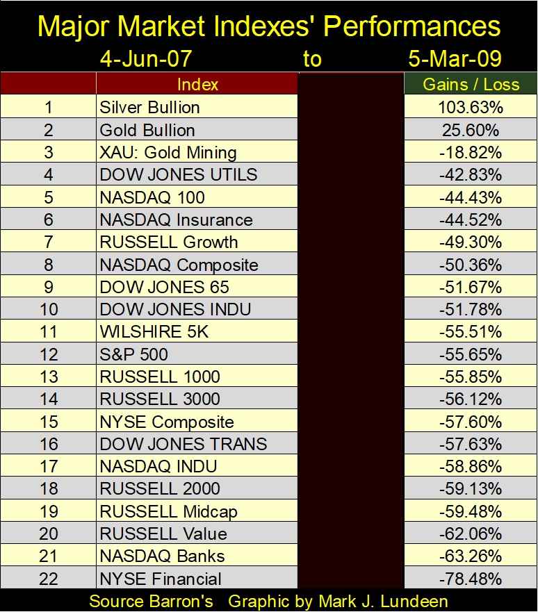
Some of my readers will observe that had I used 05 March 2009, at the 80% bottom of the NYSE Financial index as a start date, these financial companies’ performance would be very different. True enough. But as seen below, the NYSE Financial Index was the worst performing major stock index during the sub-prime mortgage bear market. Note: I redacted the BEV column as the data was very wrong and I didn’t want to spend the time to make it right.
Whatever caused the NYSE Financial Index to collapse by 80% in March 2009, in the table above, hasn’t been corrected in November 2021. Actually, I believe whatever ailed the NYSE Financial Index in 2009, is much worse twelve years later, even if it has begun making new all-time highs in the past year. So, I’m keeping an eye on the NYSE Financials. Should this index break below its BEV -10% level, before everything else, that wouldn’t be a positive development for the rest of the stock market.
Note the performance for gold, silver and the XAU in the table above (#1,2&3). They saw their lows in October 2008, and by March 2009 they actually benefitted from all of the chaos in the broad market. I’m anticipating more of the same come the next crisis in the market.
The Dow Jones has been making new all-time highs in the past month, nine of them since October 22nd, as seen in the table below (Royal Blue / BEV Zeros). But, the volume of NYSE 52Wk Highs on these Dow Jones all-time highs aren’t what I would expect. It’s like the general is leading the charge as the enlisted men refuse to follow.
I like following the daily sums of the 52Wk Highs and 52Wk Lows, the H-L Nets column below. In a good market, seeing occasional spikes into the 300 up to the 500s confirms the advance is broad based, which from last January to June the NYSE did frequently. On May 10th the H-L Net hit a 661. But since June 10th, when the NYSE saw a H-L Net of 324, all the following daily nets, to this day, have been less than 300, even as the Dow Jones made nineteen additional BEV Zeros in the past five months.
This is an example of what the old-timers used to call “selectivity.” Early in a bull market just about everything is advancing. But as a market advance approaches its end point, it becomes “selective”, meaning most of the advances seen in the market occur in an ever-shrinking group of glamor issues.
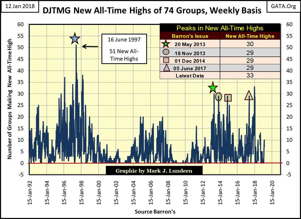
Here’s an example of that happening during the NASDAQ High-Tech bull market of the 1990s, as seen in the Dow Jones Total Market Group (DJTMG), a data series that looked at market groups instead of individual stocks.
I stopped following the DJTMG in July 2018 as Barron’s redid their market data pages. It wasn’t their fault. The market by 2018 had evolved far from where it was in October 1988 when they began publishing this data series. Every time they updated the DJTMG, I was tearing hair out of my head in frustration to reconcile the new data with the old. I really loved the old DJTMG, and today, for the purpose of providing historical examples, such as selectivity in a maturing market advance, it’s still an excellent data set.
Look at the chart below from 1992 to 2002. The volume of new all-time highs from 1992 to June 1997 continues to increase, until these groups hit a peak of 51 of 74 groups hitting a new all-time high in Barron’s 16 June 1997 issue. For the broad market, June 1997 can be seen as a market top, as before it one could invest in almost anything and realize capital gains. But following June 1997, the volume of groups making new all-time highs declined, beginning their bear markets even as the Dow Jones and NASDAQ Indexes continued advancing into early 2000.
We can use NYSE 52Wk High – Low data for the same purpose; identifying episodes of selectivity in the market. In the chart below I use a ratio of the 52Wk H-L nets as a percentage of issues trading each day at the NYSE, as the total number of companies trading at the NYSE has changed greatly since 1980. In 1980, around 1900 issues traded daily at the NYSE; today about 3500 issues trade daily. I use a threshold value of (+/-) 9% to eliminate the noise in the data. Today, with about 3500 issues trading daily at the NYSE, a ratio of 9% would be a 52Wk H-L net of 315.
A word of warning; the comments below are really good stuff, even if they will probably bore most of my readers to tears. So, in a nutshell, in the data below what I’m noting is that historically, early in a bullish advance, many companies on the NYSE make new 52Wk Highs. However, in the twilight of a bullish advance, fewer and fewer companies trading on the NYSE make new 52Wk Highs. This is because as the market matures, the market becomes increasingly selective of which stocks advance to new 52Wk highs. I’m also noting that our current advance, which began in March 2020, has become selective since last June. For the bulls, seeing the market becoming selective is not a good development.
That is all you need to know about the following chart of the NYSE 52Wk H-L Ratio. It really is. So, take a good look at it, and then feel free to skip down to my chart of the Dow Jones in daily bars, two charts down. If you want the deeper details, keep on reading.
Below, we’re looking at the history of our massive bull market; a bull market that began in August 1982, in terms of NYSE daily 52Wk Highs and Lows. On 11 October 1982, just months into the bull market, the ratio hit 32%, or a third of the companies trading on the NYSE saw a 52Wk High. But back then, EVERYTHING trading at the NYSE was going up.
On 03 October 1997, the ratio hit 19%; the NYSE then became selective two years before the top of the 1990s High-Tech bull market. This is exactly what we saw with the DJTMG data above.
The same thing happened during the sub-prime bull market, though it’s not as apparent in the chart below. On 15 June 2007, days after the NYSE Financial Index saw its last all-time high, the ratio hit 9.33%. Though the Dow Jones would continue advancing to new all-time highs into October 2007, the NYSE 52Wk H-L ratio in July 2007 began a series of negative ratios, below the -20% level in the chart below.
Without a doubt, after June of 2007, the stock market had become selective as more issues trading at the NYSE began seeing 52Wk Lows than Highs, as the Dow Jones continued to advance to new all-time highs for another four months.
What followed a year later, in October 2008, was a selling panic, with 89% of the issues trading at the NYSE hitting new 52Wk Lows on 10 Oct 2008. This was the same day when then Fed Chairman, Dr. Ben Bernanke and then Treasury Secretary, Hank Paulson, during commercial free television on CNBC lied to Congress (a Congress who wanted to be lied to) that if freed from the legislative shackles imposed on them, they could turn the market around.
Why was this a lie? Because they implied that they were going to restore the market, and the financial system, then in a state of panic and illiquidity, back to normalcy. What the truth was, is since the FOMC created their sub-prime mortgage bull and bear markets, what followed it, Bernanke’s three QEs, and Fed Chairman Powell’s Not QE#4, is anything but normal.
Congress in amazing short time freed the Federal Reserve and US Treasury of the legislative constraint imposed on them. Following the markets low of 09 March 2009, the Dow Jones and other major market indexes began a bull market that continues to this day. BUT NOTE: the lows of the NYSE 52Wk H-L Ratio was on 10 October 2008 (-87.45%), not on the lows of the Dow Jones on 09 March 2009 (-18.75). The broad market had turned around before the Dow Jones and other major indexes had.
It’s amazing what a few hundred-billion dollars “injected” into the market can do.
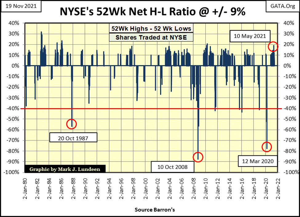
Looking at our current market, post March 2009, the NYSE 52Wk H-L Ratio from late 2009 to 2015 saw many days with their 52Wk H-L Ratios breaking above my 9% threshold. But then again, it also saw days with the ratio breaking below the -40% line, something it had never done before October 2007. I’m ignoring the down spike of 20 October 1987, as that was from a Wall Street computer software problem.
After January 2018, during the Trump Rally, the NYSE 52Wk H-L Ratio seldom broke above my 9% threshold, as the FOMC implemented their Quantitative Easing (QT). As the FOMC drained “liquidity” from the market, once again the market became selective.
In October 2019, the FOMC terminated their QT as rates in the overnight repo markets spiked into double digits. From an all-time high, beginning in February 2020, the Dow Jones plunged 37% in only twenty-seven NYSE trading sessions, as the 52Wk H-L Ratio plunged to a stunning -73% in March 2020.
It was then that Fed Chairman Powell decided to inject TRILLIONS OF DOLLARS into the market. Once again, in November 2020, the Dow Jones and other major market indexes began making new all-time highs. In the chart above, beginning in November 2020, a cluster of NYSE 52Wk H-L Ratio days of +9% also formed, peaking on 10 May 2021 with a ratio of +19%.
But since June 10th of this year, the NYSE has been free of these 9% days in its 52Wk H-L Ratio, which I recognize as the market once again becoming selective, and that is not good.
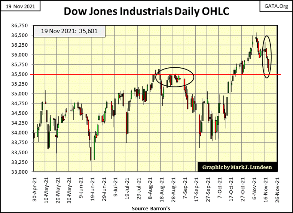
Here’s the Dow Jones in daily bars (below). Last two weeks have been hard on the venerable Dow Jones. But as noted above, as long as the Dow Jones remains above 34,610 (its BEV -5% level) it continues trading as it has since November 2020; within scoring position. As seen below, September and early October also saw some downside to the Dow Jones, during which it remained in scoring position; within 5% of its last all-time high. In November, the Dow Jones was once again making new all-time highs.
So, unless we begin seeing extreme market events, Dow Jones 2% days and NYSE 70% A-D days, I remain short term bullish on the stock market.
One reason to remain bullish on the stock market, is the idiot savants at the FOMC continue to “inject liquidity” into the market. They “injected” an additional $74.16 billion this week, and they’ll “inject” more if needed in the weeks and months to come to keep market valuations inflated.
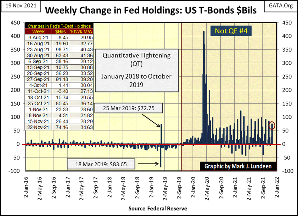
But in November 2021, the idiot savants are now playing a mug’s game, as “injecting liquidity” into the financial system cannot, and will not sustain a bull market over the long term.
Here’s a 15-minute clip by the Epic Economist. He provides some excellent insight that the top of this bull market advance is in. I’m not so sure. I believe there could be more to the upside. But then I’m saying that from the market’s peanut gallery, because I know that bulls make money, and bears make money, but pigs get slaughtered.

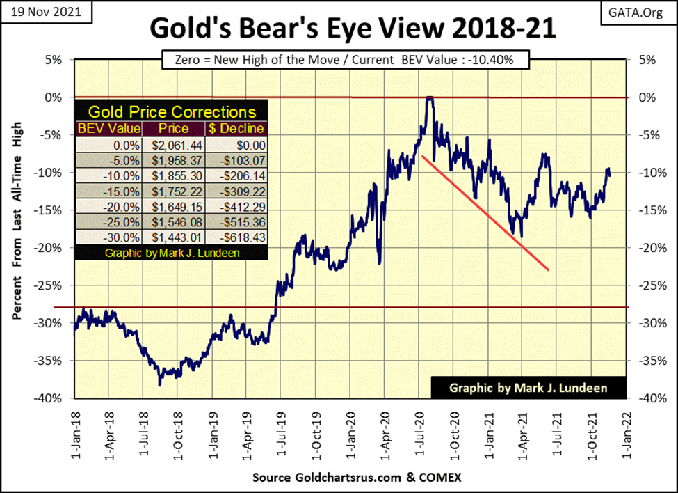
How did gold do this week? Well, last week it closed above its critical BEV -10% level. This week it closed below it, with a BEV of -10.40%. No big deal. Should some of the items pointed out by the Epic Economist above come to term in the weeks and months to come, we’ll see dollars flee the deflating stock market, as they begin flowing towards inflating commodities; like gold and silver.
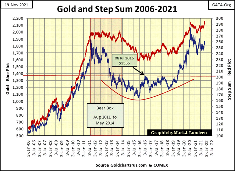
Next is gold’s step sum chart. Gold’s step sum plot (Red Plot / Market Expectations) is leading the price of gold (Blue Plot / Market Reality). It’s a nice chart, one that promises good things to come for gold, silver, and mining shares. I’m not going to predict dates, but sometime in the not too distance future, expect a big up-spike in the price of gold, one that will take out its last all-time high of August 2020.
This would be especially so, should concerns of rising CPI inflation become widespread in the general population. I’m seeing lots of stuff about rising prices in the news. I’m sure my readers are too. One of these days something big is going to happen concerning the price of energy and food. At that time, investors may not be able to buy gold and silver, as inventories disappear.
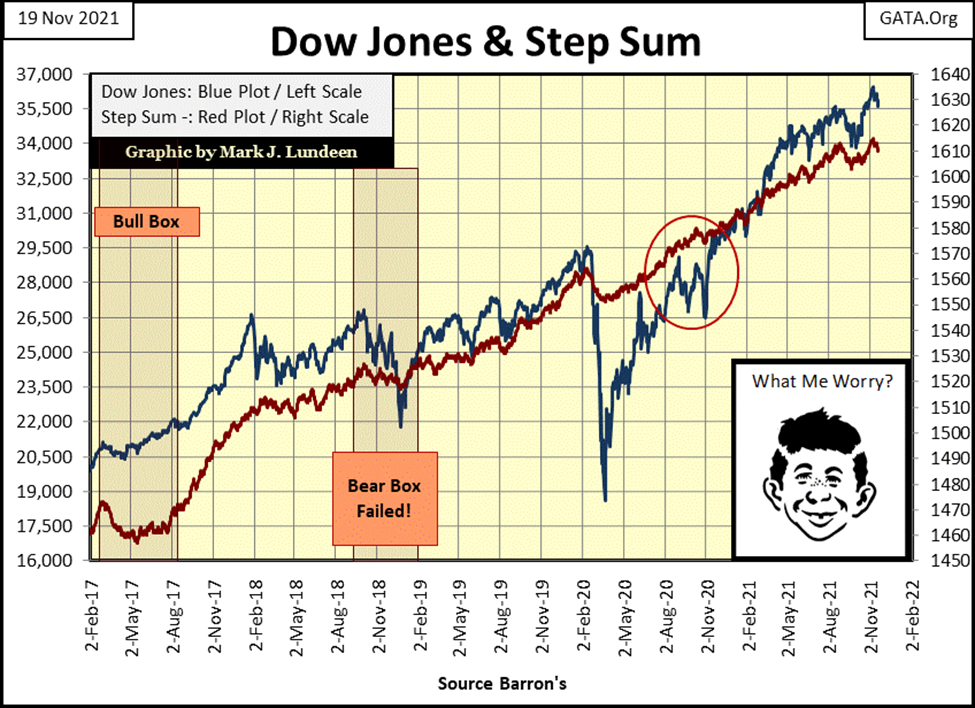
As for the step sum chart for the Dow Jones, as long as the Dow can remain above its 34,610 level (its BEV -5% level) this chart continues looking good. But then this chart looked good in February 2020, and look at what happened in March 2020 below.
Last week gold’s 15-count hit a +7, making gold an overbought market. So, I’m not surprised to see gold sell-off this week, closing the week with a neutral 15-count of +5. What’s next? I don’t know, but what I’d like to see is for gold’s 15-count to continue declining down to a negative value, as the price of gold itself continues advancing. Can that happen? Yes, it can. Call it a mini-step sum bull box.
Darn it, gold’s daily volatility’s 200-day M/A continues to fall, closing the week at 0.61%. What we need are some days of extreme volatility in the gold market, some daily moves of 3% or more from a previous day’s close. A 3% advance for gold from this week’s close would be a daily advance of $55.41, taking gold up to $1902.41. That would get everyone’s attention!
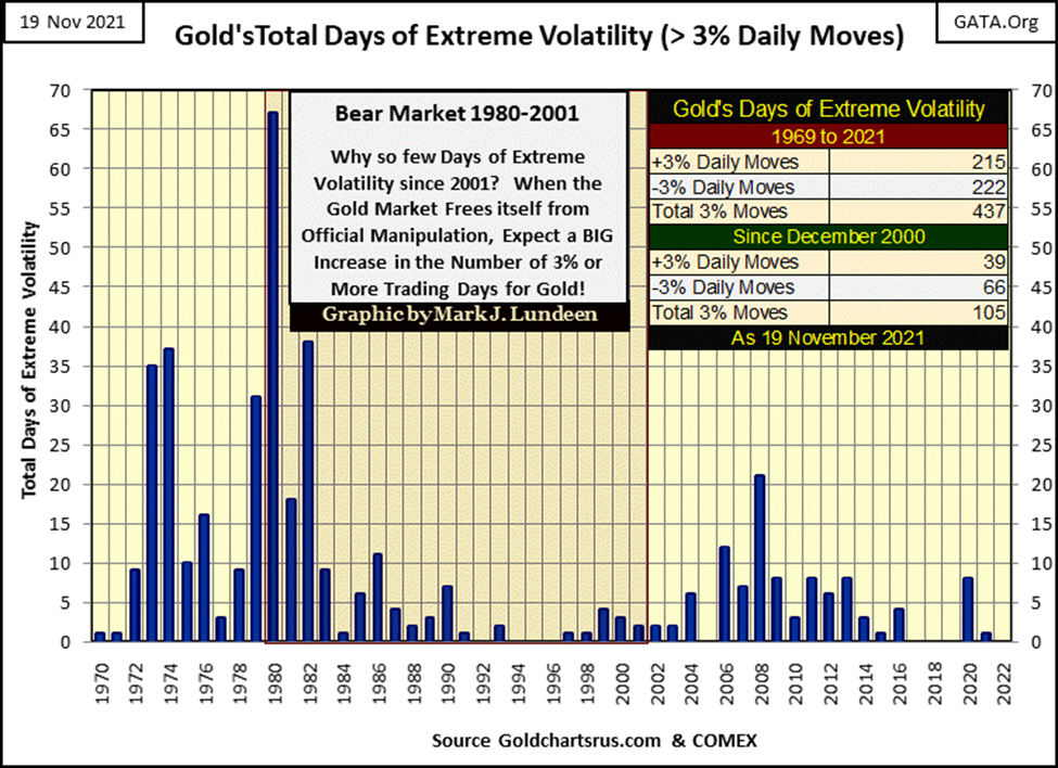
Gold does see these days of extreme volatility, as seen in the chart below. But in 2021 gold has seen only one extreme day last January, unlike 2020 which saw eight. Note: 2020 was a year that saw gold close at a new all-time high.
The Dow Jones in its step sum table (above) has seen some amazing market action since its 15-count close at a VERY overbought +9 on November 8th. Seven of nine NYSE trading sessions saw the Dow Jones close down, yet this week the Dow Jones closed with a BEV value of only -2.28%. All this indicates that so far, the Dow Jones isn’t ready to crash in a bout of explosive deflation just yet.
Dow Jones 40,000? Yeah, sure – why not? Drinking beer and eating hotdogs way up here in the market’s peanut gallery, I think I’d enjoy that.
I’ll tell you another thing I’d enjoy; when the assay labs in Canada’s British Columbia finish assaying Eskay Mining core samples from last summer’s drilling program. Eskay Mining issued a press release on the results for only five of the ninety-seven cores delivered to the assay lab. After a few days, as the market digested the data, the share price jumped up a dollar, from around $1.65 to $2.65.
What’s going to happen when the other assays from last summer are published? I don’t know, but the Hedgeless Horseman below believes something spectacular is possible.
__
(Featured image by Stevebidmead via Pixabay)
DISCLAIMER: This article was written by a third party contributor and does not reflect the opinion of Born2Invest, its management, staff or its associates. Please review our disclaimer for more information.
This article may include forward-looking statements. These forward-looking statements generally are identified by the words “believe,” “project,” “estimate,” “become,” “plan,” “will,” and similar expressions. These forward-looking statements involve known and unknown risks as well as uncertainties, including those discussed in the following cautionary statements and elsewhere in this article and on this site. Although the Company may believe that its expectations are based on reasonable assumptions, the actual results that the Company may achieve may differ materially from any forward-looking statements, which reflect the opinions of the management of the Company only as of the date hereof. Additionally, please make sure to read these important disclosures.


Youth Cannabis Use in Colorado Is Falling — But the Full Story Is More Complex
The 2026 Colorado survey shows teen cannabis use fell to 10 percent in 2025, down from 21 percent in 2015....


Morocco’s Growth Holds at 4.6% as Agriculture Offsets Economic Pressures
Morocco’s economy grew 4.6% in Q1 2026, driven by a strong agricultural rebound offsetting declines in industry. Services expanded moderately...


Abivax Shares Surge as New Trial Data Eases Safety Concerns Over Ulcerative Colitis Drug
Abivax shares surged nearly 36% after positive updated trial results for its ulcerative colitis drug obefazimod reassured investors following earlier...


El Dorado Raises $9M to Expand Cross-Border Fintech Platform
El Dorado, a Latin American fintech improving cross-border financial services, raised a $9 million Series A led by Paradigm with...


Bitcoin Stalls Near $60K as Strategy Moves, ETFs Outflow, and EU MiCA Rules Take Effect
Bitcoin hovers near $60,000 with ETF outflows, while Strategy boosts reserves, sells BTC, and raises dividends to reassure investors. Ethereum...
 |
|
 |  |
 |
|
-

 Markets7 days ago
Commodity Markets Pause as Oil Falls, Metals Correct, and Grains Show Mixed Signals
-

 Africa2 weeks ago
Egypt’s Net Foreign Assets Rise as External Position Continues Gradual Strengthening
-

 Markets3 days ago
Oil Surges on U.S.–Iran Tensions as Global Markets Show Diverging Trends and Rising Risk Fears
-

 Markets1 week ago
Cocoa Market Faces Mixed Trends Amid Rising Supply and Weak Demand