Business
Why T-Bond Yields Increased in the Past Three Decades
As the annual rate of CPI inflation increased from single to double-digit percentages during these three decades, T-bond yields increased from just over 2% to over 15% as the bond market demanded a yield that compensated creditors for ever-rising CPI inflation. This forced the FOMC to increase their Fed Funds Rate from below 4% in the 1950s to induce a recession, to 22% in the early 1980s.

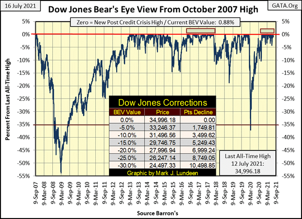
For the Dow Jones, the story remains the same; while not roaring into a historic territory, it’s not crashing down either. Closing the week with a BEV of -0.88%, the Dow Jones is comfortably in scoring position for making a new BEV Zero. Since last November, the Dow Jones has remained above its BEV -5% line, making thirty-four new BEV Zeros as it did, and we should expect more before this advance is over.
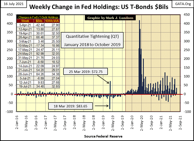
That the stock market is performing so well is only to be expected, as the FOMC continues “injecting liquidity” into the financial system. This week they “injected” another $34.4 billion dollars into it. That’s not much when we look at the weekly “injections” of March and April 2020 below. But during the 1990s, and all the way up to the top of the sub-prime mortgage debacle (October 2007), the FOMC inflated massive bubbles into the markets; the High Tech and single-family mortgage bubbles with “injections” of only $3 billion * A MONTH *.
Now it takes these massive weekly “injections” to just maintain an appearance of normalcy in the markets. The chart below plotting the FOMC’s weekly “injections” of “liquidity” into the market is a red flag that something is terribly wrong in the financial markets.
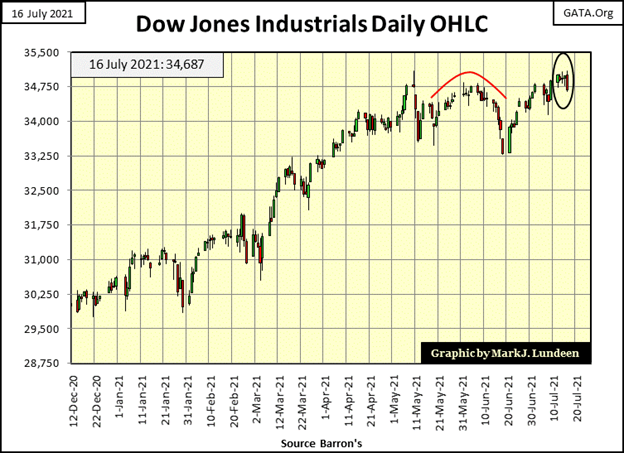
Still, even with all the “injections” seen above, looking at the Dow Jones in daily bars below, it’s apparent the Dow Jones’ advance to ever higher prices began to pause in early May of this year when it first broke above 34,750. Since last Friday’s close, the Dow Jones did close above 34,750 everyday, until today where it closed at 34,687. Is this the pause that refreshed before the next big push into market history, or maybe something else?
It’s best to assume this advance will continue until it becomes apparent there are problems developing. Should we begin seeing days of extreme-market volatility; the dreaded Dow Jones 2% days, and the NYSE begins seeing days of extreme market breadth; A-D 70% days, those would be bearish omens of bad things to come. Rising bond yields are never bullish for the stock market, though bull markets in precious metals thrive on rising bond yields.
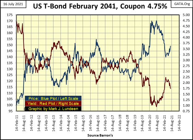
Next is a chart for a 30 Year T-bond issued in February 2011. The blue plot is the bond’s price / left scale, the red plot its yield / right scale. This bond’s yield went from 4.75% in February 2011 to below 1% last August as its price inflated by 70%. The bond market too is in a bubble.
From August of last year to February of this, the T-bond market saw a little correction, with rising yields and deflating prices. But since early March the bulls have taken back some of their lost territory. Are they going to keep buying until this bond’s yields is once again below 1%? Being the bulls driving prices up in both the stock and bond market are members in the FOMC, using monetary inflation to fund their purchases, who knows what they intend for this bond and others?
But for people, such as money managers for pension funds and insurance companies, where do they go to receive a reasonable return on their money? The entire bond market has become just another tool to execute “policy” by the FOMC.
The broad-stock market, as seen in the major market indexes BEV table below, took a rest this week. Monday began the week with nine BEV Zeros (new all-time highs). But that was followed by only one additional BEV Zero for the NASDAQ 100 on Wednesday. Friday saw fourteen of these indexes in scoring position, less than 5% from making a new all-time high, so I’m remaining bullish on the stock market for the weeks and months to come.
One thing that is odd about Thursday and Friday’s close in the table below; the Dow Jones was at the head of the list, which it almost never is. Why are the glamor issues in the NASDAQ 100 (#4) & Composite (#9) indexes lagging behind the old fogy industrials in the Dow Jones?
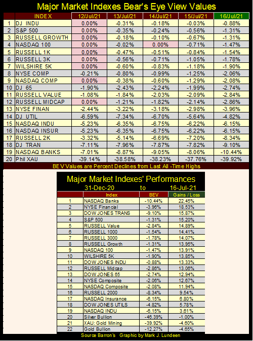
The 2021 advances for these indexes, as well as for gold and silver bullion are in the performance table above. So far 2021 has been a profitable year for most people. For the precious metals and XAU at the end of the list, they aren’t down all that much from their highs of 2021.
The BEV values seen above reveals where all the money has been flowing to, which so far in 2021 hasn’t been into my favorite groups; the old monetary metals and their miners at the bottom of the list. As precious metal assets are counter-cyclical investments to the broad stock market, it’s now just a matter of patience. We’re waiting for all that inflation, now flowing into indexes #1-19 above, to reverse direction, and begin flowing toward the old monetary metals come the next market decline. Do you think differently? Keep reading and you may change your mind.
Charts plotting data published by the Federal Reserve system, while sometimes dramatic, lack a connection to everyday reality. So, I thought I’d do something different this week and make a connection to an everyday reality too many younger people have with the credit markets, their need to “boost” their credit scores to continue their consumption.
Once, credit scores were solid-guard rails that not only protected banks from overextending their customers with too much debt, but also warned debtors that they were at risk of living beyond their means. Not anymore.
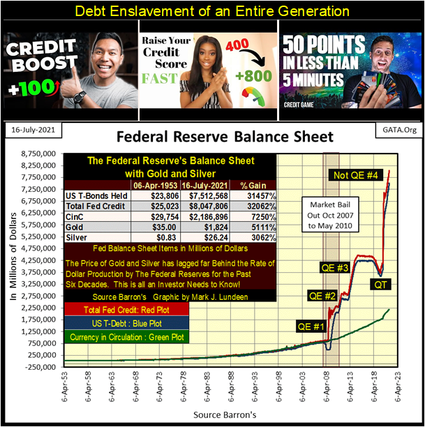
When you see the expansion of the Federal Reserve’s balance sheet below, that’s possible only if someone is willing to assume an increase in debt loading on their balance sheet, like recent graduates of high school or college. Our 21st century “policy makers” are confronted with the certainty of their failure to “inject” sufficient inflation into the economy will result in the demise of the debt-based financial system they’ve created. The FOMC cares little about whose balance sheet they trash, or the ultimate consequences for those who take full advantage of their “ample liquidity at attractive rates.” For them; it’s inflate or die.
It’s not just young people trashing their balance sheets with their school loans and credit cards, but also municipal governments.
And corporations who find themselves in a classification unique to our current era; that of corporate zombie, whose debt loading is such that normal operations are incapable of servicing the debts they’ve taken on. These zombie corporations must service their current debts with additional debt to continue their operations from one quarter to the next.
Don’t these zombie corporations have a board of directors to protect the interests of the company’s shareholders? Yes, they do, but their loyalties lie elsewhere. Like so much of American bureaucracy, corporate boards of directors for these zombies are not just useless, they have become harmful to the American public.
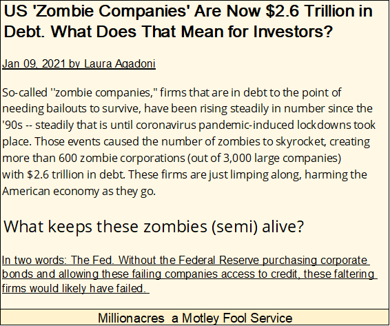
https://www.millionacres.com/real-estate-investing/articles/us-zombie-companies-are-now-26-trillion-in-debt-what-does-that-mean-for-investors/
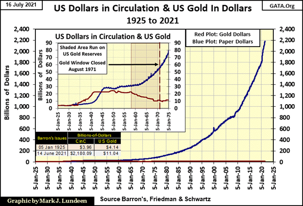
How did we come to this point? Since the creation of the Federal Reserve in 1913, a cabal of self-appointed “policy makers” have removed the US dollar, and financial system they dominate from any connection to economic reality; what was called the gold standard.
In the chart below, look at the relationship between dollars gold (Red Plot) and CinC (Blue Plot / paper dollars-in-circulation) during the 1920s. Dollars gold and dollars paper were about the same. This was during the gold standard, a time when one could take a paper $20 bill and exchange it for a $20 gold coin at a bank. Back then it was the law, as legally it was the gold that was money, paper money was only a debt on the US Treasury payable in lawful money – gold.
By 1934, paper money inflation resulted in the criminalization of gold ownership for Americans. It was a matter of “policy.” People had to surrender all gold coins and bullion to the banking system or risk fines and prison time. Paper money inflation, as seen in the increase in the blue plot, resulted in a run-on US gold in 1957, that ended only when President Nixon “closed the gold window” in August 1971. With this action, even foreign central bankers could not exchange their paper dollars for US gold.
Freed from any link to reality, the old Bretton Woods $35 gold peg, our “monetary-policy makers” were free to “inject liquidity” into the financial system to the extremes seen below.
And the blue plot below is only paper money in circulation (CinC). Go back up and look at CinC and the Fed’s balance sheet above. From 1953 to 2007 the three plots were about the same. After the 2007-09 sub-prime mortgage crisis, the Federal Reserve’s holdings of US Treasury Debt expanded far beyond CinC. Beginning with Dr Bernanke’s QE#1, paper-money printing presses could no longer keep up with the digital dollars flowing from the FOMC.
How monetary inflation has impacted the economy has changed greatly since the early 1950s.
I’ve highlighted three eras of “monetary policy” in the chart below;
- “policy makers” fight inflation,
- “policy makers” fight deflation,
- “policy makers” fight for their lives.
“Policy Makers” Fight Inflation: 1954 to 1981
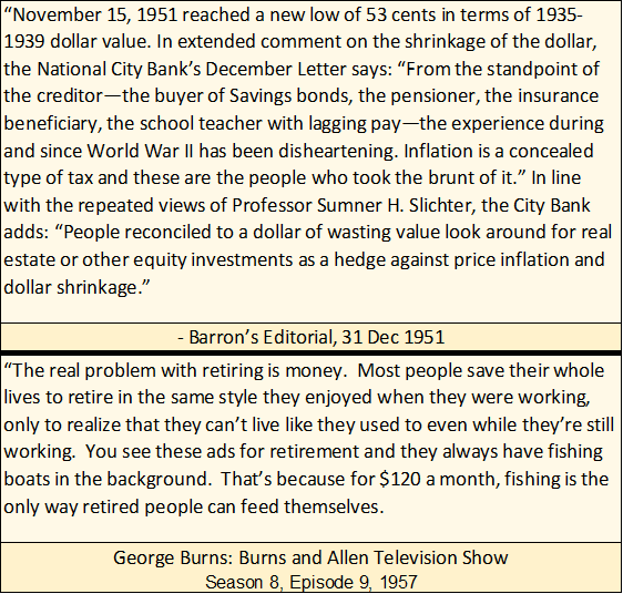
Here are two contemporary quotes on CPI inflation from the 1950s.
From 1954 to 1981 below, monetary inflation flowed into consumer prices. The “policymakers” fought consumer price inflation by triggering recessions in the economy by inverting their Fed Funds Rate (Blue Plot below) above the yield of long-term Treasury bonds (Red Plot).
As the annual rate of CPI inflation increased from single to double-digit percentages during these three decades, T-bond yields increased from just over 2% to over 15% as the bond market demanded a yield that compensated creditors for ever-rising CPI inflation. This forced the FOMC to increase their Fed Funds Rate from below 4% in the 1950s to induce a recession, to 22% in the early 1980s.
The yield curve inversion of the late 1970s to early 1980s was radical, but successful in diverting “liquidity” flowing into consumer prices, into a new channel to inflate valuations in the financial markets. From August 1982 to March 2020, concerns of rising CPI inflation were seldom expressed by economists and “market experts.” Not when monetary inflation from the FOMC was flowing into the valuation of financial assets; aka bull markets somewhere in the stock or real estate markets.
“Policy Makers” Fight Deflation: 1983 to 2007
It’s no secret; FOMC’s “monetary policy” is what makes the bulls run wild and free on Wall Street.
However, since 1982, whenever the FOMC attempted to constrain Wall Street’s irrational exuberance, bad things happen.
Post 1982, “Monetary Policy” began inflating a series of booms and busts in the financial markets during these two and a half decades. In the chart below, booms can be identified by those times when the blue Fed Funds Rate was pushed below the Red Treasury long bond yield. Every bust was the result of the FOMC pulling their blue Fed Funds Rate above the red T-bond yield, even ever so slightly.
Compared to the yield curve inversions prior to 1982, the post 1982 inversions (#1-4) were minimal, yet resulted in big-bear markets somewhere in the financial markets and economy. When they popped the sub-prime mortgage bubble (#3 below), the global-banking system almost collapsed.
The FOMC’s reaction to these market busts were always the same; drop their Fed Funds Rate far below that of the T-bond yield, and inflate yet another bubble somewhere in the financial markets.
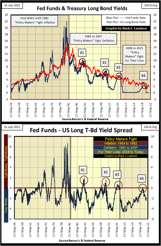
Here’s the list of booms and busts the FOMC has created since 1982;
- #1: LBO / Junk Bond,
- #2: NASDAQ High Tech,
- #3: Sub-Prime Mortgage,
- #4: Inflate All the Above, All at the Same Time.
“Policy Makers” Fight for Their Lives: 2008 to Today
This is easy to prove. Following their sub-prime mortgage fiasco (boom bust #3 above) the FOMC lowered their Fed Funds Rate to ZERO for years. Then, after inverting the yield curve for * ONLY FOUR WEEKS * in August / September 2019, by fifteen basis points or less (0.15%), the FOMC triggered a chain of events that terminated their short lived Quantitative Tightening program (QT) in October. In February 2020, the Dow Jones began a twenty-three-trading day, 38% decline that motivated the FOMC to “inject” $1.3 trillion dollars into the financial system in April for fear of what would happen had they not. See the “Not QE#4” in the Federal Reserve’s balance sheet above, which continues to this day.
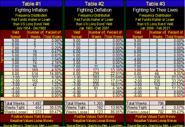
Looking at the credit spread of the Fed Funds and T-bond yield plotted in the chart above, I’ve constructed three frequency distribution tables below for each of the eras of “monetary policy” I’ve identified above. Wonks may want to study this data in detail. For most people familiar with how the FOMC creates tight or easy money in the financial system, by raising their Fed Funds Rate above or below long bond yields, all most people need to see is since January 2008, the FOMC has made money tight for only four weeks. Since the end of the sub-prime mortgage debacle, the FOMC has become a perpetual bubble-blowing machine.
So, what’s wrong with seeing market valuations continuing to inflate far above where they are now if investors are making good money as it does? Because those profits are as fictitious as I imagine the reserves for Wells Fargo must be in July 2021, as seen in the superb article below from King World News.
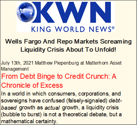
I’ll leave this topic with a few words of wisdom by the Mogambo Guru.
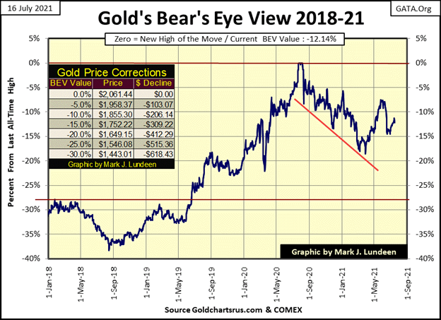
So much for all of that! Time to move on to something more pleasant to consider, something like gold’s BEV chart below. Gold last week didn’t do much, but it did close the week closer to its BEV -10% line than to its BEV -15% line. All and all, there are good reasons to continue assuming the lows of the post August 2020 correction are in, and the next BEV line to be crossed is gold’s BEV -10% line.
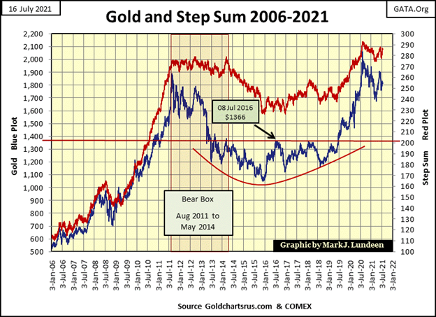
Not much new is happening with gold’s step sum chart below, but it continues looking bullish. The prospects of gold seeing some real up-field running, as seen from 2006 to 2011 below, are excellent when these plots below finally break above their highs of August of last year.
The correction gold has struggled with since August of 2011 has gone on now for a decade. A decade is a very long time for a chart pattern to continue on for. Considering all the monetary inflation seen since February 2020, the Not QE#4 in the Federal Reserve’s balance sheet posted earlier in this article, the potential for great advances in the old monetary metals and their miners are enormous.
When considering all the pending problems the financial system is now ignoring, I can’t see any good reason anyone would place at risk their hard-earned profits by remaining in the broad-based stock market, and not transferring a significant portion of their money into precious-metal assets.
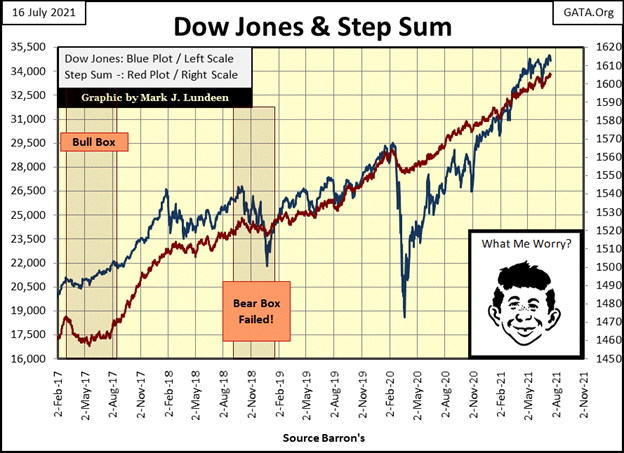
The Dow Jones and its step sum below remain bullish, but the Dow Jones has advanced by 88%, or 16,404 points since it bottomed on March 23rd, 2020.
Markets being what they are, one should anticipate a 10% to 20% correction from current levels. But so far that isn’t happening. I believe the major reason why this isn’t going to happen is the FOMC fears that should the Dow Jones correct by 10%, they’re not sure they could turn it back up no matter how much “liquidity” they “inject” into the system.
Look at gold’s 15 count below. It went to a very oversold -9 on June 28th to an overbought +7 this week. Had Friday’s close been an advancing day, it would have closed the week at a very overbought +9, from one extreme to another in only fourteen trading sessions. This is something we don’t see very often. Exactly what this means for the gold market I’m not sure, but I remain positive, and believe gold may see a new all-time high before the end of August.
Then again, a +7 for a 15 count is an overbought market, a market due for a pull back. One thing I’ve discovered about being a market watcher – it’s never simple.
Another problem I see in gold’s step sum table is its daily volatility’s 200 day moving average remains low. When gold and silver begin their big push into market history, expect gold’s current daily volatility of 0.69% to increase to something well above 1.00%. That gold is doing as well as it is, with so little daily volatility is something of a positive, I think.
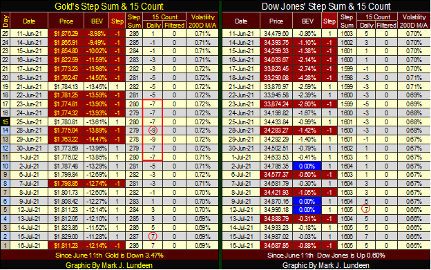
The Dow Jones step sum table looks good too. Like gold, its 15 count this week also increased to a +7, making it an overbought market. Is the stock market due for a pullback? I’m not the guy to ask. That all depends on what the idiot savants at the FOMC want to see happen. And right now, I’d have to say they’re not thinking along those lines for the Dow Jones.
Eskay Mining had its webinar on Thursday this week. The company had Dr. Quinton Hennigh, Eskay’s technical advisor, discuss the current progress in the company’s exploration project on its 100% owned Cory property in British Columbia.
I’m no expert in geology. But Dr. Hennigh is, and it was obvious he was very happy with the progress in the exploration of Eskay Mining’s Cory property. High-grade gold and silver ore are in abundance, and clearly, Dr. Hennigh anticipates much more will be found this summer.
At this point in time, no one in the company’s team of experts can speak with specificity of tonnage of high-grade precious metals ore is at their Cory property, but the potential is enormous
I was a bit shocked the price of Eskay Mining was basically unchanged in Friday’s trading following this webinar. As the company begins publishing its assay results in the months to come, I doubt investors will be able to buy its shares at current prices for much longer. If you’re looking for a mining play with excellent prospects, click on the link above and have a good look at Eskay Mining. A year from now I suspect you’ll be happy you did.
—
(Featured image by Yiorgos Ntrahas via Unsplash)
DISCLAIMER: This article was written by a third party contributor and does not reflect the opinion of Born2Invest, its management, staff or its associates. Please review our disclaimer for more information.
This article may include forward-looking statements. These forward-looking statements generally are identified by the words “believe,” “project,” “estimate,” “become,” “plan,” “will,” and similar expressions. These forward-looking statements involve known and unknown risks as well as uncertainties, including those discussed in the following cautionary statements and elsewhere in this article and on this site. Although the Company may believe that its expectations are based on reasonable assumptions, the actual results that the Company may achieve may differ materially from any forward-looking statements, which reflect the opinions of the management of the Company only as of the date hereof. Additionally, please make sure to read these important disclosures.


Bitcoin Stalls Near $60K as Strategy Moves, ETFs Outflow, and EU MiCA Rules Take Effect
Bitcoin hovers near $60,000 with ETF outflows, while Strategy boosts reserves, sells BTC, and raises dividends to reassure investors. Ethereum...


Cannabis Dominates Global Drug Use: Trends, Risks, and Shifting Markets
Cannabis remains the world’s most widely used illicit drug, with 256 million users in 2024, surpassing all others combined. Growth...


Italy Approves First Hydrogen-Powered Train for National Rail Network
ANSFISA has approved Italy’s first hydrogen-powered train, the Alstom HMU214, for use on the Brescia–Iseo–Edolo line. Capable of 140 km/h,...


Cotton Market Weakness Persists Despite Brief Rebound
Cotton prices fell to new lows last week before a modest rebound. USDA data shows crop conditions remain worse than...


Eli Lilly Hits $1 Trillion Valuation Amid Strong Bullish Momentum
Eli Lilly stock hit a record high, surpassing $1 trillion market value after strong product demand. Shares surged over 7%,...
 |
|
 |  |
 |
|
-

 Impact Investing2 weeks ago
SBTi Net-Zero Standard 2.0 Enhances Corporate Climate Action
-

 Crypto5 days ago
Bitcoin and Ethereum Slide as Market Pressure Builds Amid Strategy Concerns and Layer 2 Disruptions
-

 Business2 weeks ago
Fed Policy Shift Raises Concerns Over Debt and Inflation Risks
-
 Crypto17 hours ago
Bitcoin Stalls Near $60K as Strategy Moves, ETFs Outflow, and EU MiCA Rules Take Effect