Markets
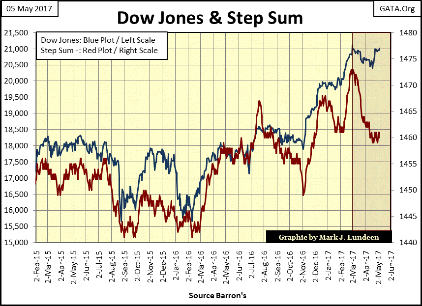
Will the Dow Jones go over 22K by mid-June?
The Dow Jones step sum data looks really good. Since March 31st it’s advanced some 340 points on a net of two down days in its step sum.

The Dow Jones and its step sum below peaked on March 1st of this year, after which the venerable Dow saw heavy selling. The collapsing step sum shows us that. But the price trend of the Dow Jones has weathered the selling better than one would expect. I’m about ready to declare the Dow Jones and its step sum is forming a bull box, but not just yet.
What makes this a bull box? Historically, the price trend is a better predictor of future market trends than is a price series’ step sum. Think of the price trend (Blue Plot) as the market’s reality, and its step sum (Red Plot) an indicator of market sentiment. A step-sum box (either bull or bear) identifies those times when a market’s emotions are out of phase with a market’s reality. Right now, the market’s reality for the Dow Jones looks bullish as its step sum collapses under the weight of day after day declines.
Usually, these bull boxes terminate as daily advances begin overwhelming declines, causing the step sum plot to reverse upward, which then results in a nice advance in the price trend. Should that happen for the Dow Jones below, my readers won’t need me to tell them the bull box is closed (terminated). That could very well happen here. In a best case scenario, I wouldn’t be surprised seeing the Dow Jones over 22K by mid-June, maybe before.
© Mark Lundeen
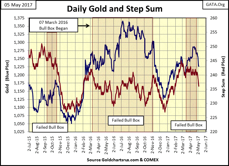
Not all bull boxes resolve themselves in the bull’s favor. In other words, they fail. In the chart below, gold and its step sum have seen three bull boxes form in the past two years, and all three of them have failed. It’s very unusual seeing so many bull boxes form in a market during a two-year period. Seeing all three of them fail is even more unusual.
(Source)
But if one is going to be a bull in the precious metals markets, one has to realize that the government and its regulators, as well as the global central banking cartel, are on the other side of the trade. So it’s not unusual seeing strange things happen in the market, the least of which are the three failed bull boxes above.
Now we wait to see what happens. Can the “policy makers” take gold down below its lows of March 9th ($1,199), or down to $1,125 from last December? I don’t think they can. But if they do, they’ll once again provide another excellent opportunity to purchase gold and silver.
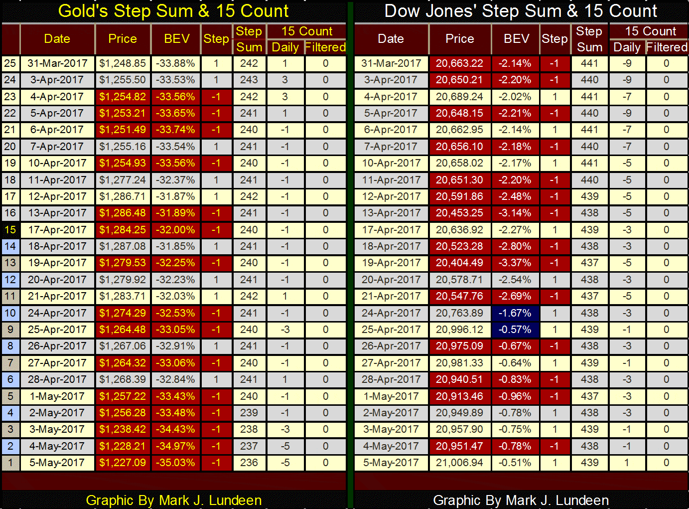
Here’s gold’s and the Dow Jones’ step sum and 15 count table. The price of gold was down every day this week. Its 15 count is down by six from last Friday. That’s a lot of selling pressure. But seeing the price of gold down by only $30 proves the bulls are only retreating, not running away in a panic – at least not yet.
The “policy makers” aren’t finished with the gold bulls. But if the gold bears continue their attack on the bulls as we see below, they’ll become exhausted in the next two or three weeks. That’s when we will see what the bulls can do; hopefully something impressive.
Ideally, I’d like the current selling to drive gold’s 15 count down to -9, or lower as the bulls successfully defend the lows of last March ($1,199). That would create a good base from which the gold market could make some really solid gains in the months to come.
Looking at the Dow Jones side of the table below, since March 31st, we see exactly this when it had a 15 count of -9. But as seen in the Dow’s step sum chart above, we’re still waiting for the bulls to do something impressive with the Dow Jones. So far the bulls have had only two days with a nice advance (April 24th & 25th).
© Mark Lundeen
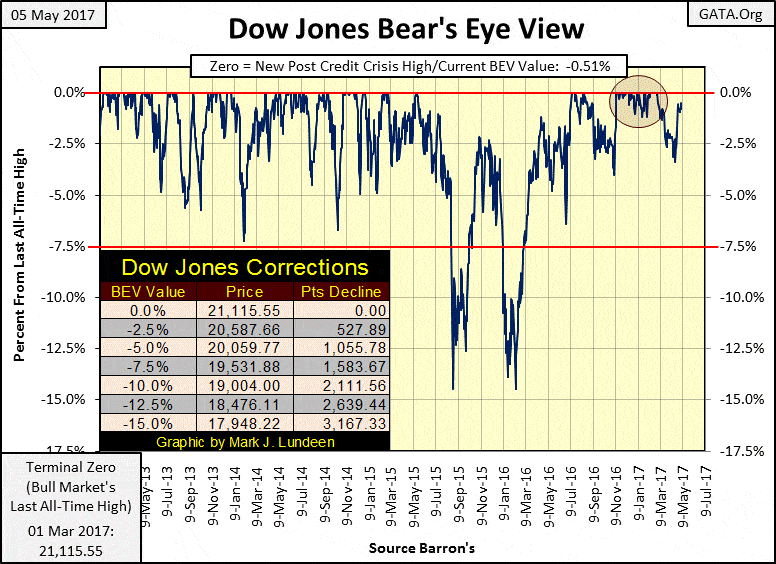
The Dow Jones step sum data looks really good. Since March 31st it’s advanced some 340 points on a net of two down days in its step sum. This entire period saw its 15 count negative. Like gold, sometime in the weeks to months ahead of us, the Dow Jones will once again see a period where there are more daily advances than declines. Let’s see what the bulls can do for the Dow’s valuation when this occurs. If the bulls * can’t * take the Dow Jones to a new all-time high by a good amount from its last BEV Zero of March 1st, that wouldn’t be a good sign for the stock market.
© Mark Lundeen
Looking at the Dow Jones, I really don’t see much enthusiasm with the bulls to take this stock market higher.
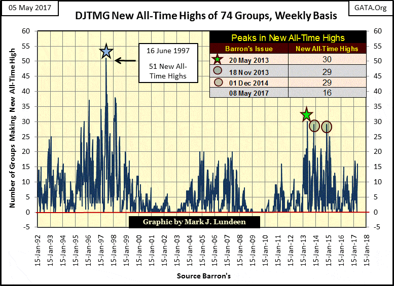
But to heck with the Dow Jones; there are people making money in the stock market. This week with the Dow Jones Total Market Group (DJTMG), sixteen groups did something the Dow Jones hasn’t been able to do since March 1st; break out to a new all-time high (see chart below).
But we should note that sixteen new all-time highs are a long way from the all-time high totals seen in 2013-14. This is a strong indication the bull market that began in March 2009 is an aging bull.
Last week, I posted an article how central banks have monetized a trillion dollars in the global stock and bond markets just in the past year. If they hadn’t, in the past year we wouldn’t have seen the DJTMG posting new all-time highs in the double digits in the chart below.
© Mark Lundeen
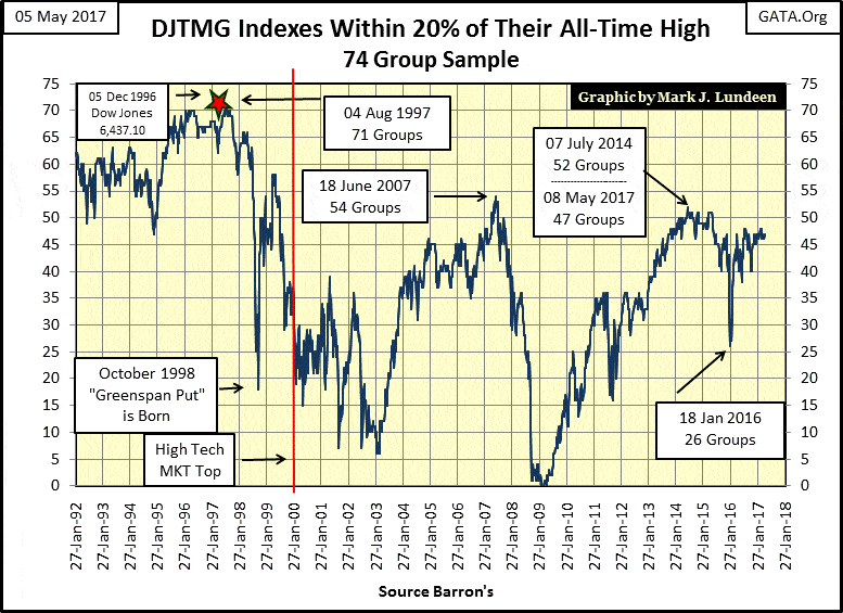
The DJTMG’s top 20 (chart below) hasn’t advanced in the past year. This proves that the gains seen in the market are only from select groups. The top 20 peaked at 52 three years ago and then began a slide that took it down to 26 in January 2016. Then a little more than a year ago, about the time central banks began monetizing a trillion dollars in the stock and bond markets, the top 20 revived.
It will be interesting to see how long the “policy makers” can keep this up.
© Mark Lundeen
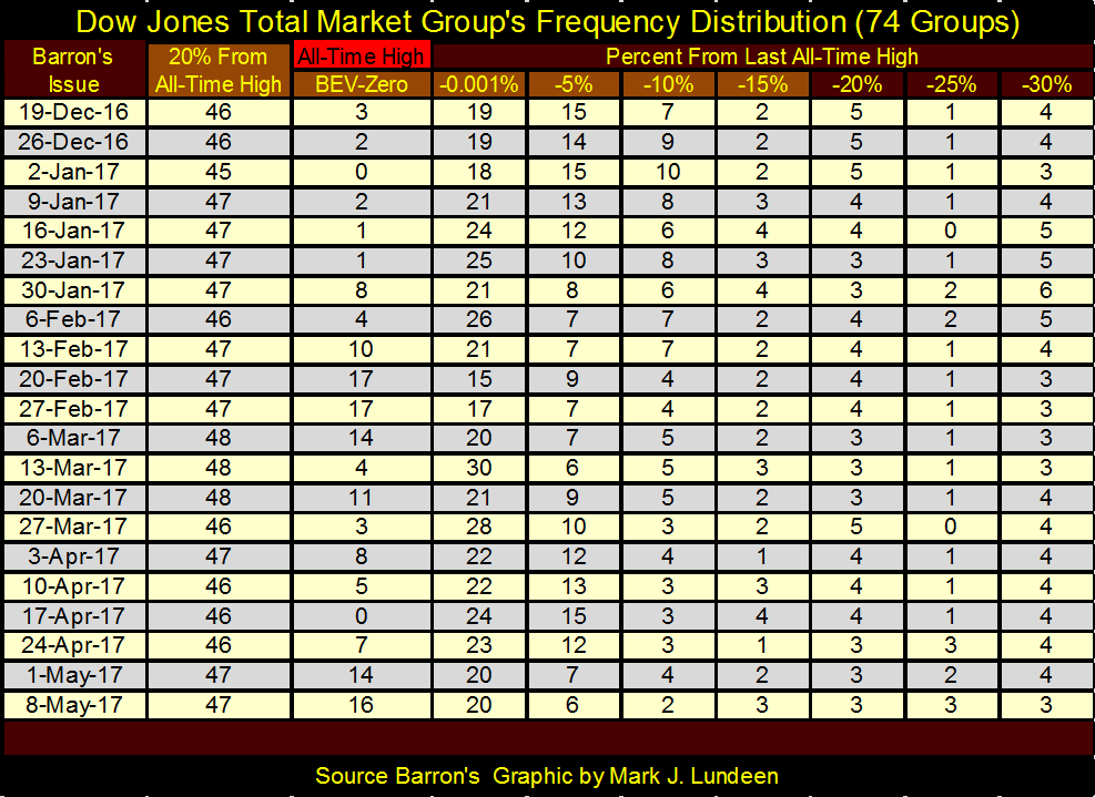
Here’s the DJTMG’s frequency table where I derived the new all-time highs (BEV Zero column) and top 20 (20% From All-Time High column) plotted in the two charts above. Note how little effect the BEV Zeros (new all-time highs) have on the top 20s. Since Christmas, BEV Zeros have swung from 0 to 17 as the top 20 remained range bound (45 to 47).
It’s the same groups oscillating between their BEV Zero and -5% columns (all-time highs to -9.99% below), without any advancement from groups that find themselves to the right of the -30% column. It’s just a fact that many groups in the DJTMG have been in the dog house for a long time.
© Mark Lundeen
So what? If one knows the groups that are going up, and they don’t try anything fancy, but just hold on, they’re sure to make money – right? That’s right until someone changes the rules! And someone always changes the rules.
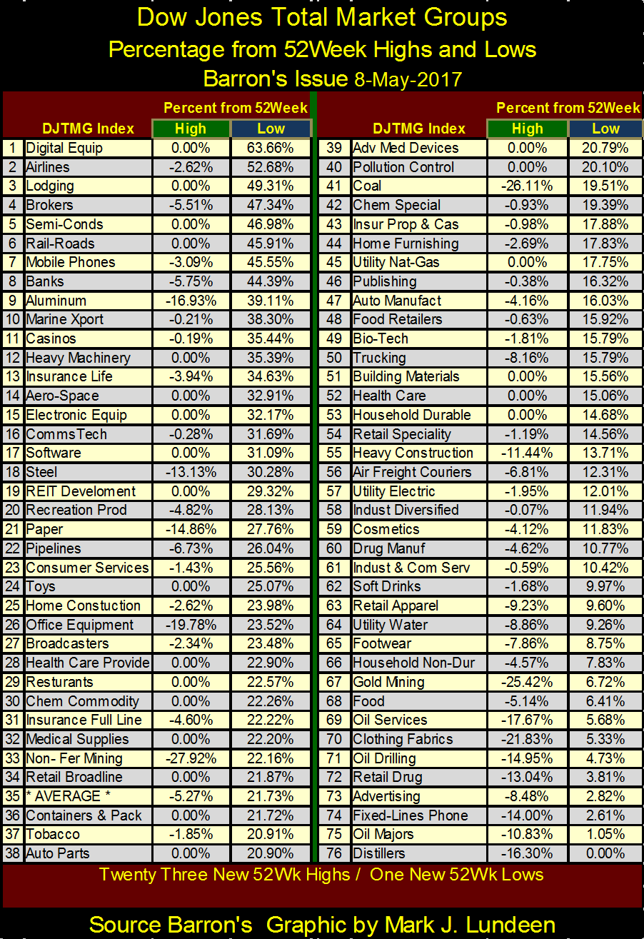
But right now, the money makers are seen in the top rows of the table below, showing the 52Wk Percentage gains and losses in the DJTMG. A 0.00% under the Green Tab is a new 52Wk High. This week there were twenty-three of them, with sixteen of those also making new all-time highs. There was only one new 52Wk Low, seen as a 0.00% under the Blue Tab for Distillers (#76) in the table.
© Mark Lundeen
Like I’ve said, things will change. Last year the hot groups were:
- Non-Ferrous Metal Mining (#33) down 28% for the year.
- Coal Mining (#41) down 26% for the year
- Gold Mining (#67) down 25% for the year
Last September the gold miners looked like this, with coal and non-ferrous metals outperforming the gold miners:
© Mark Lundeen
A year from now there will be a new list of heroes and zeros in the stock market. This will certainly be true should interest rates and bond yields continue to rise.
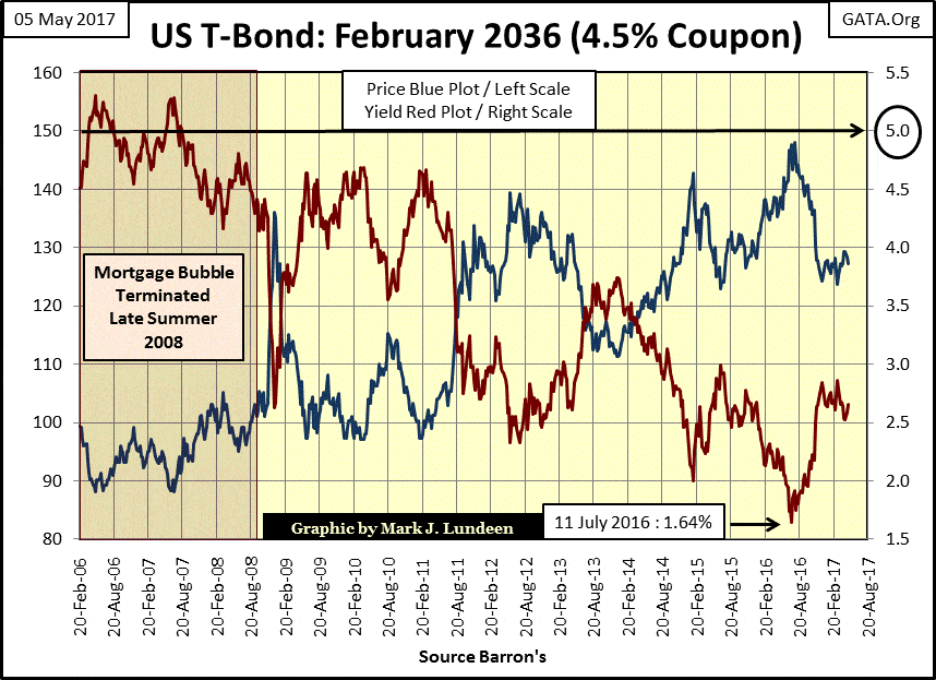
Below is the chart plotting current yields (Red Plot) and prices (Blue Plot) for a 30 Year T-bond issued in February 2006. Before the mortgage market crashed in 2008, this bond was yielding around 5%. A million dollars invested in these bonds in 2006 gave its owner about $50,000 a year income for the past eleven years and an excellent 50% increase in its market price in July of last summer.
However, for anyone who purchased this bond last summer after the FOMC had dragged its current yield down to only 1.64%, a million dollars invested in this bond would produce an annual income of only $16,400 for the next nineteen years. And when the Treasury redeems this bond in 2036, they are only going to pay a $1,000 for something the bond holder purchased for $1,500. That’s a 30% capital loss.
As bad as that is, it’s going to get much worse when central banks stop “monetizing” stocks and bonds by the trillions of dollars, which I guarantee you that someday they will! That’s when we’ll see current yields rise in the bond market.
For the purchaser of this bond from last summer (example above), they’ll never see more than $16,400 a year in income, as bonds are fixed-income instruments. If the owner wants to cash out of this bond after seeing its current yield rise to 5%, they’ll have to discount the price and take a large capital loss on their invested principal.
In May of 2017, there is nothing attractive about fixed income bonds. Even AAA rated US Treasury bonds are horrible investments.
© Mark Lundeen
For those who don’t like rich people, they may like that. But most people who don’t like rich people still have expectations of receiving income from a pension plan upon retiring years or decades from now, or benefits from an insurance policy should circumstances arise.
For fiduciaries managing OPM (other people’s money) in the pension and insurance industry, they know there are big problems ahead of them in the coming years. When bond yields and interest rates begin to advance up to where they were in 2006 (Red Plot), and then beyond, it will be a whole new ball game. However, unlike stocks and bonds, historically the old monetary metals and their miners thrive on rising yields and interest rates.
I love the markets. For decades compiling data and charting market series has been a hobby of mine. However, in the 21st-century understanding how markets operate has become more complicated than what a chart’s technical pattern will ever reveal.
In the late 1990s, I began following the work of the Gold Anti-Trust Action Committee (GATA)’s Bill Murphy and Chris Powell. They were doing ground breaking research, bringing to the light of day exactly how and why the big NY banks were manipulating the price of precious metals, as well as other markets.
That was eighteen years ago. Since then, GATA’s body of documentation of ongoing market rigging has not only grown, but the main stream FAKE NEWS financial media (to their shame) continues ignoring GATA’s research. This is understandable, as their major advertisers are the same financial companies rigging the markets.
I do what I can to promote GATA. For years I’ve had a GATA.Org flag in the upper right-hand corner of all of my charts. But sadly, for no fault of Murphy or Powell’s, two decades years later the MSM continues insulating GATA’s message of criminal rigging of the financial markets at the highest levels of government and finance from the general public.
Fortunately, there’s another source of free market information that has had some success in breaking forbidden information to the general public. Last February, Jerome R. Corsi of INFOWARS broke the story that beginning in 2012 the Obama administration began illegally diverting tens of billions of dollars belonging to investors of FANNIE MAE and FREDDIE MAC to fund Obama Care.
My hope is that Mr. Jones would give GATA’s officers air time on his INFOWARS show. Discussing the current status of the US Gold Reserves (now held in “deep storage”) would be excellent content for INFOWARS, and the scope of historical market machinations by Wall Street and their government regulators that GATA would bring to Mr. Jones’ news network is extensive.
The US government hasn’t performed a proper (and independent) audit on the US gold reserves since President Eisenhower was in office in the 1950s. After seventy years, its time they do another.
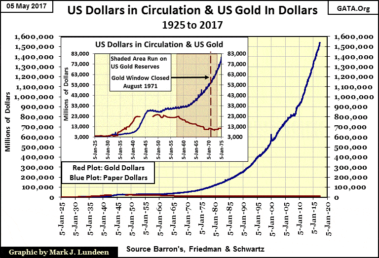
I’d also include the chart below to provide a graphic illustration of what the Federal Reserve and US Treasury has done to the American dollar over the past century.
© Mark Lundeen
—
DISCLAIMER: This article expresses my own ideas and opinions. Any information I have shared are from sources that I believe to be reliable and accurate. I did not receive any financial compensation in writing this post. I encourage any reader to do their own diligent research first before making any investment decisions.


Temenos to Acquire Additiv to Boost AI Wealth Management
Temenos is acquiring Zurich fintech Additiv to strengthen its digital wealth management and expand AI-driven financial orchestration. Additiv’s platform connects...


EFPIA Warns Limited SPC Reform Could Weaken EU Pharma Competitiveness
EFPIA supports the EU Biotechnology Law and a 12-month SPC extension but warns the current proposal is too limited. A...


EU Approves €23B Italian Renewable Energy Plan to Boost Climate Goals
The European Commission approved Italy’s €23 billion aid scheme to boost renewable energy and meet 2030 climate goals. Supporting wind,...


Institutional Bitcoin Buying and LiquidChain Presale Signal Market Optimism
Institutional Bitcoin buying, like Strategy’s 1,550 BTC purchase, signals confidence, stabilizes prices, and may trigger bullish momentum. Meanwhile, infrastructure projects...


The German Biotech Industry Faces Funding Crunch Despite Market Stability
German biotech held steady in 2025 but faces ongoing financing pressures, according to EY-Parthenon and BIO Deutschland. Total capital fell...
 |
|
 |  |
 |
|
-

 Fintech2 weeks ago
Credit Saison Invests in RedGirasol in Landmark Mexican Fintech Impact Deal
-

 Africa4 days ago
Morocco at an Energy Crossroads Amid Global Gas Volatility and Critical Minerals Opportunity
-

 Impact Investing1 week ago
Italy Advances Recycling but Infrastructure Gaps Threaten EU Targets
-
 Biotech16 hours ago
EFPIA Warns Limited SPC Reform Could Weaken EU Pharma Competitiveness
You must be logged in to post a comment Login