Markets
Will the “policy makers” allow the Dow Jones to correct 5% to 7.5%?
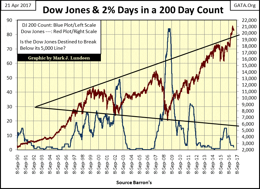
Currently, the 200 count for the Dow Jones is at 2. So, since 07 July 2016 (200 trading days ago), the Dow Jones has seen only two days where it has moved 2% or more from a previous day’s closing price.
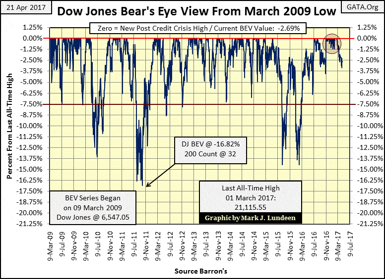
As seen in the Bear’s Eye View (BEV) chart below, the last all-time high for the Dow Jones happened on March 1st. Since then, however, it’s been slowly deflating.The post-election run up in the Dow Jones (enclosed in the Red Circle) was an excellent advance; one of the best in the post-March 2009 market. So we shouldn’t begrudge the bulls should they now take a rest before their next upward assault on the stock market, which I’m sure they are planning. However, some plans never get past their conception stage.
I like this BEV chart for the Dow Jones. It displays each advance and percentage decline of the Dow from its 09 March 2009 bottom (6,547) to its last all-time high of 01 March 2017 (21,115.55). The typical correction was a little over 5%, with only four double digit declines (none greater than 17%) since March 2009.
© Mark Lundeen
But we’re looking at an eight-year, 14,568 point, 222% advance in the Dow Jones. After eight years of this, I think current market values are low hanging fruit for Mr. Bear.
The remaining year will prove to be interesting. Will the “policy makers” allow the Dow Jones to correct 5% to 7.5% as was typical since March 2009? They must be very concerned that somewhere in this BEV chart, there is a threshold, a percentage decline from where there is no return.
Here’s the Dow Jones (Red Plot) with its 200 count (Blue Plot) from 1990. The 200 count being the number of days the Dow Jones moved (+/-) 2%, or more from a previous day’s closing price in a running 200 day count. 2% Days (day of extreme volatility) are rare market events during bull markets, but quite common when the market is deflating. As seen below, during the 2000-02 tech wreck and 2007-09 credit crisis, occurrences of 2% days peaked at the bottom of these bear markets.
© Mark Lundeen
Currently, the 200 count for the Dow Jones is at 2. So, since 07 July 2016 (200 trading days ago), the Dow Jones has seen only two days where it has moved 2% or more from a previous day’s closing price. That’s a nice low number for a 200 count. Not surprisingly, since last July the Dow Jones has seen a very nice advance.
But as the above chart makes painfully clear, a nice low number for the Dow Jones 200 count isn’t a permanent situation. When daily volatility returns to the stock market, we’ll see an increase in the 200 count, and a decline in the Dow Jones.
How far could the Dow Jones decline? The lower trend line in the chart above suggests the Dow Jones could break down to 5000, a 76% decline from its March 1st bull market high. No “market expert” today would suggest such a thing is possible, but further on in this article, I make a case for even worse to come.
The simple truth is that for all too long, college professors, politicians and bankers have had their way with the financial markets. After decades of “injecting liquidity” into market valuations, and manipulating interest rates far from where an unfettered market would have them, there is going to be an equal, but opposite reaction in the market that I and my readers want no part of.
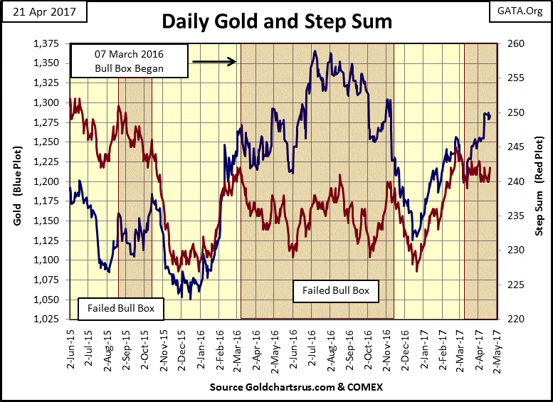
Let’s look at gold and its step sum. For the third time in the last two years, a bull box is forming. The first two of these bull boxes failed. Hopefully, that won’t be how this one terminates.
Let’s hope in the next few weeks, or months, we’ll see gold’s step sum break out to the upside with a big advance in the price of gold. Such a market event would most likely catapult the price of gold far above its highs of last summer. This new development is something I’ll be following closely in the weeks to come.
© Mark Lundeen
You can see gold’s bull box forming in the table below. Since March 17th gold’s step sum has seen no movement; 242 then and 242 today, as the price of gold has advanced by $55. Should gold’s step sum break out to 252 (up ten net steps) in the next few months, it could be an explosive market event for the price of gold.
No guarantees for that, but this is a great setup for a big advance in the price of gold. It doesn’t hurt that gold’s 15 count is only a +1; lots of room for gold to move to the upside.
© Mark Lundeen
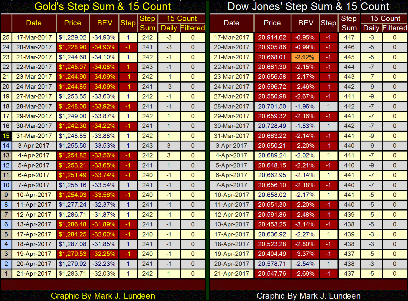
No step sum-box for the Dow Jones in the table above or chart below. But it’s remarkable how well the Dow is holding up under the assaults of overwhelming daily declines it’s seen since its last all-time high on March 1st.
Look at all the red down days in the table above and the collapse in the step sum below. If this continues the Dow Jones will break down, possibly catastrophically.
© Mark Lundeen
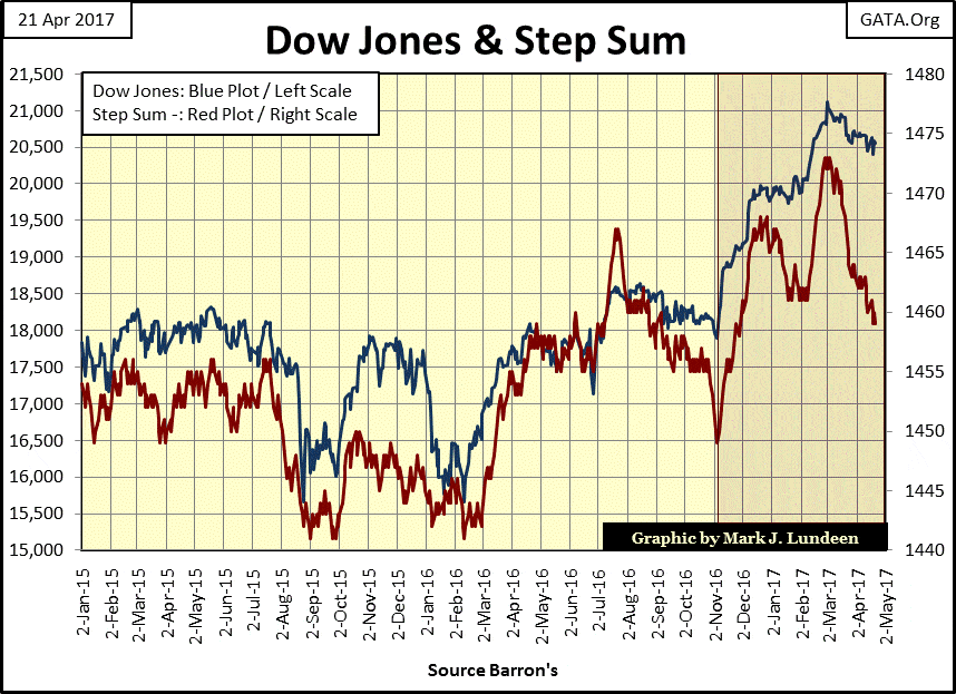
I keep thinking about the market anomaly of yields for tax-free muni-bonds being higher than taxable corporate bonds since November 2010; 338 continuous weeks. That’s over six years. After all that time, the roof hasn’t fallen on the muni bond market yet. One might be tempted to assume this as the new normal; that bond buyers actually prefer purchasing lower yielding, TAXABLE corporate bonds to TAX FREE muni bonds.
But actually, since November 2010 the bond market has been demanding a default premium for debt issued by America’s inner cities and big left-leaning states, such as New York, Illinois and California – and for damn good reasons.
© Mark Lundeen
This is going to end in tears. Not just for the holders of the debt issued by the Democratic Party, the political party that controls too many of America’s municipalities. This yield inversion also signals pending problems for city and state pension funds, and in all too many cases, pending problems with operating expenses of wages for firemen and police officers; Detroit and Flint Michigan on a national level.
And it’s not just government pensions that are at risk. Private sector pension funds for unions and corporations are going to have big problems too. The same is true for the reserves of the insurance industry. How could they not when their reserves are invested in a financial system under assault by a predatory banking cartel.
Long ago the big banks earned their money when their clients’ business operations were profitable; but not so much today. The business model for the modern banking system is based on scavenging for inflationary dollars “injected” into the economy as best they can, while they can.
During market booms, the banks see huge inflows of cash as they load up governments, corporations and consumers with debt at “attractive low rates.” Come the inevitable bust, the entire economy finds itself unable to service its principle and interest payments to the banks, and everything, including corporate earnings, comes crashing down.
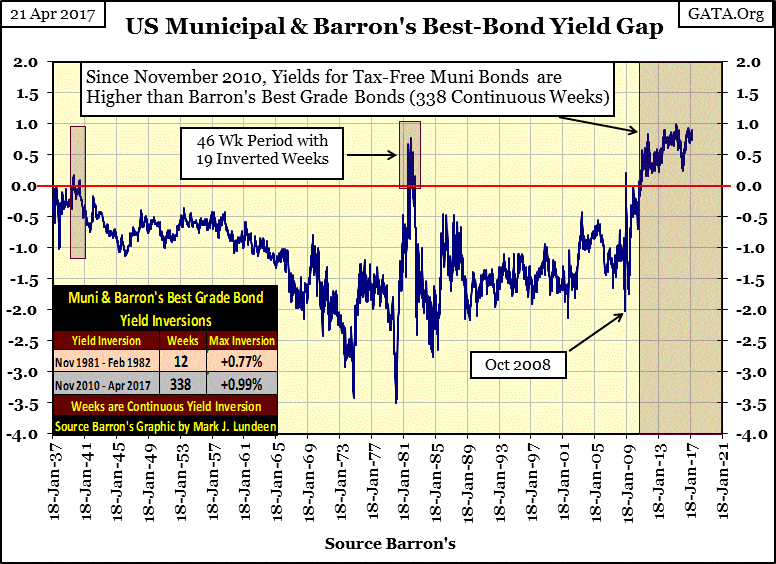
Here’s a chart plotting the Dow Jones earnings since 1929. After the Dow’s earnings cratered during the 1929-32 crash, its earnings didn’t return to the highs of 1929 until 1949 – twenty years.
Exactly as happened in the early 1930s, during the 2007-2009 credit crisis, earnings for the Dow Jones once again went negative in a big way! But this time the Dow Jones took only four years to see its earnings return to its highs of October 2007. The difference between the 1930s and 2007-09 was the Federal Reserve’s inflationary “monetary policy”, and its willingness to interfere in the workings of the 21st-century market place.
© Mark Lundeen
Reasonable people can look at this chart and see something odd has been going on with earnings for the Dow Jones since the early 1980s. This same manic depressive behavior can be seen in the S&P 500 and the Barron’s 50 Stock Average earnings, so it’s not just the thirty companies that make up the Dow Jones. What I won’t find odd would be to see the Dow Jones earnings quickly return to below zero when Mr. Bear comes back.
NYSE margin debt (Blue Plot below) made a new all-time high in February. But that’s not a comforting thought as the same was true in March 2000 and July 2007. The chart below makes clear what happened following those peaks in NYSE margin debt. After the 2007 peak in margin debt, the Dow Jones (Red Plot) suffered its second deepest bear market decline since 1885.
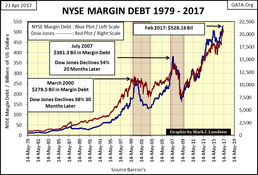
© Mark Lundeen
Here’s a chart for the Dow Jones (Red Plot) and NYSE margin debt (Blue Plot) from 1926 to 33. The Roaring 1920s’ Dow Jones floated up from one new all-time high to its next on a sea of “liquidity” flowing from the Federal Reserve. After its September 1929 top, the Dow Jones went from one historic low to its next as “liquidity” drained from underneath it.
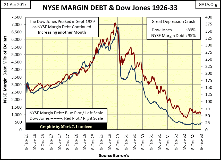
© Mark Lundeen
These charts plotting the Dow Jones with NYSE margin debt are superb studies of how quickly virtuous cycles based on the expansion of bank credit can be transformed into vicious cycles. The public first rushes into the stock market as inflation flows into market values, only to flee for their lives as “liquidity” then drains away.
This is useful information. Studying the past ten decades of this history provides investors with an iron rule that one should never expose themselves to the stock market when NYSE margin debt is at record highs. People should exercise a little patience, and wait until margin debt bottoms before scooping up the radioactive remains of the survivors in the now concluded bear market.
Sounds good, but easier said than done.
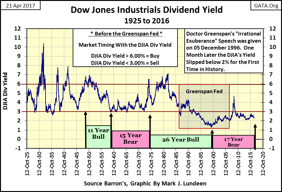
If someone wants to hear something good about the stock market, they’ll just have to go somewhere else as I can’t find anything good to say about it. Everywhere I look I see bear scat all over the place; like in the dividend yields for the Dow Jones. They stink and have since 1987.
There used to be a very effective rule-of-thumb for gauging whether or not the stock market was in a bull or bear market. One entered the stock market when the Dow Jones was yielding 6% or more and held on for dear life until the Dow was close to yielding only 3%. A 3% yield marked the beginning of a bear market, so prudent investors sold (taking one’s capital gains) and didn’t return until the Dow Jones once again yielded something over 6%, or even 7%.
The chart below records the world class performance made possible by using this simple rule-of-thumb. To reap * ALL * of the benefits of the Roaring 1920s bull market, and exit at the absolute 1929 top, as well as avoiding most (if not all) of the devastation of the early 1930s, investors of a century ago only had to sell when the Dow Jones yielded 3%, and not return until it yielded again something over 6%.
© Mark Lundeen
And so it was: until Alan Greenspan was appointed Chairman of the Federal Reserve in August 1987 (Red Box, above chart). This chart of the Dow Jones dividend yield makes very clear of how distorted market values have been since 1987, and remains so today.
Greenspan “injected liquidity” into the stock market until in December 1999, the Dow Jones yielded a pathetic 1.32%. His Irrational Exuberance speech of December 1996, proves to my satisfaction he knew his “policy” was inflating a huge bubble in the stock market.
“But how do we know when irrational exuberance has unduly escalated asset values, which then become subject to unexpected and prolonged contractions as they have in Japan over the past decade? And how do we factor that assessment into monetary policy?”
– Alan Greenspan: “Irrational Exuberance” Speech Given at the American Enterprise Institute 05 December 1996
To answer that question; I suspect Greenspan was very aware of the Dow Jones dividend yield rule-of-thumb seen in the chart above. In the month following this speech, the dividend yield for the Dow Jones fell below 2% for the first time in history. After this speech, Greenspan could blame the coming crash on investors’ “irrational exuberance”, not his “monetary policy.”
Note how I’ve labeled the past 17 years as a bear market, and so it will be until the Dow Jones once again yields something over 6%. Seeing the Dow Jones decline to its second deepest market decline since 1885 in March 2009 didn’t change that. At the Dow Jones’ 09 March 2009 54% bottom (6,547), the yield for the Dow Jones increased to only 4.74%; far from 6%.
During the credit crisis, had Doctor Bernanke not practiced bear-market interruptus with the Federal Reserve’s balance sheet, the Dow Jones would have easily declined to where it yielded 6%, and most likely something over 7%. A 6% yield would have taken down the Dow to a 63% bear market bottom (5,174), a 7% dividend yield a 69% bear market bottom (4,428) from its October 2007 high of 14,164.
Dividends are not a small issue. Today with the Dow Jones now over 20K, it yields less than 2.5%, and that’s frightening. The pending deflation in today’s market values as the Dow Jones once again sees its yield rise above 6% for the first time since 1982 will be devastating.
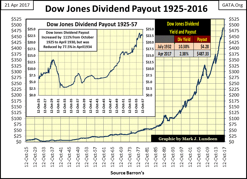
Below I’ve plotted the dividend payout for the Dow Jones going back to 1925. Dividend payouts are up by a factor of ten since the early 1980s. One would think that profits have also been up by a similar factor in the past four decades, but that’s not so.
Big companies like IBM and Apple (both components in the Dow Jones) have been trashing their balance sheets in the corporate bond market to support their dividend payouts and share buyout programs. When the economy once again turns down, both companies, and many others will be forced to cut their dividend payouts to service their debts.
© Mark Lundeen
The effects of rising dividend yields, as payouts decline, are devastating to market valuations when taken to extremes. In fact, rising yields (3% to over 10%) and collapsing dividend payouts (-77%) are what made the Great Depression Crash of the early 1930s so depressing; see chart below.
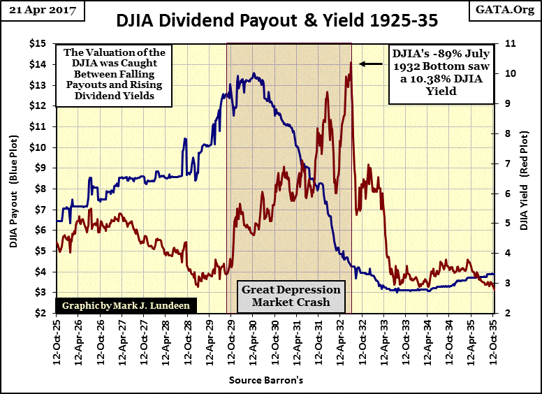
© Mark Lundeen
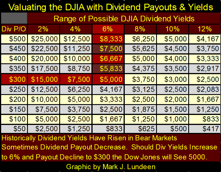
As the Dow’s dividend yield is based on its dividend payout divided by the valuation of the Dow Jones, valuation computations based on dividends is mathematical. The table below can be used to fix precise valuations based on yields and payouts.
At Thursday’s close (20,578.71) the Dow Jones was paying out $487.33 and yielding 2.37%. Giving some allowances for rounding the yield to three digits, dividing the Dow Jones’ payout by its yield returns the Dow’s valuation:
478.33 / 0.0237 = 20,562.44
In the table below, the valuations for the Dow Jones are derived exactly as seen in the above example.
In the charts above for Dow Jones dividend payouts and yields going back to 1925, seeing a 40% reduction in the dividend payout (to $300) and seeing the Dow yield increase to 6% are well within bear market historical possibilities. In the table below, that would take the Dow Jones down to 5,000. From its last all-time high of March 1st of this year (21,115.55), this would be a 76% bear market decline.
© Mark Lundeen
Is this possible? Yes it is, and it could be worse. During the Great Depression, the Dow dividend payouts declined by 77%. A similar decline would take the current payout very close to the $100 row in the table above. Match that with the 10% dividend yield of July 1932, and the table above fixes the Dow Jones at only 1,000, a 95% decline from the Dow’s current all-time high of 21,115.55.
How would this be possible in today’s “government regulated markets?” How could it not be when we look at who’s “regulating” the markets, as highlighted in this CNN article on “regulating” Wells Fargo.
As with the Bernard Madoff Ponzi scheme, the sub-prime mortgage debacle, or Enron, the MSM reports on financial scandals only after they can no longer be ignored. The story line for these articles is always the same: the regulators knew about a billion dollar plus irregularity for years and did nothing. No matter how outrageous; malfeasance in the regulated financial institution or by the government’s regulator is rarely referred to the Justice Department for criminal prosecution.
The ongoing corruption in the financial markets in 2017 is massive, if unreported. But could the Dow Jones decline down to 1,000? When bond yields and interest rate approach double digits, I think it’s a sure thing!
—
DISCLAIMER: This article expresses my own ideas and opinions. Any information I have shared are from sources that I believe to be reliable and accurate. I did not receive any financial compensation in writing this post. I encourage any reader to do their own diligent research first before making any investment decisions.


Temenos to Acquire Additiv to Boost AI Wealth Management
Temenos is acquiring Zurich fintech Additiv to strengthen its digital wealth management and expand AI-driven financial orchestration. Additiv’s platform connects...


EFPIA Warns Limited SPC Reform Could Weaken EU Pharma Competitiveness
EFPIA supports the EU Biotechnology Law and a 12-month SPC extension but warns the current proposal is too limited. A...


EU Approves €23B Italian Renewable Energy Plan to Boost Climate Goals
The European Commission approved Italy’s €23 billion aid scheme to boost renewable energy and meet 2030 climate goals. Supporting wind,...


Institutional Bitcoin Buying and LiquidChain Presale Signal Market Optimism
Institutional Bitcoin buying, like Strategy’s 1,550 BTC purchase, signals confidence, stabilizes prices, and may trigger bullish momentum. Meanwhile, infrastructure projects...


The German Biotech Industry Faces Funding Crunch Despite Market Stability
German biotech held steady in 2025 but faces ongoing financing pressures, according to EY-Parthenon and BIO Deutschland. Total capital fell...
 |
|
 |  |
 |
|
-

 Crowdfunding7 days ago
Impact Food Launches Crowdfunding to Expand Plant-Based Fast Food Concept
-

 Business2 weeks ago
TopRanked.io Weekly Affiliate Digest: What’s Hot in Affiliate Marketing [Health Trader Affiliates Review]
-

 Markets3 days ago
Sugar Markets Rise Slightly Amid War, Oil Price Pressure, and Strong Global Supply
-

 Africa1 week ago
Morocco’s Record Grain Harvest Spurs Temporary Import Barriers to Protect Farmers
You must be logged in to post a comment Login