Business
Is Gold Counter-Cyclical to the Dow Jones?
On April 15th, gold saw a new all-time high, as its 15-count increased to an extreme +9, making gold a very overbought market in mid-April. Gold doesn’t like being very overbought, so since then, gold has seen more daily declines than advances, and at this week’s close, gold’s 15-count saw a neutral -1. But, after all those down days for the past twenty-five trading sessions, this week gold still closed at a new all-time high?

This week, the Dow Jones saw new all-time highs, the 25th & 26th of the current advance. These new all-time highs followed a thirty-seven-trading day correction, that took it down, just a tad below scoring position for five, of the thirty-seven days of the correction.
What’s next? I can’t say for sure, but as long as the Dow Jones remains in scoring position (BEVs of -0.01% to -4.99%), I’m thinking we’re going to see the Dow Jones rising to new all-time highs (BEV Zeros = 0.00%) in the BEV chart below.
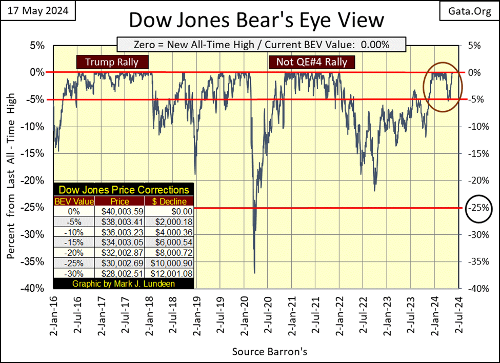
I highlighted the Trump and Not QE#4 rallies in the chart above, to illustrate the importance of an advance remaining in scoring position. The Trump Rally remained in scoring position for over eighteen months, the Not QE#4 Rally for a year. As long as the Dow Jones daily closed within 5% of its last all-time high, it was safe for the bulls to stay strong on the stock market.
Once the Dow Jones closes below its BEV -5% line, the advance may not be over, but don’t be greedy. So, lock in some profits and sell a good percentage of your bullish position. And should the Dow Jones close below its BEV -10% line, just get out of the market, and wait until the Dow Jones is once again in scoring position.
I’ll be the first to admit there are other ways to time profitable exit and entry points into the market. But for the present market, one that has seen the Dow Jones rise continuously since August 1982, from below 800 to now over 40,000 at the close of this week, following these guide lines ensures investors will see some nice gains, when nice gains are to be had, and get them totally out of the market within 10% of a market top, should a collapse come to Wall Street.
Am I following my own instructions? Nope, I’ve been out of this market for years, with my money in the gold and silver miners. But looking back, I wish I had.
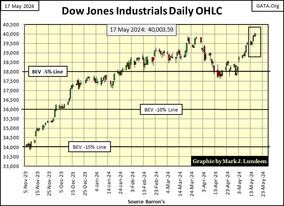
Next is the Dow Jones in daily bars. Nice; the venerable Dow closed above 40K this week. The big problem with that is, the Dow Jones is grossly overvalued, and prone to a sudden, and very dramatic collapse in valuation from these levels.
I know, I keep saying that, and so far, that hasn’t happened. But it’s still true, and my advice for you bulls out there is, should the Dow Jones break below its BEV -10% line in the chart below (36,000) – get the hell out of Dodge City, pronto.
Here are the Bear’s Eye View values for the major market indexes I follow in the table below. The stock market is beginning to produce new all-time highs again, as seen in my highlighted BEV 0.00% cells below. The week closed with nine of these indexes deep into scoring position, where additional new all-time highs become very possible, like maybe next week.
I highlighted the NASDAQ Banking Index (#20) and the XAU (#21). The XAU has been Tail-End Charlie in this table since 2011, for the past thirteen years. But all things must pass, including the gloom and doom the XAU has been mired in for over a decade. In May 2024, it looks like the miners of gold and silver are once again rising for their day in the sun. To see the XAU increase to something, anything other than #21 in the table below, will be a significant market event.
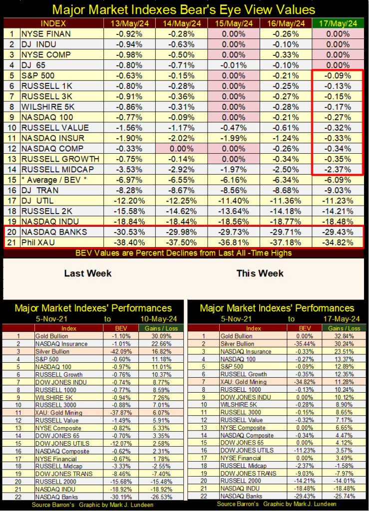
In the performance tables above, precious metal assets are leading the pack, especially silver. Note the XAU is also doing good, up from #11 last week, to #7 at this week’s close.
These miners of gold and silver are leveraged plays on the price of gold and silver bullion. As this advance in the old monetary metals mature, I’m expecting the XAU will eventually be #1 in the table above, well ahead of the gains in gold and silver. But when will that happen? I haven’t a clue on the when, just that it will, if market history is any guide to the future, and it usually is.
Currently, gold, silver and their miners are far off investors, and managed-money’s market radar. If this advance in the old monetary metals is for real, they’ll continue creeping up in a stealth bull market, until the day come when everyone suddenly discovers that a major bull market in gold and silver has been going on for quite a while. We’ll know exactly when that happens; there will be a massive one-day advances in gold, silver and the XAU.
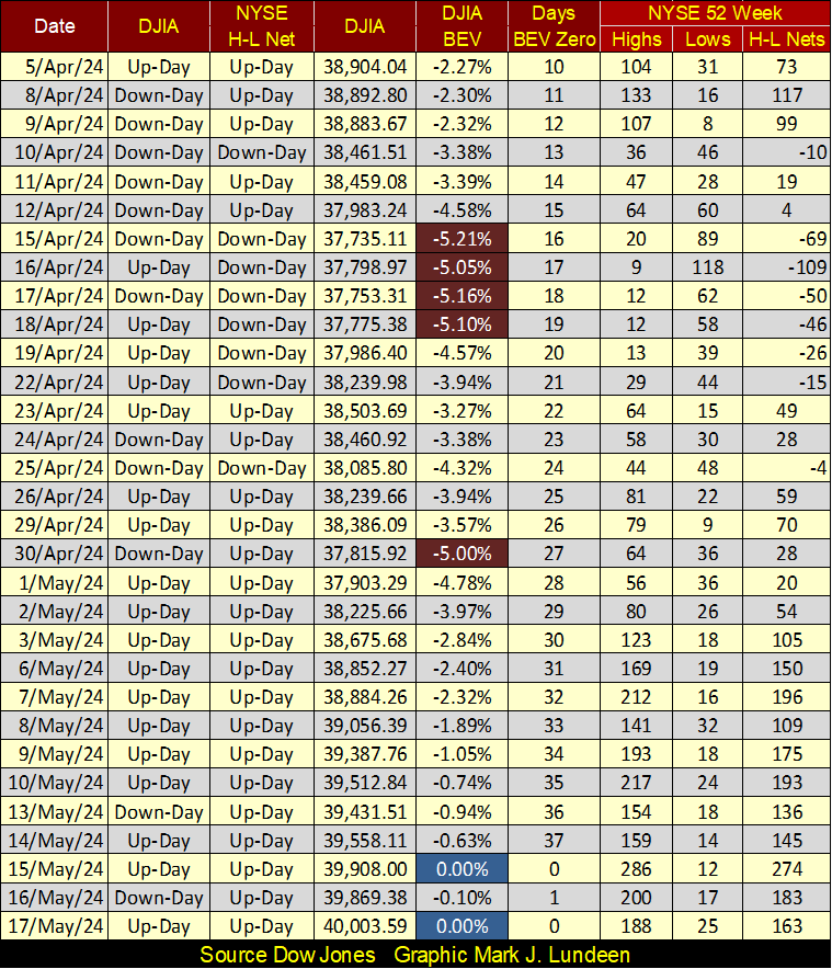
Looking at NYSE 52Wk H-L nets in the table below, the bears just can’t get any traction on Wall Street. We see a few negative 52Wk H-L nets in April, but for the most part, the NYSE is seeing positive 52Wk nets. Look at when the Dow Jones was closing outside of scoring position in mid-April (Red Cells). On these days, the NYSE saw more 52Wk Lows than Highs, but that didn’t last for long.
Currently, the Dow Jones and gold have been making new all-time highs, and both have been in scoring position, daily closes of -0.01% to -4.99% from their last all-time high, since last November, six months now. But isn’t the stock market and the price of gold counter-cyclical to each other? They certaintly can be, but not always.
However, the price of gold is a unique in the markets. The price of gold didn’t float in a market before the very early 1970s, as the price of gold was then fixed by law at $35 an ounce, via the Bretton Woods Monetary Accords of 1945. This is the same price President Roosevelt fixed for gold in March 1934. Before that, gold was fixed at $20.67 an ounce.
For centuries, the price of gold was “fixed by law” by governments, because for centuries gold (and silver) was money (coins of precious metal). The price of money (precious metal used in coins) was fixed, because they’d use the same amount of metal per coin, be it a British Guniea, Spanish Doubloon, or American Double Eagles ($20 gold piece).
Paper money issued by a government was defined by law as a debt, that could be redeemed in real money; coins of precious metal. That is why someone could take a paper $20 bill to a bank before 1933, and demand it be exchanged for a $20 gold piece – it was the law. For good reason it was the law, as monetary history has proven that unbacked paper money issued by a government, is runious to a economy, and even a nation’s culture.
Being able to exchange paper money for gold was (still is) called convertibility. The legal right for holders of paper money to convert their paper into coins of gold and silver, insured their governments did not over issue paper money, in excess to the volume of real money (coins) minted by their government.
Because the price of gold has only floated for the past half century, its impossible comparing the Dow Jones to gold before August 1971, when the US Treasury decoupled the dollar from the Bretton Woods $35 gold peg. Taking the dollar off the gold standard, and allowing “exchange rates to float” was a very bad move, one that didn’t offered any positive benefits to the economy and markets.
So, why did the estiblishment (deep state) take the dollar off of the $35 gold peg? Because it was good for them. Freeing the dollar from any peg to gold, allowed its banking system to expand credit (debt) to infinity. They wanted inflation, and with it financial asset valuations could expand in bull markets that spanned to the horizon. When an inflationary boom became a deflationary bust, as they always do, the Federal Reserve System then had only to “inject” the sufficent amount of “liquidity” into the financial system, to get the bubble inflating once again.
In 1970, there were no Silicon-Valley Billionaires. In 2024, Silicon Valley has more billionaires than is good for all the “little people,” people like you and me. We can thank the Federal Reserve System for that.
If Klaus Schwab’s WEF is promoting a digital social-credit scoring system for Europe and North America, with all its pending restrictions on the personal liberties we take for granted today, exactly like the one the Chinese Communist Party (CCP) has imposed on its citizens, it’s because billionaires from Silicon Valley are making that possible. It’s a creepy thought, but realize that today when you are looking at your computer, reading my article, the deep state is looking back at you.
When I think of Silicon Valley, and the deep state, this quote from Cicero comes to my mind.

Silicon-Valley Billionaires know where their billions come from, and so are very loyal, and willingly supports the system that made, and keeps them so rich.
One last quote on paper money, by Robert M. Bleiberg, Barron’s Managing Editor from 1979, on the absurdities of allowing floating exchange rates, something that didn’t happen before 1971. It wasn’t until Barron’s 01 September 1975 issue before they began weekly publishing foreign-exchange rates, something that hadn’t happen before in the history of the world.
They’ll call you a “conspiracy theorist” for questioning how much gold the US Treasury now holds in its reserves. There hasn’t been an actual audit of the US gold reserves since the 1950s, making me wonder why there hasn’t been one.
Without a doubt, as stated frequently in the old dusty pages of Barron’s from decades ago, the US Treasury has for decades been actively selling gold into the market, and the deep state has zero interest in accounting to the public how much of America’s gold, if any, is left.
Okay, so much for that. So, we wanted to compare the Dow Jones with the price of gold going back decades, but can’t before the 1970s. However, we can still use the Barron’s Gold Mining Index (BGMI / the miners of money) as a proxy for the price of gold.
The BGMI was first published in Barron’s 25 July 1938 issue. In 1938, there were two gold miners in the BGMI;
• Juneau Alaska Gold,
• Homestake Mining.
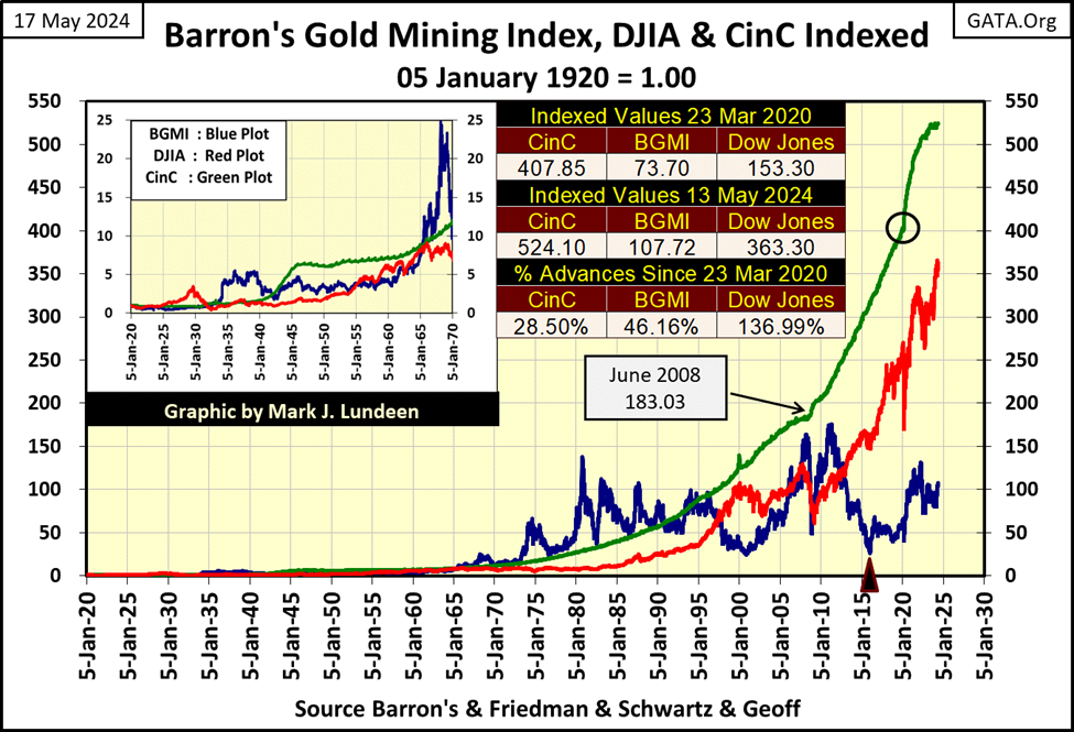
A good friend of mine from the Land Down Under; Geoff, took the time to get weekly values for Homestake Mining going back to January 1920, data I used to push the BGMI back another eighteen years, as seen in the chart below.
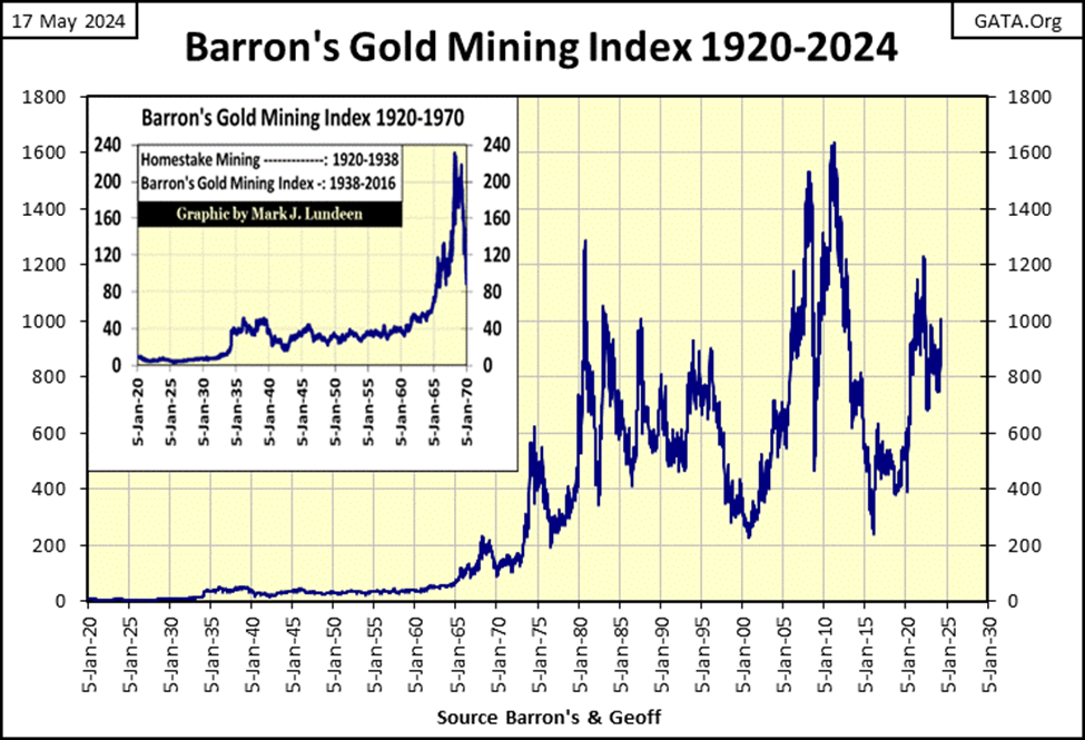
To directly compare the BGMI with the Dow Jones in the chart below, I indexed both indexes to 1.00 = 05 January 1920. Indexing these market metrics allows us to accurately compare their gains over time. Seeing their indexed values increase from 1.00 to 2.00, tells us when a metric had doubled in valuation since January 1920. I also plotted the indexed value of US Currency in Circulation (CinC = value of paper dollars in circulation), to compare the inflationary performance of these indexes, with the increase in paper-money inflation itself since 1920.
I inserted a table in the chart, posting the indexes values published in Barron’s 23 March 2020 issue (bottom of the March 2020 Flash Crash / black circle on CinC plot), and for the data published in Barron’s 13 May 2024 issue.
As of Barron’s 13 May 2024 issue, CinC has increased by a factor of 524 since January 1920, while the Dow Jones and the BGMI have increased by factors of only 363 and 107. Sure, the Dow Jones this week closed at over 40,000. But compared to the increases in inflation since 1920, chart below, the Dow Jones is lagging far behind; making the stock market a mug’s game for the longterm.
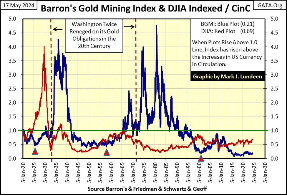
In the chart below, I used the weekly factors seen in the chart above for the Dow Jones and the BGMI, creating ratios, using the factor for CinC as these indexes’ denominator.
When a ratio below rises above the green 1.00 line, its appreciation is above the rate of inflation, as measured by the expansion in CinC. When a plot is below the green 1.00 line, its appreciation is below the rate of inflation, as measurered by the expansion in CinC.
Looking at the Dow Jones below (Red Plot), since 1920, the only bull market it has seen that provided capital gains, exceeding the rate of CinC inflation, was during the 1920s bull market. Since then, the Dow Jones has been an investment loser, when taking CinC inflation into consideration.
As I started this comparison between the Dow Jones and the BGMI, questioning whether or not they are counter-cyclical to each other, I suppose I should finally address this point.
Is the Dow Jones and the BGMI counter-cyclical to each other? They certaintly were during the booming 1920s, and depressing 1930s. In fact, as seen above, the BGMI saw a better bull market during the depressing 1930s, than the Dow Jones did in the booming 1920s.
I’m not going to do a tedious blow-by-blow discription, from decade to decade, of the action seen above for the Dow Jones and the BGMI, as when they were, and when they were not counter-cyclical to each other. Looking at the chart will tell you when, and when they were not. Currently, as I see it, they have been counter-cyclical to each other since 2011, and would continue to be should the BGMI begin to take off towards the green 1.00 line, as the Dow Jones enters a profound bear market.
What actually happens in the years to come in the chart above, like me, you are just going to have to wait to see.
I do want to point out something that is important, something to be kept in mind; in the 104 year record of the BGMI seen above, in the past when the BGMI began a major bull market advance, its initial stages of these advances have been explosive. I anticipate this will also prove to be true for its upcoming bull market advance. Also, the BGMI should rise significantly above the rate of CinC inflation, the green line at 1.00.
In Barron’s May 13th issue, the BGMI closed at 1004.08. To once again have the BGMI rise up to the 1.00 green line in the chart above, it would have to close at 4900. This would be an advance of 399%, and something I believe is likely for the BGMI, * IF NOT * for the Dow Jones (40,000 * 3.99 = 159,600) in the next few years.
This 399% gain for the BGMI in the next few years is not a prediction on my part. I’m just considering what is possible, based on the market history seen in the chart above. And seeing the BGMI once again appreciating at a rate above CinC inflation, above the 1.00 green line, is very possible in the years to come.
I thought I’d take a look at commodity prices, I should note I use Thursday’s closing prices for this Excel file, not Friday’s. I have enough to do on Friday, so I update this file on Thursday. As I usual do, the data below is in Bear’s Eye View values. And why not BEV values? Had I used the actual dollar values for these commodities, what would there be to learn from that? Not much.
However, using BEV values we see that on Thursday’s close, orange juice and copper made new all-time highs (BEV Zero = new all-time high), and gold was damn close to seeing a BEV Zero. Cocoa #8, made a new all time high a month ago, but this week is now down 34.64% from that new all-time high – ouch! But everything else this week closed below their last all-time highs by double-digit percentages, many by large double-digit percentages.
With these commodity prices so far below their last all-time highs, why is CPI inflation so high? Don’t ask me! One thing I can say with certanty is; when this “bull market” in commodities matures in the coming years, we’re going to see most, if not all of these commodities making BEV Zeros in the table below. When that happens, what it’s going to cost someone to buy lunch at a Taco Bell will most likely be shocking.
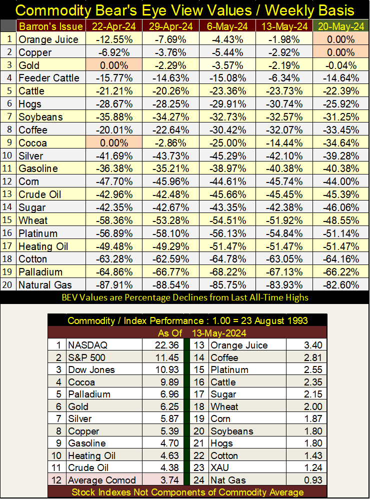
In the performance table above, we see the factor increases since August 1993, and the major stock indexes are still leading the pack at #1-3. The exception to that is the XAU at #23. In time, I expect to see these stock indexes trending downwards, as these commodities, and the XAU move up.
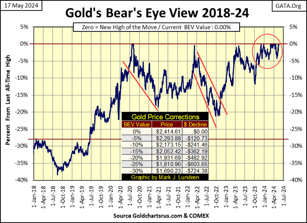
Let’s look at gold’s BEV chart next. Like the Dow Jones, gold has been in scoring position since last November, and this week made its 21st new all-time high since it’s been in scoring position. In the weeks and months to come, I’m expecting more of the same.
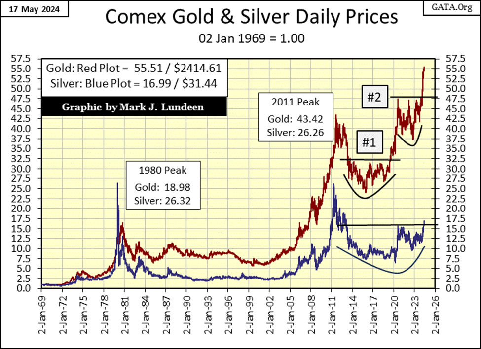
Next is a beautiful chart, plotting gold and silver indexed to 1.00 = 02 January 1969. This week, gold closed above the 55-line ($2414.61), and silver for the first time since 2013, has closed above the 15-line ($31.44).
Looking at silver’s plot (Blue Plot), silver has broken out of a Bowl & Break Out chart pattern, something gold has done twice since 2019. Historically, good things happen for the bulls when these B&B chart patterns break out. As silver hasn’t seen a new all-time high since January 1980, as 2024 flows on to 2025, the silver market, and the miners of silver may become a very interesting place to be.
Gold in its step sum table below, is in a very positive position. On April 15th, it saw a new all-time high, as its 15-count increased to an extreme +9, making gold a very overbought market in mid-April.
Gold doesn’t like being very overbought, so since then, gold has seen more daily declines than advances, and at this week’s close, gold’s 15-count saw a neutral -1. * BUT * after all those down days for the past twenty-five trading sessions, this week gold still closed at a new all-time high?
Geeze Louise – what’s with that? I don’t know, but I sure like it. In the weeks to come, gold should enter a period where daily advances out number daily declines. What impact that will have on the price of gold is something I am looking forward to.
I note also that gold’s daily volatility’s 200D M/A has increased from 0.57% in mid-April, to 0.59% at this week’s close. That isn’t much of a change, but it may be the turn in volatility in the gold market has come, and now gone. Which would be good, as bull markets in gold are always volatile markets. Seeing daily volatility for gold to rise up to, and then above 1.00% would confirm that gold has entered a major bull market.
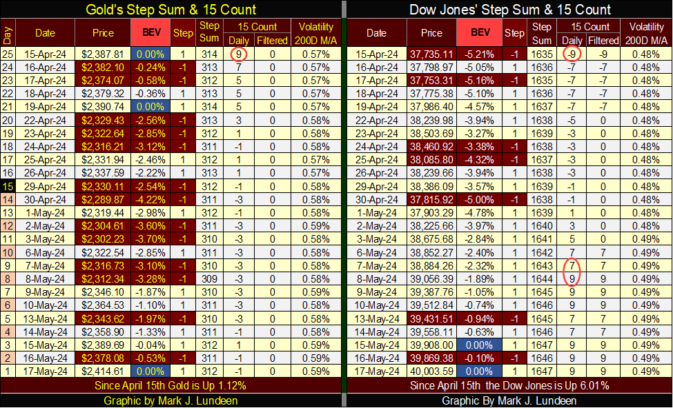
For the Dow Jones, what is seen in its step sum table isn’t as positive as what we see for gold. On April 15th, the Dow Jones’ 15-count was a -9, making the Dow Jones a very oversold market. The Dow Jones doesn’t like being very oversold, so expecting the Dow Jones would soon see a period where daily advances would outnumber daily declines was in order, and in fact happened.
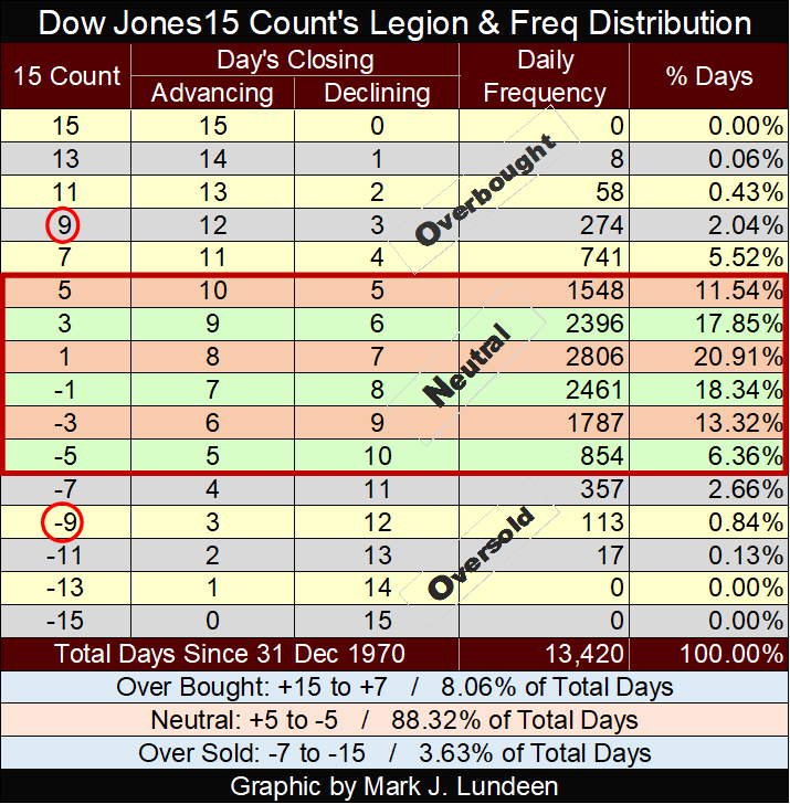
For your information, below is a table giving the values for a 15-count, and their frequencies for the Dow Jones since 31 December 1970. For the Dow Jones, having a 15-count of -9 has happened on only 113 daily closes since 1970, or 0.84% of the 13,420 of NYSE Trading sessions of the past fifty-three years. So yes, a 15-count of -9 for the Dow Jones is very oversold.
But the problem for the Dow Jones is, since May 8th its 15-count has seen a series of +9s, making the Dow Jones now very overbought market. In the weeks to come, this extreme in the Dow Jones’ 15-count will have to be corrected with a period when daily declines overwhelm daily advances, exactly as we see on gold’s side of the step sum table.
But, and this is a * BIG BUT *; will the Dow Jones come through this period of overwhelming down days with a new all-time high, as gold did at this week’s close?
Maybe, but I don’t think it will. Following this anticipated period of overwhelming declining days, if the Dow Jones could remain in scoring position, would be doubtful. It could be that what is seen in the Dow Jones step sum table above, is a set up for a significant market decline. But until the Dow Jones closes well below its BEV -5% line, let’s not think too hard about that just yet.
__
(Featured image by Jingming Pan via Unsplash)
DISCLAIMER: This article was written by a third party contributor and does not reflect the opinion of Born2Invest, its management, staff or its associates. Please review our disclaimer for more information.
This article may include forward-looking statements. These forward-looking statements generally are identified by the words “believe,” “project,” “estimate,” “become,” “plan,” “will,” and similar expressions. These forward-looking statements involve known and unknown risks as well as uncertainties, including those discussed in the following cautionary statements and elsewhere in this article and on this site. Although the Company may believe that its expectations are based on reasonable assumptions, the actual results that the Company may achieve may differ materially from any forward-looking statements, which reflect the opinions of the management of the Company only as of the date hereof. Additionally, please make sure to read these important disclosures.


TopRanked.io Weekly Affiliate Digest: What’s Hot in Affiliate Marketing [XM Affiliate Program]
This week, we're gonna talk about money. No, not making money (actually, we will... just later). Instead, we're gonna talk...


Fed Keeps Interest Rates Stable – Bitcoin Loses Recent Gains
Despite easing inflation, the US Federal Reserve plans only one interest rate cut in 2023, leaving rates at 5.25-5.50%. For...


Digital Health: An Opportunity to Attract 70% for Hospitals and 30% for Mutual Insurance Companies
In the case of the European market, countries like Denmark are also implementing practices to improve digital health. The Nordic...


Santander Terminates Wirecard Successor Business in Germany
Santander is closing its German payment platform Pagonxt, affecting around 380 employees in Germany and 150 IT specialists in Dubai...


Sales of Cananbis and Seeds Clones Are Growing Rapidly in Germany
On April 1, 2024, Germany became the largest European country to legalize adult cannabis use, allowing adults to grow, possess,...
 |
|
 |  |
 |
|