Featured
Barron’s Gold Mining Index 1920 to 2021
One would expect seeing the biggest daily advances happening during bull markets. But the last 121 years of market history proves that is not true; that in fact its during the big-bear markets that the Dow Jones sees its big double-digit percentage advances. These oversized daily advances are just Mr Bear’s way of drawing the sheep back into his meat grinder

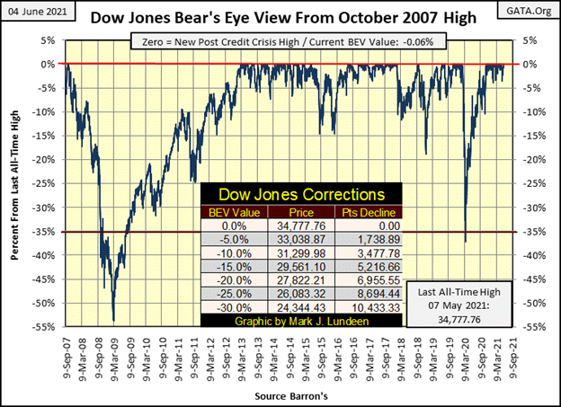
This week closed with the Dow Jones’ BEV at -0.06%. In dollar terms, the Dow Jones has to advance only twenty-two dollars to once again make market history with a new all-time high. That will be BEV Zero (0.00%) #30 seen below since its March 2020 BEV -37% flash-crash low.
This is damn bullish. It’s also a damn inflationary farce foisted upon a trusting world by the Federal Reserve’s FOMC.
Look at the two big market declines in this BEV chart. The Sub-Prime Mortgage bear market (October 2007 to March 2009), from its last BEV Zero in October 2007 to when it first broke below 37%, took 253 NYSE trading sessions. Last years’ 37% (out from nowhere) decline took only 27 NYSE trading sessions to accomplish the same, and that is a big problem to my way of thinking.
Apparently, others were thinking along these same lines. Immediately following this 27-day burst of deflation from Mr Bear, the idiot savants at the FOMC instituted their Not QE#4, and “injected” $1.3 trillion dollars of “liquidity” into the financial system in the following month; April 2020.
The idiots made their point. Much like Comrade Stalin’s command to the Red Army at the Battle of Stalingrad: “Not one Step Backward.” The Dow Jones would not be allowed to deflate below its BEV -40% line in the following days. Only God knows how much further the Dow Jones would have declined had natural market forces be allowed to discover the stock market’s fair market value. I have to believe it would have deflated far below the Sub-Prime Mortgage’s bear market low of a BEV -53%.
Now in June 2021, we’re looking at the Dow Jones make its thirtieth BEV Zero in the post March 2020 bottom’s advance above. Go bulls go! As seen below in my table of Major Market Indexes BEV Valuations below; they are.
The past month has seen a dearth of BEV Zeros in the table below. But these indexes remained in scoring position, or less than 5% from their last BEV Zeros. Then at this week’s close, seven of these major indexes closed at new all-time highs. I expect more of the same at the end of next week.
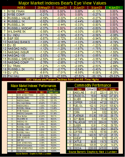
But there is a problem with this, and a big one at that when we compare the two tables above. It’s not natural seeing the major indexes on the left advance by triple and big double-digit percentages after only fourteen months, but there it is.
And what this is, is a consequence of the FOMC “injecting” humongous gobs of dollars into the financial system. What the table on the right proves is that for the first time since the early 1980s, “injected liquidity” is leaking into consumer prices, which will result in rising CPI inflation.
CPI inflation rising to annual double-digit percentages will pop this bubble no matter what the FOMC does. Double-digit CPI inflation will ultimately result in double-digit bond yields and interest rates whether the FOMC likes it or not. When this becomes widely recognized, this fact will devastate market valuations in the financial markets, and real estate. Maybe not just yet, but in its own good time this will become apparent to all.
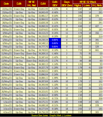
The NYSE 52Wk H-L Nets this week saw three days where it closed above my 300 threshold. As seen in the “Day’s BEV Zero” column, it’s been 19 days since the Dow Jones’ last BEV Zero. It won’t be another 19 before the Dow Jones sees its next.
In the daily bar chart below, the Dow Jones for the past month has taken a little break; let’s call it a mini-correction. Now at the start of June, it is refreshed and ready to go on to higher levels.
Why do I believe this? Because I don’t see any days of extreme market volatility in the daily bars below, days the Dow Jones has moved +/- 2% or more from a previous day’s closing price. As the current advance is now firmly established, until we see some oversized daily percentage moves in the Dow Jones below, its best assuming this advance will continue until it terminates itself with a series of Dow Jones 2% days.
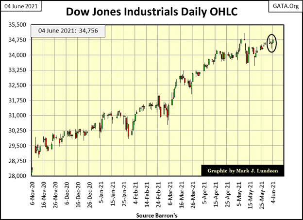
I’m not saying anything new or radical here, as since the 1920s all major market advances have been terminated with the arrival of days of extreme volatility (aka Dow Jones 2% days). The market hasn’t seen one since January 29th. And until we see two or three of them in a week or so, I’m staying bullish on the market as I sit high up in the market’s peanut gallery cheering the bulls on.
Here’s a chart plotting every day of extreme market volatility since January 1900. When the Dow Jones begins seeing daily moves of over 2%, be they up or down days, investors should place some distance between their wealth and the stock market.
One would expect seeing the biggest daily advances happening during bull markets. But the last 121 years of market history proves that is not true; that in fact its during the big-bear markets that the Dow Jones sees its big double-digit percentage advances. These oversized daily advances are just Mr Bear’s way of drawing the sheep back into his meat grinder. What a stinker that guy is!
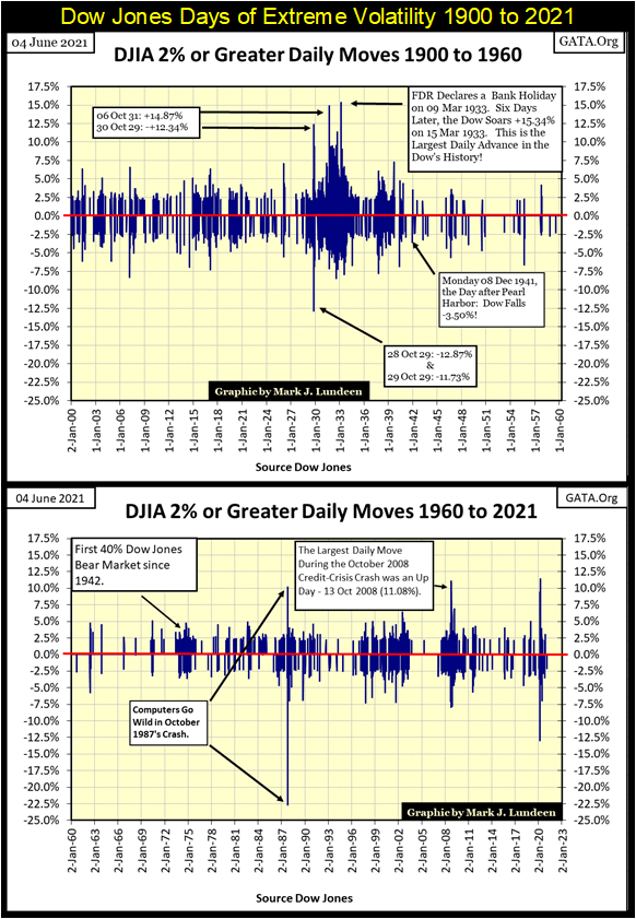
People have stopped thinking about the out-of-nowhere market crash of March 2020, but something big, bad and ugly was rising up in the markets early last year.
Look at the extremes in daily volatility for the Dow Jones from fourteen months ago. Forgetting the volatility for 1987 above, which was from a computer program going stupid, a problem quickly corrected. The volatility for those 27 NYSE trading sessions were more extreme than anything seen in the sub-prime mortgage crash, or anything else since 1960.
If you promise not to tell anyone, I’ll tell you a little secret; gold and silver mining companies are in the early stages of a historic & massive bull market – shoo!
Why do I think that? They just are and few people are aware of it. Which is to be expected as most investors (professional and retail) always follow the crowd. Not that being a crowd follower is always bad. Actually, it can be a damn fine strategy as the crowd always follows those investments that are in bull markets. So, following established market advances is how one makes money in the markets, until investors decide to stay at the party after Mr Bear crashes the festivities.
But to make the BIG MONEY, one has to identify a big market advance in its early stages, before the crowd comes in, which is exactly the situation gold and silver mining is in now. I’ll show you my reasoning why I’m so bullish on the precious metal miners, and then you can come to your own conclusions, because after all it is your money.
Let’s look at the Barron’s Gold Mining Index going back to January 1920, chart below. First thing to note is before 1970 there wasn’t much to see. Second that after 1970 the BGMI has been oscillating between 1600 on the high side and 200 on the dips. For someone seeking an investment where one could hold on for the long term, gold and silver mining for the past fifty years hasn’t been it.
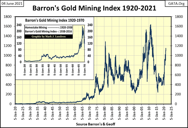
There’s a better way to look at the BGMI data above. Below (actually one table and one chart below) is a Bear’s Eye View (BEV) chart for the past 100 years for the Barron’s Gold Mining Index. Take a moment to compare these two charts, the BGMI as published (above), and the BGMI in the BEV format below.
Barron’s began publishing this data in early 1938. But a good friend of mine (Goeff) went to the trouble of getting weekly data on Homestake Mining (one of the two original gold miners in the index) so I could push this data series back to January 1920.
Thank you Goeff!
I love the BEV format, as looking at a historical market series after a century of monetary inflation is best visualized as Mr Bear sees markets. Each new all-time high (aka BEV Zeros) is seen as a Big Fat Zero (0.00%), and no more! Any data point not a new all-time high is registered as a negative percent claw back by Mr Bear, as that is all he’s interested in; how large a percentage he can claw back from the bulls!
So, a BEV plot compresses market price data into a range of 100%; with 0.00% a new all-time high, and -100% a total wipeout in valuation.
Looking at the plot below (actually one table and one chart below), before August 1971 (vertical red dashed line), the BGMI suffered from two large claw backs from Mr Bear. One in the 1920s as the Dow Jones was in a massive bull market, and again in the early 1940s when WWII deflated most financial assets, including the Dow Jones.
And like the Dow Jones, the BGMI followed their common April 1942 bottom with a big-bull market that peaked in the 1960s. The Dow Jones’ peaked in February 1966 advancing by 989%. The BGMI peaked two years later in March 1968, advancing by 1292%. So, there have been times when investing in gold and silver mining have been a successful investment strategy. I’m expecting that will once again be true sometime in the foreseeable future.
Following August 1971, volatility in the BGMI changed significantly. There were to be new all-time highs, but not many, which were followed by percentage claw backs of 65% and more.
Below is a frequency table for the BGMI before and after August 1971. This table records how many weekly closings the BGMI closed at a new all-time high (BEV Zero / 0.00%), or percentage claw backs from these BEV Zeros in increments of 5%. Take a look at the BGMI’s BEV chart, as you look over this this table.
The 0% row is the number of new weekly all-time highs. The -0.0001% row are the weekly closings just short of a new all-time high, but not more than 5% from one. I call these weekly closings in “scoring position.”
The difference between before and after August 1971 is remarkable. Also note how before August 1971 the BGMI maximum bear market low was between -65% and -70%, with ten weekly closings in this row. After August 1971, the BGMI saw 363 weekly closings (seven years) in the -70% and below rows.
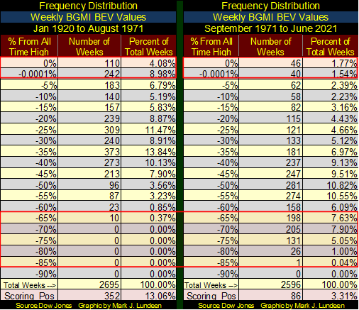
After August 1971, something changed for the worse for the BGMI. It’s been fifty years of this bearish market action, and for that reason few people take the gold and silver miners seriously. But it’s also been fifty years of monetary malfeasance by the FOMC, and that changes everything for the old monetary metals and their miners in the coming collapse of the dollar based global financial markets.
Think not? Below is a chart of the monthly changes in the FOMC’s holdings of US Treasury debt in billions-of-dollars. The idiot savants dictating “monetary policy” have yet to recover from the sub-prime mortgage fiasco (2002-08), their obscene “Not QE#4” proves that.
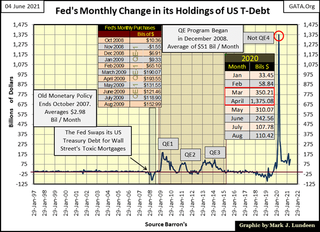
No “reserve currency” deserving the name can withstand the abuse the dollar has seen above, and remain a reserve currency. And all this abusive “monetary policy” has been for the benefit of America’s politicians, bankers and academics. I’m assuming the dollar’s current status as a “reserve currency” will be short lived from here; still, it could go on for a few years for lack of a suitable replacement.
I say this with no joy. The people responsible for this in Washington, Wall Street and Ivy League Universities should be buggy whipped on live TV for what they have done. But that isn’t going to happen, not when they can blame it all on President Trump and spend countless hours of investigations on the Trump Organization’s “responsibility for the dollar’s collapse.”
Until then, I’m just going to back up the truck and load up all the precious metals assets I can afford, and the gold and silver miners should benefit significantly from what is to come.
Now finally, on to the BEV chart for the BGMI. Take a good look at the chart for a moment. What happened in August 1971?
The US Treasury “temporarily” (yeah, they lied to us) took the dollar off the Bretton Woods’ $35 gold peg, replacing gold with the petrol-dollar. The dollar was now referred to as the petrol-dollar, as all crude oil sold in the international market could be sold only in US dollars.
That was Henry Kissinger’s idea, to keep the dollar relevant in the global market place by convincing key OPEC members to use US dollars exclusively in the global crude oil market in exchange for protection by the US Military. Iraq’s Saddam Hussein and Libya’s Muammar Gaddafi wanted to sell their crude oil in other currencies, and we all know how that ended for them.
For the past fifty years the petrol-dollar worked pretty well. However, as you see below the BGMI didn’t take it very well, nor did gold and silver bullion, metals that once served the world as money.
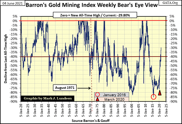
Of note in the chart above, the deepest bear market low of the last century for the BGMI (Red Circle) occurred in January 2016, a month after gold and silver’s last bear market low. The BGMI saw a nice advance in the first half of 2016, but then began trading in its usual frustrating manner, until once again it hit another important bottom in March 2020 (Red Triangle). Following this March 2020 bottom something changed for the BGMI, which I believe was the FOMC’s Not QE#4’s “injection” of $1.375 TRILLION dollars into the financial system in April 2020 (see chart above).
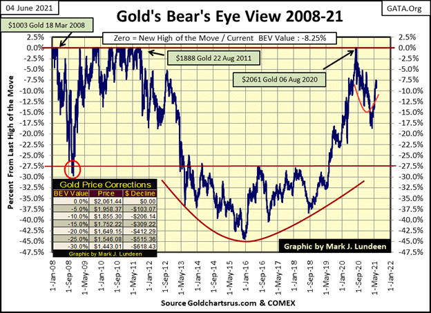
Next is gold’s BEV chart. In my last article from two weeks ago I was looking for gold to break above its BEV -10% line ($1855). As it turned out gold did that a few days later on May 17th, and hasn’t seen a double-digit BEV value since.
Like the Dow Jones, which has also seen a bit of a mini-correction these past few weeks, I suspect this will prove to be the pause that refreshes, in an advance that is destined to rise up into record territory.
Keep in mind the big picture, that since gold’s last all-time high of August 2011 (not 2020), it began a brutal four and a half year, 45% bear market decline that bottomed in December 2015. It’s this market bottom from gold’s August 2011 BEV Zero that I’m focusing on, as by December 2015 gold, silver and the precious metals miners hit very hard bottoms.
Compare gold’s December 2015 hard bottom to its March 2021 bottom, where the bears failed to force gold down 20% from last August’s BEV Zero. As big bear market bottoms go, last March 30th’s BEV -18.53% is pretty wimpy. Now two months later, at the close of this week, gold has advanced to a BEV of -8.25%.
Looking at gold’s BEV chart below, and comparing the bears success in clawing back the bulls’ gains following the record highs of August 2011 & 2020, the bears ability to control price trends in the gold market isn’t what it used to be ten years ago.
That’s not going to change any time soon, not after the implementation of the FOMC’s Not QE#4 that continues to “inject” tremendous volume of inflationary dollars into the financial system. So, I’m anticipating further advances in the price of gold, silver and their miners for the second half of 2021.
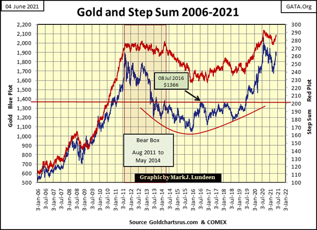
I love this chart plotting the price of gold (Blue Plot) with its step sum (Red Plot) below. It just keeps looking better and better, week after week.
It’s been over ten years since gold and its step sum have seen some unobstructed downfield running, as seen from January 2009 to August 2011. Looking at these plots come off their March 2020 lows, I wonder what they will look like in this chart a few years from now? Will they continue trending in their post August 2011 trading ranges? Or will they once again break free and soar far above where they are now?
How you look at this chart depends on how bullish you feel about gold and silver. For myself; I see a moon shot coming my way!
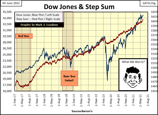
As far as the Dow Jones (Blue Plot) and its step sum (Red Plot) below goes, I agree with Alfred and fear nothing. Of course, it helps that I don’t have a nickel at risk in this market advance fueled by an ocean of “liquidity injected” into it by a gang of academic idiots. But who cares when it will provide entertainment to discerning market watchers for as long as it lasts?
In my circle of family and friends, there aren’t many who follow my market opinions. Which is a real shame as I’d love to begin a pool for what the final Dow Jones’ all-time high will ultimately be. Reasonable people know the current Dow Jones’ advance is going to end, because all market advances end at some point. I’d like to bet a buck in a pool of fellow market watchers what the Dow Jones last all-time high will be. Humm, above or below 40,000? Maybe a second one-dollar pool for, if this advance ends before January 1st 2022, or after?
As far as I’m concerned, the $1.00 betting pools seen above are the only market risks I care to have with this market.
Gold in its step sum table below is looking good. Since April 30th its step sum has increased by eight net daily advances, from 279 to 287. Gold’s 15 count became overbought on 21 & 25 May, but then decreased back into the neutral range (-5 to +5), since then. Good!
And all this with gold’s daily volatility (its 200-day moving average) declining to 0.71%. Hey, that’s the wrong way for volatility to trend in a big bull market in gold. But all the same there it is. What should we make of this? Maybe that the real fun in the bull market for precious metals hasn’t really begun yet. When the price of gold next breaks into record territory, expect a large increase in daily volatility, to something above its 1.00% line.
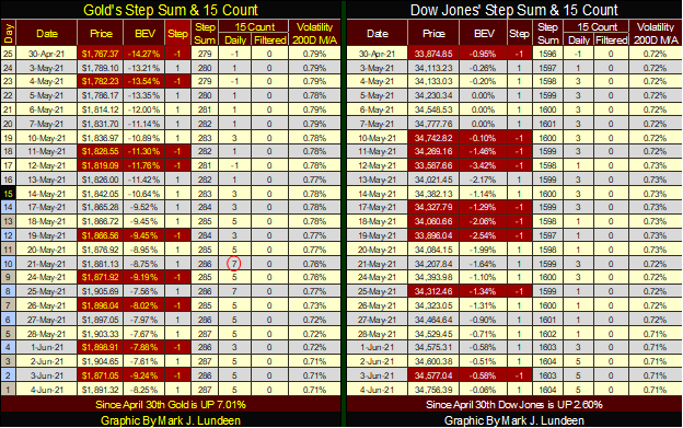
For all the same reasons, the step sum table for the Dow Jones is looking good too, except that low daily volatility for the Dow Jones, such as its current 0.71% is typical of a bull market in the Dow Jones. As mentioned above, until the Dow Jones begins producing days of extreme volatility (2% or greater days), I’m anticipating further gains in this advance.
Here’s a chart plotting Dow Jones daily volatility’s 200 day moving average going back to January 1900. With the exception of the April 1942 bear market bottom, bad things happen on Wall Street when daily volatility stops declining, and begins advancing towards the red 1.00% line.
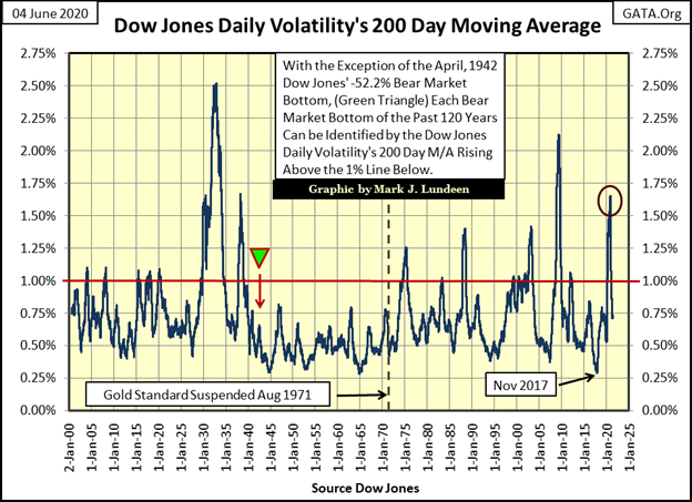
Except for the April 1942 market bottom, this chart highlights all the big-bear market bottoms of the 20th & 21st centuries:
- July 1932 (Great Depression Bear Market Bottom): 2.50%
- March 1938 bear market bottom: 1.70%
- December 1974 (first Dow Jones 40% Bear Market decline since April 1942): 1.25%
- October 1987 (flash crash): 1.40%
- October 2002 (Tech Wreck Market Bottom): 1.40%
- March 2009 (Sub-Prime Mortgage Bear Market Bottom): 2.10%
- March 2020 (It came out from nowhere bear market bottom): 1.65%
The volatility for the -37% market decline for March 2020 (Red Circle) is crazy. A 1.65% daily volatility spike from just a 37% market decline during a 27-day period is really bizarre. Where would the markets be in June 2021 had the FOMC had not implemented its Not QE#4?
With this 121-year record of market history on display, there is good reason for expecting bad things when once again daily volatility for the Dow Jones begins to rise towards its red 1.00% line. But we’re not there yet. So, Go Bulls Go, and run wild and free!
__
(Featured image by Dimitry Anikin via Unsplash)
DISCLAIMER: This article was written by a third party contributor and does not reflect the opinion of Born2Invest, its management, staff or its associates. Please review our disclaimer for more information.
This article may include forward-looking statements. These forward-looking statements generally are identified by the words “believe,” “project,” “estimate,” “become,” “plan,” “will,” and similar expressions. These forward-looking statements involve known and unknown risks as well as uncertainties, including those discussed in the following cautionary statements and elsewhere in this article and on this site. Although the Company may believe that its expectations are based on reasonable assumptions, the actual results that the Company may achieve may differ materially from any forward-looking statements, which reflect the opinions of the management of the Company only as of the date hereof. Additionally, please make sure to read these important disclosures.


Mollie Expands Across EEA With €350M Investment to Strengthen European Payments Network
Fintech company Mollie has expanded into Croatia and Iceland, achieving full coverage of the European Economic Area. It has committed...

Trulieve NYSE Listing Signals New Era for Global Cannabis Industry
Trulieve’s NYSE listing marks a milestone for the cannabis industry, giving a major US producer access to institutional capital after...


Moroccan Bond Market Shows Mixed Signals as Primary Eases and Secondary Pressures Persist
The bond market shows a mixed trend, with cautious easing in the primary market as the Treasury raises limited funds...


Markets Diverge as Oil Falls, Rates Hold, and Inflation Persists
Markets reacted to a U.S.–Iran MOU and unchanged Fed rates, with oil plunging while energy stocks showed divergence. Equities fluctuated...


Cocoa Market Faces Mixed Trends Amid Rising Supply and Weak Demand
New York cocoa prices edged lower Thursday while London closed higher, with mixed but improving daily trends. West Africa’s main...
 |
|
 |  |
 |
|
-

 Fintech5 days ago
Trade Republic Brings Back Human Support and Launches Customer Council
-

 Biotech2 weeks ago
EFPIA Warns Limited SPC Reform Could Weaken EU Pharma Competitiveness
-
 Africa2 hours ago
Moroccan Bond Market Shows Mixed Signals as Primary Eases and Secondary Pressures Persist
-

 Markets1 week ago
Corn Prices Slip Amid Strong Crop Conditions and Favorable Weather