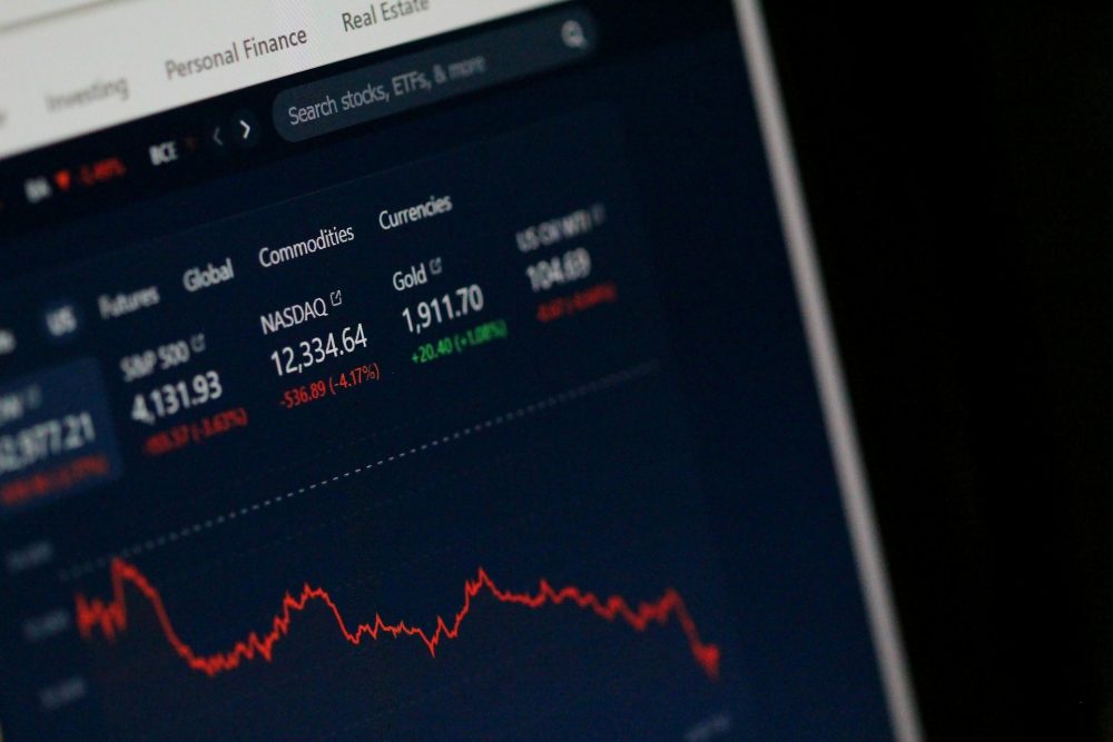
Markets
The Big Beautiful Bill: Market Highs Mask Debt and Divergence
The June jobs report surprised, but underlying issues persist. The Big Beautiful Bill signals rising debt ahead. U.S. stock markets hit record highs, yet not all indices followed—suggesting divergence. In other currencies or gold, U.S. markets look weaker. Gold remains attractive; Aura Minerals shows strength. Central banks keep buying gold, while public interest lags behind.
There were two big events this past week besides Canada Day July 1st and Independence Day July 4th. The two—the Big, Beautiful Bill and the June jobs report—both promised some fireworks to go along with Canada Day and Independence Day.
The Big, Beautiful Bill
The Big, Beautiful Bill is massively divisive. It promises to deliver for corporate America, manufacturers, small business, and high-income earners while hurting low-income Americans, hospitals, clean energy and EVs, and Medicaid and food stamp recipients, as well as widening the already huge deficit.
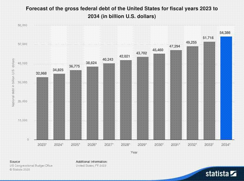
The U.S. has the biggest federal debt in the world, now surpassing $37 trillion. Of that, roughly $29.5 trillion is held by the public and $7.5 trillion by government agencies such as Social Security. $4.6 trillion is held by Federal Reserve Banks and $9.1 trillion is held by foreigners, of which the largest holder is Japan with roughly $1.1 trillion.
This debt, thanks in part to the Big, Beautiful Bill, is expected to grow to $43.7 trillion by 2029 and $54.4 trillion by 2034, according to Statista (www.statista.com). Other projections are showing the debt could grow to $46.8 trillion by 2029, according to the U.S. Debt Clock www.usdebtclock.org.
Roughly $9.2 trillion needs to be refinanced in 2025. Add in a projected budget deficit of at least $3 trillion and in 2025 the U.S. will need to raise over $12 trillion of debt. The U.S. budget deficit is already 6.0% of GDP, the highest in the G7. It is hard to find anyone with a budget deficit as large as that of the U.S. Okay, Brazil at 7.1% and Egypt at 7.7%. Canada, often tagged as profligate in debt spending is only at 1.9%, the lowest in the G7.
So why is the U.S. budget deficit projected to rise? As a part of the Big, Beautiful Bill, there are increased tax cuts and increased spending on the military and Homeland Security (borders and immigration). There is also a larger standard tax deduction plus an increased child tax credit. Offsetting this is a huge cut to Medicaid and food stamps, along with selected cuts to Social Security, increases for paying back student loans, and phasing out of the Inflation Reduction Act.
All this could have a negative impact on GDP, with some forecasting that the GDP could fall as much as 2% by 2050. But as some note, tax cuts in particular are bullish for the economy and the stock market. Nonetheless, in the first quarter of 2025 the U.S. economy contracted by 0.5%, the first decline since 2022. Maybe this contraction will be like the 2022 quarterly contraction, a one- off. An official recession is two consecutive quarters of negative GDP growth.
The tax cuts could provide some boost to the stock market in the short term. Note that the 2017 tax cut led to a rally in the stock market. The proposed tax cut could be double the size the 2017 cut. No wonder the market has remained exuberant of late with the expectations of the Big, Beautiful Bill passing. But, as the deficit and debt grow, that pushes up the annual interest payments. No wonder Trump is pushing Fed Chair Powell to drastically cut interest rates now. That also shows how the market is misunderstood.
The bond market may not be so kind. The Fed may control the Fed rate and influence the short end of the market, but the long end is controlled by the bond market. It also shows why they are striving to put as much of the debt as possible into the short end of the market rather than the long end. The short end can be influenced to go lower. Already the U.S. is paying over $1 trillion in interest payments, exceeding the amount paid for defense. No wonder they are trying to get Medicaid and food stamp recipients to pay for the increase in debt and interest payments.
No matter how one looks at it, the debt to GDP measurement is also projected to rise from the current 123% to 140% or higher by 2029. In the G7, only Japan and Italy are higher and both those economies are moribund with low or stagnant growth. Canada has the lowest federal GDP in the G7 at around 57%, but add in the provinces and the debt to GDP soars over 100%. Many consider Canada’s debt to GDP as the higher number including the provinces.
In the U.S., the states add little to the overall debt as they are not allowed to carry deficits, unlike Canadian provinces. Including the U.S. states, the debt to GDP ratio rises to 134%. Interest payments to GDP, already at around 3% of GDP, are expected to soar to 6% by 2050. Will all this become unsustainable, creating a financial crisis of a magnitude never seen before? Some cite a debt to GDP ratio of 175% as the danger zone that could spark a financial crisis.
Not surprisingly, the Big, Beautiful Bill will do little for household incomes, which are expected to continue to stagnate, with those earning over $1 million/year benefitting the most. The Big, Beautiful Bill is expected to push the income of the bottom 20% of U.S. households down 2.3% while the top 20% could see a 2.3% increase, the highest for any income group.
For those without health insurance, estimated to be currently 26.3 million, that number will rise. Interestingly, according to U.S. Debt Clock, some 26.7 million Americans are millionaires but 49.9 million are food stamp recipients, of which 35.8 million are considered to be living in poverty. There are 63 million Americans considered retired and it is estimated that there are 68 million who receive Social Security, primarily retirees and the disabled.
But from the Big, Beautiful Bill, two to six million could have their Social Security cut in half, leaving potentially millions unable to pay their bills. Not surprisingly, we noted that besides the already huge debt, there is an estimated $313 trillion of unfunded liabilities, primarily related to Social Security and Medicare/Medicaid. No word on how that will be met.
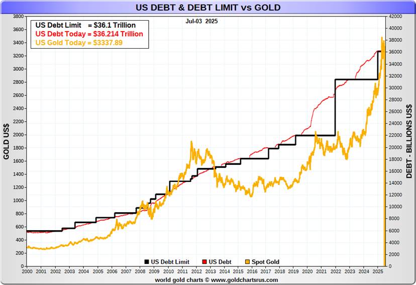
Overlooked in all of this is the big cut to the Inflation Reduction Act that helped clean energy. Gutting it could result in higher utility bills for many. Also overlooked is that the U.S. debt ceiling is being raised by $5 trillion to $41.1 trillion. Raising the debt ceiling has seen gold rise in tandem.
The U.S. is fortunate in that the U.S. dollar is the world’s reserve currency. This allows the U.S. to be able to export its debt to the rest of the world. As the reserve currency, central banks hold U.S. dollars in the form of U.S. treasuries. Debt obligations and global trade transactions are carried out in U.S. dollars. This helps maintain a strong demand for the U.S. dollar. But sanctions, seizing of assets of foreign countries (i.e. Russia), and trade wars all conspire to undermine the U.S. dollar. As a result, we are seeing the U.S. dollar fall (down 10.6% in 2025 so far).
Countries are trying to avoid using U.S. dollars as trade moves to other currencies (i.e. Chinese yuan). Blocking countries such as Russia from the global payments system SWIFT pushes the need to develop alternatives, again undermining the U.S. dollar. This Big, Beautiful Bill does nothing to help support the U.S. dollar as the world’s reserve currency and may indeed make it worse with the amount of debt this will add for future generations.
The Big, Beautiful Bill is beautiful for some, mainly the well-off. The Big, Beautiful Bill will be phased in over time. Nonetheless, for those not in the top 20% of income earners, we could see bankruptcies and poverty rise substantially.
Lest we forget, July 9, 2025 is Trump’s second “Liberation Day,” when the 90-day pause on tariffs is set to end. Will trade deals have been forged? The odds of that are low. Letters are going out to inform countries what their tariff will be. What will happen remains an unknown. Will the markets respond as they did in April? Or just keep on going up? Right now, markets don’t seem too concerned, focusing instead on tax cuts to drive the market higher.
U.S. Jobs Report
U.S. Employed Persons Unemployed Persons 2020–2025
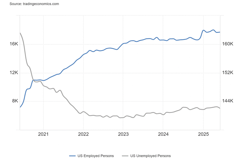
Once again, we received a surprise U.S. jobs report. Nonfarm payrolls rose 147,000 in June, well above the forecast of a rise of 110,000. May reported a gain of 144,000, but we note that is a revised number as April/May were revised down by 16,000. Downward adjustments in later months are not unusual. The jobs report also seemed to fly in the face of the ADP Employment report out earlier in the week that reported a loss of 33,000 jobs, well below the expected gain of 95,000.
This differential is not unusual as the reports are calculated differently, covering different periods, and the ADP report excludes government jobs. While they can vary month to month, over time they tend to converge. The nonfarm payrolls are, however, the gold standard for employment reports.
The better than expected nonfarm saw the stock market soar to new all-time highs again, while bond yields rose and gold fell. Traders then began to discount any July Fed cut in interest rates but maintained the stance for a September cut. Bond yields rising is not good for the huge debt. The U.S. 10-year treasury note rose to 4.35% from 4.27%.
U.S. Employment Rate Unemployment Rate 2020–2025
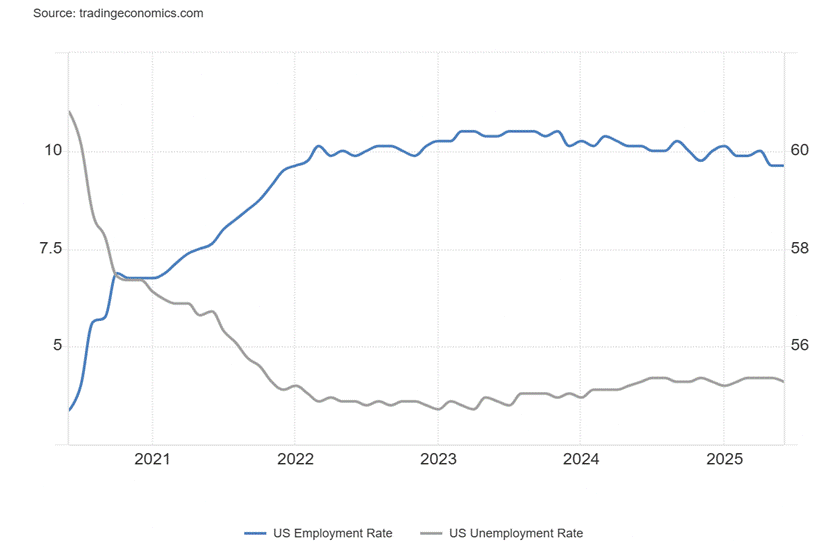
So, what happened? We were surprised to see the civilian labour force actually fell 130,000 while the total population level (15 years of age and over) rose 562,000. The employment level rose 93,000, but again, surprisingly, full-time workers saw an increase of 437,000 while the number for part-time workers fell 387,000. The labour force participation rate fell from 62.4% to 62.3% while the employment population ratio was unchanged at 59.7%.
The number of those unemployed fell 222,000, but there was a big jump of 329,000 for those not in the labour force (NILF). For clarification, NILF is retirees, students, caregivers or stay-at-home parents, those who are disabled or chronically ill, and discouraged workers (i.e. those who want to work but believe nothing is there for them). It may also include early retirees and financially independent individuals.
The unemployment rate (U3) fell to 4.1% from 4.2% while the U6 unemployment rate (total unemployed, plus all persons marginally attached to the labour force, plus total employed part-time for economic reasons as a percent of the civilian labour force, plus all persons marginally attached to the labour force) also fell to 7.7% from 7.8%. Unemployment rose for blacks to 7.2% from 5.9%. The decline in the civilian labour force and a lower participation rate were major factors in the lowering of the unemployment rate.
So, what’s going on? Wasn’t employment supposed to wither as tariffs kicked in and layoffs have continued? Even the weekly claims came in lower than expected at 233,000 vs. 237,00 the previous week and an expectation of 240,000. The unemployed (7,015 thousand U3) vs. job openings 7,769 thousand (JOLTS) are somewhat in balance. So, what gives? Layoffs may be rising, but severance packages keep people going and they are not considered to be unemployed until the severance gives out. The number of unemployed individuals vs. job openings may be somewhat in balance, but skills may not match.
We are also unsure what the impact of arresting immigrants (illegals?) is causing. Some companies, particularly in plants and agriculture, are reporting a big loss in their work force, putting them in jeopardy. Again, skills aren’t matching, as who wants to toil hours in the hot sun at low pay? The desire to see a sharp daily increase in the number of immigrants being arrested (illegals, undocumented individuals, etc.) could jeopardize upwards of 11 million people, many of them employed, paying taxes, etc.
The average number of weeks unemployed actually rose to 23 weeks from 21.8 weeks. But the median number of weeks unemployed fell to 7.9 weeks from 9.7 weeks. The number unemployed 27 weeks or more rose by 140,000 while the number of multiple job holders rose to 5.4% from 5.3%. This means that people are unemployed longer.
New jobs were primarily in health care and state governments (public education) while employment in the federal government continued to fall. The job gains were primarily in areas not impacted by tariffs. Manufacturing jobs fell 7,000 which was below expectations. The average number of hours worked fell to 34.2 from 34.3. Private payrolls rose 74,000, but that was below the expected 100,000. Average hourly earnings rose 0.2%, below May’s 0.4% but on expectations. Year-over-year (y-o-y) wages rose 3.7%, but that was below the expected 3.9%. So, the number of hours worked is falling and wages are slipping.
The jobs report may have been better than expected and the stock market loved it. However, it further complicates the feud between Fed Chair Powell and President Trump who wants Powell to lower interest rates now and sharply. We await the shadow Fed chair to be appointed, which appears to be in the fall. The odds of a July cut fell. The labour market is more resilient than many thought it would be. Still, the downward trajectory remains, despite the better than expected report.
Canada reports its job numbers this coming week.
Updates
S&P 500
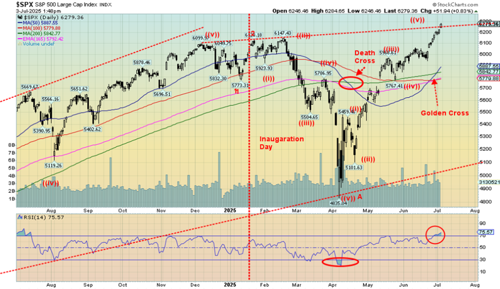
Another week, another record high. It’s getting to be a habit. We even now have the golden cross where the 50-day MA crosses over the 200-day MA to the upside. The death cross only came into play in April. Now it has been negated. Is it a misleading cross? Will it last? On the holiday-shortened week, the S&P 500 (SPX) rose 1.7% to new all-time highs. The NASDAQ also rose to new all-time highs, up 1.6%. The NASDAQ also saw a golden cross. No such luck for the Dow Jones indices.
The Dow Jones Industrials (DJI) rose 2.3% but remains about 0.5% below its all-time high. The Dow Jones Transportations (DJT) rose 3.6% but remains down, just over 12% from its all-time high seen in November 2021. That is a considerable divergence between the DJI and the DJT. Dow Theory says the indices must agree with each other, but they haven’t for quite some time.
The S&P 500 Equal Weight Index rose up 2.4% but, unlike the S&P 500, it did not make new all-time highs. SPXEW remains 1.3% below its all-time high. The NY FANG Index made all-time highs, up 1.1%. The FAANGs and the MAG7 are major drivers of both the NASDAQ and the SPX. Notably Meta, Netflix, Microsoft, Nvidia, and Broadcom all made all-time highs this pasts week. Both Nvidia and Microsoft are now $5 trillion companies. To put that in perspective, with a market cap of over $5 trillion, that would now make Nvidia and Microsoft the third and fourth largest countries in the world, behind only the U.S. and China. The two are over twice the size of Canada. Over a $4 trillion market cap is Apple, making it also larger than both India and Japan.
It’s astounding. We can’t help but notice, however, that all have their RSI at 70 or higher, which suggests they are all overbought. All that means, really, is that they all could be subject to a correction. As to a top, well, still no real sign. Tax cuts galore and it’s buy, buy, buy. The Fear and Greed Index is now registering Extreme Greed. Not the time to be buying. But could the market go higher? Yes.
As to the other indices we follow, the S&P 400 (Mid) rose 2.9% while the S&P 600 (Small) was up 3.2%. Both, however, remain well down from their all-time highs. Bitcoin rose a small 0.7% but remains shy of its all-time high.
Elsewhere, in Canada, the TSX Composite made all-time highs, up 1.3%, while the TSX Venture Exchange (CDNX) made new 52-week highs, up 4.3%. All 14 sub-indices on the TSX were up. Leading the way was Telecommunications TTS, up 4.5%. Golds followed, up 3.9%. In the EU, the London FTSE rose 0.3%, the Paris CAC 40 was up a small 0.1%, but the German DAX fell 1.0% and the EuroNext was down 0.4%. In Asia, China’s Shanghai Index (SSEC) was up 1.4% but the others fell. The Tokyo Nikkei Dow (TKN) was down 0.9% and Hong Kong’s Hang Seng (HSI) fell 1.5%. It was mixed in foreign markets.
July is noted as the fourth best month of the year and the best month of the third quarter. July can sometimes see important highs. Our best-known one was in July 1990 on the Iraqi invasion of Kuwait. Nonetheless, the third quarter has had its share of stock market highs. Once we get into August/September, August is the 10th or 11th worst month while September is the worst month of the year.
Famous tops in August include August 1987 before the October 1987 crash and September 1929 before the crashes of October 1929. October may get the crashes but also sees bottoms. Will everyone adhere to the script? Until we see a break, we can’t tell. We can’t consider a top for the SPX until we break under 6,000. Under 5,800 a top is in. Could this breakout turn into a false one?
The stock market is in a bubble and it will burst. That day may be getting closer. When the bubble breaks, that could be good for gold as a safe haven.
The Scorecard
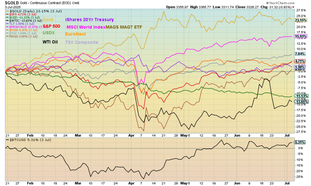
This is to July 3 only because of the U.S. Independence Day holiday. Gold continues to lead, up 23.2%. And oil continues to be the drag, down 13.7% since Inauguration Day. The US$ Index is the next worst, down 11%.
Chart of the Week
S&P 500 vs. S&P 500 in Euros
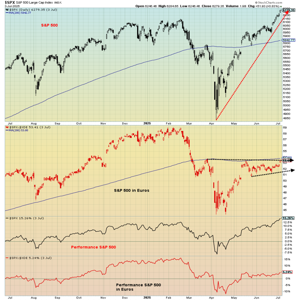
A tale of two currencies: the S&P 500 vs. the S&P 500 expressed in euros. What a difference. The view from the EU. While the S&P 500 roars to new all-time highs, the S&P 500 expressed in euros is still nowhere near its all-time high. Even performance is skewed with the S&P 500 up 15.3% over the past year while the S&P 500 in euros is up only 5.2%. The result of a weak U.S. dollar vs. strengthening foreign currencies.
The same story prevails for year-to-date. Here the S&P 500 is up 6.8% but the S&P 500 in euros is actually down 6.0%. The view from the EU is not rosy. If they were invested in the S&P 500, they’d have lost money.
For comparison, here the others including the Cdn$, Swiss francs, pound sterling, Japanese yen and gold:
| Index (in currencies) | % gain (loss) – Past Year to July 3, 2025 | % gain (loss) – Year to Date to July 3, 2025 |
| US$ | 15.3% | 6.8% |
| Euros | 5.2% | (6.0)% |
| Cdn$ | 14.5% | 0.6% |
| Swiss francs | 2.7% | (6.4)% |
| Pound sterling | 7.1% | (6.4)% |
| Japanese yen | 4.7% | (1.6)% |
| Gold | (19.2)% | (15.8)% |
Most notable here is that in terms of gold the S&P 500 actually lost 19.2% over the past year and 15.8% year to date. So, which would you rather have held? Stocks represented by the S&P 500 or gold?
Gold
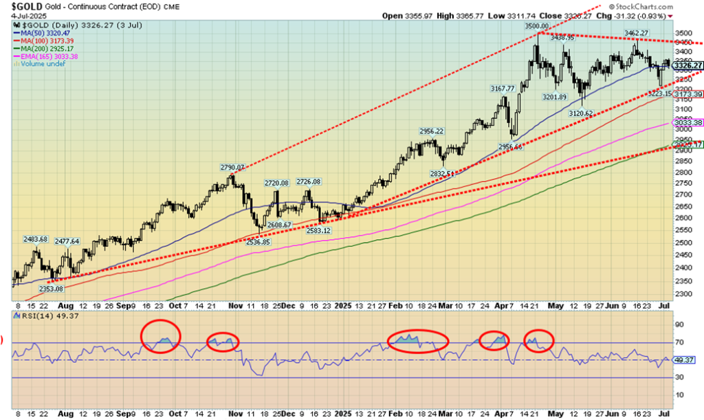
Gold—the safe haven in times of geopolitical tensions, domestic political tensions, and an uncertain economy. It is also protection against inflation, currency devaluation, and financial volatility, including systemic financial risk. Given gold is up about 26% in 2025, it is living up to its reputation, even as the S&P 500 is up 6.8%. Gold stock indices are up even more. If you are a gold bug, 2025 has been a dream so far, allowing the disaster of 2013 to at least fade into the background.
On the week, gold was up 1.6% despite the drop of 0.9% on Friday after the stronger than expected job numbers. Silver gained 2.6%. The big star has been platinum, gaining another 2.8% this past week and making 52-week highs again. Platinum is up 50.9% so far in 2025. Of the near precious metals, palladium was up 18.3% while copper was over $5 up 0.8%. The gold stock indices continued their upward ride with the Gold Bugs Index (HUI) up 4.9% and the TSX Gold Index (TGD) up 3.9%. They are up 54.9% and 49.4 % so far in 2025.
There are individual stocks up over 60%, even 100%. Even the junior mining market is showing life as we noted the TSX Venture Exchange (CDNX) was up 4.3% on the week and is now up 26.3% on the year. The TSX sub-indices of Metals & Mining (TGM) gained 3.2% while the Materials sector was up 3.2%. On the year, they are up 23.1% and 31.3% respectively.
We should note the energy sector as well as WTI oil gained 2.7% but remains down on the year, Brent crude was up 1.9%, natural gas (NG) at the Henry Hub was hit, down 7.8%, while at the EU Dutch Hub it was down 0.2%. The energy indices were up with the ARCA Oil & Gas Index (XOI) up 3.6% while the TSX Energy Index (TEN) gained a modest 0.3%.
Gold is up as the U.S. dollar continues its downward trend. The US$ Index fell 0.4% this week to once again 52-week lows. At 96.99, the US$ Index still has quite a way to go to equal its all-time low of 70.70 set in 2008 during the financial crisis. But the trend is down and still no sign of a bottom. The currencies were up with the euro gaining 0.4% and the Swiss franc up 0.5%. Both hit 52-week highs. Pound sterling actually fell 0.4% as did the Japanese yen, down 0.2%. The Canadian dollar continued its recent rise, up 1.1%. A devaluing currency is music to gold’s ears.
While the stock market continues to soar, there is apprehension about the potentially negative impact of Trump’s Big, Beautiful Bill and his trade wars. This week we’ll see if their promise to hike tariffs takes effect or whether there be a raft of trade deals. Or do we get another TACO response. Don’t hold your breath on trade deals. Gold is also ignoring slow rising yields in the bond market. Normally, higher interest rates are not friendly to gold. But yields rising is due to concern over the huge debt. As well, the Big, Beautiful Bill raises the debt ceiling by $5 trillion. All that is good for gold.
What will gold do going forward? On one hand, gold could be completing a five-point ABCDE reversal pattern with the recent low at $3,223, the E wave. To confirm, we need new highs over $3,500. But this period for gold can be tricky. Anywhere from July to September gold can be weak with the low coming somewhere during the period. Following a rally into October, gold often goes into another snooze until December where it bottoms and soars into the first few months of the new year. Note the low in December 2024 at $2,583. In April gold hit $3,500.
Gold enjoyed a run between October 2023 to a high in April/May 2024 before going into another snooze, bottoming in July/August 2024. Following a rally into October it was followed by the drop into December. The seasonal pattern was almost textbook perfect. Will this year follow the script? Even during the horrible gold years (2012–2015) the script was largely followed, even as gold fell sharply from its $1,900 top in 2011 to the low of $1,045 in December 2015. No, we are not expecting that now.
The conditions remain too good for gold. We are always reminded that the 2008–2011 bull market for gold experienced a number of pullbacks on its way from $680 to $1,900. This, we believe, is just another pullback. But in the event that the recent low was not our final low, a break of $3,223 could send us tumbling to major support near $3,000. Hence, the desire for new highs.
As to new highs, gold had made a high but silver didn’t. Now recently silver (and platinum) have made new highs but gold hasn’t. We note divergences and that’s why new highs for gold are important so that all are in sync.
Gold will be going higher as the conditions are there. Raising the debt ceiling along could get gold going. Over the years it has been a long march upward. What will a $5 trillion increase in the debt ceiling do?
The Rise of Gold and Debt 2000–2025
Markets & Trends
| % Gains (Losses) Trends | ||||||||
| Close Dec 31/24 | Close Jul 4/25 | Week | YTD | Daily (Short Term) | Weekly (Intermediate) | Monthly (Long Term) | ||
| ne | ||||||||
| S&P 500 | 5,881.63 | 6,279.36 (new highs) * | 1.7% | 6.8% | up | up | up | |
| Dow Jones Industrials | 42,544.22 | 44,828.53 | 2.3% | 5.4% | up | up | up | |
| Dow Jones Transport | 16,030.66 | 16,046.83 | 3.6% | 1.0% | up | neutral | up | |
| NASDAQ | 19,310.79 | 20,601.10 (new highs) * | 1.6% | 6.7% | up | up | up | |
| S&P/TSX Composite | 24,796.40 | 27,036.16 (new highs) * | 1.3% | 9.3% | up | up | up | |
| S&P/TSX Venture (CDNX) | 597.87 | 755.22 (new highs) | 4.3% | 26.3% | up | up | up | |
| S&P 600 (small) | 1,408.17 | 1,380.22 | 3.2% | (2.0)% | up | neutral | up | |
| MSCI World | 2,304.50 | 2,700.94 (new highs) * | 0.4% | 17.2% | up | up | up | |
| Bitcoin | 93,467.13 | 107,759.58 | 0.7% | 15.3% | up | up | up | |
| Gold Mining Stock Indices | ||||||||
| Gold Bugs Index (HUI) | 275.58 | 426.88 | 4.9% | 54.9% | up | up | up | |
| TSX Gold Index (TGD) | 336.87 | 503.33 | 3.9% | 49.4% | up | up | up | |
| % | ||||||||
| U.S. 10-Year Treasury Bond yield | 4.58% | 4.35% | 1.9% | (5.0)% | ||||
| Cdn. 10-Year Bond CGB yield | 3.25% | 3.36% | 1.5% | 3.4% | ||||
| Recession Watch Spreads | ||||||||
| U.S. 2-year 10-year Treasury spread | 0.33% | 0.46% | (13.2)% | 39.9% | ||||
| Cdn 2-year 10-year CGB spread | 0.30% | 0.69% | (2.8)% | 130.0% | ||||
| Currencies | ||||||||
| US$ Index | 108.44 | 96.97 (new lows) | (0.4)% | (10.6)% | down | down | down | |
| Canadian $ | 69.49 | 0.7374 | 1.1% | 6.1% | up | up | neutral | |
| Euro | 103.54 | 117.53 (new highs) | 0.4% | 13.5% | up | up | up | |
| Swiss Franc | 110.16 | 125.74 (new highs) | 0.5% | 14.1% | up | up | up | |
| British Pound | 125.11 | 137.51 | (0.4)% | 9.1% | up | up | up | |
| Japanese Yen | 63.57 | 68.95 | (0.2)% | 8.5% | up | up | neutral | |
| Precious Metals | ||||||||
| Gold | 2,641.00 | 3,326.27 | 1.6% | 26.0% | up | up | up | |
| Silver | 29.24 | 36.85 | 2.6% | 26.0% | up | up | up | |
| Platinum | 910.50 | 1,374.20 (new highs) | 2.8% | 50.9% | up | up | up | |
| Base Metals | ||||||||
| Palladium | 909.80 | 1,150.00 | 18.3% | 26.4% | up | up | down | |
| Copper | 4.03 | 5.10 | 0.8% | 26.6% | up | up | up | |
| Energy | ||||||||
| WTI Oil | 71.72 | 66.83 | 2.7% | (6.8)% | up (weak) | neutral | down | |
| Nat Gas | 3.63 | 3.45 | (7.8)% | (5.0)% | down (weak) | neutral | neutral | |
__
(Featured image by Anne Nygård via Unsplash)
DISCLAIMER: This article was written by a third party contributor and does not reflect the opinion of Born2Invest, its management, staff or its associates. Please review our disclaimer for more information.
This article may include forward-looking statements. These forward-looking statements generally are identified by the words “believe,” “project,” “estimate,” “become,” “plan,” “will,” and similar expressions, including with regards to potential earnings in the Empire Flippers affiliate program. These forward-looking statements involve known and unknown risks as well as uncertainties, including those discussed in the following cautionary statements and elsewhere in this article and on this site. Although the Company may believe that its expectations are based on reasonable assumptions, the actual results that the Company may achieve may differ materially from any forward-looking statements, which reflect the opinions of the management of the Company only as of the date hereof. Additionally, please make sure to read these important disclosures.
Copyright David Chapman 2025
David Chapman is not a registered advisory service and is not an exempt market dealer (EMD) nor a licensed financial advisor. He does not and cannot give individualised market advice. David Chapman has worked in the financial industry for over 40 years including large financial corporations, banks, and investment dealers. The information in this newsletter is intended only for informational and educational purposes. It should not be construed as an offer, a solicitation of an offer or sale of any security. Every effort is made to provide accurate and complete information.
However, we cannot guarantee that there will be no errors. We make no claims, promises or guarantees about the accuracy, completeness, or adequacy of the contents of this commentary and expressly disclaim liability for errors and omissions in the contents of this commentary. David Chapman will always use his best efforts to ensure the accuracy and timeliness of all information. The reader assumes all risk when trading in securities and David Chapman advises consulting a licensed professional financial advisor or portfolio manager such as Enriched Investing Incorporated before proceeding with any trade or idea presented in this newsletter.
David Chapman may own shares in companies mentioned in this newsletter. Before making an investment, prospective investors should review each security’s offering documents which summarize the objectives, fees, expenses and associated risks. David Chapman shares his ideas and opinions for informational and educational purposes only and expects the reader to perform due diligence before considering a position in any security. That includes consulting with your own licensed professional financial advisor such as Enriched Investing Incorporated. Performance is not guaranteed, values change frequently, and past performance may not be repeated.


TopRanked.io Weekly Affiliate Digest: What’s Hot in Affiliate Marketing [Bovada Affiliate Program]
This week, we're mashing up 80s tech with 2020s private messaging apps. Why? Because Big Tech just dropped a big...


Euro Stablecoins Struggle to Compete with Dollar Dominance in Crypto Markets
Euro stablecoins remain marginal despite the euro’s global importance, with minimal trading volume compared to dollar rivals like USDT and...


Gilead Sciences Advances Growth Strategy with Focus on HIV, Oncology, and Innovation
Gilead Sciences focuses on developing treatments for HIV, cancer, and inflammatory diseases, driven by blockbuster drugs like Biktarvy. Growth relies...


Casablanca Stock Exchange Profits Surge in 2025 as Growth Momentum Strengthens
In 2025, Casablanca Stock Exchange profits rose 40% to MAD 50.9 billion. Net income grew 22.3%, driven by strong industrial...


Credibur Scales Rapidly: €2 Billion in Structured Debt Facilities in Six Months
Infrastructure fintech Credibur has added over two billion euros in structured debt facilities within six months. Its platform connects lenders,...
 |
|
 |  |
 |
|
-

 Biotech2 weeks ago
Italy’s Pharmaceutical Sector Drives Innovation, Sustainability, and European Leadership
-
 Biotech2 days ago
Gilead Sciences Advances Growth Strategy with Focus on HIV, Oncology, and Innovation
-

 Crowdfunding1 week ago
Crowdfunding Evolves into Core Financial Infrastructure in Europe
-

 Impact Investing5 days ago
Italian Unlisted Banks Lag on ESG Sustainability