Featured
Dow Jones climbs higher, gold price holds up well
The Dow Jones bounces back and scores weekly highs, breaking its record five weeks ago, while gold is holding up pretty well despite overwhelming declines.
The Dow Jones closed the week with its BEV plot under -5% for the first time since early March. This is no small thing for the bulls, seeing the Dow’s BEV plot rising towards its BEV Zero (0.00%) line from the -11.53% it made on Mar. 23.
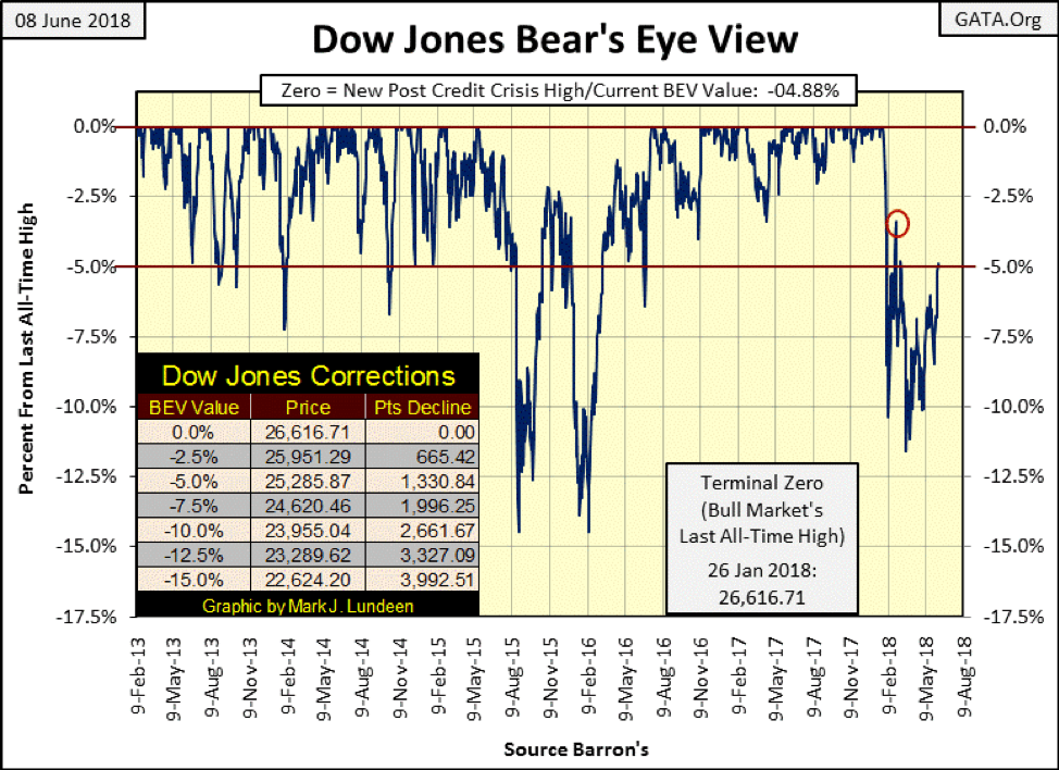
© Mark Lundeen
As of now, the Dow Jones has less than 5% separating it from a new all-time high. During the credit-crisis market crash of 2007-09, the Dow Jones saw several daily percentage ADVANCES of greater than 5%. One such day next week would result in a new all-time high in the stock market. However, any market where the Dow Jones routinely sees daily moves (up or down) in excess of 1% is a market more likely to make history to the downside than the upside.
So how’s the Dow Jones’ daily volatility looking here in June 2018? Not bad as seen in the chart below. Since the Dow Jones broke above its upper trend line five weeks ago (five circled groups), it’s been well-behaved when compared to the daily volatility seen in February, March and April.
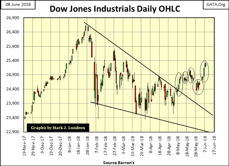
© Mark Lundeen
For the Dow Jones Total Market Group (DJTMG)’s top 20 seen in the table below, the deflation that began in Barron’s Feb. 5, 2018, issue has been plugged. Once again, the “policy makers” have been successful in reflating valuations in the stock market.
Looking at just the BEV-Zero and -0.001% columns, the number of groups at all-time highs or within 4.99% of a new all-time high, closed this week with 27 of 74 groups at or within 5% of making a new all-time high. This is a nice change from Barron’s Mar. 26 issue, where the deflation peaked with only two groups in these columns.
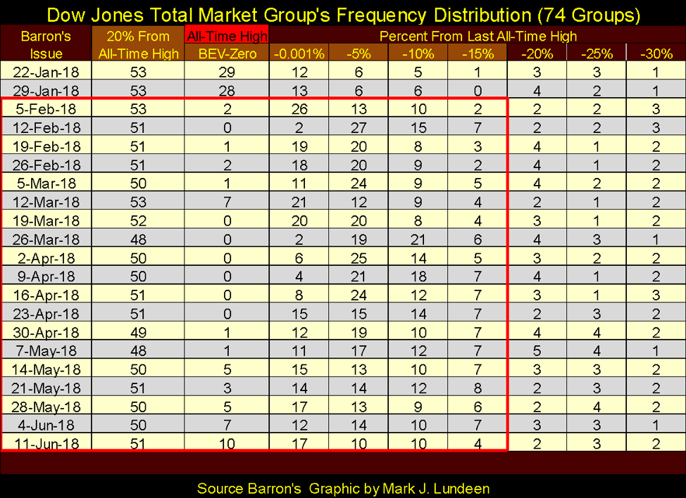
© Mark Lundeen
All in all, expecting the Dow Jones to see new all-time highs sometime this summer is becoming more reasonable as time passes by. That makes me a short-term bull. Long term, I’m as bearish as ever. I refuse to ignore the fact that this is an advance that began on Mar. 9, 2009, nine years ago when the Dow Jones closed at 6,547.05, an advance of over 20,000 points.
Also, things can change quickly in the market, and no one is going to ring a bell when it’s time to go. Go back and look at the Dow Jones’ Open, High, Low and Close bar chart above. On Jan. 26, the Dow Jones saw its last all-time high, and everything looked great. Two weeks later, Mr. Bear clawed back over 2,700 points (10.36%) from the Dow Jones. Who saw that coming? So, at this week’s close, everything appears to be on solid ground, but it always does at market tops.
And there are problems that one day will prove to be very bearish for the stock market, like the European bond market. In the past four weeks, Italian sovereign debt has seen its yield (Blue Plot below) increase by 120 basis points, a whopping 1.2% in only a month. Has the banking system written derivatives on these bonds? It’s a safe bet they have, and I wonder just who is feeling a little heat as yields for these bonds continue rising.
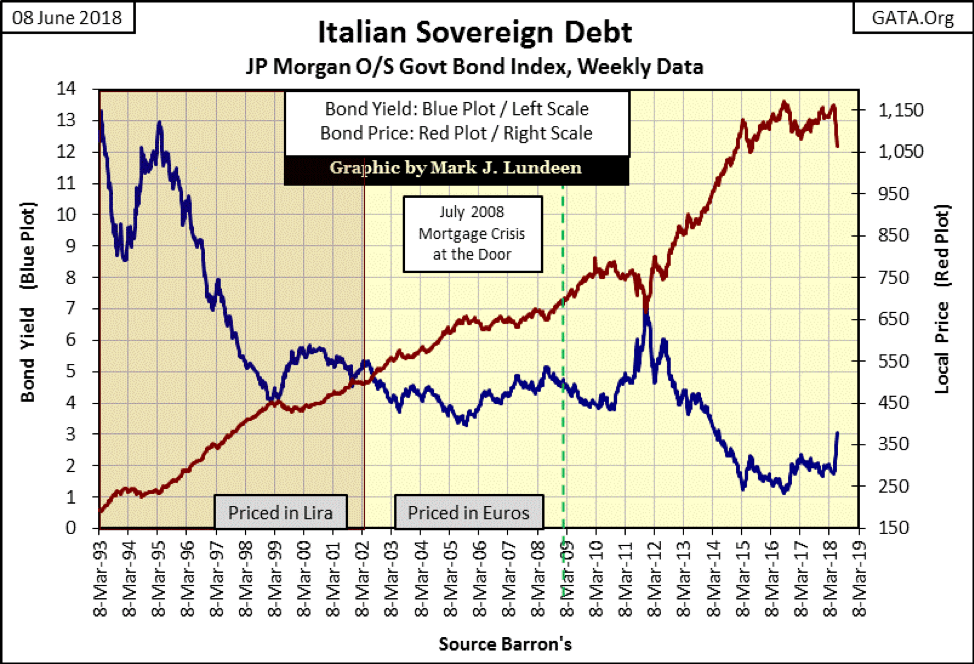
© Mark Lundeen
Martin Armstrong on Greg Hunter’s USA Watchdog predicts a day is soon coming when European bond yields will spike upward 10% in a single day when reality forces the ECB to terminate its QE program.
Mr. Armstrong believes that will be a huge positive for the American stock market, as European capital will have no place else to go but to Wall Street. He may be right, but only if the global banking system survives this pending historic crash in European bonds. Assuming he’s right, how high does the Dow Jones rise in a tsunami of flight capital from Europe? And more importantly, how long can it stay at those lofty levels after this transient flow of funds is a spent force? Months? Maybe only weeks or days.
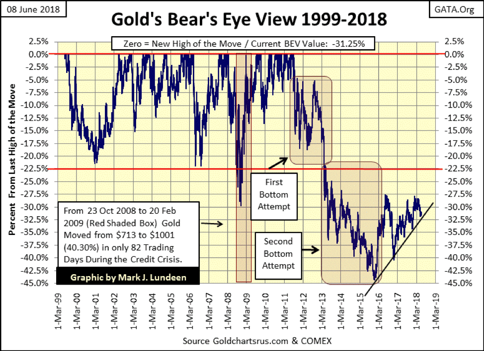
So far, flight capital from the Italian bond market hasn’t impacted the price of gold, at least not yet. Still, in gold’s BEV chart below, it so far refuses to break below the uptrend line I placed in the chart.
© Mark Lundeen
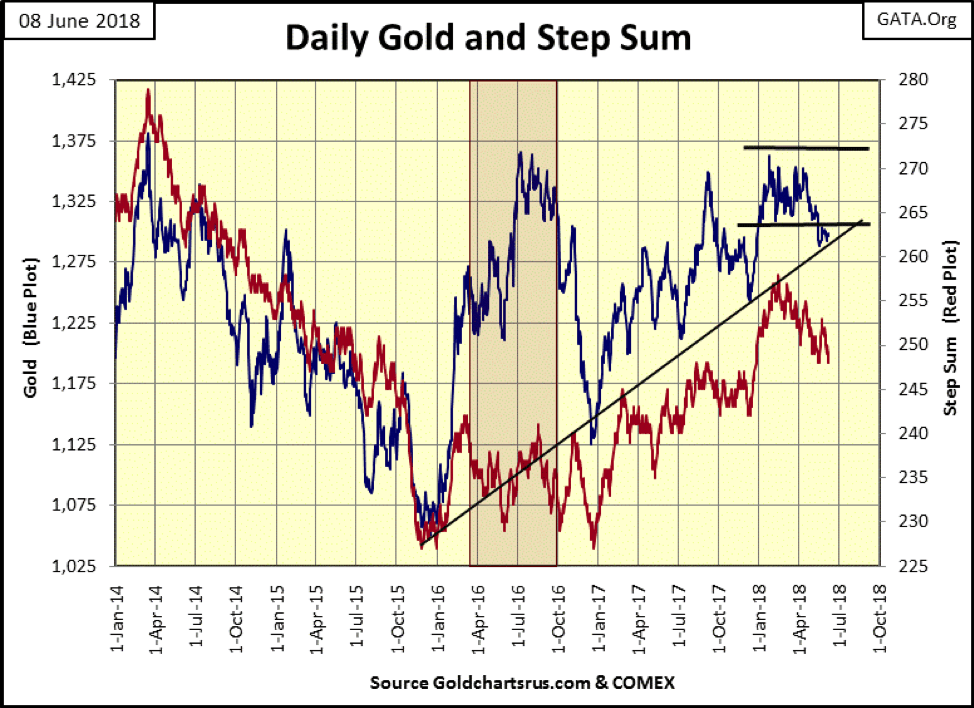
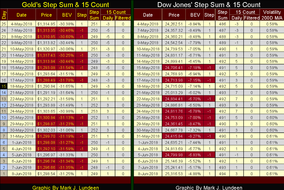
Here’s gold’s step sum chart, which I believe to be a better picture of the current market in gold. After May 10, gold broke below its lower support line. Yet in the past month (20 trading days) so far, gold has refused to break below the rising trend line I placed on the chart.
Also, market sentiment as measured by the down-trending step sum is distinctly negative, much more so than the current state of the gold market would justify. So, in the face of overwhelming declining over advancing days for the past four months, as seen in the post mid-February step sum’s decline, the price of gold is holding up pretty well.
This reminds me of Fud’s Law: “Push Hard Enough, It Will Fall Down,” except after the very hard bottom seen in December 2015 in the chart below, the bears no longer have what it takes to push prices down in the gold market as they did after April and August 2011. Gold’s BEV chart above beautifully illustrates the difference between April 2011 to December 2015 and now.
© Mark Lundeen
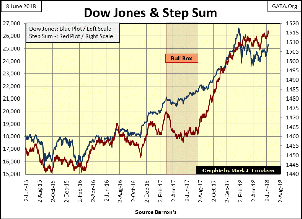
Here’s the step sum chart for the Dow Jones. Unlike the gold market, market sentiment in the stock market (Red Step-Sum Plot) is positive, which I believe is correct at this time.
© Mark Lundeen
Moving on to the step sum table below, take a moment to study gold’s market action of the past 25 trading sessions. Gold (and silver) is a market dominated by down days, and what do the bears have to show for them?
On May 10, gold closed at $1,320, but its 15 count was a -3, meaning that in the previous 15 trading days, nine of those days closed down, and only six days saw gold advance from a previous day’s close. Yet 15 days before (Apr. 20) gold closed at $1,336, all that work and the bears only got $16 for it?
The same goes since May 24 when gold closed at $1,303.65. Since then, the gold market has been dominated by daily declines, but for all that effort, the bears could only shave a few dollars off the price of gold. Internally, this is a market showing real strength.
© Mark Lundeen
Looking at the step sum table for the Dow Jones, it’s dominated by advancing days and the bulls are getting something done with them too. Since May 4, the Dow Jones has advanced by 1,054 points, and it may go to levels that may surprise us all should Martin Armstrong be proven correct, but I don’t care. It’s time to reduce one’s exposure to Wall Street and shift the proceeds into gold, silver and the precious metals mining companies.
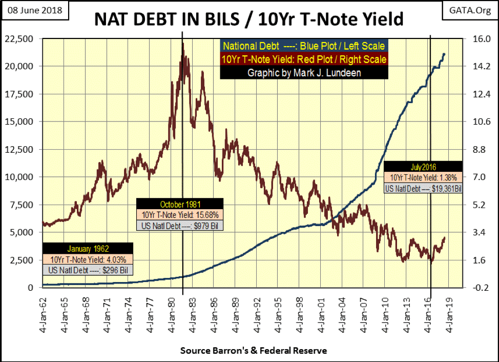
You buy them shoes and send them to school and they do this to you. And exactly who and what is that? The what is seen in the chart below where I’ve plotted the US national debt with the yield for the US Treasury’s 10-year note from 1962 to present. The who are the people in charge of the credit and banking system and members of the political establishment who can now boast how the net worth of the United States has now surpassed $100 trillion dollars.
Below, from January 1962 to October 1981, an 18-year period where the national debt increased by $683 billion (230%) as the 10yr T-note’s yield increased by 11.65%. I understand the reasons for these rising bond yields are not as simple as that; bond yields were reacting to CPI inflation (rising prices) in consumer goods. But if Washington’s serial-deficit spenders had lived within the limits of what the US Treasury collected in tax receipts, and not made an annual habit of spending borrowed money and inflating the money supply to fund only God knows what, we would not have seen the entire yield curve in October 1981 shift up above 15%.
© Mark Lundeen
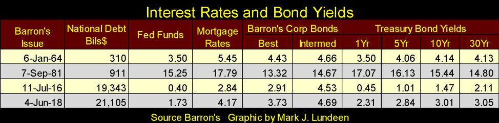
And it wasn’t only AAA-rated Treasury debt that was yielding double digits. In the autumn of 1981, everything was too (see table below). These were junk-bond yields, and when dealing with junk bonds, one has to be concerned about defaults. But in the early 1980s, there was no wide-spread panic from the bond market due to defaults. Yes, bonds were seen as toxic assets at that time as bond prices only seemed to go down by double-digit percent terms. Bonds were castigated as “certificates of confiscation” in the late 1970s and early 1980s.
But amazingly, defaults were relatively few because for decades local and state governments, corporations and individuals were, in the aggregate, living well within their means.
I know that to be true because from January 1977 to October 1981 in the chart above, bond yields increased from below 7% to deep into double digits in only four years, placing bond portfolios in great distress. But history records how the majority of issuers of those bonds and mortgages somehow managed to service their debts even during this period, the nastiest recession since the 1930s.
© Mark Lundeen
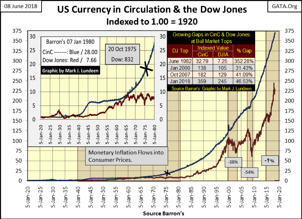
US Currency in Circulation (CinC) and the Dow Jones below are indexed to 1.00 = January 1920; a comparative view of “growth” in CinC and the stock market for the past 100 years. An interesting fact never mentioned in the media is the last time the Dow Jones’ rate of “growth” was larger than the increase in the supply of dollars from the Federal Reserve was in the 1920s. But to be fair to today’s “market experts,” they never factor into their market opinions increases in the money supply as affecting anything.
© Mark Lundeen
This is a very interesting chart, worth a few minutes of serious study, especially the three 21st century market tops noted in the chart’s table. The “policy makers” may be inflating CinC as they always have. However, since the January 2000 market top for the Dow Jones, my proxy for the general stock market, their monetary inflation is increasingly having less effect on valuations for the Dow Jones.
And look at the 21st-century bear markets. The high-tech dot.com bubble ultimately deflated the Dow Jones by 38%. The subprime mortgage debacle ultimately deflated the Dow Jones by 54%. One has to wonder how far the Dow Jones will ultimately deflate from its current lofty level. Should it surrender all of its gains since Mar. 9, 2009, the bottom of the last bear market, the Dow Jones would see a 75% market decline. Is such a decline possible? As there is so much hot air and regulatory mendacity supporting current market values, that plus more is my best guess.
So what is one to do? For what it’s worth, I recommend people should recognize the hazards of risking one’s wealth in over-inflated assets at a market top. Instead, they should choose to invest in those assets whose valuations are currently fully deflated. Gold, silver and the miners of precious metals come to my mind as fully deflated assets, assets offering minimal risks to invested funds while offering tremendous potential rewards.
The table below lists valuations for gold, silver and the BGMI going back to January 1920 in both nominal terms; the prices one would see in the newspapers of the time, and in constant 1920 dollar terms.
What are constant 1920 dollars? Dollar valuations adjusted for the past century’s inflationary increases in CinC, dollars that recognize that $20 to my grandfather in North Dakota from the early 1930s isn’t the same $20 I spend at a supermarket today. These dollars are deflated by taking the nominal dollar values seen on the below table’s left side and dividing them by the CinC Divisor listed on the right side.
The CinC Divisor is simply the indexed value of CinC from 1920, seen in the blue plot in the chart above, which as of last week was 370.43. Or for every $1.00 issued by the US Government in January 1920, CinC has increased by a factor of 370.43 as of Barron’s Jun. 4, 2018, issue. Pricing today’s market values in 1920 dollar terms isn’t ideal, but far preferred to pretending a dollar today is as valuable as it was in the 1920s or even in the last decade of the 20th century.
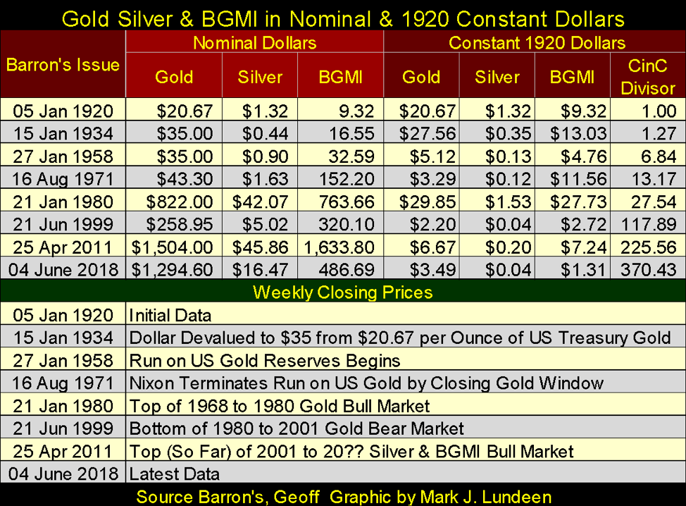
© Mark Lundeen
Precious metals assets are really cheap today, especially silver.
How do these deflated assets compare to say the Dow Jones? Look at the comparative performance of the indexed value of the BGMI (Blue Plot) to the Dow Jones (Red Plot) and CinC below.
Looking at the BGMI, twice in the 21st century (2008 and 2011), it attempted to break above the ever-rising CinC plot, a position where it has spent much of its time since the 1920s. But in April 2011, the “policy makers” invoked Fud’s Law. From its April 2011 high, the “policy makers” pushed hard enough to drive the BGMI down 84% in December 2015.
Since the summer of 2016 (circle), the BGMI has been ranged bound; not going up, but then not going down either. I believe the BGMI is currently as deflated as the “policy makers” can possibly make it, meaning the gold and silver miners offer minimum risks to invested funds, while offering maximum rewards to patient investors.
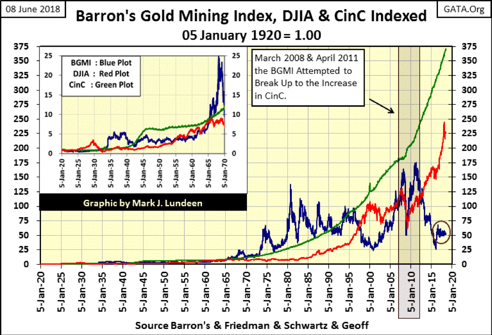
© Mark Lundeen
The Dow Jones in the chart above presents a completely different picture, one of the maximum risks to invested funds while offering minimum rewards to investors.
If Mr. Bear pointed a loaded gun at me (which is something he enjoys doing to all of us) and demanded I lock in 100% of my funds in either the general stock market or the BGMI for the next five or 10 years, looking at this chart, what advice would you recommend for me: the Dow Jones or the BGMI?
I agree! And should the BGMI, an index of major gold-mining companies do what we all hope it does in the years to come, its performance will appear timid when compared to what successful mineral exploration companies will do in a historic bull market in gold and silver.
My long-time readers know I like a little mineral exploration play called Eskay Mining. It’s a speculation NOT safe for widows or orphans, but one that is appropriate for investors in the mining shares after doing their own due diligence.
Here is a link to a John Kaiser interview on Eskay Mining my readers may find interesting.
So how does one go about investing for a bull market in gold and silver? I’d recommend that their funds be split up into three equal parts:
– Gold bullion in your personal possession
– Silver bullion in your personal possession
– Gold and silver mining shares
If someone desired to take the extra risks for the extra rewards mineral exploration offers, placing a few percent of your funds into a company like Eskay Mining is the thing to do. If Eskay Mining proves to be a bust, you lose only a small percentage of your capital. However, should Eskay Mining find the paydirt its management and the management of SSR Mining (the old Silver Standard Mining) believe is there, you just may be shocked at the profits to be made in successful mineral exploration.
—
DISCLAIMER: This article expresses my own ideas and opinions. Any information I have shared are from sources that I believe to be reliable and accurate. I did not receive any financial compensation in writing this post. I encourage any reader to do their own diligent research first before making any investment decisions.


SBTi Net-Zero Standard 2.0 Enhances Corporate Climate Action
The Science Based Targets initiative (SBTi) has released Corporate Net-Zero Standard Version 2.0, a major update to its global framework...


Europe’s Cannabis Shift: Rising Use, and New Risks
EUDA report shows cannabis remains Europe’s most used illegal drug, with 22 million adults trying it. Use is highest among...


Remote Work Reshapes Sales Management: Key Lessons for Moroccan Leaders
Remote work is rapidly expanding among Moroccan managers, yet practices lag behind. Insights from France show higher productivity but weakening...


Corn Prices Slip Amid Strong Crop Conditions and Favorable Weather
Corn was lower again last week on Midwest rains despite a neutral WASDE report. The report showed slightly higher beginning...


Advances in Biomarkers and Targeted Therapies Transform Kidney Care in Autoimmune Disease
New biomarkers and targeted therapies are reshaping the management of kidney damage in autoimmune diseases like lupus and vasculitis. Experts...
 |
|
 |  |
 |
|
-

 Fintech2 weeks ago
Barcelona Strengthens Its Position as a Southern European Fintech Hub
-

 Impact Investing6 days ago
EU Approves €23B Italian Renewable Energy Plan to Boost Climate Goals
-

 Biotech2 weeks ago
Early Use of Tirzepatide Shows Strong Results in Type 2 Diabetes Study
-
 Biotech2 days ago
Advances in Biomarkers and Targeted Therapies Transform Kidney Care in Autoimmune Disease
You must be logged in to post a comment Login