Featured
Dow Jones closes low; Gold prices stagger
Dow Jones experienced more lows than highs for the past three weeks. Gold and other precious metals were also under pressure.

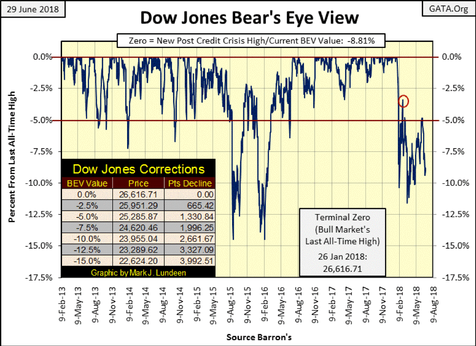
Last week, the Dow Jones closed with its BEV value at around -7.5 percent, and I wondered whether it would first breach its BEV -5 percent or -10 percent line. Five trading days later, it appears the -10 percent line is next, and what follows after that?
The factors the bulls have working against them are growing:
– Rising bond yields.
– The Federal Reserve is draining “liquidity” from the economy via its QT program.
– For the first time since April, there were more NYSE 52Wk Lows than Highs at the close of every day this week.
© Mark Lundeen
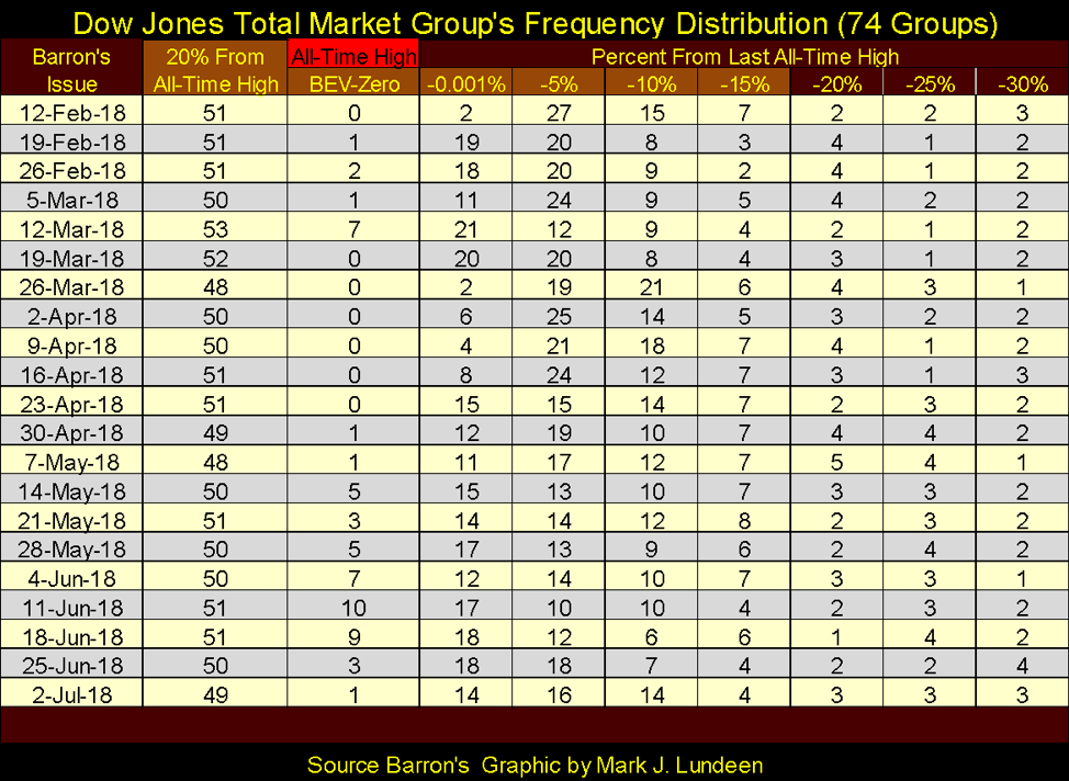
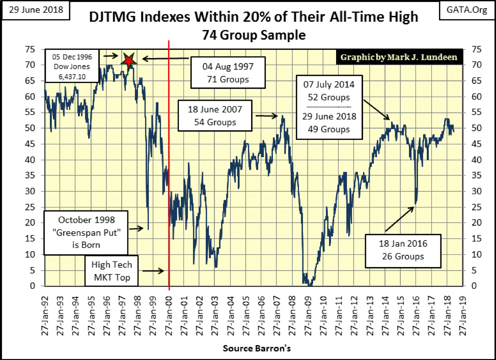
Also, the Dow Jones Total Market Groups’ (DJTMG) top 20, or the number of the 74 groups in the sample used in the table below within 20 percent of their last all-time high, closed the week at 49. This isn’t a market-shattering event, not so far anyway. But should the top 20 continue declining, at some point it will be.
Will the top 20 continue declining? I expect the 53 seen in Barron’s Mar. 12 issue will prove to be high for the March 2009 to January 2018 advance, and it’s all downhill from here. Whether the top 20 experiences a crash down to single digits in a few months or slowly deflates in the year(s) to come is a mystery. But in the fullness of time, all will be revealed.
© Mark Lundeen
Here’s the chart of the DJTMG’s top 20 going back to 1992.
© Mark Lundeen
No bull market advances forever. And seeing the Dow Jones advance over 20,000 in the past nine-year period suggests, to serious students of the market, that maybe the best of what was to come has in late-June 2018 now come and gone.
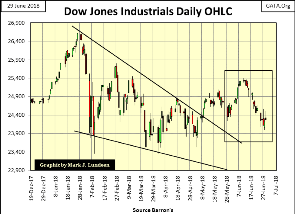
The following chart plotting the Dow Jones’ daily Open, High, Low and Close bars is looking very bad for the bulls. The Dow Jones hasn’t seen a good week since early June, four weeks ago.
Markets don’t move in a straight line for long. That the Dow Jones has done little but decline for the past three weeks suggests we may see some good gains in the week(s) to come. Assuming the next trend in the Dow Jones is up, it has to best break above that 25,400 line in the next month or so. If not, we may have some problems come this autumn. But up or down, the stock market is only a spectator sport for me. Gold, silver and the precious metal miners are where I want to be.
© Mark Lundeen
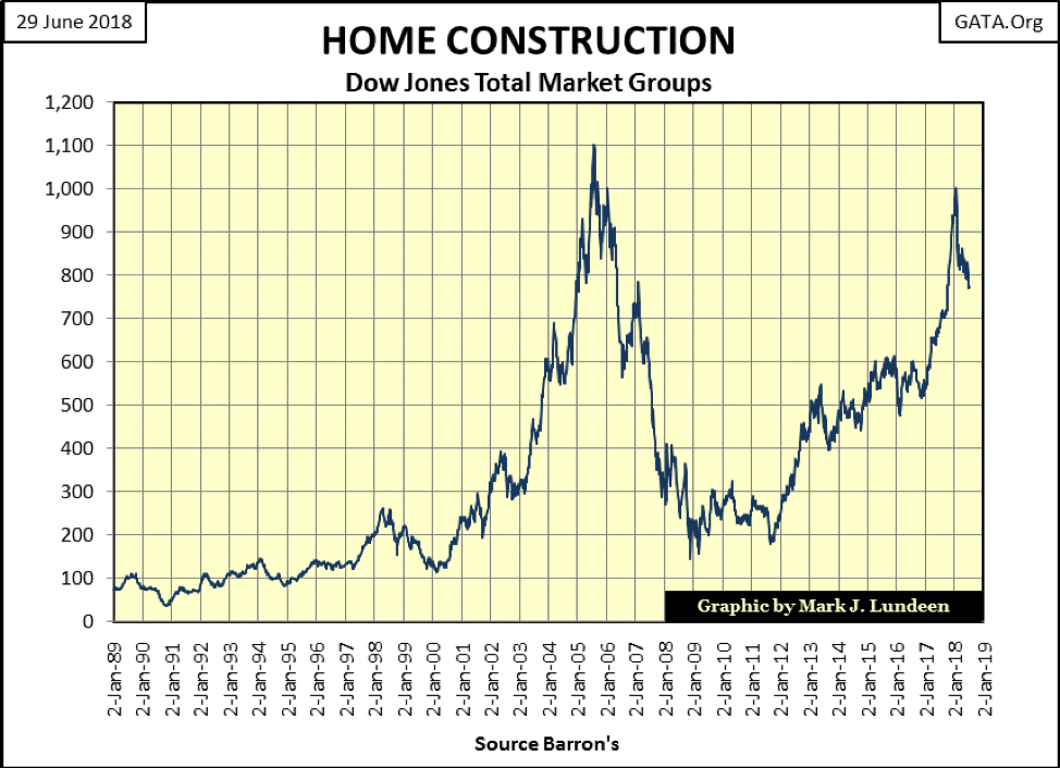
Another factor working against the bulls is the DJTMG’s Home Construction group is down over 20 percent from its highs of last January.
Home construction was a hot group during the 2001-2007 housing bubble. Seeing this group peak in mid-2005, more than a year before the problems in the subprime mortgage market were visible, provided a timely warning to those who followed the markets a decade ago.
As the “policy makers” have again inflated a massive bubble in the housing (mortgage) market, seeing this group’s post-January decline could very well be an early warning of what’s to come as it was a decade ago.
© Mark Lundeen
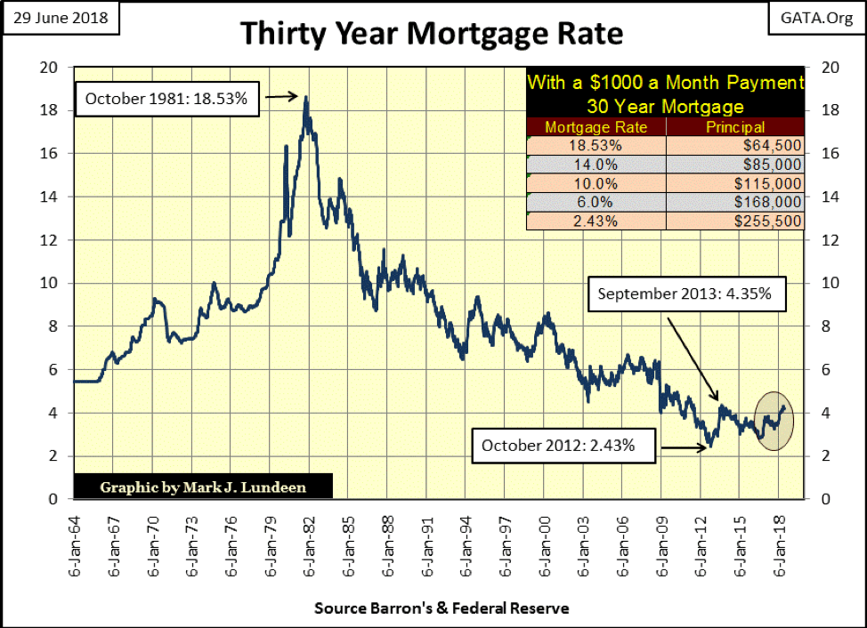
Looking at mortgage rates in the chart below, it’s interesting how most of the gains seen by the Home Construction group above occurred since January 2012, as mortgage rates increased from 2.43 percent to just under 4 percent. But in the past six months when rates approached the 4 percent line and then broke above it, the Home Construction group (above) began its current 20 percent decline.
That’s another way of saying no one cared about rising mortgage rates, until one day they did as rates broke above an unknown threshold, in this case 4 percent. I expect the same will be proven to be so for the general stock market when T-bond yields break above a similar, yet currently unknown threshold yield. And like mortgage rates, T-bond yields have been rising since July 2016.
© Mark Lundeen
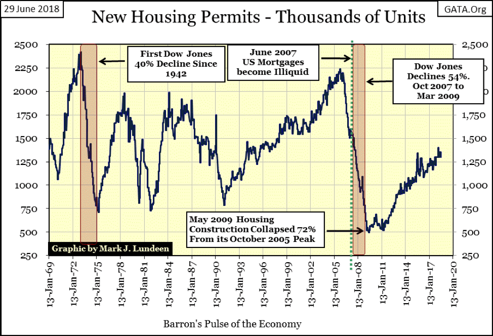
Housing permits (chart below) have recovered nicely since March 2009, though not up to their subprime mortgage bubble levels.
There’s a lot of history in this chart. The 1973-74 bear market, the first 40 percent decline in the Dow Jones since April 1942 was accompanied by a collapse in housing permits. This was also true for the subprime mortgage bear market, the next time the Dow Jones saw a 40 percent or greater decline.
But there is more to this data series. From 1969 to the early 1990s, the demand for housing permits increased and decreased like the plot on an EKG. Then in the early 1990s, the bubble master himself—Alan Greenspan—began implementing his “monetary policy” which, as seen below, impacted the housing industry.
“Market experts” and Keynesian economists called it “growth,” I’d call it something else. But there’s no arguing how, for 15 years, the demand for housing permits never slackened, until the credit crisis when the demand for permits crashed by 72 percent in May 2009.
© Mark Lundeen
Now again, in our post-subprime mortgage boom/bust market, demand for housing permits have steadily increased for the past nine years, which is a long time when compared to the data prior to the Greenspan Fed (1987-2006).
Let’s see—rising mortgage rates since 2012. The DJTMG Home Construction group begins a sharp 20 percent decline after mortgage rates approached, then broke above 4 percent in early 2018. How much longer until demand for housing permits begins a serious decline?
Your guess is as good as mine, but when demand for housing permits once again begins to contract in a major way, it will be very bearish for the broad-stock market. For one thing, writing mortgages is one of the “policy makers” favorite methods of “injecting liquidity” into the economy. A significant decline in these permits is deflationary as it indicates a sharp decline in mortgage issuance. As deflation in the financial markets is what it’s going to take to push gold, silver and their miners into a historical bull market, I keep an eye on housing permits.
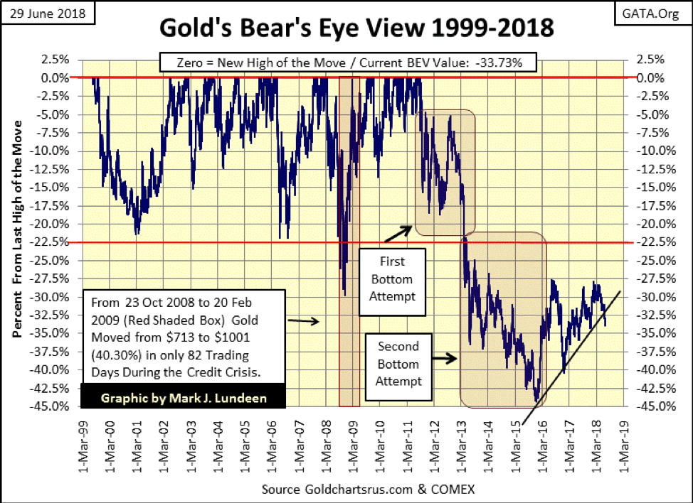
However, we’re not there yet, as seen in gold’s BEV chart (below) where the plot broke below the rising trend line. I don’t like it, but there it is, and I suspect the current decline in the price of precious metals and their miners will prove to be a reprise of what happened from March to October in 2008.
Ten years ago, the old monetary metals were whacked by the “policy makers” who understood the financial markets were facing a serious bout of deflation by what we now call the credit crisis. Applying Fud’s Law (push hard enough, it will fall down) then (as now) made the price of precious metal asset sharply decline before everything else. However, in October 2008, gold and silver (the miners too) began their advance to new all-time highs as everything else crashed and burned around them.
So, I’m looking at this breakdown in gold’s BEV chart below with a wary eye. Sure, gold is under pressure. But don’t be surprised if what we are really seeing here is a precursor of a huge deflationary event in the financial markets later in the year.
© Mark Lundeen
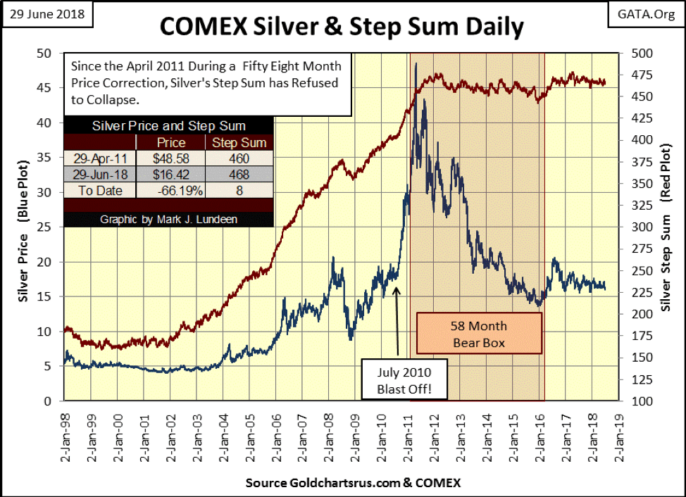
I seldom publish a step sum chart for silver (below), as silver’s step sum just doesn’t behave right. Here’s a 58-month bear box where the price of silver (Blue Plot) collapses by 72 percent, and what does silver’s step sum (Red Plot / market sentiment) do? Well, it didn’t collapse. But then since 1969, silver’s step sum never has collapsed even as silver suffered a 90% market collapse in the 1980s & 90s.
Look at the table on the chart: since 29 April 2011 silver is down by 66.19% on a net of eight Advancing days. Not shown, but gold is down by 33.73% on a net of 29 Declining days since 22 August 2011.
So what good is silver’s step sum chart? One thing it’s very good at; when silver is in a major advance, it takes its step sum up with it. As that’s something that isn’t happening right now, I’m controlling my excitement for the old monetary metals. But once silver’s step sum breaks above its 500 line in the chart below, don’t be surprised if the bull market in the precious metals will be leading the news in the financial media.
© Mark Lundeen
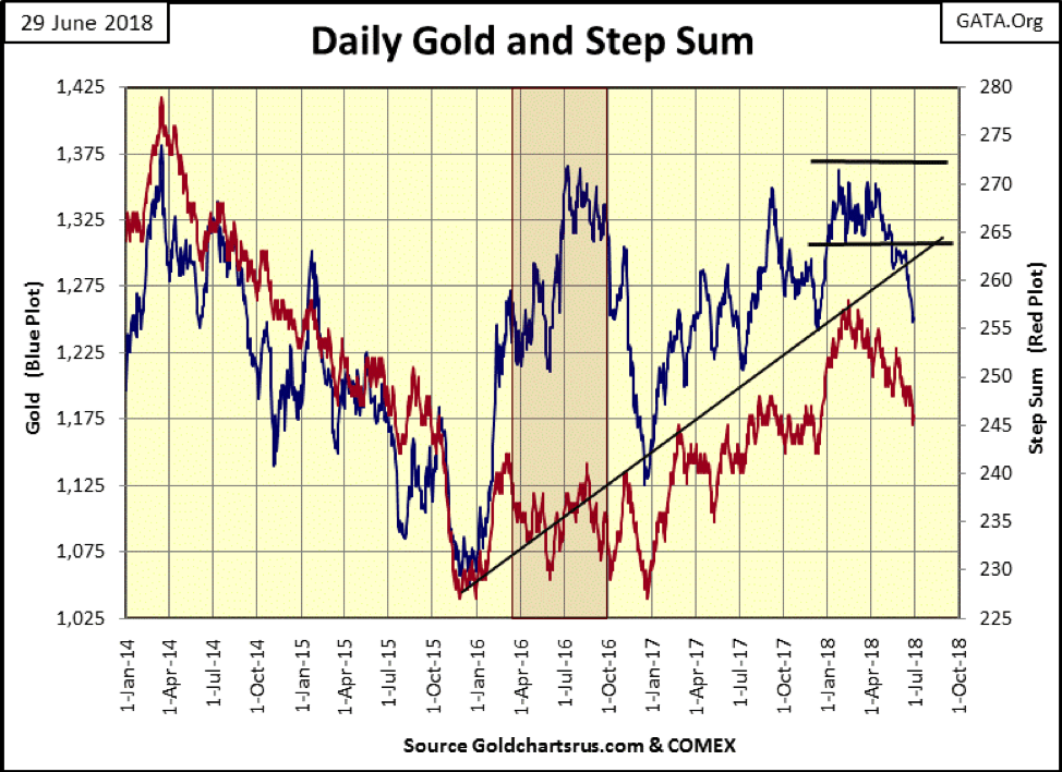
Here is gold’s step sum chart. Gold is under considerable pressure, with market sentiment (the step sum) trending down with gold’s price plot. Though that doesn’t make me happy, a worst case would be for the step sum plot to flat line here forming a bear box. As it is the bulls are in what the Marines would call a “retrograde advance” in the face of a Fud’s Law assault by the “policy makers.”
The “policy makers” are pushing down the price of gold and silver using fake digital gold and silver in the futures markets. And so it’s our lot to stay tough and not give up any ground we don’t have to. Time and natural market forces are on our side, not theirs.
All this is discouraging, but I hope I’ve given reasons for not giving up hope that buying and holding precious metal assets in today’s market is a prudent thing to do. What other choice do we have?
© Mark Lundeen
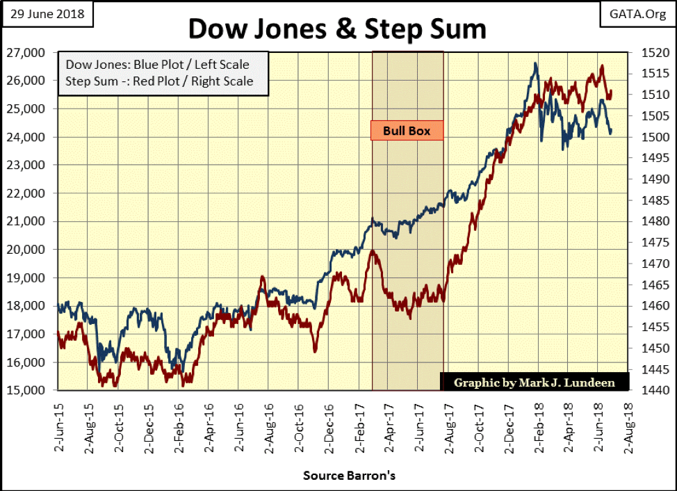
Here’s the step sum chart for the Dow Jones. Like gold’s above, we’re looking at a market under some selling pressure.
© Mark Lundeen
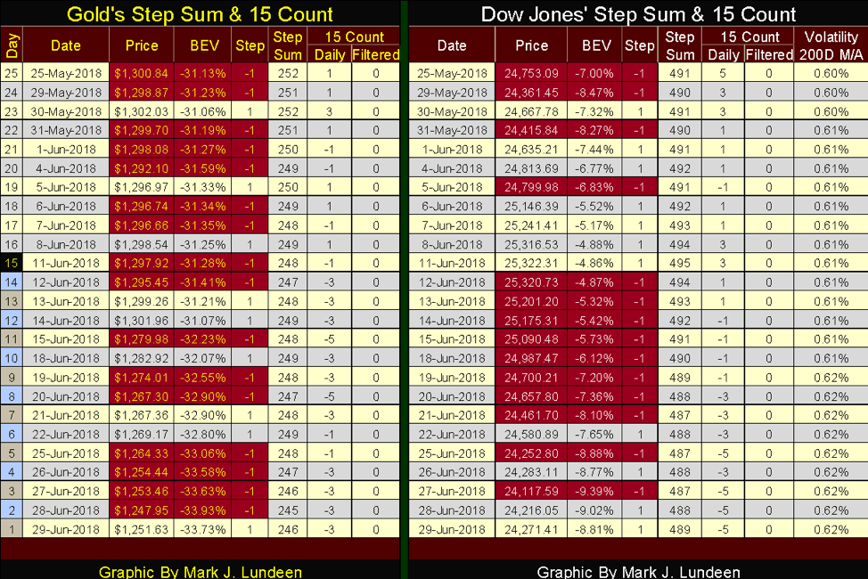
Both gold and the Dow Jones have seen a lot of selling since May 25. But this sell-off isn’t resulting in big percentage declines in either market. Let’s see what happens when their 15 counts turn positive.
© Mark Lundeen
“How did you go bankrupt?” Bill asked. “Two ways,” Mike said. “Gradually and then suddenly.” — Ernest Hemingway’s 1926 novel, “The Sun Also Rises.”
I’ve seen the above quote from Hemingway used by other writers when discussing personal or national solvency as the quote serves the purpose. People and institutions can be de-facto broke for years and not fully comprehend the peril they’re in—“and then suddenly.”
In the beginning, their financial situation is debt free, they then decide to leverage their consumption with a little debt. The debt is consumptive, used to allow one to purchase cars or homes that one’s wages, salary, or investment income by themselves would allow. Or when governments go into the debt market to fund a more generous benefits package for their workers, or purchase votes.
Consumptive debt is taken on during the good times and is then dragged behind debtors like a dead horse into their retirement age. It’s seldom paid off. In fact, the debts grow as the new game becomes one of servicing and rolling over the growing burdens of debt over time. Then comes a day where the assumptions made while taking on the debt are no longer valid, income declines AND THEN SUDDENLY debt service proves no longer a possibility.
In the old days, a very long time ago, debtors were forced to sell their children to their creditors, at greatly discounted prices. But we live in a more enlightened time, where debtors are allowed to pretty much keep what they purchased with the creditors’ money, while creditors are told to “sit down and shut up” during the bankruptcy proceedings. This was precisely what happened to General Motors’ bondholders in GM’s 2009 “reorganization” by the Obama administration; the only thing that got reorganized was GM’s bondholders’ net worth.
That sounds pretty good to most people; just stick it to the creditors. But what most debtors don’t understand is that a day is coming when this system is also going to stick it to their union-pension fund, credit union, and life-insurance company. When we consider the consequences of counterparty failure on the scale that’s pending in our debt-soaked financial system, everyone is going to be touched some way, somehow.
I bring all this up as an introduction to the following two stories in the financial media, the first on the pending AT&T and Comcast merger. If this merger is allowed to go through, the Wall Street Journal claims will earn these two companies the dubious distinction of being the world’s most indebted companies.
At first, I was alarmed at this news, but then I went outside. The sun was shining in a beautiful blue sky, bees were busy pollinating the flowers, and my two cats were safe and sleeping on the back deck. If this merger, one that would leave these two companies with potentially crippling debts in an economic downturn doesn’t bother the government’s “regulators” any more than it does Spooky and Jazz, why should I care?
Then I read the following article reporting that corporate debt has topped $6 trillion and began understanding why Spooky and Jazz weren’t worried—corporate America has “$2.1 trillion in cash to service that debt.” As CNBC further reports, “The debt load for U.S. corporations has reached a record $6.3 trillion, according to S&P Global. The good news is U.S. companies also have a record $2.1 trillion in cash to service that debt.”
Good news if true, but is it? In Barron’s latest issue the Federal Reserve reported CinC (cash) was only $1.66 trillion, so it’s an impossibility for anyone or anything to have $2.1 trillion in cash. No, in fact, what corporate America has is $2.1 trillion in short-term debt, no doubt all rated AAA by S&P. And what ready cash these corporations do have is in a Wall Street bank infected with toxic derivatives. In a world where pussy cats sleep contentedly under an azure sky, CNBC would have us believe things couldn’t get any better—so I expect things to begin to get worse.
How much of that $2.1 trillion corporate America has in “cash” is actually in debt obligations issued by AT&T and Comcast? This debt is good as cash only because these companies are servicing their debts. Something that no doubt they will be able to do even with the additional billions of debts they will soon take on with this merger.
But assuming the “world’s two most heavily indebted companies” will continue to be able to service their debts in the years to come, with the pending changes in the economy that no one today can predict is a big assumption. And the same goes for many American corporations—famous big-name companies who in recent years have trashed their balance sheets with consumptive debt to fund dividend payouts or their share-buyback programs.
I haven’t a clue what the triggering event will ultimately prove to be. It may be a political rather than economic event, international rather than domestic. But I can foresee a day where sales for these corporations turn down with the economy to the point where cash flows prove to be inadequate to service their debts.
At the end of that day, there won’t be a reduction of the total debt these companies owe to their creditors. But that’s the day their debts will prove to be no more liquid in the debt markets than subprime mortgages were in 2008, and likewise will cease to function as a cash equivalent, as creditors will once again be told to “sit down and shut up.”
Damn right I like gold and silver today; assets with no counterparty risks in a world pregnant debt default.
(Featured image by DepositPhotos.)
—
DISCLAIMER: This article expresses my own ideas and opinions. Any information I have shared are from sources that I believe to be reliable and accurate. I did not receive any financial compensation in writing this post. I encourage any reader to do their own diligent research first before making any investment decisions.


PayPal’s Slowdown: From Fintech Leader to Low-Growth Dividend Stock
PayPal has shifted from fintech leader to low-growth, value-style stock, losing over 25% in market value and trading at a...


Tilray (TLRY) Falls as Bearish Momentum Persists Despite Marketing Push
Tilray (TLRY) fell 3.32% to $4.44, remaining below key moving averages and signaling continued bearish pressure. Despite a £1 million...


ESG Gap Persists as Firms Struggle to Link Sustainability to Financial Value
KPMG’s Global Survey shows a major gap between ESG awareness and financial integration. While 72% of managers understand sustainability strategies,...


Bitcoin and Ethereum Slide as Market Pressure Builds Amid Strategy Concerns and Layer 2 Disruptions
Bitcoin fell below $60,000 with heavy ETF outflows, pressured by concerns over Strategy’s finances and its STRC stock decline. Ethereum...


AI Venture Builder Launches €600K Crowdfunding Round to Scale Secure AI Solutions
AI Venture Builder, an Italian-British firm developing AI applications and vertical startups, returns to CrowdFundMe with a equity campaign. After...
 |
|
 |  |
 |
|
-

 Markets2 weeks ago
Rising Inflation, Fed Uncertainty, and Market Excess Amid War and SpaceX Mania
-

 Markets3 days ago
Commodity Markets Pause as Oil Falls, Metals Correct, and Grains Show Mixed Signals
-

 Africa1 week ago
Egypt’s Net Foreign Assets Rise as External Position Continues Gradual Strengthening
-

 Markets5 days ago
Cocoa Market Faces Mixed Trends Amid Rising Supply and Weak Demand
You must be logged in to post a comment Login