Featured
Gold remains steady; stock markets look bearish
Despite some short selling, gold rallies appear unflinching. The stock market bounces back from extreme volatility from February to April.

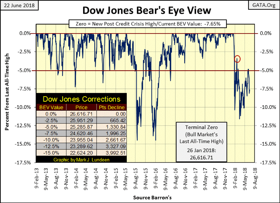
The Dow Jones is having a problem with its BEV -5 percent line, (25,285) in the chart below. It easily broke above it on Feb. 26 (Red Circle), closing the day at -3.41 percent. However, that advance was short lived. Then again in early March, it broke above the -5 percent line, just barely, before the Dow Jones went to its correction low on March 23, (-11.58 percent). After that low, the Dow worked its way back up to its BEV -5 percent line. For three days this month, it closed above this critical level, after which the Dow Jones quickly retreated to below its BEV -7.5 percent line.
This third failure of the Dow Jones to get above, and stay above the BEV -5 percent line is interesting, especially so as of the close of this week, the Dow finds itself at the -7.5 percent line—half way between the BEV -5 percent and -10 percent lines. Whether the Dow Jones breaks above one or below the other may tell us how goes the stock market for the next few months.
Currently, I’m short-term bullish and long-term BIG-BEAR bearish. But this situation is a coin toss between the bulls and Mr. Bear. BTW: Point values for those BEV lines can be found in the table in the chart below.
© Mark Lundeen
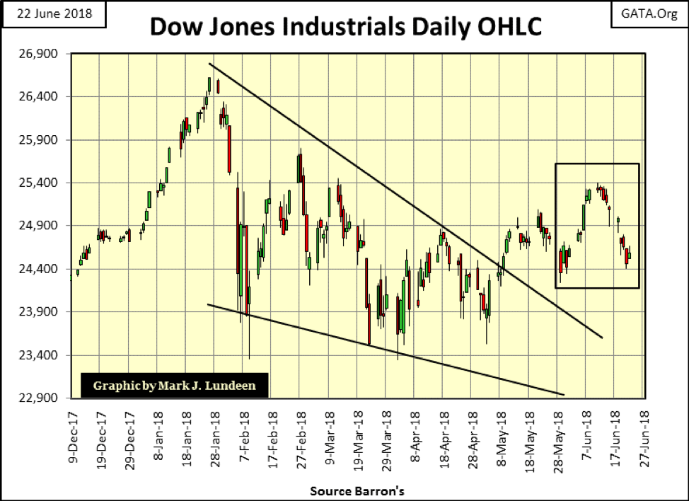
Here’s the Dow Jones in Open, High, Low and Close bars going back to last December. From December to its high on Jan. 26, the venerable Dow Jones moved up with authority. Look at the Dow’s last four trading weeks (box), the only bullish week was three weeks ago, with the last two weeks seeing the Dow Jones do little else than lose ground to Mr. Bear. On the plus side for the bulls, we’ve seen no Dow Jones 2 percent days since early April.
© Mark Lundeen
Keep in mind anything can happen in the market. However, over the long term, most outcomes in the stock market, unfortunately, are not favorable for retail investors because they don’t know when to leave the party.
I’ll keep it simple; in bull markets, surprises typically favor the bulls, while it’s just the opposite in bear markets. We have to study these charts and ask ourselves if the last all-time high seen on Jan. 26 was the last of the March 2009 to January 2018 advance. If there are more to come, after a nine-year 20,000-point advance, how much more does the stock market offer investors? If the Jan. 26 all-time high in the Dow Jones is the last of the advance, then we are in the early phase of a bear market, making this an excellent time to get out and stay out.
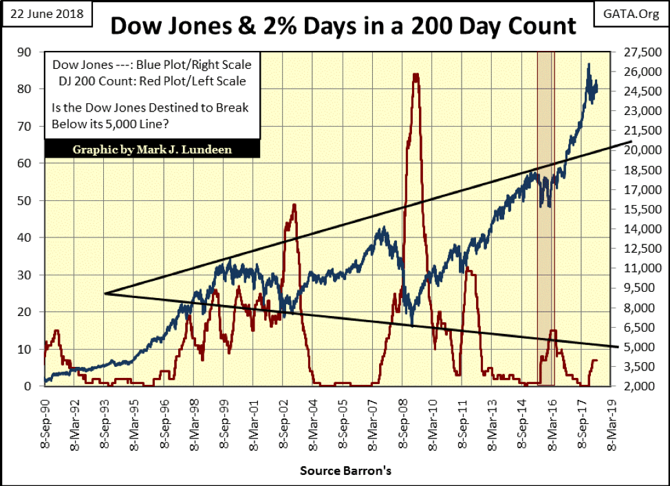
Here’s the Dow Jones (Blue Plot) with its 200 count (Red Plot), which counts the number of days the Dow Jones has moved (+/-) 2 percent or more (days of extreme market volatility) in a 200-day sample. Bear markets are volatile affairs, which drives the 200 count higher; bull markets experience low volatility, resulting in a low 200 count, and it’s been that way for over 100 years.
The 200 count has increased, but so far only to seven, and those seven days of extreme market volatility all occurred from Feb. 2 to Apr. 6. So, it’s been almost three months since the Dow Jones has seen an extreme day, which is good. However, if we are in a bear market, in the months to come, the 200 count below will rise up as the Dow Jones itself declines. Are we in a bear market? Maybe, and there are some developments in the Treasury Debt market, which in the months to come should have negative implications for the stock market, to be covered later in this article.
© Mark Lundeen
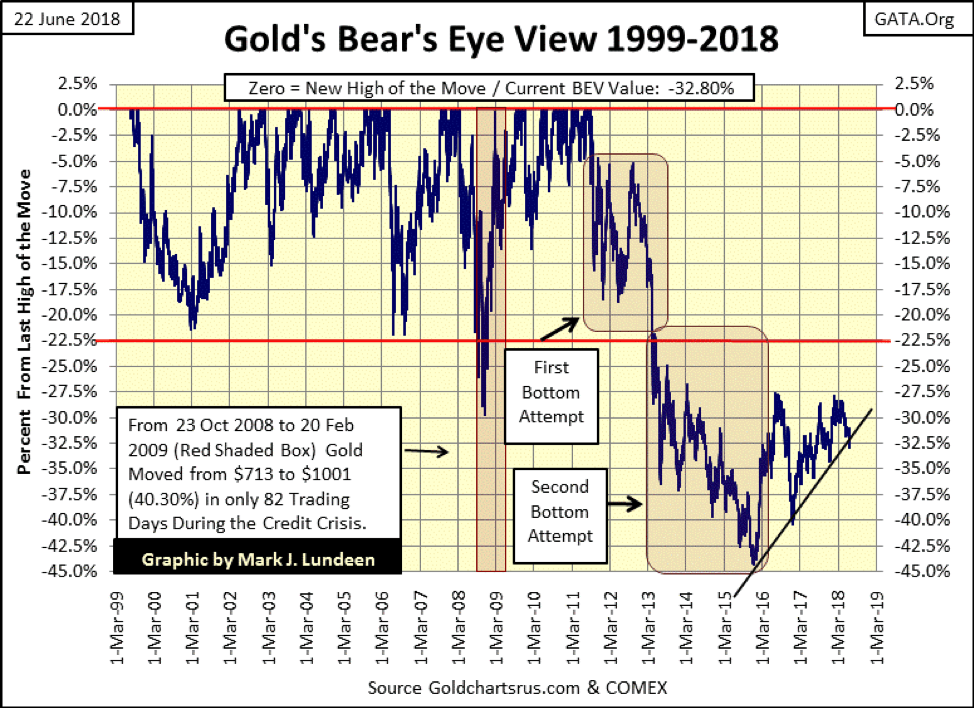
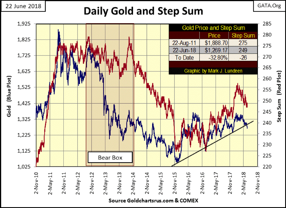
Gold’s BEV chart below shows it has broken below the rising trend line I placed in the chart. But this decline really isn’t much in the larger picture. Take a moment to study the many devastating declines gold has endured since 1999, and this was during a bull market. Since December 2016 (18 months ago), the bottom of its last big decline, gold has been well behaved.
I’ve been studying the markets long enough to know I shouldn’t make any promises on what gold is or isn’t going to do in the short term. But for all the frustration everyone is suffering in the gold market (silver and the miners too), my outlook for gold for the remainder of 2018 continues to be positive.
© Mark Lundeen
The primary source of my confidence is to be seen below, the picture perfect step-sum bear box gold saw from October 2011 to May 2014.
The step sum is simply a single item Advance – Decline Line using the daily advances and declines of a market series, like gold below. Over time, come bull or bear market, the market sees about as many advances as it does declines. However, during bull markets, there is a bias for advancing days, as bear markets have a bias for declining days.
Typically, the trends in valuation (Blue Plot) and market sentiment (Red Plot / Step Sum) agree with each other. However, there are times when they do not for a prolonged period of time, as we see in the gold market below inside the bear box.
An axiom in the step-sum analysis is the price trend is a market reality. Within the bear box below we see the reality of a market decline in the price of gold. But look at the step sum plot within the box, it refused to follow the price plot down for a year and a half. This was because after each big down day, the bulls would return to the market and take the price of gold up the next day. But the bulls’ resolute optimism in the face of declining gold prices, seen in the refusal of the step sum to decline in synch with the price trend, failed to turn the market in the bulls’ favor.
© Mark Lundeen
In around May 2014, even these dumb bulls could see market reality was lower prices. So, they stopped wasting their capital in a vain attempt to force the market up, and we can see this happen as the gold’s step sum finally came into synch with its price trend. Keep in mind what is happening here, people who purchased gold at higher prices, wrongly believing gold’s next stop was over $2,000 were selling their gold at prices below $1,400.
Look at the final collapse in market sentiment (the step sum) from October to December 2015: total and unconditional surrender by the bulls to Mr. Bear. The 15 count for gold went down to a -13 (one day in 15 advanced) while silver saw 15 consecutive down days, a 15 count of -15! Such extremes are the stuff of hard-market bottoms.
So, the bruised and battered bulls of August 2011 were finally out, and I think it’s safe believing most of them haven’t yet returned. But they sold their gold to someone at much lower prices, and these are the bulls we see today holding firm.
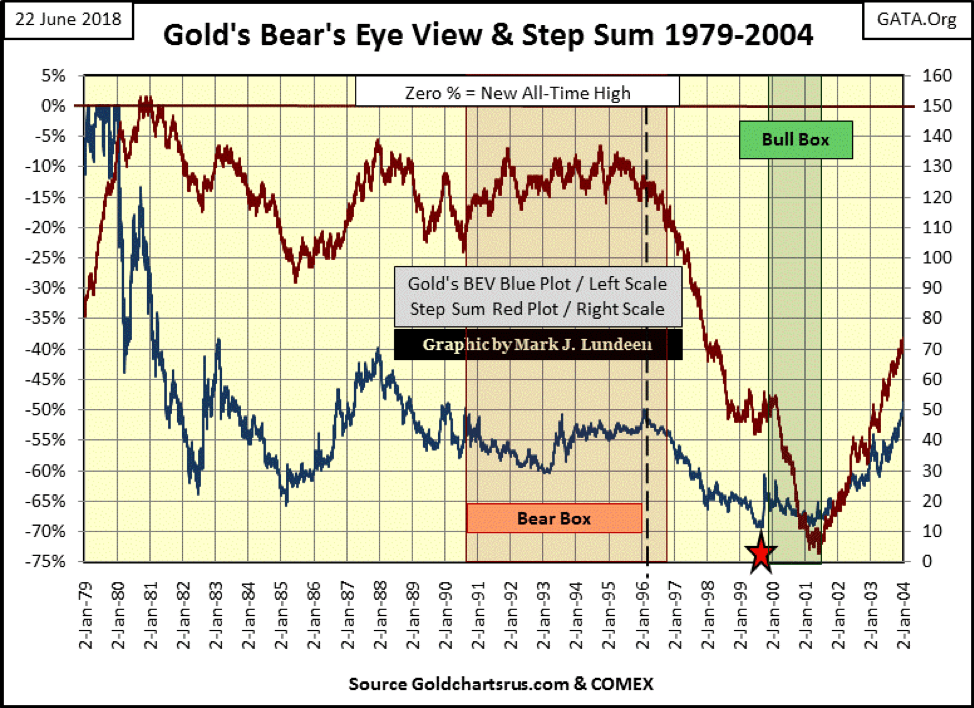
This isn’t the first time gold has found itself in a bear box. During the last half of the 1980-2001 bear market, gold found itself in a very similar technical situation, a big bear box that lasted SIX YEARS, as seen below. Interestingly, a bull box developed FOUR YEARS into the step sum collapse, collapse in market sentiment. This was one hell of a bear box!
While the bulls contemplated suicide (the step sum begins a near vertical collapse), the price of gold absolutely refused to break below the $253 close of July 19, 1999, (Red Star) in the year and a half prior to the beginning of its current bull market. This is what a hard bottom looks like. After February 2001, both the price and step sum plots realigned with each other and began to advance, marking the beginning of our current bull market in gold.
© Mark Lundeen
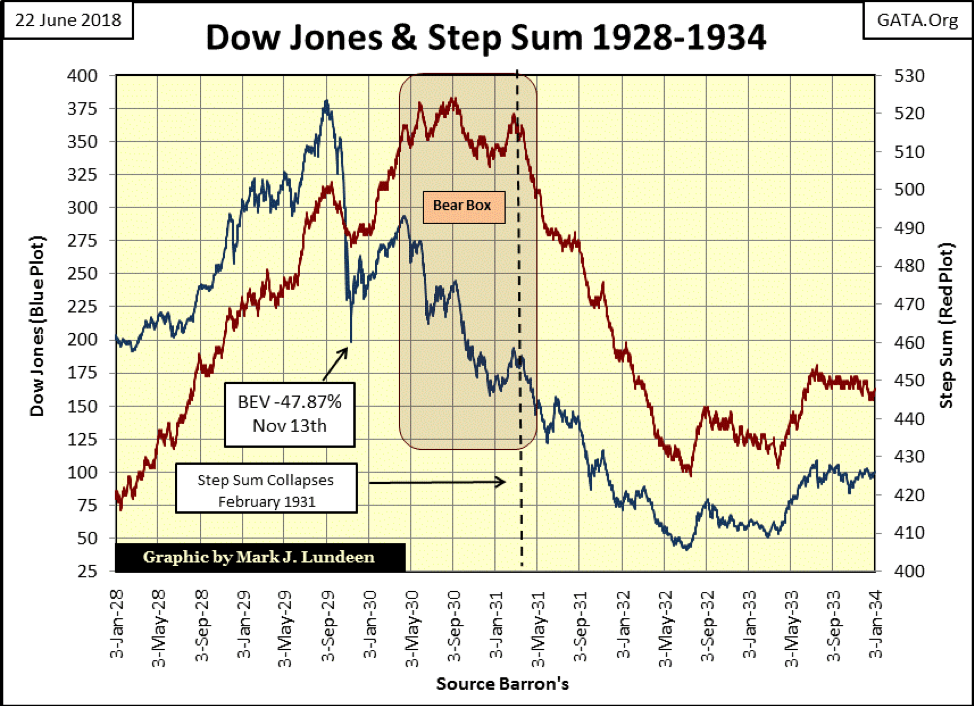
It’s not just the gold market where we find step sum bear boxes. During the Dow Jones’ Great Depression collapse, a bear box was formed. From Sept. 3, 1929, to Nov. 13, the Dow Jones declined 48 percent. The bottom was in as far as the bulls were concerned. So, when the market began its second and deepest decline in late April 1930 (Blue Plot), the bulls refused to accept this new reality in the market (Red Plot), forming a bear box that didn’t close until February of 1931.
© Mark Lundeen
The rest is history. From February 1931 to July 1932, the ever declining Dow Jones dragged down market sentiment (the step sum) with it, as America and the rest of the industrialized world became traumatized as Mr. Bear performed a stress test on every balance sheet on the planet. In the depressing 1930s, most balance sheets failed Mr. Bear’s test. But at least we can see when the Great Depression crash bottomed above; after the post bear-box collapse in the step sum, once again the Dow Jones’ price and step sum plots were in synch and ratcheting upward.
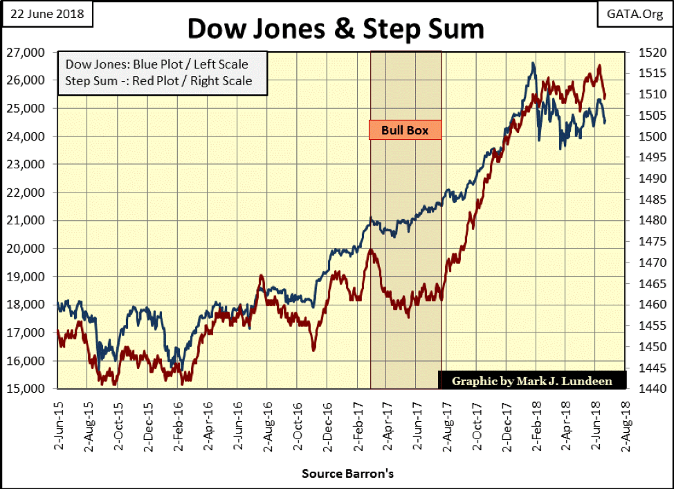
Returning to 2018, the Dow Jones below is five months into a correction that began in late January, and at the close of the week, both the price and step sum plots are trending the wrong way—down. No matter, closing the week only 7.5 percent away from the Dow Jones’ last all-time high places, the market in easy scoring position for a new all-time high, assuming this is still a bull market. But is it? That’s the big question for everyone at the close of this week’s trading.
© Mark Lundeen
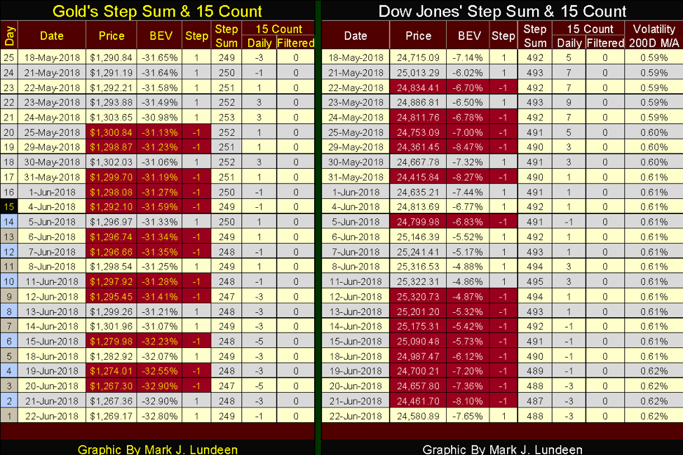
In the step sum tables below, both gold and the Dow Jones have seen a lot of selling in the past 25 trading days, and their valuations have been impacted by it. But in neither market can this selling be described as panic selling.
I highlight the down days in red as doing so provides visual impact to these tables. But the 15 count columns, though not visually dramatic, provides the market with a pressure gauge for the buying and selling. Typically, the 15 count oscillates above and below 0 (+3 to -3), and so no big deal. However, when the 15 count rises to a 5 or above, or declines to a -5 or below, frequently the market is giving us a contrarian clue of what is to come.
On May 23, the Dow Jones’ 15 count increased to a +9, or 12 advances and three declines in the past 15 trading days. That’s a lot of advancing, and maybe it’s time for the bears to have their way with the market: the Dow Jones dropped 471 points in the next five trading sessions.
© Mark Lundeen
The 15 count is also useful in timing entry and exit points in a market. If you have made a decision to sell something, waiting for the 15 count to rise to a 5 ensures you’ll get a good price for it as such a count indicates there is good demand for what you’re selling. The same is true for buying, except wait until the 15 count declines to a -5 or more. Buying with a low count ensures you’re buying when the market is under selling pressure.
However, these are guidelines that in special situations should be rejected. For example, if you wanted to sell something in September 1929, and you decided to wait for a 15 count of +5 or greater before you sold, the Great Depression Crash wasn’t going to let that happen.
And remember, the step sum is only a single item Advance – Decline Line using a market series own daily advances and declines as its inputs, with the 15 count being a derivative of those daily advances and declines. So, there is nothing stopping an investor from using this technique for buying and selling shares in a gold miner or high-tech stock.
And like any other market indicator, sometimes this works, and sometimes it doesn’t. But when dealing with our uncertain future in the market place, it’s nice to have some tools to work with as we keep in mind that we should cut our losses early while letting our profits run.
I write mostly about the stock market as most of my data has to do with the stock market. But there are other important areas of the financial market that are also important to keep an eye on, such as the US Treasury Bonds.
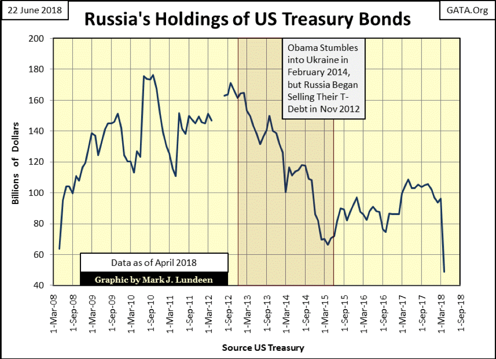
This article by CNBC that caught my eye, Russia cuts its T-debt holdings in half and foreigners are losing interest in holding Uncle Sam’s IOUs.
I’ve been tracking foreign holdings of Treasury debt since 2008. As seen in the following chart plotting Russia’s holding of T-debt. CNBC’s report of Russia halving its T-debt was right, but got it wrong that Russia’s peak holdings of Treasury debt was $108.7 billion in May 2017. They said this as CNBC reporter’s data on this story consisted only of the latest report by the Treasury. Going back 10 years, Russia’s peak holding of T-debt was $176.3 billion in October 2010.
God knows the Russians have no reason to do the US Treasury the favor of holding its debts. The fact is the Russians have been net sellers of Treasury debt since November 2012. Are they selling their Treasury holdings because of political spite or investment acumen; selling while there is still demand for their T-bonds at current high prices. Most likely their motivation is from a bit of both.
© Mark Lundeen
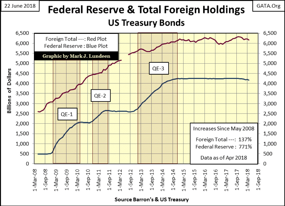
For your information, from the same data set, here’s a chart plotting total foreign holdings (Red Plot) and the Federal Reserves’ portfolio of US T-debt (Blue Plot).
© Mark Lundeen
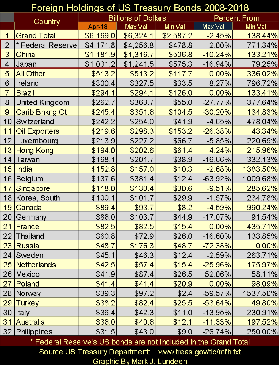
Next is a table listing foreign holders of US Treasury debt, source US Treasury and updated to April 2018.
The data in the table is sorted by holdings as of the Apr-18 column. I’ve also included the maximum and minimum holdings by these countries since May 2008, as well as the percentage the current holdings are from their maximums and minimums. In the Percent From section, a 0.00% in the Max Val column is a new all-time high, a 0.00% in the Min Val column is a new all-time low.
I highlighted the data for the Federal Reserve, China and Japan (Nos. 2, 3 and 4). The minimum values for all three are from May 2008, six months before Doctor Bernanke’s first QE. Note in May 2008, the holdings of US Treasury debt by both China and Japan was larger than the Fed’s portfolio of T-debt, but that is no longer true. Today, the Federal Reserve holds twice as much as the combined totals of China and Japan.
© Mark Lundeen
What happened? “Monetary Policy’s” response to the credit crisis of 2008-09 was to monetize $3.78 trillion in additional T-debt, as well as the nonperforming mortgages (garbage assets) on the big Wall Street banks balance sheets at full face value. The resulting effluent was “injected” back into Wall Street to keep the big banks from going under. Sounds disgusting and it was, but it worked – so far anyway.
Returning to the table, both China and Japan have reduced their holdings of US T-debt by double-digit percentages. This is a dollar reduction in their holdings of T-debt by $134 billion for China and $210 billion for Japan, while Russia’s (#23 above) maximum holdings of T-Debt was only $176 billion in the past 10 years.
Why did CNBC call out Russia for the recent reduction of its holdings of T-Debt? Why not Belgium (seat of the European Union) which has reduced its holdings by $244 billion (64%)? Given a choice between the EU and Russia, currently, I’d choose Russia as it’s the EU that’s evolving into a police state, not Russia.
The Federal Reserve’s holdings of T-debt have been reduced by 2%. Call it Quantitative Tightening (QT), and they have promised further reductions to come. This is important as when the Federal Reserve sells off its T-debt reserves, it increases the supply of T-debt in the Treasury Bond Market, which lowers bond prices and increases bond yields. It’s not good for valuations in the stock market either!
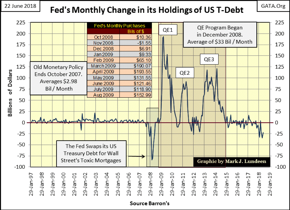
Monthly net-changes in the Federal Reserve’s holdings of T-debt are plotted below. The “Old Monetary Policy” which inflated the NASDAQ High-Tech and Sub-Prime Mortgage bubbles only monetized on average $2.98 billion in T-debt a month. That doesn’t seem like much but speaks volumes on the extensive leverage used in the Federal Reserve’s banking system.
Note the 2000–2002 deflation in the high-tech stocks didn’t force the Federal Reserve to do anything drastic. But in early 2008, all that changed when the Federal Reserve began to exchange its AAA-rated US Treasury monetary reserves, for Wall Street’s toxic mortgages. Had the Fed refused to do so, most if not all of Wall Street’s big banks would have had to close their doors for business months before the October 2008 crisis.
Then Doctor Bernanke began his three QEs, where on average the Federal Reserve monetized $33 billion a month from 2009 through 2014. Then beginning last November—two months before the January 2018 Dow Jones’ market top—the Fed began reducing its holdings of US Treasury reserves, which is of course deflationary. Exactly how deflationary this QT will prove to be for the stock and bond markets is still unknown.
© Mark Lundeen
What is also unknown is how many billions of the $3.78 TRILLION the Federal Reserve monetized and “injected” into the economy in response to the credit crisis, they now intend to unload in the T-bond market. Of course, this all assumes there is a market for these T-bonds. That there are institutions and wealthy individuals in the financial markets willing to exchange their money for these bonds at today’s high prices and ridiculous low yields. And then everyone knows that the US Treasury also intends to float a trillion or more dollars of new T-debt in the next year.
Okay, in the second half of 2018, we have foreign holders, the Federal Reserve and the US Treasury intending to flood the Treasury market with gobs of debt. But who is on the buy side of these huge sales of Uncle Sam’s IOUs? Maybe this is why the Russians have halved their holdings of T-bonds and are actively increasing their gold reserves; they can see what’s coming.
—
DISCLAIMER: This article expresses my own ideas and opinions. Any information I have shared are from sources that I believe to be reliable and accurate. I did not receive any financial compensation in writing this post. I encourage any reader to do their own diligent research first before making any investment decisions.


The TopRanked.io Guide to 2026’s Biggest and Best Affiliate Opportunities
Want to earn affiliate commissions on literal billions of dollars worth of revenue? Then this week, we've got something special...


Eni Advances Energy Transition with Major Investment and Emissions Cuts
Eni showcased its “Just Transition” report in Rome, highlighting stakeholder collaboration and progress toward decarbonization goals. The company invested over...


The German Fintech Market Shows Resilience and Strong Investment Growth in 2026
Germany’s fintech sector remained resilient in 2026 despite economic crisis and rising insolvencies. Investments reached €14.2 billion, showing strong investor...


Cannabis Legalization in Germany: A Mixed Interim Assessment
Germany’s cannabis legalization has reduced criminal cases and eased pressure on the justice system, while the black market is slowly...


Sustainable Restoration of the Haus Hövener Garden in Brilon
The Brilon Construction Workers Association is restoring the Haus Hövener garden into a cultural community space, funded through a €10,000...
 |
|
 |  |
 |
|
-

 Impact Investing2 weeks ago
Italy Advances Recycling but Infrastructure Gaps Threaten EU Targets
-

 Biotech4 days ago
EFPIA Warns Limited SPC Reform Could Weaken EU Pharma Competitiveness
-

 Fintech2 weeks ago
Revolut Begins Controlled India Rollout Targeting Massive UPI Payments Market
-

 Biotech6 days ago
TG Therapeutics Advances Subcutaneous Briumvi With Strong Trial Results and Rising Sales Momentum
You must be logged in to post a comment Login